10,000 search results
(0.01 seconds)
- CA Texteron by Cape Arcona Type Foundry,
$40.00 CA Texteron is a modern text font family to cover the most common typographical needs with a minimum of weights. It is aiming for a serious but unconventional look, which is achieved by combining round and edgy forms in the same font, often in the same glyph, and by using Humanist and modern form-principles at the same time. It merges classical type-design with an experimental spirit. CA Texteron combines elements of the dynamic renaissance principle with the static neo-classic style, which makes it hard to classify. The result is a post-modern hybridization. The Regular weight works best in text size, and with more letter-space also for footnotes. The low contrast makes it robust and legible even in very small sizes. Bold, Italic and Small Caps are intended for emphasis. Bold, Bold Italic and Heavy make good headlines, that reveal the unconventional details. The Italic is not just a slanted version of the Regular weight but has individual forms and typical italic characteristics.
 - CA Negroni by Cape Arcona Type Foundry,
$29.00 A dinner is not complete without a fine appetizer. Whatever you dinner will be, CA Negroni is the perfect introduction. Delivered in three flavors, Normal (Light + Black + Fill), Inline and Round. Versatility is proved by the extensive language support, covering whole Central Europe. CA Negroni is the well aged and improved version of a typographic classic: in the beginning of the 20th century, type in advertising was mostly drawn by hand. A master of this art and pioneer in logo-design was Wilhelm Deffke (1187–1950). CA Negroni is inspired by his kind of bold and solid letterings, picking up some of the charming details while leaving away other that might have a disturbing effect on the general look. Two stylistic sets let you choose between a more serious or a more playful look.
 - CA Spotnik by Cape Arcona Type Foundry,
$40.00 The initial inspiration for CA Spotnik was the opening title of an early Andrei Tarkovsky movie. There was this very unconventional hand drawn “s” which drew my attention. Despite its strange shape, it felt totally natural in that context. So we made a few screenshots and started to sketch some more letters in order to catch the spirit that attracted us so much. The result is a grotesque typeface with a slight contrast, the proportions are rather wide with a large x-height. The bolder the weight, the wider it gets. In case you find the swirly “s” uncomfortable, there is a standard s included as well. The general atmosphere of the typeface, which could be described as “nerdy but friendly” doesn’t depend on this detail. It’s rather the sum of details derived from the original inspiration.
 - CA Postal by Cape Arcona Type Foundry,
$39.00 CA Postal is a cute and clever little stamp-font. It was originally intended for a record-cover only, but when the artist wanted all lyrics printed in the booklet, it was time for a font. The initial inspiration was a moveable-stamp printing-set, which had a nice Futura-like style, being very pleasant to read, especially in small sizes. But of course it’s the loose and irregular outlines that give the font its special charms. CA Postal features two sets of characters and the "Contextual Alternates" feature will make sure that never two identical characters will stand next to each other, so that the stamp-look becomes even more authentic.
 - CA Capoli by Cape Arcona Type Foundry,
$29.00 CA Capoli is a fine script typeface with a vintage touch. Perfect for illustrative titles or logotypes. It comes in two styles, Regular and Stroke. The inspiration came during our trip to Italy, where we took a short rest in a bar during a hot day. We discovered a simple ceramic ashtray on the table. The word “Nido” was inscribed in a typeface that looked like it dated back to the 1950s. We made some investigations about the word, its meaning and origin but it still remains a big mystery. Was it the name of a hotel or a restaurant or some vintage Italian cigarettes? We don’t know. We were so amazed about the design of the logo that we decided to create a typeface out of it. A sophisticated endeavor because we just had four letters. How could the rest of the letters – if it ever existed – have looked like? Our hypothesis is CA Capoli. A typeface with a full Central European character set and some nice alternative letters to chose from. When we thought about “Nido” and its possible derivation of hotel business, we felt like creating a small side project for this typeface, a brand for a fictional hotel called Hotel Capoli with business cards, letterheads, a reception book, key fobs and embroidered patches for the service dress of the hotel service stuff. The Hotel Capoli is located at the wonderful beach of Cape Arcona on the fictional country of Arcona Islands where our type foundry is located.
 - CA Edwald by Cape Arcona Type Foundry,
$40.00 CA Edwald, the superbly crafted alphabet design now available in 5 weights, combining the familiar, the unusual, the practical and the aesthetic. Plan ahead and make use of the assorted logo letters that add distinction to your headline. CA Edwald is a welcome addition to our ever-growing collection of alphabet designs. It is prepared to meet your graphic requirements. Now there is one trusty Musketeer for today’s advertising. The illegitimate child of Oswald Bruce Cooper and Ed Benguiat, a mixture or even the “best of”: CA EDWALD.
 - CA Cula by Cape Arcona Type Foundry,
$40.00 CA Cula is standing in the tradition of cool tempered sans serif typefaces like DIN. But at a closer look it reveals a tendency towards rounder reading-friendly forms. The denaturalized ink traps give CA Cula a very special and individual look in display sizes, whereas in smaller sizes the positive aspects of huge ink traps show effect. The text looks clean and bright without black dots in the typographic image. This makes CA Cula suitable even for longer text, while the bold weight makes pretty cool headlines. The choice of weights aims at an easy straight forward use. A set of five well balanced weights ought to be enough to cover most needs without throwing the typographer into questions like: demibold or semibold? If you are looking for the extra kick, look out for CA Cula Superfat.
 - CA Smut by Cape Arcona Type Foundry,
$19.00 Sometimes the ugliest pets can be the cutest ones. And the dirtiest fonts can be the most charming ones. Like CA Smut which comes in two styles that can be stacked on top of each other. “Regular” is the shadow, while “Fill” is the filling. Create little masterpieces by playing with different colors, offset or deviating tracking. You can even try to use the “Fill” style on its own, but do so at you own risk. The spacing and kerning is optimized for the use with “Regular”, so be open minded for surprising results. If you ever had the intention to design a horror movie poster, there’s no way around CA Smut.
 - CA Slalom by Cape Arcona Type Foundry,
$40.00 The starting point for CA Slalom was the aspiration to create a contemporary interpretation of classics like Gill and Antique Olive in terms of aesthetics, flexibility and usefulness. The outstanding S soon became the visual hook and starting from the extra bold extended weight, CA Slalom evolved into a huge family with four widths. It’s rather round instead of squarely with stroke-ends pulled deep and a relatively low x-height. This gives CA Slalom a taste of its own, and although it is clearly contemporary, it has the potential to become a classic.
 - CA Kometo by Cape Arcona Type Foundry,
$19.00 CA Kometo is an oblique headline typeface that consists of two styles, “Regular” (the Shadow) and “Fill”. Kometo has come to save the world. A superhero typeface featuring the super powers “shadow” and “imperfection”. It comes to save you from a world of boredom. Join Kometo and experience the fun of stacking fonts! Write something with “Fill”, copy paste it to another layer and switch to “Regular“. Maybe you will want to give it a little offset? Or you can also try to use the “Fill” style for body text, but do so at your own risk, spacing and kerning is optimized for the use with the “Regular“ style, so don't be too harsh if the results looks more vivid than text normally does. The character set is well built, supporting Western and Central European languages.
 - CA Subbacultcha by Cape Arcona Type Foundry,
$25.00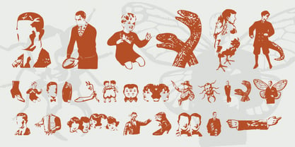
- CA Prologue by Cape Arcona Type Foundry,
$19.00 Prologue was designed to look like a postmodern typewriter. With plain and simple upper cases and trickier lower cases. Three weights give a good variety for all kinds of designs and seem especially well made for headlines and short teasers.
 - CA Yoshiro by Cape Arcona Type Foundry,
$30.00 Tomorrow’s Typeface Today Are you ready to take your science fiction, action, military films, shows or video games to the next level? Our family of fonts brings a touch of nostalgia and a dash of modernity to your titles and typography. The CA YOSHIRO “Wide” style bears a striking resemblance to the iconic Eurostile typefaces of the 1960s. It has an immediate sense of familiarity. But what sets it apart is its contemporary, fresh sci-fi design. It’s the perfect blend of classic and cutting-edge, delivering an unprecedented, unconsumed style that promises to captivate audiences like never before. The CA YOSHIRO “Normal” style can also be used for a variety of other projects that require a normal width and just need to show a light technical touch without immediately suggesting a sci-fi reference. In addition, CA Yoshiro has subtle similarities to the monospace fonts commonly used on computer displays and screens. These fonts are the foundation of written programming code and sequences, lending a distinctive character to the digital realm.
 - CA Superpilot by Cape Arcona Type Foundry,
$29.00 Introducing the CA Superpilot Sans & Script family pairing - the ultimate package designed specifically for creatives and designers. The CA Superpilot Sans font family, with its contemporary take on Futura, is the perfect choice for those seeking a sleek and modern typeface. With five weights and italics, this font is flexible enough to be used in any project. In addition, it includes an extensive Central European character set and alternate characters, ensuring that your designs will stand out in any language. On the other hand, the CA Superpilot Script font family is a monoline script font that takes inspiration from vintage camera equipment logos and type designations from the 1950s. The result is a unique and retro-inspired typeface that adds personality and charm to any project. With regular and italic styles, you have plenty of options to work with. Despite being a script typeface, its bold strokes and clean lines make it ideal for captivating and impactful headlines in uppercase. Using these two fonts together gives you unmatched flexibility for any project, whether it's branding, website design, or print design. Don't miss out on this essential font pairing - get it today!
 - CA Recape by Cape Arcona Type Foundry,
$49.00 CA Recape is a weird and beautiful vintage script family with two styles. It’s an excellent choice for creating logotypes, headlines, signs, poster and any design that requires a custom-made feeling. The basic inspiration for CA Recape comes from American 50s lettering. But instead of reviving one special style, it is a kind of “Best of”-Remix. It takes the weirdest and most beautiful letterforms of a weird and beautiful time and merges them into one font. The outcome is a charming bastard. Guess what it looks like: Weird and beautiful. CA Recape is packed with a lot of OpenType features like underlining swashes, Stylistic, Discretionary, Titling and Contextual Alternates and Ligatures for use in OpenType savvy programs. It also comes with some nice Ornaments. Derived from the original typeface, Cape Arcona Type Foundry also offers a Raw style that has the distressed look of a poorly printed raw font. See the specimen PDF in the Gallery for all OpenType features and instructions.
 - CA Segundo by Cape Arcona Type Foundry,
$29.00 The inspiration for this font came from a wall-writing in Cuba. At first glance we thought: "There is something wrong with the wall-writing." But a closer look revealed, that it just mixed up different stroke-styles. That "feature" became the designing principle behind CA Segundo: Round characters like O, U or C are available either with a fat or a thin stroke, whereas other characters with orthogonal lines come in two different styles – uppercase characters emphasize the vertical strokes, while lower cases emphasize the horizontal strokes. This gives you the opportunity to design just while you type.
 - CA Kink by Cape Arcona Type Foundry,
$20.00 CA Kink was originally created for a book cover. Mostly suitable as a headline font and for all kind of "space" themes.
 - CA Saygon by Cape Arcona Type Foundry,
$40.00 CA Saygon was originally conceived for a large corporate design project, but as this was never implemented, the way was free to make a public font. As a striking corporate typeface, it transports the fractions of a society after the post-modernist phase. After hundreds of sketches a bunch full of letters were selected, some of them quite twisted, others rather conventional. The combination of these letters reflects a rebellion of individuality but also leads to a coherent typeface. Additionally there are alternative letterforms in the Stylistic Sets or in the glyphs palette, which keeps the font always exciting to the designer. Thanks to the Cyrillic and Latin Extended character sets, a huge language area is covered that even extends to Vietnam! Numerous OpenType features make life easier for the professional typographer: There are fractions, superscript and subscript numbers, as well as proportional and tabular numbers.
 - CA Normal by Cape Arcona Type Foundry,
$40.00 CA Normal is a typeface aiming for beauty without ostensible effects, merely relying on clarity and well balanced proportions. True beauty is not to be found in perfect geometry, so slight irregularities and inconsequences are spread throughout the typographic image. That’s perfection through imperfection. CA Normal merges influences from European grotesques and American gothics, breeding an experimental mongrel. The underlying concept stays in the background, giving the design a great self-evidence. Although it is doubtful if there can be such thing as neutrality, CA Normal comes pretty close to what people mean when speaking of a neutral font. Nevertheless it’s not faceless, anonymous or confound able. It’s just that the charm comes from subtle details rather than obvious design features. As good text typefaces must not be too smooth nor too agitated, CA Normal is smuggling little uneven details into the typographic image, that keep the readers eye awake. The well crafted oblique follows the grotesque tradition which knows no individually drawn italics. A rather unexpected addition is the reverse oblique, a style mainly used for maps. Under the classic surface lies a modern well equipped font, featuring small caps, a Central European character set and numerals in all kinds of flavors. Numerous ligatures round up the overall impression. By default CA Normal will set numbers as proportional lining figures. But if you prefer oldstyle figures, or tabular figures, just use the OpenType functions of your layout program. These allow access to the small caps as well, which feature a complete central European character set, brackets, punctuation and lining figures in small caps height.
 - CA Play by Cape Arcona Type Foundry,
$29.00 This font invites you to play with it. The Real version has longer tails, while the Roman version cuts them up to make the font more suitable for text. The Script version connects the letters, while the Dynamic version is just an italic style.
 - Cas Pixalatte by Casloop Studio,
$10.00 Cas Pixalatte Typeface - Dive into Y2K Nostalgia with Pixel Perfection Unleash the power of pixelated aesthetics with Cas Pixalatte Typeface, a cutting-edge font inspired by the iconic Y2K era. This unique typeface is a masterful blend of typography, graphic design, and pixel art, crafted to infuse your projects with a distinct visual style that's both nostalgic and contemporary. Two Distinct Pixel Font Styles Tailor your designs with precision by choosing between the 'Regular' and 'Rounded' styles, allowing you to achieve the perfect balance between retro charm and modern aesthetics. Multi-Language Support Cas Pixalatte goes beyond borders, offering comprehensive support for Latin-based languages across Western Europe, Central Europe, South Eastern Europe, South America, Oceania, and Esperanto. Why Cas Pixalatte? Here's what sets it apart: Visual Versatility: Whether you're working on a gaming interface, website design, or branding project, Cas Pixalatte adds a unique visual flair, making your creations truly stand out. Easy Integration: With a range of file formats, seamless integration into your design workflow is guaranteed, ensuring a hassle-free creative process. Global Appeal: Break language barriers with multi-language support, allowing you to reach audiences around the world without compromise. Elevate your design, embrace nostalgia, and make a lasting impression with Cas Pixalatte Typeface. Discover the possibilities, unlock creativity, and transform your projects into unforgettable visual experiences.
 - CA Oskar by Cape Arcona Type Foundry,
$40.00 CA Oskar came into being as a custom typeface for the international Traumzeit music festival. As a substantial part of the new corporate identity, it had to be characteristic, but also flexible in use. Starting with the design of compressed caps for headlines, the typeface was soon expanded by a condensed weight for setting of text and further developed into a fully functional font with two widths and two weights. Both weights are very space-efficient, which was -- apart from aesthetic considerations -- an important issue in the process of the design. CA Oskar is a mixture of industrial harshness and friendly round forms, reflecting the spirit of fusion, which is basically what the whole festival is about. Its very slim proportions in two widths make it an attractive alternative to fonts like Alternate Gothic, but CA Oskar adds an extra portion of personality and a coherent choice of weights.
 - CA Zentrum by Cape Arcona Type Foundry,
$40.00 CA Zentrum is a compelling mix of conciseness and pragmatism. Bold, distinct and original, contemporary and versatile. At a closer look, it reveals rounder reading-friendly forms. The choice of weights aims at an easy, straight forward use. A set of five well-balanced weights and three widths ranging from light to black and from condensed to wide. This variety ought to be enough to cover most needs without throwing the typographer into questions. The family’s glyph set supports over 100 Latin languages. With its blend of timelessness and modernity, the type-family is uniquely suited for modern corporate visual languages, websites, corporate design, editorial design and advertising. Careful spacing and a great choice of OpenType features make it especially well suited for text copy and/or editorial design.
 - CA Mechano by Cape Arcona Type Foundry,
$19.00 CA Mechano is quite what the name suggests – A mechanical typeface. Pretty straight forward and all-caps as long as you don’t activate the stylistic set "disorder". You will see what happens then: a lot of fun for the typographic eye. A more consumable distraction is offered by the other stylistic set. You will discover peacefully rounded letters in the neighborhood of strictly mechanically constructed glyphs.
 - CAC Lasko Even Weight - Unknown license

- KR Deco Caps One - Unknown license

- Corpulent Caps Shadow BRK - Unknown license

- Kremlin Synod (Display Caps) - Unknown license

- Lady Ice - Small Caps - Unknown license

- Alpha Flight Small Caps - Personal use only

- BM spiral Cap Cyr - Unknown license

- PR Uncial Alt Caps - Unknown license

- Tulipán Broken Caps Pro by Estudio Calderon,
$40.00 Tulipán Broken Caps Pro is new variable/complement of Tulipán Broken Caps, it includes 200 interesting ligatures, specially designed for games, apps, books, logos and packaging. Its bold structure is perfect to give great effects.
 - Sis Boom Bah NF by Nick's Fonts,
$10.00An old favorite from the venerable Letragraphica series, named Yankee Shadow and designed by Tony Geddes, provides the pattern for this sporty font. For this version, the outlines have been beefed up, and the shadow has been moved in an easterly direction. Both versions of this font include the complete Latin 1252 and CE 1250 character sets, with localization for Romanian and Moldovan. - Albeit Grotesk Stencil Caps by Cloud9 Type Dept,
$20.00 Albeit Grotesk Stencil Caps is a graphic geometric stencil-style all caps display font family of four weights (Light, Regular, Medium and Bold) with slightly exaggarated diacritics for better readability making it ideal for headlines.
 - Groovy 3D Caps JNL by Jeff Levine,
$29.00 It all started with a simple idea back in 1998: do a digital version of a "lost" 70's typeface, and make up the missing letters that were not present in the only available example Jeff Levine had to work with. Jeff wasn't yet doing his own digital font creation, so he hooked up with Brad Nelson who owns a small foundry called Brain Eaters Fonts. Together, they collaborated on "Action Is"- a freeware font named after the source of the type example. This was a title page for a commemorative photo album of images from the 60's TV music show "Where the Action Is", formerly hosted by Jeff's employer at the time, singer-writer-producer Steve Alaimo. The free font took off like a rocket, being released just at the peak of the 60’s/70’s retro craze in the late 1990’s, and it was EVERYWHERE! It showed up on TV shows, packaging and web design -- and was even spotted on signage used on the side of a major amusement resort’s retro-themed hotel. From that point on, Jeff kept getting requests for a version with a lower case. Although they shared the copyright in the freeware version, Brad Nelson gave Jeff his blessing to re-work and take Action Is into the realm of commercial type. Newly improved and re-released as Groovy Happening JNL, it became one of Jeff's better selling type designs. A simplified, yet similar font was issued called Groovy Summer JNL. Now, after about a decade, Jeff had decided to clean up the 3-D (drop shadow) version that was originally freeware with many minute design flaws and re-release it commercially. Groovy 3D Caps JNL is an all-caps, limited character set font which ties in well with the previous releases, yet retains itís 1960s-1970s era charm. The font flag art is courtesy of Barbara D. Berney and is used by permission.
 - New Car Tag JNL by Jeff Levine,
$29.00 Around 2018 or 2019, the State of Florida introduced new letter and number characters on its auto plates. Inspired by this change, Jeff Levine Fonts offers up a digital version of this lettering named New Car Tag JNL, which is available in both regular and oblique versions (for those who want a more sporty look). Some people prefer a rounded 'zero' to differentiate between the regular zero and the letter 'O'. You can find this alternate character located on both the solid bar and broken bar glyphs.
 - Albeit Grotesk Rounded Caps by Cloud9 Type Dept,
$40.00 Albeit Grotesk Rounded Caps is a graphic geometric rounded all caps display font family of four weights (Light, Regular, Medium and Bold) with slightly exaggarated diacritics for better readability making it ideal for headlines.
 - The Lazy Cat Writes by HIRO.std,
$14.00 The Lazy Cat Writes is Handwritten Font This font describes about funny, dynamic, informal, easy going, humanist, easy to use and will bring a good harmony when the letters are connected and paired each other. FEATURES - 3 Alternates Uppercase letters - Numbering and Punctuations - Multilingual Support - Works on PC or Mac - Simple Installation USE The Lazy Cat Writes works great in any poster, book, magazine, typeface, quotes, print, social media posts, e-book, and any projects that need semi casual and informal taste. Enjoy using! Thanks. HIRO.std
 - Mauro Poggi Ornamental Caps by Celebrity Fontz,
$19.99Ornamental caps with scrolls and flourishes inhabited by satyrs, mermaids, Medusa heads, birds, cats, dogs, snakes, and other creatures, inspired by designs from Italian Renaissance artists dating back to 1730-1750. Beautifully ornate and perfect for the beginning of paragraphs in publications and texts conveying the feel of the Italian Renaissance, your own fairy tale stories, or religious texts to grab the reader's attention. Includes one set of A-Z ornamental caps conveniently assigned to both the upper and lower case alphabet characters.


