10,000 search results
(0.028 seconds)
- Stencilvania JNL by Jeff Levine,
$29.00 - Crispy Yellow by Bogstav,
$14.00
- Pastis by Hanoded,
$15.00
- FF Mulinex by FontFont,
$41.99
- Pandanus by Hanoded,
$15.00
- Unstable by A New Machine,
$25.00
- Quick Fix by PizzaDude.dk,
$15.00
- Bread Story by DLetters Studio,
$14.00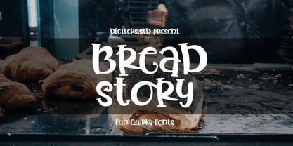
- Beginner by VladB,
$14.00
- MB DECO by Ben Burford Fonts,
$25.00
- Italican Script by Typotheticals,
$4.00
- Zahariel by Scriptorium,
$18.00 - Brush Swipe by Jonahfonts,
$35.00
- LTC Broadway by Lanston Type Co.,
$24.95
- Nutnik by Hanoded,
$20.00
- Euroika by Ingrimayne Type,
$12.95
- Colabero by Motokiwo,
$17.00
- Toolbox by Adobe,
$29.00 - Demian by ITC,
$29.99 - Edgewater Small by cm5dzyne,
$16.00 - Kitcat by Solotype,
$19.95 - Primer Print - Unknown license

- Send Cash - Unknown license

- 20th Century Font - Unknown license

- EndlessShowroom - Unknown license

- OregonDry - Unknown license

- Alpine 7558S - Unknown license

- Pulse State - Unknown license

- Aleia - Unknown license

- Webster World - Unknown license

- Alpine 7558M - Unknown license

- Model Worker - Unknown license

- Yellow Pills - Unknown license

- Soul Mama - Unknown license

- Soul Papa - Unknown license

- Primer Print - Unknown license

- Yytrium Dioxide - Unknown license

- Xolto - Unknown license

- Amelia by Tilde,
$39.75 - Doodlebirds by Greater Albion Typefounders,
$5.95


