10,000 search results
(0.051 seconds)
- Typnic Headline Slab by Corradine Fonts,
$19.95 Everybody likes to have a picnic: some fresh fruits, cheese, ham, wine and so on. Like a “typographic picnic,” Typnic font system gather many fonts with different flavors too, and you can enjoy them mixed or on their own. Typnic Headline Slab is just a piece created to complement the Typnic font system and as in the first headline version it comes in six layered fonts that can be mixed in a powerful variety of combinations to obtain outstanding texts.
 - TT Fors by TypeType,
$39.00 TT Fors useful links: Specimen | Graphic presentation | Customization options TT Fors is a modern geometric sans serif with characters and shapes contrasting in width, as close as possible to the basic geometric shapes (circle, square, triangle). TT Fors is a great addition to TypeType's line of functional sans serifs, which already includes such fonts as TT Norms Pro, TT Commons, TT Hoves and TT Interphases. The main inspiration for the creation of TT Fors was the study of geometric grotesques of the early to mid-20th century (Futura, Neuzeit Grotesk, Twentieth Century, Avantgarde Gothic, etc.), and the analysis of the contribution they made to the visual environment of that time. We gave ourselves the task to create the most versatile functional typeface that draws inspiration from the visual environment of the early to mid-20th century, but at the same time is aimed at uninterrupted use in all modern media, from branding and packaging design to work in interfaces and applications. This versatility is reflected in the title TT Fors (for), a typeface for a wide range of uses. The rounded characters in the font family tend to be shaped as the correct circle as much as possible, while the rest of the characters have narrower proportions. For more functionality, the typeface has rather high lowercase characters. Thanks to the correct and precisely selected geometric shapes and uniform construction rules, TT Fors works great both in the format of large headings and in very small text sizes used in book printing and in web design. In addition, the TT Fors family has a display subfamily TT Fors Display, which is a trendy pair for the text fonts. The main feature of the display subfamily is high contrast in horizontal or vertical strokes. When choosing a contrasting stroke, we paid attention that the shape of the letter would not go into reverse contrast and become a stressed sans serif. The subtle strokes in TT Fors Display have added sufficient display vibe to give the font a vibrant character, while remaining intelligent and serious. In total, TT Fors family includes 34 fonts: 9 weights and 9 italic styles in the text subfamily, 6 weights and 6 italic styles in the display subfamily, 2 outline styles and 2 variable fonts for both subfamilies. TT Fors has stylistic alternatives, ligatures, small caps (text family only), numbers in circles, arrows and a set of alternative round full stops and punctuation marks (text family only), slashed zero, and other useful features. More details about all OpenType features can be found in the font specimen. And, by good tradition, TT Fors has two variable fonts, for each of the subfamilies. Each variable font supports two axes of variability—thickness and slant. An important clarification—not all programs support variable technologies yet, you can check the support status here: https://v-fonts.com/support/. To use the variable font with two variable axes on Mac you will need MacOS 10.14 or higher. TT Fors supports more than 180+ languages, such as: Acehnese, Afar, Albanian+, Aleut (lat), Alsatian, Aragonese, Arumanian+, Asu, Aymara, Azerbaijani+, Banjar, Basque+, Belarusian (lat), Bemba, Bena, Betawi, Bislama+, Boholano+, Bosnian (lat), Breton+, Catalan+, Cebuano+, Chamorro+, Chichewa, Chiga, Colognian+, Cornish, Corsican+, Cree, Croatian, Czech+, Danish, Dutch+, Embu, English+, Esperanto, Estonian+, Faroese+, Fijian, Filipino+, Finnish, French, Frisian, Friulian+, Gaelic, Gagauz (lat), Galician+, Ganda, German+, Gusii, Haitian Creole, Hawaiian, Hiri Motu, Hungarian+, Icelandic+, Ilocano, Indonesian+, Innu-aimun, Interlingua, Irish, Italian+, Javanese, Jola-Fonyi, Judaeo-Spanish, Kabuverdianu, Kalenjin, Karachay-Balkar (lat), Karaim (lat), Karakalpak (lat), Karelian, Kashubian, Kazakh (lat), Khasi, Kinyarwanda, Kirundi, Kongo, Kurdish (lat), Ladin, Latvian, Leonese, Lithuanian, Livvi-Karelian, Luba-Kasai, Ludic, Luganda+, Luo, Luxembourgish+, Luyia, Machame, Makhuwa-Meetto, Makonde, Malagasy, Malay+, Maltese, Manx, Maori, Marshallese, Mauritian Creole, Minangkabau+, Moldavian (lat), Montenegrin (lat), Morisyen, Nahuatl, Nauruan, Ndebele, Nias, Norwegian, Nyankole, Occitan, Oromo, Palauan, Polish+, Portuguese+, Quechua+, Rheto-Romance, Rohingya, Romanian +, Romansh+, Rombo, Rundi, Rwa, Salar, Samburu, Samoan, Sango, Sangu, Sasak, Scots, Sena, Serbian (lat)+, Seychellois Creole, Shambala, Shona, Silesian, Slovak+, Slovenian+, Soga, Somali, Sorbian, Sotho+, Spanish+, Sundanese, Swahili, Swazi, Swedish+, Swiss German+, Tagalog+, Tahitian, Taita, Talysh (lat), Tatar+, Teso, Tetum, Tok Pisin, Tongan+, Tsakhur (Azerbaijan), Tsonga, Tswana+, Turkish+, Turkmen (lat), Uyghur, Valencian+, Vastese, Vepsian, Volapük, Võro, Vunjo, Walloon, Welsh+, Wolof, Xhosa, Zaza, Zulu+, Belarusian (cyr), Bosnian (cyr), Bulgarian (not localization), Erzya, Karachay-Balkar (cyr), Khvarshi, Kumyk, Macedonian, Montenegrin (cyr), Mordvin-moksha, Nogai, Russian+, Rusyn, Serbian (cyr)+, Ukrainian
 - Amazing Slab by Zetafonts,
$39.00 Amazing Slab is a typeface family designed by Francesco Canovaro and Andrea Tartarelli as a development of the Amazing Grotesk family designed by Cosimo Lorenzo Pancini. Mixing an egyptian serif, low contrast approach with the curved endings and open shapes of humanist sans grotesques, it was developed to embody the energetic and friendly nature of the startup scene: a feeling of innovation, information and energy, with a desire for simplicity and straightforward communication. The basic design shapes for the font come from the strong personality of the extrabold letterforms drawn by Francesco Canovaro for his StartupItalia logo, that informed the display design of the four darkest weights (from medium to black). Each of these weights, has been paired with an inline version, designed by Mario De Libero, to extend the range of uses for the typefaces, from bold signage to logo design, to editorial titling. The lighter range of the family features two weights (regular and light) that are designed for text use, complemented by the thin and extralight weights that are better suited to big point size, for editorial and signage use. All the weights of Amazing Slab, as well the matching true italics forms, feature an extended charset of over 900 glyphs, covering 211 languages using latin, cyrillic and greek alphabets, and sporting a complete set of Open type features including positional numbers, annotation and case-sensitive forms, standard ligatures and a wide array of stylistic sets to customize glyph shapes for logo and display usage. With its friendly, energetic mood and its versatile range of application use, Amazing Slab is born to make every design project look simply... amazing! Suggested uses: old signage, logo design, editorial titling, display 21 styles: 8 weights, 8 italics, 4 inline styles, 1 variable font 965 glyphs in each weight Useful OpenType features: Small Capitals; Standard Ligatures; Discretionary Ligatures; Stylistic Alternates; Stylistic sets 01, 02, 03, 04, 05, 06; Ordinals; Fractions; Tabular Figures; Old-style Figures; Slashed Zero; Circled Numbers; Case Sensitive Forms; Numerators; Denominators; Subscript; Superscript; Scientific Inferiors; 211 languages supported: extended Latin, Cyrillic, Greek English, Spanish, Portuguese, French, Russian, German, Javanese (Latin), Turkish, Italian, Polish, Afaan Oromo, Azeri, Tagalog, Sundanese (Latin), Filipino, Moldovan, Romanian, Indonesian, Dutch, Cebuano, Malay, Uzbek (Latin), Kurdish (Latin), Swahili, Greek, Hungarian, Czech, Haitian Creole, Hiligaynon, Afrikaans, Somali, Zulu, Serbian, Swedish, Bulgarian, Shona, Quechua, Albanian, Catalan, Chichewa, Ilocano, Kikongo, Kinyarwanda, Neapolitan, Xhosa, Tshiluba, Slovak, Danish, Finnish, Norwegian, Sicilian, Sotho (Southern), Kirundi, Tswana, Sotho (Northern), Belarusian (Latin), Turkmen (Latin), Bemba, Lombard, Lithuanian, Tsonga, Wolof, Jamaican, Dholuo, Galician, Ganda, Low Saxon, Waray-Waray, Makhuwa, Bikol, Kapampangan (Latin), Aymara, Zarma, Ndebele, Slovenian, Tumbuka, Venetian, Genoese, Piedmontese, Swazi, Zazaki, Latvian, Nahuatl, Silesian, Bashkir (Latin), Sardinian, Estonian, Afar, Cape Verdean Creole, Maasai, Occitan, Tetum, Oshiwambo, Basque, Welsh, Chavacano, Dawan, Montenegrin, Walloon, Asturian, Kaqchikel, Ossetian (Latin), Zapotec, Frisian, Guadeloupean Creole, Q’eqchi’, Karakalpak (Latin), Crimean Tatar (Latin), Sango, Luxembourgish, Samoan, Maltese, Tzotzil, Fijian, Friulian, Icelandic, Sranan, Wayuu, Papiamento, Aromanian, Corsican, Breton, Amis, Gagauz (Latin), Māori, Tok Pisin, Tongan, Alsatian, Atayal, Kiribati, Seychellois Creole, Võro, Tahitian, Scottish Gaelic, Chamorro, Kashubian, Faroese, Rarotongan, Sorbian (Upper Sorbian), Karelian (Latin), Romansh, Chickasaw, Arvanitic (Latin), Nagamese Creole, Saramaccan, Ladin, Palauan, Sami (Northern Sami), Sorbian (Lower Sorbian), Drehu, Wallisian, Aragonese, Tuvaluan, Zuni, Montagnais, Hawaiian, Marquesan, Niuean, Yapese, Vepsian, Bislama, Hopi, Megleno-Romanian, Creek, Aranese, Rotokas, Tokelauan, Mohawk, Warlpiri, Cimbrian, Sami (Lule Sami), Jèrriais, Arrernte, Murrinh-Patha, Kala Lagaw Ya, Cofán, Gwich’in, Seri, Sami (Southern Sami), Istro-Romanian, Wik-Mungkan, Anuta, Cornish, Sami (Inari Sami), Yindjibarndi, Noongar, Hotcąk (Latin), Meriam Mir, Manx, Shawnee, Gooniyandi, Ido, Wiradjuri, Hän, Ngiyambaa, Delaware, Potawatomi, Abenaki, Esperanto, Folkspraak, Interglossa, Interlingua, Latin, Latino sine Flexione, Lojban, Novial, Occidental, Old Icelandic, Old Norse, Slovio (Latin), Volapük
 - Alan Den - Unknown license

- Hiragino Sans by SCREEN Graphic Solutions,
$210.00 Mindful that Hiragino Sans (Kaku Gothic) would be used in conjunction with Hiragino Serif (Mincho), SCREEN developed a font that anticipated today’s world where most people do their reading on displays and yet still has an orthodox letterform that does not blur when printed on paper. In short, our goal with this font was to create a new concept that responds to the demands of today’s times. This font offers weight variations from W0 to W9 and is extremely versatile. This makes it well-suited to all visual expression media including paper, metallic textures, resins, cloth, television, movies, broadcasting, websites, and electronic displays. One of the design’s strongpoints is that it elides serif on the right side of each stroke, thus delivering more spacious counters and a comfortable appearance. Thanks to this, the typeface not only delivers a contemporary, lively impression same as Latin sans serif typefaces, but also heightens the natural continuity and readability of text whether it is set vertically or horizontally. As a result, it makes it possible to bring a strong appealing power to text. Without a doubt, this is typeface that above else embodies the role of Sans Serif.
 - Hallock by Arabetics,
$39.00 A text typeface design with completely isolated letters and extra emphasis on vertical feel and visual connectivity to aid easy reading. The Hallock font family is named after Homan Hallock, a New York based American type designer and typographer who created the first documented unified and isolated Arabic font design in July 1864. The Hallock font family has two styles, regular and left-slanted italic styles. This font family design follows the guidelines of Mutamathil Taqlidi type style with one glyph for every basic Arabic Unicode character or letter, as defined in the latest Unicode Standards, and one additional final form glyph, for the freely-connecting letters in traditional Arabic cursive text. Hallock employs variable x-height values. It includes only the Lam-Alif ligatures. Soft-vowel diacritic marks, harakat, are selectively positioned. Most of them appear by default on the same level, following a letter, to ensure that they would not interfere visually with letters. Tatweel is a zero-width glyph. Keying the tatweel key before Alif-Lam-Lam-Ha will display the Allah ligature. Hallock includes both Arabic and Arabic-Indic numerals, in addition to standard punctuations.
 - Hello Anggela by Gian Studio,
$12.00 Hello Anggela Script a new fresh & modern script with a handmade calligraphy style, decorative characters and a dancing baseline! So beautiful on invitation like greeting cards, branding materials, business cards, quotes, posters, and more!! Hello Anggela Script come with 275+ glyphs. The alternative characters were divided into several Open Type features such as Swash, Stylistic Sets, Stylistic Alternates, Contextual Alternates. The Open Type features can be accessed by using Open Type savvy programs such as Adobe Illustrator, Adobe InDesign, Adobe Photoshop Corel Draw X version, And Microsoft Word. And this Font has given PUA unicode (specially coded fonts). so that all the alternate characters can easily be accessed in full by a craftsman or designer. How to access and use font glyphs on a Windows PC : https://designbundles.net/design-school/how-to-access-use-font-glyphs-windows Accessing Font Glyphs with Font Book on Mac : https://designbundles.net/design-school/access-font-glyphs-mac Can't find Glyphs on Mac? Make sure you are in Repertoire Mode! https://designbundles.net/design-school/cant-find-font-glyphs-mac NOTE : Tail is available only for lowercase letters. Thank you
 - Cresta by James Todd,
$40.00 Loaded with personality and functionality, Cresta is built to look good while surviving the worst conditions. It is at home on screen and in a magazine. Its six weights are intended to be used everywhere. Unlike most typefaces, Cresta was built without a reference. For this project, everything design choice was based on what worked best for a workhorse sans serif family. Cresta was originally created as the primary typeface for this website. This meant it needed to work in copy, headlines, and navigation across all devices, browsers and operating systems. This meant it needed to be sturdy and have enough character to make it stand out from other UI typefaces. With its large x-height, ample counters, and giant apertures, Cresta is meant for easy utility in rough conditions. Even with all of this, that doesnít mean that its dull; as the weights increase, the style of Cresta becomes more appearant. This style is defined most apparently by the terminals on the lowercase r and the angle of the joins between the curved and straight strokes (such as in the connection on the n).
 - Rough Love by Positype,
$27.50 Rough Love, it’s fair to say, came before Love Script. The brushed letter specimens that would ultimately serve as the template for the much ‘cleaner’ Love Script have now been turned into a typeface. As I packed these up, I just kept coming back to them and staring at the texture and movement caught on the page. On a lark, I decided it would be fun to let people see an almost a before and after scenario of how one led to the other and decided to produce a typeface from these specimens… Rough Love. For the most part, in typical fashion for me when I brush out a typeface idea, I try to brush the entire character set along with each of the planned variants for swashes, titling, and other alternates—the reason for that is simple -- each letter looks and acts a bit differently when the same movements are imposed on them. With Rough Love, I tried to adhere to that and made very few modifications to the originals, and only had to ‘borrow’ in a few occasions when I happened to forget to brush a variant.
 - 1514 Paris Verand by GLC,
$20.00 This set of initial decorated letters was inspired by a font in use in the beginning of 1500s in Paris. Exactly, we have used the set that Barthélémy Verand employed for the printing of Triumphus translatez de langage Tuscan en François, (from “Triumph” of Petrarque) in the year 1514. Some letters, lacked, have been reconstructed to propose a complete alphabet. It appears that the printer used some letters to replace others, as V, turned over to make a A, or D to make a Q. The original font’s letters were drawn in white on a black background only, but it was tempting to propose a negative version in black on white. It is used as variously as web-site titles, posters and flyers design, publishing texts looking like ancient ones, or greeting cards, all various sorts of presentations, as a very decorative, elegant and luxurious additional font. This font supports strong enlargements remaining very smart and fine. It’s original medieval hight is about one inch equivalent to about four lines of characters. This font may be used with all blackletter fonts, but works particularly well with 1543 Humane Jenson, 1557 Italic and 1742 Civilite, without any anachronism.
 - Sodra by Harvester Type,
$20.00 Sodra is a wide-accented antiqua with sharp serifs and hints of futuristic forms. This typeface emerged from a passage in the Manifesto del Futurismo by Filippo Tommaso Marinetti. One short word was the inspiration and the guidance for the creation of this font. An attempt to create something unique and distinctive, an attempt to add a bit of futurism to something historical. The special aesthetics and expressiveness the type conveys will make you look closely at each letter and draw attention to your design. The font has been in development for a long time and painstaking work has been done on it. Large language support, about 470 characters and almost 4,000 kerning pairs. Hinting and testing the font itself in business and in a wide variety of applications. The uses of the type are very wide. Whether it's a branding, logo, identity or merch, a headline or product design. The nature of typeface is not limited to something rough and gloomy, on the contrary, it all depends on how you look at it. I've shown you my point of view, you in turn will see yours!
 - Trapezoidal by Ingrimayne Type,
$9.00 The letters of Trapezoidal are like sheep: they do not like being alone but want to be part of a flock. Many of the individual letters of Trapezoidal look strange and unshapely in isolation because they are designed to fit into a pattern with other letters. That pattern is formed by alternating asymmetric trapezoids, with trapezoids that are wide at the top alternating with trapezoids that are wide at the bottom. The magic of the OpenType feature of contextual alternatives (calt) automatically alternates them. The fonts in the family are largely monospaced and have very tight letter spacing. (If for some reason one wants to use only one set of the letters, the letters will overlap unless one widens character spacing.) (If D and O are too similar, use the alternative versions of D.) The family has five weights and each weight has an italics formed by flipping the trapezoidal pattern over a vertical line. Like other alternating-character typeface families from IngrimayneType, this distinctive and visually-arresting family can be used for titles or advertising. (For another but very different typeface based on alternating trapezoids, see PoultrySign.)
 - Mellow Sans by ParaType,
$30.00 Mellow Sans is a soft and friendly rounded sans serif. Its bold styles are great for packages of something tasty, while light and regular ones work well in rather long texts, from a children's book to a reading app, or a family restaurant menu. The typeface was created by Natalya Vasilyeva, an expert in designing text and calligraphic typefaces. Mellow Sans’s forms are based on humanist sans serifs. The nobility and liveliness of Renaissance calligraphy reads beneath its curves and makes the typeface even friendlier, while helping the eye to move along the line. The typeface supports extended Latin, extended Cyrillic (all major languages of the Russia’s peoples) and Greek. It also has old style figures, arrows and non-alphabetic signs. With Mellow Sans as a heading typeface (in that case bold styles fit the best), calm open sans serifs, f.e. Vast or Fact, are its optimal text companions on the screen. Calm serifs, f. e., Octava, Scientia or Aelita, will work as its companions on paper. And to create expressive typography, for example, in packaging, you can match Mellow Sans with quirky rounded serifs — Cooper or Epice.
 - Martini at Joe's by steve mehallo,
$19.56 Googie Architecture, also known as "Midcentury Coffee Shop Modern," was born in California during the Atomic Age. Martini at Joe's is based on lettering from several historic Googie sources - many of which no longer exist. The futuristic Martini at Joe's collection was named for Northern California's famous Italian-themed "Joe's" restaurants, some of which are still serving up large portions of charbroiled beef steak, canned buttered veggies and pretty decent martinis. Martini at Joe's contains many fabulous typographic extras – and is available in single font packages or as a 15 font interchangeable Megaset (with "italic-esque" obliques and "retro obliques"). Martini at Joe's is perfect for use as commercial signage, on the menu for your coffee shop, supper club, tiki bar, fish grotto, smorgy, space port or destination casino. It also holds its own in any vintage store, on greeting cards, t-shirts, hi-brow gallery announcements, product skins, your 'zine masthead, on the faceplate of your futuristic microwave oven, tv dinner packaging, at millionaire's conferences or even embellishing the fuselage of your latest jet airline venture. Martini at Joe's: there's no better way to say, "Hold the olive, I'm having a moment."
 - Argo Supernova by Eliezer Grawe,
$9.00 Argo Supernova is a sans serif font, inspired by science fiction titles. Delicate on the thinest weights, strong on the thickest ones, it is perfect for modern branding and logo design, editorial design, web design, packaging and various other projects. Argo Supernova has a geometric and open structure, with shapes that create a solid texture on the page. Its large x-height produces good reading in long texts and its peculiarities, such as curved bars and endings, generate a strong presence in titles. The Argo Supernova family consists of 8 weights with matching italics, with Extended Latin character set. The italics makes use of more curves and smoothness, creating an interesting variation in design. • 16 styles: 8 weights + 8 italics; • 602 glyphs in each weight; • Special SS02 feature: "bend" alternates for majority of caps characters with curved details; • OpenType features: Access All Alternates, Stylistic Alternates, Standard Ligatures, Discretionary Ligatures, Numerators, Denominators, Fractions, Superior and Inferior Numbers, Kerning, Localized Forms, Lining Figures, Oldstyle Figures, Proportional Figures, Tabular Figures, Slashed Zero, Stylistic Set 1 to 6. • Supporting 219 latin based languages, which are spoken in different 212 countries.
 - Romp by Positype,
$30.00 With all ego aside, Romp was designed and influenced by my daughter, Angel. For some time now, she has wanted me to design a font based on her handwriting. But each time I sit down to do it, I run into more that she needs to do and redo. On a recent attempt, I ran into the same situation again. Instead of moving on to something else, I decided to whip out a sumi brush and start making letters...for me, type design is something a little ‘serious’ and never a time to just have fun. This typeface proved that notion wrong—it really was fun. As a result, each letter encouraged another and the design grew...and grew! The happy result spawned 3 separate sets of letters & numerals (small caps and some ligatures too!). Using the beauty of OpenType, these 3 sets have been fused into one, randomly generating font set. If you are using any type of OpenType enabled application, then the Romp Pro typeface is the way to go. They include everything found in the 3 separate variants for each style as well as entirely expanding offering of additional small cap and ligature sets.
 - Dreaming Outloud by My Creative Land,
$15.00 Say hello to a casual handwritten font family - Dreaming OutLoud. 8 handwritten typefaces made to complement each other in the best possible way. They are easy to use and perfect for expressing your thoughts, posting quotes and simple daily updates on social media. The font package is complemented by more than a 100 transparent background marker lines (easy to change color!) - to emphasise what you are saying :) - and dingbats & doodles font. Two sub-packages included: Elementary package. Use this one if you primarily work in Canva/Cricut and similar applications and don’t want to deal with OpenType features of the PRO fonts. To access alternates - simply change the font to it’s ALT version. Voilà. You can use these fonts on your iPad in Procreate app! Charged package. You need this one if you feel comfortable with OpenType features, if you work in Adobe Suite and similar applications that have OpenType panel to access OT features. You can use these fonts in Canva-like applications as well - they are fully unicode mapped. Contact me with your MyFonts order # to get a free bonus - more than a 100 "Marker selection lines" in png and psd
 - Rolfter by AlienValley,
$13.00 Introducing Rolfter, a classic serif typeface with many features including ligatures, tons of alternates and multilingual support. All the ligatures and alternates can be accessed by installing just one font file. LIGATURES & CONTEXTUAL ALTERNATES We recommend that you turn on both ligatures and contextual alternates for best results. You can do this in either Photoshop or Illustrator. Photoshop: Open the "Character" panel via Window - Character and check the standard ligatures and contextual alternates icons at the bottom left corner of the panel. Illustrator: Open the "OpenType" panel via Window - Type - OpenType and also check the standard ligatures and contextual alternates at the bottom of the panel. OPTIONAL ALTERNATES These are optional alternates that can be used depending on your current design. We recommend moderate use of these for optimal results as using too many can easily make the font unreadable. To access these you need to open the following panels depending on your software: Photoshop: Window - Glyphs (Note that this panel may not be available in earlier PS versions) Illustrator: Type - Glyphs You will then have access to all the glyphs inside the font file to use them as you like.
 - Persian Grunge by Si47ash Fonts,
$19.00 The only Persian Arabic font featured on Behance [Graphic Design / Typography] Published in multiple books including New Illustration With Type and DesignAndDesign Vol. II Carefully and meticulously designed by selecting, choosing, vectorizing and editing so many different Persian and Arabic calligraphic scripts and old typefaces glyphs forms to create this one of a type [pun intended!] font. And if it's not enough, it's got patterns, textures, artistic elements, ornaments, in a grunge and dirty style. But it not over yet! Persian Grunge [Dirty] font has two styles: Dirty and Neat. Not only the Neat style is cleaner, but also a lot of same glyphs are different from the Dirty style. This Arabic grunge font is a great choice for all graphic designers, typographers and visual artists. Your posters, banners, artistic typographic projects are gonna be awesome with these fonts! Shahab Siavash, the designer has done more than 30 fonts and got featured on Behance, Microsoft, McGill University research website, Hackernoon, Fontself, FontsInUse,... Astaneh text and headline font which is one of his latest designs, already got professional typographers, lay-out and book designers' attention as well as some of the most recognizable publications in Arabic/Persian communities.
 - Coffee and Danish JNL by Jeff Levine,
$29.00 In the collection of vintage and historic images available online from the Library of Congress is one of the exterior of the Town Talk Diner in Minneapolis, Minnesota. Regrettably, on May 28, 2020, the Town Talk Diner was damaged by vandalism, and subsequently destroyed by a fire that engulfed the building early on the morning of May 29th due to civil unrest following the death of George Floyd. The restaurant first opened in 1946, closed in 2011 and subsequently re-opened under new ownership in 2014 with French cuisine, then from 2016 until its demise as an American bistro. While this was not known at the time of selecting the image for a typographic model, subsequent research on the diner turned up these facts. The large vintage sign above the entrance was in big, bold Art Deco letters with rows and rows of bulbs for illuminating the name at night. Coffee and Danish JNL, modeled from the image of that sign, is available in both regular and oblique versions. Perhaps, in a way, the type design will serve as a bit of historic recognition for a popular eating spot.
 - Figgins Antique by HiH,
$12.00 “Hey, look at me!” cried the new advertising typefaces. With the nineteenth century and the industrial revolution came an esthetic revolution in type design. Brash, loud, fat display faces elbowed their way into the crowd of book faces, demanding attention. Those who admired traditional book types harumphed and complained. Robert Thorne had fired the opening round with his Fatface. With the cutting of Figgins Antique, the battle was well and truly joined. Job printing came into its own and it seemed like everything changed. The world of printing had been turned upside down and the gentile book-type aficionados recoiled in horror much as the rural landed gentry recoiled at the upstart middle class shopkeepers and manufacturers. William Savage, approvingly quoted by Daniel Berkeley Updike over a hundred years later, described the new display faces as “a barbarous extreme.” These were exciting times. According to Geoffrey Dowding in his An Introduction To The History Of Printing Types, “The types which we know by the name of Egyptian were first shown by Vincent Figgins in his specimen book of 1815, under the name Antique.” Of course, dating the design is not quite as simple as that. Nicolete Gray points out that Figgins used the same “1815” title page on his specimen books from 1815 to 1821, adding pages as needed without regard to archival issues. As a result, there are different versions of the 1815 specimen book. In those copies that include the new Antique, that specific specimen is printed on paper with an 1817 watermark. The design is dated by the 1817 watermark rather than the 1815 title page. Figgins Antique ML is an all-cap font. This typeface is for bold statements. Don't waste it on wimpy whispers of hesitant whimsies. And please don't use it for extended text -- it will only give someone a headache. Think boldly. Use it boldly. Set it tight. Go ahead and run the serifs together. Solid and stolid, this face is very, very English. FIGGINS ANTIQIE ML represents a major extension of the original release, with the following changes: 1. Added glyphs for the 1250 Central Europe, the 1252 Turkish and the 1257 Baltic Code Pages. Added glyphs to complete standard 1252 Western Europe Code Page. Special glyphs relocated and assigned Unicode codepoints, some in Private Use area. Total of 331 glyphs. 2. Added OpenType GSUB layout features: liga and pnum. 3. Added 86 kerning pairs. 4. Revised vertical metrics for improved cross-platform line spacing. 5. Redesigned mathamatical operators. 6. Included of both tabular (standard) & proportional numbers (optional). 7. Refined various glyph outlines.
 - Times New Roman PS Cyrillic by Monotype,
$67.99In 1931, The Times of London commissioned a new text type design from Stanley Morison and the Monotype Corporation, after Morison had written an article criticizing The Times for being badly printed and typographically behind the times. The new design was supervised by Stanley Morison and drawn by Victor Lardent, an artist from the advertising department of The Times. Morison used an older typeface, Plantin, as the basis for his design, but made revisions for legibility and economy of space (always important concerns for newspapers). As the old type used by the newspaper had been called Times Old Roman," Morison's revision became "Times New Roman." The Times of London debuted the new typeface in October 1932, and after one year the design was released for commercial sale. The Linotype version, called simply "Times," was optimized for line-casting technology, though the differences in the basic design are subtle. The typeface was very successful for the Times of London, which used a higher grade of newsprint than most newspapers. The better, whiter paper enhanced the new typeface's high degree of contrast and sharp serifs, and created a sparkling, modern look. In 1972, Walter Tracy designed Times Europa for The Times of London. This was a sturdier version, and it was needed to hold up to the newest demands of newspaper printing: faster presses and cheaper paper. In the United States, the Times font family has enjoyed popularity as a magazine and book type since the 1940s. Times continues to be very popular around the world because of its versatility and readability. And because it is a standard font on most computers and digital printers, it has become universally familiar as the office workhorse. Times?, Times? Europa, and Times New Roman? are sure bets for proposals, annual reports, office correspondence, magazines, and newspapers. Linotype offers many versions of this font: Times? is the universal version of Times, used formerly as the matrices for the Linotype hot metal line-casting machines. The basic four weights of roman, italic, bold and bold italic are standard fonts on most printers. There are also small caps, Old style Figures, phonetic characters, and Central European characters. Times? Ten is the version specially designed for smaller text (12 point and below); its characters are wider and the hairlines are a little stronger. Times Ten has many weights for Latin typography, as well as several weights for Central European, Cyrillic, and Greek typesetting. Times? Eighteen is the headline version, ideal for point sizes of 18 and larger. The characters are subtly condensed and the hairlines are finer." - Times New Roman Seven by Monotype,
$67.99In 1931, The Times of London commissioned a new text type design from Stanley Morison and the Monotype Corporation, after Morison had written an article criticizing The Times for being badly printed and typographically behind the times. The new design was supervised by Stanley Morison and drawn by Victor Lardent, an artist from the advertising department of The Times. Morison used an older typeface, Plantin, as the basis for his design, but made revisions for legibility and economy of space (always important concerns for newspapers). As the old type used by the newspaper had been called Times Old Roman," Morison's revision became "Times New Roman." The Times of London debuted the new typeface in October 1932, and after one year the design was released for commercial sale. The Linotype version, called simply "Times," was optimized for line-casting technology, though the differences in the basic design are subtle. The typeface was very successful for the Times of London, which used a higher grade of newsprint than most newspapers. The better, whiter paper enhanced the new typeface's high degree of contrast and sharp serifs, and created a sparkling, modern look. In 1972, Walter Tracy designed Times Europa for The Times of London. This was a sturdier version, and it was needed to hold up to the newest demands of newspaper printing: faster presses and cheaper paper. In the United States, the Times font family has enjoyed popularity as a magazine and book type since the 1940s. Times continues to be very popular around the world because of its versatility and readability. And because it is a standard font on most computers and digital printers, it has become universally familiar as the office workhorse. Times?, Times? Europa, and Times New Roman? are sure bets for proposals, annual reports, office correspondence, magazines, and newspapers. Linotype offers many versions of this font: Times? is the universal version of Times, used formerly as the matrices for the Linotype hot metal line-casting machines. The basic four weights of roman, italic, bold and bold italic are standard fonts on most printers. There are also small caps, Old style Figures, phonetic characters, and Central European characters. Times? Ten is the version specially designed for smaller text (12 point and below); its characters are wider and the hairlines are a little stronger. Times Ten has many weights for Latin typography, as well as several weights for Central European, Cyrillic, and Greek typesetting. Times? Eighteen is the headline version, ideal for point sizes of 18 and larger. The characters are subtly condensed and the hairlines are finer." - Times New Roman WGL by Monotype,
$67.99 In 1931, The Times of London commissioned a new text type design from Stanley Morison and the Monotype Corporation, after Morison had written an article criticizing The Times for being badly printed and typographically behind the times. The new design was supervised by Stanley Morison and drawn by Victor Lardent, an artist from the advertising department of The Times. Morison used an older typeface, Plantin, as the basis for his design, but made revisions for legibility and economy of space (always important concerns for newspapers). As the old type used by the newspaper had been called Times Old Roman," Morison's revision became "Times New Roman." The Times of London debuted the new typeface in October 1932, and after one year the design was released for commercial sale. The Linotype version, called simply "Times," was optimized for line-casting technology, though the differences in the basic design are subtle. The typeface was very successful for the Times of London, which used a higher grade of newsprint than most newspapers. The better, whiter paper enhanced the new typeface's high degree of contrast and sharp serifs, and created a sparkling, modern look. In 1972, Walter Tracy designed Times Europa for The Times of London. This was a sturdier version, and it was needed to hold up to the newest demands of newspaper printing: faster presses and cheaper paper. In the United States, the Times font family has enjoyed popularity as a magazine and book type since the 1940s. Times continues to be very popular around the world because of its versatility and readability. And because it is a standard font on most computers and digital printers, it has become universally familiar as the office workhorse. Times?, Times? Europa, and Times New Roman? are sure bets for proposals, annual reports, office correspondence, magazines, and newspapers. Linotype offers many versions of this font: Times? is the universal version of Times, used formerly as the matrices for the Linotype hot metal line-casting machines. The basic four weights of roman, italic, bold and bold italic are standard fonts on most printers. There are also small caps, Old style Figures, phonetic characters, and Central European characters. Times? Ten is the version specially designed for smaller text (12 point and below); its characters are wider and the hairlines are a little stronger. Times Ten has many weights for Latin typography, as well as several weights for Central European, Cyrillic, and Greek typesetting. Times? Eighteen is the headline version, ideal for point sizes of 18 and larger. The characters are subtly condensed and the hairlines are finer."
 - Joanna Nova by Monotype,
$50.99 The Joanna® Nova design, by Monotype Studio designer Ben Jones, is an extensive update to Eric Gill’s original Joanna typefaces and brings this much admired – but underused – slab serif typeface into the 21st century. Joanna Nova features 18 fonts – more than twice as many as the original Joanna – with a wide range of weights including thin and ultra black, which were not available in the original design. Every glyph has been redrawn using a variety of reference sources, including Gill’s original sketches and the copper patterns used in Joanna’s initial production. When Jones set out to design Joanna Nova, he saw that the ‘real Joanna’ was not immediately evident. “Some of Gill’s original drawings have a sloped ‘M’; there is also a ‘K’ and ‘R’ with a curled leg and a letter ‘d’ without the flat bottom,” he explained. “Is this Joanna? Or is it the version used to print Gill’s Essay on Typography? Or is it the digital version with which most people are surely more familiar than any other version? Ultimately, I think, none of these and all of these were ‘Joanna’ because, as with any typeface, it is more the idea or concept behind the typeface that makes it what it is. My approach was to create a version of Joanna that appears in your mind when you think of Joanna.” Jones noted that one of the most distinguishing aspects of Joanna is the italics; and that, for reasons unknown, many of the characters in the current versions are much more condensed than those in the hand-set fonts of metal type., The newer designs being almost unusable at small sizes. The italics in Joanna Nova have been reworked to be more legible and closer to their original widths. Joanna Nova expands the original Joanna in several ways that open up new typographic possibilities, These additions include several new weights, support for Greek and Cyrillic scripts, small caps for all scripts in both upright and italic styles, several numeral options and a host of context-sensitive ligatures. The Joanna Nova typeface family is part of the new Eric Gill Series, drawing on Monotype's heritage to remaster and expand and revitalize Eric Gill’s body of work, with more weights, more characters and more languages to meet a wide range of design requirements. The series also brings to life new elements inspired by some of Gill’s unreleased work, discovered in Monotype’s archive of original typeface drawings and materials of the last century.
 - Times New Roman by Monotype,
$67.99 In 1931, The Times of London commissioned a new text type design from Stanley Morison and the Monotype Corporation, after Morison had written an article criticizing The Times for being badly printed and typographically behind the times. The new design was supervised by Stanley Morison and drawn by Victor Lardent, an artist from the advertising department of The Times. Morison used an older typeface, Plantin, as the basis for his design, but made revisions for legibility and economy of space (always important concerns for newspapers). As the old type used by the newspaper had been called Times Old Roman," Morison's revision became "Times New Roman." The Times of London debuted the new typeface in October 1932, and after one year the design was released for commercial sale. The Linotype version, called simply "Times," was optimized for line-casting technology, though the differences in the basic design are subtle. The typeface was very successful for the Times of London, which used a higher grade of newsprint than most newspapers. The better, whiter paper enhanced the new typeface's high degree of contrast and sharp serifs, and created a sparkling, modern look. In 1972, Walter Tracy designed Times Europa for The Times of London. This was a sturdier version, and it was needed to hold up to the newest demands of newspaper printing: faster presses and cheaper paper. In the United States, the Times font family has enjoyed popularity as a magazine and book type since the 1940s. Times continues to be very popular around the world because of its versatility and readability. And because it is a standard font on most computers and digital printers, it has become universally familiar as the office workhorse. Times?, Times? Europa, and Times New Roman? are sure bets for proposals, annual reports, office correspondence, magazines, and newspapers. Linotype offers many versions of this font: Times? is the universal version of Times, used formerly as the matrices for the Linotype hot metal line-casting machines. The basic four weights of roman, italic, bold and bold italic are standard fonts on most printers. There are also small caps, Old style Figures, phonetic characters, and Central European characters. Times? Ten is the version specially designed for smaller text (12 point and below); its characters are wider and the hairlines are a little stronger. Times Ten has many weights for Latin typography, as well as several weights for Central European, Cyrillic, and Greek typesetting. Times? Eighteen is the headline version, ideal for point sizes of 18 and larger. The characters are subtly condensed and the hairlines are finer."
 - Times New Roman Small Text by Monotype,
$67.99In 1931, The Times of London commissioned a new text type design from Stanley Morison and the Monotype Corporation, after Morison had written an article criticizing The Times for being badly printed and typographically behind the times. The new design was supervised by Stanley Morison and drawn by Victor Lardent, an artist from the advertising department of The Times. Morison used an older typeface, Plantin, as the basis for his design, but made revisions for legibility and economy of space (always important concerns for newspapers). As the old type used by the newspaper had been called Times Old Roman," Morison's revision became "Times New Roman." The Times of London debuted the new typeface in October 1932, and after one year the design was released for commercial sale. The Linotype version, called simply "Times," was optimized for line-casting technology, though the differences in the basic design are subtle. The typeface was very successful for the Times of London, which used a higher grade of newsprint than most newspapers. The better, whiter paper enhanced the new typeface's high degree of contrast and sharp serifs, and created a sparkling, modern look. In 1972, Walter Tracy designed Times Europa for The Times of London. This was a sturdier version, and it was needed to hold up to the newest demands of newspaper printing: faster presses and cheaper paper. In the United States, the Times font family has enjoyed popularity as a magazine and book type since the 1940s. Times continues to be very popular around the world because of its versatility and readability. And because it is a standard font on most computers and digital printers, it has become universally familiar as the office workhorse. Times?, Times? Europa, and Times New Roman? are sure bets for proposals, annual reports, office correspondence, magazines, and newspapers. Linotype offers many versions of this font: Times? is the universal version of Times, used formerly as the matrices for the Linotype hot metal line-casting machines. The basic four weights of roman, italic, bold and bold italic are standard fonts on most printers. There are also small caps, Old style Figures, phonetic characters, and Central European characters. Times? Ten is the version specially designed for smaller text (12 point and below); its characters are wider and the hairlines are a little stronger. Times Ten has many weights for Latin typography, as well as several weights for Central European, Cyrillic, and Greek typesetting. Times? Eighteen is the headline version, ideal for point sizes of 18 and larger. The characters are subtly condensed and the hairlines are finer." - Times New Roman PS Greek by Monotype,
$67.99In 1931, The Times of London commissioned a new text type design from Stanley Morison and the Monotype Corporation, after Morison had written an article criticizing The Times for being badly printed and typographically behind the times. The new design was supervised by Stanley Morison and drawn by Victor Lardent, an artist from the advertising department of The Times. Morison used an older typeface, Plantin, as the basis for his design, but made revisions for legibility and economy of space (always important concerns for newspapers). As the old type used by the newspaper had been called Times Old Roman," Morison's revision became "Times New Roman." The Times of London debuted the new typeface in October 1932, and after one year the design was released for commercial sale. The Linotype version, called simply "Times," was optimized for line-casting technology, though the differences in the basic design are subtle. The typeface was very successful for the Times of London, which used a higher grade of newsprint than most newspapers. The better, whiter paper enhanced the new typeface's high degree of contrast and sharp serifs, and created a sparkling, modern look. In 1972, Walter Tracy designed Times Europa for The Times of London. This was a sturdier version, and it was needed to hold up to the newest demands of newspaper printing: faster presses and cheaper paper. In the United States, the Times font family has enjoyed popularity as a magazine and book type since the 1940s. Times continues to be very popular around the world because of its versatility and readability. And because it is a standard font on most computers and digital printers, it has become universally familiar as the office workhorse. Times?, Times? Europa, and Times New Roman? are sure bets for proposals, annual reports, office correspondence, magazines, and newspapers. Linotype offers many versions of this font: Times? is the universal version of Times, used formerly as the matrices for the Linotype hot metal line-casting machines. The basic four weights of roman, italic, bold and bold italic are standard fonts on most printers. There are also small caps, Old style Figures, phonetic characters, and Central European characters. Times? Ten is the version specially designed for smaller text (12 point and below); its characters are wider and the hairlines are a little stronger. Times Ten has many weights for Latin typography, as well as several weights for Central European, Cyrillic, and Greek typesetting. Times? Eighteen is the headline version, ideal for point sizes of 18 and larger. The characters are subtly condensed and the hairlines are finer." - Times New Roman PS by Monotype,
$67.99In 1931, The Times of London commissioned a new text type design from Stanley Morison and the Monotype Corporation, after Morison had written an article criticizing The Times for being badly printed and typographically behind the times. The new design was supervised by Stanley Morison and drawn by Victor Lardent, an artist from the advertising department of The Times. Morison used an older typeface, Plantin, as the basis for his design, but made revisions for legibility and economy of space (always important concerns for newspapers). As the old type used by the newspaper had been called Times Old Roman," Morison's revision became "Times New Roman." The Times of London debuted the new typeface in October 1932, and after one year the design was released for commercial sale. The Linotype version, called simply "Times," was optimized for line-casting technology, though the differences in the basic design are subtle. The typeface was very successful for the Times of London, which used a higher grade of newsprint than most newspapers. The better, whiter paper enhanced the new typeface's high degree of contrast and sharp serifs, and created a sparkling, modern look. In 1972, Walter Tracy designed Times Europa for The Times of London. This was a sturdier version, and it was needed to hold up to the newest demands of newspaper printing: faster presses and cheaper paper. In the United States, the Times font family has enjoyed popularity as a magazine and book type since the 1940s. Times continues to be very popular around the world because of its versatility and readability. And because it is a standard font on most computers and digital printers, it has become universally familiar as the office workhorse. Times?, Times? Europa, and Times New Roman? are sure bets for proposals, annual reports, office correspondence, magazines, and newspapers. Linotype offers many versions of this font: Times? is the universal version of Times, used formerly as the matrices for the Linotype hot metal line-casting machines. The basic four weights of roman, italic, bold and bold italic are standard fonts on most printers. There are also small caps, Old style Figures, phonetic characters, and Central European characters. Times? Ten is the version specially designed for smaller text (12 point and below); its characters are wider and the hairlines are a little stronger. Times Ten has many weights for Latin typography, as well as several weights for Central European, Cyrillic, and Greek typesetting. Times? Eighteen is the headline version, ideal for point sizes of 18 and larger. The characters are subtly condensed and the hairlines are finer." - Desyrel - Unknown license

- Lovesick AOE - Unknown license

- Lansbury - 100% free

- Slalom - Unknown license

- AlphaMack AOE - Unknown license

- Tagalog Doctrina 1593 - Unknown license

- Shamen Remix - Unknown license

- Steed by Device,
$29.00 A condensed and bold obround sans inspired by 60s condensed inserat faces, with a more pronounced thick/thin stress as seen on the titles of the Avengers TV show.
 - Gothico Antiqua by MADType,
$21.00 Gothico Antiqua is the result of grunging up one of my early sans-serif type designs. It strangely works very well and looks authentic at small to medium settings.
 - Koch Antiqua LT by Linotype,
$29.99Koch Antiqua is based on forms of old Roman writings, chiseled in marble thousands of years ago. This contemporary version is more playful and reminiscent of the Roaring 20s. - Viralles Script by Letterniz,
$20.00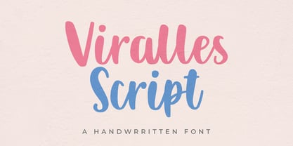 Viralles is a handwritten script font. Looks stunning on wedding invitations, thank you cards, quotes, greeting cards, logos, business cards and any other design that requires a handwritten touch.


