10,000 search results
(0.03 seconds)
- Guayaba Sans - personal use - Personal use only

- Hello Bloomie by My Creative Land,
$19.00 Hello Bloomie is an ink written font family that includes 2 styles: brush script and serif. The family benefits from OpenType features: ligatures, alternates and a few design elements that will allow you to create unique designs with an authentic brush-written look. Look through previews to get inspired and go create something awesome!
 - MC Sattel Hintar by Maulana Creative,
$14.00 Sattel Hintar Brush Script Font Sattel Hintar is a brush script font. With rough brush stroke, fun character with a bit of ligatures and has a two files lowercase alternates. To give you an extra creative work. Sattel Hintar font support multilingual more than 100+ language. This font is good for logo design, Social media, Movie Titles, Books Titles, a short text even a long text letter and good for your secondary text font with sans or serif. Make a stunning work with Sattel Hintar font. Cheers, MaulanaCreative
 - Brushstroke Plain - Unknown license

- Cyber Rock by WAP Type,
$15.00 Cyber rock Brush Script bold, cool, cursive, design, editorial, grunge, handpaint, handwritten, ink, letter, logo, logotype, magazine, marker, modern, paint, ragged, ROUGH BRUSH, script, sign, style, stylish, swash, tag tagging, textured, trend, trendy, urban, vintage, written handwritten brush script dry brush cursive font with rough and dynamic look. Ideal for quotes, posters, branding, packaging, illustration, social media.
 - Chalk Board by Stringlabs Creative Studio,
$29.00 Chalk Board is a handmade textured brush font, inspired by the chalk. This unique script will add a serious and sincere feel to any design idea!
 - MommieBrush by Hubert Jocham Type,
$29.90 MommieBrush is a brush script headline typeface. It is based on the Spencerian Mommie that won the 2008 TDC award. But as a brush script it works in a different area. Like my other brush script typefaces it is made for food packaging and product branding.
 - Austria Memories by Haksen,
$17.00 Introduce powerful font duo collaboration in Austria Memories the stylish modern and natural fonts combination with casual brush in script and elegant in Serif. These are perfect for branding, wedding invites and cards, and more option for your requirement. Austria Memories include two font styles with full set of natural brush style draw for script and elegant with all uppercase letters for serif. Numerals, a large range of punctuation and ligatures giving realistic hand-lettered style. In order to use the beautiful ligatures for script also all uppercase for sans serif, you need a program that supports OpenType features such as Adobe Illustrator CS, Adobe Photoshop CC, Adobe Indesign and Corel Draw. Thanks and have a great day :) Haksen
 - D3 LiteBitMapism Bold-Selif - Unknown license

- Ainslie Sans by insigne,
$- Say g'day to Ainslie Sans, insigne Design’s new typeface. Like its big brother, the new face incorporates a mix of influences from Oz, although Sans is pared down from the original semi-serif. The original Ainslie was inspired by Mt. Ainslie and the city of Canberra’s inner suburb of the same name. Canberra is Australia’s capital--a planned city designed by American architect Walter Burley Griffin. Griffin’s style and geometric design for the city, which include Mt. Ainslie, are now also the same structure that make up the foundation of Ainslie Sans. Unlike the original Ainslie family member, though, Ainslie Sans does away with much of the aboriginal-inspired touches by eliminating the semi-serifs, forcing the font to borrow more heavily than its predecessor from Canberra’s distinct, geometric design and style. The result’s a spiffy Australian font that’s usable within a wide array of applications. The trendy typeface incorporates a multitude of alternates. You can access these in any OpenType-enabled application. Alternates, swashes and alternate titling caps allow you to customize the look and feel. Also incorporated are capital swash alternates, old style figures, and compact caps. Check out the PDF brochure to view these options in action. OpenType enabled applications can take complete benefit of your automatic replacing ligatures and alternates. This font also presents the glyphs to help a wide array of languages. Try it for copy. Try it for a headline. Try it alongside the original Ainslie. Whichever way suits you best, give it a burl. You won't be sad you did.
 - Howelstun by Maulana Creative,
$12.00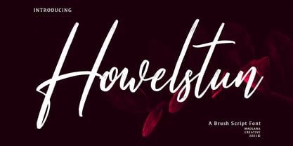 Howelstun is a soft brush script font, with a light soft brush stroke, slanted and fun character. It has Opentype features ligatures of character, To give you an extra creative work. Howelstun soft brush font support multilingual more than 100+ language. This font is good for logo design, Social media, Movie Titles, Books Titles, a short text even a long text letter and good for your secondary text font with sans or serif. Make a stunning work with Howelstun font. Cheers, MaulanaCreative
 - Hibagon by Hanoded,
$15.00 Hibagon is the Japanese equivalent of the Yeti from the Himalayas, or Bigfoot from North America. It is usually sighted on Mt. Hiba (Hiroshima prefecture), hence the name. I have never seen Hibagon myself, even though I have visited Hiroshima several times. Hibagon font is a nice, handpainted, all caps font with a mythical feel to it. It probably won’t scare you, but it will look good on anything that needs a bit of brushwork, or a bit of roughness.
 - Parteys by Craft Supply Co,
$20.00 Introducing Parteys – Brush Script Dynamic and Captivating: Parteys – Brush Script is a font that exudes dynamism with its varied stroke widths, making it perfect for creating eye-catching displays. Expressive Brush Strokes: This font boasts expressive brush strokes that give your text a lively and energetic appearance, making it ideal for projects that demand a touch of excitement. Versatile Design Possibilities: Parteys – Brush Script offers versatility in design, suitable for a wide range of creative applications, from posters and invitations to branding and social media graphics.
 - billieKid - Unknown license

- Choujun - Unknown license

- TwoBeers - Unknown license

- Steak And Cheese by Fenotype,
$25.00 Steak and Cheese - a Savoury Font Collection Packed with flavour, Steak and Cheese includes following: • Brush - Two weights of a connected Brush Script with Contextual, Swash, Titling and Stylistic Alternates • Pen - Three weights of a connected monoline Script with Contextual, Swash, Titling and Stylistic Alternates • Slab - Two weights of a chunky Slab Serif with rounded corners • Condensed - A bold and tight condensed Sans Serif with rounded corners. Steak and Cheese fonts are designed to work together - in pairs or more. Steak and Cheese is great for branding, posters or any display use. All fonts are PUA encoded and have a wide language support.
 - SAA Series EM by URW Type Foundry,
$35.00 - SAA Series D by URW Type Foundry,
$35.00 - Cicero Series 2 by Alphabet Agency,
$15.00 Cicero Series 2 is a decorative serif display font that expresses a dominant yet prestigious presence.
 - Geogrotesque Condensed Series by Emtype Foundry,
$69.00 The popular Geogrotesque family becomes an extended system with the inclusion of three new members to the family; Geogrotesque Condensed, Geogrotesque Compressed and Geogrotesque Extra Compressed. The condensed series keep the spirit of the original one, and give way to a superfamily up to 56 styles. This new system fluidly varies between widths, ranging from the original width to a 55% of it in the narrower one. As their original partner, the new fonts are great headline families for publications, but will also work in text of intermediate length and point size. The Geogrotesque superfamily offers now one font for each design need. It is available in Open Type format and includes Ligatures, Tabular Figures, Fractions, Numerators, Denominators, Superiors and Inferiors. All of them with support for Central and Eastern European languages. This type family consists of 42 styles, 7 weights plus italics in 3 widths. For more details see the PDF.
 - SAA Series B by URW Type Foundry,
$35.00 - Gracia Series 50 by astype,
$30.00 Gracia is a classic connected script design. OpenType features: - over 700 glyphs - central European faces - connection forms & stylistic alternates - proportional, mediaeval numerals & Roman numerals - numerators, denominators and fractions
 - Geogrotesque Expanded Series by Emtype Foundry,
$69.00 Geogrotesque Expanded Series comes in three widths: Wide, Extended and Expanded, that go between 120% and 200% of the normal width. Since the original Geogrotesque is slightly condensed, the Wide family becomes a good option for texts. Whereas the Extended and Expanded are ideal for display sizes. With the inclusion of the Expanded Series and the preceding Condensed ones, the Geogrotesque super family is now a complete widths system. For more details see the PDF.
 - SAA Series E by URW Type Foundry,
$35.00 - SAA Series F by URW Type Foundry,
$35.00 - SAA Series A by URW Type Foundry,
$35.00
- Concert Series JNL by Jeff Levine,
$29.00 The design of Concert Series JNL is based on hand-lettering for a 1930s-era WPA (Works Progress Administration) poster for the Federal Music Project of New York City’s symphony concerts. Held every Sunday at the Theater of Music [located at 254 West 54th Street], the admission in those Depression-era days was 25 cents and 60 cents, with all seats reserved.
 - SAA Series C by URW Type Foundry,
$35.00 - Gracia Series 40 by astype,
$30.00 Gracia is a classic connected script design. OpenType features: - over 700 glyphs - central European faces - connection forms & stylistic alternates - proportional, mediaeval numerals & Roman numerals - numerators, denominators and fractions
 - Matchstick by Fenotype,
$25.00 Matchstick is a hand drawn brush script. Matchstick is packed with loads of ligatures and alternates that help simulate a swift look of a handwriting. This feature is set in Standard Ligatures and it is normally automatically on. Matchstick is a great display brush to be used in writing headlines, packaging, posters or as a logotype. Matchstick works great when paired with strong sans serifs.
 - Wildstreet by Runsell Type,
$18.00 Wildstreet – Script Urban Street Style A natural script textured brush, matching for urban street themes. The features uppercase, lowercase, numeral, punctuation & symbol, ligatures, alternates, multilingual support, PUA encoded (fully accessible without additional design software). It inspires a handcrafted aesthetic that pairs so well with san serif display.
 - Fleet Street - Unknown license

- Gliny by Typesketchbook,
$45.00 Gliny was created by mixing different styles of handwriting fonts that derived from various tools such as pen, markers, drafting pens, painting brushes, writing brush and etc. In order to develop a new and diverse font styles. We also keep incomplete details and uneven textures that resulted from a writing process. We provide various font styles to help you mix and match them to suit your creative work harmoniously. Gliny comes with different font families such as brush, slab serif, heavy, handmade script for making your amazing work !!
 - Blue Jeans by Resistenza,
$29.00 Blue Jeans, is a new unconnected brush script font designed with Pentel brush sign. More about Opentype Features: https://bit.ly/opentype-rsz
 - Myteri Script PERSONAL USE ONLY - Personal use only

- VA Script No. 1 SB by Scangraphic Digital Type Collection,
$26.00 Since the release of these fonts most typefaces in the Scangraphic Type Collection appear in two versions. One is designed specifically for headline typesetting (SH: Scangraphic Headline Types) and one specifically for text typesetting (SB Scangraphic Bodytypes). The most obvious differentiation can be found in the spacing. That of the Bodytypes is adjusted for readability. That of the Headline Types is decidedly more narrow in order to do justice to the requirements of headline typesetting. The kerning tables, as well, have been individualized for each of these type varieties. In addition to the adjustment of spacing, there are also adjustments in the design. For the Bodytypes, fine spaces were created which prevented the smear effect on acute angles in small typesizes. For a number of Bodytypes, hairlines and serifs were thickened or the whole typeface was adjusted to meet the optical requirements for setting type in small sizes. For the German lower-case diacritical marks, all Headline Types complements contain alternative integrated accents which allow the compact setting of lower-case headlines.
 - Van Den Velde Script Pro by Intellecta Design,
$59.95 Van den Velde Script Pro is the definitive edition of the original Van den Velde Script, by Intellecta Design, a free interpretation of the work of the famous master penman Jan van den Velde, to be found in the “Spieghel der schrijfkonste, in den welcken ghesien worden veelderhande gheschrifften met hare fondementen ende onderrichtinghe. ” (Haarlen, 1605). This font has evocative ancient ligature forms from the XVII Century Dutch master penman Jan van den Velde. Your indescritible writing-book was important not only with regard to the specific period it represents, but also in relationship to the entire history of calligraphy as an art: Van den Velde is rightly credited with having introduced and perfected a new trend in Dutch calligraphy. Our font, Van den Velde Script, merges modern necessities or better legibility without loosing the taste of his archaic origins. This enhanced OpenType version is a complete solution for producing documents and artworks whith an evocative and voluptuous style of calligraphic script: Van den Velde Script PRO has - more glyphs than the original Van den Velde Script. We created hundred of new glyphs, deactivated old non-representative glyphs and redesign the remaining library of original glyphs. Van den Velde Pro is more functional, soft and beauty than the original. - to keep the powerful of this unusual kind of script we make a tour-de-force kerning work: 771 glyphs in this font was adjusted in 5400 kerning pairs handly. - hundreds of contextual alternates combinations, some of them with three or more letters, - historical ornaments and fleurons in the typical style (and motifs) from the XVII century at the Lower Countryes accessed with the glyph palette using the Ornaments feature); - an extensive set of ligatures (100s of contextual alternates plus discretionary ligatures) providing letterform variations that make your designs really special, resembling real handwriting on the page; .... and, much better, Van den Velde Scriopt PRO is plus cheap than the original font !!! In non-OpenType-savvy applications it works well as an unusual and beautiful script style font. Because of its high number of alternate letters and combinations (over 700 glyphs), we suggest the use of the glyph palette to find ideal solutions to specific designs. The sample illustrations will give you an idea of the possibilities. You have full access to this amazing stuff using InDesign, Illustrator, QuarkXpress and similar software. However, we still recommend exploring what this font has to offer using the glyphs palette: principally to get all the power of the Contextual Alternates feature. Van den Velde Script PRO has original letters designed by Iza W and overall creative direction plus core programming by Paulo W.
 - Pollet Signature Script Sans Font by Maulana Creative,
$14.00 Pollet is a fancy signature script and sans serif font duo. With light contrast stroke, fun character with a bit of ligatures. To give you an extra creative work. Pollet font support multilingual more than 100+ language. This font is good for logo design, Social media, Movie Titles, Books Titles, a short text even a long text letter and good for your secondary text font with sans or serif. Make a stunning work with Pollet font. Cheers, MaulanaCreative
 - Hello Cartel Story Script Duo by Attract Studio,
$13.00 Hello Cartel Story Script FONT DUO is a new modern script font with irregular base lines. Trendy and feminine style. Hello Cartel Story Script looks beautiful in wedding invitations, thank-you cards, quotes, greeting cards, logos, business cards, and more. Perfect for use in ink or watercolors. Includes initial letters and terminals, alternatives and support for many languages. Include file: Hello Cartel Story Script.OTF Hello Cartel Story Sans.OTF To activate the OpenType Stylistic alternative, you need a program that supports OpenType features such as Adobe Illustrator CS, Adobe Design & CorelDraw X6-X7, Microsoft Word 2010 or newer versions. There are additional ways to access alternatives / swash, using Character Map (Windows), Nexus Fonts (Windows), Font Books (Mac) or software programs such as PopChar (for Windows and Mac). How to access all alternative characters, using Windows Character Map with Photoshop: https://www.youtube.com/watch?v=Go9vacoYmBw How to access all alternative characters using Adobe Illustrator: http://youtu.be/iptSFA7feQ0 How to use a stylish font set in Microsoft Word 2010 or later versions: https://youtu.be/x1A_ilsBsGs Need help or have questions, let me know. I am happy to help :) Thank you & Congratulations on the Design!


