10,000 search results (0.041 seconds)
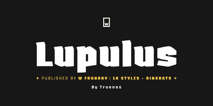
  1. Lupulus by W Type Foundry, $25.00
    Lupulus is a typeface inspired by the works of german expressionist artist and type designer Rudolf Koch. Drawing inspiration from types such as Neuland and Kabel for some of its features, it possesses a gothic and contemporary essence. Its constant rhythm; strict, solemn, yet boldly exuberant keeps it clean and functional. Its expressiveness allows for a wide range of uses: short texts, headlines, posters and branding, for which it is exceptionally well-suited. Lupulus consists of 17 fonts: 8 weights, 8 italic variables and one free ornamental variable. Featuring alternate characters, it is a comprehensive and versatile set built to suit your design needs. It comes fully equipped with Opentype for any and all technical requirements. Learn about upcoming releases, work in progress and get to know us better! On Instagram W Type Foundry On facebook W Type Foundry wtypefoundry.com
  2. PTL Attention by Primetype, $79.00
    PTL Attention a robust and contemporary sans serif type family with its very own characteristics. Made for work in text as well as display it comes with nine weights in two styles, including small caps, a set of contemporary OpenType features, all standard figure sets and a rich language support. The concept for PTL Attention goes back to the days of Viktor’s thesis Type Attack!. From the beginning there was the idea not only to have a display stencil type like PTL Attack, but also to create a more serious companion. One of the intentions while designing it was also to come to an result that shows not another feel-good, streamlined corporate typeface. A pinch of "anti" should vibrate with it. Nevertheless the main intention was to create a highly legible and useful type family.
  3. Bell MT by Monotype, $39.00
    Monotype’s hot metal Bell series from 1931 was based on original types made by the punchcutter Richard Austin for the foundry of John Bell in the 1780s. The different sizes of Monotype’s series were not all based on the same model. As type historian James Mosley wrote on Typophile, “For 18 point and above (the metal type was cut in sizes up to 36 point) Monotype’s model was a larger type [than the model used for the text sizes], the ‘Great Primer’ cut by Austin. This has greater contrast in the capitals and a flat foot to letter a.” The digital Bell closely follows the design of the hot metal 18pt version, and is therefore somewhat lighter in color than the text sizes of Monotype’s original metal face. James Mosley’s Typophile article can be found here.
  4. My Puma - Unknown license
  5. Ecolier - Unknown license
  6. VegasTWENTYTWO - Unknown license
  7. Rubbed - Unknown license
  8. SF Foxboro Script - Unknown license
  9. SF Foxboro Script Extended - Unknown license
  10. SF Cartoonist Hand SC - Unknown license
  11. SF Foxboro Script Extended - Unknown license
  12. SF Cartoonist Hand - Unknown license
  13. NewStyle - Unknown license
  14. Alphawave - Unknown license
  15. SF Cartoonist Hand SC - Unknown license
  16. SF Zimmerman - Unknown license
  17. Critical Mass - Unknown license
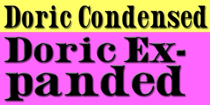
  18. Doric by Wooden Type Fonts, $15.00
    A revival of one of the popular wooden type fonts of the 19th century, suitable for text.
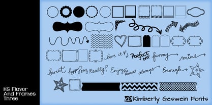
  19. KG Flavor And Frames Three by Kimberly Geswein, $5.00
    Frames and borders of various types. Also includes a series of words perfect for accenting Instagram photos.
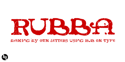
  20. Rubba by MADType, $19.00
    Rubba was created using rub-on type to create completely new letterforms from the bits of others.
  21. Habibi by Habibi Shaikh, $99.00
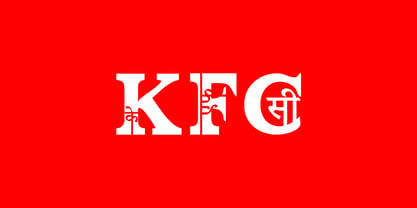
    Its Indian language Hindi/Marathi mixed with English alphabets for exp. A mixed with Hindi type (A)
  22. Wynwood JNL by Jeff Levine, $29.00
    Wynwood JNL is a wider treatment of the same vintage wood type source used for Broadletter JNL.
  23. Clarendon Condensed by Wooden Type Fonts, $15.00
    A revival of one of the popular wooden type fonts of the 19th century; suitable for text.
  24. Number 154 by Wooden Type Fonts, $15.00
    A revival of one of the popular wooden type fonts of the 19th century. Suitable for display.
  25. Gothic by Wooden Type Fonts, $15.00
    Gothic Bold Condensed, first shown in 1889 by Hamilton wooden type founders. With lowercase. Gothic Bold Expanded.
  26. Northfork JNL by Jeff Levine, $29.00
    Northfork JNL is based on a William H. Page wood type alphabet called Parisian, circa 1857-58.
  27. Clarendon Heavy by Wooden Type Fonts, $15.00
    A revival of one of the popular wooden type fonts of the 19th century, suitable for display.
  28. Gargoyle by Red Rooster Collection, $45.00
    Based on an Adrian Williams design, circa 1976 and Brook Type in 1903 designed by Lucien Pissaro.
  29. Mayville JNL by Jeff Levine, $29.00
    Mayville JNL is a re-drawing of an all-caps Clarendon Wood Type font from the 1800s.
  30. De Vinne by Wooden Type Fonts, $15.00
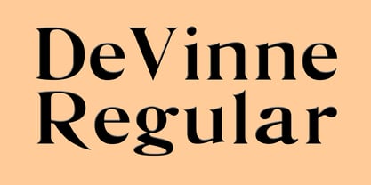
    A revival of one of the popular wooden type fonts of the 19th century; suitable for text.
  31. Columbian Slab by Wooden Type Fonts, $20.00
    One of the classic display types of the 19th century, an Egyptian with slab serifs. Quite bold.
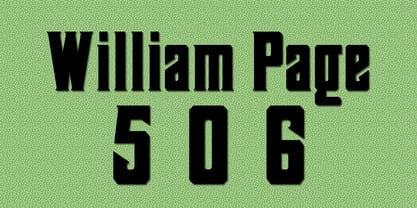
  32. William Page 506 by Wooden Type Fonts, $15.00
    A revival of one of the popular wooden type fonts of the 19th century, somewhat condensed, square.
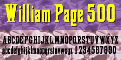
  33. William Page 500 by Wooden Type Fonts, $15.00
    A revival of one of the popular wooden type fonts of the 19th century, somewhat condensed, square.
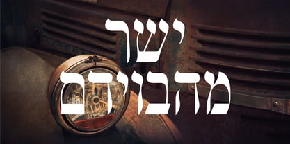
  34. Shtetl MF by Masterfont, $59.00
    Inspired by traditional old Biblical type, this font has a rich and unique style, with modern touch.
  35. Antique Three by Wooden Type Fonts, $15.00
    A revival of one of the popular wooden type fonts of the 19th century, suitable for text.
  36. Columbian by Wooden Type Fonts, $20.00
    One of the classic display types of the 19th century, an Egyptian with bracketed serifs. Quite bold.
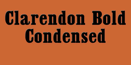
  37. Clarendon Condensed Bold by Wooden Type Fonts, $15.00
    A revival of one of the popular wooden type fonts of the 19th century, suitable for display.
  38. DeDisplay by Ingo, $24.99
    A type designed in a grid, like on display panels Type is not only printed. There were always and still are a number of forms of type versions which function completely differently. Even very early in the history of script there were attempts to combine a few single elements into the diverse forms of individual characters and also efforts to construct the forms of letters within a geometric grid system. The “instructions” of Albrecht Dürer are probably most well-known. But although designers of past centuries assumed the ideal to basically be an artist’s handwritten script, the idea which developed in the course of mechanization was to “build” characters in a building block system only by stringing together one basic element — the so-called grid type was discovered, represented most commonly today by »pixel types.« But even before computers, there were display systems which presented types with the help of a mechanical grid display, like the display panels in public transportation (bus, train) or at airports and train stations. In a streetcar, I met up with a modern variation of this display which reveals the name of each tram stop as it is approached. This system was based on a customary coarse square grid, but the individual squares were also divided again diagonally in four triangles. In this way it is possible to display slants and to simulate round forms more accurately as with only squares. The displayed characters still aren’t comparable to a decent typeface — on the contrary, the lower case letters are surprisingly ugly — but they form a much more legible type than that of ordinary [quadrate] grid types. DeDisplay from ingoFonts is this kind of type, constructed from tiny triangles which are in turn grouped in small squares. The stem widths are formed by two squares; the height of upper case characters is 10, the x-height 7 squares. DeDisplay is available in three versions: DeDisplay 1 is the complex original with spaces between the triangles, DeDisplay 2 forgoes dividing the triangles and thus appears somewhat darker or “bold,” and DeDisplay 3 is to some extent the “black” and doesn’t even include spaces between the individual squares.
  39. Caslon #540 by ITC, $29.00
    The Englishman William Caslon punchcut many roman, italic, and non-Latin typefaces from 1720 until his death in 1766. At that time most types were being imported to England from Dutch sources, so Caslon was influenced by the characteristics of Dutch types. He did, however, achieve a level of craft that enabled his recognition as the first great English punchcutter. Caslon's roman became so popular that it was known as the script of kings, although on the other side of the political spectrum (and the ocean), the Americans used it for their Declaration of Independence in 1776. The original Caslon specimen sheets and punches have long provided a fertile source for the range of types bearing his name. Identifying characteristics of most Caslons include a cap A with a scooped-out apex; a cap C with two full serifs; and in the italic, a swashed lowercase v and w. Caslon's types have achieved legendary status among printers and typographers, and are considered safe, solid, and dependable. A few of the many interpretations from the early twentieth century were true to the source, as well as strong enough to last into the digital era. These include two from the American Type Founders Company, Caslon 540 and the slightly heavier Caslon #3. Both fonts are relatively wide, and come complete with small caps, Old style Figures, and italics. Caslon Open Face first appeared in 1915 from the Barnhart Bros & Spindler Foundry, and is not anything like the true Caslon types despite the name. It is intended exclusively for titles, headlines and initials, and looks elegant whether used with the more authentic Caslon types or by itself.
  40. Bauer Bodoni by Linotype, $45.99
    Giambattista Bodoni (1740-1813) was called the King of Printers; he was a prolific type designer, a masterful engraver of punches and the most widely admired printer of his time. His books and typefaces were created during the 45 years he was the director of the fine press and publishing house of the Duke of Parma in Italy. He produced the best of what are known as "modern" style types, basing them on the finest writing of his time. Modern types represented the ultimate typographic development of the late eighteenth and early nineteenth centuries. They have characteristics quite different from the types that preceded them; such as extreme vertical stress, fine hairlines contrasted by bold main strokes, and very subtle, almost non-existent bracketing of sharply defined hairline serifs. Bodoni saw this style as beautiful and harmonious-the natural result of writing done with a well-cut pen, and the look was fashionable and admired. Other punchcutters, such as the Didot family (1689-1853) in France, and J. E. Walbaum (1768-1839) in Germany made their own versions of the modern faces. Even though some nineteenth century critics turned up their noses and called such types shattering and chilly, today the Bodoni moderns are seen in much the same light as they were in his own time. When used with care, the Bodoni types are both romantic and elegant, with a presence that adds tasteful sparkle to headlines and advertising. The Bauer Bodoni was done by Heinrich Jost for Bauer Typefoundry in 1927. This version has finer details of the original Bodoni types. It works well for headlines, logos, advertising.
Looking for more fonts? Check out our New, Sans, Script, Handwriting fonts or Categories
abstract fontscontact usprivacy policyweb font generator
Processing