10,000 search results
(0.037 seconds)
- LTC Goudy Sans by Lanston Type Co.,
$24.95 Goudy Sans Bold was originally designed by Fredric Goudy in 1922 as a less formal "gothic" and finished in 1929. The light was designed in 1930 and the Light Italic in 1931. Alternate letterforms are included in these three Goudy designs which are digitized true to their original design. In 2006, designer Colin Kahn drew "LTC Goudy Sans Regular" which is a medium weight version intended for text purposes. Kahn has also designed an experimental "LTC Goudy Sans Hairline" which has a skeletal almost mono-width stroke and results in a surprisingly elegant display face.
 - Young Itch AOE by Astigmatic,
$19.95Ok, so many of you are now probably wondering if I am a teenager. Nope. But I was once, and I had alot of pent up angst like alot of other teens, and maybe this typeface is my outlet for what is left of those teenage days of mine. Take it as you will, but Young Itch is a bold, scratchy, handdrawn typestyle, with that feel of grunge and pent up anger. The typeface comes with its own persona, but I bet it would work itself well into a wide array of designs. Ventilate your current or past teen angst with Young Itch today! - LTC Twentieth Century by Lanston Type Co.,
$49.95 Twentieth Century was Lanston Monotypes answer to Futura. In fact Saul Hess's redrawing of Futura is so close that this new digital revival includes alternates of the long lost original letterforms originally designed by Paul Renner for Futura, but were left out of the released version that has become so popular. 20th Century is a modern sans serif with apparent geometry yet still a certain warmth in its design. The OpenType version of LTC Twentieth Century incorporates the alternate Renner glyphs with two sets of alternate lowercase characters. The font also includes oldstyle numerals and a full Western and Central European character set.
 - LTC Forum Title by Lanston Type Co.,
$24.95 Forum Title was originally designed by Frederic Goudy in 1911. It was intended to be the heading font used for a book set in Kennerley. Based on inscriptional Roman stone cut capitals, this face is true to the early Roman forms which did not have a lower case. Forum exemplifies the classic Roman letterform at its finest. If a lower case were desired, Forum Title can be paired with Goudy Oldstyle for a harmonious hybrid font.
 - LTC Swing Bold by Lanston Type Co.,
$24.95
- LTC Record Title by Lanston Type Co.,
$24.95 Record Title was designed by Frederic Goudy in 1927 as a proprietary commission for the Architectural Record magazine. Based on classic Roman letter proportions, Goudy considered this one of his most successful commissions ever. It is an all caps titling face originally digitized by Jim Rimmer for Lanston in 2001. It was remastered in early 2007.
 - LTC Law Italic by Lanston Type Co.,
$24.95 Law Italic was designed as an imitation of a formal style of penmanship used in legal documents. It has a more pronounced angle than standard italics. It is intended to be used by itself but can be combined with other faces to suit a designer's inclination. Historically, this face was once used by Bruce Rogers strictly for headings.
 - LTC Fleurons Granjon by Lanston Type Co.,
$24.95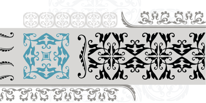
- LTC Pabst Oldstyle by Lanston Type Co.,
$24.95 Frederic W. Goudy originally designed Pabst in 1902. This lettering was used by the Pabst Brewing Company for their promotional materials. It was later developed into type for ATF. Goudy later licensed Pabst Oldstyle to the Lanston Type Library. Lanston Pabst Oldstyle features several differences from the more familiar ATF version. Some caps are narrower while some lower case characters are wider than the ATF version. The descenders are also shorter in the Lanston version. Logotypes of italic words and, of, and the are included as originally designed as well as ligatures including the unusual tt ligature.
 - LTC Goudy Initials by Lanston Type Co.,
$24.95LTC Goudy Initials has been a best-seller since it was reformatted to font format by P22 in 2005. We decided that while it works very well at medium sizes, when it was used extra large, the outlines were not as true to Frederic Goudy’s 1917 drawings as they could be. We decided to redraw from the ground up—and here we have the NEW LTC Goudy Initials! Meticulously redrawn by Miranda Roth, these ornaments referenced original proofs of large sizes of Cloister Initials. In our quest for artwork for this project, we even arranged a quickly sold out recasting of the 120 point size and have produced a limited edition letterpress print from this casting This new digital version features two additional layers to allow for quick colorizing of the central letter and/or the floriated background. Registered users of the previous version of LTC Goudy Initials may upgrade to the set at a discount. - LTC Remington Typewriter by Lanston Type Co.,
$39.95 Remington Typewriter, whose original designer is unknown, was one of the earliest Lanston Monotype designs. The italic was designed by Frederic Goudy in 1927. His approach was to make an unconventional typewriter form that looked well-spaced even though all letters shared the same width.
 - LTC Fleurons Garamont by Lanston Type Co.,
$24.95
- LTC Holiday Ornaments by Lanston Type Co.,
$24.95 Assembled for those less commercialized holidays, LTC Holiday Ornaments features over 80 printers' ornaments from Lanston Monotype and other historical foundries such as BBS and ATF. Holidays include Easter, Valentine's Day, St. Patrick's Day, April Fool's Day, Thanksgiving and 4th of July. There¹s even a pirate to represent international "Talk Like a Pirate" day. LTC Holiday Ornaments joins the Lanston Collection alongside the popular LTC Halloween and Christmas Ornaments. LTC Holiday Ornaments contains additional Halloween and Christmas ornaments as well.
 - LTC Goudy Thirty by Lanston Type Co.,
$24.95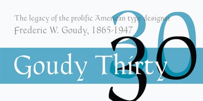
- LTC Ornaments Three by Lanston Type Co.,
$24.95 LTC Ornaments Three combines ornaments previously released as "Printers Vine Leaves C", "Printers Fleurons C" and "Water Garden Ornaments Round" plus additional Lanston ornaments for a total of over 70 printers ornaments for single accentuation or combined for border creation.
 - Adonis Old Style SG by Spiece Graphics,
$39.00 Willard T. Sniffin deserves the credit for this charming little stationery and greeting card typeface developed for American Type Founders in 1930. Capital letters show an occasional hint of ornamentation and lowercase letters are of the linking variety. The original set of exquisite alternate characters (A,B,G,T,V, W, o, s) has been included in this digital version. Adonis Old Style is ideal where a 1920s or 30s script-like lettering look is required. Adonis Old Style with Alternates is also available in the OpenType Std format. Some new characters have been added to this OpenType version. Advanced features currently work in Adobe Creative Suite InDesign, Creative Suite Illustrator, and Quark XPress 7. Check for OpenType advanced feature support in other applications as it gradually becomes available with upgrades.
 - Boogie Nights NF Pro by CheapProFonts,
$10.00 A typical Art Deco font. I have redesigned the uppercase “S” to mach the lowercase, tweaked a little here and there - and completely redesigned all the diacritics (which didn't really match the letter designs). Nick Curtis says: "The inspiration for this font came from a poster for an Austrian trade show from the 1920s, credited simply to Wasserman." ALL fonts from CheapProFonts have very extensive language support: They contain some unusual diacritic letters (some of which are contained in the Latin Extended-B Unicode block) supporting: Cornish, Filipino (Tagalog), Guarani, Luxembourgian, Malagasy, Romanian, Ulithian and Welsh. They also contain all glyphs in the Latin Extended-A Unicode block (which among others cover the Central European and Baltic areas) supporting: Afrikaans, Belarusian (Lacinka), Bosnian, Catalan, Chichewa, Croatian, Czech, Dutch, Esperanto, Greenlandic, Hungarian, Kashubian, Kurdish (Kurmanji), Latvian, Lithuanian, Maltese, Maori, Polish, Saami (Inari), Saami (North), Serbian (latin), Slovak(ian), Slovene, Sorbian (Lower), Sorbian (Upper), Turkish and Turkmen. And they of course contain all the usual “western” glyphs supporting: Albanian, Basque, Breton, Chamorro, Danish, Estonian, Faroese, Finnish, French, Frisian, Galican, German, Icelandic, Indonesian, Irish (Gaelic), Italian, Northern Sotho, Norwegian, Occitan, Portuguese, Rhaeto-Romance, Sami (Lule), Sami (South), Scots (Gaelic), Spanish, Swedish, Tswana, Walloon and Yapese.
 - Bodie MF Holly - Unknown license

- SW Crawl Body - Unknown license

- Dona Doni Script by Nk Studio,
$14.00 Dona Doni Modern Calligraphy Script font with a subtle, handwritten style. Equipped with 350 glyphs. Dona Doni is perfect for branding projects, homeware design, product packaging, use in business cards, invitation cards, etc. Simply as a stylish text overlay onto a background image or anything that requires a touch of elegance.
 - Capture it - 100% free

- Capture it - 100% free

- Swatch it - Unknown license

- ACED IT - Personal use only

- Lady Ice - Unknown license

- Face it! - Unknown license

- Lady Ice - Unknown license

- Illustrate IT - Unknown license

- Lady Ice - Unknown license

- Buckwheat TC by Tom Chalky,
$12.00 Introducing the Buckwheat Font Collection; Each and every font within the Buckwheat Collection was carefully created to be timeless, super versatile, and effortlessly cohesive. An essential kit to come back to time and time again for any number of design projects; from clean and modern, to rough and organic. What's Inside? - Buckwheat TC Regular: A condensed heading/titling font boasting real small caps (along with numerals, currency glyphs and more to match the small caps). - Buckwheat TC Sans: A rounded sans-serif font with several stylistic alternatives for various capitals (A, B, G, H, J, K, P, and R). - Buckwheat TC Script: Tying everything together, a simple yet effective monoline script font designed to look great big or small. - Rough and Smooth Styles: All of the aforementioned fonts are available in both smooth and textured styles. The textures are consistent throughout the collection, improving the cohesion of the fonts and eliminating the need to texture them yourself. - All of the typefaces within this collection include multilingual support and a full western character glyph range.
 - Ice Valley by Good Java Studio,
$25.00 Introducing Ice Valley Hand-drawn Fonts The Ice Valley hand-drawn font is perfect for logos, invitations, stationery, wedding designs, social media posts, advertisements, product packaging, product designs, label, photography, watermark, special events or anything. This font includes: Ice Valley OTF font file, Ligatures, and Multilingual support.
 - IC Havolane by Ironbird Creative,
$7.00 Havolane, A display serif font with a modern vintage twist, ideal for branding, headlines, and packaging. Havolane offers two styles, "Regular" and "Inked," to add versatility and depth to your designs. Perfectly complements sans-serif fonts, making your creations stand out effortlessly.
 - Ice Flowers by kapitza,
$69.00 Kapitza's 2009 Ice Flowers font is a derivative of their snowflake font Snow. It is a much bolder interpretation of the theme, with strong black and white contrasts. The graphic style of Ice Flowers is inspired by 1960s folk art and embroidery.
 - Ice Creamery by FontMesa,
$29.00Ice Creamery is a new variation of our Saloon Girl font family complete with italics and fill fonts which may be used to layer different colors into the open parts of each glyph. We don’t recommend using the fill fonts for Ice Creamery as stand alone solid fonts, Ice Creamery Chocolate was designed as a the stand alone solid font for this font family. Fill fonts go back to the 1850's where they would design matched sets of printing blocks and the layering of colors took place on the printing press, they would print a page in black then on a second printing they would print a solid letter in red or blue over the letters with open spaces to fill them in. Most of the time the second printing didn't line up exactly to the open faced font and it created a misprinted look. With the fill fonts in Ice Creamery and other FontMesa fonts you have the option to perfectly align the fill fonts with the open faced fonts or shift it a little to create a misprinted look which looks pretty cool in some projects such as t-shirt designs. I have some ice cream making history in my family, my Grandfather Fred Hagemann was the manager of the ice cream plant for thirty years at Cock Robin Ice Cream and Burgers in Naperville IL. In the images above I've included an old 1960's photo of the Cock Robin Naperville location, the ice cream plant was behind the restaurant as seen by the chimney stack which was part of the plant. If you were to travel 2000 feet directly behind the Cock Robin sign in the photo, that's where I started the FontMesa type foundry at my home in Naperville. My favorite ice cream flavor was their green pistachio ice cream with black cherries, they called it Spumoni even though it wasn't a true Spumoni recipe. Their butter pecan ice cream was also incredibly good, the pecans were super fresh, their Tin Roof Sundae ice cream was chocolate fudge, caramel and peanuts swirled into vanilla ice cream. One unique thing about Cock Robin and Prince Castle was they used a square ice cream scoop for their sundaes. - Ice Cream by Positype,
$25.00 Ice Cream is the product of an abandoned typeface concept a non-connected script for food packaging. The original exemplars were so iconic, so inspiring, it demanded completion. Curvy with a huge dollop of fun, to be honest, and I wouldn’t have it any other way with this one. Influenced heavily by Kari and Juicy (and even the shameless copies of my originals, wink wink), Ice Cream’s recipe blends in some very simple elements that are unobtrusive and clean, perfect for packaging designs, children’s books, and anywhere a light-hearted scoop with a cherry on top is needed.
 - Hand It by PintassilgoPrints,
$24.00 Carefully messy, sweetly odd, this friendly family conveys a cool - but warm - organic feel. With mixed letterforms and somewhat unexpected choices here and there, each font brings a handful of alternates for a nice natural look: there are five alternates for letters, three for numbers plus alternates for punctuation marks. All cleverly programmed into Contextual Alternates feature to instantly cycle at your command. This is not an usual font. Is that one just strange enough to nicely fit a wide range of designs, carrying your idea with plenty of personality. Quite cool. Hand it!
 - Ice Age by URW Type Foundry,
$35.00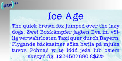
- Rustic TC by Tom Chalky,
$19.00 Proudly introducing Volume Rustic, where hand-craftsmanship meets professional design. Each of these meticulously handcrafted fonts were thoughtfully designed to harmoniously complement one another, oozing the essence of authenticity, warmth, and the human touch. These fonts are tailor-made for projects that celebrate the organic, the handmade, the local, and everything that puts people at the center. Compatible & Multilingual The fonts are in the OpenType font format. OpenType fonts are accepted within the vast majority of design software (including mobile and tablet design apps). Multilingual support is also included for Basic Latin, Western European, Euro & Pan African Latin.
 - EF It by Elsner+Flake,
$35.00 - TC Europa by Monotype,
$29.99Europa gives a rectangular appearance to words. Strokes have lightly flaired terminals to give the effect of serifs. The Europa font is excellent for headlines in journals.


