10,000 search results
(0.027 seconds)
- Colonial Press by Simeon out West,
$25.00 Colonial Press is a font based on serif typefaces designed by William Caslon I (1692-1766) and various revivals thereof. Caslon is cited to be the first original typeface of English origin, but some type historians point out the close similarity of Caslon's design to the Dutch Fell types, presumed to be the work of Dutch punchcutter Dirck Voskens. Colonial Press harkens to the look and feel of newspapers in Colonial North America around the mid 1700s without the rough edges commonly associated with colonial printing and many reconstructions. The rough quality of the American typeface is believed to be the result of oxidation from the exposure to seawater during the long voyage from England to the Americas. Colonial Press is a heavy font that retains some of the handcut quality of these fonts while smoothing out the irregularities that make many of these fonts so visually distracting at larger point sizes. For the italic version of this font, I chose to emulate the more ornate letterforms that I have encountered, giving the italic characters a more ornamental feel. Colonial Press comes with full punctuation and a 362 glyph character set for most Western European-based Latin alphabet languages. It is a font that is designed both for normal typing and for larger, decorative display.
 - BOXDON Titling by TYDTYP,
$15.00 BOXDON is an extra heavy expanded typeface which was especially designed for VERTICAL layout. Each shape looks like a box and has minimum graphical treatment to distinguish each character. It means that the counter space is not enough to use this typeface for small font sizes, however, for titles this typeface should give incredible effects. I highly recommend using it with software that is compatible with vertical layout. (e.g. Adobe illustrator)
 - Perfect Colony by Pen Culture,
$15.00 Proudly present "Perfect Colony // Bold Serif Font" Perfect colony is bold and classic serif with elegant curves. This font is perfect for branding, logo design, header text, poster and many other. What inside and what will you get: Uppercase and lowercase letter Number and punctuation Multilingual Support PUA Encoded I really hope you enjoy it – please do let me know what you think, comments & likes are always hugely welcomed and appreciated. More importantly, please don’t hesitate to drop me a message if you have any issues or queries. Thank you
 - Bousni Carre by Linotype,
$29.99The Bousni family's six faces display links unexpected by most readers of western alphabets. Inspired by both by Arabic calligraphy, and contemporary bitmap design, Bachir Soussi Chiadmi created this playful series of faces. Letters in each of the six typefaces link together, but not in the ways normally expected from script fonts. Suited for a wide array of fun functions, Bousni Carre and Bousni Ronde (each available in Light, Medium, and Bold weights) bring new a style and flavor to your collection. All six fonts in the Bousni family are included in the Take Type 5 collection from Linotype GmbH. The Bousni family espouses similar construction traits with other fonts from Linotype. Specifically, the straight lines and joints in the three Bousni Carre fonts are based off of a grid system similar to Anlinear, another member of the Take Type 5 collection from Linotype GmbH. The letter connections throughout the Bousni family are similar to Arabic kashidas, a typographic feature found recently in many non-Arabic typefaces, such as Linotype Atomatic." - Faithful Colony by Creativemedialab,
$20.00 Faithful Colony is a modern, elegant, classic typeface with a timeless look. It comes with seven weights ranging from thin to black, matching italics, and a variable format. Faithful Colony is perfect for fashion-related concepts, Luxury and Elegant design, Classy or high-end branding, logo, and many more. Try to combine the regular and italic styles for a modern and elegant look.
 - Body by Zetafonts,
$39.00 Body graphic project at Behance Body is a type family designed for Zetafonts by Cosimo Lorenzo Pancini with Andrea Tartarelli. Conceived as a contemporary alternative to modernist superfamilies like Univers or Helvetica, Body tries to maximize text readability while providing a wide range of options for the designer. It comes in two variants (Body Text and Body Grotesque), each in four widths and four weights: regular and bold for basic typesetting, light and extrabold for display use. Body Grotesque applies to the sans serif modernist skeleton little imperfections and quirks inspired by our research in early 20th century type specimens. Curves are slightly more calligraphic and a light inverse contrast is applied to bold weights, giving the typeface a slight vintage appearance in display use. Body Text, on the contrary, challenges the modernist aesthetics maximizing horizontal lines and using open terminals for letters like “s” and “a” that appear normally dark in modernist grotesques. For both variants, the normal width family is slightly condensed in an effort to maximize space usage; the Slim width is provided for extremely dense texts or side notes while the Fit width is optimized for display usage as in logos, headings or titles. The Large width manages to look elegant in its light weight while becoming a valid heading or subtitle font in its extrabold weights. All the 64 fonts in the Body superfamily include a complete latin extended character set with small caps for over 70 languages, Russian cyrillic, open type positional numbers, stylist sets and alternate forms.
 - Walk Da Walk Two - Personal use only

- KR Christmas Dings Two - Unknown license

- Eight Track program two - Personal use only

- KR Halloween Signs Two - Unknown license

- Display Dots Two Serif by Gerald Gallo,
$20.00 Display Dots Two Serif is a display font not intended for text use. It, along with its sans counterpart were designed specifically for display, headline, logotype, branding, and similar applications. Display Dots Two Serif has an uppercase alphabet, numbers, and punctuation.
 - Mailbox Letters Two JNL by Jeff Levine,
$29.00Mailbox Letters Two JNL is the second typeface from Jeff Levine inspired by metal lettering used on mailboxes and homes. Each cast letter or number sat on a lower "rail" which was then slipped into a slot that held them firmly in place. Jeff's Inventory JNL looked close enough to the original type style to use as a model for this font, and for typographic purposes there are certain punctuation and other glyphs that "float" above the rail. Limited character set. - Two Step Nouveau JNL by Jeff Levine,
$29.00 Popular music of the early 1900s included a genre called two step; round dances utilizing a sliding step with a tempo in either march or polka time. 1911's "Daughters of the American Revolution" was one such march/two step. The cover of the sheet music had the title hand lettered in a slightly rounded sans serif type design in the Art Nouveau style popular during that era. It is now available as Two Step Nouveau JNL, in both regular and oblique versions.
 - MFC Franklin Corners Two by Monogram Fonts Co.,
$19.95
- Cheddar Gothic Sans Two by Adam Ladd,
$25.00Cheddar Gothic Sans Two is a hand-drawn, multi-weight display family. An all-caps, sans serif typeface with condensed proportions that works great for a variety of display uses. The uppercase characters add distinction with extended crossbars and chiseled terminals, while the lowercase provides a more classic sans serif appearance. This family is an expanded version of the original Cheddar Gothic Sans, with more weights and even broader language support. - Headline Helpers Two SG by Spiece Graphics,
$39.00 Wouldn't it be nice to have an assortment of little hand-lettered words? Words like “The” or “A”; “With” or “At”; “To” or “From”? Headline Helpers Two are word accents that can go just about anywhere. Set off the title of your next design project with one of these little gems. Or use a Helper with your new product introduction headline. Convenient instructions and character map come as standard equipment with this highly desirable addition to your type library. Headline Helpers Two is available in the OpenType Std format. Advanced features currently work in Adobe Creative Suite InDesign, Creative Suite Illustrator, and Quark XPress 7. A Windows TrueType version of this font has also been provided if you prefer normal keyboard access.
 - HWT Bulletin Script Two by Hamilton Wood Type Collection,
$29.95 Bulletin Script was a style offered by several American wood type manufacturers in the late 19th Century. It may actually be one of the most iconic styles of the late 1960 Psychedelic era when Victorian revival was in full swing. The style known as "Bulletin Script No. 2” varies from the more commonly seen Bulletin in that its bottom strokes have a concave swash to them rather than rounded bulbous bottom terminals. This new digitization features over 300 glyphs including Central European characters.
 - MFC Arteaga Borders Two by Monogram Fonts Co.,
$19.95 The inspiration source for Arteaga Borders Two is a collection of the embroidery and beading patterns from a vintage embroidery patterns catalog dating back to 1865. The original collection of patterned sides has been expounded upon to create matching corners that continue the fluidity of the ornate forms. Download and view the “MFC Arteaga Borders Two Guidebook” if you would like to learn a little more.
 - Two Cents Plain JNL by Jeff Levine,
$29.00 Two Cents Plain JNL is a simple sans design for titling, sign work, display ads and so forth. The name is derived from the way folks in the Northeast used to ask for a glass of seltzer water at restaurants and soda fountains decades ago: "Give me a two cents plain." It was always cheaper to order plain seltzer than to have flavored syrup added, and this was especially true in the years during the Great Depression when every penny made a difference.
 - Display Dots Two Sans by Gerald Gallo,
$20.00 Display Dots Two Sans is a display font not intended for text use. It, along with its serif counterpart were designed specifically for display, headline, logotype, branding, and similar applications. Display Dots Two Sans has an uppercase alphabet, numbers, and punctuation.
 - Varial Two Super Rounded by Paavola Type Studio,
$21.00 Varial Two typefaces are new and updated versions of Varial family created 2014: Extra-condensed Opentype™ sans-serifs with small caps, extended character set (european languages support) and extra features (fractions, ligatures and alternatives). Varial Two Super Rounded family is versatile in all design applications, for example all headlines, branding, display use, infographics and more!
 - MFC Bruce Corners Two by Monogram Fonts Co.,
$19.95
- Calligraphia Latina Versals Two by Intellecta Design,
$21.90 - Privilege Sign Two JNL by Jeff Levine,
$29.00 Unique and decorative signage for many drive-ins, motels, food stores and other businesses of the 1940s had what was referred to as “privilege signs” provided by one of the major cola brands. Consisting of the brand’s emblem on a decorative panel, the remainder of the sign would carry the desired message of the storekeeper (such as “Drive-In”) in prismatic, embossed metal letters. Inspired by the Art Deco sans serif style of those vintage signs, Privilege Sign Two JNL recreates the type design in both regular and oblique versions. The typefaces are solid black, but adding a selected color and a prismatic effect from your favorite graphics program can reproduce the look and feel of those old businesses. This is a companion font to Privilege Sign JNL, which recreates the condensed sans serif lettering of other privilege signs from the 1950s and early 1960s.
 - BAHAMAS TWO PERSONAL USE - Personal use only

- SlabStruct Too - Unknown license

- Aklatanic TSO - Unknown license

- Too Late - Unknown license

- Teddybers Too - Personal use only

- TWT Prospero by Three Islands Press,
$24.00TWT Prospero is the kind of typeface you seldom find in blocks of continuous text these days. Similar fonts based on late-18th-century work by Bodoni, the Didots, and others tend to be reserved for display type: their exaggerated contrast and vanishing hairlines can make you squint and strain at small sizes. But TWT Prospero, with its moderate contrast and fairly robust hairlines, is impressively legible in book text while remaining ideal for use in display situations. The full family has seven styles: roman, italic, bold, bold italic, condensed roman, condensed italic, and condensed bold. - Too Much by Comicraft,
$19.00If you've had too much coffee but not enough of Too Much Coffee Man you can now indulge in an excess of characters created by the hand of Too Much Coffee Man's creator, Mister Shannon Wheeler. Don't worry, in our efforts to ensure clean and confident lettering samples, we kept Shannon on decaf until he was done. Dip this font in your system folder and your hard drive will get a caffeine and sugar rush guaranteed to increase its memory partition and bring the images on your monitor into sharper focus. - Baka Too by Positype,
$20.00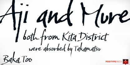
- FF Zwo by FontFont,
$68.99 German type designer Jörg Hemker created this sans FontFont in 2002. The family has 16 weights, ranging from Extra Light to Black (including italics) and is ideally suited for advertising and packaging, editorial and publishing, logo, branding and creative industries as well as sports. FF Zwo provides advanced typographical support with features such as ligatures, small capitals, alternate characters, case-sensitive forms, fractions, and super- and subscript characters. It comes with a complete range of figure set options – oldstyle and lining figures, each in tabular and proportional widths. This FontFont is a member of the FF Zwo super family, which also includes FF Zwo Correspondence.
 - Doodles Too by Outside the Line,
$19.00 Doodles Too is a new pictogram font from Outside the Line. It features 40 little pictures... odds & ends of this & that. If you liked the font Doodles, Holiday Doodles or Holiday Doodles Too you should love Doodles Too as it is more of the same.
 - TWT Pavane by Three Islands Press,
$29.00TWT Pavane is based on the calligraphy of Art Nouveau designer Rudolph Koch. Chelsea Studio is based on hand lettering from architectural sketches by Charles Rennie Mackintosh. - Super Bodo Bodo by Daylight Fonts,
$50.00 This is a modern, ultra-thick Bodoni font with a lot of swashes.
 - Toony Black - Personal use only

- Moony Cat - Unknown license

- Cajun Boogie - Personal use only

- Komika Boogie - Unknown license


