10,000 search results
(0.025 seconds)
- Nostalgic Typewriter by Typehead Studio,
$10.00 Nostalgic Typewriter is a typewriter font that exudes classic vintage charm with an irresistible allure. Inspired by the iconic typewriters that once dominated the world of manual typing, this font brings forth warm nostalgia and timeless appeal in every character. Key Features: Classic Aesthetics: Every letter in the Nostalgic Typewriter is meticulously crafted to create a classic look that harks back to bygone eras of manual writing. Vintage Power: The font captures invaluable retro vibes in its design, with rough edges and character placement that evoke an authentic feel from yesteryears. Character Diversity: Nostalgic Typewriter boasts a variety of characters, including uppercase, lowercase, numbers, and special symbols. All are designed to cater to your diverse design needs. Ease of Use: This font is ready to enhance a wide range of projects, such as poster designs, stickers, greeting cards, t-shirts, and more. With flexible licensing, you can confidently use it for personal or commercial projects. High-Quality: Nostalgic Typewriter is crafted with attention to detail and top-notch quality, ensuring that your printed or digital output will always captivate.
 - LaRuja by SilverStag,
$19.00 Embrace the captivating elegance of LaRuja, a modern serif font that seamlessly blends feminine grace with unwavering strength. Its distinctively high contrast between horizontal and vertical lines creates a dynamic interplay of elegance and structure, making it a versatile choice for a wide range of applications. LaRuja's gracefully tapered terminals and subtly curved arches exude a sense of refined femininity, while its sturdy serifs and well-defined letterforms project an unyielding strength. This unique balance of characteristics makes LaRuja the ideal choice for projects that demand both beauty and substance. LaRuja's extensive language support, encompassing over 90 languages, makes it a global font that can be effortlessly adapted to diverse cultural contexts. From fashion magazines and branding materials to websites and marketing campaigns, LaRuja seamlessly conveys your message across borders. LaRuja's comprehensive weight system, ranging from Thin to Black, enables you to tailor the font's appearance to suit the specific needs of your project. The lighter weights, such as Thin and Light, exude elegance and sophistication, while the heavier weights, such as Semibold and Black, project authority and impact. Happy creating everyone!
 - Bellwood Gothic by Breauhare,
$19.99 Bellwood Gothic™ is an unorthodox but happy pairing of upper and lowercases that breaks typographic rules: its capitals evoke traditional early 20th century styling and strength. Lowercase displays a softer, more warm and friendly flavor that points to a Bauhaus aesthetic. But for some strange reason they work so well together! Therein lies the mystique of this font. Overall it isn’t strictly uniform in stroke but shows some variation of color. The sofa poster includes a cameo appearance by breauhare’s own popular Daddy’s Hand™ font. Bellwood Gothic’s nostalgic flavor of the 1960s & 1970s still conveys a modern look that lends itself to sports, fashion, lifestyle and more. The wide track of the lettering helps short words easily fill spaces. Includes stylistic alternates for the lowercase a, e, & l (L), plus 13 uppercase letters! Among OpenType features are Stylistic Alternates, Stylistic Sets, Ligatures, Fractions, & Case-sensitive forms. Extended support for Western, Central, and Eastern European languages is included. Use it for headlines, subheads, branding, editorial, packaging, and logos!
 - Mestora by Skinny Type,
$18.00 Mestora is a classic and elegant retro serif with a modern twist. With its decent readability, Mestora is perfect for both display as well as body text. Inspired by all the retro aesthetics making a comeback, Mestora is perfectly suitable for creating nostalgic yet still clean and elegant designs such as logos, packaging, editorial, and more. Mestora FEATURE: Europeans languages Alternates Uppercase & Lowercase Ligatures SOFTWARE REQUIREMENTS: The regular fonts in the pack are widely supported by most software - To get the full functionality of the large selection of standard ligatures (custom connected letters) in the script font, any software that can read OpenType fonts will do. To generate all ligatures, please open Adobe Ilustrator - Type - Glyphs. Please drop me a message if you have trouble regarding either installing or using this font. 🌟While using this product, if you encounter any problem or spot something we may have missed, please don't hesitate to drop us a message. We'd love to hear your feedback in order to further fine-tune our products. Thank you! Skinny Type
 - Enoway by Valentino Vergan,
$17.00 Enoway is a modern elegant typeface, which leans towards the Neue Nouveau style. The Enoway typeface was inspired by the early the Art Nouveau typographic designs, which was characterized by decorative designs and embellished stroke endings. The Enoway typeface has a high-contrast and a thin hairline, this gives the typeface a modern but nostalgic look. The Enoway typeface comes in two styles, Regular and Oblique. The Enoway typeface can be paired with a minimal sans serif or light script font, this combination will give your next project a modern and unique look. The Enoway typeface is very versatile and can cover a wide range of project such as: fashion branding, mastheads, magazines, feminine logos, facebook banners, wedding invitations, Instagram posts, websites, blog posts, pull quotes, editorials, product packaging, trendy social media posts, advertisements and much more. If you are looking for something modern and nostalgic for you next project, Enoway is the font for you. ENOWAY INCLUDES A FULL SET OF: Uppercase and lowercase letters. Numbers. Punctuation. Ligatures. Alternate characters. Multilingual symbols. We hope you enjoy using the Enoway typeface.
 - Garota Sans SC - Personal use only

- Salden by Canada Type,
$40.00 The Salden fonts are our tribute to the man who was dubbed the face of the Dutch book, and whose work is considered essential in 20th century Dutch design history. Helmut Salden’s exquisite book cover designs were the gold standard in the Netherlands for more than four decades. His influence over Dutch lettering artists and book designers ranges far and wide, and his work continues to be used commercially and exhibited to this very day. At the root of Salden’s design work was a unique eye for counter space and incredible lettering skills that never failed to awe, regardless of category or genre. This made our attention to his lettering all the more focused within our appreciation to his overall aesthetic. Though Salden never designed alphabets to be turned into typefaces (he drew sets of letters which he sometimes recycled and modified to fit various projects), we thought there was enough there to deduce what a few different typefaces by Salden would have looked like. The man was prolific, so there were certainly enough forms to guide us, and enough variation in style to push our excitement even further. And so we contacted the right people, obtained access to the relevant material, and had a lot of fun from there. This set covers the gamut of Salden’s lettering talents. Included are his famous caps, his untamed, chunky flare sans serif in two widths, his unique Roman letters and an italic companion and, most recognizable of all, his one-of-a-kind scripty upright italic lowercase shapes, which he used alongside Roman caps drawn specifically for that kind of combination titling. All the fonts in this set include Pan-European glyph sets. They’re also loaded with extras. Salden Roman (908 glyphs) and Salden Italic (976 glyphs) each come with built-in small caps (and caps-to-small-caps), quite a few ligatures, and two different sets of alternates. Salden Black and Salden Black Condensed (636 glyphs each) come with a set of alternates, and both lining and oldstyle figures. Salden Caps (597 glyphs) comes with a set of alternates, and Salden Titling (886 glyphs) comes with a quite a lot of swashed forms and alternates (including as many six variants for some forms), a few discretionary ligatures, and two sets of figures. There are also some form alternates for the Cyrillic and Greek sets included in all six fonts. These alphabets were enjoyably studied and meticulously developed over the past ten years or so. We consider ourselves very fortunate to be the ones bringing them to the world as our contribution to maintaining the legacy of a legendary talent and a great designer. The majority of the work was based on Salden’s original drawings, access to which was graciously provided by Museum Meermanno in The Hague. The Salden fonts were done in agreement with Stichting 1940-1945, and their sale will in part benefit Museum Meermanno.
 - Sofa Sans Hand by FaceType,
$24.00 High-contrast & all handmade – the powerful Sofa Sans. Sofa Sans is a hand-drawn/handmade all-caps display-family for packaging, posters, book-covers, food- and logo-design and will best stand out in huge grades. Its handcrafted character is friendly and eye-catching. Stylish features and alternates add personality and let you create unique logos and stunning headlines. Two optical sizes and extra shadow-, 3D-, inline- and hatched-styles make Sofa Sans a flexible solution for any display need. Sofa Sans now has a sister: view Sofa Serif here. · The family boasts 4 weights from a monolinear Thin to Black, each containing more than 1000 glyphs, plenty of OpenType features and full ISO latin 1 & 2 language support. In addition, extra shadow-, 3D-, inline- and hatched-styles round out the package. · High contrast is one of Sofa Sans’ key features. To maintain a wide range of use, choose from two optical sizes: Standard and Display with a maximum of contrast especially in the heavier weights. · Sofa Sans includes a variety of OpenType alternates which add uniqueness to your work. OpenType features include Swashes- and Titling-Alternates, Beginnings and Endings, Stylistic-Sets for even more alternative glyphs as well as a “random-double-letter-feature” with “Discretionary Ligatures” activated. OpenType Swashes- and Titling-Alternates are smart features which automatically adjust all swashy letters to the available white space. Switch one on and let Sofa Sans do the rest. Please download the SofaSans-OpenType Feature Guide from the gallery for further details. · Have fun! · View other fonts from Georg Herold-Wildfellner: Sofa Serif | Sofa Sans | Mila Script Pro | Pinto | Supernett | Mr Moustache | Aeronaut | Ivory | Weingut · Language Report for Sofa Sans Hand/ 195 languages supported: Abenaki, Afaan Oromo, Afar, Afrikaans, Albanian, Alsatian, Amis, Anuta, Aragonese, Aranese, Aromanian, Arrernte, Arvanitic, Asturian, Aymara, Bashkir, Basque, Bikol, Bislama, Bosnian, Breton, Cape Verdean, Catalan, Cebuano, Chamorro, Chavacano, Chickasaw, Cimbrian, Cofan, Corsican, Creek, Crimean Tatar, Croatian, Czech, Danish, Dawan, Delaware, Dholuo, Drehu, Dutch, English, Estonian, Faroese, Fijian, Filipino, Finnish, Folkspraak, French, Frisian, Friulian, Gagauz, Galician, Genoese, German, Gooniyandi, Greenlandic, Guadeloupean, Gwichin, Haitian Creole, Han, Hawaiian, Hiligaynon, Hopi, Hotcak, Hungarian, Icelandic, Ido, Ilocano, Indonesian, Interglossa, Interlingua, Irish, Istroromanian, Italian, Jamaican, Javanese, Jerriais, Kala Lagaw Ya, Kapampangan, Kaqchikel, Karakalpak, Karelian, Kashubian, Kikongo, Kinyarwanda, Kiribati, Kirundi, Klingon, Ladin, Latin, Latino Sine, Latvian, Lithuanian, Lojban, Lombard, Low Saxon, Luxembourgish, Makhuwa, Malay, Maltese, Manx, Maori, Marquesan, Meglenoromanian, Meriam Mir, Mohawk, Moldovan, Montagnais, Montenegrin, Murrinhpatha, Nagamese Creole, Ndebele, Neapolitan, Ngiyambaa, Niuean, Noongar, Norwegian, Novial, Occidental, Occitan, Oshiwambo, Ossetian, Palauan, Papiamento, Piedmontese, Polish, Portuguese, Potawatomi, Qeqchi, Quechua, Rarotongan, Romanian, Romansh, Rotokas, Sami Lule, Sami Southern, Samoan, Sango, Saramaccan, Sardinian, Scottish Gaelic, Serbian, Seri, Seychellois, Shawnee, Shona, Sicilian, Silesian, Slovak, Slovenian, Slovio, Somali, Sorbian Lower, Sorbian Upper, Sotho Northern, Sotho Southern, Spanish, Sranan, Sundanese, Swahili, Swazi, Swedish, Tagalog, Tahitian, Tetum, Tok Pisin, Tokelauan, Tongan, Tshiluba, Tsonga, Tswana, Tumbuka, Turkish, Turkmen, Tuvaluan, Tzotzil, Uzbek, Venetian, Vepsian, Volapuk, Voro, Wallisian, Walloon, Waraywaray, Warlpiri, Wayuu, Welsh, Wikmungkan, Wiradjuri, Xhosa, Yapese, Yindjibarndi, Zapotec, Zulu, Zuni
 - Juvenis by Storm Type Foundry,
$32.00Designs of characters that are almost forty years old can be already restored like a historical alphabet – by transferring them exactly into the computer with all their details. But, of course, it would not be Josef Tyfa, if he did not redesign the entire alphabet, and to such an extent that all that has remained from the original was practically the name. Tyfa published a sans-serif alphabet under the title Juvenis already in the second half of the past century. The type face had a large x-height of lower-case letters, a rather economizing design and one-sided serifs which were very daring for their time. In 1979 Tyfa returned to the idea of Juvenis, modified the letter “g” into a one-storey form, narrowed the design of the characters even further and added a bold and an inclined variant. This type face also shows the influence of Jaroslav Benda, evident in the open forms of the crotches of the diagonal strokes. Towards the end of 2001 the author presented a pile of tracing paper with dozens of variants of letter forms, but mainly with a new, more contemporary approach: the design is more open, the details softer, the figures and non-alphabetical characters in the entire set are more integral. The original intention to create a type face for printing children’s books thus became even more emphasized. Nevertheless, Juvenis with its new proportions far exceeds its original purpose. In the summer of 2002 we inserted all of this “into the machine” and designed new italics. The final computer form was completed in November 2002. All the twelve designs are divided into six variants of differing boldness with the corresponding italics. The darkness of the individual sizes does not increase linearly, but follows a curve which rises more steeply towards the boldest extreme. The human eye, on the contrary, perceives the darkening as a more fluent process, and the neighbouring designs are better graded. The x-height of lower-case letters is extraordinarily large, so that the printed type face in the size of nine points is perceived rather as “ten points” and at the same time the line spacing is not too dense. A further ingenious optical trick of Josef Tyfa is the figures, which are designed as moderately non-aligning ones. Thus an imaginary third horizontal is created in the proportional scheme of the entire type face family, which supports legibility and suitably supplements the original intention to create a children’s type face with elements of playfulness. The same applies to the overall soft expression of the alphabet. The serifs are varied; their balancing, however, is well-considered: the ascender of the lower-case “d” has no serif and the letter appears poor, while, for example, the letter “y”, or “x”, looks complicated. The only serif to be found in upper-case letters is in “J”, where it is used exclusively for the purpose of balancing the rounded descender. These anomalies, however, fit perfectly into the structure of any smoothly running text and shift Juvenis towards an original, contemporary expression. Tyfa also offers three alternative lower-case letters *. In the case of the letter “g” the designer follows the one-storey form he had contemplated in the eighties, while in “k” he returns to the Benda inspiration and in “u” adds a lower serif as a reminder of the calligraphic principle. It is above all the italics that are faithful to the tradition of handwritten lettering. The fairly complicated “k” is probably the strongest characteristic feature of Juvenis; all the diagonals in “z”, “v”, “w”, “y” are slightly flamboyant, and this also applies to the upper-case letters A, V, W, Y. Juvenis blends excellently with drawn illustrations, for it itself is modelled in a very creative way. Due to its unmistakable optical effect, however, it will find application not only in children’s literature, but also in orientation systems, on posters, in magazines and long short-stories. - Auberge Script by Sudtipos,
$79.00 It took me a long time, but I think I now understand why people of my generation and older feel the need to frame current events in an historical context or precedents, while most of the young couldn't care less about what happened ten years ago, let alone centuries back. After living for a few decades, you get to a point when time seems to be moving quite fast, and it’s humbling to see that your entire existence so far can be summed up in a paragraph or two which may or may not be useful to whoever ends up reading the stuff anyhow. I suppose one way to cope with the serenity of aging is trying to convince yourself that your life and work are really an extension of millenia of a species striving to accept, adapt to, and improve the human condition through advancing the many facets of civilization -- basically making things more understandable and comfortable for ourselves and each other while we go about doing whatever it is we are trying to do. And when you do finally convince yourself of that, history becomes a source of much solace and even a little premonition, so you end up spending more time there. Going far back into the history of what I do, one can easily see that for the most part it was ruled by the quill. Western civilization’s writing was done with quill pens for more than thirteen centuries and with newer instruments for about two. By the mid-18th century, the height of the quill experience, various calligraphy techniques could be discerned and writing styles were arranged in distinct categories. There are many old books that showcase the history of it all. I recommend looking at some whenever the urge comes calling and you have to get away from backlit worlds. Multiple sources usually help me get a better perspective on the range of a specific script genre, so many books served as reference to this quill font of mine. Late 17th century French and Spanish professional calligraphy guides were great aides in understanding the ornamental scope of what the scribes were doing back then. The French books, with their showings of the Ronde, Bâtarde and Coulée alphabets, were the ones I referenced the most. So I decided to name the font Auberge, a French word for hotel or inn, because I really felt like a guest in different French locales (and times) when I going through all that stuff. Because it is multi-sourced, Auberge does not strictly fit in a distinct quill pen category. Instead, it shows strong hints of both Bâtarde and Coulée alphabets. And like most of my fonts, it is an exercise in going overboard with alternates, swashes, and ornamental devices. Having worked with it for a while, I find it most suitable for display calligraphic setting in general, but it works especially well for things like wine labels and event invitations. It also shines in the original quill pen application purpose, which of course was stationery. Also, as it just occurred to me, if you find yourself in a situation where you have to describe your entire life in 50 words or less, you may as well make it look good and swashy, so Auberge would probably be a good fit there as well. This is one quill script that no large bird had to die for. A few technical notes The Auberge Script Pro version includes 1800 glyphs, everything is included there. Also latin language support. We recommend you to use the latest design application to have full access to alternates, swashes, small caps, ornaments, etc. The images from the gallery uses this version. For better results use the fonts with “liga” feature on. Awards During 2014 the early develop of Auberge Script was chosen to be part of Tipos Latinos, the most important type exhibition in South America.
 - Desyrel - Unknown license

- Lovesick AOE - Unknown license

- Lansbury - 100% free

- Slalom - Unknown license

- AlphaMack AOE - Unknown license

- Tagalog Doctrina 1593 - Unknown license

- Shamen Remix - Unknown license

- Steed by Device,
$29.00 A condensed and bold obround sans inspired by 60s condensed inserat faces, with a more pronounced thick/thin stress as seen on the titles of the Avengers TV show.
 - Gothico Antiqua by MADType,
$21.00 Gothico Antiqua is the result of grunging up one of my early sans-serif type designs. It strangely works very well and looks authentic at small to medium settings.
 - Digi Grotesk by Linotype,
$29.99DigiGrotesk is one of the earliest digital fonts ever created. It is intended for use in longer texts set in smaller point sizes, including dictionaries and newspaper classified ads. - Bordeaux by Solotype,
$19.95This font was inspired by the lettering on a shop sign along a very classy shopping street in Bordeaux, France. There were similar styles among mid-nineteenth century types. - Koch Antiqua LT by Linotype,
$29.99Koch Antiqua is based on forms of old Roman writings, chiseled in marble thousands of years ago. This contemporary version is more playful and reminiscent of the Roaring 20s. - Viralles Script by Letterniz,
$20.00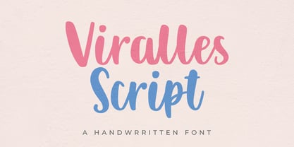 Viralles is a handwritten script font. Looks stunning on wedding invitations, thank you cards, quotes, greeting cards, logos, business cards and any other design that requires a handwritten touch.
 - Engrace by Angele Kamp,
$26.00 Meet Engrace, a serif font family with elegant & stylish curves. She’s romantic, classy and modern all wrapped into one, and surely can not be missed in your font collection.
 - Pepino by Robert Petrick,
$19.95 Pepino is loosely based on the classic font Hobo but Pepino is a completely new and original drawing. The font is bold, fun, casual, easy to set and read.
 - Chisel by Linotype,
$29.99An inline version of the Latin bold condensed, and designed on the suggestion of Robert Harling. There is a double white line, which was originally engraved in Latin type. - Bonita by Monotype,
$40.99Bonita is a bold handlettering style based on movie poster lettering from the early 20th century. It's similar to the typeface Broadway, but much bolder and far less formal. - CG Symphony by Monotype,
$29.99CG Symphony was among the first one hundred PostScript faces released by Compugraphic in 1988. The original version of CG Symphony font is the Linotype Original font family Syntax. - Xylo Sans by PintassilgoPrints,
$19.00 Xylo Sans letterforms are based on a typeface from Miller & Richard type foundry, from circa 1911. They are presented here with a rough wood texture, in two xylographic flavors.
 - Fifty Famous Fairy Tales by Funk King,
$20.00 Fifty Famous Fairy Tales was inspired by lettering on the cover of a children’s book of the same name published by Whitman Publishers back in the 50s or 60s.
 - FG Noel by YOFF,
$13.95 FG Noel works great at small and large sizes. I can imagine a kids' book with this font and it will be perfect for cute quotations on greeting cards.
 - Bobila by Rashatype,
$10.00 Bobila is a cool and casual display font. It will look stunning on any poster flyer or print. Use this font for your designs and explore its endless possibilities.
 - Fairytale Serif Oblique by Nicky Laatz,
$26.00 A whimsical little serif transporting you back in time. Based on vintage hand scribed italics, Fairytale Serif is ready to charm it's beholder with its quaint inky edged letters.
 - Skribler by Cool Fonts,
$24.00 Here’s a scratchy skribly font you can use to make something look grungy or use it reversed and it looks like it was scratched on a wall or something.
 - Borough Park JNL by Jeff Levine,
$29.00 Borough Park JNL is named for a neighborhood in the southwestern part of the borough of Brooklyn, NY and was modeled from hand lettering found on vintage sheet music.
 - Metal rocker by Letterafandi Studio,
$14.00 Metal Rocker is a natural handwritten font. It looks stunning on thank you cards, quotes, greeting cards, logos, business cards, and every other design which needs a handwritten touch.
 - Print Shop Classics JNL by Jeff Levine,
$29.00 Print Shop Classics JNL is comprised of twenty-six decorative letterpress ornaments from vintage source material along with the words "Welcome" and "Introducing" on the period and comma keys.
 - Baker Signet by Bitstream,
$29.99A design on classical lines with subtle but effective calligraphic touches, by Arthur Baker for VGC. The Bold version is used for the Coke logo all over the world. - Blastero by Letterafandi Studio,
$14.00 Blastero is a natural handwritten graffiti font. It looks stunning on thank you cards, quotes, greeting cards, logos, business cards, and every other design which needs a handwritten touch.
 - LD Bella by Illustration Ink,
$3.00Bella, the heroine, comes to life with this one of a kind font. LD Bella, is great for journaling, adorning memories or adding the final touch to your projects.


