10,000 search results
(0.05 seconds)
- Kalvesta JNL by Jeff Levine,
$29.00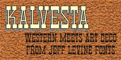 A bit of experimentation with the Art Deco-flavored Sign Card JNL brings forth a hybrid alphabet where Art Deco meets Western. The result is Kalvesta JNL. This font's unusual character shapes defy and yet redefine the notion of the classic Western alphabet. The name is from a town in Kansas.
 - French Calligraphic JNL by Jeff Levine,
$29.00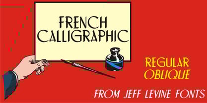 French Calligraphic JNL is actually more semi-calligraphic in nature. Its name takes a descriptive liberty because of the sharp, angled pen strokes of the original hand lettered example found in the 1930s publication "100 Alphabets Publicitaires" by M. Moullet. The design is available in both regular and oblique versions.
 - Arbeit Technik by Studio Few,
$20.00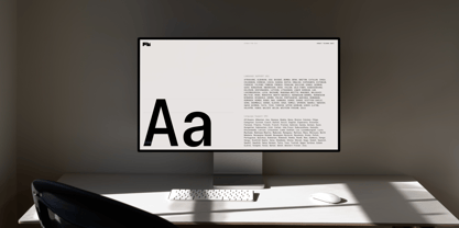 Arbeit Technik, a semi-mono condensed variation of the Arbeit Pro typeface, is designed specifically for technical drawings and user interface applications. With a Stylistic Set that allows users to remove the 'mono' style serifs, this typeface offers versatility and a clean, professional appearance perfect for a variety of design projects.
 - Klose Slab by Studio Sun,
$20.00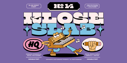 Introductory Klose Slab Another Vintage Typeface from Studio Sun (SUN014) for your Fonts collection. Klose comes with 4 style (condensed, normal, semi expanded, and expanded) also available in Variable Font format (for customize widths). Perfect for logotype, head text, displayed text, and many more). Klose support more 75 language (Latin pro).
 - Paneuropa 1931 by ROHH,
$19.00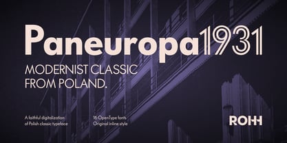 Paneuropa 1931™ is a faithful recreation of XX-century Polish classic, made by Idzikowski foundry in Warsaw, 1931. Original Paneuropa was a renowned and highly popular typeface in XX-century Poland, and was widely used in all kinds of design, editorial use and printed materials for decades. Paneuropa is a geometric, clean and versatile font family inspired by Paul Renner's famous Futura - it is a bit narrower, with different proportions and details in drawing, completely different figures and punctuation shapes than Futura. It is an interesting and refreshing alternative to Futura with its own distinct personality and a subtle authentic vintage flavour. Paneuropa 1931 contains separate styles for display and large sizes as well as styles for small text sizes - differing in spacing and the softness of letterforms. The family features an original Paneuropa Double font - a beautiful inline style for headlines and display use. The whole family is completed with added missing inbetween styles as well as italics. The original subfamily set is available for purchase and it contains solely the original Paneuropa styles (Thin, Regular, Bold, Text Regular, Text Italic, Double). Paneuropa 1931 characteristics: letter shapes and proportions are very faithful to the original, keeping its idiosycrasies and inconsistencies spacing and kerning are carefully adjusted in order to achieve the colour of the original fonts, keeping maximum possible consistency - a compromise between authentic vintage feel and legible consistent text colour (for hardcore users: just turn off the kerning) weights precisely matching the original (Thin, Regular, Bold, Text Regular, Text Italic, Double), inbetween weights were added (Light, Demi Bold, as well as missing italic styles) italic angle faithful to the original (8 degrees) softened corners help achieving the character of old imprecise printed display styles for big sizes are sharper and have tight spacing, text styles have softer shapes (recreating small print imperfect print) and broader spacing for use in paragraph text (spacing in both display and text styles matches the original as well) original style names in Polish for devices with Polish set as their primary language The family is very versatile. The Inline style as well as bold and thin weights are perfect for headlines and display use, other styles works wonderfully as paragraph text. Paneuropa 1931 consists of 18 fonts - 5 display weights with corresponding italics + 3 text weights with corresponding italics + 2 inline styles (for big and small print sizes). It has extended support for latin languages, as well as broad number of OpenType features, such as case sensitive forms, fractions, superscript and subscript, ordinals, currencies and symbols.
 - Madriz by SilverStag,
$14.00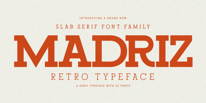 Introducing Madriz, a slab serif font with a retro feel that's perfect for any project that needs a touch of old-school charm. With over 32 fonts in one font family, Madriz offers a wide range of styles to suit any need. You can choose from Thin to Black weights and Regular to Extra Expanded widths to create your perfect look. Madriz is inspired by the old-school signage of Madrid, Spain. The name "Madriz" is actually the affectionate nickname that Madrileños, the people of Madrid, gave to their city. The font's bold, blocky letters capture the essence of Madrid's vibrant and historic streets. Madriz's versatile nature makes it a great choice for a wide range of projects. Its bold, retro style is perfect for showcasing heritage brands or giving a modern touch to classic designs. Madriz can also be used to create a sense of nostalgia, making it ideal for retro-themed projects or campaigns. Here are some of the ways you can use Madriz: Titles and headings: Madriz's bold, eye-catching style is perfect for titles and headings. Text blocks: Madriz's wide range of weights and widths makes it suitable for text blocks, from body copy to large paragraphs. Logos and branding: Madriz's retro charm makes it a great choice for logos and branding. With its 32 font styles and support for over 90 languages, Madriz is an incredibly powerful tool for any designer. It can be used to create a variety of looks, from classic and elegant to modern and edgy. Whether you're working on a print project, a web design, or an app, Madriz has the potential to make a lasting impression. Madriz is the perfect font for anyone who wants to add a touch of old-school charm to their designs. With its wide range of styles and features, Madriz is sure to make a statement in any project. Would you like to get 5 completely free fonts worth over $75? No tricks, no hidden words, terms or anything. Just subscribe to my newsletter, make sure to check your email to approve the subscription, add me to your contacts so that the emails don't end up in spam folder and you will get 5 fonts for free. The fonts are packed with alternates, ligatures and some even come with extra goodies. Happy creating everyone!
 - Stone Dense by Putracetol,
$20.00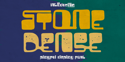 Stone Dense is a playful display font. Stone Dense has a large number of ligatures, 160 ligatures. So that makes this display font more playful and unique. And Stone Dense has a bold body, with unequal widths for the characters. Stone Dense can suitable for your projects that require fonts with bold and strong characteristics. Such as branding, logos, titles, headlines, printing, magazines, quotes, posters, fashion, t-shirts, apparel and others. Stone Dense is also support multi language.
 - Right Potions by Sarid Ezra,
$19.00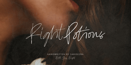 Introducing, Right Potions, handwritten script family! Right Potions is a handwritten script family contains three weight from light to bold. With ligatures and underline, this fonts will make your design more naturally handwritten. You can use this fonts to make logo and branding, magazine, aesthetic post, and also handwritten quote. Right Potions also support multilingual! Foreign Languages Support: ÀÁÂÃÄÅÇÈÉÊËÌÍÎÏÐÑÒÓÔÕÖØÙÚÛÜÝßàáâãäåæçèéêëìíîïðñòóôõöøùúûüýÿ What Will You Get: Right Potions Light (TTF/OTF) Right Potions Regular (TTF/OTF) Right Potionsn Bold (TTF/OTF)
 - Dutche by Craft Supply Co,
$20.00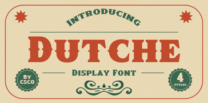 Dutche: Boldly Defined Meet Dutche – Display Serif, where boldness takes center stage. This thick, low-contrast serif font stands out. Added serifs on stems enhance its masculine aura. It’s eye-catching, making a statement with every word. Masculine Appeal Dutche offers a sturdy, masculine look to your text. The extra serifs bring a unique toughness. Its bold nature catches the eye immediately. This font doesn’t just say; it declares. Furthermore, it works great for headlines and logos.
 - Atnew by Outerend,
$18.00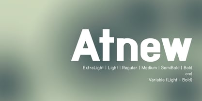 "Atnew" is a modern typeface that includes six individual fonts (ExtraLight, Light, Regular, Medium, SemiBold, Bold) and a variable font ranging between Light (50pt) and Bold (200pt). Keeping geometric shapes but with soft curves gives fonts a playful feel. They can be used in interfaces, websites, posters, stationery, tv show credits, and many other purposes. It could be for your everyday activities like journaling. The variable font version provides more flexibility for your needs by fine-tuning weight points.
 - Leira by WildOnes,
$10.00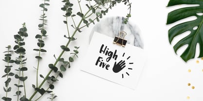 Leira hand drawn typeface is drawn by hand with a thick brush, resulting in really bold characters with some shakiness in line to get that personal touch feel. This typeface will suit for headlines, logo, titles, identities, packaging, posters, cards, quotes, etc. With the uniqueness of the shapes, Leira can definitely attract attention of anyone and be an eye catching font. The bold letters and playfulness of this font makes it stand out from the crowd.
 - Bodebeck by Linotype,
$29.99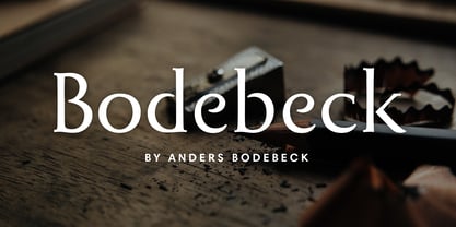 The Swedish designer/typographer Anders Bodebeck designed the Bodebeck type family in 2002. The family, which includes five different styles, is primarily intended for use as a titling, or display face, and belongs to the neo-transitional style of typefaces. Transitional style type first appeared in England during the late 1750s, when John Baskerville released his first sets of type. Bodeck bears similarities to another, later transitional style typeface as well - Eric Gill's Perpetua (originally released by the British Monotype Corporation in 1928). Like these two previous English stonecutters turned masters of typography, Anders Bodebeck has given us a modern re-interpretation of classic letterforms. Bodebeck, which is fitted with old style figures, is available in the following styles: Regular, Italic, Bold, Bold Italic, and Extra Bold."
 - WC_AquaBlues_Bta - Unknown license

- Covington - Unknown license

- Plasmatica - Unknown license

- Pervitina Dex - Personal use only

- Flatstock - 100% free

- LOL! - Personal use only

- YES! - 100% free

- London - Personal use only

- Clashed Dinosaurs - 100% free

- Moderna - 100% free

- Fleet Street - Unknown license

- Key Tab Metal - 100% free

- Garbageschrift - Unknown license

- Prodotto In Cina - Unknown license

- Giza RE by Font Bureau,
$40.00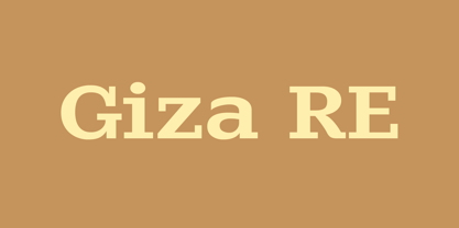 Giza brings back the colorful power and variety of the original Egyptian letterforms, a glory of the Victorian era. Designer David Berlow based the family on showings in Vincent Figgins’ specimen of 1845, the triumphant introduction of this thunderous style. This version of the family is part of the Reading Edge series of fonts specifically designed for small text onscreen, having been adjusted to provide more generous proportions and roomier spacing, and having been hinted in TrueType for optimal rendering in low resolution environments.
 - Mellow Serif by ParaType,
$30.00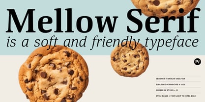 Mellow Serif is a soft and friendly typeface. It looks compelling in large point sizes due to the rounded terminals and calligraphic details. Mellow Serif also works well in body text with a small leading size as it has even proportions and a large x-height. Mellow Serif includes ten styles—five upright and five italic, ranging from Light to Extra Bold. The typeface supports extended Latin, extended Cyrillic, and Greek. The character set also includes old style figures, small caps in the Light, Regular, and Medium upright styles as well as stylistic alternate sets that slightly change the way Mellow Serif looks in large point sizes. The Regular style also has alternative letterforms with swashes. Mellow Serif is great for book printing (from fiction and children’s books to science literature), headings, and large texts on the web as well as for toys and confectionary packaging. It also works perfectly with a rounded sans serif Mellow Sans. Mellow Serif was created by Natalya Vasilyeva, an expert in designing text and calligraphic typefaces, and released by Paratype in 2023.
 - Culoare by Luxfont,
$18.00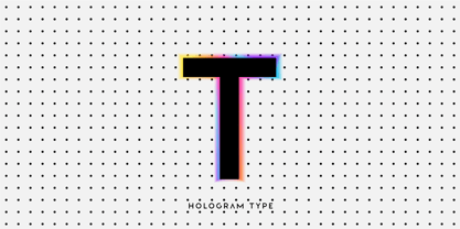 Introducing space-bright COLORED hologram font. Soft color transitions combined with minimalistic clean glyphs. Ideal for modern web and print design. Excellent readability of glyphs for both the title and the large volume of text is preserved. Multi-colored modern family with different types of coloring - a highlighted gradient border of letters or fully hologram glyphs - a large selection of 11 ready-made font styles. Originality of the font will fit well into the fashionable logo, headline in the magazine or on the website, emphasize the trend of the product in branding and complement web advertising on social media. This font family is based on the Regular font Boldini - which means that if necessary you can combine these two families and they will be absolutely stylistically identical and complement each other. Check the quality before purchasing and try the FREE DEMO version of the font to make sure your software supports color fonts. Features: Free Demo font to check it works. 11 OTF SVG color fonts in the family Free Demo font to check it works. Gradient and hologram fonts Kerning IMPORTANT: - OTF SVG fonts contain vector letters with gradients and transparency. - Multicolor OTF version of this font will show up only in apps that are compatible with color fonts, like Adobe Photoshop CC 2017.0.1 and above, Illustrator CC 2018. Learn more about color fonts & their support in third-party apps on www.colorfonts.wtf -Don't worry about what you can't see the preview of the font in the tab "Individual Styles" - all fonts are working and have passed technical inspection, but not displayed, they just because the website MyFonts is not yet able to show a preview of colored fonts. Then if you have software with support colored fonts - you can be sure that after installing fonts into the system you will be able to use them like every other classic font. Question/answer: How to install a font? The procedure for installing the font in the system has not changed. Install the font as you would install the classic OTF | TTF fonts. How can I change the font color to my color? · Adobe Illustrator: Convert text to outline and easily change color to your taste as if you were repainting a simple vector shape. · Adobe Photoshop: You can easily repaint text layer with Layer effects and color overlay. ld.luxfont@gmail.com
 - SF Junk Culture - Unknown license

- Trolley JNL by Jeff Levine,
$29.00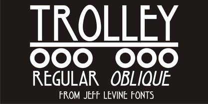 The Art nouveau era sheet music "Goodbye Sweet Old Manhattan Isle" (1905) offers up a classic hand lettered sans reflective of that era. It is available digitally as Trolley JNL in both regular and oblique versions.
 - Evil Ways JNL by Jeff Levine,
$29.00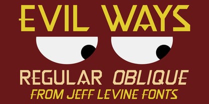 The April 8, 1932 issue of The Film Daily ran an ad for a film entitled "The Sin of Lena Rivers". Hand lettered in a block style of chamfered characters, it is reminiscent of the 1920s, but still carries a touch of Art Deco influences with the thinner and extended horizontal strokes of the E, F and H. This retro sans serif design is now available digitally as Evil Ways JNL in both regular and oblique versions.
 - Ravelion by Typehand Studio,
$18.00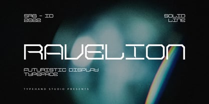 Ravelion is a sans serif all caps display font. Available in reguler and line style. Ravelion is made for futuristic font display. Ravelion is a funky, future-forward typeface set up perfectly any sci-fi space thriller. If you're a fan of futuristic fonts, this one is for you! Ideal for contemporary, sci-fi and space designs, you can also apply this on adventure, branding, or music themes. Try different styles and experiment with kerning for best results.
 - Rekusen by Product Type,
$15.00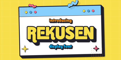 Rekusen is a modern and bold sans-serif display font that stands out with its cleanness. Perfect for branding, headlines, and editorial design, this font is sure to make a statement. The unique combination of thick and thin strokes creates a dynamic and eye-catching appearance that draws attention to your message. In addition to its stylish design, Rekusen also features a wide range of alternate characters and ligatures that allow for creative customization and increased versatility. With alternates and ligatures, this font provides endless possibilities for unique and impactful designs. And with support for multiple languages, it can be used across a variety of projects with ease. Whether you’re designing a logo, creating a poster, or crafting a website, Rekusen is a powerful tool that will help you achieve your design goals with style and sophistication. Its modern, clean, and versatile design makes it a perfect fit for any project that needs a touch of boldness and professionalism. What’s Included : - All glyphs Iso Latin 1 - We highly recommend using a program that supports OpenType features and Glyphs panels like many Adobe apps and Corel Draw, so you can see and access all Glyph variations. - PUA Encoded Characters – Fully accessible without additional design software. - Fonts include Multilingual support
 - Emedan by Cercurius,
$19.95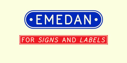 An all-capitals reversed sans-serif font, designed for easy creation of signs, labels and banners. Various endpieces are included. Upright and italic can be combined.
 - Levarolls by Jehansyah,
$9.00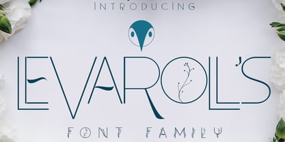 this is a cool sans serif font with a casual and complete with unique icons that you can make a logo or decoration on your design
 - Knappast by Cercurius,
$19.95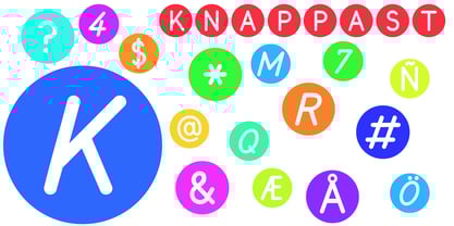 Sans-serif reversed capitals in circles, resembling typewriter keys. The font can be used for logos, signs and labels, and for markings on maps and charts.
 - Servus Slab by Dada Studio,
$29.00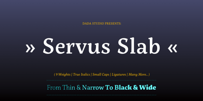 This family is very special to me. I started working on it right after my first son was born. I decided to name the typeface "Servus" which means "Hello" in my country. The whole idea of the family symbolizes a child’s growth. It starts with Thin and Narrow weights - just like a newborn baby - then it slowly grows to Black and Wide. As You can guess, my son is quite chubby now! And I can assure You that I put all my love into details. Servus consists of 9 weights which gives us 18 fonts with matching italics. Lights and Bolds, due to their strong personality, are perfect for display uses. At the same time, Regulars create a harmonious structure that provides good legibility in long texts. Servus covers all latin languages. It contains a wide set of numerals, small capitals, fractions, ligatures and other OpenType goodies.
 - VNI-Thufap3 - Unknown license

- Moldr Thai by Deltatype,
$59.00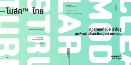 Moldr Thai, a sans-serif with modular grid structure with Thai script, inspired from handmade letter to industrial machine mold, Moldr come with 9 weights in complete family, Support many language with standard Adobe Lain 4 glyphs, world-ready and mark2mark support, especially Thai script.


