10,000 search results
(0.034 seconds)
- Sales Event JNL by Jeff Levine,
$29.00 Sales Event JNL is an inline sans that was modeled from examples of old wood type. Its casual, cheerful style well suits point-of-sale signage or banners, fun headlines and relaxed themes. The font is available in both the regular inline version and the black (solid) version.
 - Rotola TH Pro by Elsner+Flake,
$40.00 Karl-Heinz Lange presented his first drafts of Rotola during a Typoart® type design competition in 1985 under the name "Boutique". A year later, Norbert du Vinage, former manager of the type design department, integrated "Boutique" in his production plan. Due the Fall of the Wall, it took about 18 years until Lange finished this font family in cooperation with Elsner+Flake. Karl-Heinz Lange was born on July 29, 1929 in Wiesenkirch in West Prussia. He was enrolled in the Humanistic Gymnasium at Elbing from 1939 to 1945 and changed to the Wernigerode High School after his family had to flee to central Germany. From 1949 to 1951, Karl-Heinz Lange studied at the Werkkunstschule Halle, where one of his teachers was Professor Post. After 1951, he continued his studies at the Hochschule for Grafik und Buchkunst in Leipzig with an emphasis on book design. He received his diploma in 1955 with distinction based on his design of a hot metal typeface. From 1956 to 1961, Karl-Heinz Lange worked as a lecturer for Type and Commercial Graphics at the Hochschule für Angewandte Kunst in Magdeburg. From 1961 to 1963, he taught at the Hochschule für Grafik und Buchkunst in Leipzig, and finally as a freelance commercial designer in Magdeburg. He worked on a variety of assignments, one of which was the design of trick films. From 1969 to 1976 he took the position of Artistic Director of the Henschelverlag, Berlin; from 1976 to 1994 he was Professor of Type and Typography at the Fachschule für Werbung und Gestaltung in Berlin; and, until 2004, he taught at various institutes for advanced professional education. From 2005 to 2007 he taught at the Fachhochschule Magdeburg/Stendal. Karl-Heinz Lange was awarded the second prize at the "International Type Design Contest 1971" for a headline typeface, and, in 1984, at the XI. Biannual of Graphic Design in Brno, he won a Silver Medal for the design of his typeface family Publica. He created the telephone book typeface Minima and re-designed the Typoart Super Grotesk® (Arno Drescher, 1930) as well as the Newspaper typeface Magna® by Herbert Thannhaeuser for the use on digital typesetting systems. To the day of his death on June 29, 2010, Karl-Heinz Lange lived and worked as a type designer. Among others, he closely followed the designs of the typefaces which were developed under his guidance for Typoart®: "Publica®", "Typoart Super Grotesk®" and "Minima®" which he launched as "Publicala", "Minimala" and "Superla" in 2009. In cooperation with Elsner+Flake, he developed the Typeface family "Rotola" between 2006 and 2009 as well as the script families of the "Viabella®" series. To the end, he followed the development of his first typeface, the "Diplom Antiqua", which he also wanted to bring to market together with Elsner+Flake.
 - Argue by Sarid Ezra,
$17.00 Introducing, Argue - a stylish font based on sans serif! Argue is an elegant and modern sans serif with a bunch of features that will make your presentation or logo more stunning and stand out! You can use this font for several purposes such as a wedding invitations or even your own branding! This fonts support Multi Language and already PUA Encoded! Also comes with beautifully crafted details that make this font more stylish. Features Uppercase & Lowercase Number & Symbol Multi language Alternates PUA Encoded
 - EB Mensch by Eko Bimantara,
$19.00EB Mensch is a complete humanist sans and serif font family. EB Mensch emphasize expressive and fun characters that visualized by it's letterforms; Large x height, low caps, spacious counters and apertures, characterized by diagonal and sunken stroke ends. Perfect for large display and also to be read in small size. Mensch contain 32 fonts consist of sans and serif styles with 8 weight from thin to black with each matching italics. Its contain more than 440 glyphs which support broad latin languages. - Malohallo by Maulana Creative,
$15.00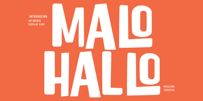 Malohallo is a Fun Display font. With Bold sharp and round edge combine stroke, fun character with a bit of ligatures and alternates. To give you an extra creative work. Malohallo font support multilingual more than 100+ language. This font is good for logo design, Social media, Movie Titles, Books Titles, a short text even a long text letter and good for your secondary text font with script or signature. Make a stunning work with Malohallo font. Cheers, Maulana Creative
 - Groen California by Fargun Studio,
$19.00 Introducing Groen California Font. It’s a cool and fancy font duo. When combined, these two fonts will add a unique spark to any design project! Here’s a run through everything included in this product: Groen California Sans is a modern and bold sans serif typeface featuring characters that stand out from every background. Groen California Script is a brush font with beautiful and natural brush stroke with Alternates and Ligatures, that perfect for logo, poster, product, apparel, packaging and many more.
 - Tablica by RMU,
$30.00 Inspired by Typoart’s Minima, Tablica which comes in three styles - Regular, Italic, Bold - fills ideally narrow columns, charts and tables. Since all numerals are monospaced, you can sum up all numbers of a table. Though this is a condensed sans serif family, it offers a high legibility even in small degrees.
 - Serba by Sealoung,
$15.00 Serba is a fun, unique look serif display. With a modern look, it looks perfect when paired with a conventional serif/sans serif. It can be used for mastheads, posters, business identity and just about anything else. The all-inclusive also includes the complete set: All caps Multilingual character Number Punctuation
 - Gollder Vintage by Jinan Studio,
$12.00 Introducing, Gollder Vintage Font Duo is an excellent choice for logo design, branding, packaging, business cards, and adventure-themed designs. Its combination of script and sans serif styles, along with the textured and solid options, provides ample creative opportunities for designers to explore and create stunning visual identities and marketing materials.
 - Mousseline Pro by fontcastle,
$100.00 Mousseline Pro is hand drawn font a fresh, sans serif font family. Simple and adaptable, this font will make each of your designs look great. Have fun with this beautiful font and explore its endless variations. The typeface is versatile and can be successfully used in Magazines, Posters, Branding, Websites etc.
 - Elevator by Tyler Jamieson Moulton,
$11.00 Elevator is a variable, industrial sans serif created by TJM Type. It has two variable axes; a weight axis and a stylistic axis that raises and lowers the letters crossbars. Elevator is perfect for poster and print design, and now as a variable font, it's even more fun on the web.
 - Mexican Tequila - Personal use only

- Oomph - Personal use only

- Elephants in Cherry Trees - Unknown license

- Rub This! - Unknown license

- Gilgongo Kaps - Unknown license

- Fudd - Unknown license

- Bulltoad by Typodermic,
$11.95 Bulltoad is a set of 32 fonts with thematic icon counters. The icons include apple, boat steering wheel, classic bomb, bone, butterfly, maple leaf, car icon, crosshair, crucifix, skull, U.S.A. Democrat icon, female symbol, fish, medical cross, hemp leaf, Jesus fish, jet airliner, old-fashioned key, heart, shamrock, male symbol, crescent moon, peace sign, pistol, question mark, U.S.A. Republican icon, rose, star, smiley face, star of David, sun, and lightning bolt. Most Latin-based European writing systems are supported, including the following languages. Afaan Oromo, Afar, Afrikaans, Albanian, Alsatian, Aromanian, Aymara, Bashkir (Latin), Basque, Belarusian (Latin), Bemba, Bikol, Bosnian, Breton, Cape Verdean, Creole, Catalan, Cebuano, Chamorro, Chavacano, Chichewa, Crimean Tatar (Latin), Croatian, Czech, Danish, Dawan, Dholuo, Dutch, English, Estonian, Faroese, Fijian, Filipino, Finnish, French, Frisian, Friulian, Gagauz (Latin), Galician, Ganda, Genoese, German, Greenlandic, Guadeloupean Creole, Haitian Creole, Hawaiian, Hiligaynon, Hungarian, Icelandic, Ilocano, Indonesian, Irish, Italian, Jamaican, Kaqchikel, Karakalpak (Latin), Kashubian, Kikongo, Kinyarwanda, Kirundi, Kurdish (Latin), Latvian, Lithuanian, Lombard, Low Saxon, Luxembourgish, Maasai, Makhuwa, Malay, Maltese, M?ori, Moldovan, Montenegrin, Ndebele, Neapolitan, Norwegian, Novial, Occitan, Ossetian (Latin), Papiamento, Piedmontese, Polish, Portuguese, Quechua, Rarotongan, Romanian, Romansh, Sami, Sango, Saramaccan, Sardinian, Scottish Gaelic, Serbian (Latin), Shona, Sicilian, Silesian, Slovak, Slovenian, Somali, Sorbian, Sotho, Spanish, Swahili, Swazi, Swedish, Tagalog, Tahitian, Tetum, Tongan, Tshiluba, Tsonga, Tswana, Tumbuka, Turkish, Turkmen (Latin), Tuvaluan, Uzbek (Latin), Venetian, Vepsian, Võro, Walloon, Waray-Waray, Wayuu, Welsh, Wolof, Xhosa, Yapese, Zapotec Zulu and Zuni.
 - Lunasequent - Unknown license

- Patsy PB by Pink Broccoli,
$14.00 Patsy is a quirky sans-serif font inspired by the titling sequence from the 1964 film, "The Patsy", starring Jerry Lewis. Heavyweight, yet fun and full of personality, it was a lettering styles that was so much fun to flesh out and make into a typeface. I've opened up the letter spacing lightly from the original film poster design for better readability at a range of sizes. With an alternating all-caps character set, and offbeat letter weighting, Patsy is fun to typeset with as the font auto-switches between Capitals and Lowercase (alternate capitals) no matter if you type all caps or all lowercase.
 - Comic Mode by 38-lineart,
$24.00 Comic Mode is a warm, fun and comical sans serif family, "its an alternative for comic sans, with a more formal looks". Availavle of 9 weights from thin to black. with a curved character that is round on thin and increasingly elliptical on black. The unique look of comic Mode is the combination of a technical sans serif and casual handwriting . These 9 diffrent weights also come with oblique style, so there are 18 styles in this family and 1 variable font that are a relatively new font format that allow one font file to contain multiple stylistic variations. Fresh, unique and casual, make this font really worth having.
 - Almatine by Arterfak Project,
$15.00 Almatine Script is a classic signature font inspired by classic handwriting that using a flat pen (or signature pen) and written in the low height of letterforms. There is Almatine Sans as the combination, a clean sans serif that you can use the sans serif for sub-headline, tagline, and body text. This font duo has elegant looks and modern that perfect for logotype, display, labels, watermarks, signatures, signage, photography, weddings, advertisements, fashion, food, magazines, and much more! Almatine Script equipped with some OpenType features such as stylistic alternates, stylistic sets, and ligatures that you can mix and match to get the natural handwriting looks!
 - DECOST - Unknown license

- BBQcow - Unknown license

- Josef K Patterns by Juliasys,
$9.60 Franz Kafka’s manuscripts have always been a source of inspiration for designer Julia Sysmäläinen. At first she was just interested in literary aspects but later she noticed that content and visual form can not be separated in the work of this ingenious writer. Analyzing Kafka’s handwriting at the Berlin National Library, Julia was inspired to design the typeface FF Mister – by now a well known classic. Over the years, FF Mister K became a handsome typeface family and even produced offspring: the Josef K Patterns. Some of Kafka’s most expressive letterforms were the starting point for these decorative ornaments. How do the Patterns work? Outlines and fillings correspond to the uppercase and the lowercase letters on your keyboard. You can use them separately or layer them on top of each other. If you write a line of “pattern-text” in lowercase and repeat it underneath in uppercase you get a row of fillings followed by a row of outlines. Now you can color them and then set line space = 0 to get a single line of layered colored ornaments. Alternatively, activating OpenType / stylistic set / stylistic alternates will also unite the two lines to a single layered line. Further magic can be done with OpenType / contextual alternates turned on. On the gallery page of this font family is a downloadable Josef K Patterns.pdf with an alphabetical overview of forms. Hundreds of patterns are possible … we’d love to see some of yours and present them here on the website!
 - Sealt by Michael Rafailyk,
$9.00 Sealt Typeface is inspired by the oldest saltworks in Eastern Europe, founded in 1390 in Drohobych. Sealt means salt in Old English, so most letters are rough and sharp like salt crystals and seem to be carved out of the rock. View PDF Specimen: https://michaelrafailyk.com/typeface/specimen/Sealt.pdf Variable font: Sealt VF has weight axis and includes hundreds of weights ranging from Light (300) to Bold (700), so feel free to choose the most accurate weight that you need, using a slider. Localized Forms: 47 character substitutions for Azeri, Bulgarian, Catalan, Dutch, German, Kazakh, Moldavian, Polish, Romanian, Tatar, Turkish. Glyph Composition/Decomposition (Diacritics): Full Latin and based Vietnamese set of diacritics (561 characters). Precomposed. Ordinals: adehnorst. Superscript, Subscript, Numerator, Denominator: 0123456789. Fractions: ¼½¾⅐⅑⅒⅓⅔⅕⅖⅗⅘⅙⅚⅛⅜⅝⅞⅟ (precomposed). Any other fractions (even those typed through a slash) will also be displayed correctly, with the automatic replacement to Numerator + fraction + Denominator. Slashed Zero: All 0 figures, including Lining, Superscript, Subscript, Numerator, Denominator, and Fractions. Contextual Alternates: ΆΈΉΊΌΎΏ. Greek uppercase accented characters lose their tonos accent and retain only dieresis in All Caps mode. Turned on by default. If you need tonos accents in All Caps then turn off Contextual Alternates (calt) feature. Standard Ligatures: OO TT tt fi. Turned on by default. Language count: 480+. Kerning Class pairs: 4295. The promo images used photos of Albin Berlin, Hervé Piglowski, Karolina Grabowska, Scott Webb from Pexels and Dollar Gill from Unsplash.
 - Wonderbear PB by Pink Broccoli,
$14.00 From the title screens and comic books of the Hair Bear Bunch comes the fun and funky Wonderbear typeface. All that 70’s flavor packed into a Caps/Alt Caps typestyle reminiscent of a lovable limited run cartoon show. The Hair Bears miss you as much as you miss them. Relive the laughter.
 - ITC Resavska by ITC,
$29.99 Olivera Stojadinovic made her first sketches of the ITC Resavska family with the goal of creating a typeface that would be readable at small sizes. Stojadinovic added geometric serifs to the original design to create four weights in serif and sans serif sub-families. Each weight (except the black) has an italic counterpart.
 - Anglina Farmhouse by Letterara,
$14.00 A simple Anglina Farmhouse font looks unique and classy. Its beautiful charm makes it look absolutely stunning, easy to read, and, ultimately, incredibly versatile. This will add a fun and friendly touch to any of your projects. This font is PUA encoded which means you can access all the glyphs and sweeps easily.
 - Candy Grunge by Mvmet,
$12.00 Candy Grunge is a fun and comical sans serif font. You can use it for anything ranging from t-shirts, kids’ book designs, and greeting cards to stickers and posters, or anything that needs a casual touch. Fall in love with its incredibly versatile style and use it to create lovely designs!
 - Newspaper Publisher JNL by Jeff Levine,
$29.00 The Logansport, Indiana Pharos-Observer dated June 12, 1917 had the following headline running across its front page: “American Steamer Sunk by German U Boat”. The condensed slab serif typeface used to set that headline has been recreated digitally as Newspaper Publisher JNL, and is available in both regular and oblique versions.
 - Chennai Slab by insigne,
$29.00 Chennai Slab is an extension of the original Chennai. Chennai Slab is a simplified slab serif with over sixty OpenType alternates for the ball terminals, unique simplified alternates and more traditional capital forms. Use Chennai Slab when you need a fun and versatile slab serif. The sans-serif Chennai makes a great complement.
 - Bustellina by Krafted,
$10.00 Seeking to redefine your brand's image or add an extra essence to your projects? We've got you covered. Introducing Bustellina - An Elegant Sans Serif Font. Whether it's logos, digital assets, or print media, Bustellina leaves an enduring impression. Amplify your brand's visual identity with the captivating allure of this font. Have fun!
 - Mastro by Ndiscover,
$49.00 Mastro is a contemporary design comprising 72 styles. With 9 weights and 4 optical sizes: Caption, Text, Sub-head and Display. A super versatile font family ideal for editorial, graphic design, branding and web. Filled with iconic unusual shapes, yet with a super rigorous professional look this design will stand out and work efficiently. Caption styles are meant for very small text like footnotes; Text styles are meant for long strings of text; Subhead styles are meant for sub-headlines; Display styles are meant for large size type setting. Mastro has many OpenType features such as Small Caps, Standard and Discretionary Ligatures, Superscript Letters, Case Sensitive Forms, Lining Figures, Old Style Figures, Tabular and Proportional Numbers, and more. If you want to enlarge this font family make sure you get its sans counterpart: Mastro Sans.
 - Coastal by Arkitype,
$10.00 Coastal is a typeface made up of 12 fonts, it is a display sans family with some cues that give it a fun looking and informal type family. Coastal has rounded, rough, hand and outline versions so there are a lot of options to play around and have some fun with. Coastal is great for headlines, posters and artwork where larger type is needed. It also has some neat alternate glyphs that give the user a few more additional options to get creative with.
 - Criteria CF by Connary Fagen,
$35.00 Criteria CF is a geometric sans, efficiently built from lines and circles. Its strong, thoughtful construction allows for cleanly-stacked lowercase text and stunning headlines and logotypes. Criteria CF pairs nicely with any serif. Typefaces designed for body copy, such as Artifex CF and Addington CF, are a great match. It also looks great with bold display serifs like Wayfinder CF, or a humanist sans, like Artifex Hand CF. All typefaces from Connary Fagen include free updates, including new features, and free technical support.
 - RansomNote - Unknown license

- Quinquefoliolate - Unknown license

- Schneidler Latein by Spirit & Bones,
$33.00 The Schneidler Latein is a sharp and elegant Antiqua based on the ductus of the broad edged pen with a strong character. Running perfectly in paragraph text giving it something quite special and being effortlessly legible at the same time, Schneidler Latein works great in headings as well. Each glyph is a piece of art ready to be used in branding and blowup combining beauty and personality in a kick-ass blend. It is absolutely new to the digital world as it never has been digitized before. This new version digitized, further developed and extended by artist and graphic designer Lena Schmidt comes in nine styles from which there are four application-related ones like Subtext and Display and five weight-related ones like Bold and Heavy. Each style contains 948 glyphs, variations of numbers, three stylistic sets one preserving the historic forms of changed characters, small caps, open type features and superior and inferior characters. Designed by F. H. Ernst Schneidler the Schneidler Latein was released in 1916, the bold version in 1920 and the italics in 1921. Schneidler was born in 1882 in Berlin. He studied at the school for applied arts in Düsseldorf with professor F. H. Ehmcke and P. Behrens. He was as a painter, graphic designer and illustrator. In 1920 he was appointed as teacher in the school for applied arts Stuttgart. His students were Albert Kapr, Imre Reiner and Lilo Rasch-Naegele among others. Further well-known fonts from his hands are for example Legende, Amalthea, Schneidler Mediävel and Schneidler Antiqua. Lena Schmidt was born 1981 in Bremen. She is a german painter, graphic designer and illustrator mostly known for her huge wood carving paintings. From 2003 to 2011 she studied Fine Arts in Hamburg with professor Matt Mullican. From 2015 to 2019 she studied graphic design with a focus on type design at HAW Hamburg Department Design with professor Jovica Veljović. She lives and works in Hamburg, Germany.
 - P22 St G Schrift by IHOF,
$39.95 P22 ST.G Shrift is a font series based on the type designs of Stefan George with an italic version designed by Colin Kahn. Stefan George (1868-1933) was a German poet who led the revolt against realism in German literature. All of his works were privately published and the typefaces that were used reflected his neo-classic and anti-industrial (progessive) aesthetics; oftentimes consisting of his own hand lettering designs. The original font was cast in 1907 by a small foundry in Germany and was used primarily for the works of George as well as other books including a monumental edition of Dante's Divine Comedy. The ST.G Shrift Fonts contained in this set are derived from 3 known variations of the original roman typeface, St.G., found in various books published in Berlin in the early 20th century. ST.G Shrift One contains the most idiosyncratic characters, while ST.G Shrift Two uses more familiar characters as well as a redesign of characters including the t and the k to be more in keeping with modern san-serif designs. The OpenType version of the roman contains both one and two and expands on them by including central European characters, small caps, and small caps titling figures. The Small Caps titling figures are derived from the first version of the typeface. Below is a features list (accessible through the type palette in Adobe programs) and their functions: ST.G Shrift Opentype Features: Small Caps: Changes Lowercase to Small Caps Titling Figures: Changes Uppercase to Titling Caps, and Small Caps to Small Caps Titling Figures Contextual Alternates: Changes Character Set to match ST.G One and changes Small Caps to Titling Small Caps Ornaments: Changes < > and ? (greater, less and bullet) to ornaments ST.G Shrift Italic is an art nouveau version of the roman. The OpenType version includes central European characters, small caps, titling caps, titling small caps and ornaments.


