10,000 search results
(0.055 seconds)
- Vintage Monograms by Intellecta Design,
$16.00 A Monogram is a lettering character made up of the main letters of a name and sometimes all of them. It is a kind of design which dates from the earliest times of our history. It is a distinctive mark that everyone could have themselves, to apply to documents and many purposes. The signatures of ancient Kings were Monograms. Today this brand, for the people of taste, must have the cachet of this era or the evocative feelings of ancient times. Our predecessors knew how to create it by using the capital that preceded Gothic and the other characters. The Vintage Monograms collection contain hundreds of ready to use in alarge of shape of the letters, with styles from Victorian, to Art Nouveau and to mediaeval like in the old manuscripts. Ready to use fonts, Vintage Monograms collection is a classic that features elegant and intricate monograms perfect for branding and personalization. Its ornate designs evoke the timeless style of vintage logos and can be used to add a touch of sophistication to invitations, stationery, and packaging. Monogram brings an air of refinement and exclusivity to any project.
 - Quijote Sauvage by Lián Types,
$45.00 It was in the beginning of 2008 when I designed a font named Quijote, its predecessor. In the middle of 2009, I looked at it again and thought it could be a good idea to make an update of it. Variables and Features: Quijote Sauvage Pro is the most complete variable. It includes all the ligatures, alternates and swashes. It has the OpenType function in order to alternate glyphs easily when running applications which support this. The font is also offered separately. Quijote Sauvage Standard has the right glyphs to get an equilibrium between wildness and softness. It includes standard and discretionary ligatures. Quijote Sauvage Stylistic has the sharpest glyphs. Its decorative traces are discreet in order not to have problems as regards legibility. Its upper case are less wild than the other variables. Quijote Sauvage Text is the most discreet of its partners. This one was thought in order to improve legibility. Its ascenders and descenders are shorter, so the words are easier to read in small sizes. Quijote Sauvage Contextual, Swash and Titling, are the ones with wonderful terminals. They decorate words, adding a wonderful look of wildness or passion.
 - Hedwig Pro by Ingo,
$42.00 A modern sans serif with open round forms. The ”round“ letters emphasize the condensed open oval; the light counter forms provide the rhythm of the typeface, causing the typeface to appear gentle and pleasing. The ”modern“ design of a and g being especially contributive here. All of the letters are recognizably narrow, almost ”condensed,“ the forms being very functionally shaped. The construction of the ”triangular“ upper case letters A M N V W as well as v and w, especially catches the eye with the shafts joined together as beams are stacked upon each other. With this construction Hedwig displays a down-to-earth touch. Contrary to the classical sans serifs, a few letters were given light echoes of serifs which promote fluency: a d l are displayed below the line in a reading direction and end in a compressed but also very short serif style; on m n p r the upstroke is gently displayed and on u the downstroke. For all the typo-maniacs among you designers there are alternative forms for a number of letters in Hedwig: A B D G I M R W and a d f g j l ß u. Even an antiquated ”long“ s and an upper case ß is available. Plus, Hedwig includes numerous ligatures which can save that little bit of space where required and which allow the typeface to appear more variable: ch, ck, ct, fi, fj, fl, ff, ffi, ffl, ft, mm, ti, tt, tz.
 - Gator by Canada Type,
$24.95 Cooper Black's second coming to American design in the mid-sixties, after almost four decades of slumber, can arguably be credited with (or, depending on design ideology, blamed for) the domino effect that triggered the whole art nouveau pop poster jam of the 1960s and 1970s. By the early 1970s, though Cooper Black still held its popular status (and, for better or for worse, still does), countless so-called hippie and funk faces were competing for packaging and paper space. The American evolution of the genre would trip deeper into psychedelia, drawing on a rich history of flared, flourished and rounded design until it all dwindled and came to a halt a few years into the 1980s. But the European (particularly German) response to that whole display type trend remained for the most part cool and reserved, drawing more on traditional art nouveau and art deco sources rather than the bottomless jug of new ideas being poured on the other side of the pond. One of the humorous responses to the "hamburgering" of typography was Friedrich Poppl's Poppl Heavy, done in 1972, when Cooper Black was celebrating its 50th anniversary. It is presented here in a fresh digitization under the name Gator (a tongue-in-cheek reference to Ray Kroc, the father of the fast food chain). To borrow the title of a classic rock album, Gator is meaty, beaty, big and bouncy. It is one of the finest examples of how expressively animated a thick brush can be, and one of the better substitutes to the much overused Cooper Black. Gator comes in all popular font formats, and sports an extended character set covering the majority of Latin-based languages. Many alternates and ligatures are included in the font.
 - Beverly Hills by Monotype,
$29.99Beverly Hills is an all-caps display face in the Art Deco style. Its design features dramatically low crossbars, and each letter has a fine inline highlight. The most prominent letters in this typeface are clearly the E, F, G, and K, while the elegantly narrow S is sure to delight. A classy offering like Beverly Hills should only be set very large, either as a magazine headline, a store sign, or on the cover of a fine invitation. If you like Beverly Hills, you make enjoy other high-contrast Art Deco designs in Linotype's library, including ITC Anna, Avenida, Broadway, Jazz, and ITC Manhattan. - Quintet by Lauren Ashpole,
$15.00 Quintet is a narrow, stylized sans serif font made up of thin, looping lines. This font tries to walk the line between retro and modern and to incorporate some hand drawn imperfections without being too obvious about it. I kicked off designing without any particular inspiration in mind but, as time went on, started associating it in my head with an old-timey, swingy jazz aesthetic. So hopefully it captures the spirit of the Jeeves and Wooster throwback theme song and opening credits, the music of Stéphane Grappelli and Django Reinhardt (who the name is a nod to), and countless album covers from that era.
 - Trapper by Typeco,
$29.00Trapper is so named because it exploits a typographic design mechanism known as ink traps purely for graphic effect. Ink traps are a device used by type designers to create significantly higher legibility under adverse printing conditions, especially when the intended use of the type is to be printed at small sizes on mediocre substrate. For Trapper the ink trap is overused for exaggerated visual effect. This gives the Round version a playful twisted balloons look while the Sharp has a stern mechanical default effect. Trapper is a versatile font family of 8 fonts -- Sharp and Round variations in regular and bold weights each with an accompanying oblique. - Armin Grotesk by W Type Foundry,
$25.00 As a graphic designer, sometimes it’s impossible not to be inspired by the Swiss Style, specifically the work of Armin Hofmann, who is one of its best exponents. Grids and grotesk and neo-grotesk typefaces are a fundamental part of the tools that make this aesthetic possible. A visual language that has caused full admiration since we were students. Therefore, we decided to design Armin as an homage to Hofmann’s work. Technically, we added stylistic sets applied to the letters –G, R, a, g, h, l, m, n, r, t, u, y– to make Armin more eclectic and suitable for the creation of any visual language.
 - Verlo by Kufic Studio,
$15.00 Verlo is a modern minimalist font that compliments any sort of graphic and web design. This font is perfect for branding, wedding invitations, magazines, business cards, quotes, posters, and websites. The complete font set includes; Regular, Italic, Light, Light Italic, Bold & Bold Italic will bring a unique and tender look to your overall design, as any typeface is a major part of the design. The font is designed so easily be read & bring a minimalist effect to any kind of design. Kufic Studio is a platform that provides professional and high-quality designs & fonts to fill the gap that has been missing in the market.
 - Cynosure by Device,
$39.00Cynosure is a humanist sans with a subtle thick/thin stress. This gives it a clean, sharp elegance and precision that can be missing in some more familiar monoline sans faces. The wide range of weights and the matching reweighed italics make it a versatile solution where a consistent appearance across a broad range of applications is required. Its clear and inarguable design make it suitable for a wide variety of uses, from corporate to entertainment, text to headline, signage, logotypes, magazines and reports. The italics retain the design of the upright across all characters, again ensuring consistency. Includes tabular, lining and old-style numerals. - Havel by T4 Foundry,
$39.00Havel is an updated interpretation of a Czech type design from the 1930s. It is powerful and very condensed. At a quick glance you might find kinship with other condensed typefaces of the same period, like Spire (Sol Hess, 1937), Onyx (Gerry Powell for ATF, 1937) or Quirinus Bold (Alessandro Butti, 1939). But Havel has its very own look, rooted in the rapidly disappearing "Eastern European Type", a typographical tradition where poster and packaging design were the highlights. Torbjörn Olsson has revived this classical Czech beauty, and the Open Type version, Havel Pro, can also be used for Czech, Hungarian, Polish, Estonian, Latvian and Lithuanian. - Mortice by ArtyType,
$24.00 I set out to create a solid, bold, strong, rugged font, one that would lend itself to any industrial type of use, and by that I mean industry in general, but probably sectors that would still be considered male preserves such as carpentry or metalwork. I thought specifically of mortice & tenon joints, whilst toying with shape and form for this self imposed challenge. I was also visualizing a router tool used for producing most wood joints nowadays. I think the general premise worked out well; in the end I settled on the name Mortice, referring to the slots or negative spaces that the matching part, or tenon would fit into.
 - Plan by Characters Font Foundry,
$17.50 Plan is a corporate typeface made for 'Plan A Ontwerp', a graphic design studio based in Eindhoven, The Netherlands. Based on the rough sketches of the founder of Plan A Ontwerp, Frank Vogt, Characters constructed, mastered and finetuned the complete Plan Family. Plan comes in three versions; Plan A, Plan B and Plan C. All versions can be mixed because they share the same metrics, spacing and kerning. Where Plan A is a strong display type, Plan B has more details and is therefore better suited for longer and smaller texts. Plan C is a decorative stencil version with an own personality and dynamic.
 - Breaktime by Mightyfire,
$15.00 Step into the future with Breaktime, a cutting-edge digital futuristic font that seamlessly merges technology, innovation, and style. Inspired by the sleek aesthetics of tomorrow's digital landscape, Breaktime embodies a perfect synergy of form and function. Whether you're designing a tech-forward website, a space-age poster, or a forward-looking logo, Breaktime is your gateway to a digital tomorrow. Embrace the future of typography with this innovative font and let your creations resonate with the essence of tomorrow's possibilities. Breaktime – where technology meets typography in perfect harmony. We're proud and honored if Breaktime can be the part of your special projects. Thank you :)
 - Bulbis by Azzam Ridhamalik,
$10.00 Introducing Bulbis, the latest addition to our font collection. This unique bubble font is inspired by graffiti and street art, infused with a modern layout that is sure to stand out. The font also incorporates a mix of y2k culture and streetwear visuals, which are currently trending in design identities. With its eye-catching appearance, Bulbis captures attention right from the start, drawing the viewer in to explore its fun and dynamic features. The font is versatile and can be used for a variety of design projects, from logos and branding to social media graphics and more. Give your designs a fresh and modern edge with Bulbis font today!
 - Erimboo by Typehead Studio,
$25.00 The "Erimboo" font is a perfect embodiment of the beauty and elegance of calligraphic style. Key Features: ~ Smooth lines and beautiful handwriting flow. ~ Elegance and a classic touch, suitable for designs that require a luxurious ambiance. ~ Creative and diverse letter characters, making it perfect for titles, logos, invitations, and much more. ~ Includes various opentype options like ligatures, alternate characters, and numerals for flexibility and variation in your designs. The "Erimboo Script " font is the perfect choice for those who appreciate the beauty of calligraphy in their designs. With its unique characters and unparalleled quality, this font will be a valuable asset in your collection.
 - Chilango by Ed Garland,
$28.00 Chilango is a beautiful new typeface based on the gorgeous hand-painted street signs of Mexico City.., It come with 7 weights and a unique Italic family. Throughout Mexico City, from the Centro Historic (Zocalo) through La Condessa, Polanco and Guerrero - from La Roma to San Rafael to Atlampa to Lomas, you can be sure to see the iconic hand painted blue with white lettered street signs wherever you go. It is an exuberant and flourishing font that represents this fabulous flourishing city to its core. It is a historical one, classy and stylish and deeply routed in the curvature and designs of the Spanish heritage.
 - Nightlife by Studio K,
$45.00 Nightlife is a neon style font family reminiscent of Broadway, Hollywood, Las Vegas and the bright lights and razzamatazz of show business. Not that I want to typecast it. It’s a fluid type style that is equally at home on food and drink, confectionery and fmcg packaging: my original working title for it was ‘Jelly Bean’, for reasons that should be obvious! (Note to designers: to create the neon glow effect in Photoshop, make a duplicate of the type layer, rasterize it and add a Gaussian blur filter of approx. 50%. Then bring the original type layer to the top and offset it as required).
 - Charlize by GRIN3 (Nowak),
$26.00 Charlize is a handwritten, fully connected script with ligatures to help with flow and readability. It can be used for invitations, greeting cards, posters, advertising, weddings, books, menus etc. Charlize pro is the most complete style, it contains over 740 glyphs. Every lowercase letter has six variations (uppercase letter has two). To get the alternate glyph just add "+","*","--","__","++" or "==" before the letter in any OpenType savvy application or manually chosen the characters from Glyph Palette. Charlize One and Charlize Two have less glyphs than the Pro one, they contain less alternates and ligatures. Language support includes Western, Central and Eastern European character sets, as well as Baltic and Turkish languages.
 - Biblia Serif Display by Hackberry Font Foundry,
$12.95 What I needed in my projects was a solid oldstyle serif typeface with impact for heads. I had an old engraving font, which I’d never really finished. It happened to be built on the Minister/Diaconia base drawings I used to create Biblia Serif, so I took a shot at it. It’s wide enough to minimize the large solid ink shapes of many of the bolder display headline faces. It’s not readable, but it’s very legible. This is exactly what I needed for headlines, callouts, and special subheads. It uses the same vertical metrics of the Biblia Serif book Production Group It helps keep fiction designs comfortable
 - Ceudah by PojolType,
$12.00 Ceundah font is inspired by thick and thin Hand Sketches. This font can be used for film titles, magazine titles, newspaper front pages, billboards, or company brands.
 - Maqueen by Forberas Club,
$16.00 Maqueen font create with simple and clean style. You can apply this font to simple and happy design. Can be use too for cover and cartoony style.
 - Candillas by Forberas Club,
$16.00 This Candillas font is made with a marker that has a curve that looks beautiful to look at and can be used for a variety of purposes.
 - Diesel Rudolf by Ingo,
$82.00 Write like the inventor of the diesel engine — it’s possible with the Diesel Rudolf Script (patterned after the original handwriting of Rudolf Diesel)... In 2008 the city of Augsburg and the MAN Group celebrated the 150th birthday of Rudolf Diesel, inventor of the diesel engine which was named after him. With the help of a few preserved original letters, it was possible to create a convincing digital version of Rudolf Diesel’s personal handwriting. The engineer and inventor Rudolf Diesel was born in Paris in 1858 and also went to school there. In1870 his family moved to England and Rudolf was sent to relatives in Augsburg where he continued going to school. Later, after completing his studies in Munich, he began working as an engineer in the machine factory Linde. Alone this part of his life makes clear why Rudolf Diesel’s handwriting was so ”jerky,“ hesitant and inconsistent. He learned to write according to the French style, that is, Latin cursive — completely different from the very correct and neat German handwriting taught at that time which he had to learn at 13 years of age. These circumstances explain why his handwriting is ”messy“ (especially for those days) with its mixtures of letter forms within a text, even within individual words. Plus, he obviously did not attach much importance to ”pretty writing.“ Sometimes the characters are wide, then narrow, sometimes large and clear and then again crammed and primitive. The individuality is emphasized with characteristics derived from quill and ink. The diversified images of the font Diesel Rudolf Script make more than 80 ligatures and stylistic alternates possible which can be selected with help from the OpenType functions Ligatures and Discretional Ligatures.
 - Sepulcra - Personal use only

- Eckhardt Signwork JNL by Jeff Levine,
$29.00Eckhardt Signwork JNL was inspired by visual images collected by two great nostalgia sites: www.forgotten-ny.com and www.norelevance.com. The vintage signage photographed and saved for posterity on both sites reflect an age when hand-crafted work was the rule, rather than the exception [as is today]. Although somewhat limited in scope, this font can best be used for retro or nostalgic embellishments in ads or design work. There's also a generous amount of blank panels to insert your own copy for special projects. As with previous typefaces in this series, the font is named in honor of the late Al Eckhardt, owner of Allied Signs in Miami, Florida - a talented sign man and Jeff Levine's good friend for 18 years. - Merlo Neue Round by Typoforge Studio,
$29.00 Merlo Neue Round is the younger brother of Merlo Round and cousin of Merlo Neue. This new family received a refreshed, rounded style and a new shape of many glyphs. New Merlo consist of a wide range of instances' seven new weights with italics, from Hairline to Bold allows to use the family in a complex way, depending on the users' needs. The font has a glyph set for latin and cyrylic script, small caps and old-style figures. Merlo Neue Round would be a great choice for display use as well as for the longer texts. This family is inspired by a "You And Me Monthly" published by National Magazines Publisher RSW "Prasa" from May 1960 till December 1973 in Poland.
 - Face Front by Comicraft,
$49.00 FACE FRONT, True Believers, This is The Issue You’ve Been Waiting For! In response to requests from our Hawkeyed customers, we’re making this Super Team of fonts -- which our fontmeister Assembled for the pages of THE AVENGERS -- available for the first time! A handsome collection of characters that would put a Norse God to shame, FACE FRONT is composed of Earth’s Mightiest regular, italic, bold and bold italic faces -- in UPPER and lower case. And now, these Living Legends can now be yours! Rick Jones not included! Remastered Face Front includes improved spacing and kerning, an upright Bold weight, Central European & Cyrillic characters,Crossbar I Technology™ to place it in exactly the right spots, plus hearts, stars & music notes for Manga lettering.
 - Tourist Spot JNL by Jeff Levine,
$29.00 Tourist Spot JNL is the same lettering style as Old Tijuana JNL, but with the squiggly inside lines stripped away. The original design was modeled from the hand lettered title on the cover of the 1939 sheet music for "Class Will Tell" and is available in both regular and oblique versions. Casual and playful in nature, the font can be used by itself or combined with Old Tijuana JNL for any project that promotes festive occasions.
 - Tacit by Fontar,
$25.00 Tacit is the first typeface to be the creative outcome of a PhD thesis in graphic design. The work's main study had the aim of documenting design processes in an effort to externalise the tacit (experiential) knowledge of graphic designers. Initially the task was only to design several glyphs but the work resulted in a full typeface. Tacit is an elegant sans serif with a distinctive character and is legible at small and large point sizes.
 - Hang the DJ by PizzaDude is a strikingly unique and irresistibly edgy font that stands out for its bold and expressive characteristics. Crafted with a strong sense of individuality, it embodies a ble...
- Kugelhopf JF by Jukebox Collection,
$32.99 Kugelhopf is a calligraphic style font with an old-world Blackletter feel to it. Full of charm and flair, this friendly script font will lend a sense of childlike magic to any design. Perfect for themes relating to holidays, fairy tales, storybooks and even Renaissance designs, Kugelhopf was inspired by a hand-lettered sample in an old book about sign painting. It can also be used for cards, invitations and scrapbooking as well! ‘Kugelhopf’ is a German & Austrian holiday yeast cake from which our modern western Bundt cake was derived. It has a particular shape that is said to be inspired by Turkish turbans. Jukebox fonts are available in OpenType format and downloadable packages contain both .otf and .ttf versions of the font. They are compatible on both Mac and Windows. All fonts contain basic OpenType features as well as support for Latin-based and most Eastern European languages.
 - Miracle World by Nathatype,
$29.00 Do you want to get something miracle? Miracle World is an elegant serif font to level up your design into something miracle. It can never go wrong to be applied in any purposes. The weight of the font was designed to bring strength to any title/header. On the other hand, the curves of the characters convey a sense of elegance. It is also has fascinating features that helps you maximize your design. Features: Stylistic Sets Ligatures Multilingual Supports Numerals and Punctuations PUA Encoded It can be used for many design projects, such as poster, logo, book cover, branding, heading, printed product, merchandise, quotes, social media campaign, etc. Learn more about how to use it by seeing the font preview. Thank you for purchasing our fonts. Please don’t hesitate to contact us, if you have any further question or issues. We’re happy to help. Happy Designing.
 - Bodybag - Unknown license

- Tramuntana Dingbats by Vanarchiv,
$12.00 Tramuntana Dingbats is a selection of different graphic elements (Box Terminals, Box Extensions and Arrows) designed to work as a complement of the main typeface Tramuntana Pro. Tramuntana Dingbats can also be used with other typefaces as a decorative graphic resource.
 - Funny Frog Display by Sipanji21,
$15.00 Funny Frog - A Fun Display Font With Cute Characters. It will elevate a wide range of design projects to the highest level, be it branding, headings, Kids Zone, designs, invitations, Snack Package, logotype, wall art illustration, apparel, labels, and much more!
 - Beluga Road by Sipanji21,
$15.00 Beluga Road is a spectacular decorative font with a graffiti style. It will elevate a wide range of design projects to the highest level, be it branding, headings, wedding designs, invitations, signatures, logotype, wall art illustration, apparel, labels, and much more!
 - Holland Gateway by Stringlabs Creative Studio,
$25.00 Holland Gateway is a magical handwritten font carefully created with a touch of elegance. It will elevate a wide range of design projects to the highest level, be it branding, headings, wedding designs, invitations, signatures, logos, labels, and much more!
 - Amore by ParaType,
$30.00 Based on informal handwriting. The face resembles sophisticated but naive childish hand and brings associations of summer vacation and meadows spread with daisies. It may be useful in designing of invitations, picture-cards, posters, funny headers and certainly in advertising.
 - Wushand Graffiti by Sipanji21,
$10.00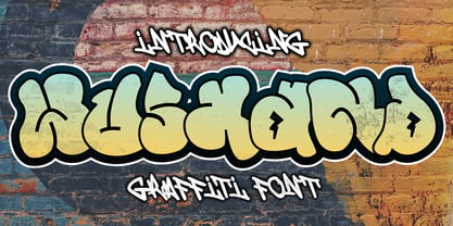 Wushand is a spectacular decorative font with a graffiti style. It will elevate a wide range of design projects to the highest level, be it branding, headings, wedding designs, invitations, signatures, logotype, wall art illustration, apparel, labels, and much more!

