10,000 search results
(0.066 seconds)
- Silian Rail by Mans Greback,
$39.00 Silian Rail is a high quality serif typeface. A professional uppercase font, this intellectual font has a distinct personality while being strict and controlled. Drawn and created by Mans Greback in 2022, the Silian Rail family consists in 16 high-quality styles, complimenting each other. Among them, Light, Regular, Bold, Black, Italic, Sharp and several combinations. The font is built with advanced OpenType functionality and has a guaranteed top-notch quality, containing stylistic and contextual alternates, ligatures and more features; all to give you full control and customizability. It has extensive lingual support, covering all Latin-based languages, from Northern Europe to South Africa, from American to South-East Asian. It contains all characters and symbols you'll ever need, including all punctuation and numbers.
 - Bodoni Classic Deco Two by Wiescher Design,
$39.50 Bodoni Classic Deco Two, like the original Bodoni Classic Deco, breaks all rules. Giambattista Bodoni himself would probably hate me for doing it; he was a real purist. The whole idea of the Bodoni typeface is no embellishments and here I go and decorate those nice clear letters. Shame on me! But I find this is a very nice and useful typeface for all kinds of cards and certificates. So I just did it for all of you out there that are not born purists, and want a little embellishment to their lives. And to make things worse, I added a small caps cut. I even decorated the numbers. This Bodoni is the condensed version!!! Enjoy! Yours, still breaking all the rules, Gert Wiescher
 - Eastman Condensed by Zetafonts,
$39.00 Discover here the Eastman Roman Family See the Eastman Grotesque Family Designed in 2020 for Zetafonts by Francesco Canovaro and Andrea Tartarelli with help from Solenn Bordeau and Cosimo Lorenzo Pancini, the original Eastman typeface family was conceived as a geometric sans workhorse family developed for maximum versatility both in display and text use. The original wide weight range has been complemented with three more additional widths, to give you maximum control over the appearance of text in your page. While Eastman Compressed and Eastman Condensed behave as space-saving condensed families, Eastman Grotesque adapts the family design style to humanist proportions. All share a solid monolinear design and a tall x-height that makes body text set in Eastman extremely readable on paper and on the screen. Influenced by Bauhaus ideals and contemporary minimalism, but with a nod to the pragmatic nature 19th century grotesques, Eastman has been developed as a highly reliable tool for design problem solving, and given all the features a graphic designer needs - from a wide language coverage (thanks to over one thousand and two hundred latin, Cyrillic and greek characters) to a complete set of open type features (including small capitals, positional numbers, case sensitive forms). The most impressive feature of all Eastman fonts remains the huge choice of alternate characters and stylistic sets that allows you to fine-tune your editorial and branding design by choosing unique, logo-ready variant letter shapes. Don’t want to lose too much time with the glyphs palette? Use the Eastman Alternate weights, thought for display use and presenting a selection of some of the more eye catching & unusual letter shapes available for the family.
 - Kingthings Lickorishe Pro by CheapProFonts,
$10.00 Kevin King says: "When I started this font it was called Pestle... It didn't run - it didn't even walk. At some point I thought, Hmm! Looks a bit like Liquorice! And now... Voila! I remember being able to buy about a yard of Liquorice rolled round a central comfit - how fab! Tuppence worth of sticky afternoon! You could also buy bundles of Liquorice root - which looked like black twigs with bright yellow wood - they left my teeth full of black twiggy bits... The past is a strange Lady - Bless her! This was almost Kingthings Leechy... just another one of my bulbous shiny things - I have always liked letter-shapes with 'bottom', probably a 70's thing, as many a seventies thing did indeed possess it - including the fabulous Chaka Kahn... Oooh, Diva!" ALL fonts from CheapProFonts have very extensive language support: They contain some unusual diacritic letters (some of which are contained in the Latin Extended-B Unicode block) supporting: Cornish, Filipino (Tagalog), Guarani, Luxembourgian, Malagasy, Romanian, Ulithian and Welsh. They also contain all glyphs in the Latin Extended-A Unicode block (which among others cover the Central European and Baltic areas) supporting: Afrikaans, Belarusian (Lacinka), Bosnian, Catalan, Chichewa, Croatian, Czech, Dutch, Esperanto, Greenlandic, Hungarian, Kashubian, Kurdish (Kurmanji), Latvian, Lithuanian, Maltese, Maori, Polish, Saami (Inari), Saami (North), Serbian (latin), Slovak(ian), Slovene, Sorbian (Lower), Sorbian (Upper), Turkish and Turkmen. And they of course contain all the usual "western" glyphs supporting: Albanian, Basque, Breton, Chamorro, Danish, Estonian, Faroese, Finnish, French, Frisian, Galican, German, Icelandic, Indonesian, Irish (Gaelic), Italian, Northern Sotho, Norwegian, Occitan, Portuguese, Rhaeto-Romance, Sami (Lule), Sami (South), Scots (Gaelic), Spanish, Swedish, Tswana, Walloon and Yapese.
 - Eastman Grotesque by Zetafonts,
$39.00 Designed in 2020 for Zetafonts by Francesco Canovaro and Andrea Tartarelli with help from Solenn Bordeau and Cosimo Lorenzo Pancini, the original Eastman typeface family was conceived as a geometric sans workhorse family developed for maximum versatility both in display and text use. The original wide weight range has been complemented with three more additional widths, to give you maximum control over the appearance of text in your page. While Eastman Compressed and Eastman Condensed behave as space-saving condensed families, Eastman Grotesque adapts the family design style to humanist proportions. All share a solid monolinear design and a tall x-height that makes body text set in Eastman extremely readable on paper and on the screen. Influenced by Bauhaus ideals and contemporary minimalism, but with a nod to the pragmatic nature 19th century grotesques, Eastman has been developed as a highly reliable tool for design problem solving, and given all the features a graphic designer needs - from a wide language coverage (thanks to over one thousand and two hundred latin, cyrillic and greek characters) to a complete set of open type features (including small capitals, positional numbers, case sensitive forms). The most impressive feature of all Eastman fonts remains the huge choice of alternate characters and stylistic sets that allows you to fine-tune your editorial and branding design by choosing unique, logo-ready variant letter shapes. Don’t want to lose too much time with the glyphs palette? Use the Eastman Alternate weights, thought for display use and presenting a selection of some of the more eye catching & unusual letter shapes available for the family.
 - Eastman by Zetafonts,
$39.00 Discover the complete Eastman type family: Eastman Grotesque and Eastman Condensed! Designed in 2020 for Zetafonts by Francesco Canovaro and Andrea Tartarelli with help from Solenn Bordeau and Cosimo Lorenzo Pancini, the original Eastman typeface family was conceived as a geometric sans workhorse family developed for maximum versatility both in display and text use. The original wide weight range has been complemented with three more additional widths, to give you maximum control over the appearance of text in your page. While Eastman Compressed and Eastman Condensed behave as space-saving condensed families, Eastman Grotesque adapts the family design style to humanist proportions. All share a solid monolinear design and a tall x-height that makes body text set in Eastman extremely readable on paper and on the screen. Influenced by Bauhaus ideals and contemporary minimalism, but with a nod to the pragmatic nature 19th century grotesques, Eastman has been developed as a highly reliable tool for design problem solving, and given all the features a graphic designer needs - from a wide language coverage (thanks to over one thousand and two hundred latin, cyrillic and greek characters) to a complete set of open type features (including small capitals, positional numbers, case sensitive forms). The most impressive feature of all Eastman fonts remains the huge choice of alternate characters and stylistic sets that allows you to fine-tune your editorial and branding design by choosing unique, logo-ready variant letter shapes. Don’t want to lose too much time with the glyphs palette? Use the Eastman Alternate weights, thought for display use and presenting a selection of some of the more eye catching & unusual letter shapes available for the family.
 - Alfarooq by Eyad Al-Samman,
$20.00 Alfarooq is the most widely known epithet for the Islamic figure Umar ibn al-Khattab (c. 586 - 644) who was a leading companion and an adviser to the Islamic prophet Muhammad (peace be upon him) who later became the second Muslim Caliph after Muhammad’s death (pbuh) in 632. Muslims widely know Umar ibn Al-Khattab (may Allah be pleased with him) as Alfarooq (i.e., he who knows and distinguishes between truth and falsehood). Alfarooq is a unique, wide, and headline Arabic display typeface. The main trait of this typeface is the novel design of its letters' tails and its dots which renders it as one of the modern stylish typefaces used for headlines and titles. This can be noticed in different letters such as Ain, Ghain, Jeem, Khah, Seen, Sheen, and others. In addition, Alfarooq font has an Arabic character set which supports Arabic, Persian, Kurdish, and Urdu letters and numerals with a limited range of specific Arabic ligatures. This typeface comes in two ultra-bold styles (i.e., Alfarooq and Alfarooq-Pro) and more than 430 distinctive glyphs with a single weight for each style. Alfarooq typeface effectively offers diverse typographic and digital usages including mainly the very large and wide poster-size works. Due to its strong baseline-stroke, Alfarooq typeface is appropriate for heading and titling works in Arabic, Persian, Kurdish, and Urdu newspapers, magazines, and other printed materials. It is also elegantly suitable for signs, book covers, advertisement light boards, street and city names, products- and services names, and titles of flyers, pamphlets, and posters. The wide style of Alfarooq font’s characters gives it more distinction when it is used in greeting cards, covers, exhibitions' signboards, external or internal walls of malls, and also the exits and entrances of airports and halls.
 - Clairveaux Demo - Unknown license

- Carmilla Demo - Unknown license

- Sanhedrin - Unknown license

- Hadrianus Demo - Unknown license

- Morgow Demo - Unknown license

- Jerash Demo - Unknown license

- Dementia Demo - Unknown license

- Rackham Italic - Unknown license

- Paleos Demo - Unknown license

- Pullman Demo - Unknown license

- Delaguerra Demo - Unknown license

- Reynard Demo - Unknown license

- Ligeia Demo - Unknown license

- Allencon Demo - Unknown license

- Pyle Initials Demo - Unknown license

- Hubbard Demo - Unknown license

- Belphebe - Unknown license

- Plowright Demo - Unknown license

- Carumba by ITC,
$29.99Carumba is the work of California designer Jill Bell and like the name suggests, it exudes liveliness and festivity. Carumba is perfect for anything which says FUN! - Alyanda by Nissa Nana,
$20.00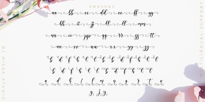 Alyanda is a beautiful script with a classy, elegant, and modern look. Fall in love with its authentic vibe, and turn any design project into a standout!
 - Ongunkan Old Turkic Arrival by Runic World Tamgacı,
$40.00 It's the old Turkish runic script, which I adapted the written language of the three-legged aliens, the characters of a fantastic science fiction movie called Arrival.
 - Honduras by Red Rooster Collection,
$45.00 Based on the typeface called either ‘Albert’ or ‘Select’ by Albert Augspurg, circa 1936, Amsterdam Foundry. Paul also designed the alternates not available on the original design.
 - Akoyster by Koval TF,
$19.00 Akoyster is a fusion of cyberpunk visual culture & contemporary calligraphy with broad nib pen. It's ideal for eyecatching bald statements. Enjoy wiered shapes and create new future.
 - Bloxed Rounded by Fontmill Foundry,
$20.00Bloxed Rounded was originally designed for a new Manchester band called Datadiva. Unfortunately they split up before the face was completed. Well, their loss is your gain. - Xenogears - 100% free

- CalligraphyFLF - Unknown license

- Multistrokes - Unknown license

- Holitter Spike - 100% free

- Base 05 - Unknown license

- Kids - Unknown license

- unc - Unknown license

- GDS Infinity - 100% free

- SansThirteenBlack - 100% free


