10,000 search results
(0.061 seconds)
- Lizadah by IbeyDesign,
$17.00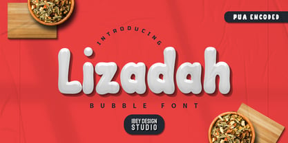 Lizadah Bubble font is a cool, trendy, and bubbly display font. It embodies playfulness and authenticity and is the perfect choice for any children's activity or school project.
 - Lu Px by Letradora,
$15.00 Based on an architect's handwriting, Lu has a good balance between quirkiness and legibility. With an extended character set, it is a good choice for setting short texts.
 - Aliman by Cititype,
$9.00 Aliman is a simple and neat lettered handwritten font. Add this font to your creative ideas and notice how it will make them stand out! All Caps fonts.
 - Kezuri by Powerfonts,
$16.99 Kezuri is a great choice to give your project a unique feel. Modern yet edgy, Kezuri is suited to high tech applications as well as urban / street projects.
 - Shelf Tags JNL by Jeff Levine,
$29.00 Before the mid-to-late 1970s, when retailers started to embrace UPC (universal price code) technology on a grand scale, pricing merchandise took on many forms. One method especially popular with variety stores (such as Woolworth's, McCrory's, Kress, etc.) were pre-printed price tags that came in small pads and were inserted into metal holders. Shelf Tags JNL recreates a vintage price tag based on examples seen online, and allows the user different ways to create their own vintage-style price tags. You can either utilize the round pen nib style numbers and price marks to place on any size or type tag, or type out prices using the reversed characters (white on black) along with the two end caps provided to form a complete tag unit. For the more adventurous, a complete blank tag is also provided in case the desire is to print a solid color tag background and [using the regular numbers] crate prices in custom colors. Two sets of smaller number (for "floating" cents prices) are also provided in regular numbers and reverse panels. As an extra bonus, there is a set of 1 through zero, dollar sign, cents sign and decimal point individual black-on-white outlined panels for making individual pricing numbers. The keyboard layout for the various characters is as follows: asterisk key - regular cents sign (no panel) dollar sign key - regular dollar sign (no panel) period key - regular decimal point (no panel) left and right parenthesis keys - panel end caps (to form price tags) colon key - reverse decimal point on black panel 1 thru 0 keys - regular numbers (no panels) A through J keys - small regular numbers (no panels) K and L keys - truncated [shorter width] end caps M through Y keys - individual price numbers (black on white with black border a through j keys - reverse numbers on black panels k key - reverse dollar sign on black panel l key - reverse cents sign on black panel m through v keys - reverse small numbers on black panels w through z keys - blank rectangular panels of varying widths equal sign key - full black panel price tag hyphen key - blank rectangular black panel based on the width of most number panels
 - Encorpada Classic by dooType,
$20.00 Encorpada classic brings the best features of the Didone genre, but with a 21st century look and feel. With smooth details Encorpada Classic is a elegant choice for your type library. The Encorpada family began in 2011 with the release of Encorpada Black. After that instant success, in 2012, dooType brought to us Encorpada PRO. Encorpada Classic retains the main look and feel of his predecessors, but is designed with more functional considerations. With 14 styles, Encorpada Classic is a fine choice.
 - Meredia by IbraCreative,
$17.00 Meredia is a striking modern space sans serif typeface that embodies contemporary design principles with its clean lines and geometric shapes. This versatile font exudes a sense of sophistication and minimalism, making it an ideal choice for a wide range of applications, from digital interfaces to printed materials. With its well-balanced letterforms, Meredia exudes a sense of professionalism and readability while embracing a futuristic aesthetic, making it a standout choice for designers seeking a sleek and timeless typeface for their projects.
 - Abendschroth by SIAS,
$34.90 Abendschroth is a wonderful dreamy and whimsical typeface for novel titlings and other fiction headline settings. Also a sophisticated choice for lullabies, girl’s literatur, murder poems, fairy tales, short stories and christmas gift books. New! There is now two alternative fonts: Abendschroth Scriptive and Abendschroth Slim. Even more jolly, whimsical and – wonderfully odd! – Enhance your means of typographic expression with this brandnew romantic fonts. Abendschroth supports every Euro-Latin language. For the choice of a similar font go to Albyona.
 - Ian Segoe by Ingrimayne Type,
$6.00 The faces of IanSegoe were early attempts by IngrimayneType to construct medieval-looking faces. They drew inspiration from several medieval-themed fonts that were available at the time (1990). The upper-case letters are similar but not identical in the two faces but the lower-case letters are completely different.
 - Convert Light by Mindtype Co.,
$5.00 Convert Light is something unique and interesting to display and can be used for various media needs, such as social media, brochures, posters, movies, cartoons, horrors, and more.
 - Rockabye - Personal use only

- Complete - Unknown license

- Verdaguera by Type-Ø-Tones,
$40.00 Another rebirth: Verdaguera. The all time Catalan people's choice. Now with a complete set of characters that covers a wide range of latin alphabet languages. Catalan included, of course.
 - The Good Feeling by Alfareaniy,
$100.00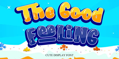 The Good Feeling is a fun, jolly, and incredibly charming display font. It embodies playfulness and authenticity and is the perfect choice for any children’s activity or school project.
 - Kris Kringle by Sealoung,
$15.00 Kris Kringle is a bold and chunky lettered display font. Add this font to your creative ideas and notice how it will make them stand out! All caps fonts.
 - Zombielicious by Zombie Font Group,
$- A meticulously-designed font that captures the spirit of the undead in a modern world. One will notice ample graveyard influence crossed with the newer, emerging trends in typography.
 - Elgista by Zealab Fonts Division,
$10.00 Elgista is modern serif display font with design choices and a combination between high contrast, experimental, and brutalism style. Elgista comes with stylistic, alternates, ligatures and supports multilingual languages.
 - Tokyotrail by Dharma Type,
$9.99 Tokyotrail is inspired by the capital of Japan. Over 2,000 square kilometers to explore. Lines run vertically horizontal and aslant. Square and geometric form attracts notice in various scenes.
 - Sillyheads by PizzaDude.dk,
$10.00 Need something VERY silly for your headlines and still keep the legibility?! Then Sillyheads could be your no. 1 choice! Sillyheads has got that funny, weird, cute, crazy look!
 - Cadels by Intellecta Design,
$21.90Cadels are a family of fonts inspired in the medieval "cadel" style fo blackletters - Castiana by Sebastian Cabaj,
$29.00 Castiana is an elegant font inspired by old books, medieval typography, and rustic art.
 - Ongunkan Swedish Runes by Runic World Tamgacı,
$60.00 Swedish Runes Swedish Runes is a way to write Swedish with medieval runes devised by Sven Salvenson. Proto-Norse was written with Elder Futhark runes, and viking age runes were in Younger Futhark (an adaptation of Elder Futhark). Then early Old Norse was written in medieval runes (an adaption of Younger Futhark). Sven decided to carry on that tradition and adapt the medieval runic alphabet for modern Swedish. General information can be found on this site. I used the data here while working on the font. https://omniglot.com/conscripts/swedishrunes.htm
 - Comic Sans by Microsoft Corporation,
$49.00The Comic Sans® typeface, one of Microsoft's most popular designs, has received a makeover courtesy of Monotype Imaging. The company has introduced the four-font Comic Sans Pro family of typefaces. Featuring elements such as speech bubbles and cartoon dingbats, Comic Sans Pro extends the versatility of the original Comic Sans, designed by Vincent Connare for Microsoft in 1994. Hats off to Monotype Imaging for enlivening Comic Sans and getting it back to its roots as a comic book lettering face. Now everyone can write with more panache - and look even more like a pro using swashes, small caps and other typographic embellishments," said Connare. "Every day, millions of people rely on Comic Sans for countless applications ranging from scrapbooking to school projects," said Allan Haley, director of words and letters at Monotype Imaging. "Comic Sans is also a favorite in professional environments, used in medical information, instructions, ambulance signage, college exams, corporate mission statements and executive reprimands - even public letters from sports team owners to their fans. Breaking up with your spouse? Why not write a letter in Comic Sans Pro, embellished with a typographic whack!, pow! or bam! Comic Sans is everywhere, and now it's even better." The Comic Sans Pro family includes regular and bold fonts, in addition to two new italic and bold italic fonts drawn by Monotype Imaging's Terrance Weinzierl. "Our aim is to put the 'fun' back in 'functional.' We can't wait to see Comic Sans Pro used in everything from second wedding announcements to warning labels," said Weinzierl. "Long live Comic Sans!" Comic Sans Pro contains a versatile range of typographic features including swashes, small caps, ornaments, old style figures and stylistic alternates - all supported by the OpenType® font format. OpenType-savvy applications, such as Adobe® Creative Suite®, QuarkXPress® or Mellel™ software are required to access these features. Comic Sans Pro can also be used in new versions of Microsoft® Office including Microsoft Word 2010 and Microsoft Publisher 2010. In addition, Comic Sans Pro includes a set of ornaments and symbols, including speech bubbles, onomatopoeia and dingbats, pre-sized to work well as bullets." - Wild Flowers by Jafar07,
$19.00 Wild Flowers is a unique and modern bold serif font that seamlessly blends traditional elements with contemporary style. Its bold and confident lines give it a strong presence, while the decorative serifs add a touch of elegance and sophistication. This font is perfect for a wide range of design projects, including branding, editorial, packaging, and headlines. Its versatility allows it to work well in both print and digital mediums, making it an ideal choice for both body text and larger display uses. One of the key benefits of "Wild Flowers" is its legibility. The clear, well-defined letterforms make it easy to read, even at smaller sizes, while its boldness and character make it ideal for designers looking to make an impact with their typography. In summary, "Wild Flowers" is a modern and unique serif font that will add a touch of sophistication and style to any design. Its blend of traditional and modern styles makes it a versatile font that will work well in a wide range of projects, and its legibility ensures that it will be easy to read no matter the application. What are you getting? - Special Ligatures & Alternates - Numbers & Punctuation - Multilingual Support Works onMac PC & Mobile - Simple Installations
 - Aukim by AukimVisuel,
$20.00 Aukim is an exceptional, unique and ligature-rich font that gives a new look to your texts. It is a more text-oriented font and thanks to its OpenType features, it becomes versatile. It is available in 3 sub-families (condensed, normal and extended) for a total of 54 fonts. There are 9 weights with their real italics. It has 886 glyphs, 107 uppercase and 65 lowercase ligatures per font. It also offers a wide range of languages, from Latin to Cyrillic, as well as powerful OpenType features such as meticulously and professionally maintained kerning, stylistic variations, swashes, highly distinctive ligatures, old-fashioned tabular figures, fractions, denominators, superscripts, unlimited subscripts, arrows and much more to satisfy the most demanding professionals. On the one hand, it has rounded curves with very open endings that make this font family noble, friendly and contemporary and on the other hand very useful for writing titles on any medium. Perfectly suitable for graphic design and any display use. It could easily work for web, signage, corporate design as well as editorial design. Aukim is a cool, wonderful, elegant, bold and fun display font. It can easily be paired with an incredibly wide range of projects, so add it to your creative ideas and notice how it makes them stand out!
 - ZT Bros Oskon 90 s by Zelow Type,
$13.00 ZT Bros Oskon 90s is a captivating typographic creation that seamlessly blends the aesthetic charm of the 1990s retro era with a modern touch. With unmatched serif elegance and a unique 90s style, this font offers 72 variations, including sharp Condensed forms, graceful Expanded, and captivating italic styles. Every character in ZT Bros Oskon 90s is meticulously crafted, creating a vintage ambiance that is truly enchanting. Featuring 6 font weights ranging from Extra Light to Bold, this font provides you with the flexibility to create a wide range of striking and memorable designs. Features of ZT Bros Oskon 90s: 72 Unique Variations Aesthetic Retro Vibes from the 1990s Elegant Serif Style Condensed, Expanded, and Italic Forms 6 Font Weights: Extra Light, Light, Regular, Medium, Semi-Bold, Bold Exceptional Creative Versatility ZT Bros Oskon 90s is the perfect choice for graphic design projects, branding, posters, and other promotional materials that require a captivating retro touch. Unleash limitless creativity with this font and infuse a nostalgic 1990s vibe into every one of your creations. ZT Bros Oskon 90s has 6 free styles, you can get them on my GUMROAD I hope you have fun using ZT Bros Oskon 90s. Thanks for using this font ~ Zelowtype
 - PF Libera Pro by Parachute,
$79.00 PF Libera was designed at a time of leisure with no particular intention for commercial use. In fact it was offered in the beginning as a freeware. In 2001, designer Charis Tsevis was convinced that it may have some commercial value, so Parachute obtained the rights to sell this typeface. At that time, we did not even imagine what would follow. Since then, PF Libera is one of our most successful typefaces. We have seen it being used in very diverse applications. From publishing to advertising to banking, to transportation, to retail applications. Food, beverages, fashion, automobiles, tourism, the list goes on and on. In any way, this typeface is very personal, modern and provocative. It stays with you and definitely it brings along the message. PF Libera comes in 3 styles. One of them, 'Liberissima', was added later and is more loose than the other two. The new 'Pro' version is powered with 7 OpenType features and is carefully designed to include all languages that are based on Latin, Greek and Cyrillic.
 - Mosler by Carmel Type Co.,
$19.00 Inspired by the interior of a now defunct Mosler Safe Company bank vault door located inside of what is now an Irish Pub in Stroudsburg, Pennsylvania, Mosler is a typeface that is impenetrability incarnate. This all uppercase, slab-serif brawny beauty comes in four weights - Safe, Strongbox, Vault, and Fortress, and each one is more powerful than the last. Each weight has 450 glyphs included, making for a whopping 1800 glyphs for the full family, complete with small capitals, total support for nearly 80 different languages, decorative word glyphs, and a handful of select alternates. Ranging from the low contrast of the "Safe" weight to the extreme contrast of the "Fortress" weight, Mosler is effective in a wide array of applications but serves best as a titling, headlining, or display face that need to make a mammoth statement. Features Include: 4 Weights Uppercase Only with Small Capitals Numerals, Punctuation & Symbols 450 Characters per Style Stylistic Alternates and Word Glyphs Supports 75+ Latin Languages OTF files Designed and Developed by Jason Carne
 - The font "Back In The USSR DL" is an evocative typeface crafted by Duncan Long, an artist renowned for his multifaceted creativity, encompassing illustrations, writing, and graphic design. This font ...
- Old Bikers by Fractal Font Factory,
$8.00 Introducing a new font - an old biker. It is a multilayer vintage typeface with 5 styles. The font contains stylistic alternatives for uppercase and lowercase letters. Numbers, punctuation and multilingual characters for each style. The font design is inspired by gothic, biker and rock culture.
 - Restauranteur JNL by Jeff Levine,
$29.00 The 1960 revised edition of Sam Welo’s “Studio Handbook – Letter and Design for Artists and Advertisers” showcased a beautiful, semi-condensed Art Deco alphabet called “Modern Gothic”. It has been digitally redrawn and is available as Restauranteur JNL in both regular and oblique versions.
 - CA Gothique Superfat by Cape Arcona Type Foundry,
$44.00 The name says it all. It is aesthetically located between American Gothics and European Grotesques and features small caps, a Central European character set and four number formats plus small caps numerals. This makes it not only a heartbreaking headline font, but also extremely versatile.
 - FF Good by FontFont,
$72.99 FF Good is a straight-sided sans serif in the American Gothic tradition, designed by Warsaw-based Łukasz Dziedzic. Despite having something of an “old-fashioned” heritage, FF Good feels new. Many customers agree: the sturdy, legible forms of FF Good have been put to good use in the Polish-language magazine ‘Komputer Swiat,’ the German and Russian edition of the celebrity tabloid OK!, and the new corporate design for the Associated Press. Although initially released as a family of modest size, the typeface was fully overhauled in 2010, increasing it from nine styles to 30 styles, with an additional 30-style sibling for larger sizes, FF Good Headline. In 2014, the type system underwent additional expansion to become FontFont’s largest family ever with an incredible 196 total styles. This includes seven weights ranging from Light to Ultra, and an astonishing seven widths from Compressed to Extended for both FF Good and FF Good Headline, all with companion italics and small caps in both roman and italic. With its subtle weight and width graduation, it is the perfect companion for interface, editorial, and web designers. This allows the typographer to pick the style best suited to their layout. As a contemporary competitor to classic American Gothic style typefaces—like Franklin Gothic, News Gothic, or Trade Gothic—it was necessary that an expanded FF Good also offers customers both Text and Display versions. The base FF Good fonts are mastered for text use, while FF Good Headline aims for maximum compactness. Its low cap height together with trimmed ascenders and descenders give punch to headlines and larger-sized copy in publications such as newspapers, magazines, and blogs. There is even more good news about FF Good: it has something of a serif companion. Łukasz Dziedzic built FF Good to work together with FF More, creating in a powerhouse superfamily that is versatile in both its function and aesthetic.
 - Binder by Grype,
$16.00 Our Binder Family is a revival and expansion of Binder-Style, a typeface designed by Joseph Binder and released by D. Stempel AG in 1959. It originally was a single weight. In later film type adaptations, a bold style, and an outline with drop shadow style were made available. However, this typeface never really had a true sense of family or larger language compatible character set. The original Binder-style typeface found revived popularity with its super condensed style when it appeared on the movie poster for "Silence of the Lambs". It was always a disappointment to me how this typestyle had never gained more traction in use. And so, many years later, we decided to revive the original typestyle, and expand it with a range of weights and obliques to pair with those weights. We've moved most of the unusual lowercase forms to a Stylistic Alternates feature, along with unicast alternates for the Capitals. The family includes a full standard character set with expansive international support of latin based languages, and 4 weights jumping from Thin to Bold, along with 4 accompanying obliques. This family is ready for you to eat it up with a nice glass of Chianti. Here's what's included with the Binder Family: 538 glyphs per style - including Capitals, Lowercase, Numerals, Punctuation and an extensive character set that covers multilingual support of latin based languages. 4 weights: Thin, Light, Regular, & Bold. Accompanying Obliques with each weight/width style. TTF formatted fonts have been hinted for optimal performance. Here's why the Binder Family is for you: You're in need of a stylish condensed font with a variety of weights and obliques for your designs You're a fan of the typographic works of Joseph Binder, but wish there was more to them You love the style of Agency and Bank Gothic, but want something uber-narrow You are desperate to recreate the movie poster from Silence of the Lambs You just like to collect quality fonts to add to your design arsenal
 - Analogue Pro by Ingo,
$42.00 very traditional forms strongly slanted italic consistant proportions extraordinary ligatures swashes alternate letters alternate figures lower case l with a hooked “foot” Believe it or not, there are hardly any sans serif fonts in which the lower case letter l also has the hooked form of an l. Instead, we readers have to constantly distinguish whether we are seeing an uppercase I or a lower case l — just take a look at the word “Illinois”... The ingoFont Analogue was developed for exactly this reason. The intent: To create a pretty much »ordinary«, even classical font with its most striking characteristic being the inclusion of the “crooked l.” As a model, I used the »mother of all sans serifs«, Akzidenz Grotesk from Berthold, with its beginnings going back to the 19th century. Analogue is so to say a new interpretation of Akzidenz Grotesk from ingoFonts. All characters — following the model — have been newly designed. And if you want to emphasize the shape of the hooked foot even more, you can also activate the alternate styles for d, h, m, n (Style Set 1). Conversely, the alternate a somewhat softens the “hooked” impression (Style Set 2). The slanted versions — it isn’t truly a real cursive font — are noticeably stronger with 13° than the italics in comparable fonts, and were given a round e with a mind of its own which distinguishes itself considerably compared to the upright characters in the overall appearance of the font. More modern and formal solutions in detail were chosen for some of the characters, for example the M was given lightly slanted sides; the a reflects the curves of the s; the “feet” of a, l and t match; the flared legs of K and R became a “foot”, too. General proportions were carried over almost completely with no changes from Akzidenz Grotesk as well as the slanted trimming on the open forms of a, c, e, s; in comparison, C, G and S were given straight endings. Analogue contains many ligatures, even discretional ligatures, plus proportional, old style as well as tabular figures. All in all, at first sight Analogue brings back memories of the charm of its well-known predecessor; and yet, many small differences give Analogue an unmistakable certain something...
 - Bunyan Pro by Canada Type,
$39.95 Bunyan Pro is the synthesis of Bunyan, the last face Eric Gill designed for hand setting in 1934 and Pilgrim, the machine face based on it, issued by British Linotype in the early 1950s — the most popular Gill text face in Britain from its release until well into the 1980s. Gill’s last face doesn't date itself anywhere near as obviously as Gill’s other serif faces, which were all really products of their time, heavily influenced by the richly ornamental and constantly changing aesthetic trends of the interwar period. When compared to Gill’s previous work, Bunyan seems like a revolution in the way he thought and drew. It’s as if he was shrugging off all heavy burden of what was popular, and going back to the basics of older standards. Bunyan had no bells and whistles, doesn't risk functionality with contrasts that are too high or too low, and didn't venture far outside the comfortable oldstyle rhythm Gill grew up with. By interbellum standards, this was utter austerity, a veritable denial of deco excess. Surprisingly, even without all the cloying trivialities, Bunyan still stood indisputably as an aesthetically pleasing, space saving design that could have been made only by Eric Gill. Bunyan Pro comes in three weights and their italics. The main font is intended for use between 8 and 14 points. The medium and the bold are great for emphasis but also have good merit in larger sizes, so can make effective display types as well. All six fonts include small caps, ligatures, alternates, six sets of figures, and three original Gill manicules. We tried to keep the best features of the handset (Bunyan) and machine (Pilgrim) versions while building a text face that can function in today’s immersive reading media. Deciding on which useful letterpress features to preserve for aesthetic importance was hell on our eyeballs — which lead to complex and painstaking ways of ironing out irregularities and inconsistencies related to metal technologies, in order to provide something with authenticity. The result is a unique typeface based on a Gill design that, to a much greater extent than any of his other faces, works well as a text face that can be used for entire books and magazines. For more information on Bunyan Pro’s character set, features, development process and some print tests, please consult the PDF in the gallery section of this page.
 - DZR MENTAL - Unknown license

- Victor Vector - 100% free

- Xandercode by Sipanji21,
$10.00 Xandercode is a bold and chunky lettered display font. Add this font to your creative ideas and notice how it will make them stand out! with spalsh vector bonus inside.
 - Muskamot MF by Masterfont,
$59.00 Solid and elegant font family will stand out in headlines, signage, packaging and much more. The choice of 7 weights makes it super versatile to use in your next design.


