2,329 search results
(0.013 seconds)
- Lenox Avenue by Hanoded,
$15.00
- Park Avenue by Bitstream,
$29.99 - An Unfortunate Event - Unknown license

- The Mighty Avengers - Personal use only

- A.C.M.E. Secret Agent - Personal use only

- A.C.M.E. Secret Agent - Personal use only

- A.C.M.E. Secret Agent - Personal use only

- Customs Agent JNL by Jeff Levine,
$29.00
- Park Avenue Script by Linotype,
$29.99 - Film Event JNL by Jeff Levine,
$29.00
- Federal Agent JNL by Jeff Levine,
$29.00
- Nouveau Event JNL by Jeff Levine,
$29.00
- Sporting Event JNL by Jeff Levine,
$29.00
- F2F Mekanik Amente by Linotype,
$29.99 - Art Event JNL by Jeff Levine,
$29.00
- Secret Agent NF by Nick's Fonts,
$10.00 - News Event JNL by Jeff Levine,
$29.00
- Boardwalk Avenue Rough by Fenotype,
$30.00
- Evening Event JNL by Jeff Levine,
$29.00
- Creepy Events JNL by Jeff Levine,
$29.00
- Formal Event JNL by Jeff Levine,
$29.00
- Boogaloo Avenue NF by Nick's Fonts,
$10.00 - Sales Event JNL by Jeff Levine,
$29.00
- Fifth Avenue Salon NF by Nick's Fonts,
$10.00 - ITC Avant Garde Gothic by ITC,
$42.99
- Agent Of The Uncanny by Device,
$39.00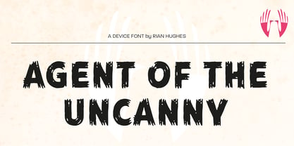
- ITC Avant Garde Gothic Paneuropean by ITC,
$49.00 - Havent Slept in Two Days Shadow - Personal use only

- Ethnocentric - Unknown license

- Impossible - Unknown license

- BOODAS DREIECKE - Unknown license

- Quark Outline - 100% free

- Movement - Personal use only

- New Alphabet - Unknown license

- Deco Slice - Personal use only

- AB Exp - 100% free

- Cienfuegos - Personal use only

- D3 Labyrinthism katakana - Unknown license

- Bifurk - Unknown license

- Metalic Avacodo - Unknown license


