10,000 search results
(0.151 seconds)
- Mister Loopy - Unknown license

- SF Orson Casual Heavy - Unknown license

- DF667 Chlorine - Unknown license

- Sweet as candy - Unknown license

- SwishButtons - 100% free

- Strobo - 100% free

- milky - Unknown license

- Rotondo - Unknown license

- FT Pedant Dilettante - Unknown license

- Red Circle - Unknown license

- GOST type A - Unknown license

- Das Reicht Gut Regular - Unknown license

- Bubbleboy - Unknown license

- Tank Junior - Unknown license

- Street Humouresque - Personal use only

- JellyBelly - Unknown license

- Roosk by DearType,
$39.00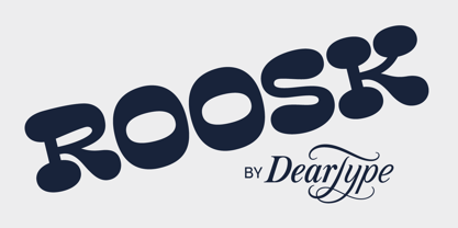 Roosk is a round, reverse-contrast serif designed for display usages. It bears a 70s influence as well as a subtle western vibe, although it’s more rounded and chunky. The font is a single weight, Caps only and sports a set of 450+ glyphs and some cute symbols such as hearts and floral hearts. Roosk has Cyrillic and All European Languages Support and is best suited for posters, headlines, editorial, merchandise and packaging.
 - Quan by Typesketchbook,
$40.00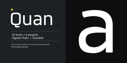 The complete Quan font family designed by Chatnarong Jingsuphatada of Bangkok-based Typesketchbook consists of a very usable, clean and modern sans typeface and a rounded sub-family. The font looks clean and geometric but it’s designed with unusual stylistic features to give the Quan font a special and unique touch. The complete Quan type family includes eight weights with obliques and rounded versions for each of them all in all 32 fonts.
 - Rockford Sans by Fenotype,
$20.00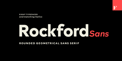 Rockford is a geometrical Sans Serif with subtly rounded edges. Rockford comes in eight weights and matching Italics. With its large x-height and round features it’s both legible and friendly. It’s suited to cover a wide variety of tasks from editorial to brand design, advertising, logos and more. Rockford is equipped with plenty of OpenType features to perform well. Rockford comes with Small Caps, Old Style Figures, superior and inferior figures and fractions.
 - Norden Standard by Asgeir Pedersen,
$23.99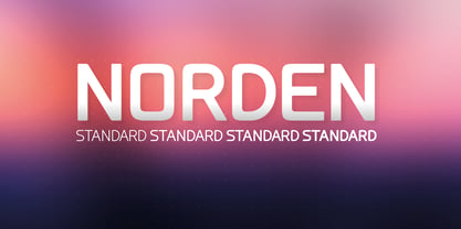 The Standard version of the Norden font family (see Round and Display) is "a standard sans serif" font. However, the significant detail and difference is that it comes with slightly rounded end corners, which makes the font “easier on the eye”, especially at large sizes compared to traditional fonts with sharp-edge corners. This little but important difference gives the font a commanding yet poised presence, without it imposing itself, as it were.
 - Monograph by Pelavin Fonts,
$25.00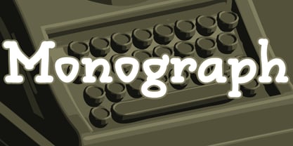 Monograph conjures ancient typewriters, telephone switchboards, vintage office machines past visions of the future. As though it were drawn with the rounded nib a of a Speedball "B" style pen, the soft curves and rounded serifs speak of a gentler less complicated time. It is nuanced with traces of the Arts and Crafts movement at the turn of the 20th Century which stressed craftsmanship and preserving and emphasizing the qualities of construction and materials.
 - Puzzle by Just My Type,
$25.00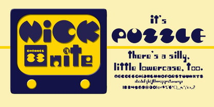 Call me some kind of weird, but I find designing fonts about the most fun you can have out of bed. Legible-scmedgible, sometimes you just have follow the font muse regardless of where she takes you. She threw me a circle, a triangle, a rounded stroke and a rounded-cornered square; “Make glyphs,” she sang. Okay! Is it legible? Yes. Is it readable? Kinda. For the right project, though, that’s enough!
 - Broide by Craft Supply Co,
$20.00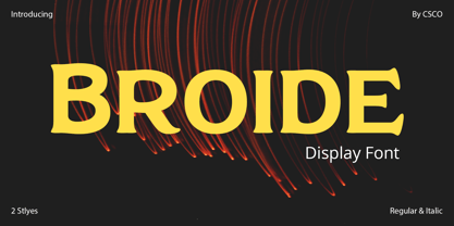 Broide: Softness Meets Serif Introducing Broide – Display Serif, where softness shapes strength. This bold, low-contrast serif font is friendly. Rounded serifs give it a gentle character. It’s a font that combines clarity with warmth. A Friendly Touch Broide brings a friendly vibe to your words. Its rounded serifs soften its bold stance. This typeface looks strong yet approachable. It’s ideal for invitations and branding. Also, it’s perfect for creating a welcoming feel.
 - Marshfield by Adam Fathony,
$10.00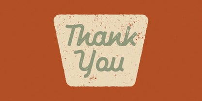 Monoline Fonts with strong identity for an outdoor design, camping, wild, journey, adventure, masculine, and etc. Opentype features are available on Marshfield such as Ligatures, Stylistic Alternates (Up to 6 Alternates), Contextual alternates, and Terminal Alternates. Marshfield Comes with 2 Type of Fonts, Script and Cursive. On each type of fonts have 3 different style, Clean (sharp corner), Round (Rounded Corner), and Rough (Rough Version). 6 Fonts in Total for completing your design style.
 - Nostalgia by Resistenza,
$39.00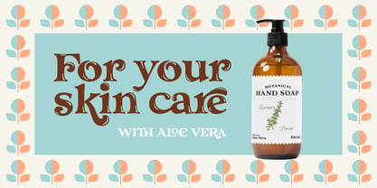 Say Hello to Nostalgia! A Modern Font with a retro feeling 3 Fonts Regular, Effect and Flowers Go back in time and travel through the magazines and graphics from the fabulous 1970´s. Different serif typefaces, rounded and bold were the big focus to add a spark of life and modernity to the products. Nostalgia is our contemporary interpretation of this beautiful collection of fonts. Our aim is to draw the positive mood of these nostalgic letterforms with softened edges and rounded terminations, to evoke a fresh and contemporary view on this graphic approach. An extended set of alternates & swashes specially designed to create stylish lettering compositions have been included. You can Access your OpenType features and discover all the possibilities. Combining the glyphs with "Nostalgia Icons" as well as changes of color you'll feel the magic. This endless collection of flowers and decorative forms will boost the vintage mood to any project. The result is a very versatile font that works in a wide range request, from logos, headlines, branding, magazine design to wedding cards, poster and so much more.
 - Ulga Grid Solid by ULGA Type,
$19.00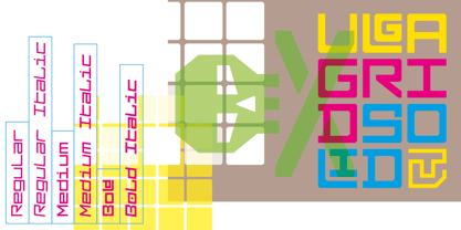 ULGA Grid Solid is the sharp, blockier sibling of ULGA Grid and ULGA Grid Rounded. The typeface consists of three weights, regular, medium and bold, with corresponding oblique styles. Every character in the extended ULGA Grid family shares the same width. Forged from a box full of ninja throwing stars – props from the now-forgotten 1976 Japanese film, Gridzilla, Revenge of King Gridorah – the solid shapes and sharp, chamfered corners give the characters a hard, cut-from-metal feel. A versatile display typeface that can be used for a wide range of purposes including CD covers, posters, packaging, advertising, nameplates for tractors, brochures and film titles. Mix and match with ULGA Grid and ULGA Grid Rounded, use the alternatives, sneak in an oblique style to spice things up, but most of all this is a fun typeface family. But, please, don’t use the characters as throwing stars. That’s just dangerous, someone will get hurt and you’ll regret it. The character set supports Western Europe, Vietnamese, Central/Eastern Europe, Baltic, Turkish and Romanian.
 - Hinnual by Jipatype,
$27.00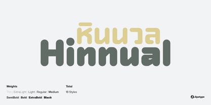 Hinnual เป็นฟอนต์ที่ผสมผสานระหว่างรูปทรงสี่เหลี่ยมและทรงกลมเพื่อสร้างสไตล์ที่ไม่เหมือนใคร ชื่อมาจากคำไทย 2 คำ คือ Hin แปลว่า หิน และ Nual แปลว่า อ่อน ผสมผสานองค์ประกอบที่แข็งและอ่อนนี้สะท้อนให้เห็นในแบบอักษร ซึ่งมีเส้นที่สะอาดตาและเส้นคมซึ่งถูกทำให้อ่อนลงด้วยมุมโค้งมน ฟอนต์มีให้เลือกถึง 18 แบบ มีตัวเลือกหลากหลายให้คุณได้เลือกใช้ Hinnual เหมาะอย่างยิ่งสำหรับใช้ในพาดหัวและพาดหัวย่อย ซึ่งลักษณะที่โดดเด่นสามารถช่วยดึงดูดความสนใจของผู้อ่านได้ เส้นสายที่สะอาดตาและสไตล์ที่เป็นเอกลักษณ์ยังทำให้เป็นตัวเลือกที่ยอดเยี่ยมสำหรับแบรนด์ โลโก้ และงานออกแบบอื่นๆ ที่ต้องการภาพลักษณ์ที่น่าจดจำ โดยรวมแล้ว Hinnual เป็นฟอนต์อเนกประสงค์และสะดุดตาที่ผสมผสานองค์ประกอบทั้งความแข็งแกร่งและความนุ่มนวล การออกแบบที่เป็นเอกลักษณ์ทำให้เป็นตัวเลือกที่ยอดเยี่ยมสำหรับนักออกแบบที่ต้องการสร้างผลงานที่น่าจดจำ Hinnual is a font that combines the square and rounded shapes to create a unique visual style. Its name comes from two Thai words - Hin, which means stone, and Nual, which means soft. This juxtaposition of hard and soft elements is reflected in the font's design, which features clean, sharp lines softened by rounded corners. The font comes in 18 styles, providing a range of options for designers to choose from. Hinnual is particularly well-suited for use in headlines and sub-headlines, where its bold and distinctive appearance can help to grab the reader's attention. Its clean lines and unique style also make it a great choice for branding projects, logos, and other design elements that require a memorable. Overall, Hinnual is a versatile and eye-catching font that combines elements of both strength and softness. Its unique design make it an excellent choice for designers looking to create impactful visual content.
 - CF Cozyscript by CozyFonts,
$25.00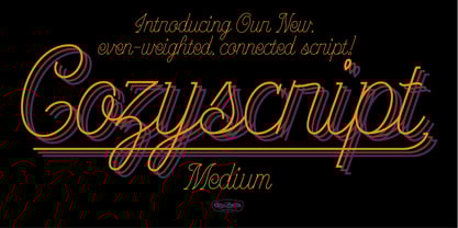 CF Cozyscript is an even weighted connecting script. Created in the spirit of the Old Grade School cursive chart seen above the blackboard in the front of the classroom. Giving students a constant visual reference of the smooth flow of Caps and Lower case script. Neither formal nor casual but a combination of both styles. Cozyscript is currently available in 3 styles: Light, Medium & Rounded. The Light & Medium styles are best suited for Invitations, Notes, Advertising, Personal Letters, and Sensitive Subjects such as Movie Titles, Biographies, Wedding paraphernalia, etc. The Light & Medium Glyphs finish in squared-off ends, whereas the Rounded version is slightly bolder than the Medium version with rounded ends resembling a tubular look. The Rounded version lends itself to effective use in Sports, Music, and Advertising, Graphics, Signage, Branding, Neon effects, Logos, Titles, and Packaging. With over 300 glyphs applicable in over 100 languages, Cozyscript is available for use! Cozyscript is CozyFonts Foundry's 17th Font Family released and 2nd script font by Tom (Cozy) Nikosey, California Designer.
 - Adore by Canada Type,
$24.95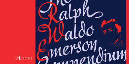 In 1939 the Stephenson Blake Company bought a very popular script called Undine Ronde and began marketing under the name Amanda Ronde. Although Undine/Amanda was quite popular and can be seen in many advertisements from the 1930s and 1940s, there seems to be no surviving record stating the original foundry or designer. We thought that six and half decades of dust layers over the once-popular typeface were enough, so here and now you have its complete and expanded digital incarnation, Adore. It is quite easy to see why this typeface was popular. A round script with graceful meaty curves is rarely found and can be used in plenty of applications. Wedding paraphernalia, chapter titles, posters, poetry, book covers, religious literature... you name it, Adore can fit it. Aside from its totality being unmatched by currently available designs, Adore also possesses some of the most unique and imaginative letter shapes. The narrow loops on the B, P and R, the minuscule-like Z, the looped b and d, the descending h... all these shapes contribute to a breathtaking and adorable calligraphic work unlike any other. The original design came in a basic alphabet, but we have updated it for current digital technologies, and expanded it to include plenty of alternates and ligatures, as well as some ornaments. The Postscript Type 1 and True Type versions come in two fonts, the second containing the alternates and extras, while the Open Type version is a single font containing all the alternates and extras in conveniently programmed features, easily accessible at the push of a button in OpenType-supporting software. We also encourage you to take a look at Typodermic's Mecheria font, which is further experimentation with the same letter forms, resulting in a quirky, friendly, curly, angular gothic-like creature.
 - Sign Engraver JNL by Jeff Levine,
$29.00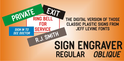 Sign Engraver JNL and Sign Engraver Oblique JNL reproduce the classic rounded letters and numbers engraved into plastic signs, desk nameplates and employee name tags.
 - Entourage by Hanoded,
$15.00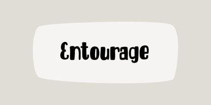 Entourage is a sweet little font - rounded, quirky and cute. Entourage will shine on product packaging, posters and websites. Comes with an ‘entourage’ of diacritics.
 - Shield Ornaments by Gerald Gallo,
$20.00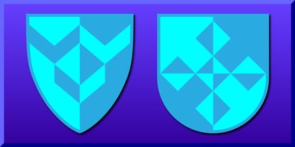 The shield, a form in heraldry, has infinite design subdivision possibilities. Shield Ornaments contains a selection of 98 geometric designs on rounded and pointed shields.
 - Lettering Pen JNL by Jeff Levine,
$29.00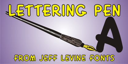 The rounded hand lettering for the circa-1920s sheet music title "I'm On My Way Back Home" inspired the font design for Lettering Pen JNL.
 - General Merchant JNL by Jeff Levine,
$29.00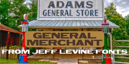 General Merchant JNL is a bold, compressed sans design in the 'Grotesk' fashion with varying character widths and flattened tops on the usually rounded characters.
 - Boa by Alien,
$30.00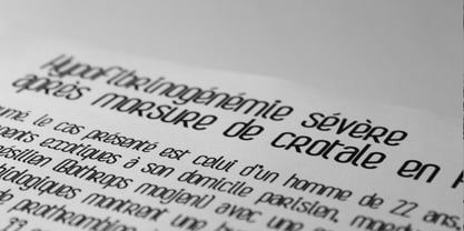 Boa bold is a basic display font made for print. It was created for an Artbook about reptiles. It needed to be round and clear.
 - Van Dingbats by Vanarchiv,
$30.00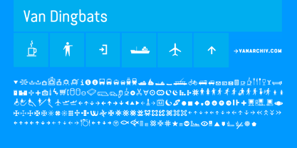 This Dingbat font is designed to work well with the Van Condensed family. The dingbats in it have the same round treatment like the typeface.
 - Kinesta by Letterhend,
$18.00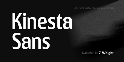 Kinesta Sans is a variable sans serif font with with 7 weights. You can play around to match your project, whether for a standout headline, or for a tagline, you name it. Perfect to be applied to the other various formal forms such as invitations, labels, logos, magazines, books, greeting / wedding cards, packaging, fashion, make up, stationery, novels, labels or any type of advertising purpose. Features : Uppercase & lowercase Numbers and punctuation Alternates & Ligatures Multilingual PUA encoded
 - Cardholder Dispute SRF by Stella Roberts Fonts,
$25.00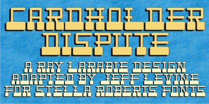 From the remnants of an old freeware font by Ray Larabie comes Cardholder Dispute SRF. Thoroughly rebuilt from the ground up by Jeff Levine, this post-80s techno lettering can also double as a pop culture font evoking 60s or 70s rock concerts and hippie colonies or (as the name implies) credit cards. The net profits from my font sales help defer medical expenses for mysiblings, who both suffer with Cystic Fibrosis and diabetes. Thank you.
 - La Portenia by Sudtipos,
$69.00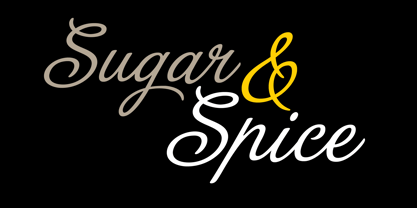 La Portenia pays homage to the spirit of early 20th-century show card writers and type designers. This face has two variations: La Portenia de Recoleta is slightly more formal and polite, while La Portenia de la Boca has longer, more extravagant flourishes and indulges in more interletter space. This showier variant is reminiscent of signs found in Buenos Aires. Both have been designed by Diego Giaccone and Angel Koziupa, and engineered and expanded by Alejandro Paul.
 - ZsaZsa Galore by Chank,
$39.95Chank created Zsazsa Galore as a fresh alternative to Mister Frisky, another jerky, hypercaffeinated interpretation of the traditional roman alphabet. The difference this time is that the new font has no descenders. Every letter comes to rest hard on the baseline. It sits there firmly rooted with branches wiggling around in the air. It was released as the Chank Font of the Month in October 1999 and it was named after Zsa Zsa Gabor because she is beautiful.


