10,000 search results
(0.025 seconds)
- Do It Yourself JNL by Jeff Levine,
$29.00 Do It Yourself JNL was modeled after self-adhesive vinyl letters and numbers manufactured by Duro Art Industries of Chicago - formerly the Duro Decal Company. The hand-drawn look of the original lettering was retained by Jeff Levine to stay true to the design, and the rectangles that border each glyph represent the pieces of self-adhesive vinyl onto which the characters were silk screened. Limited character set.
 - KG Shake It Off by Kimberly Geswein,
$5.00 Hand-drawn by my 10-year-old daughter, this font comes in 4 whimsical styles- chunky, 3D, regular, and outline.
 - Ethnocentric - Unknown license

- Cry Kitty - Unknown license

- Cry Uncial - Unknown license

- Angel Cry by Stefani Letter,
$12.00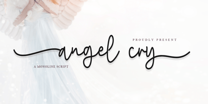 Angel cry is a beautiful monoline script font that will effortlessly add a perfect look to any craft! Your imagination and this font will make a perfect combination. Get inspired by its unique charm and create amazing greeting cards, Weddings, books, logos, stationery, and much more! This font is PUA encoded which means you can access all of the cute glyphs with ease! It also features a wealth of including ligatures.
 - Cry One by Sinograff,
$20.00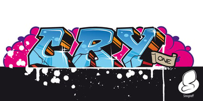
- Battle Cry by Comicraft,
$19.00 As Titans Clash in The Final Battle of Good versus Evil, Man versus Machine, God versus Mortal and Coke versus Pepsi, ace lettering artist, Ferran Delgado from Spain teams up with our very own John ‘JG’ Roshell for one last attack on the assembled Cover Lettering Styles of Yore. Fill your lungs and prepare for... BATTTTTTLECRRRRRYYYYYYYYYYY! See the families related to Battle Cry: Battle Scarred & Battle Damaged .
 - Metal Cry by Fabulous Rice,
$25.00 Metal Cry is a font family that was inspired by countless hours spent playing video games, watching old movies or reading comic books. And even more hours closely analysing the design of all these things. The art of creating beautiful letters has slowly declined with the rise of the digital age and its solid-colour, 2D fonts. And most of the time, the care given to typography in cultural products just isn't what it used to be anymore. This was the inspiration for Metal Cry, a family of 4 layerable fonts that can bring a feeling of depth to its letters, and offers endless possible combinations. Metal Cry Outlands is the basic shape of all the characters, it can be used as the bright side of the bevel. Metal Cry Front is the inline border font that can be used as the front side of the bevel. Metal Cry Shadow can be used as the dark side of the bevel. Metal Cry Depth can be used to flash out the inside shape of the letter. But of course, any font can be combined with any other font(s) to obtain various results. The planets in the above visuals are courtesy of 3D artist Thomas Veyrat / veyratom.com
 - Cry Wolf by Hanoded,
$20.00 When I was a kid, I loved the story of The Boy Who Cried Wolf. I thought it was pretty stupid of the boy to trick the villagers into believing wolves are attacking his flock of sheep. But I also thought it was a bit sad that the sheep are eaten by a wolf in the end. I didn’t really feel sorry for the boy (he really was stupid), nor the wolf (he just does what he is supposed to do in life), but I did feel sorry for those poor sheep. I guess this is what disinformation leads to in the end. Cry Wolf is a bit of a scary font: it was made with a really old and battered brush, using Chinese ink and some quality French paper. It has a slight tilt to the right and I added some inky splatter for dramatic effect. Use Cry Wolf for your book covers, product packaging and headlines; use if to spice up you invitations and your halloween posters. Comes in a slightly tilted Regular style and an outright Italic style.
 - New Lincoln Gothic BT by Bitstream,
$50.99New Lincoln Gothic is an elegant sanserif, generous in width and x-height. There are twelve weights ranging from Hairline to UltraBold and an italic for each weight. At the stroke ends are gentle flares, and some of the round characters possess an interesting and distinctive asymmetry. The character set supports Central Europe, and there are three figure sets, extended fractions, superior and inferior numbers, and a few alternates, all accessible via OpenType features. Back in 1965, Thomas Lincoln had an idea for a new sanserif typeface, a homage of sorts, to ancient Roman artisans. The Trajan Column in Rome, erected in 113 AD, has an inscription that is considered to be the basis for western European lettering. Lincoln admired these beautiful letterforms and so, being inspired, he set out to design a new sanserif typeface based on the proportions and subtleties of the letters found in the Trajan Inscription. Lincoln accomplished what he set out to do by creating Lincoln Gothic. The typeface consisted only of capital letters. Lincoln intentionally omitted a lowercase to keep true his reference to the Trajan Inscription, which contains only magiscule specimens. The design won him the first Visual Graphics Corporation (VGC) National Typeface Competition in 1965. The legendary Herb Lubalin even used it to design a promotional poster! All this was back in the day when typositor film strips and photo type were all the rage in setting headlines. Fast forward now to the next millennium. Thomas Lincoln has had a long, illustrious career as a graphic designer. Still, he has one project that feels incomplete; Lincoln Gothic does not have a lowercase. It is the need to finish the design that drives Lincoln to resurrect his prize winning design and create its digital incarnation. Thus, New Lincoln Gothic was born. Lacking the original drawings, Lincoln had to locate some old typositor strips in order to get started. He had them scanned and imported the data into Freehand where he refined the shapes and sketched out a lowercase. He then imported that data into Fontographer, where he worked the glyphs again and refined the spacing, and started generating additional weights and italics. His enthusiasm went unchecked and he created 14 weights! It was about that time that Lincoln contacted Bitstream about publishing the family. Lincoln worked with Bitstream to narrow down the family (only to twelve weights), interpolate the various weights using three masters, and extend the character set to support CE and some alternate figure sets. Bitstream handled the hinting and all production details and built the final CFF OpenType fonts using FontLab Studio 5. - Engravers' Old English BT by Bitstream,
$29.99Designed by Morris Fuller Benton in 1907; an improved version of the familiar nineteenth century blackletter as he had executed it in his Wedding Text. - Iowan Old Style BT by Bitstream,
$40.99Iowan Old Style was designed for Bitstream in 1990 by noted sign painter John Downer. Iowan Old Style is a hardy contemporary text design modeled after earlier revivals of Jenson and Griffo typefaces but with a larger x-height, tighter letterfit, and reproportioned capitals. Iowan Old Style Titling was designed by John Downer and added to the Iowan Old Style family in 2002. The cap-only character set includes several ornaments and fleurons, broadening the appeal and functionality of the typeface family. Iowan Old Style was originally designed for Bitstream in 1990 by Downer, a noted sign painter. Iowan Old Style is a hardy contemporary text design modeled after earlier revivals of Jenson and Griffo typefaces but with a larger x-height, tighter letterfit, and reproportioned capitals. Expert and old style figure font sets were added in 2000. - Oz Handicraft BT WGL by Bitstream,
$50.99Oswald Cooper is best known for his emblematic Cooper Black™ typeface. Although he was responsible for several other fonts of roman design, Cooper never drew a sans serif typeface. But that didn’t stop George Ryan from creating one. Ryan saw a sans serif example of Cooper’s lettering in an old book and decided that it deserved to be made into a typeface. Ryan’s initial plan was to make a single-weight typeface that closely matched the slender and condensed proportions of the original lettering. While the resulting Oz Handicraft™ typeface proved to be very popular, Ryan was not satisfied with the limited offering. So, between other projects – and over many years – Ryan worked on expanding the design’s range. The completed family includes light, semi bold and bold weights to complement the original design, plus a matching suite of four “wide” designs, which are closer to normal proportions. Fonts of Oz Handicraft include a Pan-European character set that supports most Central European and many Eastern European languages. - Impossible - Unknown license

- BOODAS DREIECKE - Unknown license

- Quark Outline - 100% free

- Sho-Card-Caps - 100% free

- Fancy Card Text - Personal use only

- Funny farm hard - Unknown license

- KR Grads 2002 - Unknown license

- Ben Hard Life - Unknown license

- Lobby Card JNL by Jeff Levine,
$29.00Lobby Card JNL takes the limited characters of Theatrics JNL, removes the prismatic effect and expands the font into an extended character set for a multitude of uses. - KG Hard Candy by Kimberly Geswein,
$5.00 Whimsical, hand-drawn connected cursive handwriting in both striped and solid versions.
 - Stenciling Cards JNL by Jeff Levine,
$29.00Stenciling Cards JNL is the digital equivalent of the individual letter and number stencils used to paint markings on walls, crates, boxes, etc. Use this type design when you want a reversed stencil look. Kern it super tight for a continous word stencil. - Card-O-Mat by PintassilgoPrints,
$30.00 Card-O-Mat is an inspiring font family that makes it easy to design awesome greeting cards for many occasions. Each font is packed with an impressive number of items, check out the glyphs map and get surprised! Card-O-Mat Messages font counts more than 170 unique lettering designs, with a great assortment of messages. From an effusive ‘Happy Birthday’ to a sensible ‘Thank You’, you'll find charming choices for many situations. Card-O-Mat BuddyBirds brings more than 180 picture elements, comprising a pocketful of birds and handy adornments such as flowers, leaves, stars, clouds, speech bubbles and so on. Beyond making a perfect pair with Card-O-Mat Messages, it also goes brilliantly well with our hand-crafted fonts, like Populaire, Oyster, Berimbau, Amarelinha and many others. Pick the ones that fit you better and happy card making!
 - Work Yard Stencil by Jeff Levine,
$29.00 The image of a set of vintage French tin stencils spotted online was the starting point in designing Freight Yard Stencil JNL. A more traditional ‘B’ and ‘R’ replaces the original characters (which looked kind of awkward due to extra ‘stencil breaks’ within the letters). However, there are a few interesting variants in other characters to set the design apart from similar stencil fonts. Work Yard Stencil JNL is available in both regular and oblique versions.
 - Yard Goods JNL by Jeff Levine,
$29.00 Yard Goods JNL is another typeface derived from a sign making outfit consisting of a series of stencils manufactured by the Display Material Company of St. Paul Minnesota. This clean and casual sans design embodies the hand-lettering of 1920s and 30s era show cards, price tickets and display signs.
 - LT DIE HARD by Latam Type Foundry,
$9.00 LT DIE-HARD FONT DUO+EXTRAS is a handcrafted typeface, carefully designed to capture the essence of strength and determination. With its horrible and worn strokes, this font transmits a sensation of resistance and solidity, Each letter is made in a unique style, creating a sense of movement and dynamism in the text. DIE-HARD typeface is ideal for projects requiring a strong and determined approach, such as posters, titles, logos...
 - Calling Card JNL by Jeff Levine,
$29.00In today's day and age, the term "calling card" refers to a prepaid means of making long distance phone calls. In a more gentler time, the calling card (similar to a business card) was what a gentleman presented to a housekeeper or butler when visiting (calling) on a friend or business contact. - Hard Stones Pro by FHFont,
$17.00 Hard Stones include sans, display, and script, retro combination with layered font, clean and rough vintage authentic style, Suitable for design, element design, event, t-shirt, logo, badges, sticker, and awesome work.
 - Sign Card JNL by Jeff Levine,
$29.00 The addition of serifs to an existing typeface can drastically change the look and feel of a design. Sign Card JNL and its oblique version is just such a treatment of Sign Shop JNL. By adding the serifs, there is not only a brand-new Art Deco typeface possessing a regal and formal style, but a distant resemblance to a Russian Cyrillic font with its mechanical form and function.
 - House Of Cards by Dharma Type,
$19.99 House of Cards is inspired by and based on retro Hamilton’s Teniers typeface which is popular wooden type fonts of the 19th century. To make natural and contemporary impressions, the original lowercase design was slightly changed from the original but all glyphs had been designed carefully to be retro-looking of the old time and to fill all with nostalgia. This modern wood type includes 2 weights and their matching italic style and all style have sprayed ends(beginning) alternates for F, H, P, U, f, h, m, n, t, u, and w which can be accessed by using OpenType Stylistic alternates or swash alts. House of Cards will be the best solution for posters, titles and anywhere you need vintage lettering.
 - Movement - Personal use only

- New Alphabet - Unknown license

- Deco Slice - Personal use only

- Hall Fetica Upper Decompose It - Unknown license

- Mikey Likes It Corpulent NF by Nick's Fonts,
$10.00Fat and sassy, this ultrabold brush font is based on the works of lettering legend Mike Stevens as seen in his book, Mastering Layout. A natural choice for can't-miss headlines, this typeface also works surprising well for short blocks of body copy. Both the OpenType and Truetype versions of this font contain the complete Latin language character set (Unicode 1252) plus support for Central European (Unicode 1250) languages as well. - KG Love You Through It by Kimberly Geswein,
$5.00 My beautiful mom was diagnosed with breast cancer in August 2011. Our family's resolution was to love my mom through this time- to stay by her side and remind her each day that she is not alone and that she is loved as she walks this difficult road. This font was made in her honor.
 - It Aint Rocket Science Pro by CheapProFonts,
$10.00 This font was reworked by request. It is another lovely handwritten font made by Kimberly Geswein - with its long e and c it gets a semi-connected look. Perfect for text with a personal touch. ALL fonts from CheapProFonts have very extensive language support: They contain some unusual diacritic letters (some of which are contained in the Latin Extended-B Unicode block) supporting: Cornish, Filipino (Tagalog), Guarani, Luxembourgian, Malagasy, Romanian, Ulithian and Welsh. They also contain all glyphs in the Latin Extended-A Unicode block (which among others cover the Central European and Baltic areas) supporting: Afrikaans, Belarusian (Lacinka), Bosnian, Catalan, Chichewa, Croatian, Czech, Dutch, Esperanto, Greenlandic, Hungarian, Kashubian, Kurdish (Kurmanji), Latvian, Lithuanian, Maltese, Maori, Polish, Saami (Inari), Saami (North), Serbian (latin), Slovak(ian), Slovene, Sorbian (Lower), Sorbian (Upper), Turkish and Turkmen. And they of course contain all the usual "western" glyphs supporting: Albanian, Basque, Breton, Chamorro, Danish, Estonian, Faroese, Finnish, French, Frisian, Galican, German, Icelandic, Indonesian, Irish (Gaelic), Italian, Northern Sotho, Norwegian, Occitan, Portuguese, Rhaeto-Romance, Sami (Lule), Sami (South), Scots (Gaelic), Spanish, Swedish, Tswana, Walloon and Yapese.


