10,000 search results
(0.031 seconds)
- Hidetoshy by Zamjump,
$13.00
- Sweet Sans by Sweet,
$59.00
- HWT Konop by Hamilton Wood Type Collection,
$24.95
- Sweet Sans Pro by Sweet,
$79.00
- Behrensschrift iF Plus by Ingo,
$29.00
- Gambler by Fenotype,
$25.00
- Yacimiento - Personal use only

- BonvenoCF - 100% free

- Tempora LGC Uni - 100% free

- The "Octin College Free" font, designed by the prolific type designer Ray Larabie, is part of the Octin series of fonts, which includes various styles catering to different themes and requirements. T...
- The font "Negotiate Free" by Ray Larabie is a distinctive typeface that embodies the unique fusion of modernity and functionality, intrinsic to Larabie's design philosophy. Known for his prolific out...
- Rixiline by Creative Lafont,
$10.00
- Gidglet by Nathatype,
$29.00
- Fodecumbers Display by Zamjump,
$9.00
- Parisi by Eurotypo,
$34.00
- SF Proverbial Gothic, created by ShyFoundry, is a distinctive typeface that seamlessly marries the essence of traditional gothic design with contemporary flair, thus creating a versatile font suitabl...
- Kodama Forest by Hanoded,
$15.00
- North Little by Arendxstudio,
$18.00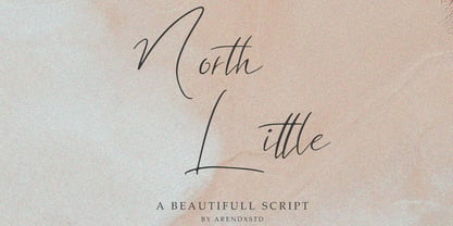
- Charmante by Juraj Chrastina,
$39.00
- Jositary by HafisHidayat,
$15.00
- Threefonte by Girinesia,
$13.00
- VAL - Personal use only

- Spin Cycle 3D OT - Unknown license

- FlatPack - Unknown license

- Fresh Anemone by Seemly Fonts,
$14.00
- Best Kids by Awan Senja,
$14.00
- Ben Kidoz by Sipanji21,
$5.00
- Funcy Kids by Stringlabs Creative Studio,
$29.00
- Venarotta by Aftertime Studio,
$20.00
- Milking by WAP Type,
$20.00
- Happy Dinosaur by Sipanji21,
$10.00
- Spooky Green by Illushvara,
$13.00
- Creamy Delight by Awan Senja,
$14.00
- Fletcher-Gothic is a typeface designed by Alan Carr, showcasing a unique balance between historical gravitas and a contemporary twist. The design of Fletcher-Gothic draws its inspiration from the tra...
- "TRASHED" by Last Soundtrack is a captivating display of creative chaos, intricately designed to bring a rugged, edgy feel to the table. At first glance, the font boldly defies traditional typographi...
- KometenMelodie1 by PizzaDude is a font that can only be described as dynamically playful, teeming with a vibe that's both retro and futuristically sleek. This typeface, crafted with a keen eye for de...
- Konfuciuz, a unique typeface developed by Apostrophic Labs, stands out for its distinctive blend of modern and traditional elements that conjure the essence of wisdom and ancient philosophy, subtly h...
- Bad Coma is an intriguingly distinctive typeface that stands out with its unmistakably bold and somewhat rebellious character. Instantly recognizable by its unique style, this font weaves together th...
- The D3 Labyrinthism katakana font, created by Kat Rakos, stands as a unique and mesmerizing addition to the typographic landscape. Its design is heavily influenced by the intricate and complex pathwa...
- Sfilth, a distinctive font crafted by the talented Stephen Bird, stands as a testament to the innovative and adventurous spirit of modern typography. At first glance, Sfilth captivates with its uniqu...


