5,484 search results
(0.028 seconds)
- Gasthony Signature by Sronstudio,
$18.00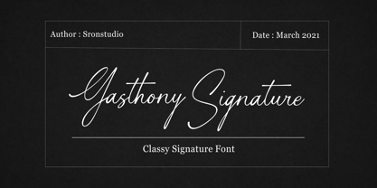 Gasthony - Signature Font - Perfect for branding, invitation, stationery, wedding designs, social media posts, advertisements, product packaging, product designs, label, photography, watermark, special events, and more. Features: Uppercase and lowercase letters Swash alternates ( Beginning, Ending ) Multilingual symbols, numerals, and punctuation How To Access Alternate Swashes? You can read this article: https://helpx.adobe.com/illustrator/using/special-characters.html Follow Instagram: @sronstudio Thank You!
 - Luxury Home by Fo Da,
$5.00 Luxury Home is a slab serif typeface of 9 weights from Extra Light to Extra Black and can be used as both a headline and text face. "Luxury Home" is recommended for using in long-form writing and articles, since a serif is far more readable for longer passages of text. The typeface has a carefully crafted weight range, with ligatures .
 - Penman by Page Studio Graphics,
$25.00The Penman fonts are partially based on the 19th century penmanship of one of the designer’s ancestors, and originally created for a personal mailing with an “old-times tradition” flavor. The fonts are lightly pair-kerned, in order to control punctuation and numeral spacing. Auto-kerning should be turned on, and tracking should be checked to make sure all characters join well. - Hastery Signature by Sronstudio,
$18.00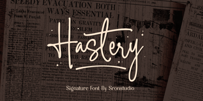 Hastery - Signature Font - Perfect for branding, invitation, stationery, wedding designs, social media posts, advertisements, product packaging, product designs, label, photography, watermark, special events, and more. Features: Uppercase and lowercase letters Swash alternates ( Beginning, Ending ) Multilingual symbols, numerals, and punctuation How To Access Alternate Swashes? You can read this article: https://helpx.adobe.com/illustrator/using/special-characters.html Follow Instagram: @sronstudio Thank You!
 - Penman B by Page Studio Graphics,
$25.00The Penman fonts are partially based on the 19th century penmanship of one of the designer’s ancestors, and originally created for a personal mailing with an “old-times tradition” flavor. The fonts are lightly pair-kerned, in order to control punctuation and numeral spacing. Auto-kerning should be turned on, and tracking should be checked to make sure all characters join well. - Elina by ParaType,
$30.00 Elina continues the series of graceful calligraphic typefaces by Natalia Vasilyeva that partially imitate broad pen drawings. The family consists of two styles -- normal and decorative. Decorative style contains characters ornamented with thin strokes that add a beauty and charm to the design. The fonts can be used in display matters, advertising and celebration texts. Released by ParaType in 2011.
 - DorovarFLF-Carolus - Unknown license

- Christmas Memories by Ake,
$12.00 Christmas Memories is a beautiful, well balanced and stylish script font. It is defined by smooth curves and is perfect for fashion branding or editorial designs. Add it confidently to your projects, and you will love the results.
 - Thanks Mom by Letterafandi Studio,
$12.00 Thanks Mom is a delicate and elegant handwritten font. Its distinct and well balanced letters make this font a masterpiece. Thanks Mom is PUA encoded which means you can access all of the glyphs and swashes with ease!
 - Candy Night by FadeLine Studio,
$15.00 Introducing CANDY NIGHT! A Hand Drawn slab serif font! Made by hand to provide a natural, unique and modern style. This font is carefully designed to maintain the balance of each letter. Very easy and convenient to use.
 - Aloka Gikairo by Letterena Studios,
$17.00 Aloka Gikairo is a stylish and serif script font. It is PUA encoded which means you can access all of the amazing glyphs and ligatures with ease! Its distinct and well balanced letters make this font a masterpiece.
 - Neue Frutiger Paneuropean by Linotype,
$79.00During planning for the new Roissy Charles de Gaulle airport in Paris at the beginning of the 1970s, it was determined that the airport's signage system had to include the clearest and most legible lettering possible. The development of all signage was put into the hands of Adrian Frutiger and his studio. The team carried out their task so effectively that a huge demand for their typeface soon arose from customers who wanted to employ it in other signage systems, and in printed materials as well. The Frutiger® typeface not only established new standards for signage, but also for a range of other areas in which a clear and legible design would be required, especially for small point sizes and bread-and-butter type. The typeface family that which emerged as a result of this demand was added into the Linotype library as "Frutiger" in 1977. Frutiger Next, created in 1999, is a further development of Frutiger, not necessarily a rethinking of the design itself. It was based on a new concept, the most obvious visual characteristics of which is the larger x-height, as well as a more pronounced ascender height and descender depth for lower case letters in relation to capitals. This new design created a balanced image and included considerably narrower letterspacing. Frutiger Next meets the demand for a space-saving, modern humanist sans. 2009's Neue Frutiger is a rethink of the 1977 Frutiger family, now revised and improved by Akira Kobayashi in close collaboration with Adrian Frutiger. Despite the various changes, this "New Frutiger" still fits perfectly with the original Frutiger family, and serves to harmoniously enhance the weights and styles already in existence. The perfect mix, guaranteed Neue Frutiger has the same character height as Frutiger. As a result of this, already existing Frutiger styles can be mixed with Neue Frutiger where necessary. Likewise, Neue Frutiger is perfect for use alongside Frutiger Serif. Newly added are the "Neue Frutiger 1450" weights. Especially for the requirements of the newly released German DIN 1450 norm we have built together with Adrian Frutiger specific weights of the Neue Frutiger. The lowercase l" is curved at the baseline to better differentiate between the cap "I", additionally the number "0" has a dot inside to better differentiate between the cap "O", and the number "1" is now a serifed 1. The font contains additionally the origin letterforms from the regular Neue Frutiger font which can be accessed through an Opentype feature." - Neue Frutiger Cyrillic by Linotype,
$89.00During planning for the new Roissy Charles de Gaulle airport in Paris at the beginning of the 1970s, it was determined that the airport's signage system had to include the clearest and most legible lettering possible. The development of all signage was put into the hands of Adrian Frutiger and his studio. The team carried out their task so effectively that a huge demand for their typeface soon arose from customers who wanted to employ it in other signage systems, and in printed materials as well. The Frutiger® typeface not only established new standards for signage, but also for a range of other areas in which a clear and legible design would be required, especially for small point sizes and bread-and-butter type. The typeface family that which emerged as a result of this demand was added into the Linotype library as "Frutiger" in 1977. Frutiger Next, created in 1999, is a further development of Frutiger, not necessarily a rethinking of the design itself. It was based on a new concept, the most obvious visual characteristics of which is the larger x-height, as well as a more pronounced ascender height and descender depth for lower case letters in relation to capitals. This new design created a balanced image and included considerably narrower letterspacing. Frutiger Next meets the demand for a space-saving, modern humanist sans. 2009's Neue Frutiger is a rethink of the 1977 Frutiger family, now revised and improved by Akira Kobayashi in close collaboration with Adrian Frutiger. Despite the various changes, this "New Frutiger" still fits perfectly with the original Frutiger family, and serves to harmoniously enhance the weights and styles already in existence. The perfect mix, guaranteed Neue Frutiger has the same character height as Frutiger. As a result of this, already existing Frutiger styles can be mixed with Neue Frutiger where necessary. Likewise, Neue Frutiger is perfect for use alongside Frutiger Serif. Newly added are the "Neue Frutiger 1450" weights. Especially for the requirements of the newly released German DIN 1450 norm we have built together with Adrian Frutiger specific weights of the Neue Frutiger. The lowercase l" is curved at the baseline to better differentiate between the cap "I", additionally the number "0" has a dot inside to better differentiate between the cap "O", and the number "1" is now a serifed 1. The font contains additionally the origin letterforms from the regular Neue Frutiger font which can be accessed through an Opentype feature." - Neue Frutiger 1450 by Linotype,
$71.99 During planning for the new Roissy Charles de Gaulle airport in Paris at the beginning of the 1970s, it was determined that the airport's signage system had to include the clearest and most legible lettering possible. The development of all signage was put into the hands of Adrian Frutiger and his studio. The team carried out their task so effectively that a huge demand for their typeface soon arose from customers who wanted to employ it in other signage systems, and in printed materials as well. The Frutiger® typeface not only established new standards for signage, but also for a range of other areas in which a clear and legible design would be required, especially for small point sizes and bread-and-butter type. The typeface family that which emerged as a result of this demand was added into the Linotype library as "Frutiger" in 1977. Frutiger Next, created in 1999, is a further development of Frutiger, not necessarily a rethinking of the design itself. It was based on a new concept, the most obvious visual characteristics of which is the larger x-height, as well as a more pronounced ascender height and descender depth for lower case letters in relation to capitals. This new design created a balanced image and included considerably narrower letterspacing. Frutiger Next meets the demand for a space-saving, modern humanist sans. 2009's Neue Frutiger is a rethink of the 1977 Frutiger family, now revised and improved by Akira Kobayashi in close collaboration with Adrian Frutiger. Despite the various changes, this "New Frutiger" still fits perfectly with the original Frutiger family, and serves to harmoniously enhance the weights and styles already in existence. The perfect mix, guaranteed Neue Frutiger has the same character height as Frutiger. As a result of this, already existing Frutiger styles can be mixed with Neue Frutiger where necessary. Likewise, Neue Frutiger is perfect for use alongside Frutiger Serif. Newly added are the "Neue Frutiger 1450" weights. Especially for the requirements of the newly released German DIN 1450 norm we have built together with Adrian Frutiger specific weights of the Neue Frutiger. The lowercase l" is curved at the baseline to better differentiate between the cap "I", additionally the number "0" has a dot inside to better differentiate between the cap "O", and the number "1" is now a serifed 1. The font contains additionally the origin letterforms from the regular Neue Frutiger font which can be accessed through an Opentype feature."
 - Miedinger by Canada Type,
$24.95 Helvetica’s 50-year anniversary celebrations in 2007 were overwhelming and contagious. We saw the movie. Twice. We bought the shirts and the buttons. We dug out the homage books and re-read the hate articles. We mourned the fading non-color of an old black shirt proudly exclaiming that “HELVETICA IS NOT AN ADOBE FONT”. We took part in long conversations discussing the merits of the Swiss classic, that most sacred of typographic dreamboats, outlasting its builder and tenants to go on alone and saturate the world with the fundamental truth of its perfect logarithm. We swooned again over its subtleties (“Ah, that mermaid of an R!”). We rehashed decades-old debates about “Hakzidenz,” “improvement in mind” and “less is more.” We dutifully cursed every single one of Helvetica’s knockoffs. We breathed deeply and closed our eyes on perfect Shakti Gawain-style visualizations of David Carson hack'n'slashing Arial — using a Swiss Army knife, no less — with all the infernal post-brutality of his creative disturbance and disturbed creativity. We then sailed without hesitation into the absurdities of analyzing Helvetica’s role in globalization and upcoming world blandness (China beware! Helvetica will invade you as silently and transparently as a sheet of rice paper!). And at the end of a perfect celebratory day, we positively affirmed à la Shakti, and solemnly whispered the energy of our affirmation unto the universal mind: “We appreciate Helvetica for getting us this far. We are now ready for release and await the arrival of the next head snatcher.” The great hype of Swisspalooza '07 prompted a look at Max Miedinger, the designer of Neue Haas Grotesk (later renamed to Helvetica). Surprisingly, what little biographical information available about Miedinger indicates that he was a typography consultant and type sales rep for the Haas foundry until 1956, after which time he was a freelance graphic designer — rather than the full-time type designer most Helvetica enthusiasts presume him to have been. It was under that freelance capacity that he was commissioned to design the regular and bold weights of Neue Haas Grotesk typeface. His role in designing Helvetica was never really trumpeted until long after the typeface attained global popularity. And, again surprisingly, Miedinger designed two more typefaces that seem to have been lost to the dust of film type history. One is called Pro Arte (1954), a very condensed Playbill-like slab serif that is similar to many of its genre. The other, made in 1964, is much more interesting. Its original name was Horizontal. Here it is, lest it becomes a Haas-been, presented to you in digital form by Canada Type under the name of its original designer, Miedinger, the Helvetica King. The original film face was a simple set of bold, panoramically wide caps and figures that give off a first impression of being an ultra wide Gothic incarnation of Microgramma. Upon a second look, they are clearly more than that. This face is a quirky, very non-Akzidental take on the vernacular, mostly an exercise in geometric modularity, but also includes some unconventional solutions to typical problems (like thinning the midline strokes across the board to minimize clogging in three-storey forms). This digital version introduces four new weights, ranging from Thin to Medium, alongside the bold original. The Miedinger package comes in all popular font formats, and supports Western, Central and Eastern European languages, as well as Esperanto, Maltese, Turkish and Celtic/Welsh. A few counter-less alternates are included in the fonts.
 - Franqueline Slab by Sudtipos,
$39.00 Introducing Franqueline Slab, the captivating new typeface family passionately designed by Estudio Vástago and expertly distributed by Sudtipos! This versatile font offers a diverse array of styles, ranging from delicately refined to boldly eye-catching on the weight axis, all elegantly inspired by the timeless Egyptian fonts of the late 19th century. With expressive character and exquisitely unique shapes, Franqueline Slab harmoniously blends the finesse of its delicate strokes with sophisticated endings, resulting in a truly remarkable typography. Every letter in Franqueline Slab has been meticulously crafted to strike the perfect balance between a contemporary edge and a touch of traditional charm, appealing to both the younger generation and typography enthusiasts who appreciate the artistry of the past. Its adaptability makes it ideal for captivating headlines that convey a message of youthful energy and playfulness, while still exuding the timeless elegance that only classic fonts can deliver. Embrace distinction and originality in your designs with Franqueline Slab. Whether it graces an editorial project, logo, or advertising material, this exceptional typeface family will undoubtedly stand out, leaving a lasting impression with its captivating personality. Watch your messages come to life and shine with the unparalleled charm of Franqueline Slab!
 - PF Bague Inline Pro by Parachute,
$79.00 Bague Inline Pro is the inline version of Bague Universal a contemporary geometric typeface family which blends distinct minimalist characteristics with mainstream details. Despite its inspiration from Herbert Bayer’s drawings of the 1920s, it diverts from the constructivist rigidity and display structure of early geometric typefaces by incorporating humanist characteristics as well as classic letterform shapes which balance out the extremity of the minimal shapes. Bague Inline is a typeface that stays true to its urban nature and heritage. A very interesting feature of Bague Inline is its vast array of uppercase alternates and ligatures which truly shine when set at display sizes. Make your selection from 4 groups of alternates as well as a rich set of discretionary ligatures and watch it transform into a flexible, charming and stylish typeface with strong modern aesthetics. This typeface offers enormous possibilities and variations for editorial design and branding. Bague Inline is the only commercially available inline typeface that comes in 4 weights for uppercase and lowercase letters. Each style consists of 775 glyphs with more that 128 alternates and ligatures and an extended set of characters which supports simultaneously Latin, Cyrillic and Greek. PDF Specimen Bague Inline on Behance
 - Les Tulipes Pro by Fontforecast,
$29.00 We present Les Tulipes Pro. A smart, classy, modern calligraphy layered type system that offers an array of versatility. Les Tulipes Pro is hand drawn with dip pen and ink, with great attention for details. To name a few: - Elongated entrance and exit strokes ( type ++1 to ++10 in front and __1 to __10 at the back of any letter) - 5 different connecting spaces that make it appear as if the pen was never lifted from the paper (type space1 to space5 wherever you want the connecting spaces to appear) - 9 alternate ampersands (type &1 to &9) - 2 alternate at signs (type @1 or @2) - 5 stylistic sets for alternate characters Note: Discretionary ligatures must be ON The various designs of Les Tulipes Pro harmonize beautifully. Les Tulipes Pro Sans was designed to complement and support the other styles. The more straight forward appearance of the Sans styles enable you to balance out your designs perfectly. The Bold and Closed versions offer even more possibilities to combine or highlight words and phrases. On top of that Les Tulipes Pro Extra, with its 85 gorgeous swirls and swashes tempts you to further embellish your design.
 - Madelican by Subectype,
$19.00 Madelican is a beautiful combination of modern and classical calligraphy, inspired by the handwriting of Italian women and ancient manuscripts. I think calligraphy has an advantage for the alternate characters, Madelican has tons of possibilities for just one letter. My exploration of this fonts was not as easy as in my imagination, it took several trial and errors for the perfect balance of the style. Madelican is very suitable for weddings, book covers, greeting cards, logos, branding, business cards and certificates, even for any design work that requires a classic, formal or luxurious touch. Almost all letters have more alternate than others, it is fine because the limitations of the shape of the letters. It must be readable and legible. Every letter that I've chose are only the best on it and fit with the character style. Multi-lingual support and up to 16 stylistic alternates. If you do not have programs that support OpenType features like Adobe Illustrator and CorelDraw X Versions, you can access all alternative flying machines using Font Book (Mac) or Character Map (Windows). And feel free contact me if you have a question.
 - Quieta by Italiantype,
$39.00 Quieta is a humanist serif typeface inspired by the aesthetics of Italian Renaissance and by the empowering history of the painter Artemisa Gentileschi, first woman to be admitted to an Academy of Fine Arts in Italy. The designer, Maria Chiara Fantini, has used sharp flat-nib calligraphic strokes to add a vibrant contemporary vibe to the traditional humanist proportions. Classical details (such as the beak of the “e” and the angled stress of the “o”), are balanced by a modern and readable low-contrast design, developed in a range of six weights with a matching set of true italics. A Display weight, with lighter shapes and stronger contrast has been developed excel in logos, headlines and captions. The wide array of alternate, decorative and swash glyphs and the full coverage of over 200 extended latin languages make Quieta a solid, highly readable and elegant typeface perfect for body text both on the screen and on the printed page. Graceful and powerful at the same time, this typeface family is ready to help you when in need of the timeless appeal of a self-conscious feminine elegance.
 - Evocativa by Intellecta Design,
$23.00 Evocativa has a perfect combination of roman bodonian inspired ornamented caps with a well crafted blackletter set, in a balanced typeface suit to use in your headings text projects and in jobs with a classit and yet antique feeling.
 - Greek House Fathouse - Unknown license

- Pea Mystie - Personal use only

- Pea Lyndal - Unknown license

- Pea Superamy - Unknown license

- Pea Marcie - Unknown license

- Pea Friend - Unknown license

- Pea Protani - Unknown license

- Pea Monica - Unknown license

- Pea Kristin - Unknown license

- Pea Steph - Unknown license

- Pea Kareen - Unknown license

- Pea Tangee - Unknown license

- Pea Jamie - Unknown license

- Pea Melanie - Unknown license

- Pea Sarahloo - Unknown license

- Pea HeidiQ - Unknown license

- Pea Johanna - Unknown license

- Pea Lis - Unknown license

- Pea Angedawn - Unknown license


