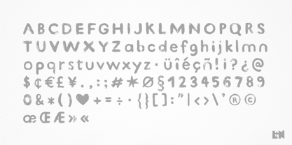
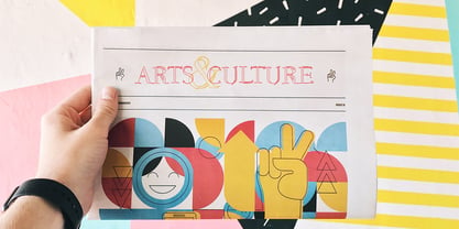
Kind Type is based on watercolor painted letters. Open, bold strokes with rounded terminals make it a very legible typeface even at small size. Kind Type has a soft, friendly character with a distressed edge. It is suitable for short paragraphs, captions or headings.
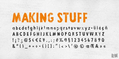
Lino Stamp is a geometrical, sans-serif typeface inspired by Futura Bold Condensed. To produce it, letters were carved into linoleum, inked and impressed on paper – giving a worn and distressed finish. Lino Stamp works particularly well for headings, short paragraphs and scrapbook-style designs.
Tuzonie imitates misprinted or degraded and distressed type. It especially imitates type where the outline has only small imperfections, (which at smaller sizes might even appear fairly-well defined) but where the imperfections in the interior of the letter shapes are more obvious and frequent.
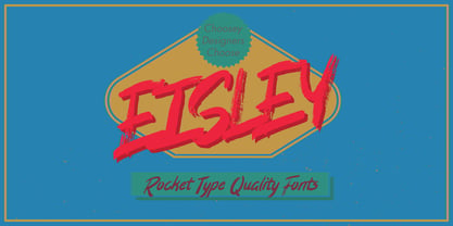
Eisley started as an experiment with creating brushes in illustrator. I began by drawing each letter and tweaking until each one balanced next to one another. I painted over 50 paint brush strokes to give a variety of different looks to the final characters. Strategically crafted to look as real and as spontaneous as a sign painter might paint up (although possibly running a bit dry on paint giving the end result a vintage and grungy effect). Eisley is perfect for use in any design branding that requires vintage or distressed display lettering. Eisley is perfect for use in any design branding that requires vintage or distressed display text. Great fun to use AND personalize with your own flair.
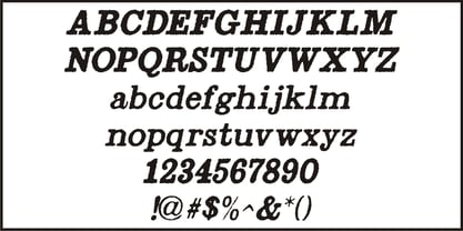
The font Antique Slabserif JNL was run through a filter to create a design that looks like worn type at smaller settings or jaggedly distressed lettering in larger type heights. The end result is Radio Interference JNL, which is available in both regular and oblique versions.
Eduardo Manso has brought new meaning to the word distressed. The contours of Rina have been randomly inverted, spiked and split to create this agitated look. Surprisingly, Rina remains legible. And just to turn the screw a little more, Manso created an outline version, Rina Linea.
Konscript is a distressed typewriter face developed from analog samples from papers Mary Browers typed in the 1950s for her high school coursework. The model and age of the typewriter are not known. Additional characters were developed based on the analog samples to complete the character set.
Disgrunged is a distressed grunge font, as you might guess, and industrial sans-serif in feel. The Disgrunged-1234 family has ink blotches and spills, along with misprinted letters, and the typeface has four versions (1, 2, 3, 4) giving increasing amounts of chaos, jumbledness and irregularities.
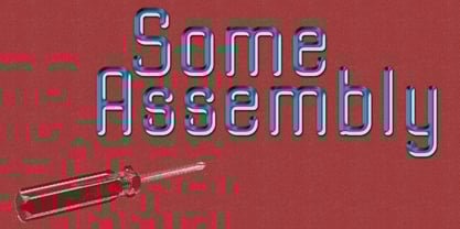
Some Assembly is a sans serif printer font which ran into a few problems when it came time to print. Offered with a wide range of distressed styles. It is a pleasantly styled geometric face which is highly legible and its various styles provide dynamic alternatives.
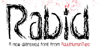
Rabid is an inky, messy, super distressed display font. It's part charcoal, part chalk strokes, add a splash a of red and it starts to look like blood. Why SO Serious? It has about 200 glyphs including all those extra pesky foreign features. O Hope you like it.
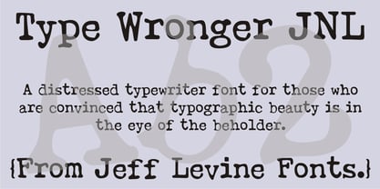
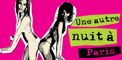
A typewriter gives you clean, crisp text from its keys, but Type Wronger JNL does anything but this. A distressed typewriter font, this font emits a rough, crude imprint as if the original had been photocopied, copied from that copy and re-copied until the original message had degenerated.
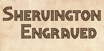
Shervington Engraved is a re-drawing of our previous Shervington typeface, showing it as it appears hand engraved on copper-plate with a stylus, with the letter forms shaded in diagonally. It combines excellent clarity with a rustic distressed look, and is ideal for use on signage and headings.
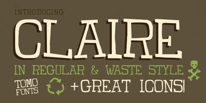
TOMO Claire is a handmade typeface with a relaxed style and committed to the environment. It comes in two styles, Regular and Waste with a distressed look. This typeface is ideal for all types of projects related to the care of the environment and everything else. Be green! Act now!
Disgrunged is a distressed grunge font, as you might guess, and industrial sans-serif in feel. The Disgrunged ABCD family resembles bad printing with rubber stamps, with corners showing, along with misprinted letters, and the typeface has four versions (A, B, C, D) giving increasing amounts of chaos, jumbledness and irregularities.
Smash is nicely distressed and has cracks, chunks and blobs. Some people think it looks like a crappy FAX or broken typewriter. It is compatible with Overexposed, so you can mix and match letters so you don't have two of the same messed up letters in a row.(Pretty cool huh?)
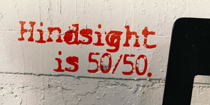
Fille de Joie is a distressed typewriter font created from a vintage typewriter that a friend of mine bought in Paris. It’s pretty dirty and nasty. Included are open type ligatures for all of the double letters like “EE” “TT” “FF” etc. to give the font a more natural look.
This friendly rounded display typeface is perfect for headlines and logos, its gentle curves and comfortable corners are reminiscent of forms found in nature. Inspired by the shapes found in leaves - soft curves forming gentle corners as they meet. Cockle pairs well with Arial for a body font. Includes over 500 characters; with Ligatures, small caps, old style figures, and mathematical symbols.
DokChampa is a Lao font based on the Arial typeface. DokChampa was created by the Monotype Type Drawing Office to support Lao and Thai scripts. The DokChampa font is a legible sans serif that is good for use on screen and in printed documents. DokChampa is a Lao script font and requires an application program that supports Lao or Thai scripts.
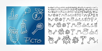
Digitized handwriting fonts are a perfect way to give documents the “very special touch”. Invitations look simply better when handwritten than when printed in bland Arial or Times New Roman. Short handwritten notes look authentic and appealing. There are numerous occasions where handwritten text makes a better impression. “Picto Handwriting” comes with beautiful handwritten pictograms that let you quickly spruce up your designs.
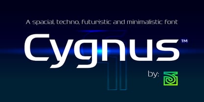
A font face with cyber, spacial, and aerial connotations that offers a decisive futuristic and techno spirit. Available in two stylish versions, clear and rusty. With one alternate for lowercase /a/ and more diacritics and ligatures and extended range glyphs and more new stylish alternates, Cygnus can be used in titles and display text that require a futuristic and dynamic style. Recommended for games, presentations, or any graphic design pieces that reveal and need futuristic, techno, spacial, aerial and/or Sci-fi style.
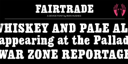
Rough and ready artisanal lettering for your fair trade coffee shop, whiskey microbrewery or Victorian bill-poster — or, alternatively, distressed type for the cover of a hard-hitting novel set in a war zone. Fairtrade uses opentype technology to cycle through three versions of each character, giving an authentically uneven time-worn appearance.
Talbot Type Keymer Thug is a display face available in three weights, it is a distressed variation of Keymer Radius . Its textured look brings a characterful, time-worn quality. Keymer Thug features an extended character set to include old style numerals, accented characters for Central European languages and bespoke characters in the italic.
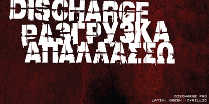
Discharge is a bold, heavy, distressed and destroyed sans serif typeface. It was started alongside Universally Corrupt and Insurgent, but it took a couple extra years to finish. It was expanded to include extended Latin, extended Cyrillic and Greek alphabets, so it will work with most languages in Europe and the Americas.
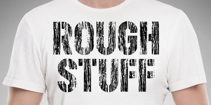
Cool and contemporary or hot and happening? Street smart or down and dirty? You decide. Either way Rough Stuff will add a dash of style and the stamp of authenticity to your graphic projects. Perfect for tee shirt slogans or gig posters. Suitably distressed 'warning' symbols are also supplied. See also Export Drive.
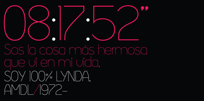
Lynda is a post-modern, monoline rounded sans ideal for club flyers, music covers and fashion publications. The fonts were designed by Ariel Di Lisio and digitized by Alejandro Paul.
The Buckboard family uses the OpenType ligature feature to substitute a unique pair of distressed characters when any upper or lower case letter is keyed twice in a row. The Buckboard Shadow font can be overlapped with Buckboard Regular to color the drop shadow separately. All fonts also support Eastern European Latin and Baltic languages.
Magic is a vintage wide serif distressed stamp-like font with 4 styles to choose from. Ideal for a project that need that rough look and you can always combine styles to customize your type. With 3 styles (+lowercases) all combined into a single font. Styles can be accessed in opentype features “stylistic alternates & Swashes".
A misprinted sans serif loosely based on Phillip Cavette’s 1999 font 4990810, but with re-drawn outlines, more distress marks, a neater vertical aspect and no baseline irregularity. Unlike its inspiration, Sans Culottes is a complete font which includes a lower case, accented characters and as many dingbats as you can shake a stick at.
LATINATE is a condensed Latin typeface whose sharp serifs are not as fiercely pointed as traditional Latins. The fonts are derived from the serial numbers of bus tickets issued by the Bell Punch Company in the mid twentieth century, and the LATINATE ROUGH font is a distressed version based on scans of coarsely printed tickets.