473 search results
(0.016 seconds)
- As of my last update in April 2023, the font named Sagan isn't a universally recognized standard typeface like Times New Roman or Arial. However, given the naming convention, it's possible to imagine...
- Once upon a time, in the enchanted lands of typography, nestled between the bold warriors of Arial and the elegant serifs of Times New Roman, there lived a whimsically charming font named TagettesPlu...
- KR Wiccan Symbols by Kat Rakos is like the mystic cousin in the font family who turned the attic into a spell-casting room. Imagine if your keyboard was imbued with magic, and each keypress invoked a...
- Ah, yes, the Bionic Comic Condensed font by Iconian Fonts – it's like the superhero of the typeface world, donned in its sleek, form-fitting spandex, ready to add a punch of personality to any projec...
- Sure thing! Imagine if the fonts in your computer decided to throw a costume party. Amongst the sea of letters dressed in their serif and sans-serif finery, one font stands out for its audacity and f...
- Constant by Underscore,
$32.00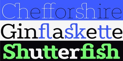 Constant is a meticulously constructed slab serif display typeface of a sturdy lineage. The strong horizontal and vertical rhythm and calculated angles dominate its appearance, yet sweeping broad shapes infuse the design with an overall warm undertone. Constant is best suited for setting short headlines, word marks, posters and other visual communication ephemera. Particular when set in all uppercase the typeface’s squarish and resolute nature commands attention and projects authority. Despite the prominent slab serifs and their angular corner details, these fonts work well also for shorter text passages, especially in the lighter to medium weights. When typesetting Constant in paragraphs spanning several lines the face requires a fair amount of leading to not appear vertically compressed. As customary for Underscore’s catalog the fonts have very extensive support for languages in the Latin script, reaching from Afrikaans to Vietnamese and Zulu. The fonts are carefully spaced, kerned and hinted, and include a variety of typographic glyphs and OpenType features like various ligatures, number features and case alternatives. Constant has been developed and released in 2018 as the proud forth release from the Underscore label. This design by Johannes Neumeier is available from the Underscore webshop as well as selected retailers.
 - Bion by Type Forward,
$38.00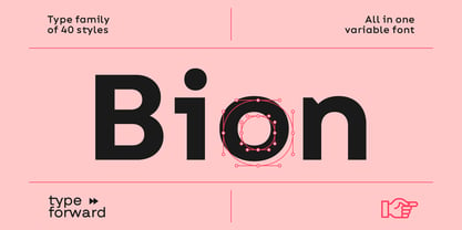 Bion is a contemporary geometric sans serif with a down-to-earth attitude. It is distinguished by a high x-height, vertically cut terminals, and a minimal stroke contrast, giving it a distinctive, sharp look that is both timeless and universally appealing. Bion comes with 40 weights in a single variable file, ranging from Hairline to Black. We also included Upright, Italic, and Condensed variations to give you a fresh and diverse look for poster and title designs. Whatever message you want to get across, Bion has you covered - with support for 220 languages and 1,220 glyphs in total, as well as Extended Latin, Cyrillic and Greek scripts and an exhaustive list of typographic symbols. Our latest typeface also arrives packed full of OpenType features, including an alternative glyph set that will transform the way your text looks, giving it a more squarish appearance and offering additional visualization options. The Bion type family also includes an extensive set of standard and discretionary ligatures, tabular and small figures, fractions, and language localizations. These features work in static and variable fonts alike, providing a ready-made solution to all your advanced typographic needs. This functional, pragmatic typeface is clean and easily readable, making it an ideal choice for both print and on-screen media.
 - Grapple BRK Pro by CheapProFonts,
$10.00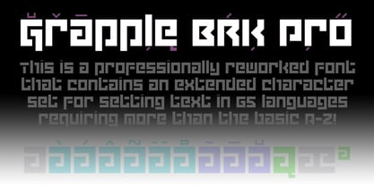 Another very squarish and futuristic font from Brian Kent. This time I've kept the very thin style of the diacritics, but I have redesigned the A and H (and a couple of other letters and glyphs ;) - mostly to give them a little more "meat". And then added the usual plethora of accented letters for our unique language support, of course. Result! ALL fonts from CheapProFonts have very extensive language support: They contain some unusual diacritic letters (some of which are contained in the Latin Extended-B Unicode block) supporting: Cornish, Filipino (Tagalog), Guarani, Luxembourgian, Malagasy, Romanian, Ulithian and Welsh. They also contain all glyphs in the Latin Extended-A Unicode block (which among others cover the Central European and Baltic areas) supporting: Afrikaans, Belarusian (Lacinka), Bosnian, Catalan, Chichewa, Croatian, Czech, Dutch, Esperanto, Greenlandic, Hungarian, Kashubian, Kurdish (Kurmanji), Latvian, Lithuanian, Maltese, Maori, Polish, Saami (Inari), Saami (North), Serbian (latin), Slovak(ian), Slovene, Sorbian (Lower), Sorbian (Upper), Turkish and Turkmen. And they of course contain all the usual "western" glyphs supporting: Albanian, Basque, Breton, Chamorro, Danish, Estonian, Faroese, Finnish, French, Frisian, Galican, German, Icelandic, Indonesian, Irish (Gaelic), Italian, Northern Sotho, Norwegian, Occitan, Portuguese, Rhaeto-Romance, Sami (Lule), Sami (South), Scots (Gaelic), Spanish, Swedish, Tswana, Walloon and Yapese.
 - Aure Brash by Aure Font Design,
$23.00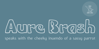 Aure Brash speaks with the cheeky inuendo of a sassy parrot. The quirky forms of this unique outline font engage the reader with a subtext of whimsy. Designed for its visual impact, Brash stands out as a title font and offers delightful possibilities for graphic imagery. Brash is an original design developed by Aurora Isaac. After more than a decade in development, 2018 marks the first release of the CJ and KB glyphsets. The CJ glyphset is a full text font with an extended set of lowercase and uppercase glyphs supporting a variety of European languages. Additional glyphs include standard ligatures, four variations of the ampersand, and check-mark and happy-face with their companions x-mark and grumpy-face. Numbers are available in lining and oldstyle versions, with numerators and denominators for forming fractions. Companion glyphs include Roman numerals, specialized glyphs for indicating ordinals, and a variety of mathematical symbols and operators. The CJ glyphset also includes an extended set of glyphs for typesetting Western Astrology. These glyphs are also available separately in the KB glyphset: a symbol font re-coded to allow easy keyboard access for the most commonly used glyphs. Brash is not designed for use in extended text. It shows its strength paired with strong text fonts such as Aure Jane or Aure Teddy. Used sparingly, Brash will add witty highlights to catch the reader's eye. Give Aure Brash a trial run! You may discover a permanent place for this font family in your typographic palette. AureFontDesign.com
 - Resist Sans by Groteskly Yours,
$25.00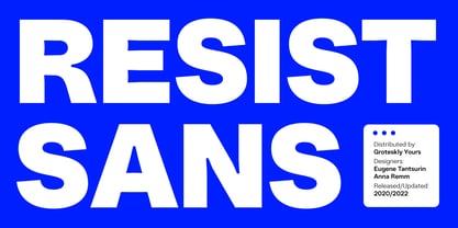 Resist Sans is a free-spirited neo-grotesque that embodies both the innate desire for revolt and a tendency towards uniformity. While Resist Sans preserves the neat, minimalist look which is associated with neo-grotesques, it also accentuates the tentativeness of each letter form. The name, too, hints at the rebellious character of the typeface. Resist Sans comes in 28 styles (14 uprights and matching obliques). Text vs Display Resist Sans comes in two versions: Display and Text, which serve different purposes but remain interchangeable and even complementary in some cases. Resist Text is equipped with deep ink traps and optical compensators, which really come into play at smaller sizes. The Display version is smoother and more consistent, so better for use in larger sizes and headlines. Styles/Weights Each of the two versions of Resist Sans comes in 7 weights (Thin to Black) and is equipped with matching Obliques, which brings the total number of styles to 28. Two trial styles (Text Light and Display Medium Oblique) can be downloaded free of charge. Each style contains 900+ glyphs, awesome OpenType features, and around 1500 kerning pairs. Language Support Resist Sans is truly multilingual. It supports most European and Latin-languages and features Extended Cyrillic, which gives access to such languages as Ukrainian, Bulgarian, Serbian, Russian, Macedonian and many more. Free Styles Two styles of Resist Sans can be downloaded for free on MyFonts. Type Specimen Resist Sans PDF Type Specimen can be downloaded here: Resist Sans PDF Type Specimen
 - Aure Nox by Aure Font Design,
$23.00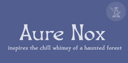 Aure Nox inspires the chill whimsy of a haunted forest. The roughhewn forms of this decorative, sans-serif font engage the reader with a subtext of rakish charm. Surprisingly legible, Nox adds a bit of rebelious sass to text and titles, and a daring stance to astrological expressions and chartwheels. Nox is an original design developed by Aurora Isaac. After more than a decade in development, 2018 marks the first release of the CJ and KB glyphsets in regular, italic, bold, and bold-italic. The CJ glyphset is a full text font supporting a variety of European languages. A matching set of small-caps complements the extended lowercase and uppercase glyphsets. Supporting glyphs include standard ligatures, four variations of the ampersand, and check-mark and happy-face with their companions x-mark and grumpy-face. Numbers are available in lining, oldstyle, and small versions with numerators and denominators for forming fractions. Companion glyphs include Roman numerals, specialized glyphs for indicating ordinals, and a variety of mathematical symbols and operators. The CJ glyphset also includes an extended set of glyphs for typesetting Western Astrology. These glyphs are also available separately in the KB glyphset: a symbol font re-coded to allow easy keyboard access for the most commonly used glyphs. Though Nox stands well on its own as a text font, the more traditional sans-serif forms of Aure Jane pair well as an innocuous foil to Nox's brazen presence. Give Aure Nox a trial run! You may discover a permanent place for this font family in your typographic palette. AureFontDesign.com
 - Aure Westra by Aure Font Design,
$23.00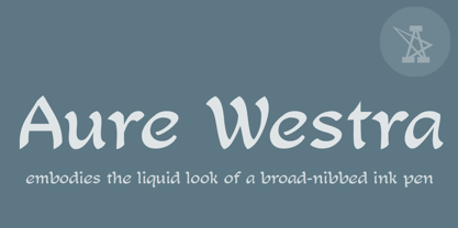 Aure Westra embodies the liquid look of a broad-nibbed ink pen. These bold forms engage the reader with a subtext of exotic wisdom. Westra’s entrancing flow brings a dramatic intrigue to text and titles and an esoteric savor to astrological expressions and chartwheels. Westra is an original design developed by Aurora Isaac, first released in the LP glyphset in 2011. After more than a decade in development, 2018 marks the release of the CJ and KB glyphsets. The CJ glyphset is a full text font with an extended set of lowercase and uppercase glyphs supporting a variety of European languages. Additional glyphs include standard ligatures, four variations of the ampersand, and check-mark and happy-face with their companions x-mark and grumpy-face. Numbers are available in lining and oldstyle versions, with numerators and denominators for forming fractions. Companion glyphs include Roman numerals, specialized glyphs for indicating ordinals, and a variety of mathematical symbols and operators. The CJ glyphset also includes an extended set of glyphs for typesetting Western Astrology. These glyphs are also available separately in the KB glyphset: a symbol font re-coded to allow easy keyboard access for the most commonly used glyphs. The unique look of Aure Westra stands on its own as a text font. Where needed, use the clean lines of Aure Jane to provide contrasting text that will showcase Westra’s exotic nature. Give Aure Westra a trial run! You may discover a permanent place for this font family in your typographic palette. AureFontDesign.com
 - Sure, Squareworm by Måns Grebäck is a visually striking font that captures attention with its unique and playful essence. It's like stepping into a whimsical digital playground where each character h...
- As of my last update in April 2023, there isn't a widely recognized font specifically called "Notepad" that stands apart in the same way as, say, Arial or Times New Roman. However, the concept of a "...
- Ah, Brassiere by Apostrophic Labs – if fonts were garments, this one would definitely be a lacy number you'd find hidden in the mischievous corner of your wardrobe. Picture this: a font that flirts w...
- Ah, the NAUJOKSLOVE font, the very essence of what happens when a designer decides that the alphabet had one too many glasses of romantic comedy and decided to waltz through the moonlight! Crafted by...
- Picture this: "Teen Spirit" by Steven J. Lundeen is not just a font; it's the embodiment of youth rebellion, a visual shout that echoes through the halls of high school, sticking it to the man with e...
- Aure Jane by Aure Font Design,
$23.00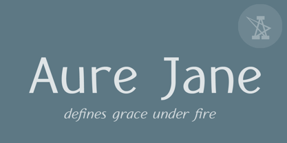 Aure Jane defines grace under fire. These clean, sans-serif forms engage the reader with a subtext of trust. Jane’s excellent legibility will stand up under almost any typographic challenge, bringing confidence to text and titles, and clarity to astrological expressions and chartwheels. Jane is an original design developed by Aurora Isaac. After more than a decade in development, 2018 marks the first release of the CJ and KB glyphsets in regular, italic, bold, and bold-italic. The CJ glyphset is a full text font supporting a variety of European languages. A matching set of small-caps complements the extended lowercase and uppercase glyphsets. Supporting glyphs include standard ligatures, four variations of the ampersand, and check-mark and happy-face with their companions x-mark and grumpy-face. Numbers are available in lining, oldstyle, and small versions, with numerators and denominators for forming fractions. Companion glyphs include Roman numerals, specialized glyphs for indicating ordinals, and a variety of mathematical symbols and operators. The CJ glyphset also includes an extended set of glyphs for typesetting Western Astrology. These glyphs are also available separately in the KB glyphset: a symbol font re-coded to allow easy keyboard access for the most commonly used glyphs. In addition to Aure Jane’s versatility as a text font, Jane can enhance the message of other designs. Aure Jane pairs well as an innocuous foil to any decorative font; Aure Sable, for example, will shine all the more beside Jane’s sensible utility. The witty highlights of Aure Brash will sparkle against Jane’s practicality. Give Aure Jane a trial run! You may discover a permanent place for this font family in your typographic palette. AureFontDesign.com
 - Koufiya by Linotype,
$187.99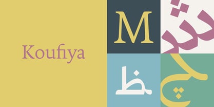 Koufiya is designed by Nadine Chahine in 2003 as part of her MA project at the University of Reading, UK and later released by Linotype in 2007. It is the first typeface to include a matching Arabic and Latin designed by the same designer at the same time with the intention of creating a harmonious balance between the two scripts. The Arabic part is based on the Early Kufi style popular in the 7th to 10th century AD. It is characterized by a strong horizontal baseline, horizontal stacking order, clear and open counters, and a general open feeling. Though based on the earliest styles on Arabic manuscript, the design paradoxically appears quite modern and fresh. The Latin part of Koufiya recalls a Dutch influence in its shallow top arches and rather squarish proportions. Both Arabic and Latin parts have been carefully designed to maintain the same optical size, weight, and rhythm. However, no sacrifices were made to make them appear closer to each other. They are designed so that they work well together on the printed page, and to make sure that the two scripts are harmonious when they are mixed together even if within the same paragraph. The font includes support for Arabic, Persian, and Urdu. It also includes proportional and tabular numerals for the supported languages.
 - Corners 2 isn't one of the mainstream fonts that you'd find popping up in your everyday text editor or design program. It's more like a hidden gem tucked away in the vast world of typography, waiting...
- As of my last update in early 2023, the font named "Ptarmigan" is not one of the widely recognized or mainstream fonts, such as Helvetica, Times New Roman, or Arial, which have broad applications and...
- Once upon a time, in the bustling metropolis of Typography Town, there lived a unique and rather intriguing font named EU-Sym. This font wasn't your typical character in the neighborhood, like the bo...
- Ah, the Capitular Moldurada font by Ouripedes Gallene, a font so distinctive that it makes Arial look like it's pretending to be Helvetica at a costume party. Imagine if letters decided to go to a ma...
- Resist Mono by Groteskly Yours,
$25.00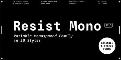 Resist Mono is a highly functional monospaced type family designed for optimal performance both in print and on the web. Inspired by the distinctive features of the original Resist Sans family, it showcases deep inktraps, angled terminals, and exceptional legibility. With its bold personality and style, Resist Mono remains highly readable even at small sizes. Suitable for coding, UX, web, and graphic design, Resist Mono offers versatility and visual impact for a wide range of applications. Resist Mono comes in 16 styles (14 static fonts) and two variable fonts. Each font contains over 1300 glyphs, including letters, small capitals, numbers, punctuation, symbols, etc. Resist Mono supports more than 200 Latin-based languages and has extensive Cyrillic support for languages like Russian, Bulgarian, Ukrainian, Serbian, and many more. In addition to this, Resist Mono also includes special Powerline symbols for coding. OpenType features in Resist Mono include Small Capitals, Case Sensitive Punctuation, Stylistic Alternates, Fractions, Subscript, Superscript, Ligatures and many more. Resist Mono Type Family Features: - 1300+ characters per font - 14 static fonts - 2 variable fonts - True Italics - Small Capitals - Extensive OpenType features - Supports 200+ Languages (Latin & Cyrillic) - Special Symbols and Features - Free Trial Fonts Available Resist Mono has been meticulously developed to prioritize functionality and legibility, making it an ideal choice for coding. It offers true italics with a calligraphic influence, adding a unique touch to the font. Additionally, users can access the regular slanted letterforms through OpenType by selecting the corresponding stylistic set. With its versatility, Resist Mono can be applied beyond coding, finding relevance in various contexts like product and graphic design, web design, publishing, and more, thanks to its visually appealing features and bold stylistic choices. Explore Resist Mono Dynamic Specimen for more features, type testers, etc.
 - Austin Antique by HiH,
$10.00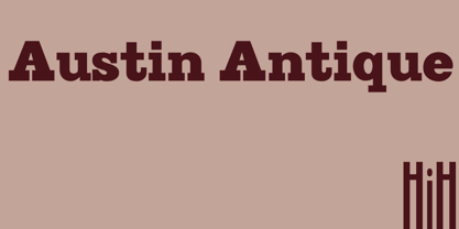 “More is better” may have been the motto of Richard Austin of Austin and Son’s Imperial Letter-Foundry on Worship Street at Finsbury Square in London when he designed and cut his Antique typeface. The year it was created is uncertain, but it is known to have appeared in a specimen book produced in 1827. At first glance, the upper case letters of Austin Antique look very much like Figgins Antique. But, upon examination, one will note that the Austin face is much darker. In general, the letters designed and cut by Richard Austin have fatter strokes, larger serifs and smaller counters -- more metal and less daylight. The premise was that the darker the letter, the more attention an ad using the typeface would receive. In old pictures of London and Paris one may see walls crowded with posters and “bills” -- competing for the attention of the passerby. Morris and Updike aside, the early nineteenth century marked the beginning of a commercial as well as industrial revolution. Patterns of commerce were changing. With new methods of marketing came the need for new typefaces to support the new methods. Foundries found the display types were very profitable and competed most energetically and creatively for the trade. There was a lot of trial-and-error. Some ideas faded away. Others, like the Antiques or Egyptians, were refined and developed. From them came the Clarendons that were to prove both popular and long lasting -- because they worked. Their job was to sell goods, not please the aesthetic sensibilities of the critics. They did their job well. Austin Antique has a full Western European character set, plus the following ligatures: ct, st, fi, fl, ff, ffi and ffl. Tabular numbers. Surprisingly readable.
 - Aure Declare by Aure Font Design,
$23.00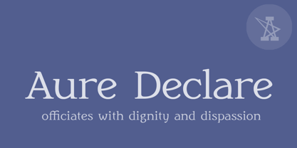 Aure Declare officiates with dignity and dispassion. These traditional serif forms engage the reader with a no-nonsense subtext of reliability. Declare’s capacity to showcase the message rather than the medium brings a welcome legibility to extended text and a formal assertion to astrological expressions and chartwheels. Declare is an original design developed by Aurora Isaac. After more than a decade in development, 2018 marks the first release of the CJ and KB glyphsets in regular, italic, bold, and bold-italic. The CJ glyphset is a full text font supporting a variety of European languages. A matching set of small-caps complements the extended lowercase and uppercase glyphsets. Supporting glyphs include standard ligatures, four variations of the ampersand, and check-mark and happy-face with their companions x-mark and grumpy-face. Numbers are available in lining, oldstyle, and small versions, with numerators and denominators for forming fractions. Companion glyphs include Roman numerals, specialized glyphs for indicating ordinals, and a variety of mathematical symbols and operators. The CJ glyphset also includes an extended set of glyphs for typesetting Western Astrology. These glyphs are also available separately in the KB glyphset: a symbol font re-coded to allow easy keyboard access for the most commonly used glyphs. In addition to Aure Declare’s versatility as a text font, Declare pairs well as a no-nonsense foil to any decorative design. Aure Sable, for example, will shine all the more beside Declare’s practicality. Aure Declare pairs especially well with its close cousin, Aure Wye. Wye’s decorative forms provide elegant titles and drop-caps for Declare’s extended text. Give Aure Declare a trial run! You may discover a permanent place for this font family in your typographic palette. AureFontDesign.com
 - Aure Wye by Aure Font Design,
$23.00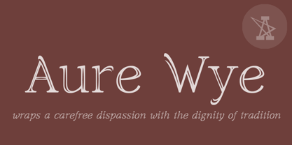 Aure Wye wraps a carefree dispassion with the dignity of tradition. The precise engraving and organic finials of these decorative serif forms engage the reader with a subtext of elegance. Wye brings an unpretentious grace to titles and drop-caps and provides dignity to astrological expressions and chartwheels. In Regular, Wye presents a formal presence; in Italic, Wye offers a more romantic feel. Its small-caps add a stately variety to Wye's typographic textures. Wye is an original design developed by Aurora Isaac. After more than a decade in development, 2018 marks the first release of the CJ and KB glyphsets, now available in regular and italic. The CJ glyphset is a full text font supporting a variety of European languages. A matching set of small-caps complements the extended lowercase and uppercase glyphsets. Supporting glyphs include standard ligatures, four variations of the ampersand, and check-mark and happy-face with their companions x-mark and grumpy-face. Numbers are available in lining, oldstyle, and small versions, with numerators and denominators for forming fractions. Companion glyphs include Roman numerals, specialized glyphs for indicating ordinals, and a variety of mathematical symbols and operators. The CJ glyphset also includes an extended set of glyphs for typesetting Western Astrology. These glyphs are also available separately in the KB glyphset: a symbol font re-coded to allow easy keyboard access for the most commonly used glyphs. Aure Wye will stand up as a text font, but for extended text, try pairing Wye with its close cousin, Aure Declare. Used in titles and drop-caps, Wye will provide a striking elegance that will blend well with the serifed forms of Declare. Give Aure Wye a trial run! You may discover a permanent place for this font family in your typographic palette. AureFontDesign.com
 - Canturiana by Latinotype,
$39.00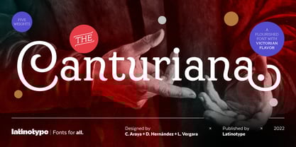 According to the Dictionary of the Spanish Royal Academy, «canturía» is the exercise of singing, and a way of singing musical compositions. Canturiana Type (derived from «canturía») has a romantic and musical air, as well as a clear sensuality thanks to its sinuous construction. The curves seduce us, conquer us, hypnotize us and the letters acquire a resounding lightness, and a very earthly presence that is complemented by a certain aerial, spiritual expressiveness. Canturiana Type is inspired by Canterbury, a font designed in the 1920s by the legendary American type designer and engineer Morris Fuller Benton and published by the American Type Founders (ATF). Canturiana Type collects all this heritage and transforms it into a digital typeface perfectly functional and adapted to the visual communication of the 21st century. Its elegant art deco essence provides it with a unique and heterodox imprint that works in very different media, giving them distinction and depth. The creative process of Canturiana Type has gone through various mutations to a point where each episode of its creation has left its mark, a multiple imprint that makes it unique, singular in its essence and plural in its possibilities. For this reason, Canturiana Type expresses itself with several voices without any variation in its essence. A conceptual ambiguity that makes it truly versatile. Canturiana Type is a typographic choir, a complex entity that has infinite nuances and tones. Classic and cool. Disruptive and romantic. Literary and musical. Canturiana Type is composed of 5 weights, and has a large number of swashes, alternate characters, ligatures and various visual elements to make compositions as titles or for use in short texts. Canturiana Type has more than a thousand glyphs and offers a wide range of languages that use the Latin alphabet.
 - Aure Teddy by Aure Font Design,
$23.00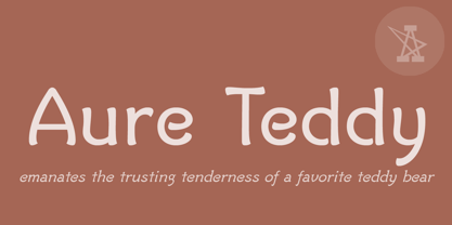 Aure Teddy emanates the trusting tenderness of a favorite teddy bear. The hand-penned look of these forms engages the reader with a subtext of comfort. Teddy is delightfully legible as a text font and works well where a more organic look is wanted. It brings an unassuming charm to text and titles and a welcome empathy to astrological expressions and chartwheels. Its engaging charcter serves well in labeling diagrams and personalizing nametags. Teddy is an original design developed by Aurora Isaac. After more than a decade in development, 2018 marks the first release of the CJ and KB glyphsets in regular, italic, bold, and bold-italic. The CJ glyphset is a full text font supporting a variety of European languages. A matching set of small-caps complements the extended lowercase and uppercase glyphsets. Supporting glyphs include standard ligatures, four variations of the ampersand, and check-mark and happy-face with their companions x-mark and grumpy-face. Numbers are available in lining, oldstyle, and small versions, with numerators and denominators for forming fractions. Companion glyphs include Roman numerals, specialized glyphs for indicating ordinals, and a variety of mathematical symbols and operators. The CJ glyphset also includes an extended set of glyphs for typesetting Western Astrology. These glyphs are also available separately in the KB glyphset: a symbol font re-coded to allow easy keyboard access for the most commonly used glyphs. Aure Teddy fills a unique niche, being a modestly decorative font as well as a competant text font. Like Aure Jane, Aure Teddy serves well paired with the decorative touches of Aure Brash and Aure Sable. Give Aure Teddy a trial run! You may discover a permanent place for this font family in your typographic palette. AureFontDesign.com
 - Aure Sable by Aure Font Design,
$23.00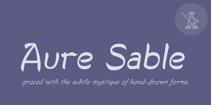 Aure Sable embodies the entrancing mistique of an adventurous spirit. The fluid forms of this brush font engage the reader with a subtext of serendipitious happenstance. Sable Regular brings the soft touch of familiarity to text and titles and imbues astrological expressions and chartwheels with an exotic intrigue. The graceful forms of Sable Italic add the flowing touch of a personal comunique. Sable is an original design developed by Aurora Isaac. After more than a decade in development, 2018 marks the first release of the CJ and KB glyphsets in regular and italic. The CJ glyphset is a full text font with an extended set of lowercase and uppercase glyphs supporting a variety of European languages. Additional glyphs include standard ligatures, four variations of the ampersand, and check-mark and happy-face with their companions x-mark and grumpy-face. Numbers are available in lining and oldstyle versions, with numerators and denominators for forming fractions. Companion glyphs include Roman numerals, specialized glyphs for indicating ordinals, and a variety of mathematical symbols and operators. The CJ glyphset also includes an extended set of glyphs for typesetting Western Astrology. These glyphs are also available separately in the KB glyphset: a symbol font re-coded to allow easy keyboard access for the most commonly used glyphs. Aure Sable is engaging as a text font, but its empathic nature radiates against more traditional fonts that provide the perfect foil to Sable's casual persona. Pair Sable with the formal look of geometric fonts such as Aure Jane and Aure Declare to accentuate Sable's heartfelt nature. Give Aure Sable a trial run! You may discover a permanent place for this font family in your typographic palette. AureFontDesign.com
 - Aure Zeritha by Aure Font Design,
$23.00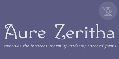 Aure Zeritha emotes the unassuming charm of fairytale romance. The modestly adorned forms of this decorative serif font engage the reader with a subtext of innocence. Zeritha brings an ingenuous romance to text and titles and a guileless promise of adventure to astrological expressions and chartwheels. The breadth of typographic textures revealed in its bold and italic forms is given depth by the charm of its small-caps and the delight of its curly alternates. Zeritha is an original design developed by Aurora Isaac, first released in the LP glyphset in 2011. After more than a decade in development, 2018 marks the release of the CJ and KB glyphsets, available in regular, italic, bold, and bold-italic. The CJ glyphset is a full text font supporting a variety of European languages. A matching set of small-caps complements the extended lowercase and uppercase glyphsets. Supporting glyphs include standard ligatures, four variations of the ampersand, and check-mark and happy-face with their companions x-mark and grumpy-face. Numbers are available in lining, oldstyle, and small versions, with numerators and denominators for forming fractions. Companion glyphs include Roman numerals, specialized glyphs for indicating ordinals, and a variety of mathematical symbols and operators. The CJ glyphset also includes an extended set of glyphs for typesetting Western Astrology. These glyphs are also available separately in the KB glyphset: a symbol font re-coded to allow easy keyboard access for the most commonly used glyphs. Aure Zeritha stands its own as a text font, but for extended text, try pairing Zeritha with its distant cousin, Aure Declare. Use Zeritha where the fairytale romance is needed; use Declare for tight text and practical contrast. Give Aure Zeritha a trial run! You may discover a permanent place for this font family in your typographic palette. AureFontDesign.com
 - SCR-N by URW Type Foundry,
$39.99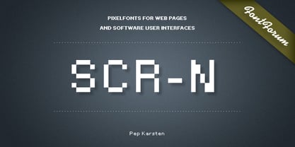 SCR fonts are screen optimized (also called 'pixel fonts'). Unlike standard fonts (and like the few well-hinted fonts like Verdana or Arial), they give a crisp look on screen at very small sizes, thus increasing legibility. The perfect applications for those fonts are web pages and software user interfaces (computer, cellular phones, console games and any other system that uses a screen interface). Unlike most pixel fonts, SCR fonts contain kerning information. Kerning is the adjustment of space between certain pairs of characters (like 'AV') to make text look more fluid, thus increasing legibility and appeal. To benefit from this feature, auto-kerning must be activated in the application. In Photoshop, kerning must be set to 'Metrics'. Although SCR fonts are optimized for screen, they can be used for print (in Illustrator or Indesign for example) for a decorative 'computer text' effect. In this case, there is no constraint: they can be used as any other font. For screen use (in Photoshop, Fireworks, Flash... ), they have to keep aligned with the screen pixel grid not to look blurred or distorted. To achieve this, here are the guidelines to follow: RESOLUTION If the application permits it (Photoshop, Fireworks), document resolution must be set to 72 pixels per inch. SIZE The font size must be set to 10 (or multiples of 10) points. POSITIONING & ALIGNMENT The reference points of text fields and text blocks (upper left corner for left aligned text, upper right for right aligned text) must be positioned at integer values of pixels. In Photoshop, text can be precisely moved with [Edit Free Transform]. In Flash, movie clips containing text fields must also be positioned at integer values on the stage. Text must be aligned to the left or right only. Center alignment can be simulated with left alignment by adding spaces at the begin of each line. To dispense with the positioning and alignment constraints, text anti-aliasing can be turned off if the application permits it (Photoshop, Flash MX 2004). OTHER SETTINGS Leading (line spacing), tracking (letter spacing), manual kerning and baseline shift must be set either to integer values of points or to multiples of 100 units (depending on the application). Vertical and horizontal scaling must be set to 100%. Faux bold or Faux italic must not be used. The document must neither be resized on export, nor allow resizing (Flash Movies).
 - SCR-I by URW Type Foundry,
$39.99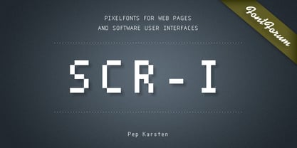 SCR fonts are screen optimized (also called 'pixel fonts'). Unlike standard fonts (and like the few well-hinted fonts like Verdana or Arial), they give a crisp look on screen at very small sizes, thus increasing legibility. The perfect applications for those fonts are web pages and software user interfaces (computer, cellular phones, console games and any other system that uses a screen interface). Unlike most pixel fonts, SCR fonts contain kerning information. Kerning is the adjustment of space between certain pairs of characters (like 'AV') to make text look more fluid, thus increasing legibility and appeal. To benefit from this feature, auto-kerning must be activated in the application. In Photoshop, kerning must be set to 'Metrics'. Although SCR fonts are optimized for screen, they can be used for print (in Illustrator or Indesign for example) for a decorative 'computer text' effect. In this case, there is no constraint: they can be used as any other font. For screen use (in Photoshop, Fireworks, Flash... ), they have to keep aligned with the screen pixel grid not to look blurred or distorted. To achieve this, here are the guidelines to follow: RESOLUTION If the application permits it (Photoshop, Fireworks), document resolution must be set to 72 pixels per inch. SIZE The font size must be set to 10 (or multiples of 10) points. POSITIONING & ALIGNMENT The reference points of text fields and text blocks (upper left corner for left aligned text, upper right for right aligned text) must be positioned at integer values of pixels. In Photoshop, text can be precisely moved with [Edit Free Transform]. In Flash, movie clips containing text fields must also be positioned at integer values on the stage. Text must be aligned to the left or right only. Center alignment can be simulated with left alignment by adding spaces at the begin of each line. To dispense with the positioning and alignment constraints, text anti-aliasing can be turned off if the application permits it (Photoshop, Flash MX 2004). OTHER SETTINGS Leading (line spacing), tracking (letter spacing), manual kerning and baseline shift must be set either to integer values of points or to multiples of 100 units (depending on the application). Vertical and horizontal scaling must be set to 100%. Faux bold or Faux italic must not be used. The document must neither be resized on export, nor allow resizing (Flash Movies).
 - Olivine by URW Type Foundry,
$35.00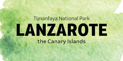 In an era of typographic neutrality, Pria Ravichandran adds spirit and flavour to the humanist sans, a genre that is known for legibility. Introducing Olivine. Olivine is a versatile type family that performs admirably across sizes. It is designed with maximum care ensuring legibility across various sizes, angles and distances. The sturdy shapes and the exaggerated ink traps fade to produce an even typographic colour and a lively texture in smaller text sizes. In larger display settings, the details become self-conscious and highlight the spectacular quality of the design. Olivine is neither experimental nor minimal, striking a balance between formality and friendliness. Olivine is clean as well as organic at the same time. Consisting of seven weights in roman and italics, the type-family address typographic hierarchy for texts of all kinds and sizes. Distinctive, yet neutral letterforms add personality to the type family. The counter-forms are large and open giving the design plenty of internal space which is balanced against the generous spacing of the characters. These features of Olivine make the reading process enjoyable in digital as well as the print medium. No squinting to read this type-family! If you are looking to add some flavour into your design, try Olivine. It is a trend-setting typeface that we predict is going that extra mile. Try before you buy, Olivine Medium and Medium Italic are available free for unlimited commercial usage.
 - Andulka by Storm Type Foundry,
$44.00A universal typeface for books, magazines and newspapers must be economizing, quiet, strong in drawing, but original and peaceful at the same time. Type "for all weather" must resist also many difficulties of printing on different surfaces. Therefore, the basic design "Text" is slightly darker and legible from 6 point size even in a dim light, whereas "Book" reduces the effect of running ink and saves toner cartridge. In offices of smaller companies these lighter fonts are welcomed as toner-savers. Andulka also need less space on the page than other text typefaces and saves paper too. Medium and Bold designs keep the original grace, changing its weight only in shadows. Italics may remind humanistic inspiration and forcing the horizontal of x-height with robust horizontal serifs, whereas Roman lower case maintains the baseline. Basic numerals are non-aligning proportional, but there are available upper case figures as well as special numerals drawn for the same height as small caps, which is just about a hairline above the x-height. The characteristic feature of Andulka is a squinted eye in letters 'a', 'c', 'f', 'r', 's', 'k', and softened diagonals through all characters in family. Diagonals were always disturbing and gripping attention extensively. Serifs are stressed trapezoids reminding small beaks at curved endings, descenders 'j' and 'y' may evoke tail feathers of budgerigar. Andulka [budgerigar] sings lovely and is everyday quiet companion. The whole family consists of 24 separate fonts for graphic studio, office or home. - Totemic by Canada Type,
$29.95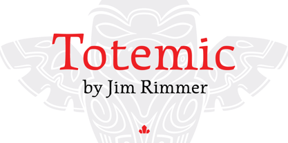 Jim Rimmer’s first typeface was originally published in 1970 as a basic film type alphabet through a small, independent type house in central California. Its sources of influence (now calligraphic type standards by Dair, Goudy and Zapf) are ones that remained with Jim for the rest of his career. If you squint at Totemic in just the right way, you can see some recognizable themes Jim would later flesh out and make his own in later works throughout his career as a type designer and printer. Totemic is now available for the first time as a digital font, of the refined and expanded kind now expected from Canada Type. It comes with quite a few standard advanced typography features: Small caps, caps-to-small-caps, automatic fractions and standard ligatures, stylistic alternate sets, six kinds of figures, case-sensitive forms, and extended Latin language support. It also comes with a very unique and unprecedented feature: Variably stackable totem poles. Simply enable the discretionary ligatures feature, type any unique three-digit combination using numbers between 1 and 4, and watch the magic happens. With a name like Totemic, we just couldn't help ourselves. Many thanks to Andrew Steeves of Gaspereau Press for finding Jim’s lost gem in a most unexpected place, and for helping us bring it back to life 45 years after its analog birth. 20% of Totemic’s revenues will be donated to the Canada Type Scholarship Fund, supporting higher typography education in Canada.
 - Bitsumishi Pro v2 by CheapProFonts,
$10.00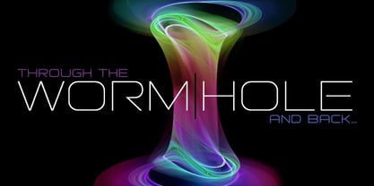 A squarish uppercase font perfect for logos and short eye-catching headings. The lowercase contains some alternate letterforms - more specifically: uppercase have closed forms (I made a new A D and R), and lowercase have some open alternatives (new B E F P and T in addition to the A D and R). I noticed the two width version of the H and made similar normal and wide versions of J and L. Then I added lots of missing glyphs and all the diacritic letters, of course - and finally the family has been expanded to 7 weights AND corresponding Italics! Enjoy! ALL fonts from CheapProFonts have very extensive language support: They contain some unusual diacritic letters (some of which are contained in the Latin Extended-B Unicode block) supporting: Cornish, Filipino (Tagalog), Guarani, Luxembourgian, Malagasy, Romanian, Ulithian and Welsh. They also contain all glyphs in the Latin Extended-A Unicode block (which among others cover the Central European and Baltic areas) supporting: Afrikaans, Belarusian (Lacinka), Bosnian, Catalan, Chichewa, Croatian, Czech, Dutch, Esperanto, Greenlandic, Hungarian, Kashubian, Kurdish (Kurmanji), Latvian, Lithuanian, Maltese, Maori, Polish, Saami (Inari), Saami (North), Serbian (latin), Slovak(ian), Slovene, Sorbian (Lower), Sorbian (Upper), Turkish and Turkmen. And they of course contain all the usual "western" glyphs supporting: Albanian, Basque, Breton, Chamorro, Danish, Estonian, Faroese, Finnish, French, Frisian, Galican, German, Icelandic, Indonesian, Irish (Gaelic), Italian, Northern Sotho, Norwegian, Occitan, Portuguese, Rhaeto-Romance, Sami (Lule), Sami (South), Scots (Gaelic), Spanish, Swedish, Tswana, Walloon and Yapese.
 - **The Enigmatic Elegance of Xiparos Lombard: A Font Review by Yours Truly, the Artistic Oracle** In the grand parade of typographies where fonts like Arial and Helvetica march with their heads held...
- Ah, "rockdafonkybit" by Grafik Industries - a font that sounds like it was named during a groovy jam session in the basement of a 1970s disco-tech, where the walls were painted in psychedelic pattern...
- Pantera by Lián Types,
$39.00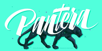 ROARRR! THE STYLES -Pantera Pro is the most complete style, and although its default look is mono-rhythmic it gets really playful and crazy like the examples of the posters by just activating the Decorative Ligatures button in the Open-type Panel of Adobe Illustrator. However, I recommend using also the Glyphs Panel because there you'll find much more variants per letter. Pantera Pro is in fact, coded in a way the combination of thicknesses will always look fantastic. -Pantera Black Left, and Pantera Black Right are actually “lite” versions of Pantera Pro: They have very little Open-Type code, so what you see here is what you get. Pantera Black Left has its left strokes thick, while Pantera Black Right has its right strokes thick. -Pantera White is a lovely member in this family that looks lighter and airy, hence its name. With the feature Standard Ligatures activated (liga) the font gets very playful. -Pantera Caps is based on sign painters lettering and since it follows the same pointed brush rules as the other styles, it matches perfectly. -Pantera Claws like its name suggests, is a set of icons that were done by our dear panther. THE STORY It is said that typography can never be as expressive as calligraphy, but sometimes it can get close enough. I tend to think that calligraphic trials, in order to work well as potential fonts, need first to go through very strict filters before going digital: While calligraphy is synonym of freedom (once its rules are mastered), type-design, in the other hand, has its battlefield a little tighter and tougher. When I practice pointed brush lettering, there are so many things happening on the paper. And most of them are delicious. The ones who know my work may see that although many of my fonts are very expressive, my handmade brush trials are much more lively than them. With that in mind, this time I tried to go further and rescue more of those things that are lost in the process of thinking type when first sketches are calligraphic. I wondered if I could create something wild, hence its name Panther, by understanding the randomness that sometimes calligraphy conveys and turning it to something systemic: With Pantera, I created an ordered disorder. Like it happens a lot in many kinds of lettering styles, in order to enrich the written word the scribe mixes the thickness of the strokes and the width of the letters. Like one of my favorite mentors say (1), they make thoughtful gestures Some lively strokes go down with a thick, while some do that with a thin. Some letters are very narrow, meaning some of them will need to be very wide to compensate. Why not?. The calligrapher is always thinking on the following letters, and he/she designs in his head the combination of thicks and thins before he/she executes them. He/she knows the playful rhythm the words will have before writing them. It takes time and skill to master this and achieve graceful results. Going back to the font, in Pantera, this combination of varying thicknesses and widths of letters were Open-Type coded so the user will see satisfactory results by just enabling or disabling some buttons on the glyphs panel. I'm very pleased with the result since it’s not very easy to find fonts which play with the words' rhythm like Pantera does, following of course, a strong calligraphic base. I believe that if you were on the prowl for innovative fonts, this is your chance to go wild and get Pantera! NOTES (1) Phrase by Yves Leterme. In fact, it’s the title of a book by him. EPILOGUE Esta fuente está dedicada a mi panterita