10,000 search results
(0.042 seconds)
- Dot.com - Unknown license

- BPchubby - Unknown license

- BattleLines - Personal use only

- LED BOARD REVERSED - Unknown license

- Andovine by Stringlabs Creative Studio,
$25.00 Andovine is a strong and powerful display font with a vintage feel. Fall in love with its raw authenticity. Andovine is a handbrush font with authentic style. This font is made with a brush pen with very careful techniques, so the results are charismatic and have enchanting characteristics.
 - Cherrydorry by Motokiwo,
$15.00 Cherrydorry, a chic and elegant handwritten font with classy ligatures. It also support multilingual characters and absolutely PUA encoded. I recommend this font for logos, business cards, fashion design, beauty design, magazine, or a movie. With natural handwriting and a lovely pen stroke, Cherrydorry will blend into your design.
 - Williamson by Stringlabs Creative Studio,
$25.00 Williamson is a luxurious and playful script with a contemporary vibe. Get inspired by its minimalist elegance. Williamson Path is a flowing and elegant handwritten font, created with the help of a brush pen. Get inspired by its unique and beautiful style and add it to your favorite designs!
 - Black Hat by Trustha,
$17.00 Black Hat is a bold handwritten font. Inspired by a round black hat. Written with a brush pen with fast movements. Comes with two fonts, makes it easy to choose a font that suits the project being worked on. Suitable for branding, advertising, headlines, packaging design, and more.
 - Hallywood by Stringlabs Creative Studio,
$25.00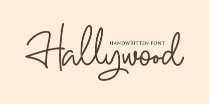 Hallywood is a sweet handwritten font. It’s perfect for logos, wedding invitations, signatures, advertising and much more! Hallywood is a flowing and elegant handwritten font, created with the help of a brush pen. Get inspired by its unique and beautiful style and add it to your favorite designs!
 - After Breaking by Stringlabs Creative Studio,
$25.00 After Breaking is a nostalgic script with a personal feel. Get inspired by its authentic charm! After Breaking is a flowing and elegant handwritten font, created with the help of a brush pen. Get inspired by its unique and beautiful style and add it to your favorite designs!
 - Rainclouds by Hanoded,
$15.00 I was doodling away with a sharpie pen on a rainy day. Hey… wait a minute. A rainy day, a font called Rainclouds… Yep, that’s right, it is called Rainclouds for that reason! ;-) Rainclouds is a fat marker font with a lot of texture and a lot of mouth.
 - Lid by One Fonty Day,
$15.00 Lid is a handwritten, versatile typeface. The non-cursive script is uncomplicated, unpretentious and easy to read. The typeface comes in three different styles; Pen, Brush and Marker. Each style has a different touch, but all three styles come together perfectly. Most of the european languages are supported.
 - Bungler by Bogstav,
$17.00 This font is a strange mixture of sweet strawberry cake and horrifying terror! :) Meaning that the font can be used for something pretty scary (such as a horror poster) or something quite innocent (like products for children) It resembles fat brushstrokes, but clearly it was drawn with a pen.
 - Simple Stencil JNL by Jeff Levine,
$29.00 A brass hand-punched shipping stencil from the 1950s inspired Simple Stencil JNL. The rounded ends of the characters are reminiscent of technical lettering templates, especially since there are a combination of solid letters and those with stencil "breaks" as many of those pen and ink templates possessed.
 - Mough by Krntype Studio,
$16.00 a bold marker display font. Font with round and fat style. Mough imitate round marker pen in a clean way, this font fits perfectly into any background. Mough is perfect for many design such as merch, T-shirts, titles, book covers, social media posts, websites, events, and many more
 - Oyukis Ghost by Hanoded,
$10.00 Oyuki's Ghost is a scary typeface made with a steel pen and Chinese Ink. The name comes from a painting by Maruyama Okyo (1733–1795), which depicts his mistress who died young. Maruyama Okyo claimed she haunted him in his sleep. The font comes with extensive language support.
 - Cracksmoon by Zamjump,
$15.00 Cracksmoon was hand-drawn with a marker pen and converted to font - and like the marker, it has natural edges and realistic shapes. Includes bonus ligatures and style swashes. Perfect for designs where you need a font that's a little rougher around the edges. Including : Alternate Multilingual support
 - Regua by Tipos do aCASO,
$2.90Play like a child with letter forms, fill the gaps of a stencil with a ballpoint pen and work this to generate a digital type. Régua (Ruler, in Portuguese) is the result of a typographical joke with the upper cases made by Buggy, a Brazilian typographer, in 1998. - James Black by Motokiwo,
$15.00 James Black, a signature milli pen font with classy handwriting style. This is a perfect font for business, for your personal feels, for everything about you smart people! You will get a casual handwritten font with some ligatures that will give you more taste of high class personality.
 - Potpourri by Linotype,
$29.99 Potpourri was based on an energetic alphabet written by expert calligrapher Gottfried Pott. To create the elegant yet rugged strokes, Pott cut a pen with a unique fringed tip — from a drinking straw! He then produced an huge series of drafts before deciding on the final alphabet for digitization.
 - Shopie by Hendra Pratama,
$19.00 Shopie is a handmade script made with a marker pen. It is useful for a variety projects such as quotes, book covers, t-shirt designs, magazine titles and much more. Features: 370 Glyphs Uppercase Lowercase Symbols & Punctuation Support more than 62 Languages Support OpenType Features Support PUA Unicode
 - P22 Avocet by IHOF,
$29.95 A light chancery script font influenced by both the hand-held pen and the typefounder’s machinery. The curves are reminiscent of the beak of the avocet, a wading bird. This font was originally engraved in metal and copper matrices made for casting into hot metal type for letterpress printing.
 - Snooty Fox NF by Nick's Fonts,
$10.00This casually elegant typeface is based on an unnamed offering from Pen & Brush Lettering and Practical Alphabets, published by Blandford Press, Ltd., London, in 1929. Good taste dictates that, because of the ornate and unusual letterforms of the uppercase letters, the font never be used as all caps. - Hylandia by Monotype,
$15.99 Delicate but spirited, Hylandia is a cursive script with gorgeous looping letterforms drawn with a light touch using a thin brush pen. This font has a sensitive sense of delicacy and care, with clear roots in calligraphy and tradition. Hylandia is available with some ligatures and alternate forms.
 - Selfish Jeans by Bogstav,
$16.00 The song "Selfish Jean" by Travis inspired me to name this font, and a runny pen made me draw the letters. Actually, I started making the font while listening to that particular song - and the whole atmosphere about that situation, suited me perfect to make this handmade font! :)
 - Maiden Sans by Deltatype,
$29.00 Maiden Sans is a humanist sans-serif based typeface which contains nine weights, from thin to black. Designed to use as body text to headline. The design of Maiden Sans typeface can easily be recognized at the terminal with reverse pen-head style and a bit sweet link!
 - Fasteam by IbeyDesign,
$17.00 Fasteam Brush Stroke Font is an incredibly relaxed and beautiful handwritten font, created with the help of a lovely brush pen. Fall in love with its incredibly versatile style and use it to create gorgeous wedding invitations, beautiful stationary art, eye-catching social media posts, and much more.
 - Hollow Roachian Futhark - 100% free

- John Sans by Storm Type Foundry,
$49.00 The idea of a brand-new grotesk is certainly rather foolish – there are already lots of these typefaces in the world and, quite simply, nothing is more beautiful than the original Gill. The sans-serif chapter of typography is now closed by hundreds of technically perfect imitations of Syntax and Frutiger, which are, however, for the most part based on the cool din-aesthetics. The only chance, when looking for inspiration, is to go very far... A grotesk does not afford such a variety as a serif typeface, it is dull and can soon tire the eye. This is why books are not set in sans serif faces. A grotesk is, however, always welcome for expressing different degrees of emphasis, for headings, marginal notes, captions, registers, in short for any service accompaniment of a book, including its titlings. We also often come across a text in which we want to distinguish the individual speaking or writing persons by the use of different typefaces. The condition is that such grotesk should blend in perfectly with the proportions, colour and above all with the expression of the basic, serif typeface. In the area of non-fiction typography, what we appreciate in sans-serif typefaces is that they are clamorous in inscriptions and economic in the setting. John Sans is to be a modest servant and at the same time an original loudspeaker; it wishes to inhabit libraries of educated persons and to shout from billboards. A year ago we completed the transcription of the typefaces of John Baskerville, whose heritage still stands out vividly in our memory. Baskerville cleverly incorporated certain constructional elements in the design of the individual letters of his typeface. These elements include above all the alternation of softand sharp stroke endings. The frequency of these endings in the text and their rhythm produce a balanced impression. The anchoring of the letters on the surface varies and they do not look monotonous when they are read. We attempted to use these tricks also in the creation of a sans-serif typeface. Except that, if we wished to create a genuine “Baroque grotesk”, all the decorativeness of the original would have to be repeated, which would result in a parody. On the contrary, to achieve a mere contrast with the soft Baskerville it is sufficient to choose any other hard grotesk and not to take a great deal of time over designing a new one. Between these two extremes, we chose a path starting with the construction of an almost monolinear skeleton, to which the elements of Baskerville were carefully attached. After many tests of the text, however, some of the flourishes had to be removed again. Anything that is superfluous or ornamental is against the substance of a grotesk typeface. The monolinear character can be impinged upon in those places where any consistency would become a burden. The fine shading and softening is for the benefit of both legibility and aesthetics. The more marked incisions of all crotches are a characteristic feature of this typeface, especially in the bold designs. The colour of the Text, Medium and Bold designs is commensurate with their serif counterparts. The White and X-Black designs already exceed the framework of book graphics and are suitable for use in advertisements and magazines. The original concept of the italics copying faithfully Baskerville’s morphology turned out to be a blind alley. This design would restrict the independent use of the grotesk typeface. We, therefore, began to model the new italics only after the completion of the upright designs. The features which these new italics and Baskerville have in common are the angle of the slope and the softened sloped strokes of the lower case letters. There are also certain reminiscences in the details (K, k). More complicated are the signs & and @, in the case of which regard is paid to distinguishing, in the design, the upright, sloped @ small caps forms. The one-storey lower-case g and the absence of a descender in the lower-case f contributes to the open and simple expression of the design. Also the inclusion of non-aligning figures in the basic designs and of aligning figures in small caps serves the purpose of harmonization of the sans-serif families with the serif families. Non-aligning figures link up better with lower-case letters in the text. If John Sans looks like many other modern typefaces, it is just as well. It certainly is not to the detriment of a Latin typeface as a means of communication, if different typographers in different places of the world arrive in different ways at a similar result.
 - ITC Ellipse Script by Typorium,
$30.00 The Typorium presents a new optimized and enriched version of ITC Ellipse which first appeared in 1996 in the International Typeface Corporation typeface library. ITC Ellipse Script is a complementary typeface to ITC Ellipse Neo, designed a very legible handwriting style. ITC Ellipse Script is both modern and classic. Modern in the unusual shape based on the geometric ellipse form. And classic in the structure of some letters like the lower cases c, e, g, o, s. These letters alone could come from a traditional typeface, but they fit perfectly with the atypical rest of the alphabet giving it a present-day and traditional mix. Furthermore, the ellipse shape fits naturally in the italic styles, giving the font an organic and fluid feeling. ITC Ellipse Script offers OpenType features such as alternate characters for upper and lower case, and an extended accented character set to support many languages. Five weights have been created for each style to offer a wide range of graphic possibilities in a tidy digital footprint. Designer: Jean-Renaud Cuaz Publisher: Typorium MyFonts debut: Nov 1, 2020 Le Typorium présente une nouvelle version optimisée et enrichie d'ITC Ellipse qui est apparue pour la première fois en 1996 dans la bibliothèque de caractères de l'International Typeface Corporation. ITC Ellipse Script est une police complémentaire à ITC Ellipse Neo, conçue dans un style d'écriture très lisible. ITC Ellipse Script est à la fois moderne et classique. Moderne dans le dessin inhabituel basé sur la forme géométrique de l’ellipse. Et classique dans la structure de certaines lettres comme les minuscules c, e, g, o, s. Ces lettres pourraient provenir d'une police de caractères traditionnelle, mais elles s'intègrent parfaitement avec le reste de l'alphabet plus insolite en lui donnant un mélange de modernité et de tradition. De plus, la forme de l'ellipse s'intègre naturellement dans les styles italiques, donnant à la police une sensation organique et fluide. ITC Ellipse Script offre des fonctionnalités OpenType telles que des caractères alternatifs pour les capitales et les bas de casse, et un jeu de caractères accentués étendu pour prendre en charge de nombreuses langues. Cinq graisses ont été créés pour chaque style afin d'offrir un large éventail de possibilités graphiques pour une empreinte numérique rigoureuse.
 - Gonte by Dear Alison,
$29.00 If you are like me, you love to doodle in a sketchbook when traveling abroad to capture the indescribable moments that a camera or video would miss. Years ago, on a trip to Spain, I penned out this fanciful handwritten script and just fell in love with it. I came across that old sketchbook recently, and the love affair was renewed. Gonte brings back all of the magic and charm of that trip, and I hope that it will bring a little magic to whatever flights of fancy you might use it for. Double letter Ligatures, Contextual Swashes to start and finish letterforms, and Stylistic Alternates for the lowercase v and w all lend to keeping the carefree hand-penned style.
 - Castle On The Hill by Hanoded,
$15.00 When I started working on this font, I had the radio on. Ed Sheeran was singing his song ‘Castle On The Hill’ and when I looked at this new font of mine, I couldn’t help but notice it had a bit of a medieval look. So I named it Castle On The Hill. COTH is a very lively, messy handpainted serif. It was made with a Japanese brush pen. I actually had a different look in mind, but this is what came out of the pen and I quite liked its looks. It is especially useful for children’s book covers, apps and posters, but be my guest and use it as you like. All it needs is a designers’ touch, a nice tune and a sunset.
 - Occam by Veil of Perception,
$20.00 Occam is an informal calligraphic script face. The letter forms were drawn and constructed rather than penned or brushed but reflect a definite flat pen influence. The ascenders and descenders incorporate an abstract implied loop form. Some curves that would normally be round are pointed and some transitions that would normally be sharp and pointed have been made round. A few exit strokes curve back instead of moving up and out for a little different look. This font could be put to good use as a contrasting style combined with sans and serif faces in applications such as newsletters, brochures, invitations and annual reports. It could be used for heads, subheads, pull quotes, drop caps and as a title font for covers.
 - Antique by Storm Type Foundry,
$26.00The concept of the Baroque Roman type face is something which is remote from us. Ungrateful theorists gave Baroque type faces the ill-sounding attribute "Transitional", as if the Baroque Roman type face wilfully diverted from the tradition and at the same time did not manage to mature. This "transition" was originally meant as an intermediate stage between the Aldine/Garamond Roman face of the Renaissance, and its modern counterpart, as represented by Bodoni or Didot. Otherwise there was also a "transition" from a slanted axis of the shadow to a perpendicular one. What a petty detail led to the pejorative designation of Baroque type faces! If a bookseller were to tell his customers that they are about to choose a book which is set in some sort of transitional type face, he would probably go bust. After all, a reader, for his money, would not put up with some typographical experimentation. He wants to read a book without losing his eyesight while doing so. Nevertheless, it was Baroque typography which gave the world the most legible type faces. In those days the craft of punch-cutting was gradually separating itself from that of book-printing, but also from publishing and bookselling. Previously all these activities could be performed by a single person. The punch-cutter, who at that time was already fully occupied with the production of letters, achieved better results than he would have achieved if his creative talents were to be diffused in a printing office or a bookseller's shop. Thus it was possible that for example the printer John Baskerville did not cut a single letter in his entire lifetime, for he used the services of the accomplished punch-cutter John Handy. It became the custom that one type founder supplied type to multiple printing offices, so that the same type faces appeared in various parts of the world. The type face was losing its national character. In the Renaissance period it is still quite easy to distinguish for example a French Roman type face from a Venetian one; in the Baroque period this could be achieved only with great difficulties. Imagination and variety of shapes, which so far have been reserved only to the fine arts, now come into play. Thanks to technological progress, book printers are now able to reproduce hairstrokes and imitate calligraphic type faces. Scripts and elaborate ornaments are no longer the privilege of copper-engravers. Also the appearance of the basic, body design is slowly undergoing a change. The Renaissance canonical stiffness is now replaced with colour and contrast. The page of the book is suddenly darker, its lay-out more varied and its lines more compact. For Baroque type designers made a simple, yet ingenious discovery - they enlarged the x-height and reduced the ascenders to the cap-height. The type face thus became seemingly larger, and hence more legible, but at the same time more economical in composition; the type area was increasing to the detriment of the margins. Paper was expensive, and the aim of all the publishers was, therefore, to sell as many ideas in as small a book block as possible. A narrowed, bold majuscule, designed for use on the title page, appeared for the first time in the Late Baroque period. Also the title page was laid out with the highest possible economy. It comprised as a rule the brief contents of the book and the address of the bookseller, i.e. roughly that which is now placed on the flaps and in the imprint lines. Bold upper-case letters in the first line dramatically give way to the more subtle italics, the third line is highlighted with vermilion; a few words set in lower-case letters are scattered in-between, and then vermilion appears again. Somewhere in the middle there is an ornament, a monogram or an engraving as a kind of climax of the drama, while at the foot of the title-page all this din is quietened by a line with the name of the printer and the year expressed in Roman numerals, set in 8-point body size. Every Baroque title-page could well pass muster as a striking poster. The pride of every book printer was the publication of a type specimen book - a typographical manual. Among these manuals the one published by Fournier stands out - also as regards the selection of the texts for the specimen type matter. It reveals the scope of knowledge and education of the master typographers of that period. The same Fournier established a system of typographical measurement which, revised by Didot, is still used today. Baskerville introduced the smoothing of paper by a hot steel roller, in order that he could print astonishingly sharp letters, etc. ... In other words - Baroque typography deserves anything else but the attribute "transitional". In the first half of the 18th century, besides persons whose names are prominent and well-known up to the present, as was Caslon, there were many type founders who did not manage to publish their manuals or forgot to become famous in some other way. They often imitated the type faces of their more experienced contemporaries, but many of them arrived at a quite strange, even weird originality, which ran completely outside the mainstream of typographical art. The prints from which we have drawn inspiration for these six digital designs come from Paris, Vienna and Prague, from the period around 1750. The transcription of letters in their intact form is our firm principle. Does it mean, therefore, that the task of the digital restorer is to copy meticulously the outline of the letter with all inadequacies of the particular imprint? No. The type face should not to evoke the rustic atmosphere of letterpress after printing, but to analyze the appearance of the punches before they are imprinted. It is also necessary to take account of the size of the type face and to avoid excessive enlargement or reduction. Let us keep in mind that every size requires its own design. The longer we work on the computer where a change in size is child's play, the more we are convinced that the appearance of a letter is tied to its proportions, and therefore, to a fixed size. We are also aware of the fact that the computer is a straightjacket of the type face and that the dictate of mathematical vectors effectively kills any hint of naturalness. That is why we strive to preserve in these six alphabets the numerous anomalies to which later no type designer ever returned due to their obvious eccentricity. Please accept this PostScript study as an attempt (possibly futile, possibly inspirational) to brush up the warm magic of Baroque prints. Hopefully it will give pleasure in today's modern type designer's nihilism. - Daimaru by Arendxstudio,
$16.00 Introducing Daimaru Modern Signature font, hand made with brushing. Beautiful for wedding card design, logotype, website header, fashion design and any more. Features : • Character Set A-Z • Numerals & Punctuations (OpenType Standard) • Accents (Multilingual characters) • Ligature
 - Hasan Elham by Hiba Studio,
$59.00 Hasan Elham is modern Kufi font with a new idea with round shapes. It is a decorative font with mechanical proportions. It is useful for titles and graphic projects. It supported Arabic, Persian and Urdu.
 - Mango Style by Creativemedialab,
$20.00 Mango Style is a modern branding font with a stylish script alternates. This font is ideal for crafting logos for fashion, apparel brand, luxury projects. Tips: Insert stylish alternates between words for more fashionable look
 - Love Angellina by Good Java Studio,
$20.00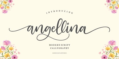 Love Angellina a luxury font with a natural and modern handwritten font. It's perfect for logos, invitations, stationery, wedding designs, social media posts, advertisements, product packaging, product designs, labels, photography, watermarks, special events or anything.
 - MAREGY by Salamahtype,
$19.00 MAREGY is a modern sans-serif font with an elegant style. This font is perfect for branding projects, logos, social media posts, advertisements, product packaging, wedding invitations, product design, labels, photography, watermarks, stationery, and more.
 - JH Oleph var by JH Fonts,
$200.00 JH Oleph is a modern neo sans humanist Typeface. It includes eight weights and five widths, total of forty weights and another forty italics. JH Oleph may be used as screen display and text type.


