10,000 search results
(0.032 seconds)
- Wouldkat by Joachim Frank,
$11.00 Inspired by an old house font of an anthroposophical hospital in Germany, this font was created: coarse, irregular, with corners and edges. In nature there are no right angles, no symmetries, no evenness: and so is this font. Tis is not a fine font, Like a woodcut this font roars: Look at me, I am here! Ideal for posters, leaflets, posters, billboards. Designed by Joachim Frank (Germany) in 2021
 - Gandur New by Blackletra,
$50.00 Gandur is a display textura in three weights, split into two families: Alte — the German word for old — and New. Gandur was inspired by other geometric texturas, specially Max Bittrof’s Element (1933). The design began by adhering to a strict hexagonal grid, but during its development, slowly moved from a purely geometric to a more pen-based design (this is especially true in the heaviest weights). The differences between Alte and New are essentially morphological, with reflections in the character set and OpenType features. Gandur New has a more humanistic, contemporary structure and is more ‘romanized’ then Alte. Gandur New also features small capitals. Gandur Alte, on the other hand, remains truer to historical forms, most notably: S s X x Z z. Gandur Alte also features the long-s, which can be accessed via a Stylistic Set or the glyph palette. (As is historically accurate, a short-s will be used at the end of words automatically when the historical Stylistic Set has been activated).
 - Epillox by Formatype Foundry,
$20.00 PDF Epillox is a modern, contemporary, geometric typeface, with a strong personality and more unique with maximum emotional. It is inspired by modern contemporary display sans typefaces. We spent a lot of time, especially in the italic, to draw with high-quality compensation for all circles and strokes to become fresher and cleaner from the geometric point of view. As an OpenType family it includes 51 alternate characters and ligatures, plus extra characters. The most interesting is about Stylistic set (ss02) have a more powerful characters the combination of original and wide characters. Epillox also supports other OpenType such as: Ligatures, Discretionary Ligatures, ordinal numbers, case sensitive, fraction, supscript, superscript, ss01, ss02, ss03, ss04, ss05, ss08 Epillox contains 695 characters supports over — 200 Latin-based languages. Other Essential sets are composed of alternative glyphs. its great in headline, titles and short paragraphs (Poster, Signage, Logo, Branding, cover and etc) A Variable Font is also included in the family.
 - Conte Script Plus by Ingo,
$61.00 A personal handwriting done in pencil. Conté Script is a computer font but has the extraordinary look of handwriting. The typeface is exceedingly lively, diversified and distinct thanks to more than 300 different ligatures, i.e. letter combinations. In addition to the letter combinations in Conté Script, there are also double letters and figures included (aa, ff, AA, MM, 22, 66…) as ligatures with stylistic alternates. Type set in Conté Script appears remarkably similar to a text actually handwritten with a pencil. The typical style of the pencil — crumbliness where pressure lessens and the deep darkness where the pressure of the graphite in it's fullest denseness smudges — is another earmark of Conté Script. The font appears to be written quickly, fleetingly, casually, as if not really to be taken seriously, and as if it would be written one minute and erased the next. Conté Script looks most ”authentic“ around the point size of 18 to 22.
 - Gandur Alte by Blackletra,
$50.00 Gandur is a display textura in three weights, split into two families: Alte — the German word for old — and New . Gandur was inspired by other geometric texturas, specially Max Bittrof’s Element (1933). The design began by adhering to a strict hexagonal grid, but during its development, slowly moved from a purely geometric to a more pen-based design (this is especially true in the heaviest weights). The differences between Alte and New are essentially morphological, with reflections in the character set and OpenType features. Gandur New has a more humanistic, contemporary structure and is more ‘romanized’ then Alte. Gandur New also features small capitals. Gandur Alte, on the other hand, remains truer to historical forms, most notably: S s X x Z z. Gandur Alte also features the long-s, which can be accessed via a Stylistic Set or the glyph palette. (As is historically accurate, a short-s will be used at the end of words automatically when the historical Stylistic Set has been activated).
 - Simple Serif by Gerald Gallo,
$20.00 The Simple Serif fonts are designed as hand-lettered serif fonts. They are casual and informal and are ideal for use in conveying these qualities.
 - Tokyo Olive by Dharma Type,
$14.99 Tokyo Olive was designed as an homage to nostalgic display types and advertisements in the mid-late 80s. The mid-late 80s was the era of the post-modernism and fancy-decorative design especially in Japan In other words, it was the mixture of superficial form-operation and girly taste. This curious design movement vanished without a trace in the 90s, but it had its moments. Tokyo Olive has voluminous and simple geometric skeleton (for post-modern) with rounded and craft-style stencil joints (for fancy decoration). We added a classic open style as a little spice. The mixture of those essences makes new impression we have never seen before. Tokyo Olive family consists of 5 styles for stacking color font. Please use Photoshop or Illustrator, or your favorite graphic design apps that can handle layers. Layers are the printing plates of wood type. You should be able to change text color for each layer. Tokyo Olive "Standard" style is the base of this font family. You can add open effect by stacking "Fill" layers over the Standard layer. Instruction 1. Type your text as you like. 2. Set font-name "Tokyo Olive" and font-style "Standard". 3. Set color of "Standard" layer. 4. Duplicate the "Standard" layer to make "Fill" layer. 5. Set font-style "Half Fill" or "Full Fill" and new color of upper layer. Tokyo Olive Standard, Half Open, and Full Open style can be used solely.
 - Huai by Positype,
$29.00 Huai and Huai Thai marks the first professional typeface release by Potch Auacherdkul and represents the culmination of research into the duality of influences between handwritten, vernacular Thai lettering and Latin typefaces. The result is a warm, expressive typeface that doesn’t abandon the human hands and the language that produced them. With Thai script, there are two different terminal styles—the Loop terminal style, associated with the original forms of Thai glyphs; and the Loopless, which has evolved to best coordinate with Latin sans serif typefaces. In recent years, this Thai Loopless style has continued to influence and even change to become ‘more Latin.’ One would go so far as to define these heavily Latin-influenced typefaces as Thai Latinized. This curiosity with shifting influences, turns the idea around and explores what would happen if the vernacular Thai scripts actually influenced their Latin counterparts instead. An Inversion of Thai Latinized is the result. The street signs of Bangkok, local vernacular writing, quick, fluid strokes… these influences form the DNA behind the Huai Thai typeface. Refining and systematizing those natural, handwritten strokes into a Thai typeface and then using those solutions to serve as the pioneer proportions behind the development of its Latin script companion was the product. Huai adopted the essence of these Thai glyphs into the Latin and uniquely embraced the contemporary writing system (and soul) of the Thai people in its letterforms.
 - Workhorse by Borges Lettering,
$35.00 Workhorse is a Sign Painter’s Gothic developed by Master Sign Painter Greg Reid. Workhorse captures the true essence of hand lettering. From the tapered waists to the elegant snaps of the brush; these elements present a warmth unseen in today’s mechanically stiff Gothics. Greg Reid and Charles Borges de Oliveira collaborated to bring this truly one of a kind typeface to fruition. With the power of Open type, Workhorse utilizes Contextual Alternates to create random variations of the capitals and lowercase letters. This allows your text to have subtle differences in the letters without losing form which helps to create an honest hand lettered look. This feature can be turned on or off to suit your individual style. You also have the ability to manually choose the glyph variations from the glyph pallet to help you create one of kind designs. Both versions of Workhorse feature complete variations of the capitals and lowercase letters (56 total), Small Caps and six alternates. The Small Caps are not just the capitals scaled down. They have been designed as a unique second set that adjusts the stroke thickness to match the existing letters, creating what we like to refer to as “Real Small Caps”. Workhorse is a timeless classic that can be used from early Americana advertising all the way up to present day modern use. No matter how you use Workhorse it always looks and reads well.
 - Andhibath by Sabrcreative,
$17.00 Introducing Andhibath Bold Script Font, a captivating script typeface that exudes elegance and versatility. With its bold strokes and graceful curves, this font is perfect for adding a touch of sophistication to your design projects. Whether you're creating invitations, branding materials, packaging, or any other creative work, Andhibath will elevate your designs with its unique charm. The Andhibath font features both uppercase and lowercase letters, allowing you to mix and match different letterforms for a customized look. It also includes numbers and punctuation, ensuring that your compositions are comprehensive and well-rounded. With multilingual support, you can effortlessly incorporate various languages into your designs, making it suitable for projects with a global reach. One of the standout features of Andhibath is its PUA encoding. This means that accessing the font's special ligatures and glyphs is a breeze, giving you even more creative possibilities. The ligatures add a natural and handcrafted feel to your text, enhancing its visual appeal. With its script style, Andhibath captures the essence of handwritten elegance. It is ideal for a wide range of design applications, from wedding stationery and logos to social media graphics and advertising materials. The versatility of this font allows you to adapt it to different themes and moods, whether you're aiming for a classic, modern, or whimsical look. Experience the beauty and versatility of Andhibath Bold Script Font. Let its graceful curves and bold presence make a lasting impression in your designs.
 - Cephalonia by Design by Pascal,
$40.00 Cephalonia is a geometric sans-serif with a unique set of alternates that draw their inspiration from classical greek engravings. The crossbars in the alt characters O, E, F and D are the most notable examples of this greek influence. The landscape of Greece and in particular its islands were the inspiration behind the angular A, H and G, which conjure images of rolling hills and waves. Cephalonia's alternate Q and ampersand are completely original designs. Cephalonia combines the simplicity and elegance of the most famous geometric sans-serifs while adding original embellishments that make it something new and exciting. The end result is a typeface that can evoke a classic feeling while simultaneously holding an edgy contemporary feel.
 - Myteri Script PERSONAL USE ONLY - Personal use only

- Amurg - Personal use only

- TaitDemo - Unknown license

- Hooey by Ahmad Jamaludin,
$17.00 HOOEY - A fun Y2K - inspired monoline handwritten bubble font in two styles, regular and clean versions! I mixed a bit of texture and a bit of goopy-ness to create a wonderfully imperfect and unique font What's you get? Hooey Regular Hooey Clean Have alternate with all characters (Uppercase & Lowercase) Regular and Clean version Unique letterforms Works on PC & Mac Simple Installations Enjoy your day! Dharmas Studio
 - Anglican - Unknown license

- Tostada - 100% free

- Loyolliams by Eyad Al-Samman,
$5.00 “Loyolliams” is my first designed Latin typeface which has special meanings and unforgettable memories for me. The font's name, Loyolliams, consists of two mixed syllables stand for two different names. The first syllable is derived from the name “Loyola” and the second syllable is derived from the last five letters of the name “Williams.” These two names are related to “Concordia University”—located in Montreal in Canada—where I studied at a short academic term and spent in a very special period of my life in the late 2005. This renowned Canadian academic institution was created following the 1974 merger of “Loyola College” (1896) and “Sir George Williams University” (1926). This conglomeration formed “Concordia University” and the name Concordia itself was taken from the motto of the city of Montreal, Concordia salus (meaning ‘well-being through harmony’). This font comes in two different weights; light and regular. “Loyolliams” is a square, geometric, techno, and modern font. It is suitable for T-shirts, books' covers, websites’ addresses, advertisement light boards, and titles in technical, artistic, and other types of magazines and signboards. “Loyolliams” can be used also in posters, surfaces of electrical and electronic tools, digital devices and chips, geometrical machines, trucks, tractors, calculators, mobile phones, watches, laptops, personal computers, power equipments, digital cameras, technical magazines, and other digital and electronic tools. This fonts can be effectively used in titles especially when its uppercase and lowercase letters are mixed together and when it is used in its italic mode. "Loyolliams" is suitable for writing and printing small textual paragraphs in cards, magazines advertisements, and also posters. The main characteristic of "Loyolliams" Typeface is its non-curve style in most of its alphanumeric letters. The characters are deliberately designed to have only angular and square shapes.
 - Gazeta Slab by Vanarchiv,
$35.00 This humanist slab-serif style is an extension from Gazeta font family, the letterform are more sharp, racional and mechanical. Italics are having small differences from roman letterforms, the characters are slightly more narrow (weight) and the proportions are less open (width).
 - Cordel Interior by Ana Cordel Interior Font,
$15.00 Cordel Interior family draws inspiration from covers of 'cordel literature’, - small booklets of popular story-poems that played an essential role on the folk-popular cultural life of Brazil. Printed in coarse paper, usually with an woodcut illustration and lettering in the front, these booklets were sold on the streets, in marketplaces and town squares, hung in a cord - therefore the name ‘cordel’.
 - New Orleans by Sarid Ezra,
$15.00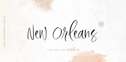 Introducing, New Orleans, a Stylish Handwritten Script New Orleans is a stylish handwritten script that contain lowercase, uppercase, symbol, and also support multi language. This font also comes with essential ligature that will make your text more natural. New Orleans also suitable for logo branding, beautiful fashion design, suitable for wedding invitation, or handwritten quote. Also already PUA Encoded. Foreign Languages Support: ÀÁÂÃÄÅÇÈÉÊËÌÍÎÏÑÒÓÔÕÖØÙÚÛÜÝàáâãäåæçèéêëìíîïñòóôõöøùúûüýÿ
 - Quadrivium NF by Nick's Fonts,
$10.00A classic typeface with timeless appeal, based on the venerable Weiss Initials II, designed by Eric Rudolf Weiss for Bauersche Gießerei in 1931. Essentially a monocase font, this version also includes variants located at lowercase a, e and g. Both versions of this font contain the Unicode 1252 (Latin) and Unicode 1250 (Central European) character sets, with localization for Romanian and Moldovan. - Epic Miracle by Prestige Artsy Studio,
$29.99 Epic Miracle is beautiful rounded bold retro serif with a 90s touch. A great serif that works beautifully in modern designs. You can definitely create amazing logos, headings, apparel designs and more. Epic Miracle is an essential font for branding as well if you want to go BOLD. I can't wait to see what you can create with Epic Miracle!
 - Outspace Fighter by Ditatype,
$29.00 Outspace Fighter is an electrifying game-themed display font designed in uppercase, capturing the essence of futuristic space battles. This font is made in boxy shapes with sharp corners, evoking a sense of strength and precision. Each uppercase letter is meticulously crafted to exude a futuristic aesthetic, mirroring the angular and geometric forms found in the vast expanse of outer space. This design choice gives the font a sleek and modern appeal, perfect for conveying the intensity of space battles. With low-contrast letters, this font places emphasis on the overall form and structure of the font. The subtle differences in stroke width create a balanced and unified visual experience. This design choice ensures legibility while maintaining a cohesive and visually appealing composition, allowing your audience to effortlessly engage with your game-themed designs. You can also enjoy the available features here. Features: Stylistic Sets Multilingual Supports PUA Encoded Numerals and Punctuations Outspace Fighter fits in headlines, logos, posters, titles, branding materials, print media, editorial layouts, website headers, and any other projects. Find out more ways to use this font by taking a look at the font preview. Thanks for purchasing our fonts. Hopefully, you have a great time using our font. Feel free to contact us anytime for further information or when you have trouble with the font. Thanks a lot and happy designing.
 - Bunken Tech Sans by Buntype,
$49.00 The Bunken Tech Sans superfamily: A reminiscence of constructed fonts of the modern age designed with considerably cleaner forms. Bunken Tech Sans follows in the best tradition of the straight-lined and somewhat angular structures of its predecessors while offering a much more open and mild design. The shapes of the letters are therefore reduced to the most essential elements: The spurs on a, b, n and other lower case letters occur just as little as decorative or style details, the lightly rounded inside edges are more pleasing to the eye than certain historic role models and make for a harmonic, flowing style. Use In particular Bunken Tech Sans stands out as an easy, distinctive headline font with its straight-lined, technical design. Open counters and large x-height make it equally suited for use in shorter texts. It is also perfectly complemented by Bunken Sans or Bunken Slab in longer texts (available soon). Features Available in 10 styles with widths ranging from Light to ExtraBold with associated Italics. All of the styles are very extensive: Support for at least 58 languages, Small Capitals, 9 number sets (e.g. Lining, Oldstyle, Tabular and Small Cap Figures), ligatures, alternate characters, numerous Opentype functions, and lots of other small features that make it more pleasant to work with the font on a daily basis as well as fulfilling typographic desires. Each style contains more than 870 characters! Each style is available in a professional (Pro) and standard (Std) edition with a reduced range of functions. (Language support, OpenType features and number of glyphs). Details can be found on the respective pages. Bunken Tech Sans is part of the Bunken Tech superfamily and is available in Condensed, Normal and Wide. Also of interest: The slab serif variation Bunken Tech Slab Features in Detail: 12 Weights: -Light -Book -Medium -SemiBold -Bold -ExtraBold and corresponding Italics 3 Widths: -Condensed -Normal -Wide Alternate Characters: A, E, F, L, S, e, f, t, s, y, etc. Small Capitals 5 Sets of Figures: -Lining Figures -Old Style Figures -Tabfigures -Old Style Tabfigures -Small Cap Figures Automatic Ordinals Automatic Fractions Extended Language Support and more...
 - Oliandre Demo - Personal use only

- Declaration - 100% free

- Kandidat by Fontroll,
$30.00 Imagine being printer in the early nineteenth century, your stock isn’t the finest, your lead characters are worn out: Voilá Kandidat Rough. But wait, Kandidat isn’t the usual scan-an-old-book,-put-the-glyphs-in-a-font-and-you’re-done-font. Kandidat Rough has a variety of whopping 14 alternates for most characters. Our algorithm changes the letters automatically. All you have to do is turn on Contextual Alternates in your layout app. The algorithm is the best we’ve seen so far, and it’s so good that even same words appear in different forms. And should by coincidence words have the same glyphs, just assign a different Style Set to the first letter, and all other letters in the word will change as well (well, it depends a bit on your software). The mechanism isn’t perfect and maybe we stretched OpenType capabilities a bit over the top, but we yet haven’t seen any better routine for switching letters on the fly. Is it worth to mention that Kandidat Rough not only speaks English, but also German, French, Spanish, Dutch, Danish, Norwegian, Swedish, Croatian, Turkish and most likely some other languages? Maybe. To be sure whether your language is supported, this is the typeset of all letters: ABCDEFGHIJKLMNOPQRSTUVWXYZÀÁÂÃÄÅÆÇÈÉÊËÌÍÎÏÑÒÓÔÕÖØÙÚÛÜÝĆČĐĞ݌ފŸŽ abcdefghijklmnopqrstuvwxyzàáâãäåæçèéêëìíîïñòóôõöøùúûüýÿćčđğıœşšž Apart from that we also included the following punctuation and currency symbols: !"#$%&'()*+,-./:;?@[\]_{|}¡©«®°±¶·»¿×–—‘’‚“”„†•…‹›⁄≠☞ €¢$£¥ This sums up to nearly 3000 glyphs per font, and we have three of them: Regular, Italic and Bold. All neatly kerned. All in all a great repertoire for even the most demanding book or advert jobs with a look of old times. And now imagine you are sick of the rugged print experience Kandidat Rough delivers: go for Kandidat. This is our Scotch-ish ancestor the Rough version was made from. A sturdy, friendly, round, warm friend from the beginning of the nineteenth century. A bit dark, maybe. You will like it. Kandidat has the aforementioned type set plus complete Baltics, Eastern Europe and Cyrillic. Plus a couple of gimmicks like fleurons, stars, circled numbers, arrows, and, and, and… Kandidat Regular additionally has small caps for Latin based scripts (not Cyrillic). The spick and span Kandidat font set also consists of Regular, Italic and Bold cuts. The bold cut is on the very bold side and can nicely be used for headings, whereas Italic is a great companion for Regular. It took us some time and trouble to finish this project, but after all we are very proud of our little feat and hope you will enjoy Kandidat as much as we do. Enjoy!
 - Sucesion Slab - Personal use only

- Mister Loopy - Unknown license

- Revue - Unknown license

- DIN 1451 fette Breitschrift 1936 - 100% free

- Eire - Unknown license

- Helena - Unknown license

- Lombardo - Unknown license

- Aarco1 - Unknown license

- FetteFraktur - Unknown license

- LibbyScript - Unknown license

- IglooCaps - Unknown license

- Vostrey - Unknown license


