10,000 search results
(0.074 seconds)
- The Blast by Vultype Co,
$29.00 Blast is a font with a futuristic edge, geometric corners, perfect for technology theme. As with its Blast, Blast makes a strong impression in print, headlines, video, and social media – whether paired with a contrasting typeface or on its own.
 - Wichittra by Jipatype,
$17.00 Wichittra is a high-contrast serif condensed font. The name of this font is derived from the common Thai women's name, meaning 'beautiful' or ‘Elegant’. It is suitable for use in text headlines, sub-headlines, packaging, posters, and other print media.
 - Milton Keynes by Dumadi,
$20.00 Milton Keynes is a modern thick font that comes from hand scratches so it is great for branding logos, t-shirt designs, posters, business cards, typography, newspapers, other design projects and many other media that can be manipulated with this font.
 - Greatlove by Realtype,
$15.00 Greatlove is a brush script written in natural brushes. Written in quick motion using a rather dry brush pen, looks beautiful and is perfect for designs like, magazines, logos, product packaging, quotes, posters, merchandise, social media greeting cards and more.
 - Dianda by RagamKata,
$14.00 Hello, new retro serif called Dianda! Dianda is a stylish font that is both retro and bold font. Works great for logos, magazine, social media. It come with a unique lower and uppercase plus numbers, punctuation & multilingual letters, alternates and ligatures.
 - Donnabold by Qwrtype Foundry,
$14.00 Proudly Present, Donnabold Donnabold is a Fat Monoline Handwritten font Donnabold is perfect for product packaging, branding project, megazine, social media, wedding, or just used to express words above the background. This font includes OTF, Donnabold also multilingual support. Thank you!
 - Ringtrack by Patria Ari,
$15.00 Ringtrack is a sharp and strong brush script font with variable swashes you can try on. This font perfect for branding projects, apparel, logo, social media posts, advertisements, product packaging, product designs, label, and any projects that you work on.
 - Magista Brush by Sronstudio,
$18.00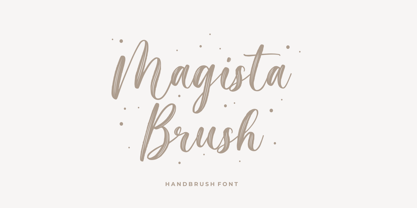 Magista Brush - Handbrush Font perfect for branding, invitation, stationery, wedding designs, social media posts, advertisements, product packaging, product designs, label, photography, watermark, special events, and more. Features: Uppercase and lowercase letters Multilingual symbols, numerals, and punctuation Follow Instagram: @sronstudio Thank You!
 - Matchings by Fontysia,
$20.00 Matching is a beautiful, casual script adds a custom and organic feel to any design you need! Use this font for: Branding, Invitations, Stationery, Logos, Print Materials, Watermark, Label, Wedding designs, Social media posts, Products, Desktop Programs, Canva , Websites and more.
 - Blapuhy by Sealoung,
$10.00 Blapuhy is a lovely handwritten font, designed with the help of a brush pen. Fall in love with its authentic feel and use it to create gorgeous wedding invitations, beautiful stationary art, eye-catching social media posts, and cute greeting cards.
 - Bluegold by Lemonthe,
$14.00 Bluegold is a beautiful modern calligraphy font, with 150+ Ligatures. Bluegold Font is perfect for many different project such as logos & branding, invitation, stationery, wedding designs, social media posts, advertisements, product packaging, product designs, label, photography, watermark, special events or anything.
 - Relaxa by ahweproject,
$10.00 Relaxa is a fun, retro-style script display font that is ready to take your designs to the next level. Add it to your vintage-inspired posters, stickers, apparel, or social media posts and you will definitely impress your audience.
 - Wicked Steam by Krakenbox Studio,
$16.00 Wicked Steam is a handwritten script font. This stunning handwritten font is cute, fun, classy, and Cool. It’s a great font for fashion, apparel projects, signature, album cover, logo, branding, magazine, social media, & advertisements, but also works great for other projects.
 - Dinalee by Arendxstudio,
$12.00 Introducing our newest Dinalee Stylish Signature Font. Dinalee Signature font is made as elegant as possible for the use in a variety of design projects, including logos & amps, branding, wedding designs, social media posts, advertisements, product designs, magazines and more.
 - Gildane Hyme by Essentials Studio,
$16.00 Introducing by Essentials Studio Proudly Present, Gildane Hyme Gildane Hyme Is a Modern monoline Font Include 50+ stylish Alternate Gildane Hyme is perfect for product packaging, branding project, megazine, social media, wedding, or just used to express words above the background.
 - HOH Forgetmenot by HOHOHtype,
$19.99 ‘Forgetmenot’ is a feminine handwritten font. It has a small x-height, and long descender. It was designed with applications such as advertising and packaging, editorial and publishing, logo, branding and creative industries, poster and social media, and marketing in mind.
 - Urban Case by Inumocca,
$15.00 URBAN CASE inspiration from the Urban People, Simple, Elegant, Classy, have a great different Style. great for your Logos, signature, promotion media, etc. unique glyph and deep touch. - Multilingual Characters Support - UPPERCASE - Lowercase - Numeric - Symbol - Punctuation Character inumocca type Studio
 - Magicalnotes by Timurtype,
$14.00 Introducing by Timur type Proudly Present, Magicalnotes Magicalnotes A Handwritten Font Magicalnotes is perfect for product packaging, branding project, megazine, social media, wedding, or just used to express words above the background. Magicalnotes also multilingual support. Enjoy the font.Thank you!
 - Glancing by Etcsupply,
$8.00 Glancing™ script typeface with bounce style designed by Ilham Nashrul Huda and published by Etcsupply. Glancing script typeface created inspired from lettering artist in social media. Glancing features: Glancing Vol 1 OTF Glancing Vol 2 OTF Glancing Swash OTF
 - Frutiger Symbols by Linotype,
$29.00In Adrian Frutiger, the discipline of a mathematically exact mind is joined with an unmistakable artistic sense. His independent work possesses the controllable language of letterforms. Personal and intensive, this work is the manifestation of his expressive will. Frutiger's precise sense of outline reveals itself two- or three-dimensionally in wood, stone, or bronze, on printing plates and in the form of reliefs. However, even his independent work can be understood as objectivized signs; in their symbolism, they are embedded in the fundamental questions of human existance. They might have developed in the spirit of playfulness, but their nature is always conceptual, directed towards a complex, yet harmonic, whole. Following function, form also necessarily follows the content of the language. The entire spiritual world becomes readable through letters. Essentially, Adrian Frutiger attempts to fathom the basic, central truth which defines our lives: change, growth, division - beginning and end. In a virtual synthesis, he seems to close the circle in which the world reflects itself in symbolic forms. Frutiger Stones is for Adrian Frutiger the example of his formal artistic sensibility par excellence. Searching for the fundamental elements in nature, he has discovered the pebble, rounded and polished over innumerable years by gently flowing water. And out of this, he has created his complete system, a ruralistic typeface of letters and symbols. It depicts animals and plants, as well as astrological and mythical signs. Because of its unique aura, Frutiger Stones is particularly well-suited to different purposes - in headlines and prominent pictograms, as symbol faces, illustrations, and more. Frutiger Symbols is a symbol font of plants, animals and stars as well as religious and mythological symbols. Together with Frutiger Stones this typeface builds a complete design system, which offers endless possibilities. It can be used for illustrations or a symbol type with its distinctive pictograms. Frutiger Symbols is available in the weights regular, positive and negative. - Patient Paige, crafted by the talented Kimberly Geswein, is a font that embodies a relaxed yet engaging character, making it an irresistible choice for a wide array of design projects. This particula...
- Novera by René Bieder,
$29.00 The Novera family is a sharp geometric sans in ten weights plus matching italics, available in two versions – Modern and Classic. It has a contemporary, approachable and multifunctional yet characteristic design, that comes with an extensive glyphs set of 1000+ glyphs per font, meeting all typographic demands. The Design Vertical terminals, circular shapes and angular apexes – Novera truely breathes geometry! But the concept goes beyond the application of rational geometry. The intension was to create a highly legible family suitable for every day usage inspired by the work of Paul Renner, Eric Gill or Jakob Erbar, combining the geometric with the human and the functional with the unconventional. Although Novera is inspired by the past, its appearance is unmistakingly modern. Modern vs Classic Novera is available in two versions - Modern and Classic - born from the same source file but with different characters set as default. This creates subtle but effective distinctions such as the double-storey a (Novera Modern) which is optimized for legibility in longer text paragraphs, as opposed to the single-storey a (Novera Classic) which allows a purely geometric appearance. Another distinguishing feature are the ascenders on Novera Mondern, which extend above the cap height for an elegant presence, compared to the ascenders on Novera Classic, ending at the cap height, for a compact and helvetica-flavored look. Novera Modern was intended for usage in body copy, whereas Novera Classic was planned for headlines, short paragraphs or logos, but both versions can be used vice versa too, of course. Alternate Characters To maintain neutrality and a modern appearance, the standard character set largely dispenses with idiosyncratic forms. This is in contrast to the alternative forms with the gill-like lowercase letters g and t as well as a traditional shape of S and the German ligature t/z, which traces back to old German spellings. Also inspired by German poster designs from the early 20th century are the elongated i-dots and dieresis-dots that can create eye-catchers in headlines or logos. By the way, both versions, Novera Modern and Classic, can be created via stylistic set 1, 17 and 18. Opentype Features and Symbols The family comes with many opentype features to support modern typesetting. This includes ligatures, different number sets or alternative shapes for texts set in all caps. If you like arrows and other shapes, you will love Novera! The family has a built-in extensive symbols-set including 48 different arrows and various geometric shapes or icons. Weights With its 40 styles and 1000+ glyphs per font, the Novera family covers all thinkable design scenarios from branding to web, app or editorial usage. It blends in perfectly in text heavy paragraphs with its mid-weights like Light, Regular, Medium or Bold or stands out like a monument in headlines and posters with its extreme weights like Thin, ExtraLight, Black or Ultra. Testfonts If you like to test the fonts before buying the full version, please follow the link below. Please note, all test fonts are available for evaluation purposes only and contain a limited character set! A commercial license for the full version must be purchased separately. Please send a mail to contact@renebieder.com for more information. Download the test fonts here: https://www.renebieder.com/test-fonts
 - Juvelo is a distinguished typeface crafted by the adept type designer Barry Schwartz. It stands out as a testament to Schwartz's commitment to producing fonts that not only serve practical purposes b...
- As of my last update in 2023, "Sepulcra" is not a widely recognized or established font within mainstream typographic resources or design communities. However, crafting a descriptive narrative based ...
- Burstwick by Fettle Foundry,
$10.00 Burstwick is a sans-serif typeface inspired by modern workhorse typefaces and designed for everyday use. It has unique personality but doesn’t suffer in more practical situations, and is very flexible: there are six weights, ranging from thin to bold, and matching oblique italicis. Lifting elements from grotesque, geometric, and humanist styles, and putting legibility at the forefront, each weight is drawn with higher contrast and subtle asymmetrical features to enhance individuality and aid in readability, particularly at body sizes on websites. These features are intended as an alternative to rigid geometric lines, bringing a natural feeling to glyphs, resulting is a friendly, but professional choice for any organisation or designer. The foundation of the design is a large X-height, which further aids in differentiating lowercase characters from one another. This allows Burstwuck to feel open, airy, and really shine when used in single-family type hierachies, particulalry in headlines and larger text. Through its 630 glyphs, Burstwick supports many Latin languages, with thorough kerning for accented character combinations, making it an ideal choice for organisations considering multilingual users, and the perfect addition to any designer’s toolbox. In addition to accented characters, a large number of special characters and alternatives have been included to increase choice and flexibility. Among these are expand currency symbols, oldstyle figures, math operators, and symbols. Language support includes: Bosnian, Catalan, Czech, Danish, German, English, Spanish, Estonian, Finnish, French, Irish, Croatian, Hungarian, Icelandic, Italian, Lithuanian, Latvian, Maltese, Dutch, Norwegian, Polish, Portuguese, Romanian, Slovak, Slovenian, Albanian, Swedish, Turkish.
 - Kremlin II Pro by CheapProFonts,
$10.00 Most uppercase letters of these constructivist fonts are made to look like cyrillic letters, so by carefully interspersing those you can set your text and headlines with it and make it look Russian! To a native Russian this of course looks very silly indeed, so to make amends for toying with their letters I have also included a full proper and genuine cyrillic character set. So these are the first CheapProFonts fonts to support languages using the cyrillic script in addition to the usual 65 latin-based languages. Check out Kremlin Pro for a version with different designs for these glyphs: ¡ ¿ 0 3 6 9 K k M m N n R r V v X x ? ! ALL fonts from CheapProFonts have very extensive language support: They contain some unusual diacritic letters (some of which are contained in the Latin Extended-B Unicode block) supporting: Cornish, Filipino (Tagalog), Guarani, Luxembourgian, Malagasy, Romanian, Ulithian and Welsh. They also contain all glyphs in the Latin Extended-A Unicode block (which among others cover the Central European and Baltic areas) supporting: Afrikaans, Belarusian (Lacinka), Bosnian, Catalan, Chichewa, Croatian, Czech, Dutch, Esperanto, Greenlandic, Hungarian, Kashubian, Kurdish (Kurmanji), Latvian, Lithuanian, Maltese, Maori, Polish, Saami (Inari), Saami (North), Serbian (latin), Slovak(ian), Slovene, Sorbian (Lower), Sorbian (Upper), Turkish and Turkmen. And they of course contain all the usual "western" glyphs supporting: Albanian, Basque, Breton, Chamorro, Danish, Estonian, Faroese, Finnish, French, Frisian, Galican, German, Icelandic, Indonesian, Irish (Gaelic), Italian, Northern Sotho, Norwegian, Occitan, Portuguese, Rhaeto-Romance, Sami (Lule), Sami (South), Scots (Gaelic), Spanish, Swedish, Tswana, Walloon and Yapese.
 - Vernacular Sans by jpFonts,
$19.95 The Vernacular trilogy was designed by Swiss designer Hans-Jürg Hunziker, who had worked for Adrian Frutiger in Paris for many years. Based on the concept of a transitional Linear Antiqua, he has developed a colorful bouquet of typefaces that contain the entire spectrum of typefaces for book design and corporate identity. Thanks to his "Swiss school" and his outstanding skills, he has succeeded in giving the typefaces a particularly noble and sympathetic expression. In addition to the Sans family, there is a Serif family and a Clarendon family, each of which, including the separately drawn italics, is equipped with 12 font weights that are finely tuned to one another. Each of the 3 font styles develops its own character, but thanks to a concept that brings the different font styles closer together, they also work well together and complement each other perfectly. Sans and Clarendon have a vertical axis and similar endings in contrast to the Serif, which has a traditional diagonal axis and horizontal endings. The straight stems and the proportions are used as an element to stress the closeness of the typeface-trilogy. They thus share a comon feature. All fonts contain tabular and proportional figures as well as old style figures. Small caps and small cap figures are also available in all fonts. In addition, some fonts have alternative characters available via style set, such as «g», which can be used to further vary the typeface. Vernacular offers all the options for well-kept typesetting for print and web - for small and large orders.
 - Faible by Identity Letters,
$29.00 An open-hearted humanist sans-serif. Playful and friendly. Faible is everybody’s darling. You cannot not like this good-natured humanist typeface. Sure, it’s a typeface for serious work—but all serious work is better when you put a smile on your face and a whistle on your lips. The typeface itself isn’t rooted in calligraphy, but there are quite some details in Faible that reference handwriting and add a friendly, humanist facet to its appearance. Take the bowls of B, P, and R: they are merrily bulged, like balloons about to take off. The curved leg of the R adds to this joyful mood. Faible’s italics are rendered playfully, too: they’re not merely sloped Roman styles. Rather, they were designed independently with an internal dynamic that sets them apart on the page. With its trademark glyphs, the swooshin’ K and k, and its friendly details, Faible will radiate optimism in display sizes, titles, and headlines. That makes it a great choice for book covers, posters, editorial design, branding, corporate design, advertising, and packaging. Nontheless, it’s carefully spaced and equipped with plenty OpenType features—a reliable tool for short texts and body copy, too. The font family consists of six weights (ranging from Thin to Black), each with its corresponding italic style. Faible’s glyph set contains more than 600 characters, allowing you to enhance your layouts with ligatures, different sets of figures, case sensitive forms, arrows, and other necessities for the ambitious typographer. Faible is the typeface that puts “fun” back into “functional”.
 - CAL Bodoni Terracina by California Type Foundry,
$47.00 Bodoni Terracina is a legible, fun-formal script face, with lots of curls. Sometimes script faces are hard to read. Sometimes being formal means that there’s no personality and there’s no fun. Enter Terracina: one of the masterpieces of font design. Some of the most personable italics ever carved. Includes powerful new features for: • Dates • Pricings • Addresses Not is only Terracina formal but fun, it’s also fun to use! In a program like Adobe Indesign or Illustrator, just highlight a word and see lots of fun options. Bodoni himself etched these symbols, and his fun-loving personality shines through. As a semi-script, it can go together with many script fonts, but it is more readable. When you need something equal parts elegant and whimsical, Terracina strikes a perfect balance to let the fun shine through, such as for holiday designs or fairytales. Terracina is a subheads font, but Bodoni also used it for paragraphs. So Terracina works well doing subhead paragraphs, especially when contrasting with the mood of the first font. And because of the swash variety, it works well for setting German and other European languages. CAL Bodoni Terracina is a member of our Origins Series. Origin Fonts are designed to be true to the original designer's intentions and fonts. Our Bodoni origin fonts ARE Bodoni fonts, not imitations or interpretations. They were drawn by Bodoni, our team just expanded it for modern use. For Terracina, Bodoni's original weight is the "Quasi-Lite" option, all other weights have been meticulously matched by the CAL Origins Team.
 - Gentlemens Script by Piñata,
$15.00 Gentlemen’s Script is a dynamic hand-written script in which the sharpness and speed of writing harmoniously coexist with elegance and a serious attitude. The script allows you to simulate fast inscriptions made by hand while keeping them elegant and classy. Working on the project, we wanted to develop a script that would harmoniously complement serifs or traditional sans-serifs and perfectly match them. Gentlemen’s Script is like an accessory in a gentleman’s wardrobe. It dilutes font traditions and adds brightness and dynamics to them. Despite the fact that the script was designed to be used as a complementary font, it has all the prerequisites to become the main character of your design story. It does not matter how you use it—Gentlemen’s Script easily adapts to reality and always works at the maximum level of efficiency. To make the script more harmonious and natural, we have drawn more than 60 ligatures. In order for the ligatures to be substituted automatically, we recommend always keeping the standard ligatures OpenType feature turned on! In addition, there are several alternative characters in the font that are programmed on the OpenType feature contextual alternates and which are used when the letter meets the service characters. To use the script to its maximum power, we recommend that you always keep the standard ligatures and contextual alternates OpenType features turned on. If you do not have access to applications that support OpenType features, it does not matter—even without these features you can use and enjoy our font!
 - Gineso by insigne,
$- Michaelangelo. da Vinci. Bellini. Rafael. Masters of Italian art whose names have dwarfed those of many other great Italian artists. Yet relics from these other artists remain, though often unnoticed because of their practical nature. These unknowns are the Italian Masters of vernacular sign painting, and insigne now gives a nod to their work with its new sans serif, Gineso. Based on its inspiration, Gineso was created for posters, headlines and logotypes. (It does well in apps, too, though the sign painters probably weren’t thinking about that at the time.) Aesthetically remedied, yet still with an uncut charm, Gineso’s condensed qualities make it especially nice for signs and titling where horizontal space is at a premium. The tight, narrow forms of its geometric design leave you with a robust flavor that will remind you of mamma’s spaghetti. But don’t worry; the font’s ample counters ensure your audience won’t be reading through a bowl of pasta. These condensed forms look great on their own or when their seven different weights and matching italics are utilized together. With the included OpenType features, fractions and superior/inferior positions are also available to broaden your palette. Even more, this font is ready for complex, professional typography with OpenType features like alternate letters and a large character set including Central and Eastern European Languages. So when you find yourself (or your project) in a tight space, stir in Gineso to get the right taste for your copy. It may just make all the difference.
 - Cinnamon Peach by Abbasy Studio,
$8.50 Let me introduce my first ever product on my shop. Cinnamon Peach - Layered Font After 2 years of learning how to create a fonts, learn about the anatomy of typography, features of the OpenType fonts, and all of the experience on my collaborations with many friends, Finally I just launched my first personal product with the name Cinnamon Peach. Cinnamon Peach is beauty combinations of layered font. It has a Serif and Script style inside. Both of them are layered font, which is you can express the style on both of it. You can add shadow, inline or hatch on Serif style. Changing the color of the other layer as just easy as change standard color of the fonts but it’s more deep in detail. On the Script style, I give you more freedom of choosing which style do you want, if you want a deep style of layer, you can choose regular and inside with different color. but if you want the outline style, it also available as a single fonts. Looks like on the display that I Created, You can see the most of combinations font in there are perfectly matched even on script version doesn’t include the Uppercase character. Because of the strong characteristic of this fonts you can see the combinations are great with or without layer, monochrome or multi color, pastel or watercolour. It’s great for posters, display, logos, header website, magazine, animation text, etc. Thank You very much, hope you enjoy this fonts !
 - Kontext H by Elster Fonts,
$20.00 Imagine a font that is easier to read the smaller it is – or the further away the text is. There are already many line screen fonts, I wanted to take it to the extreme and use as few lines as possible, while keeping the grid of the fonts metrics. The result is a typeface that lives up to its name. Each individual line makes no sense on its own; individual letters are only recognisable in the context of all associated lines, individual letters are most likely to be recognised in the context of whole words. Attached to a building wall, text would be readable from a great distance and become increasingly difficult to decipher the closer you get to the building. Placed on the ground or on a large flat roof, text would only be readable from an aeroplane or - depending on the size - in Google Earth. Kontext has old style figures, superscript numerals, case-sensitive questiondown and exclamdown and an alternative ampersand, 390 glyphs at all. Use the same value for font size and line spacing to keep the lines in the grid, or change the line spacing in 10% steps. Change the spacing in 100-unit or 25-percent increments increments to keep the grid. The »H« in the font name stands for horizontal (lines). The numbers in the font name refer to the brightness of the background and letters themselves, with the first number describing the background and the second the letters. Starting with »00« (white) to »200« (dark) See also my Family Kontext Dot
 - Nova Horst by PintassilgoPrints,
$35.00 Nova Horst is an amplified version of Horst, a highly original font (MyFonts Rising Star) based on etchings by the extraordinary artist and printmaker Horst Janssen. Nova Horst keeps all the amazing wilderness of the original font, while enriched with sharp OpenType programming, plus a whole new set of alternates, a handy set of ornaments and loads of cool unpredictable overlapping glyphs. Language support was also expanded. Now there are 5 sets of letters, 2 sets of numerals and a robust set of discretionary ligatures. OpenType functionalities now include an extremely playful Contextual Alternates feature and also Discretionary Ligatures and Stylistic Alternates. Nova Horst is an energizing blend of eccentric characters, cool OpenType features, loads of alternates and a meticulous kerning table. But be warned: as the original font, this one is quite addictive! A quick roadmap: • All features turned off: you can choose the different letterforms stored on upper- and lowercase sets. There are no overlapping letters. • Contextual Alternates turned on: you get alternating characters from 4 sets of glyphs, with loads of overlapping letters, all managed by a carefully handcrafted kerning table. The result is a very cool random effect on glyphs distribution. • Discretionary Ligatures turned on: now some additional glyphs enter the scene. There are more than 60 ligatures glyphs which substitute pairs of letters for some extra-coolness • Stylistic Alternates turned on: access the counterless glyphs from the Stylistic Alternates set. Use each feature alone or mix them up for added boldness. Gorgeous extravaganza guaranteed!
 - Vernacular Serif by jpFonts,
$19.95 The Vernacular trilogy was designed by Swiss designer Hans-Jürg Hunziker, who had worked for Adrian Frutiger in Paris for many years. Based on the concept of a transitional Linear Antiqua, he has developed a colorful bouquet of typefaces that contain the entire spectrum of typefaces for book design and corporate identity. Thanks to his "Swiss school" and his outstanding skills, he has succeeded in giving the typefaces a particularly noble and sympathetic expression. In addition to the Sans family, there is a Serif family and a Clarendon family, each of which, including the separately drawn italics, is equipped with 12 font weights that are finely tuned to one another. Each of the 3 font styles develops its own character, but thanks to a concept that brings the different font styles closer together, they also work well together and complement each other perfectly. Sans and Clarendon have a vertical axis and similar endings in contrast to the Serif, which has a traditional diagonal axis and horizontal endings. The straight stems and the proportions are used as an element to stress the closeness of the typeface-trilogy. They thus share a comon feature. All fonts contain tabular and proportional figures as well as old style figures. Small caps and small cap figures are also available in all fonts. In addition, some fonts have alternative characters available via style set, such as «g», which can be used to further vary the typeface. Vernacular offers all the options for well-kept typesetting for print and web - for small and large orders.
 - Vernacular Clarendon by jpFonts,
$19.95 The Vernacular trilogy was designed by Swiss designer Hans-Jürg Hunziker, who had worked for Adrian Frutiger in Paris for many years. Based on the concept of a transitional Linear Antiqua, he has developed a colorful bouquet of typefaces that contain the entire spectrum of typefaces for book design and corporate identity. Thanks to his "Swiss school" and his outstanding skills, he has succeeded in giving the typefaces a particularly noble and sympathetic expression. In addition to the Sans family, there is a Serif family and a Clarendon family, each of which, including the separately drawn italics, is equipped with 12 font weights that are finely tuned to one another. Each of the 3 font styles develops its own character, but thanks to a concept that brings the different font styles closer together, they also work well together and complement each other perfectly. Sans and Clarendon have a vertical axis and similar endings in contrast to the Serif, which has a traditional diagonal axis and horizontal endings. The straight stems and the proportions are used as an element to stress the closeness of the typeface-trilogy. They thus share a comon feature. All fonts contain tabular and proportional figures as well as old style figures. Small caps and small cap figures are also available in all fonts. In addition, some fonts have alternative characters available via style set, such as «g», which can be used to further vary the typeface. Vernacular offers all the options for well-kept typesetting for print and web - for small and large orders.
 - Burford by Kimmy Design,
$10.00 Burford is a font family that I sketched while traveling through Europe. I was mesmerized by all the unique typography that was showcased throughout the five countries I visited. Inspired by all that I had seen, I found myself spending 4-5 hours per day in Amsterdam’s Vondel Park drawing characters. Once back in the states I digitalized Burford, deciding it would make for a beautiful layer-based font. Burford Pro package comes with all 18 layering fonts including 5 base layers, 3 top layers, 5 bottom layers and 2 sets of graphic elements. They are strategically made to build on top of each other, creating a cohesive and easy to use layer-based family. Each font also comes with a set of Stylistic Alternatives for letters A C E F G H P Q R. Burford Basic package is created for users who don’t have access to premiere design programs (such as Illustrator, InDesign, Photoshop, etc) and are unable to use the layering effect. Burford can still be a powerful tool as each font can also be used on its own. It includes every font file not needed for the layering effect. (Include 13 fonts - Burford Basic, Dots, DropShadow, Extras Set A, Extras Set B, Extrude B, Extrude C, Inline, Line, Marquee, Outline, Stripes A and Stripes B). The Burford Extras set uses all basic keyboard characters - around 100 total elements per set. They are designed to go specifically with Burford and complement its varying styles perfectly. The set includes: banners, borders, corners, arrows, line breaks, catchwords, anchors and many more!
 - Kontext V by Elster Fonts,
$20.00 Imagine a font that is easier to read the smaller it is – or the further away the text is. There are already many line screen fonts, I wanted to take it to the extreme and use as few lines as possible, while keeping the grid of the fonts metrics. The result is a typeface that lives up to its name. Each individual line makes no sense on its own; individual letters are only recognisable in the context of all associated lines, individual letters are most likely to be recognised in the context of whole words. Attached to a building wall, text would be readable from a great distance and become increasingly difficult to decipher the closer you get to the building. Placed on the ground or on a large flat roof, text would only be readable from an aeroplane or - depending on the size - in Google Earth. Kontext has old style figures, superscript numerals, case-sensitive questiondown and exclamdown and an alternative ampersand, 390 glyphs at all. Use the same value for font size and line spacing to keep the lines in the grid, or change the line spacing in 10% steps. Change the spacing in 50-unit or 25-percent increments to keep the grid. The »V« in the font name stands for vertical (lines). The numbers in the font name refer to the brightness of the background and letters themselves, with the first number describing the background and the second the letters. Starting with »00« (white) to »200« (dark) See also my family Kontext Dot
 - Kremlin Pro by CheapProFonts,
$10.00 Most uppercase letters of these constructivist fonts are made to look like cyrillic letters, so by carefully interspersing those you can set your text and headlines with it and make it look Russian! To a native Russian this of course looks very silly indeed, so to make amends for toying with their letters I have also included a full proper and genuine cyrillic character set. So these are the first CheapProFonts fonts to support languages using the cyrillic script in addition to the usual 65 latin-based languages. Check out Kremlin II Pro for a version with different designs for these glyphs: ¡ ¿ 0 3 6 9 K k M m N n R r V v X x ? ! ALL fonts from CheapProFonts have very extensive language support: They contain some unusual diacritic letters (some of which are contained in the Latin Extended-B Unicode block) supporting: Cornish, Filipino (Tagalog), Guarani, Luxembourgian, Malagasy, Romanian, Ulithian and Welsh. They also contain all glyphs in the Latin Extended-A Unicode block (which among others cover the Central European and Baltic areas) supporting: Afrikaans, Belarusian (Lacinka), Bosnian, Catalan, Chichewa, Croatian, Czech, Dutch, Esperanto, Greenlandic, Hungarian, Kashubian, Kurdish (Kurmanji), Latvian, Lithuanian, Maltese, Maori, Polish, Saami (Inari), Saami (North), Serbian (latin), Slovak(ian), Slovene, Sorbian (Lower), Sorbian (Upper), Turkish and Turkmen. And they of course contain all the usual "western" glyphs supporting: Albanian, Basque, Breton, Chamorro, Danish, Estonian, Faroese, Finnish, French, Frisian, Galican, German, Icelandic, Indonesian, Irish (Gaelic), Italian, Northern Sotho, Norwegian, Occitan, Portuguese, Rhaeto-Romance, Sami (Lule), Sami (South), Scots (Gaelic), Spanish, Swedish, Tswana, Walloon and Yapese.
 - Hanna by Wilton Foundry,
$29.00Hanna has its roots in the Plato and Cilantro fonts published earlier by Wilton Foundry. It is an informal roman and very legible at any size - a rare combination for many applications. Hanna was specifically designed to generate additional income for an orphanage in Ethiopia. Hanna Teshome runs an orphanage of roughly 140 children in Addis Ababa, Ethiopia. She is an amazing lady with a deep passion for orphan kids as well as innocent kids that find themselves in jail because their mothers have been imprisoned - they are treated as prisoners and are typically sexually abused - it is not uncommon for them to commit suicide when they are released from jail at age 18. Most of the orphans end up with Hanna because one or both of their parents have died from AIDS. Hanna relies entirely on donations to keep her orphanage running and this font is a small but tangible way for you to help make a difference in the lives of the orphan kids. I am committed to helping Hanna after visiting the orphanage several times and seeing the jails from where the kids have been rescued. Hanna is my hero because she stepped out of her comfort zone, with no financial support, to take care of the kids. My hope is that you will use this font as a messenger of good. All of Wilton Foundry royalties for this font will go to the support of Hanna’s orphanage in Ethiopia. Thank you in advance for your support on behalf of Hanna and the kids!