10,000 search results
(0.044 seconds)
- Mono Hexular by PizzaDude.dk,
$20.00 A wrecked, monospaced font containing 278 ligatures and unique accented characters! You will need to use OpenType supporting applications to use the autoligatures.
 - Mono Amono NF by Nick's Fonts,
$10.00Here’s a techno typeface with a difference. Its monoline stroke and sharp terminals are softened by rounded corners, and its perceptual monospaced widths have been subtly altered and strategically kerned to improve the visual flow. This font contains the complete Latin language character set (Unicode 1252) plus support for Central European (Unicode 1250) languages as well. - Papercut - Unknown license

- Avernus by URW Type Foundry,
$35.99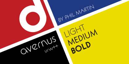
- Papercute by S&C Type,
$9.00 2018 Update: We extended the language support, added a Black version and added new ornaments. Thank you! Papercute is a cute hand-drawn font designed by Fanny Coulez and Julien Saurin in Paris. Inspired by paper cutting, this font is easy to read, easy to play. Small caps are a little different than caps to create alternative glyphs. We also designed a set of cute paper ornaments, to enhance your designs. We also designed an inline version of this font: Papercute Inline . You could follow us on our Instagram: instagram.com/sc.type Merci beaucoup!
 - Aperta by Stefano Giliberti,
$15.00 Adita is a font family that elevates the content of its characters. It supports 113 languages, features a total of 467 glyphs and includes an italicized version for each of the 5 weights.
 - Aperto by Calligraphics,
$30.00 - Mono - Unknown license

- Apéro by Resistenza,
$39.00 A cheerful handwritten font family composed by 8 fonts. 5 slab weights, 2 slab effects and a sans serif. Handmade, friendly and classy, this family is inspired in one of our favorite traditions in Torino, “ L'Aperitivo ”. The social event every afternoon! Before dinner friends meet in the local bar and spend the time together eating, drinking, talking, laughing and eating and drinking again. Handwritten to get a friendly and human feeling. Letterforms specially designed to take the charming mood of this event. The sans serif has been inspired in some letterings found in old local liquor labels. Check out also ‘Modern Love Slanted’ Turquoise Nautica
 - Regulaire by PizzaDude.dk,
$16.00 Regulaire is my laid back comic font, inspired by graffiti and my everyday regular handwriting. Works quite nice for kids products, comics, party posters - or anything that needs a casual comic look!
 - Quercus 10 by Storm Type Foundry,
$69.00 Quercus is characterised by open, yet a little bit condensed drawing with sufficient spacing so that the neighbouring letters never touch. It has eight interpolated weights with respective italics. Their fine gradation allows to find an exact valeur for any kind of design, especially on the web. Quercus serif styles took inspiration from classicistic typefaces with vertical shadows, ball terminals and thin serifs. The italics have the same width proportion as upright styles. This “modern” attitude is applied to both families and calls for use on the same page, e g in dictionaries and cultural programmes. Serif styles marked by “10” are dedicated to textual point sizes and long reading. The sans-serif principle is rather minimalistic, with subtle shadows and thinned joints between curved shapes and stems. Quercus family comprises of the usual functionality such as Small Caps, Cyrillics, diacritics, ligatures, scientific and aesthetic variants, swashes, and other bells & whistles. It excels in informational and magazine design, corporate identity and branding, but it’s very well suited for book covers, catalogues and posters as well. When choosing a name for this typeface I've been staring out from my studio window, thinking helplessly without any idea in sight. Suddenly I realised that all I can see is a spectacular alley of oaks (Quercus in Latin) surrounding my house. These oaks were planted by the builders of local ponds under the leadership of Jakub Krčín in the fifteenth century.
 - Quercus Whiteline by Storm Type Foundry,
$69.00 Quercus is characterised by open, yet a little bit condensed drawing with sufficient spacing so that the neighbouring letters never touch. It has eight interpolated weights with respective italics. Their fine gradation allows to find an exact valeur for any kind of design, especially on the web. Quercus serif styles took inspiration from classicistic typefaces with vertical shadows, ball terminals and thin serifs. The italics have the same width proportion as upright styles. This “modern” attitude is applied to both families and calls for use on the same page, e g in dictionaries and cultural programmes. Serif styles marked by “10” are dedicated to textual point sizes and long reading. The sans-serif principle is rather minimalistic, with subtle shadows and thinned joints between curved shapes and stems. Quercus family comprises of the usual functionality such as Small Caps, Cyrillics, diacritics, ligatures, scientific and aesthetic variants, swashes, and other bells & whistles. It excels in informational and magazine design, corporate identity and branding, but it’s very well suited for book covers, catalogues and posters as well. When choosing a name for this typeface I've been staring out from my studio window, thinking helplessly without any idea in sight. Suddenly I realised that all I can see is a spectacular alley of oaks (Quercus in Latin) surrounding my house. These oaks were planted by the builders of local ponds under the leadership of Jakub Krčín in the fifteenth century.
 - Papercute Inline by S&C Type,
$9.00 Papercute Inline is a cute layered hand-drawn font designed by Fanny Coulez & Julien Saurin in Paris. Inspired by paper cutting, this font is easy to read, and easy to play with 8 different styles, including 3D, outline, full or dotted line, that you can use alone or together. To do so, you can simply superimpose them with a compatible software like Photoshop, then choose a color for each, making your works charming and unique. This font, finely designed for cards, book titles, headlines or any artworks is the Inline version of Papercute . Just click on our foundry name to see it! You could follow us on our Instagram: instagram.com/sc.type We hope you will enjoy our work. Merci beaucoup!
 - Quercus Serif by Storm Type Foundry,
$69.00 Quercus is characterised by open, yet a little bit condensed drawing with sufficient spacing so that the neighbouring letters never touch. It has eight interpolated weights with respective italics. Their fine gradation allows to find an exact valeur for any kind of design, especially on the web. Quercus serif styles took inspiration from classicistic typefaces with vertical shadows, ball terminals and thin serifs. The italics have the same width proportion as upright styles. This “modern” attitude is applied to both families and calls for use on the same page, e g in dictionaries and cultural programmes. Serif styles marked by “10” are dedicated to textual point sizes and long reading. The sans-serif principle is rather minimalistic, with subtle shadows and thinned joints between curved shapes and stems. Quercus family comprises of the usual functionality such as Small Caps, Cyrillics, diacritics, ligatures, scientific and aesthetic variants, swashes, and other bells & whistles. It excels in informational and magazine design, corporate identity and branding, but it’s very well suited for book covers, catalogues and posters as well. When choosing a name for this typeface I've been staring out from my studio window, thinking helplessly without any idea in sight. Suddenly I realised that all I can see is a spectacular alley of oaks (Quercus in Latin) surrounding my house. These oaks were planted by the builders of local ponds under the leadership of Jakub Krčín in the fifteenth century.
 - Linotype Aperto by Linotype,
$40.99Linotype Aperto is a typical text font in the style of transitional faces, like its often-used cousin Times. It is available in roman, semibold and bold weights, each with its matching italic. The roman weight is complete with old style figures and small caps. Its balanced, reserved appearance makes Aperto extremely flexible, good for long texts as well as headlines. - Quercus Sans by Storm Type Foundry,
$69.00 “Quercus” is characterised by open, yet a little bit condensed drawing with sufficient spacing so that the neighbouring letters never touch. It has eight interpolated weights with respective italics. Their fine gradation allows to find an exact valeur for any kind of design, especially on the web. Quercus serif styles took inspiration from classicistic typefaces with vertical shadows, ball terminals and thin serifs. The italics have the same width proportion as upright styles. This “modern” attitude is applied to both families and calls for use on the same page, e g in dictionaries and cultural programmes. Serif styles marked by “10” are dedicated to textual point sizes and long reading. The sans-serif principle is rather minimalistic, with subtle shadows and thinned joints between curved shapes and stems. Quercus family comprises of the usual functionality such as Small Caps, Cyrillics, diacritics, ligatures, scientific and aesthetic variants, swashes, and other bells & whistles. It excels in informational and magazine design, corporate identity and branding, but it’s very well suited for book covers, catalogues and posters as well. When choosing a name for this typeface I've been staring out from my studio window, thinking helplessly without any idea in sight. Suddenly I realised that all I can see is a spectacular alley of oaks (Quercus in Latin) surrounding my house. These oaks were planted by the builders of local ponds under the leadership of Jakub Krčín in the fifteenth century.
 - Aperture Display by Mi Chen,
$5.99 Aperture Display is a san-serif typeface which combines the “standard” forms of grotesks and the modern takes on the use of ink traps. It is a display typeface designed mainly for branding and printed matter.
 - Varsity Regular - Unknown license

- Ingleby Regular - Personal use only

- MADFONT Regular - Unknown license

- CalliPsoGrafia Regular - 100% free

- Azertype-Regular - Personal use only

- Aracne Regular - Personal use only

- junction regular - 100% free

- Belta Regular - Personal use only

- Lacuna Regular - Unknown license

- Share-Regular - Unknown license

- Capital regular - Personal use only

- Conman Regular - Unknown license

- Savia Regular - Personal use only

- Older Regular - Unknown license

- 7inch Regular - Unknown license

- Salmiak Regular - Unknown license

- Myosotis Regular by La Boîte Graphique,
$30.00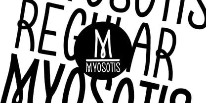 handwriting font
 - OBO Regular by Wilton Foundry,
$29.00 OBO is a modern interpretation of the classical Italian letterforms with the readability of contemporary sans typefaces. OBO is ideally suited for creating identities for branding, posters, book covers, headlines, logotypes, restaurant menus, beer labels.
 - Context Regular by Wilton Foundry,
$19.00 Context Regular is a condensed inline font with a stencil inline glyph - this makes for a smoother visual join of the stems. Context is also mono-case with the most interesting case selected for a pleasing end result. Applications are numerous: Display, Branding, Advertising, Logos, Publications, etc.
 - Mergian Regular by Tebaltipis Studio,
$15.00 Mergian - Modern Ligature Font by Tebaltipisstudio introducing our new "Mergian" Modern Ligature with Elegant Style this is perfect for branding, logos, invitation, masterheads and more. Mergian Features : -Multilanguange -Alternates -PUA Encoded -Ligatures Files Includes : -Mergian Regular.otf -Mergian Regular.ttf -Mergian Slant.otf -Mergian Slantttf If you have any questions, before or after purchase, please feel free to get in touch. Thank you
 - Vinchenso Regular by BA Graphics,
$45.00A strong powerful face that really works well for any application requiring a distinguished, clean look. Headlines, subheads, and text; anything goes. Vinchenso also has a matching Bold weight. - Krifon Regular by Tebaltipis Studio,
$15.00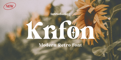 Krifon - Modern Bold Serif Font is a stylish font It has both modern and retro look. Comes with alternatives and ligatures, helps to create stunning logos, quotes, posts, blog posts. branding projects, magazine imagery, wedding invitations, and much more. WHAT'S YOU GET ? Unique Letterforms Works on PC & Mac Simple Installations Accessible in the Adobe Illustrator, Adobe Photoshop, Microsoft Word Fully accessible without additional design software. I really hope you'll get pleasure using Krifon Font and it will be perfect addition to your font collection! Contact me with an inbox message If you have any question. Thank you! Happy Creating.
 - Bondan Regular by Great Studio,
$13.00 Bondan is a family of Sans Serif fonts designed with a modern and vintage feel. Strong and dynamic. We set individual letters of medium with medium spacing for perfect typography. Bondan is very versatile. Perfect for brands, magazines, posters, logos, logotype stickers, website titles, packaging, branding, quotes, business cards and more. Bondan is equipped with a full set of uppercase letters, numbers, punctuation and multilingual support. Each font family version is available in the OTF formats for a total of 5 font files. What is included? • Bondan Light • Bondan Regular • Bondan Bold • Bondan Regular Outline • Bondan Bold Outline


Page 1 of 250Next page