10,000 search results
(0.061 seconds)
- Old printing press_free-version - Personal use only

- Rockabye - Personal use only

- Sumdumgoi - Unknown license

- Doggy - Unknown license

- ICR Ever East Serif by Nocturnal Workspace,
$15.00 Ever East is a stylish font that is both classic and minimal. Ever East has a regular version plus multilingual support. Includes: Letters, numbers, punctuation, multilingual support. Regular versions
 - Toucan Tango JNL by Jeff Levine,
$29.00In the days before vinyl sign lettering overran the landscape, talented neighborhood sign painters and show card writers made attractive displays for local merchants. Toucan Tango JNL is Jeff Levine's interpretation of a sign painter's sans serif letter with a distinctive inline. - Spur Handlettered JNL by Jeff Levine,
$29.00The spurred serif style of Roman lettering has long been a favorite of sign painters and show card writers. Spur Handlettered JNL from Jeff Levine gives this classic design an ultra-casual look, complete with all of the nuances of hand-lettering. - Lazy Monk by Mirco Zett,
$18.00 In the past it was the monk's duty to duplicate the bible, as they wrote everything by hand. The "Lazy Monk" font shows how these replica could have appeared if the monks had been too drunk or too lazy to rewrite the bible.
 - Cuckoo by Very Good Fonts,
$19.00Cuckoo was first seen in 1988 when I painted it on a record shop's window. Since then this hand lettered font has been there and done that. Cuckoo is strong, classic and informal display font designed to work well on any job. - Miss Dottie NF by Nick's Fonts,
$10.00 The 1897 specimen book from Barnhart Brothers and Spindler showed a enchanting little face called Dotted Roman. Here's a faithful revival, ready to warm up the 21st century. Both versions support the Latin 1252, Central European 1250, Turkish 1254 and Baltic 1257 codepages.
 - Diva Doodles Too by Outside the Line,
$19.00Diva Doodles Too is more of Outside the Line's top selling font Diva Doodles. More girl things in a line drawn, playful style. Font includes clothes, purses, shoes, jewelry, glove, high heel, bikinis, hats, perfume, flowers and cocktails and the scripted word Diva. - Belwe by Bitstream,
$29.99 Designed by George Belwe for Schelter & Giesecke in Dresden, Belwe is one of the first typefaces to show the elements of the style we have classified as Kuenstler. Deliberately unusual proportions and detailing break with traditional rhythm and hint at blackletter connections.
 - Fiasco by ChibaChiba,
$24.95 Extremely influenced by the new rave trend, Fiasco is a reflex of it's excesses. Way too many elements, bright neon colors, and that not-knowing-when-to-stop sort of behavior. Acid House aesthetic remixed by the nu school DJs. Neon Flamboyant.
 - Eckhardt Speedletter JNL by Jeff Levine,
$29.00Eckhardt Speedletter JNL was named in honor of Al Eckhardt (1929-2005), a talented sign painter and good friend of font designer Jeff Levine. The font was inspired by hand lettering on a reproduction of a 1950s rock and roll show poster. - Foda Naskh by Fo Da,
$50.00 Foda Naskh is a modern naskh typeface that Combines the originality and modernity, which shows the letters beauty and the ease of reading. Foda Naskh is typical for books, the writing of newspapers, headlines, magazines, poetry, long and short text paragraphs and more..
 - Corporate S by URW Type Foundry,
$180.99 The Corporate ASE typeface trilogy was designed by Prof. Kurt Weidemann, a well-known German designer and typographer, from 1985 until 1990. This superb trilogy consisting of the Corporate A (Antiqua), Corporate S (Sans Serif), and Corporate E (Egyptian) is a design program of classical quality, perfectly in tune with each other. Weidemann says: “My ASE trilogy, quite like triplets, is in perfect harmony and covers all needs of modern typography!” Initially exclusively designed for DaimlerChrysler as a corporate font, the ASE trilogy may be now licensed and used without restriction. URW++ digitized the ASE for DaimlerChrysler and Prof. Weidemann and is the exclusive licensing agent for this outstanding and extremely popular typeface program. Meanwhile, URW++ enhanced the Corporate ASE family in regular, bold, italic, and bold italic by Greek, Cyrillic, and all additional Latin characters to cover Eastern Europe including the Baltic Rim, Romania and Turkey. Corporate ASE in regular, bold, italic, and bold italic is now available in the WGL 4 character complement.
 - Corporate S WGL by URW Type Foundry,
$210.99 The Corporate ASE typeface trilogy was designed by Prof. Kurt Weidemann, a well-known German designer and typographer, from 1985 until 1990. This superb trilogy consisting of the Corporate A (Antiqua), Corporate S (Sans Serif), and Corporate E (Egyptian) is a design program of classical quality, perfectly in tune with each other. Weidemann says: “My ASE trilogy, quite like triplets, is in perfect harmony and covers all needs of modern typography!” Initially exclusively designed for DaimlerChrysler as a corporate font, the ASE trilogy may be now licensed and used without restriction. URW++ digitized the ASE for DaimlerChrysler and Prof. Weidemann and is the exclusive licensing agent for this outstanding and extremely popular typeface program. Meanwhile, URW++ enhanced the Corporate ASE family in regular, bold, italic, and bold italic by Greek, Cyrillic, and all additional Latin characters to cover Eastern Europe including the Baltic Rim, Romania and Turkey. Corporate ASE in regular, bold, italic, and bold italic is now available in the WGL 4 character complement.
 - Corporate A WGL by URW Type Foundry,
$210.99 The Corporate ASE typeface trilogy was designed by Prof. Kurt Weidemann, a well-known German designer and typographer, from 1985 until 1990. This superb trilogy consisting of the Corporate A (Antiqua), Corporte S (Sans Serif), and Corporate E (Egyptian) is a design program of classical quality, perfectly in tune with each other. Weidemann says: "My ASE trilogy, quite like triplets, is in perfect harmony and covers all needs of modern typography!" Initially exclusively designed for DaimlerChrysler as a corporate font, the ASE trilogy may be now licensed and used without restriction. URW++ digitized the ASE for DaimlerChrysler and Prof. Weidemann and is the exclusive licencing agent for this outstanding and extremely popular typeface program. Meanwhile, URW++ enhanced the Corporate ASE family in regular, bold, italic, and bold italic by Greek, Cyrillic, and all additional Latin characters to cover Eastern Europe including the Baltic Rim, Romania and Turkey. Corporate ASE in regular, bold, italic, and bold italic is now available in the WGL 4 character complement.
 - Vassallo - Unknown license

- Lagos by Scholtz Fonts,
$19.00 Lagos was created because of the lack of African-inspired fonts that are truly modern without being partly art-deco in origin. I wanted to make a vigorous, sharp-edged font that reflects the energy and dynamism of modern Africa. The lines of the font combine the sharp angularity of African rocks and mountains with the smooth fluidity of Africa's snake-black rivers. The font is supplied in two styles, Lagos Regular and Lagos Light. Lagos Light is not a simple, mechanical modification of Lagos Regular. The outlines and proportions have been subtly modified to accommodate the lighter weight. Lagos contains a full 256 character set (upper and lower case, punctuation, diacritical characters, special symbols and numerals), in which all characters have been fully kerned and letter-spaced.
 - MVB Peccadillo by MVB,
$39.00MVB Peccadillo is an interpreted revival of a metal typeface popular in the 19th Century, then known as Skeleton Antique. Highly condensed with extra short descenders, the face makes a big impact in a narrow space. Holly Goldsmith worked from letterpress-printed specimens of 96-point, antique metal type, deliberately retaining subtle distortions due to type wear and letterpress impression. Alan Dague-Greene, referring to printed samples of Skeleton Antique, adapted the design to create two additional optical sizes: “Eight” for smaller text and “Twenty-four” for subheads. - Free - Unknown license

- Camden - Unknown license

- Visitation - Unknown license

- Floora by Valentino Vergan,
$16.00 Floora is a modern and unique font duo. The font combines two different type styles, a polished uppercase sans serif and a Neue Nouveau style lowercase, this combination makes the font very unique and distinct. The uppercase sans serif comes with large ink traps at its joints, this gives the font a modern and trendy appearance. Floora has a set of italic uppercase and lowercase letters, this combination of regular and italic letters gives you the ability to create a multitude of different letter combinations. Floora was also created with unique ligatures, alternative characters and multi-language support. Floora is perfect for designing posters, magazines, logos, Instagram posts, websites, blog posts, pull quotes, social media posts and much more. If you a looking for something modern and unique for you next project, Floora is the font for you. I hope you enjoy using the Floora typeface.
 - Ongunkan Archaic Etrusk by Runic World Tamgacı,
$50.00 Etruscan was the language of the Etruscan civilization, in Italy, in the ancient region of Etruria (modern Tuscany, western Umbria, northern Latium, Emilia-Romagna, Veneto, Lombardy and Campania). Etruscan influenced Latin but was eventually completely superseded by it. The Etruscans left around 13,000 inscriptions that have been found so far, only a small minority of which are of significant length; some bilingual inscriptions with texts also in Latin, Greek, or Phoenician; and a few dozen loanwords. Attested from 700 BC to AD 50, the relation of Etruscan to other languages has been a source of long-running speculation and study, with its being referred to at times as an isolate, one of the Tyrsenian languages, and a number of other less well-known theories. The consensus among linguists and Etruscologists is that Etruscan was a Pre–Indo-European,and a Paleo-European language and is closely related to the Raetic language spoken in the Alps, and to the Lemnian language, attested in a few inscriptions on Lemnos. Grammatically, the language is agglutinating, with nouns and verbs showing suffixed inflectional endings and gradation of vowels. Nouns show five cases, singular and plural numbers, with a gender distinction between animate and inanimate in pronouns. Etruscan appears to have had a cross-linguistically common phonological system, with four phonemic vowels and an apparent contrast between aspirated and unaspirated stops. The records of the language suggest that phonetic change took place over time, with the loss and then re-establishment of word-internal vowels, possibly due to the effect of Etruscan's word-initial stress. Etruscan religion influenced that of the Romans, and many of the few surviving Etruscan language artifacts are of votive or religious significance.
 - Rito by Wilton Foundry,
$19.00 Rito Regular and Italic is a clean, crisp and modern monospaced font ready to make your work shine. Its distinctive ink-trap inspired chiseled glyphs create a unique flavor that is more pronounced in the italics. Rito is not your typical monospaced boring font - from the outset the goal was to develop an exuberant, dynamic and contemporary mono-spaced font. Ideal for coding, writing and has plenty of attitude to stretch into display formats!
 - Palestra by Larin Type Co,
$12.00 Palestra - a modern sans serif font in four style : Regular, Italic, Bold and Bold italic. In this font, I can see many alternatives for the lowercase and most common ligatures that fit perfectly with this font style. This font can look more classic without serifs and more expressive with alternative substitutes, try to play with them and you will get the uniqueness in your project. All characters in this font are PUA-encoded.
 - Mavericks by BoxTube Labs,
$24.00 Maverick, noun, /ˈmæv.ɚ.ɪk/ a person who thinks and acts in an independent way, often behaving differently from the expected or usual way. Mavericks is a condensed small caps serif with focus on strength and power. It comes in two styles, Regular & Vintage, and features a fair amount of alternate characters to make each design a little more unique. It's perfect for logotypes, sports branding, posters, apparel design, magazine headlines, labels and so much more.
 - Have a Nice Day by Cultivated Mind,
$20.00 Have A Nice Day is a handwritten font created by Cindy Kinash. This font features three font styles (Basic/Tall/Wide) and comes in three weights (Light/Regular/Bold). All three font styles can be used together as one unique and fun font! This font also includes a set of fun hand drawn ornaments like smiley faces, flowers, leaves, insects, frames, captions, desserts, food, clouds, and catchwords that will surely brighten your day! Enjoy!
 - Maraka by Rosario Nocera,
$12.00 Maraka is a handwritten font family, drawn with a paint marker on rough paper, then scanned and turned into vector format. Maraka has a lot of alternative letters and is available in three versions: “Regular”, characterized by an unique look obtained by drawing the letters on a rough sheet, "Solid" and "Serif". Maraka is ideal for large headers, straplines and typographic compositions, but it still gives a great dynamic effect when writing wordy paragraphs.
 - Affront by fontkingz,
$19.00Affront is Carsten Raffel's first font for fontkingz. It is a very extended computer-generated font-family with three members: regular, light and a stylish doublette-version. Affront fonts include a full character set. The capital letters are monospaced, some of the lower case letters look very unique. This font works best for logotype- and headline design. It looks good on futuristic refrigerators, Science-fiction film posters and modern dance music cd-compilations. - Solarica by Struvictory.art,
$14.00 Solarica is a linear font decorated with tribal patterns. The typeface includes Decorative, Regular and Symbol versions. Combine fonts with each other to get a unique design! Solarica is suitable for lettering posters and cards, tourist brochures, photo overlays, music album and book covers. The font works great both for printing, clothes and craft products, branding and packaging (herbal tea, handmade soap, organic food). Also use individual letters to create logos and monograms.
 - Road Crew by Larin Type Co,
$16.00 Road Crew is a handwritten, monoline font that includes two styles, regular and bold, with which you can combine and create unique designs in an instant. Also included in this font are alternatives and touches that you can use to make your design more diverse and attractive. You can also use them to create a logo or use them for small businesses, t-shirts, book covers, stationery, marketing, blogs, magazines, and more.
 - Sans Andreas by Java Pep,
$11.00 Proudly presenting the newest handwritten font called Sans Andreas. These font made by handwritten style, so all shape looks unique and natural. Sans Andreas is a family font, with 4 styles regular, italic, bold, bold italic. Sans Andreas is also perfect for all your project that has sense fun, playful, art, and .etc If you have any questions or technical support don't hesitate to comment, message or contact java.indonesian@yahoo.com. Have a nice day.
 - Olliverya by Maulana Creative,
$17.00 Olliverya is a modern unique script font. With regular mono-line stroke, fun character with some of ligatures. To give you an extra creative work. Olliverya font support multilingual more than 100+ language. This font is good for logo design, Social media, Movie Titles, Books Titles, a short text even a long text letter and good for your secondary text font with sans or serif. Make a stunning work with Olliverya font. Cheers, MaulanaCreative
 - Trickshot by Mans Greback,
$59.00 Trickshot is a handmade script font that evokes a sense of rustic charm and enthusiasm. Its bold and expressive style makes it an excellent choice for designs that require a strong visual impact, such as sports team logos, outdoor event posters, and country-themed branding. The Trickshot font family includes four versatile styles: Regular, Bold, Italic, and Bold Italic, giving you the flexibility to mix and match styles to create unique and eye-catching designs.
 - Oxyless by Maulana Creative,
$16.00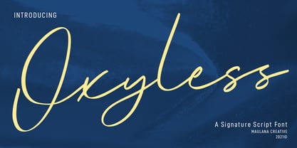 Oxyless is a Unique Script font. With regular contrast stroke, slanted and fun character with a bit of ligatures. To give you an extra creative work. Oxyless font support multilingual more than 100+ language. This font is good for logo design, Social media, Movie Titles, Books Titles, a short text even a long text letter and good for your secondary text font with sans or serif. Make a stunning work with Oxyless font. Cheers, MaulanaCreative
 - Marttabuck by Letterhend,
$10.00 Marttabuck Script - The bold and straight-forward look script. This script comes with two types, the regular and special. The special type has its unique tiny slices which gives more personal touch and makes the font looks being customized. This font is suitable to use as a logotype, apparel, wedding invitation, signboard, sport club, motor / car, etc. This font has many opentype features like ligature, stylistic alternate, contextual alternate, swash, etc and support multi language.
 - Diamonds and Rust Historical by OKSHUtypeCO,
$9.00 DIAMONDS AND RUST FONT DUO - a new fresh handmade calligraphy font. DAR Regular - Italic - Outline Script Historical SANS and SCRIPT MULTILANGUAGE OK Very suitable for greeting cards, branding materials, business cards, quotes, posters, and more!This font are perfect for wedding postcard. Or you can create perfect and unique design of your logo, blog, stationery, marketing, magazines and more :) Features: Ligatures Script UpperCase & Lowercase Numerals & Punctuations All style font Multilingualcharacters(AÀÁÂÃÄÅCÇDÐEÈÉÊËIÌÍÎÏNÑOØÒÓÔÕÖUÙÜÚÛWYÝŸŸ ÆŒßÞàáâãäåæçèéêëìíîïðñòóôõöøùúûüýÿ)


