10,000 search results
(0.043 seconds)
- Easy Mind by Putracetol,
$22.00 Easy Mind - Retro Script Font is a captivating retro script typeface designed to transport your designs to a bold and vintage world. Its distinctive style showcases the perfect blend of boldness and retro aesthetics, making it an ideal choice for various creative applications. This font comes with an extensive set of alternative characters, each offering a multitude of unique shapes and swashes, adding versatility and flair to your designs. Perfect for logos, packaging, invitations, greeting cards, posters, magazines, titles, business branding, and all projects with a retro or vintage theme, Easy Mind infuses your designs with a sense of nostalgia and timeless charm. With its bold and retro style, this font allows you to effortlessly channel the spirit of the past into your creative projects, giving them a distinctive and classic touch.
 - Serofina by insigne,
$24.99 Serofina is an adaptable and fluid connected script with plenty of alternate flourish options. From clean and flowing to cute and frilly, Serofina can do it. The Serofina family comes with four weights, including a unique hairline, which makes it a versatile investment for a wide range of design possibilities. All weights include the OpenType programming to automatically and seamlessly swap out the default characters for 45 alternate forms and 18 auto-replacing ligatures. These alternates can make the face appear to be more simplified, restrained or frilly. Serofina also includes seven ornaments and old-style numbers. Check out the sample images to see these features in action. Serofina is a highly versatile script family and its range of weights make it perfect for whenever you need an expressive and original typeface.
 - Figment by Scholtz Fonts,
$10.00 Like a figment of the imagination, this very readable font wafts across the page, leading the reader into a world of enchantment. Ethereal and fluid, it is reminiscent of sorcerer's spells written on ancient parchment. It manages, by the distortion of its characters, to transform a simple serif font into something quite different. Wavy outlines and an uneven baseline create an impression of fluidity and magic, while retaining the essential clarity of the classic serif body font. Use Figment for: -- Children's books -- Halloween advertising media -- book covers -- movie titles -- swing tickets -- posters Figment is available in two styles, Figment Regular and Figment Force (a wider and bolder style) The font has been professionally letterspaced and kerned. All upper and lower case characters, punctuation, numerals and accented characters are present.
 - KERASIH by Product Type,
$15.00 Keraasih is a graffiti display font that combines art, freedom, and the beauty of handwriting. Crafted with boldness and expression, this font is the perfect solution for projects that require a unique artistic touch and beautiful handwriting. With Keras, you can create striking and eye-catching designs. This font gives you the freedom to express your creativity and exudes a style like no other. The expressive look and strong character make Kerasih a standout choice among other fonts. The artistic touch in each letter and the intricate details make Keraasih so attractive. Every cut, line, and stroke exudes boundless creative courage and passion. The bold graffiti design and the feel of beautiful handwriting create a unique and eye-catching combination. Keraasih takes you into the world of art and freedom. Use this font to create eye-catching posters, memorable logos, or cool merchandise designs. With Kerashy, you can bring an interesting and evocative touch of art to your projects. What’s Included : - File font - All glyphs Iso Latin 1 - Ligature, Alternate - We highly recommend using a program that supports OpenType features and Glyphs panels like many Adobe apps and Corel Draw, so you can see and access all Glyph variations. - PUA Encoded Characters – Fully accessible without additional design software. - Fonts include Multilingual support
 - KOEEYA by Product Type,
$13.00 Koeeya is a font with a charming Display Graffiti theme. Created to give your projects a touch of freedom and uniqueness, Available in three different variations, Koeeya provides flexibility and the opportunity to express your creativity in limitless ways. You can choose between solid and plain styles, dramatic shadows, or interesting textures. With eccentric designs and beautifully handwritten characters, Koeeya gives each design a different and memorable impression. This font combines the boldness and creativity of graffiti writing with the amazing smoothness and clarity of handwriting. By using Koeeya, you can give a unique and stylish touch to your promotional materials, posters, merchandise designs, and much more. This font exudes energy and freedom, capturing the attention of potential customers in an instant. Now is the time to let your imagination run wild and express yourself through eye-catching designs. Choose Koeeya as your main font and watch how your project becomes unique, interesting, and unforgettable. What’s Included : - File font - All glyphs Iso Latin 1 - Ligature, Alternate - We highly recommend using a program that supports OpenType features and Glyphs panels like many Adobe apps and Corel Draw, so you can see and access all Glyph variations. - PUA Encoded Characters – Fully accessible without additional design software. - Fonts include Multilingual support
 - Earthbound - 100% free

- Ardenwood Demo - Unknown license

- Chubby Cheeks - Unknown license

- Technotyp by URW Type Foundry,
$39.99 The digital font Technotyp is based on the hot metal typeface created by the German typographer and type designer Herbert Thannhaeuser (1898-1963) for the former East German type foundry Typoart in Dresden. In the typography book ‘Der Schriftsetzer’ (Fachbuchverlag, Leipzig, 1952), by Paul Fritzsche, this absolutely beautiful slab serif design is presented in all its variations. Fritzsche remarked that – because of its rather condensed form and its relatively long ascenders – the 'Werkschrift' of the Technotyp (comparable with our 'Regular') seemed to be very well suited to serve as a text face, and recommended for this purpose that the face be cut for the composing machine. However, this never happened and the entire Technotyp family was made available for hand composition only. This is finally changing and being remedied for good now: URW++ proudly presents the new digital version of this really charming font family with its distinct flavor of the 1950s, adding it to the other digital renditions of Herbert Thannhaeuser fonts at URW++, namely Garamond No. 4 and Magna. The original Typoart family had an italic style for the light version only. The new digital version of Technotyp includes italic styles for the regular, medium and bold weights as well, enhancing the family to meet today’s standards and requirements for professional type setting. To further increase its usefulness, Cyrillic faces were created, too. True to the standard for all digital fonts at URW++, the character set for Technotyp covers all West- and East European languages.
 - Mencken Std by Typofonderie,
$59.00 An American Scotch remixed in 27 fonts Mencken has twenty seven styles, divided into three widths, three optical sizes, romans and italics. Generally, optical size typeface families belong to a same common construction. It falls into the same category of type classification, while presenting different x-heights or contrasts. Mencken is unique because it is designed according to different axis and optical sizes. Firstly, Mencken Text is a low-contrast transitional typeface, designed on an oblique axis, asserting horizontal with featuring open counters. Its capitals follow Didots to better harmonize the rest of the family. On the other side of the spectrum, Mencken Head (and narrow variations) is designed on a vertical axis, high contrast, in a contemporary Didot style. The Mencken is therefore a typeface answering to different sorts of uses, whose design is different according to its uses: from oblique axis in small size to vertical axis in large sizes. Vertical proportions (x-height, capitals height, etc.) were calibrated to be compatible with many Typofonderie typeface families. Lucie Lacava and I followed the idea launched by Matthew Carter few years ago for some of his typefaces intended for publications. From Baltimore Sun’s project to Typofonderie’s Mencken It is a bespoke typeface for American newspaper The Baltimore Sun started at the end of 2004 which marks the beginning of this project. The story started with a simple email exchange with Lucie Lacava then in charge of redesigning the American East Coast newspaper. As usual, she was looking for new typeface options in order to distinguish the redesign that she had started. At the time of its implementation, a survey of the newspaper’s readers has revealed that its previous typeface, drawn in the mid-1990s, was unsatisfactory. The Mencken was well received, some reader responses was particularly enjoyable: “It’s easier to read with the new type even though the type is designed by a French.” Why it is called Mencken? The name Mencken is a tribute to H. L. Mencken’s journalistic contributions to The Sun. According to the London Daily Mail, Mencken ventured beyond the typewriter into the world of typography. Because he felt Americans did not recognize irony when they read it, he proposed the creation of a special typeface to be called Ironics, with the text slanting in the opposite direction from italic types, to indicate the author’s humour. Affirming his irreverence, the Mencken typeface does not offer these typographic gadgets. Henry Louis Mencken (1880 — 1956) was an American journalist, satirist, cultural critic and scholar of American English. Known as the “Sage of Baltimore”, he is regarded as one of the most influential American writers and prose stylists of the first half of the twentieth century. He commented widely on the social scene, literature, music, prominent politicians and contemporary movements. Creative Review Type Annual 2006 Tokyo TDC 2018
 - Leftfield by Fenotype,
$35.00 Leftfield - stylish vintage font collection. Leftfield collection includes following: •Leftfield Brush -a bold baseball style script with Clean and Rough version •Leftfield Swoosh -a set of swooshes designed to go with Leftfield Brush. Clean and Rough version. •Leftfield Sans -a sturdy all caps sans serif with Regular and Bold weight and Clean and Rough version of both •Leftfield Serif -a sturdy all caps serif with Regular and Bold weight and Clean and Rough version of both Leftfield Brush is a bold and strong sports team style vintage connected script. It’s great for any kind of display use from impressive logos to packaging and headlines. Brush is equipped with automatic Contextual Alternates that keep the connections smooth. In addition there is Swash, Titling and Stylistic alternates for standard characters. Try combining Leftfield Swoosh to make stunning compositions. Leftfield Sans and Serif work great as themselves, they make striking word blocks and they are designed to go with the Brush. Try Leftfield Serif in large sizes to make the best out of the subtle serif’s. Leftfield Rough versions simulate a printed version of the font for authentic vintage look. They’re otherwise the same font but with a rugged outline and print texture inside the characters. Leftfield has a wide language support including West European, Central European, Baltic, Turkish and Romanian character sets.
 - Hadigen by Bungletter,
$12.00 Hadigen is a very Beautiful, elegant and unique handwritten font. Expertly designed to be a true favourite, this font has the potential to take your creative ideas to the highest level! This font is PUA encoded which means you can access all the glyphs and sweeps easily! Hadigen is attractive because it is sleek, clean, feminine, sensual, glamorous, simple and very easy to read, thanks to its many luxurious letter connections. I also offer a decent number of style alternatives for all letters. Classic style is very suitable to be applied in various formal forms such as invitations, labels, restaurant menus, logos, fashion, make up, stationery, novels, magazines, books, greeting/wedding cards, packaging, labels or all kinds of advertisements. for your purposes. . . . . . . Thanks & Congratulations on the Design.
 - Larky by Alterspieler,
$17.00 Larky is a beautiful and unique modern calligraphy. This font has simple and interesting characters for various design needs. You can use it for embroidery, screen printing, business cards, cutting, branding, and more. Larky has all uppercase and lowercase letters, also has alternatives, multi languages, ligatures, numbers, punctuation.
 - Shivanya by Arkrist Letter,
$14.00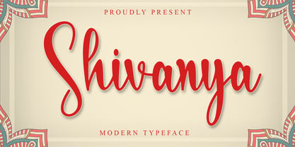 Shivanya is a lovely and delicate script font that exudes elegance and class. This font was particularly crafted for those who need a beautiful and refreshing look to their designs. Shivanya is PUA encoded which means you can access all of the amazing glyphs and ligatures with ease!
 - Bright Burn by onlyfontyouandme,
$10.00 Bright Burn is cool, retro and fun display font. Bright Burn have 2 fonts,regular and brush. This font is PUA encoded which means you can access all of the glyphs and alternates with ease! It will look great on headlines, magazines, logos, branding and so much more!
 - Ancientos by ZetDesign,
$15.00 ancientos is a font inspired by ancient writings, transporting you to the past that is amazing and full of beauty and strong character. This font is perfect for use on all historical-themed projects and comes with italic style and opentype features that help designers produce stunning work.
 - Vanquish by Aboutype,
$24.99A traditional Sans serif with a modern flair and uniform consistent weight to the vertical and horizontal stokes. Vanquish was designed for all media and can be used in a wide range of point sizes. Vanquish was kerned for text point sizes but requires subjective display kerning and compensation. - White Stallion by ErlosDesign,
$19.00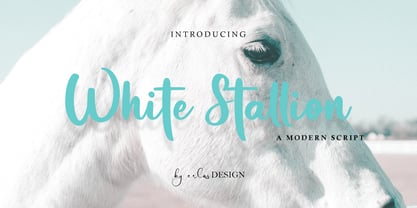 White Stallion is a lovely and delicate script font that exudes elegance and class. This font was particularly crafted for those who need a beautiful and refreshing look to their designs. White Stallion is PUA encoded which means you can access all of the glyphs and swashes with ease!
 - Black Falken by Gian Studio,
$16.00 Black Falken is my new elegant serif font that will give your projects a touch of luxury and style. It's perfect for logotypes, branding, monograms and wedding invitations, blog headlines, and more. Browse through all the previews and get as inspired as I was when creating this font. Thanks.
 - QR Hiykaya by QR Type,
$45.00 All uppercase typeface for comic book lettering. Designed by Abay Emes. Supports extended Cyrillic and Latin characters. Has a stylistic set alternate L and D for Cyrillic and a stylistic set for languages with dotless i and i with dot (like Turkish). "Hiykäyä" translates from Qazaq as "Story".
 - Andalusia Felistica by Letterena Studios,
$9.00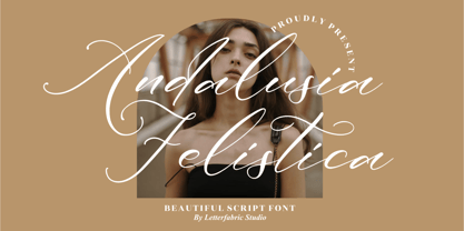 Andalusia Felistica is a lovely and delicate script font that exudes elegance and class. This font was particularly crafted for those who need a beautiful and refreshing look to their designs. Andalusia Felistica is PUA encoded which means you can access all of the glyphs and swashes with ease!
 - Sticky Time by Bogstav,
$14.00 Here's my super legible and handmade font. I've made several versions, and they overlap and compliments each other very sweetly. To enhance that nice handmade look, the outline and striped versions are a bit more rough - just like they all come with 3 different versions of each lowercase letter!
 - Slazer by João Henrique Lopes,
$20.00 Slazer is a futurist font designed for a dynamic and powerful effect when it comes to science, technology, games, web, cellphones and electronics. All glyphs are open, straight and smooth, enhancing their connection with images. Slazer’s lines never touch or split: they always go somewhere… and go fast!
 - Seaglass by Atlantic Fonts,
$26.00 Seaglass is decorative, feminine, and strong. Its whimsical curls and handmade form make a crafty statement in all-caps, and its expressive lower case invites in young and old alike - not unlike the gems found on secluded beaches. Let Seaglass transform your next packaging, poster, or book project.
 - Hello Hellen by Hrz Studio,
$14.00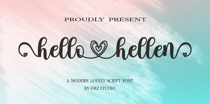 Hello Hellen is a lovely and delicate script font that exudes elegance and class. This font was particularly crafted for those who need a beautiful and refreshing look to their designs. Hello Hellen Script is PUA encoded which means you can access all glyphs and swashes with ease!
 - Balnuettes by ahweproject,
$14.00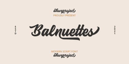 Balnuettes is a lovely and delicate script font that exudes elegance and class. This font was particularly crafted for those who need a beautiful and refreshing look to their designs. Balnuettes is PUA encoded which means you can access all of the amazing glyphs and ligatures with ease!
 - Casual Font Bundle by Konstantine Studio,
$12.00 Please welcome, Casual Font Bundle. A pack of fun and variative fonts for your playful design. Every single fonts have their own personality and characters. Would be a perfect mate for your fun and casual design projects. Pair up each of them and you'll never disappointed at all!
 - Burst My Bubble Pro by CheapProFonts,
$10.00 This font has been described as "one of the cutest fonts I've ever seen. I can imagine a beautiful, young 22-year-old fashion design student from Los Angeles, CA with this handwriting as she's writing in her journal." I have cleaned it up a bit, increased the size of all the dots slightly and then designed all the diacritics and expanded the character set. The lowercase "f" has a big overhang and the lowercase "j" goes really far to the left - I have programmed automatic (OpenType) Contextual Alternate versions that automatically substitute with shorter variants when letters collide. These alternate letters can also be switched on using the OpenType palette's Stylistic Alternates or Stylistic set 01 ("j") and 02 ("f"). ALL fonts from CheapProFonts have very extensive language support: They contain some unusual diacritic letters (some of which are contained in the Latin Extended-B Unicode block) supporting: Cornish, Filipino (Tagalog), Guarani, Luxembourgian, Malagasy, Romanian, Ulithian and Welsh. They also contain all glyphs in the Latin Extended-A Unicode block (which among others cover the Central European and Baltic areas) supporting: Afrikaans, Belarusian (Lacinka), Bosnian, Catalan, Chichewa, Croatian, Czech, Dutch, Esperanto, Greenlandic, Hungarian, Kashubian, Kurdish (Kurmanji), Latvian, Lithuanian, Maltese, Maori, Polish, Saami (Inari), Saami (North), Serbian (latin), Slovak(ian), Slovene, Sorbian (Lower), Sorbian (Upper), Turkish and Turkmen. And they of course contain all the usual "western" glyphs supporting: Albanian, Basque, Breton, Chamorro, Danish, Estonian, Faroese, Finnish, French, Frisian, Galican, German, Icelandic, Indonesian, Irish (Gaelic), Italian, Northern Sotho, Norwegian, Occitan, Portuguese, Rhaeto-Romance, Sami (Lule), Sami (South), Scots (Gaelic), Spanish, Swedish, Tswana, Walloon and Yapese.
 - Modern Vision - 100% free

- Project Y - Personal use only

- Project X - Personal use only

- Maskalin - Unknown license

- Angela Love Script by Fargun Studio,
$14.00 Introducing Angela Love Script Angela Love Script is modern script that is perfect for photography, branding, signature. It is beautiful and classy for all your projects. This font has given PUA code (specially coded fonts) so that all the alternate characters can easily be accessed in full by a craftsman or designer.
 - Phone Pro Hebrew by Tamar Fonts,
$30.00 Note: the 'Phone Pro Hebrew' typeface, includes just the Hebrew characters of the comprehensive "Phone Pro" family font, sold separately [on this MyFonts site], so they are economical for those interested just in the Hebrew Characters. And regarding the “Phone Pro” project in general, this is what I wrote: 'PRISTINE'; this font is—neither beautiful nor ugly, neither vigorous nor weak, neither traditional nor modern, neither serif nor sans serif, neither script nor printable, neither a text font nor a display font—it is rather all of the above, which makes it a more versatile typographic tool—[handwritten] characters that are well-suited for a wide variety of applications—from editorial design, [friendly] greeting cards... to branding, advertising, publicity and digital. Each glyph design combines its unique shapes and stylish ink-traps with parabolic curves. Each glyph design has been treated as an 'individual character'—the way I would treat a breathing, living, vulnerable and courteous human being; looking after each and every character as if it was my only child — bringing to light the authenticity and uniqueness of each individual, as well as my objective to bring about peace and harmony between them all as a whole. Designed with the intention of harmonizing between four scripts — Latin, Cyrillic, Greek and Hebrew; the whole family has a comprehensive set of characters—in addition to the Latin letters, the Phone typeface also has a full set of characters for Vietnamese, partially extended Cyrillic, Greek and Hebrew (sold separately). The t_t ligature is something unique to Phone, as well as the t_z ligature, among others and extras. A distinctive trait of the Phone typeface, is a high x-height combined with relatively short ascenders. The Phone typeface is in a way evoking the feeling of some Gaelic font and of the [Egyptian] Papyrus font (by Chris Costello, though, not being based on neither of those), having an exotic and an exquisite look, under the category of "Soft Fonts & Friendly Faces".
 - RePublic by Suitcase Type Foundry,
$75.00In 1955 the Czech State Department of Culture, which was then in charge of all the publishing houses, organised a competition amongst printing houses and generally all book businesses for the design of a newspaper typeface. The motivation for this contest was obvious: the situation in the printing presses was appalling, with very little quality fonts existing and financial resources being too scarce to permit the purchase of type abroad. The conditions to be met by the typeface were strictly defined, and far more constrained than the ones applied to regular typefaces designed for books. A number of parameters needed to be considered, including the pressure of the printing presses and the quality of the thin newspaper ink that would have smothered any delicate strokes. Rough drafts of type designs for the competition were submitted by Vratislav Hejzl, Stanislav Marso, Frantisek Novak, Frantisek Panek, Jiri Petr, Jindrich Posekany, and the team of Stanislav Duda, Karel Misek and Josef Tyfa. The committee published its comments and corrections of the designs, and asked the designers to draw the final drafts. The winner was unambiguous — the members of the committee unanimously agreed to award Stanislav Marso’s design the first prize. His typeface was cast by Grafotechna (a state-owned enterprise) for setting with line-composing machines and also in larger sizes for hand-setting. Regular, bold, and bold condensed cuts were produced, and the face was named Public. In 2003 we decided to digitise the typeface. Drawings of the regular and italic cuts at the size of approximatively 3,5 cicero (43 pt) were used as templates for scanning. Those originals covered the complete set of caps except for the U, the lowercase, numerals, and sloped ampersand. The bold and condensed bold cuts were found in an original specimen book of the Rude Pravo newspaper printing press. These specimens included a dot, acute, colon, semicolon, hyphens, exclamation and question marks, asterisk, parentheses, square brackets, cross, section sign, and ampersand. After the regular cut was drafted, we began to modify it. All the uppercase letters were fine-tuned, the crossbar of the A was raised, E, F, and H were narrowed, L and R were significantly broadened, and the angle of the leg and arm of the K were adjusted. The vertex of the M now rests on the baseline, making the glyph broader. The apex of the N is narrower, resulting in a more regular glyph. The tail of Q was made more decorative; the uppercase S lost its implied serifs. The lowercase ascenders and descenders were slightly extended. Corrections on the lower case a were more significant, its waist being lowered in order to improve its colour and light. The top of the f was redrawn, the loop of lowercase g now has a squarer character. The diagonals of the lowercase k were harmonised with the uppercase K. The t has a more open and longer terminal, and the tail of the y matches its overall construction. Numerals are generally better proportioned. Italics have been thoroughly redrawn, and in general their slope is lessened by approximatively 2–3 degrees. The italic upper case is more consistent with the regular cut. Unlike the original, the tail of the K is not curved, and the Z is not calligraphic. The italic lower case is even further removed from the original. This concerns specifically the bottom finials of the c and e, the top of the f, the descender of the j, the serif of the k, a heavier ear on the r, a more open t, a broader v and w, a different x, and, again, a non-calligraphic z. Originally the bold cut conformed even more to the superellipse shape than the regular one, since all the glyphs had to be fitted to the same width. We have redrawn the bold cut to provide a better match with the regular. This means its shapes have become generally broader, also noticeably darker. Medium and Semibold weights were also interpolated, with a colour similar to the original bold cut. The condensed variants’ width is 85 percent of the original. The design of the Bold Condensed weights was optimised for the setting of headlines, while the lighter ones are suited for normal condensed settings. All the OpenType fonts include small caps, numerals, fractions, ligatures, and expert glyphs, conforming to the Suitcase Standard set. Over half a century of consistent quality ensures perfect legibility even in adverse printing conditions and on poor quality paper. RePublic is an exquisite newspaper and magazine type, which is equally well suited as a contemporary book face. - PF Libera Pro by Parachute,
$79.00 PF Libera was designed at a time of leisure with no particular intention for commercial use. In fact it was offered in the beginning as a freeware. In 2001, designer Charis Tsevis was convinced that it may have some commercial value, so Parachute obtained the rights to sell this typeface. At that time, we did not even imagine what would follow. Since then, PF Libera is one of our most successful typefaces. We have seen it being used in very diverse applications. From publishing to advertising to banking, to transportation, to retail applications. Food, beverages, fashion, automobiles, tourism, the list goes on and on. In any way, this typeface is very personal, modern and provocative. It stays with you and definitely it brings along the message. PF Libera comes in 3 styles. One of them, 'Liberissima', was added later and is more loose than the other two. The new 'Pro' version is powered with 7 OpenType features and is carefully designed to include all languages that are based on Latin, Greek and Cyrillic.
 - EBRATHO by Twinletter,
$17.00 Ebratho is a superhero-themed display font that brings strength, courage, and modernity to your projects. With a strong, bold, and full-of-character style, this font is the perfect solution for creating an impressive and aggressive look. In every letter, Ebratho radiates soul-stirring power. Each character is designed with meticulous detail and a unique style, creating a strong and compelling impression on your audience. With a modern and charismatic look, this font will give your project an unforgettable touch. Ebratho is packed with creative tools, including ligatures and alternates, that allow you to combine elements of this font in various ways to create interesting and unique stylistic variations. Additionally, multilingual support allows you to use Ebratho in multiple languages, making your project accessible to a global audience. If you’re looking for a strong, bold, modern, and bold font with a superhero touch, Ebratho is the right choice. With benefits that include the ability to create impressive looks and creative features such as ligatures and alternates, this font will quickly catch the attention of your potential customers and make a memorable impression in no time. What’s Included : File font All glyphs Iso Latin 1 Alternate, Ligature Simple installations We highly recommend using a program that supports OpenType features and Glyphs panels like many Adobe apps and Corel Draw so that you can see and access all Glyph variations. PUA Encoded Characters – Fully accessible without additional design software. Fonts include Multilingual support
 - Alpha Dance - Unknown license

- Dutch Treat by Solotype,
$19.95Authentic rendering of the original font called Vanden Houten from the Keystone Foundry in Phaladelphia. Very popular among job printers of the early twentieth century. - Secret Agent NF by Nick's Fonts,
$10.00This typeface was suggested by a 1930s ad for a product called Plantol, designer unknown. It can be either graceful or playful, depending on context.


