10,000 search results
(0.029 seconds)
- Mauritz Sans by Mans Greback,
$49.00 Mauritz Sans is a brush script typeface. A cartoony brush handwriting, Mauritz was drawn and created by Mans Greback in 2021 to be the ultimate set of wild-style scripts for logotypes and branding. This calligraphy family consists of nine high-quality fonts in a variety of weights and styles: Mauritz Sans Light, Regular and Bold, plus each style is provided in the additional styles Upright and Italic. The font is built with advanced OpenType functionality and has a guaranteed top-notch quality, containing stylistic and contextual alternates, ligatures and more features; all to give you full control and customizability. It has extensive lingual support, covering all Latin-based languages, from North Europe to South Africa, from America to South-East Asia. It contains all characters and symbols you'll ever need, including all punctuation and numbers.
 - Croissant by ITC,
$39.00Phillip Kelly first drew the Croissant typeface in 1978 for Letraset. Back in the 1970s and 80s, Letraset's rubdown lettersheets were a popular means of designing with type. Today, many of these nostalgic classics are available in digital format. Linotype is pleased to re-present Croissant. This experimental typeface is built up out of round, brush-like strokes, creating heavy, and black letters. These forms are best used for display signage and headline text. If you are designing for a local bakery or donut shop, this typeface may be the perfect fit. The dark, heavy character that Croissant lends to the page is similar to Cooper Black , one of the most renowned American type designs ever produced. If you are looking for a typeface with Croissant's feel, but need to set smaller headlines or text, check out that family's offerings." - Bremer Presse by Schraube,
$29.00 As most successful German private press, «Bremer Presse» has strongly influenced German book art. It was founded 1911 in Bremen to print and produce books in perfection. The role model of the press’ typeface was the english Doves Press. Willy Wiegand drew three versions of the «Bremer Presse» antiqua font, starting with the regular weight in 16 pt and adding later the regular weights in 11 and 12 pt. The revival of this beautiful font is based on the 12 pt weight. During the design process, the focus was laid on finding the elegance and strength of original prints. As it was designed to print books, the typeface is optimally used for texts. And with the revival’s new weights «medium» and «bold» and OpenType features like ligatures or old style figures, you can design sophisticatedly typographical compositions.
 - Blend by Typesenses,
$49.00 Blend is a hand drawn collection that takes its cues from the visual universe of bakeries and coffee shops. The name refers to the combining of different kinds of coffee beans to get a balanced taste, and Blend does just that, although here each typographic flavor can also be enjoyed separately. Projects such as branding, children’s books, wedding invitations and labels are sweetened with this cute family. The bouncing informal Script programmed with Open Type offers a wide range of features like ligatures, swashes, endings, initial forms and lots of alternates. Use professional software that widely support Open Type features. Otherwise, you may not have access to some glyphs. Keep the Standard Ligatures feature always active. For further information about features and alternates, see the User Guide Blend has extensive Western, Central and Eastern European language support. Make some coffee and enjoy!
 - Surfnik by Wing's Art Studio,
$9.00 Surfnik - A Hand-Made Font Influenced by Vintage Surf and Beatnik Culture Surfnik is a hand-drawn font inspired by beatnik and surfing culture of the 1950s and 60s. A fun, loose design that’s typical of pulpy fanzines, movie posters and advertising of the era. From promoting the local surf shop, burger joint or drive-in, it’s a font that evokes a bygone era with a playful, nostalgic feel. Surfnik features an all-caps design that includes unique uppercase and lowercase characters, punctuation, language support and numerals. It also comes with six styles that mix up weights and outlines that look great when creatively combined in titles and headlines. It’s a great choice for when you need a fun and lively look when creating menus, posters, movie titles, album covers and more! Check out the visuals for lots of examples.
 - Mr Anteater by Hipopotam Studio,
$20.00 Hand drawn serif typeface designed for one of our books. You can use just the regular style or set the fill style over the stroke style to get a more colorful version. It has upper and lowercase characters with up to three alternate glyphs. Build in OpenType Contextual Alternates feature will automatically set alternate glyphs depending on frequency of appearance of the same character (even in web font but only in HTML5 browsers). The script doesn’t throw random glyphs (so it won't break the layered, two colored version). For example in the word “HIPPOPOTAMUS” you will automatically get three different “P” glyphs and two “O” glyphs. It really works great but of course you can always fine tune it by hand. Mr Anteater has younger sister. Mrs Ant was designed for side notes in the same book.
 - VLNL Mais by VetteLetters,
$30.00 The design of VLNL Mais started out as a thought experiment – "How would it look if you dressed up FuturaBlack in LatinWide serifs?” DBXL drew up the first sketches on graph paper in 2014. Although the concept looked promising enough, it ended up dormant in a desktop folder. To be resurfaced recently when covid-19 started spreading and we were asked to all stay home. The final design ended up with a distinct latino flavour due to the long spikey serifs. They look like tortilla chips. And as maize is the main ingredient in many South-American and specifically Mexican dishes – tortillas, burritos, nachos, tamales, tacos – a name was quickly found. VLNL Mais was designed by DBXL, and can be used for logos, headlines, flyers or posters (and not just for Mexican restaurants). It can be found in the VetteLetters vegetable section.
 - Teimer Std by Suitcase Type Foundry,
$75.00Typographer and graphic designer Pavel Teimer (1935-1970) designed a modern serif roman with italics in 1967. For the drawing of Teimer he found inspiration in the types of Walbaum and Didot, rather than Bodoni. He re-evaluated these archetypes in an individual way, adjusting both height and width proportions and modifying details in the strokes, thus effectively breaking away from the historical models he used as a starting point. Teimer's antiqua has less contrast; the overall construction of the characters is softer and more lively. The proportions of the italics are rather wide, making them stand out by their calm and measured rhythm. This was defined by the purpose of the typeface, as it was to be utilised for two-character matrices. The long serifs are a typical feature noticeable throughout the complete family of fonts. In 1967, a full set of basic glyphs, numerals and diacritics of Teimer's antiqua was submitted to the Czechoslovak Grafotechna type foundry. However, the face was never cast. At the beginning of 2005 we decided to rehabilitate this hidden gem of Czech typography. We used the booklet "Teimer's antiqua - a design of modern type roman and italics", written by Jan Solpera and Kl‡ra Kv’zov‡ in 1992, as a template for digitisation. The specimen contains an elementary set of roman and italics, including numerals and ampersands. After studying the specimen, we decided to make certain adjustments to the construction of the character shapes. We slightly corrected the proportions of the typeface, cut and broadened the serifs, and slightly strengthened the hair strokes. In the upper case we made some significant changes in the end serifs of round strokes in C, G and S, and the J was redrawn from the scratch. The top diagonal arm of the K was made to connect with the vertical stem, while the tail of Q has received a more expressive tail. The stronger hairlines are yet more apparent in the lower case, which is why we needed to further intervene in the construction of the actual character shapes. The drawing of the f is new, with more tension at the top of the character, and the overall shape of the g is better balanced. We also added an ear to the j, and curves in the r have become more fluent. To emphasise the compact character of the family, the lining numerals were thoroughly redrawn, with the finials being replaced by vertical serifs. The original character of the numerals was preserved in the new set of old-style figures. To make the uppercase italics as compact as possible, they were based on the roman cut rather than on the original design. The slope of lowercase italics needed to be harmonised. The actual letter forms are still broader than the characters in the original design, and the changes in construction are more noticeable. The lower case b gained a bottom serif, the f has a more traditional shape as it is no longer constricted by the demands of two-matrice casting, the g was redrawn and is a single storey design now. The serifs on one side of the descenders of the p and q were removed, the r is broader and more open. The construction of s, v, w, x, y, and z is now more compact and better balanced. Because Teimer was designed to make optimal use of the OpenType format, it was deemed necessary to add a significant amount of new glyphs. The present character set of one font comprisess over 780 glyphs, including accented characters for typesetting of common Latin script languages, small caps and a set of ligatures, tabular, proportional, old style and lining, superscript and fraction numerals. It also contains a number of special characters, such as arrows, circles, squares, boxed numerals, and ornaments. Because of its fine and light construction, the original digitised design remained the lightest of the family. Several heavier weights were added, with the family now comprising Light, Light Italic, Medium, Medium Italic, Semibold, Semibold Italic, Bold, and Bold Italic. - Auberge Script by Sudtipos,
$79.00 It took me a long time, but I think I now understand why people of my generation and older feel the need to frame current events in an historical context or precedents, while most of the young couldn't care less about what happened ten years ago, let alone centuries back. After living for a few decades, you get to a point when time seems to be moving quite fast, and it’s humbling to see that your entire existence so far can be summed up in a paragraph or two which may or may not be useful to whoever ends up reading the stuff anyhow. I suppose one way to cope with the serenity of aging is trying to convince yourself that your life and work are really an extension of millenia of a species striving to accept, adapt to, and improve the human condition through advancing the many facets of civilization -- basically making things more understandable and comfortable for ourselves and each other while we go about doing whatever it is we are trying to do. And when you do finally convince yourself of that, history becomes a source of much solace and even a little premonition, so you end up spending more time there. Going far back into the history of what I do, one can easily see that for the most part it was ruled by the quill. Western civilization’s writing was done with quill pens for more than thirteen centuries and with newer instruments for about two. By the mid-18th century, the height of the quill experience, various calligraphy techniques could be discerned and writing styles were arranged in distinct categories. There are many old books that showcase the history of it all. I recommend looking at some whenever the urge comes calling and you have to get away from backlit worlds. Multiple sources usually help me get a better perspective on the range of a specific script genre, so many books served as reference to this quill font of mine. Late 17th century French and Spanish professional calligraphy guides were great aides in understanding the ornamental scope of what the scribes were doing back then. The French books, with their showings of the Ronde, Bâtarde and Coulée alphabets, were the ones I referenced the most. So I decided to name the font Auberge, a French word for hotel or inn, because I really felt like a guest in different French locales (and times) when I going through all that stuff. Because it is multi-sourced, Auberge does not strictly fit in a distinct quill pen category. Instead, it shows strong hints of both Bâtarde and Coulée alphabets. And like most of my fonts, it is an exercise in going overboard with alternates, swashes, and ornamental devices. Having worked with it for a while, I find it most suitable for display calligraphic setting in general, but it works especially well for things like wine labels and event invitations. It also shines in the original quill pen application purpose, which of course was stationery. Also, as it just occurred to me, if you find yourself in a situation where you have to describe your entire life in 50 words or less, you may as well make it look good and swashy, so Auberge would probably be a good fit there as well. This is one quill script that no large bird had to die for. A few technical notes The Auberge Script Pro version includes 1800 glyphs, everything is included there. Also latin language support. We recommend you to use the latest design application to have full access to alternates, swashes, small caps, ornaments, etc. The images from the gallery uses this version. For better results use the fonts with “liga” feature on. Awards During 2014 the early develop of Auberge Script was chosen to be part of Tipos Latinos, the most important type exhibition in South America.
 - gAbAcHiTA FFP - Personal use only

- Bamf - Unknown license

- Project Z - Personal use only

- Sweeep - Unknown license

- CMSquish - 100% free

- FirstGrader-Normal - Unknown license

- Vacant by Reserves,
$39.99 Vacant is a precisely drawn, contemporary stencil face built with attention towards retaining pure underlying geometric forms and visual balance between letterforms. Stylistically, Vacant exudes a strong sense of clarity and sophistication which contrasts the unrefined nature of stencil typefaces.
 - Namex by BaronWNM,
$14.00 Namex is a handwritten font with serifs. It tends to be a slab serif style while maintaining the hand-drawn shape, making it look original and non-standard. We recommend you use this font for retro and warm decoration designs.
 - Artlessness by sugargliderz,
$18.00 I used a technical pen to the trace the letters in an alphabet learning book for this font. Of course, I drew several letters by freehand as if I were practicing, and included all of them together as a Stylistic Set.
 - Come Alive by Epiclinez,
$18.00 Introducing Come Alive, a hand-drawn, organic feel brush typeface. With its carefree and playful vibe, this typeface is suitable for logos, apparel, headlines, and more. Add a warm touch to your design projects with this fun and energetic brush typeface.
 - Printers Choice JNL by Jeff Levine,
$29.00 Banners, arrows with numbers, cartoon cuts, decorative elements and ad helpers make up the assortment of classic images found in Printers Choice JNL. Each were carefully re-drawn from vintage sources to offer a wide variety of topics and uses.
 - Stencil Chamfer JNL by Jeff Levine,
$29.00 The packing information stenciled on an antique wooden crate included a slab serif type style with chamfered corners. This design has now been re-drawn as the digital typeface Stencil Chamfer JNL, which is available in both regular and oblique versions.
 - We Love Nature Stems by kapitza,
$85.00 We Love Nature is a picture font consisting of 52 high quality, hand drawn illustrations with clean outlines and a minimum of vector points. The contemporary stem flower illustrations can used on their own or combined to create striking illustrations.
 - Jadran by Mina Arko,
$7.00 Jadran drew inspiration from holidays in the 80's, spent on the Adriatic coast. This all caps display face supports all European languages and comes with several illustrations. Jadran font is an homage to a cult children's magazine named 'Ciciban'.
 - Greeting Script by Ayca Atalay,
$19.00 Greeting Script | A Hand Lettered Script Font Greeting Script is a cute and tidy hand lettered script font. It is perfect for adding text to any illustration work as it preserves its hand drawn quality whilst being legible and neat.
 - Brooster by Gassstype,
$29.00 Hello Everyone, introduce our new product Font Brooster This Is Hand Drawn Marker Font.This is a Textured Natural Style and classy style with a clear style and dramatic movement. You can activate 12 Ligatures and 35 Alternate glyphs OpenType panel.
 - Antreg Slapoy by Gatype,
$12.00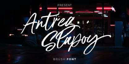 Introducing Antreg Slapoy - A handwritten brush font with authentic dry brush strokes drawn on paper. Perfect for logo design, poster design, social media, typography quotes over photos, book covers and packaging designs. International support for most Western Languages is included.
 - Adhesive Letters JNL by Jeff Levine,
$29.00 Adhesive Letters JNL was drawn from sample letters and numbers once manufactured by the Tablet and Ticket Company of Chicago. Originally sold under the brand name of Willson's, these gummed letters were available in a number of styles and sizes.
 - DARKMODE Helloween by WAP Type,
$15.00 Darkmode helloween was inspired from gothic, scary, protest, and horror nuance. Combine with hand drawn brush who make the typeface looks very instant and messy. Uses for film, quotes, cover book, title, cover album, logo, clothing, invitation, event, labels, poster, etc.
 - Zombie Sunrise by Fonts of Chaos,
$10.00 Zombie Sunrise is a hand drawn font taking inspiration from the 60's horror zombie movies. When you buy this font you receive for free 6 exclusive patterns that you can use directly in Photoshop or any other graphic software.
 - Catch Words JNL by Jeff Levine,
$29.00In the days of wood type, suppliers offered words such as 'and', 'at', 'for', 'each' and numerous others as stock cuts called "catch words". This collection of twenty-six were re-drawn using a vintage type catalog page as a model. - Heart Quarter by Rometheme,
$16.00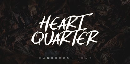 Heart Quarter is a brush font, hand-drawn typeface. It has an elegant, classy look and cool. It’s a great font for fashion, apparel projects, signature, album cover, logo, branding, magazine, social media, & advertisements, but also works great for other projects.
 - Mango Smoothie by Hanoded,
$15.00 Summer's almost here, so it's time for some mango smoothies! Mango Smoothie is a tall, all caps, hand drawn font. A little shaky, a little uneven, but with a big taste and some creamy glyphs. Comes with multi-language support.
 - Inkie by Turtle Arts,
$20.00Inkie is a hand drawn pen and ink alphabet with scratchy embellishments, and works great whenever you want a handwritten look to your art, but with a bit of extra flair. Inkie looks great both as text and as headlines. - Disclover by Zang-O-Fonts,
$25.00Disclover came about when I was doodling on a pad of paper. I was thinking about contemporary font designs, and disclover came to mind. The original sketches were scanned and then re-drawn in Illustrator. The name is just made up. - Frazzle by Paul O'Connell,
$9.95 This roughly hand drawn font was created to give that loose scribbled effect look and to imitate a typically hand written style. Designed and produced by Paul O'Connell of POCT, it is a typeface purely for fun to experiment with.
 - Mr Dog Dog by Hipopotam Studio,
$20.00 We’re children’s book illustrators and Mr DogDog is a set of our 96 unique hand-drawn pictures (61 animals, 20 dialogue balloons and 15 other symbols). You can use it on invitations, mugs, posters, pillows, wallpapers, balloons and so much more.
 - LTC Broadway by Lanston Type Co.,
$24.95 Originally designed by Morris Fuller Benton for ATF in 1927, Sol Hess added a lower case in 1929. Hess also drew Broadway Engraved in 1928 for Lanston Monotype. Broadway has become somewhat of a classic icon as an "Art Deco" typeface.
 - Cut Block by Adam Ladd,
$20.00 A hand-drawn typeface that depicts the idea of cutting away pieces of wood. It has a rough, yet modern appearance as it is largely based off the popular Gill Sans (with some modifications). Leaving a graphic and textured look.
 - EightZeta by GRIN3 (Nowak),
$14.00EightZeta is a hand-drawn font designed by Bartek Nowak. It can be used for invitations, greeting cards, posters, advertising, weddings, books, menus etc. Language support includes Western, Central and Eastern European character sets, as well as Baltic and Turkish languages. - Vapor by The Hiscott Foundry,
$35.00This font was inspired by the swirling steam drawn on a chalkboard at a coffee shop. Not actually a script font though it has a similar feel. This font dances and twirls the way a wisp of smoke or steam would.


