10,000 search results
(0.182 seconds)
- Karins Lombardy Caps by New Renaissance Fonts,
$10.00Karin's free reinterpretation of the early Renaissance Lombardic tradition, in two different versions. In the upper case the fill is blacker and has a straight pattern with diamond elements; in the lower case the fill is thinner with more white space and has a wavy pattern with rounded elements. - Noble Line Caps by URW Type Foundry,
$28.00 The basic idea for this headline typeface is to create strictly geometric letters, similar to a script typeface, as far as possible in a single sweep, without setting them down. And similar to a typeface written with a quill, there is a thin and a thicker stroke. The uppercase letters can also be used with the lowercase keys. The varied and unusual variety of forms in this typeface gives headlines, keywords and even short texts the attention they are looking for.
 - Like Gutemberg Caps by Intellecta Design,
$22.90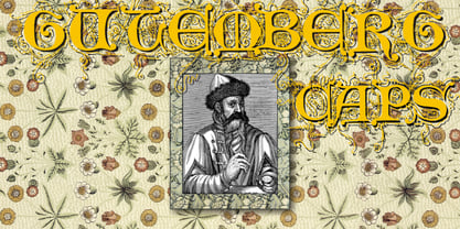
- Franciscan Caps NF by Nick's Fonts,
$10.00The majority of the letterforms in this mono-case font are based on a little-seen titling typeface designed by Frederic Goudy. The lowercase positions contain alternate letterforms, so you can mix and match to obtain just the right look. Both the OpenType and Truetype versions of this font contain the complete Latin language character set (Unicode 1252) plus support for Central European (Unicode 1250) languages as well. - Antoine Drop Caps by Kaer,
$19.00 These initials set I collected from “Tristan of the Round Table”, published approximately in 1513, by Antoine Verard. Antoine drop caps font family has Regular, Light and Colored styles. It's all you need to precisely imitate medieval style text. Use this font as a decorative element at the beginning of a paragraph or section, other part of the paragraph should be in regular black letter font. You’ll get Drop Caps & Numbers set. --- *You can use color fonts in PS CC 2017+, AI CC 2018+, ID CC 2019+, macOS 10.14 Mojave+ * *Please note that the Canva & Corel & Affinity doesn't support color fonts!* *Please download this test file with only A letter ( https://www.dropbox.com/s/lpzmdikw0ewxozx/AntoineDropCaps-Test.otf?dl=0 ) to check your app & system.* --- Please feel free to request any help you need: kaer.pro@gmail.com Best, Roman.
 - Drop Cap One by Outside the Line,
$19.00 Drop Cap One is a drop cap or an initial cap font. Even though it has all the letters of the alphabet it is not an alphabet font to be used for headlines or body copy. It has no kerning or punctuation except a period. It does not have accent marks. There are basically 2 alphabets in this font. The lighter letters are lower case and the darker letters are upper case. The light and dark letters are interchangeable. While a fun desktop font the real inspiration for this font was my need for a webfont for initial caps for blogging. It could also make a great scrapbooking font too. Lots of uses for this quirky little font.
 - Partager Caps NF by Nick's Fonts,
$10.00This typeface takes its inspiration from Will Bradley's Ultra Modern Initials, released by American Type Founders in 1934. Unlike the caps-only original version, both versions of this font contain complete Unicode 1252 (Latin) and Unicode 1250 (Central European) character sets, with localization for Romanian and Moldovan, and the Macintosh Roman character set, as well. - Intellecta Monogram Caps by Intellecta Design,
$28.90
- Newsreel Caps JNL by Jeff Levine,
$29.00 Newsreel Caps JNL is a novelty caps-only outline letter with cast shadow set inside film frames. Although the design idea itself is not new, this version is based on lettering from a vintage piece of sheet music for a song featured in the movie "Fox Movietone Follies". The font is a wink and nod to Fox's long-running newsreel series called "Fox Movietone News". The upper case keys have black letters on a white frame, while the lower case keys have white letters on a black frame. A blank white frame is on the period key; a blank black frame is on the comma key. Use this font for individual initials, set the characters loose for effect or set them tight (as provided) for a continuous film strip.
 - Isometric Initial Caps by Gerald Gallo,
$20.00 Contains characters A-z, 0-9, and ampersand in two variations totaling 74 characters.
 - Mr Richmond Caps by Intellecta Design,
$11.90 a classic decoative caps from wood types era
 - Berengard Caps Two by Intellecta Design,
$12.00 a classical wood type era box ornament using blackletter... a beautiful arrangement for publishing edition and other jobs
 - Flowery Drop Caps by Celebrity Fontz,
$15.99The Flowery Drop Caps font is a set of highly ornate block letters with rich embedded flowery designs, perfect for Spring and holiday themes and publications or any text where you want to add some texture, pizzazz, and depth to make your message stand out. This one-of-a-kind font has the feel of a homemade embroidered or quilted design and comes with both upper and lower case letters to give you more design flexibility. (Numbers, special characters, and punctuation are a neutral sans serif typeface and are included for convenience only.) - Speedball Metropolitan Caps by Intellecta Design,
$6.00 a decorative caps font based in designs of old Speedball booklets
 - Renaissance Caps BA by Bannigan Artworks,
$19.95This is a revival font of a sixteenth century typeface. I kept this font as close as possible to the original letters, including the imperfections and irregularities, to preserve the look of antiquity. Some of the letters of the original sample were missing and had to be created from the available letters. - LTC Circled Caps by Lanston Type Co.,
$24.95 This handy font allows designers of commercial products to add basic circled letters that are uniform in appearance. For example, on music CDs, the Copyright and Publish (AKA Phonogram) symbols often do not match. While most fonts include a circled 'c' for Copyright, they seldom contain a circle 'p' for Publish (note that all P22 fonts include the circle 'p' and 'c'). The circle 'U' and 'K' for Kosher foods are rarely included in fonts and have to be made as needed. This single font contains both a serif and sans serif style caps A-Z as well as figures assigned to regular keys and also mapped to standard Unicode for "Enclosed Alphanumerics".
 - P22 Durer Caps by IHOF,
$24.95 Durer Caps is three fonts in one. Based on master artist Albrecht Dürer’s 1525 geometric construction of Roman capitals, this font features A to Z as caps only. But there are three variations included: filled construction, unfilled construction, and the solid fill letters by themselves.The user can layer the unfilled and the solid fill letters to do two-color overlay effects.
 - Medieval Caps BA by Bannigan Artworks,
$19.95This is a revival font from an Image of a plate made from Eleventh Century initial letters. The "numerals" are Roman numbers done as ligatures. - Albeit Grotesk Caps by Cloud9 Type Dept,
$40.00 Albeit Grotesk Caps is a graphic geometric all caps display font family of four weights (Light, Regular, Medium and Bold) with slightly exaggarated diacritics for better readability making it ideal for headlines.
 - Snowflake Drop Caps by Celebrity Fontz,
$15.99The Snowflake Drop Caps font is a set of highly ornate block letters with rich embedded snowflake designs, perfect for winter and holiday themes and publications or any text where you want to add some texture, pizzazz, and depth to make your message stand out. This one-of-a-kind font has the feel of a homemade embroidered or quilted design and comes with both upper and lower case letters to give you more design flexibility. (Numbers, special characters, and punctuation are a neutral sans serif typeface and are included for convenience only.) - LP Horizont Caps by URW Type Foundry,
$19.99 LP Horizont Caps is another new font creation from German designer Peter Langpeter (lp-design.de). LP has been running his own design studio since 1995, working as a typeface and logo designer, as a calligrapher, cartographer and illustrator. During this time LP created a large number of excellent new typeface designs. LP Horizont Caps is a very futuristic looking, sharp and elegant sans serif.
 - Apothem Caps Med - Personal use only

- Axial Caps Med - Personal use only

- Tighten Caps Light - Personal use only

- Octavus Caps Black - Personal use only

- Card-O-Mat by PintassilgoPrints,
$30.00 Card-O-Mat is an inspiring font family that makes it easy to design awesome greeting cards for many occasions. Each font is packed with an impressive number of items, check out the glyphs map and get surprised! Card-O-Mat Messages font counts more than 170 unique lettering designs, with a great assortment of messages. From an effusive ‘Happy Birthday’ to a sensible ‘Thank You’, you'll find charming choices for many situations. Card-O-Mat BuddyBirds brings more than 180 picture elements, comprising a pocketful of birds and handy adornments such as flowers, leaves, stars, clouds, speech bubbles and so on. Beyond making a perfect pair with Card-O-Mat Messages, it also goes brilliantly well with our hand-crafted fonts, like Populaire, Oyster, Berimbau, Amarelinha and many others. Pick the ones that fit you better and happy card making!
 - THE AMAZING SPIDER-MAN - Personal use only

- KG Small Town Southern Girl - Personal use only

- Ps Willy Small But Fine by Fontopia,
$13.99 Willy small but fine is a typeface with a wink. This display font is based on existing piquant form from the immediate vicinity. It is sexy, if you have an eye for. But it also should not be taken too seriously, especially because it has a humorous slant. The font has its origins in an art project. It is now made available for design around festifals, parties, invitations, etc.
 - Times New Roman Small Text by Monotype,
$67.99In 1931, The Times of London commissioned a new text type design from Stanley Morison and the Monotype Corporation, after Morison had written an article criticizing The Times for being badly printed and typographically behind the times. The new design was supervised by Stanley Morison and drawn by Victor Lardent, an artist from the advertising department of The Times. Morison used an older typeface, Plantin, as the basis for his design, but made revisions for legibility and economy of space (always important concerns for newspapers). As the old type used by the newspaper had been called Times Old Roman," Morison's revision became "Times New Roman." The Times of London debuted the new typeface in October 1932, and after one year the design was released for commercial sale. The Linotype version, called simply "Times," was optimized for line-casting technology, though the differences in the basic design are subtle. The typeface was very successful for the Times of London, which used a higher grade of newsprint than most newspapers. The better, whiter paper enhanced the new typeface's high degree of contrast and sharp serifs, and created a sparkling, modern look. In 1972, Walter Tracy designed Times Europa for The Times of London. This was a sturdier version, and it was needed to hold up to the newest demands of newspaper printing: faster presses and cheaper paper. In the United States, the Times font family has enjoyed popularity as a magazine and book type since the 1940s. Times continues to be very popular around the world because of its versatility and readability. And because it is a standard font on most computers and digital printers, it has become universally familiar as the office workhorse. Times?, Times? Europa, and Times New Roman? are sure bets for proposals, annual reports, office correspondence, magazines, and newspapers. Linotype offers many versions of this font: Times? is the universal version of Times, used formerly as the matrices for the Linotype hot metal line-casting machines. The basic four weights of roman, italic, bold and bold italic are standard fonts on most printers. There are also small caps, Old style Figures, phonetic characters, and Central European characters. Times? Ten is the version specially designed for smaller text (12 point and below); its characters are wider and the hairlines are a little stronger. Times Ten has many weights for Latin typography, as well as several weights for Central European, Cyrillic, and Greek typesetting. Times? Eighteen is the headline version, ideal for point sizes of 18 and larger. The characters are subtly condensed and the hairlines are finer." - GEOspeed SC - Personal use only

- KR Deco Caps One - Unknown license

- Corpulent Caps Shadow BRK - Unknown license

- Kremlin Synod (Display Caps) - Unknown license

- BM spiral Cap Cyr - Unknown license

- PR Uncial Alt Caps - Unknown license

- Tulipán Broken Caps Pro by Estudio Calderon,
$40.00 Tulipán Broken Caps Pro is new variable/complement of Tulipán Broken Caps, it includes 200 interesting ligatures, specially designed for games, apps, books, logos and packaging. Its bold structure is perfect to give great effects.
 - Albeit Grotesk Stencil Caps by Cloud9 Type Dept,
$20.00 Albeit Grotesk Stencil Caps is a graphic geometric stencil-style all caps display font family of four weights (Light, Regular, Medium and Bold) with slightly exaggarated diacritics for better readability making it ideal for headlines.
 - Groovy 3D Caps JNL by Jeff Levine,
$29.00 It all started with a simple idea back in 1998: do a digital version of a "lost" 70's typeface, and make up the missing letters that were not present in the only available example Jeff Levine had to work with. Jeff wasn't yet doing his own digital font creation, so he hooked up with Brad Nelson who owns a small foundry called Brain Eaters Fonts. Together, they collaborated on "Action Is"- a freeware font named after the source of the type example. This was a title page for a commemorative photo album of images from the 60's TV music show "Where the Action Is", formerly hosted by Jeff's employer at the time, singer-writer-producer Steve Alaimo. The free font took off like a rocket, being released just at the peak of the 60’s/70’s retro craze in the late 1990’s, and it was EVERYWHERE! It showed up on TV shows, packaging and web design -- and was even spotted on signage used on the side of a major amusement resort’s retro-themed hotel. From that point on, Jeff kept getting requests for a version with a lower case. Although they shared the copyright in the freeware version, Brad Nelson gave Jeff his blessing to re-work and take Action Is into the realm of commercial type. Newly improved and re-released as Groovy Happening JNL, it became one of Jeff's better selling type designs. A simplified, yet similar font was issued called Groovy Summer JNL. Now, after about a decade, Jeff had decided to clean up the 3-D (drop shadow) version that was originally freeware with many minute design flaws and re-release it commercially. Groovy 3D Caps JNL is an all-caps, limited character set font which ties in well with the previous releases, yet retains itís 1960s-1970s era charm. The font flag art is courtesy of Barbara D. Berney and is used by permission.
 - Albeit Grotesk Rounded Caps by Cloud9 Type Dept,
$40.00 Albeit Grotesk Rounded Caps is a graphic geometric rounded all caps display font family of four weights (Light, Regular, Medium and Bold) with slightly exaggarated diacritics for better readability making it ideal for headlines.


