10,000 search results (0.027 seconds)
  1. Nimba by Pedroglifos, $12.00
    Inspired by the magic in the clouds, this part paintbrush, part san serif, Nimba is a hybrid display typeface that brings swiftness and joy to any project. Ideal for projects that require a sans type without sacrificing personality. This family contains true italic members, providing a stronger sense of motion and speed. Elegant, yet Vivid, this typeface will make your project stand out from the sans dominated design world.
  2. Stara by Yukita Creative, $14.00
    Stara Sans Serif Font is a sans serif font that combines simplicity with elegance. With its clean design and balanced proportions, this font gives off a modern and professional feel. Each letter is carefully designed to ensure optimal clarity and legibility. Stara Sans Serif Font is suitable for use in various design projects, such as logos, titles, paragraphs and digital displays, with its ability to give a fresh and elegant look.
  3. Analogue Pro by Ingo, $42.00
    very traditional forms strongly slanted italic consistant proportions extraordinary ligatures swashes alternate letters alternate figures lower case l with a hooked “foot” Believe it or not, there are hardly any sans serif fonts in which the lower case letter l also has the hooked form of an l. Instead, we readers have to constantly distinguish whether we are seeing an uppercase I or a lower case l — just take a look at the word “Illinois”... The ingoFont Analogue was developed for exactly this reason. The intent: To create a pretty much »ordinary«, even classical font with its most striking characteristic being the inclusion of the “crooked l.” As a model, I used the »mother of all sans serifs«, Akzidenz Grotesk from Berthold, with its beginnings going back to the 19th century. Analogue is so to say a new interpretation of Akzidenz Grotesk from ingoFonts. All characters — following the model — have been newly designed. And if you want to emphasize the shape of the hooked foot even more, you can also activate the alternate styles for d, h, m, n (Style Set 1). Conversely, the alternate a somewhat softens the “hooked” impression (Style Set 2). The slanted versions — it isn’t truly a real cursive font — are noticeably stronger with 13° than the italics in comparable fonts, and were given a round e with a mind of its own which distinguishes itself considerably compared to the upright characters in the overall appearance of the font. More modern and formal solutions in detail were chosen for some of the characters, for example the M was given lightly slanted sides; the a reflects the curves of the s; the “feet” of a, l and t match; the flared legs of K and R became a “foot”, too. General proportions were carried over almost completely with no changes from Akzidenz Grotesk as well as the slanted trimming on the open forms of a, c, e, s; in comparison, C, G and S were given straight endings. Analogue contains many ligatures, even discretional ligatures, plus proportional, old style as well as tabular figures. All in all, at first sight Analogue brings back memories of the charm of its well-known predecessor; and yet, many small differences give Analogue an unmistakable certain something...
  4. Apla Clare by Hooper Type, $9.00
    Apla Clare comes from the love of my wife.. She's 'Simply' Clare. It's a straihght forward sans, but with a little bit of play, and a friendliness that ensures it moves away from sterile, serious sans. PLease enjoy!
  5. ITC Busorama by ITC, $40.99
    Part of the first typeface release package from ITC in 1970, Busorama melds Art Deco and 70s flower-power into a delightful sans serif design. Designed by Tom Carnase, this three-weight sans serif family still turns heads.
  6. Fd Flawless by Fortunes Co, $19.00
    flawless is a experimental typographic that combines san serif and groovy fonts, with the liquify technique, to create an elastic and fun impression, can be combined with sans serif, fixed width, script fonts, suit for branding, titles, clothing.
  7. Sango by Katatrad, $29.00
    Sango is a monospaced Sans Serif family with the closed forms — a normal sans and rounded version in 6 weights. This typeface is ideally suited for publication, corporate identity, branding, wayfinding as well as web and screen design.
  8. Graphite by Adobe, $29.00
    Graphite was designed by David Siegel, who began thinking about the typeface in 1982, looking for an architect's handwriting with a chiselled pencil" look. The handwriting of San Francisco architect Anthony Celis LaRosa became Siegel's choice. With the assistance of David Berlow and Tom Rickner, Graphite was designed and released as a multiple master typeface with weight and width axes that allow for its use in a dynamic range from light condensed to black extended. Graphite is an upright script with simple lines, and is usable in a large variety of informal copysetting situations."
  9. Hebrew Castel by Samtype, $125.00
    Beautiful Calligraphic font and also a readable font.
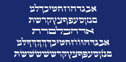
  10. Allison Style by Sarid Ezra, $13.00
    Allison Style is my newest font duo. Contain two fonts, the delicate serif and a free hand writing script. This font duo also support multilingual, number and symbol, end swash and many ligatures. Also this font already PUA Encoded.
  11. Lapoya by Cuchi, qué tipo, $9.95
    “LAPOYA” (meaning in english “the coolest”) is a large slab serif typeface family, with a certain Italian inverted contrast touch. Specially designed for advertising big shows and commerces, Lapoya has 36 variables and four axes, including a text and decorative versions, where the drawing and width of its counterforms vary. It also has icons that remember the old aesthetics of wood types from the early 20th century, and more than 400 characters with a multitude of signs and ligatures, that make Lapoya ideal for up to 89 languages. It is clearly inspired by the large wood types designed for posters, advertisements and newspapers. Since they were introduced in the 19th century, slab serifs have become extremely popular. In fact, serifs are often enlarged, not so much to look like beautiful or balanced letters, but to be more graphic and visual powerful than others. Furthermore, in the case of this typeface, this idea has been applied not only to capital letters, but also to the lowercase, numbers and signs of all kinds. “That’s why this typeface is LAPOYA!” Designed by Carlos Campos in 2023. cuchi@cuchiquetipo.com OPENTYPE FONT 426 GLYPHS 388 CHARACTERS 4 AXES 36 INSTANCES 9 LAYOUT FEATURES 89 LANGUAGES
  12. Magnite by Tom Chalky, $12.00
    Introducing Magnite - an expressive, handwritten brush font jam-packed with character and authentic charm. Designed to be versatile, Magnite is perfect for branding projects, editorial work, invitation design, product packaging, and everything in between. The original handcrafted font family containing uppercase and lowercase glyphs alongside a large range of punctuation, symbols, numerals, and multilingual support. Also included in this font are discretionary ligature swashes (activated by typing in 1--, 2--, etc, as illustrated in the above presentation). 'Magnite Alt' contains a whole new range of lowercase and uppercase letters. By using this font in combination with the original you can improve the overall authenticity.
  13. Littler Serifada by Intellecta Design, $21.90
    a bold sans serif family with many variants
  14. Soyombo by Letterhead Studio-VG, $50.00
    Geometric Sans for any use. Strong, modern, new.
  15. LCT Picon by LCT, $35.00
    Big modern sans-serif family, for multiple use.
  16. Flexy by AKTF, $25.00
    This is a sans serif version of Flexy.
  17. Grotesca Defragmentation by Intellecta Design, $16.90
    a round sans serif with optical art effects
  18. Leo Arrow - 100% free
  19. Display Dots Three Serif by Gerald Gallo, $20.00
    Display Dots Three Sans and Serif are display fonts not intended for text use. They were designed specifically for display, headline, logotype, branding, and similar applications. Display Dots Three Sans and Serif include an uppercase alphabet, numbers, and punctuation.
  20. Display Dots Four Serif by Gerald Gallo, $20.00
    Display Dots Four Sans and Serif are display fonts not intended for text use. They were designed specifically for display, headline, logotype, branding, and similar applications. Display Dots Four Sans and Serif include an uppercase alphabet, numbers, and punctuation.
  21. Guildford Pro by Red Rooster Collection, $60.00
    Our Guildford is based on the Stephenson Blake typeface, Guildford Sans. Guildford Sans is identical to Elegant Grotesque, the 1928-29 design by Hans Möhring. Guildford contains all the high-end features expected in a quality OpenType Pro font.
  22. Hypatia by Adobe, $35.00
    Hypatia Sans is a geometric sans serif with humanist undertones. Its rich features and wide range of weights make this family both versatile and expressive at larger sizes yet still clear and readable at text sizes in short paragraphs.
  23. Fattern - 100% free
  24. Disc - Personal use only
  25. Champagne & Limousines - Personal use only
  26. STR - 100% free
  27. Tabarra Black - Personal use only
  28. Arista 2.0 - Personal use only
  29. Babylon Font - Unknown license
  30. Teio - Personal use only
  31. Kroftsmann - 100% free
  32. Orbitron - 100% free
  33. Yacarena Ultra FFP - Personal use only
  34. f2 Tecnocratica - Personal use only
  35. OldSansBlack - 100% free
  36. Faltura - Personal use only
  37. Giro - 100% free
  38. Expressway Free - 100% free
  39. ETIAW v3 - 100% free
  40. Zyphyte - Personal use only
Looking for more fonts? Check out our New, Sans, Script, Handwriting fonts or Categories
abstract fontscontact usprivacy policyweb font generator
Processing