10,000 search results
(0.024 seconds)
- StudioSans by BrightHead Studio,
$20.00 StudioSans — is a modern representative of the class of sans-serif fonts inspired by the traditional Swiss design and typography of the mid 20th century. This is a minimal, clean and open font family with friendly forms. Focuses on functionality, has a high x-height and short ascender and descender elements. This is combined with soft circles and high legibility of characters contributing to comfortable reading. The family contains six weights from ExtraLight to ExtraBold. Each of them has in its arsenal more than 450 glyphs and knows more than 50 languages. Support for OpenType Features focused on the Oldstyle Figures (including signs of currencies and interest), Case-Sensitive Forms, Standarts and Discretionary Ligatures, Slashed Zero and Etc.
 - Woolworth by The Northern Block,
$32.95 Woolworth is a modern sans serif font inspired by the grotesque designs of the late 19th century. Each letter has been developed with careful attention towards balance and purity of form, creating a clean, functional and optically correct typeface. These handcrafted details make a warm personality throughout the design without any single character being too overwhelming. It's a contemporary grot typeface fully equipped to tackle a wide variety of text setting scenarios. Woolworth is now available as version 2.0 (2022). Details include six weights and italics, over 600 characters with alternative lowercase a, e, g, and basic punctuation. Open type features include seven variations of numerals, small caps, ligatures, and language support covering Western, South and Central Europe.
 - Qi by Cory Maylett Design,
$14.98 Qi is a display sans-serif inspired, in part, by the art deco typefaces sometimes seen on old signs along rural American backroads. Unlike these signs, Qi is new, fresh, a little bit quirky, and not at all in need of repair or a fresh coat of paint. The family is comprised of six distinct fonts with more on the way. With an entire set of Central and Western European (and, of course, American) glyphs, plus a bunch of alternates and ligatures, Qi could be the perfect display face for your next sign, poster, newsletter, headline or, well, most anything else. Hey, the lowercase alone makes these fonts well worth the price.
 - Sagarana by Eller Type,
$35.00 Sagarana is an elegant display typeface rooted in the style of romantic or didones letterforms; however, it is a sans serif with a cleaner appearance. The contrast and the vertical stress maintain the modern style, while the terminals, the finials, the proportions and the narrow look enhance its stylish personality. It could be suitable for editorial projects such as magazines, books or even for sophisticated environments, let’s say, fashion, department store, perfumes, cosmetics and so on. Sagarana was initially inspired by a Brazilian book cover from 50’s. The name itself combines the words “saga” (as in the English sense of “story”) and “rana,” a Tupi word (Indigenous language) that roughly means “showing similarities”.
 - FF Sanuk Round by FontFont,
$50.99 “The rounded shapes are like Chantilly cream or Italian meringue over a lemon pie,” says designer Xavier Dupré of his FF Sanuk Round typeface. Designed to work alongside the existing members of the FF Sanuk family, this sprightly sans serif offers a more mischievous personality than its counterparts. Angular shapes have been gently softened, to create a playful design that really comes into its own at larger sizes. Set this one on posters and packaging, or anywhere you need to be punchy yet approachable. The FF Sanuk Round family is based on the original FF Sanuk family and offers 5 weights plus from Ultra Light to Black plus italics. It offers OpenType features including stylistic alternates and ligatures.
 - Posterman by Mans Greback,
$59.00 Posterman is a cool sans-serif typeface. With tall letterforms in a grotesque appearance, this legible typography is a lettering for neo-classic headline or clean logotype. The Posterman font family consists of Regular, Bold and Black, and each weight as Italic, totalling in six styles. The font is built with advanced OpenType functionality and has a guaranteed top-notch quality, containing stylistic and contextual alternates, ligatures and more features; all to give you full control and customizability. It has extensive lingual support, covering all Latin-based languages, from Northern Europe to South Africa, from America to South-East Asia. It contains all characters and symbols you'll ever need, including all punctuation and numbers.
 - Zeta by Roy Cole,
$34.00 Zeta was developed by Roy Cole, the British typographer and book designer. It is his second typeface family, completed in 2006, and comprises six fonts. As with his other typeface families - Lina, Colophon and Coleface - Zeta is a sans-serif typeface, particularly notable for its fluidity and strong legibility. Whilst the proportions of Zeta are derived from classical models, the letter forms themselves are totally modern in concept. For example, when used for blocks of text little line spacing is needed to achieve good readability. Zeta is conceived as an easy reading typeface presenting an up-to-date impression wherever it is utilized. Due to its origins it really comes into its own when used for book design.
 - Coleface by Roy Cole,
$34.00 Coleface was created by the British typographer Roy Cole, completed shortly before his death in 2012. It comprises six fonts: Coleface 30, 60, 90 and the italics 33, 66, 99. As with his earlier typeface families - Lina, Zeta and Colophon - Coleface is a highly-readable sans serif typeface that offers significant flexibility in terms of its potential uses. Roy Cole studied typographic design under the tutelage of Emil Ruder at the Gewerbeschule in Basel, at a time when typographic history was being made through the creation of a style that epitomized modernity. Consequently the principles of order, simplicity and legibility, fused with experimentation, became a hallmark of his practice, as exemplified in his last font Coleface.
 - Joanna by Monotype,
$40.99 The English stone carver, artist, and typographer Eric Gill conceived the Joanna typeface as a personal design for use in books printed at his Joanna Press."" Gill saw his press work there as a continuation of the British Arts and Crafts Movement, pioneered in the 19th Century by William Morris. Joanna is notable for its almost vertical ""upright"" italics, and the unusally small size of its italic characters. Joanna is versatile and extremely legible. The letterforms are a bit narrow, so the face is very economic as well. A lot of text may be packed densely together onto a page with Joanna. Joanna mixes very well with other typefaces designed by Eric Gill; especially Gill Sans.
 - BD Gitalona Variable by Balibilly Design,
$139.00 We introduce our Variable Font from the high-complex BD Gitalona font family. Consisting of 3 axes; weight, optical size, and serif, that will give you a different experience extending the family of BD Gitalona. We don't want to mention how many families can be generated from this variable font. During the development process, we got up to more than 50 families and stopped to allow you to continue to play with the slide buttons. And again, BD Gitalona is filled with an explorative and experimental decorative version that we present separately. Figure out the decorative version BD Gitalona Moxa to make the aesthetic appeal of this whole typeface here! Inspiration The world of entertainment moves non-stop. One by one, figures appeared and left. We expect to create something to entertain previous trends with packaging more relevant to the present. More specifically, we admire and are inspired by some of the world's leading and top singers with a segmented nature. We imagine so many figures that can affect every viewer. However, each artist or singer has a segment because almost all of them have characteristics. The Design The basic design of this typeface begins with a transitional serif shape with sharp, shapeless corners. Then in the middle of the invention, there was an opportunity to explore it further from the readability side by adding an optical variable that can adjust the serif thickness when used together between large, medium to paragraph text sizes for editorials. The shift from serif to sans-serif with the contrast initiated by the shift of the serif family form as a different variable also makes this font richer in terms of the features it contains. Parts are expected to add to the user satisfaction with the complexity of this font. The Features BD Gitalona consists of one sub-family intended for body text with nine weights from Thin(100) to Black(900) and four other display sub-families such as Display serif, Flick, Harmony Sans and Contrast Sans. Each consists of four weights Thin(100), Regular Weight(400), Bold(700), and Black(900). And again, there are also retailed separately; the BD Gitalona Variable font, which is designed to accommodate all Subfamily in 1 font file, and BD Gitalona Moxa, an experimental typeface. A total of 700+ glyphs in each style. Advanced OpenType features functionally and aesthetically, such as Case-sensitive forms, small caps, standard and discretionary ligatures, stylistic alternates, ordinals, fractions, numerator, denominator, superscript, subscript, circled number, slashed zero, old-style figure, tabular and lining figure. Supports multi-languages including Western Europe, Central Europe, Southeast Europe, South America, and Oceania.
 - Aure Nox by Aure Font Design,
$23.00 Aure Nox inspires the chill whimsy of a haunted forest. The roughhewn forms of this decorative, sans-serif font engage the reader with a subtext of rakish charm. Surprisingly legible, Nox adds a bit of rebelious sass to text and titles, and a daring stance to astrological expressions and chartwheels. Nox is an original design developed by Aurora Isaac. After more than a decade in development, 2018 marks the first release of the CJ and KB glyphsets in regular, italic, bold, and bold-italic. The CJ glyphset is a full text font supporting a variety of European languages. A matching set of small-caps complements the extended lowercase and uppercase glyphsets. Supporting glyphs include standard ligatures, four variations of the ampersand, and check-mark and happy-face with their companions x-mark and grumpy-face. Numbers are available in lining, oldstyle, and small versions with numerators and denominators for forming fractions. Companion glyphs include Roman numerals, specialized glyphs for indicating ordinals, and a variety of mathematical symbols and operators. The CJ glyphset also includes an extended set of glyphs for typesetting Western Astrology. These glyphs are also available separately in the KB glyphset: a symbol font re-coded to allow easy keyboard access for the most commonly used glyphs. Though Nox stands well on its own as a text font, the more traditional sans-serif forms of Aure Jane pair well as an innocuous foil to Nox's brazen presence. Give Aure Nox a trial run! You may discover a permanent place for this font family in your typographic palette. AureFontDesign.com
 - Sherbrooke by Eyad Al-Samman,
$- Sherbrooke is a simple and sans serif font. I have chosen the name of this typeface after the "Sherbrooke" Street in Montreal, Canada, that I daily walked in for several months in the late 2005 while I was studying in Montreal, Quebec, Canada. I do adore this street and also I adore the whole city of Montreal. This font comes in two different weights. "Sherbrooke" can be used in wide fields of publications such as the titles of novels, literary texts, short stories, dictionaries, books, newspapers, websites, and magazines. It is suitable for T-shirts, mugs, advertisement light boards in malls, subtitles of movies, logos, cans of foods, and medicines' names. The font is more attractive when it is printed in calendars and for displaying the contents and paragraphs of electronic encyclopedias and different online websites. "Sherbrooke" is specifically designed for educational, journalistic, literary, and social purposes. The main characteristics of "Sherbrooke" Typeface are in its sans serif new designed letters and also in its lowercase special numerals. I think that these characteristics have made "Sherbrooke" exceptionally unique with its alphanumeric combinations. You can enjoy this typeface and use it anywhere at any product or service. It is simply gratuitous for all. The word "Sherbrooke" is a person's name. Sherbrooke Street - officially Rue Sherbrooke - is a major east-west artery at 31.3 kilometers in length and it is the second longest street on the Island of Montreal in Canada. The street is named for John Coape Sherbrooke, the Governor General of British North America from 1816 to 1818.
 - Encercle Draft by Typodermic,
$11.95 With Encercle Draft, you can create circles and other shapes containing numbers up to 999999. Here's how it works: hold shift and type the number of digits, followed by a number. If you want the number 25, hold shift, type 2 followed by 25. If you want the number 250, hold shift, type 3 followed by 250. You can also type letters, periods, slashes, hyphens, question marks and exclamation points. Create an inverse white-on-black effect using your application's Bold feature. Easily change shapes by selecting a different font style from your application's font menu. Encercle Draft is available in the following shapes. Circle Square Box (wide rectangle) Box with rounded ends (tab) Diamond Circle inside a diamond Hexagon Hexagon rotated Octagon Triangle up Triangle down Triangle right Triangle left Quote bubble with left tail Quote bubble with right tail Quote bubble with no no tail Cloud (thought bubble) Encercle Draft uses OpenType technology. Most current graphic design applications support basic OpenType features but there are a few exceptions including AutoCAD, SketchUp, Solidworks and Canva. Encercle Draft will work in Affinity, Inkscape, GIMP, Adobe apps (not Photoshop Elements), Microsoft apps (not Powerpoint), Sibelius and more. Encercle Draft includes a PDF manual with examples. There's also an advanced feature which allows you to create solid-colored backgrounds. For a thicker, sans-serif style, check out Encercle Sans. For more complex layered effects with a different selection of typefaces and shapes, check out Numbers with Rings. Encercle PDF user manual.
 - Vernacular Serif by jpFonts,
$19.95 The Vernacular trilogy was designed by Swiss designer Hans-Jürg Hunziker, who had worked for Adrian Frutiger in Paris for many years. Based on the concept of a transitional Linear Antiqua, he has developed a colorful bouquet of typefaces that contain the entire spectrum of typefaces for book design and corporate identity. Thanks to his "Swiss school" and his outstanding skills, he has succeeded in giving the typefaces a particularly noble and sympathetic expression. In addition to the Sans family, there is a Serif family and a Clarendon family, each of which, including the separately drawn italics, is equipped with 12 font weights that are finely tuned to one another. Each of the 3 font styles develops its own character, but thanks to a concept that brings the different font styles closer together, they also work well together and complement each other perfectly. Sans and Clarendon have a vertical axis and similar endings in contrast to the Serif, which has a traditional diagonal axis and horizontal endings. The straight stems and the proportions are used as an element to stress the closeness of the typeface-trilogy. They thus share a comon feature. All fonts contain tabular and proportional figures as well as old style figures. Small caps and small cap figures are also available in all fonts. In addition, some fonts have alternative characters available via style set, such as «g», which can be used to further vary the typeface. Vernacular offers all the options for well-kept typesetting for print and web - for small and large orders.
 - Vernacular Clarendon by jpFonts,
$19.95 The Vernacular trilogy was designed by Swiss designer Hans-Jürg Hunziker, who had worked for Adrian Frutiger in Paris for many years. Based on the concept of a transitional Linear Antiqua, he has developed a colorful bouquet of typefaces that contain the entire spectrum of typefaces for book design and corporate identity. Thanks to his "Swiss school" and his outstanding skills, he has succeeded in giving the typefaces a particularly noble and sympathetic expression. In addition to the Sans family, there is a Serif family and a Clarendon family, each of which, including the separately drawn italics, is equipped with 12 font weights that are finely tuned to one another. Each of the 3 font styles develops its own character, but thanks to a concept that brings the different font styles closer together, they also work well together and complement each other perfectly. Sans and Clarendon have a vertical axis and similar endings in contrast to the Serif, which has a traditional diagonal axis and horizontal endings. The straight stems and the proportions are used as an element to stress the closeness of the typeface-trilogy. They thus share a comon feature. All fonts contain tabular and proportional figures as well as old style figures. Small caps and small cap figures are also available in all fonts. In addition, some fonts have alternative characters available via style set, such as «g», which can be used to further vary the typeface. Vernacular offers all the options for well-kept typesetting for print and web - for small and large orders.
 - FF Signa Round by FontFont,
$72.99 FF Signa Rounded is a natural complement to the rest of the FF Signa super family – and can stand on its own in a variety of print and on-screen applications. The design is Ole Søndergaard’s rounded branch in his FF Signa family three. In it, he took the distinctive shapes and proportions of FF Signa Sans and created a warm, inviting design for text and display copy. Like its parent design, FF Signa Round is not a humanistic sans, nor is it based on 19th-century grotesques. Its characters are minimalist interpretations of letterforms – distinctive, yet easy to read. Thanks to FF Signa Round’s large x-height, open counters and simple character shapes, the design does not overpower the message – and draws the reader in. At substantial sizes, especially in the bolder weights, the design communicates with amiable conviction. At text sizes, FF Signa Round remains inviting and legible. It can be used as a companion to the rest of the FF Signa family, providing depth of style and breadth of reach. The collection of designs can also be used on their own for brand, brochure, publication, and way-finding design in digital and hard copy environments. Like the rest of the FF Signa family, OpenType® Pro fonts of FF Signa Round provide for the automatic insertion of ligatures and alternate characters, and also offer an extended character set supporting over 100 languages, including most Central European and many Eastern European – in addition to Cyrillic and Greek.
 - Camera by Dharma Type,
$19.99 Legible, simple and very lovely sans serif is based on art deco advertisement from 1800s to early 20th. The sweetest sans for your retro-style project. This font include ligatures and small capital for advanced typography.
 - Browser Serif by AVP,
$19.00 Browser Sans is a companion to Browser Sans, sharing similar forms and metrics. The four styles (Regular, Italic, Bold and Bold Italic) make it simple to use in desktop applications and easy to implement on websites.
 - Merge by Philatype,
$15.00 Merge is a soft family of sans, available in 4 weights. Readable at small sizes, it sets open and wide. At display sizes, the softness makes for a friendlier, more casual alternative to other rounded sans.
 - Hebrew Stam by Samtype,
$34.00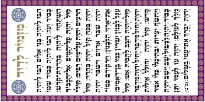 Beautiful Caligraphic font and also readable font.
 - Local Brewery Collection by Cultivated Mind,
$29.00 Local Brewery is back with a new vintage inspired font collection that includes a script, two sans serif fonts, icons and extras. The sans serif fonts and the script include regular, semi-bold and bold weights. The script is monoline with smooth edges. The sans serif fonts have a smooth edge with all caps letters. Local Brewery Script comes with caps and lowercase alternates. These alternates will give your designs an extra flair and uniqueness. The script and sans serif fonts work exceptionally well together. Use Local Brewery for packaging, products, websites, marketing and beer branding.
 - Vintage Crafted by Edignwn Type,
$18.00 The Vintage Crafted Font is hand drawn typeface with retro themes. This font collections contain script and sans serif font. Every font comes with 3 style typefaces (regular, rough and stamp). This sans serif font includes some ligatures. The Vintage Crafted matches apply in some designs such as the logo, poster, label, badge, packaging, t-shirt, branding, quotes and more custom design. Vintage Crafted includes : 6 fonts (script and sans serif) 3 style typefaces (regular, rough and stamp) Uppercase, lowercase, numeral, symbol and punctuation in script font All-caps, numeral, symbol, punctuation and ligature in sans serif font Multilingual and PUA Encoded
 - Jushley Shine by Ergibi Studio,
$19.00 Jushley Shine is a brush font made from handwriting. It contains lowercase, uppercase, symbols, and also support for multiple languages. Jushley Shine also works well on posters, branding, packaging, beautiful fashion design, wedding invitations and handwritten quotes.
 - VLADOVSKIY - Unknown license

- MoTenacity AOE by Astigmatic,
$19.95An serif-sans mix offbeat comic font. - FaxFont by Emboss,
$19.95Designed after receiving a bearly legible fax. - Reeler by Mans Greback,
$59.00 Rounded sans-serif with a clean design.
 - KG Why You Gotta Be So Mean by Kimberly Geswein,
$5.00 Tall, chunky title-friendly sans serif capitals.
 - Joppa by MADType,
$21.00 Joppa is a cheerful hand drawn sans.
 - Cleancut by Gerald Gallo,
$20.00 Cleancut is a contemporary sans serif typeface.
 - Martin Bold by Wooden Type Fonts,
$15.00 Unusual sans serif with some rounded portions.
 - Dasieve by JMA,
$20.00Dasieve, Alexandar's constant companion and sans serif. - Cross by Volcano Type,
$19.00 A constructed font family with six weights.
 - Serene by Gerald Gallo,
$20.00 Serene is a sans serif contemporary typeface.
 - Intellecta Grotesca Compacta by Intellecta Design,
$25.00a bold and grotesque sans serif typeface - Song Sheet JNL by Jeff Levine,
$29.00 Sheet music for the 1930s song "Josephine" had its title hand lettered in a simple, bold sans design that is recreated in Song Sheet JNL. This bold sans is perfect for titling wherever strong emphasis is necessary.
 - Sancoale Slab Soft by insigne,
$24.75 Ready for the designs of today, the Sancoale superfamily takes a softer turn with a rounded slab serif. Crafted from Sancoale’s simple geometry, new softened slab serifs provide a lively typeface that conveniently enhances its cousins: Sancoale Softened--a sans with blunted terminals; Sancoale Slab; and, certainly, the first Sancoale. The weights of each and every member are balanced diligently to be compatible with one another. When used alongside one another, the combination makes for robust and tight design. With weights starting with the slender thin ranging to the juicy black, Slab Soft opens the doorway to the vary of uses. Its design is legible and neutral enough for bodies of copy--both in print and on your website. The web font also stands out perfectly as a headline or a display face. Slab Soft carefully places a foot ahead, and doesn't overpower like many slabs. This font’s the choice to seize the day and get the job done. All insigne™ fonts are absolutely loaded with OpenType options. Sancoale Slab is geared up for pro typography, together with alternates with stems, compact caps and lots of alts, together with “normalized” capitals and lowercase letters. The font features many numeral sets, with fractions, old-style and lining figures with superiors and inferiors. OpenType-capable programs like Quark or the Adobe suite allow you to quickly change ligatures and alternates. You can see these options shown in the .pdf brochure. Bundled are compact caps, fractions, old-style and lining quantities, scientific superior/inferior figures, entire ordinal and inferior alphabet. The Sancoale superfamily also features the glyphs to aid a variety of languages, together with Central, Eastern and Western European languages. In all, Sancoale Slab supports around forty languages that utilize the Latin script, earning Sancoale the pick for for multi-lingual publications and packaging.
 - ReTyper by Green Type,
$19.00 ReTyper is a typewriter font. ReTyper is a family of decorative fonts designed aspecially to make your texts look like authentic typewritten text. Designed for use in advertising, branding, packaging. It is also suitable for use in online activities. ReTyper is also great for your personal purposes, like romantic letters, poetry writing, and making vintage vibes. ReTyper contains Latin, Cyrillic and Greek glyphs. There is also a crossed out stylistic set.
 - Shutter Stone by Sarid Ezra,
$13.00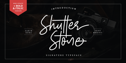 Introducing, Shutter Stone. Another Signature Script Font for you! Shutter Stone is handwritten font that contain stylistic alternate, swash, etc to create your own customised signature. This font is also support multi language. Also Support PUA. Thank You!
 - Augent by Slide Shoot,
$17.00 Augent Sans Serif is a balanced, smooth, elegant and stylish sans serif font. He has a beautiful character. It fits perfectly with invitation card designs, company logos, movie titles, movie names, business cards, book titles, brand names and various other designs. Augent Sans Serif is a subtle serif font that exudes sophistication and elegance. Its stylish alternations and ligatures make this font the perfect partner for any project.
