10,000 search results
(0.023 seconds)
- Tastebud by Bogstav,
$17.00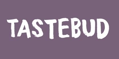 Brushy brushed font, made to look organic!
 - Digital2 - Unknown license

- Terminator Cyr - 100% free

- Grande Sans by Type Innovations,
$39.00 Say hello to Grande Sans—a geometric typeface that features highly stylized capitals with sharp corners, circular forms and generous proportions. Specifically created for visual impact—use Grande Sans when you want your words to stand out from the rest of the crowd. The concept is modern, futuristic and non-traditional. Perfect for display text, logos and headlines. The development of Grande Sans started in 1997, inspired by Alex Kaczun’s best selling grotesque font family called Contax Pro. Grande Sans is specifically introduced here as a black weight, but Alex plans to expand the design to include many weights, styles and alternative design treatments. Stay tuned! If you like Grande Sans—check out Alex Kaczun’s Decrypt fonts as well as all of Type Innovations fonts here.
 - Sensational Sans by Type Innovations,
$39.00 Sensational Sans is an original design by Alex Kaczun. The inspiration started with the shape of a paper clip. Simple and elegant. A condensed sans serif that's, well... just sensational! It's a delight to use and view. Great for advertising, large headlines, web applications, and well... just about anything. Works equally well in a broad range of text point sizes. Comes in 4 delightful flavors—Light, Regular, Medium and Bold.
 - Minora by Alex Meier,
$40.00 Minora is a contemporary sans serif type family of three weights. Glyphs with open, plain and reduced forms are attributes of Minora. Several OpenType features allow different figure sets, fractions and more. Minora had its beginning in 2007 during Alex Meier’s Typedesign study (CAS Typedesign) at the ZHdK in Zurich (Switzerland). After graduation, Alex Meier continued working on this project in a shared studio with his former fellow student Dominique Kerber . He completed this fully developed font in April 2011.
 - China - Unknown license

- Atrium by Alex Jacque,
$20.00 Atrium, designed by Alex Jacque, is a strong, linear, geometric sans-serif display typeface based off century-old pen art by W.E. Dennis. Atrium's stubbornly geometric letterforms are set off with a few softening flourishes on a few glyphs. It's sharp corners, straight verticals and horizontals make Atrium pack some punch when used in headlines, pull quotes, and logotypes. Atrium was released in 2012 in OpenType format and comes in three different weights: light, regular, and bold, with a regular and oblique version of each for a total of 6 styles in the family.
 - Gothica by Type Innovations,
$39.00 Say hello to Gothica. It’s a display geometric sans designed with Stencil-like elements and letter cutouts specifically created for visual impact—ideal for logo, branding and advertising purposes. The font includes capitals and capital alternatives in the lower case keystroke positions—it’s like having 2 display fonts in one. In addition, Gothica includes various opentype features that allow graphic designers to tailor the type for custom needs. The development of Gothica started in 1997, inspired by Alex Kaczun’s best selling grotesque font family called Contax Pro. An experimental design, Gothica is specifically introduced as a bold weight, but Alex plans to expand the design to include many weights, styles and alternative design treatments. Stay tuned! If you like Gothica—check out similar gothic alternates like Decrypt 01, Decrypt 02, Decrypt H1 and all of Type Innovations fonts from Alex Kaczun.
 - Lifetime Font - Personal use only

- Libertinas-co. - Personal use only

- BB Petie Boy - Unknown license

- Futurex Deco - Unknown license

- Futurex Embossed - Unknown license

- Futurex Engraved - Unknown license

- Racetrack by Type Innovations,
$39.00 Racetrack is the work of American type designer, Alex Kaczun, and was conceived as a result of developing a logo for a client. Alex was experimenting with a uniform grid pattern, outline and inline, connecting the dots which lead to this interesting typeface effect. Racetrack is a bold display font, which also works well at many point sizes. It has a futuristic appeal with straight lines and sharp corners. The uniform strokes, inline treatment and symmetry make for a powerful headline. The applications for this font design are endless.
 - Excritura by Linotype,
$29.99Excritura is the third typeface created by the Spanish designer Alex Camacho. The robust personality of this original calligraphy-derived italic font will undoubtedly also win you over.Organic shapes determine the character of Excritura, a calligraphic typeface by Alex Camacho. The font has been modelled on the work of the Spanish Architect Antoni Gaudí and was inspired by his love of natural forms and craftsmanship. This is perhaps unsurprising in view of the fact that Camacho grew up in Barcelona, home to much of Gaudí’s creative oeuvre. Organic shapes determine the character of Excritura, a calligraphic typeface by Alex Camacho. The font has been modelled on the work of the Spanish Architect Antoni Gaudí and was inspired by his love of natural forms and craftsmanship. This is perhaps unsurprising in view of the fact that Camacho grew up in Barcelona, home to much of Gaudí’s creative oeuvre. - Faktos - Unknown license

- Wobble - Unknown license

- Misses Twiggs by Type Innovations,
$39.00 Misses Twiggs is a contemporary modern serif created by the American type designer Alex Kaczun. It compliments its partner Mister Twiggs and is a perfect marriage of two fonts. Mister Twiggs brings his tall good looks and Misses Twiggs bring her cute little serifs to the relationship. There are absolutely no curves in these elegant typefaces. Both fonts have sharp corners with extra tall capitals and narrow waistlines. Misses Twiggs also comes in 3 flavors: regular, thin and heavy.
 - Escobeta One - Personal use only

- Project Z - Personal use only

- Slab Compact JNL by Jeff Levine,
$29.00 Slab Compact JNL was based on the printed title found on the box cover of a 1950s-era word games set called “Lex-O-Grams” and is available in both regular and oblique versions.
 - Olho de Boi - Personal use only

- WATERCOLORS CLEAN PERSONAL USE - Personal use only

- Wild Sewerage - Unknown license

- Bionic Type Italic - Unknown license

- Binary X BRK - Unknown license

- DECRYPT 01 by Type Innovations,
$39.00 Say hello to Decrypt—a geometric typeface that features highly stylized capitals with sharp corners, circular forms and generous proportions. Specifically created for visual impact—use Decrypt when you want your words to stand out from the rest of the crowd. The concept is modern, futuristic and non-traditional. Perfect for display text, logos and headings. The development of Decrypt started in 1997, inspired by Alex Kaczun’s best selling grotesque font family called Contax Pro. Decrypt is specifically introduced here as a bold weight, but Alex plans to expand the design to include many weights, styles and alternative design treatments. Stay tuned! If you like Decrypt—check out all of Type Innovations fonts here.
 - Winterberry by Hanoded,
$15.00 Winterberry (Ilex verticillata) is a species of holly, native to the USA and Canada. I thought it was a rather cool name (pun intended) for a messy script font made during a cold spell. Winterberry was created using Chinese ink and a crappy brush - hence its messy appearance. Use Winterberry on your alt-Christmas invitations, your fantasy novels, your rock albums or your website! You’ll love it! Comes with a bunch of diacritics and some ripe double letter ligatures as well.
 - Brushstroke Plain - Unknown license

- Downhill Dive by Hanoded,
$15.00 I used to live in the English Lake District, where I worked in an outdoor gear store. I bought a bright red mountain bike and each day, after work, I cycled up the mountain and hurtled down - heavy metal blasting from my MP3 player. Of course, the bike was a regular MTB, so it got some serious damage after a while, but the adrenaline rush was great! Downhill Dive is a great brush font (made with actual brushes and ink on paper - no tablets involved here!). It is an ode to that wonderful time spent in England. Downhill Dive comes with some really nice ligatures.
 - Paula by Autographis,
$39.50 Paula is a non-joining rough brush script with traces of the brush's backstroke that give it that typical look. Paula is an open script with very good readability.
 - My Darling by Type Innovations,
$39.00 ‘My Darling’ is a stunning new typeface by Alex Kaczun. Inspired by the Didone shapes, ‘My Darling’ incorporates some Didot, a little Caslon, a splash of Scotch and a pinch of old Times. This unique display, with its high-contrast strokes is playful, formal and just a bit ‘sexy’. The swash capital terminals and lively curves, give this design a unique and distinctive look. It works well as a headline font, and because it was designed with generous counters, proportions and spacing—works equally well over a large range of text point sizes. My Darlings' character set supports most Central European and many Eastern European languages. Alex hopes to add many style variations, along with alternate glyph sets and weights to further enhance this offering. Stay tuned!
 - Pila by Alex Jacque,
$20.00 Pila, designed by Alex Jacque in 2014, is a modular, sans-serif stencil typeface that comes in regular and condensed formats. Crafted to be a bold, punchy, no-nonsense stencil typeface, Pila owes its unique look — as well as its name — to its adherence to the rigid modular system it is built upon. Pila is meant to be used at larger point sizes where visual impact is desired. Pila has a broad glyph set with the necessary characters to support a wide number of languages. Through the use of OpenType Pila can automatically create fractions as well as create superscript and subscript numerals.
 - Directors Cut Pro by Type Innovations,
$39.00 Directors Cut Pro is a compelling new font series designed by Alex Kaczun. It recently won the second place—a commendation in the Canberra Typeface Competition. This handsome Geometric Antique serif design is based on the early 19-century Moderns and Scotch styles, infused with the warm charm of traditional antique, added for interest. Capturing the best of both ages: it's warm, comforting and persuasive. Directors Cut Pro's graceful aspects naturally invite uses at large sizes, for which we have created a stunning and elegant lighter weight. But, this workhorse typeface series incorporates a solid regular weight, along with its italic—ideal for a multitude of text purposes, at varying point sizes. A robust Bold weight is available for headlines and emphasis. Director Cut Pro comes with proportional as well as tabular lining figures for quickly setting up charts and tables. It also contains an extended character set—including most Central European languages. Alex Kaczun is in the process of expanding this typeface series to include additional weights, styles and proportions. Stay tuned! The large Pro font character set supports most Central European and many Eastern European languages.
 - Comforter by TypeSETit,
$49.95 Comforter promises to be a favorite among professional designers and people who love quality hand lettered forms. It’s a bouncy, upright brush style script. It’s look is appealing for many various usages. It’s contemporary, and non- traditional. It’s sophisticated, yet fun and funky. The Brush style of Comforter adds another touch to its “brushy” look. Comforter Pro versions come complete with multiple language options including Rob’s interpretation of a script style of Cyrillic. Unlike a “cursive” style, the script Cyrillic uses both traditional and cursive forms. In addition, the PRO versions are programmed with numerous OpenType features plus a few ornamental and word art glyphs not found in the Regular flavors. The regular versions are properly kerned, but contain none of the OpenType features found in the PRO versions. The Alternate flavors contain a few of the alternate forms found in the PRO versions of the typeface, including Cyrillic.
 - New Age Gothic by Type Innovations,
$39.00 New Age Gothic is an original design by Alex Kaczun. It is a contemporary gothic design based on generous proportions and clean crisp lines. Ideally suited for easy reading and long lines of copy. The concept for the design came from a previously successful font family Contax Pro. Alex felt that the skeleton for Contax Pro was ideally suited to modify the design into a true gothic companion typeface series. Numerous modifications where made to the body proportions, stems and shapes. Serifs where added reminiscent to Copperplate Gothic to solidify the overall design. The result is a truly unique modern gothic font. Unlike other typefaces, New Age Gothic incorporates uniform stems throughout the capitals, lower case and figures. This gives the design a uniform appearance in overall color and strength. There is a perfect visual balance between inter-letter spacing, stem weights and proportions. The large Pro font character set, which supports most Central European and many Eastern European languages, also include small caps to compliment the old style figures. As a result, the design is ideally suited for display copy as well as text composition. In the near future, Alex plans to expand the typeface to include a broad range of weights along with italics.
 - Decrypt H1 by Type Innovations,
$39.00 Say hello to Decrypt H1—a geometric typeface that features highly stylized capitals with sharp corners, circular forms and generous proportions. Specifically created for visual impact—use Decrypt H1 when you want your words to stand out from the rest of the crowd. The concept is modern, futuristic and non-traditional. Perfect for display text, logos and headings. The development of Decrypt H1 started in 1997, inspired by Alex Kaczun’s best selling grotesque font family called Contax Pro. Decrypt H1 is specifically introduced here as a bold weight, but Alex plans to expand the design to include many weights, styles and alternative design treatments. Stay tuned! If you like Decrypt H1—check out it’s alternate twins Decrypt 01, Decrypt 02 and all of Type Innovations fonts at: http://www.myfonts.com/person/Alex_Kaczun/
 - Decrypt 02 by Type Innovations,
$39.00 Say hello to Decrypt 02—a geometric typeface that features highly stylized capitals with sharp corners, circular forms and generous proportions. Specifically created for visual impact—use Decrypt 02 when you want your words to stand out from the rest of the crowd. The concept is modern, futuristic and non-traditional. Perfect for display text, logos and headings. The development of Decrypt 02 started in 1997, inspired by Alex Kaczun’s best selling grotesque font family called Contax Pro. Decrypt 02 is specifically introduced here as a bold weight, but Alex plans to expand the design to include many weights, styles and alternative design treatments. Stay tuned! If you like Decrypt 02—check out it’s alternate twin Decrypt 01 and all of Type Innovations fonts at: http://www.myfonts.com/person/Alex_Kaczun/


