10,000 search results
(0.024 seconds)
- Melbylon - 100% free

- Ohio Player - Unknown license

- Flim-Flam - Personal use only

- Starcraft - Unknown license

- Distant Galaxy Outline - Unknown license

- Blackout - 100% free

- Planet N - Personal use only

- LEGO BRIX - Personal use only

- super danger - Unknown license

- Viper Squadron Solid - Unknown license

- End of Path - Unknown license

- Be Aggressive - Unknown license

- Hadriatic - Personal use only

- Parasight - Unknown license

- Rubbed - Unknown license

- Battleforce 5 - Personal use only

- Feldicouth Norm - Unknown license

- Kremlin Samovar - Unknown license

- Half SunBurst-w4-02 - Unknown license

- Amerika - Unknown license

- Gill Sans MT by Monotype,
$45.99 Gill Sans is a humanistic sans serif family that, while is considered by many to be quintessentially British in tone and concept, has been used in virtually every country and in nearly every application imaginable. Gill Sans has reached this level of near-ubiquity for one simple—and very good—reason: it is an exceptionally distinctive design with a potential range of use that is almost limitless. This toolkit family includes a wide range of styles including the standards such as Light—which is open and elegant—and a Regular that, with its flat-bottomed d, flat-topped p and q and triangular-topped t, has a more compact and muscular appearance. Its Bold styles tend to echo the softer, more open style of the light while the extra bold and ultra bold have their own vivid personalities, but each of them would make for an eye-catching headline. Take into account the family’s many weights, including condensed and extra condensed designs, and extended language support and you have yourself a tool you’ll be thrilled to return to, time and again. Gill Sans was designed by Eric Gill: a versatile, brilliant, and prolifically successful designer of the early part of the last century. One of the main reasons for the enduring success of his namesake design is that it is based on Roman character shapes and proportions, making it unlike virtually any other sans serif out there. Gill also worked his own warmth and humanity into his design, resulting in a typeface in which each weight retains a distinct personality of its own. Pair with serif fonts like Gill's own Joanna; or more modern offerings like Frutiger® Serif, Malabar™, Syntax® Serif, FF Scala®, or DIN Next™ Slab.
 - FS Kim by Fontsmith,
$80.00 Unconventional beauty FS Kim is bold and intriguing – exuberant and unmissable, but playing a supporting role when needed. This typeface shines brightest as a display font, and is perfect for applications across fashion, theatre, cultural projects and pretty much any brand that wants to make a statement. While FS Kim is dramatic, it’s incredibly versatile, too, and works to showcase content in a stylish, striking way. This font makes you look, and makes you curious – perfect for brands and publishers that relish unconventional beauty. A playful text version While FS Kim’s text version is more constrained than the display, the strength and playfulness remain. Modifications for the text version include larger x-heights, longer ascenders and descenders, wider proportions and spacing, longer and more defined serifs and a lower contrast. “The overall idea is that it’s not an optical size,” Radoeva explains. Text and display maintain a strong connection that mean they can be used together. A display with a twist The calligraphic starting point helped to create familiar forms, while a contemporary display feel is achieved through short wedge serifs, with bold touches added through the font’s exaggerated forms and details. FS Kim’s narrow proportions, short ascenders and descenders, and tighter spacing make the font suitably compact for display use. The overall aesthetic feels bold and sharp, but closer inspection reveals that all the corners are softened. Decorative inlines In an unusual twist, FS Kim’s display version was first drawn using a broad-nib pen to create familiar forms and elegance while still breaking from serif traditions and making it all about standout character. There are also two additional styles, based on the Regular and Black with inlines – in uppercase, figures and symbols. The inline brings an extra option for an even stronger, more decorative display use.
 - FS Kim Variable by Fontsmith,
$349.99Unconventional beauty FS Kim is bold and intriguing – exuberant and unmissable, but playing a supporting role when needed. This typeface shines brightest as a display font, and is perfect for applications across fashion, theatre, cultural projects and pretty much any brand that wants to make a statement. While FS Kim is dramatic, it’s incredibly versatile, too, and works to showcase content in a stylish, striking way. This font makes you look, and makes you curious – perfect for brands and publishers that relish unconventional beauty. A playful text version While FS Kim’s text version is more constrained than the display, the strength and playfulness remain. Modifications for the text version include larger x-heights, longer ascenders and descenders, wider proportions and spacing, longer and more defined serifs and a lower contrast. “The overall idea is that it’s not an optical size,” Radoeva explains. Text and display maintain a strong connection that mean they can be used together. A display with a twist The calligraphic starting point helped to create familiar forms, while a contemporary display feel is achieved through short wedge serifs, with bold touches added through the font’s exaggerated forms and details. FS Kim’s narrow proportions, short ascenders and descenders, and tighter spacing make the font suitably compact for display use. The overall aesthetic feels bold and sharp, but closer inspection reveals that all the corners are softened. Decorative inlines In an unusual twist, FS Kim’s display version was first drawn using a broad-nib pen to create familiar forms and elegance while still breaking from serif traditions and making it all about standout character. There are also two additional styles, based on the Regular and Black with inlines – in uppercase, figures and symbols. The inline brings an extra option for an even stronger, more decorative display use. - Callistera Script by Sarid Ezra,
$15.00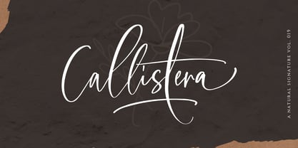 Callistera Script is a natural also expressive font that contain lowercase, uppercase, symbol, and also mult- language support. It comes with ligatures, contextual alternates, stylistic alternates, swashes, and also underline. Callistera Script also suitable for logo branding, beautiful fashion design, suitable for wedding invitations, or handwritten quotes. Also with PUA encoding. For another questions, please send a mail to saridezra@gmail.com. Thank You!
 - Catalina by Kimmy Design,
$10.00 Earlier this year I visited a bakery in Newport Beach, CA and fell in love with the organic design and typography of the place. Hand-drawn menus, table cards, chalkboards, and wall quotes surrounded the charming spot. It inspired me to create a new font family based on the combination of hand drawn fonts. Included in this package are 5 font families, with 2 graphic ornament fonts. Each font family contains at least a light, medium and bold. Here is a breakdown of what's cookin' at Catalina's Bakery: Catalina Anacapa: Tall and skinny, this font comes in 3 weights for both sans and slab serif styles. It includes contextual alternatives (giving 3 versions of each letter), stylistic alternatives for select letters (A, K, P, Q, R, Y) and also includes Small Caps. Catalina Avalon: Based off Anacapa, this sub family has a high contrasting line weight. It comes in light, regular and bold as well as an inline alternative for both sans and slab serif styles. Avalon also includes opentype features such as contextual alternatives (giving 3 versions of each letter), stylistic alternatives for select letters (A, K, P, Q, R, Y) and small caps for each letter. Catalina Clemente: In a more standard width, Clemente is one of the two sub families that can be used for paragraph text as well as headlines. It's organically geometric in style and comes in ALL CAPS and lowercase, includes upright and custom italics, and has the opentype feature giving 3 versions of each letter. Catalina Script: A great compliment with the display sub-families, Catalina Script rounds out the package with a hand-drawn cursive flair. It includes contextual alternatives (giving 2 variations to each letter) as well as stylistic alternatives for many of the capital and lowercase letters. It has special ligatures for some letter combinations, and titling alternatives for all the capital letters. Catalina Typewriter: The second of the paragraph text sub-families, this typewriter inspired hand-drawn font family works great as either a display or paragraph text. It has contextual alternatives with 3 versions of each letter, and comes in both upright and custom italics versions. Catalina Extras! These two fonts go perfectly with the Catalina Family. They includes borders, frames, arrows, banners, flourishes and more. Catalina Flourish has all of it's options in a light and bold style, to use the light version type all lowercase letters, then to make something bold, used it's uppercase (or shift+) characters. For a breakdown of graphic/letter correlation, see the breakdown PDF. All of Catalina was drawn by the same hand, using the same ink and technique. While they contrast in their type styles, they work together perfectly to create one cohesive font family.
 - Good Slient Night by Scoothtype,
$10.00 Good Slient Night is handmade fresh typeface, created with brush and ink. contemporary approach to design hand-painted natural and also a combination of delicate script with an irregular baseline. Suitable for use in watercolor design or as a hand brushed bold letters. Such as Novel tittle, Apparel, Invitations, Quotes, Books tittle, Stationery Design, Branding, Logos, Greeting Card, T-shirt, Packaging design, Poster and more. Good Slient Night includes a complete set of uppercase and lowercase letters, as well as multi-language support, numbers, punctuation, ligatures and alternative character. How to access all alternative characters, using Windows Character Map with Photoshop: https://www.youtube.com/watch?v=Go9vacoYmBw How to access all alternative characters using Adobe Illustrator: https://www.youtube.com/watch?v=XzwjMkbB-wQ If you need help or advice, please contact me by e-mail. Thank you.!
 - Hisham by Linotype,
$187.99Hisham is a modern Arabic headline face, designed by the Lebanese calligrapher, Ahmed Maged, originally for Linotype-Hell Ltd. The Hisham design has a distinctive style with a strong baseline, relieved by strategic cut-away effects, which is counterbalanced by the bold vertical strokes and some strong diagonals. This somewhat compact font adds a new style to the range of Linotype’s Arabic headline fonts. This OpenType font includes Latin glyphs from Optima Extra Black, allowing users to set text in both most Western European and Arabic languages without switching between fonts. Hisham incorporates the Basic Latin character set and the Arabic character set, which supports Arabic, Persian, and Urdu. The font also includes tabular and proportional Arabic, Persian, and Urdu numerals, as well as a set of tabular European (Latin) numerals. - Western Europe by Atom,
$19.00 Western Europe is Luxurious Bold Signature! Cool, confident, and captivating fonts, designed to give a very luxurious feel to any of your designs. Ligatures: With 29 ligatures included will make the letters look more natural. Alternate (Alt): There are 2 alternates in it, namely & ampersand and r lowercase. Create perfection in every uppercase and lowercase r. Swash: 26 swash suffix found on all lowercase letters, create perfection in all your design projects. Language Support: Western Europe also supports several languages, including the following: English, French, Italian, Spanish, Portuguese, German, Swedish, Norwegian, Danish, Dutch, Finnish, Indonesian, Malay, Hungarian, Polish, Croatian, Turkish, Romanian, Czech, Latvian, Lithuanian, Slovak, Slovenian Thank you for stopping by my shop, and don't hesitate if you have any questions! 😉 Have a great day! Eko Kurniawan | Letteratom
 - HS Almohandis by Hiba Studio,
$59.00 HS Almohandis is an Arabic display typeface. It is useful for book titles and graphic projects where a contemporary, streamlined look is desired. The font is based on the simple lines of modern and simplified Kufi calligraphy, that support Arabic, Persian and Urdu. This font was created in the beginning as regular weight with the font HS Alhandasi in 2007 for use in technical and engineering company. The company tends to follow the geometrical shape with equal dimensions in both vertical and horizontal storks. There is also a tendency to make all characters to be similar to oval shape with the impression that they are all geometrical and clear. I followed that with Bold weight in 2011. The difference between this font and HS Almohandis is that its characters have a sharp baseline.
 - Tokyo City Pop by IKIIKOWRK,
$19.00 Are you prepared to add a retro energy and the vivacious pop culture of the 1980s to your creative projects? Look no further than Tokyo City Pop, the ideal retro pop font that is ready to give your creative pursuits a fresh and vibrant edge! Tokyo City Pop yells instead than merely speaking. Its text is bold and funky, dancing across the page and vibrating with the energy of a busy city. Each word evokes a burst of vitality, embodying the youthful spirit and inventiveness that characterize urban landscape. This typeface is perfect for an vintage stuff, retro poster layout, magazine design, packaging, food & beverages and also good for quotes, or simply as a stylish text overlay to any background image. What's included? Uppercase & Lowercase Number & Punctuation Multilingual Support Works on PC & Mac
 - Better Together by Katsia Jazwinska,
$19.00 Take a look at Better Together, a four-font handwriting family, which was made to look great together in all possible combinations, but also work beautifully on their own. The family consists of: - Better Together Script - a charismatic script, which includes some double-lettered ligatures and alternates for several letters to make your texts look more authentic. - Better Together Condensed - a friendly, fun and quirky font which will give your project illustrative handmade feel. - Better Together Spaced - a specially spaced small font which will give your designs a handwritten feel and a modern aesthetic look. - Better Together Caps - a bold Uppercase font which is indispensable in all occasions where eye-catching headline needed. And one more thing! Each font includes cyrillic and international characters that support most European languages. Hope you like it!
 - Funyard by Anomali Creative,
$19.99 The idea behind the creation of the Funyärd font is that there is an increasing need for fonts that are simple, funny and can be used in children's learning books, storytelling book, especially for pre-school children, kindergartens or toddlers, who due to this pandemic have not been able to enjoy the atmosphere of school learning, but must still feel a cheerful atmosphere while studying at home. Funyärd can be used as display text or as body text, so that for a story book or textbook for children, this one font family can complete all the typeface needs in it. Funyärd can also be created in typography works, merchandise or any product intended for children. What you will get is Funyärd Regular Funyärd Bold Funyärd Thin Funyärd College Funyärd Shadow
 - Scratch Out by Pixesia Studio,
$23.00 Introducing Scratch Out - Urban Brush Font Scratch Out is an edgy and modern brush font that is perfect for adding a rough, urban look to your designs. The brush strokes give it a handmade, authentic feel that is perfect for streetwear brands, music album covers, posters, and more. With its bold and rough style, Scratch Out is sure to make a statement and catch the eye of your audience. This font is versatile and can be used for a wide range of projects where you want to create a raw and energetic look. FEATURES - Stylistic Alternates - Ligatures - PUA Encoded - Uppercase and Lowercase letters - Numbering and Punctuations - Multilingual Support - Works on PC or Mac - Simple Installation - Support Adobe Illustrator, Adobe Photoshop, Adobe InDesign, also works on Microsoft Word Hope you Like it. Thanks.
 - Cavas Nera by Authentype,
$13.00 Cavas Nera modern & elegant font with discretionary ligatures that give each word a different shape. Also contains a swash with an elegant, contrasting, and clean, perfect for logo designs, posters, and various types of promotional media. Including 8 Font weight Thin, ExtraLight, Light, Medium, SemiBold, Bold, ExtraBold, Black. – Standard glyphs uppercase and lowercase letters – Numerals, a large range of punctuation and ligatures. – Swashes. – Multilingual – Works on PC & Mac. Simple installations, accessible in Adobe Illustrator, Adobe Photoshop, Adobe InDesign, even work on Microsoft Word. PUA Encoded Characters – Fully accessible without additional design software. Fonts include multilingual support for; ä ö ü Ä Ö Ü ß ¿¡ _________________________________________________________________________________________ Image used: All photographs/pictures/logo/vectors used in the preview are not included, they are intended for illustration purposes only. Thank you for your purchase! Hope you enjoy our font!
 - Monstro by PintassilgoPrints,
$24.00 Monstro is a carefully hand-crafted typeface with different lettershapes on upper- and lowercase slots, although being an all-caps font. When working in OpenType savvy applications, the contextual alternates feature can take care of alternating the glyphs, preventing double letters from showing the same lettershape while bringing more spontaneity to your designs. There is also a set of stylistic alternates for added amusement: just turn on the stylistic alternates feature or pick the glyphs manually. Monstro comes in 2 versions: sketchy and solid, both hand-drawn. And yet there is the matching picture font that brings a big bunch of irresistible monsters and other very cool graphic elements. Sans-serif and bold, useful and friendly, these fonts are quite perfect for a monsterful of purposes. I can tell that you are gonna be friends!
 - NorB Architect Pencil Condensed by NorFonts,
$35.00 NorB Architect Pencil Condensed fonts are the fruit from learning architectural lettering books so featuring 7 condensed weights going from Light to Extra Bold version. These Architectural fonts will add a beautiful architectural hand-lettering style to all your CAD project drawings. Architects have always wanted their CAD drawings to look more like they were drawn by hand, rather than by a CAD program. These AutoCAD fonts are the first step in bringing back that “artistic hand-drawn” feel to your CAD drawings or any graphic design project that can use true type fonts. They also can be used with any word processing program for text and display use, print and web projects, apps and ePub, Comics, graphic identities, branding, editorial, advertising, scrapbooking, cards and invitations … or even just for fun!
 - Carrington by Groen Studio,
$20.00 Carrington is a contemporary Serif font, it comes in 6 family variants, the font has a strong and bold character, Carrington gives a clear and elegant look to logos, quotes, advertisements, and more. Carrington is a versatile typography filled with the character you want. with Marston you work. Carrington has standard styles, Stylistic Alternates and ligatures. and includes upper and lower case letters, numbers and punctuation marks. Carrington works great in any branding, logos, magazines, films. The different weights give you full range to explore a whole host of applications, while the outlined fonts give a real modern feel to any project. OpenType Features can be accessed by using OpenType smart programs such as Adobe Photo Shop, Adobe Illustrator, Adobe Indesign, Corel Draw and Microsoft Office. can also be accessed through the character map.
 - Egoism by WTFont,
$10.00 Presenting a proud and tall font! The ability to express emotion through typography is one that is very much needed. Thus, the idea of emotional typography to communicate feelings was born. The emotion of Egoism is primarily one that is self serving and personal. While appearing to be deceptively simple, it is designed to have a handmade effect. The center point of the letters has been raised, giving the letters and glyphs a taller appearance. This reflects the feeling of having an inflated Ego. The handmade aspect of this font is what makes it great for giving any design a personal touch. Pair it with a bold Sans Serif font which also has a hand made appearance. Create designs with this Egoism font that enhances your hand made looking pieces!
 - Waghu by Twinletter,
$12.00 Waghu is an abstract font that you can use for casual design purposes. It is also right for you to use it for formal design purposes, this font can adapt beautifully if you use it in your project. there are three alternatives thin, regular, and bold. makes it easier for you to combine them according to your needs. This handwritten font is perfect for children’s magazines, drink banners, games, posters, beverage, outdoor events, thumbnails, food banners, cheerful writing, film titles, quotes, titles, logos, and various kinds of projects you need, of course, your various design projects will be perfect and extraordinary if you use this font because this font is equipped with a complimentary font family, both for titles and subtitles and sentence text. start using our fonts for your amazing projects.
 - Magnify by XdCreative,
$29.00 Geometric sans serif is one of my favorite fonts because it's so, simple, clean and modern, and a long time I've been dreaming of making this type, inspired by many media and especially "Futura, 1927" ( by Early Bauer) I created "Magnify" Geometric sans. The structure and element shape of Magnify is not really perfectly circle, but slightly oval it can be seen in the uppercase letters O, G, C, Q and in the lowercase letters o, a, c, e. Magnify has 8 weights, - from Hairline to Bold and Matching Oblique. Magnify also has special alternate characters in letters a, g, y and o. it is to give a different look to a paragraph, headline or your display design. thanks, hope you would like and accept "Magnify" as part of your family. thank you in advance


