4,960 search results
(0.026 seconds)
- Agilita by Linotype,
$29.99 Created by German designer Jürgen Weltin, Linotype’s Agilita is a contemporary humanist sans serif family with a wide variety of weights, including both ultra thin hairline options and heavier, dark type. Agilita has rather classical proportions; its clear ascenders and descenders lend more distinct word shapes. Weltin’s design has a dynamic, yet strong and very functional appearance with a fine but clear emphasis on the horizontals. This traditional approach makes it a versatile typeface for large-scale text setting, but it can also be used in complex information design projects, and orientation systems, for example. Hence it was developed carefully into a wide range type family system consisting of 32 styles. This even covers the requirements for display and headline setting. Corresponding condensed weights are suitable where horizontal space is scarce, as in narrow columns and tables, for example. The Agilta Hairline and Agilta Ultra Thin styles were especially made for display use. These fonts should be set at a minimum size of 20 pt for printed project, and about 40 pt on output to laser printers, depending on the paper used. Agilita’s character sets include special symbols and signs that may be used in dictionaries; like arrows for lemmata and signs for cross references, idioms or colloquial language. There are two sets of arrows available in each weight for use in orientation systems. Each font in the Agilta family is built according to Linotype’s Extended European character set guidelines. These offer support for more than 48 Latin-based languages used in Western, Central, and Eastern Europe, including Baltics and Turkey.
 - Fragilita by SilverStag,
$24.00 Introducing Fragilità, a captivating serif font that embodies the delicate balance of classic elegance and modern innovation. With its exquisitely crafted characters, high contrast, and subtle ligatures, Fragilità seamlessly blends the charm of yesterday with the spirit of today. Fragilità's unique design harmoniously blends elements of both retro and modern aesthetics. Its condensed letterforms evoke a touch of nostalgia, reminiscent of classic serif fonts from the past. Yet, the font's modern sensibilities shine through in its circular O, Q, and C characters, which retain their full circularity, adding a touch of contemporary sophistication. Fragilità's high contrast between the thick and thin strokes of its characters ensures exceptional readability across various mediums. Whether gracing the pages of a book, adorning a website, or captivating viewers on a digital screen, Fragilità remains effortlessly legible. Fragilità's extensive library of ligatures adds a touch of refinement and sophistication to your text. These intricate pairings of letters flow seamlessly together, creating a sense of continuity and elegance that elevates your written expression. Fragilità's comprehensive support for over 92 languages makes it an invaluable tool for anyone seeking a versatile font that can transcend cultural boundaries. With its adaptability to a wide range of languages, Fragilità ensures that your message resonates with audiences worldwide. We understand that quality fonts shouldn't be a luxury reserved for a select few. That's why Fragilità is available for an incredibly affordable price of just $24, making it accessible to designers and creative professionals of all levels. With its exquisite design, exceptional readability, and ligature-rich character, Fragilità is a font that will elevate your creative projects to new heights. Whether you're crafting elegant body text, designing eye-catching headlines, or creating captivating marketing materials, Fragilità will add a touch of timeless elegance and modern sophistication to your work. Embrace the delicate balance of classic charm and modern innovation with Fragilità, your new go-to serif font for all your creative endeavors. Would you like to get 5 completely free fonts worth over $75? No tricks, no hidden words, terms or anything. Just subscribe to my newsletter, make sure to check your email to approve the subscription, add me to your contacts so that the emails don't end up in spam folder and you will get 5 fonts for free. The fonts are packed with alternates, ligatures and some even come with extra goodies. https://view.flodesk.com/pages/63594052b967a943dd6cc528 Happy creating everyone!
 - Adelita by Type-Ø-Tones,
$40.00 Adelita by Adela de Bara, Laura Meseguer / OpenType, 4 styles Adelita has its origins from Adela de Bara’s hand drawings, a display typeface with balls at the end of the strokes. Helped by Laura Meseguer, this artist entered our catalogue in the nineties with four weights: three display faces and a collection of naive dingbats.
 - Aelita by ParaType,
$30.00 Aelita is a low contrast serif typeface in 6 styles. It's distinguished by lowercase character alternates that noticeably change the text pattern. The main character set is quite strict and is characterized by sharp and clear terminals and stiff junctions between stems and bowls. Alternates are more facile and calligraphic. Neutral design of the main character set makes the typeface suitable for scientific and literary texts. Alternates are ideally suited for science fiction, fantasy and art books. The typeface was designed by Natalia Vasilyeva and released by ParaType in 2014.
 - MTC Maglita by Martype co,
$59.00 MTC Maglita is a semi-slab serif font that comes with seven styles for display purposes to make it satisfying, also suitable for minimalist, chic, branding, packaging, and logotype design to boost your design exploration. Additional Information Comes with many iconic symbols and arrows (which can be accessed from glyphs in your Adobe software) Multilingual Support supports many different languages 20+ Seven styles to make it more versatile typefaces Thanks & Happy Designing! Umar
 - Agista Script by Rotterlab Studio,
$15.00 Introducing by Rotterlab Studio. Agista Script is a Modern Handwritten Font. Whether you’re using it for crafts, digital design, presentations, or making greeting cards, this font has the potential to become your favorite go-to font, no matter the occasion! Enjoy the font! Feel free to comment or feedback! Thank you!
 - Agita MF by Masterfont,
$59.00 Free form scribble is what you get when you draw freely on your canvas.
 - Agitas Gallery by Thaddeus Typographic Center,
$49.00 - AidaSerifa-Condensed - Unknown license

- Ephesian Condensed - Unknown license

- Army Condensed - Unknown license

- U.S.A. Condensed - Personal use only

- JustOldFashion-Condensed - Unknown license

- Gunship Condensed - Personal use only

- Ptarmigan Condensed - Unknown license

- Walkway Condensed - Personal use only

- XPED Condensed - Unknown license

- Zado Condensed - Unknown license

- Ptarmigan Condensed - Unknown license

- Quartermain Condensed - Unknown license

- Daville Condensed - Unknown license

- Regulators Condensed - Personal use only

- So Condensed - Unknown license

- Nestor Condensed - Unknown license

- Perdition Condensed - Unknown license

- Uberhölme Condensed - Personal use only

- Naratif Condensed by Akufadhl,
$25.00 Naratif is a condensed display based on an early 1900 sans-serifs and gothic faces and it has 7 weights including italic. Great for anything big and for not so small text or display. With a wide range of latin support, and OpenType features such as Small Caps, Fractions, Alternates Character, Inferior and Arrows.
 - Neutraface Condensed by House Industries,
$33.00 Richard J. Neutra became an icon of Modern architecture as an artistic visionary, social commentator and outspoken defender of the environment. He refined his unique approach to design, for which he coined the term biorealism, over half a century ago. Regarding humankind and its surroundings as two inseparable halves to a greater whole, Neutra created habitats with the welfare of man and nature as his utmost concern. His ideas of evolutionary growth and adaptability compelled House Industries to develop Neutraface Condensed, built upon the original typeface and driven by the enduring spirit of the revolutionary who inspired it. “I have tried to be a feeling observer of life in all its manifestations, not a cold rationalist.” House Industries adopted this precept of Neutra as the guiding principle when the foundry commissioned Christian Schwartz to draw Neutraface Condensed. Instead of being exactingly compressed, the new companion fonts were composed around a complementary structural framework in order to better reflect the sensibilities of their predecessor. The result is an individualistic design with a restrained exuberance that shuns stylistically ersatz imitation. This compact yet lively presence allows Neutraface Condensed to lend flexibility and economy to headlines without sacrificing the simplicity and charm of the original. Like all good subversives, House Industries hides in plain sight while amplifying the look, feel and style of the world’s most interesting brands, products and people. Based in Delaware, visually influencing the world.
 - Solido Condensed by DSType,
$40.00 Solido is a very versatile and usable type system with five widths: Solido, Solido Constricted, Solido Condensed, Solido Compressed and Solido Compact, in a total of 35 fonts with many of alternate characters.
 - Arto Condensed by S6 Foundry,
$29.00 Arto is a unique super-condensed typeface, ideal for branding projects and editorials headlines. The super tight kerning give this family a distinctive retro feel. The full family is a go to font for making projects distinctive, allowing projects to stand out. Arto Condensed has an extended character set to support Central and Eastern European as well as Western European language. Also available a variable version of the font.
 - Eastman Condensed by Zetafonts,
$39.00 Discover here the Eastman Roman Family See the Eastman Grotesque Family Designed in 2020 for Zetafonts by Francesco Canovaro and Andrea Tartarelli with help from Solenn Bordeau and Cosimo Lorenzo Pancini, the original Eastman typeface family was conceived as a geometric sans workhorse family developed for maximum versatility both in display and text use. The original wide weight range has been complemented with three more additional widths, to give you maximum control over the appearance of text in your page. While Eastman Compressed and Eastman Condensed behave as space-saving condensed families, Eastman Grotesque adapts the family design style to humanist proportions. All share a solid monolinear design and a tall x-height that makes body text set in Eastman extremely readable on paper and on the screen. Influenced by Bauhaus ideals and contemporary minimalism, but with a nod to the pragmatic nature 19th century grotesques, Eastman has been developed as a highly reliable tool for design problem solving, and given all the features a graphic designer needs - from a wide language coverage (thanks to over one thousand and two hundred latin, Cyrillic and greek characters) to a complete set of open type features (including small capitals, positional numbers, case sensitive forms). The most impressive feature of all Eastman fonts remains the huge choice of alternate characters and stylistic sets that allows you to fine-tune your editorial and branding design by choosing unique, logo-ready variant letter shapes. Don’t want to lose too much time with the glyphs palette? Use the Eastman Alternate weights, thought for display use and presenting a selection of some of the more eye catching & unusual letter shapes available for the family.
 - Jingle Condensed by ArFF,
$24.95I once tried to imagine what the children of Schoolbook and Bodoni would look like if they were married. I'm still trying to imagine that! In the meantime I drew the Jingles. - Contane Condensed by Hoftype,
$49.00 Contane Condensed is the slim complement to the Contane Family. Its economic proportions permit space saving applications, in particularly, eye catching headlines and subheads. Contane Condensed is high-contrasted, and the spiky wedge shaped serifs, still result in an elegant text flow. Contane supports up to 80 languages and it’s OpenType format allows a wide range of typographic applications. 20 styles offer fine graduation of the weights. All weights contain small caps, ligatures, superior characters, proportional lining figures, tabular lining figures, proportional old style figures, lining old style figures, matching currency symbols, fraction- and scientific numerals, matching arrows and alternate characters.
 - Bisco Condensed by Galapagos,
$39.00Bisco Condensed is a small capital design inspired by hand lettered memorial wall art from the Harlem section of New York City. As a memorial, this design is dedicated to a type design colleague who lost his long battle with cancer. This font is a tribute to his strength and his liveliness. The original idea for Bisco Condensed was to capture the energy of those unique "streetforms" in a text/display design and encapsulate them into a lively & fluid type design with a high level of readability at all point sizes. Bisco Condensed is an excellent type for expressive display layouts. It works well as an independent design or a long with contemporary sans serifs that complement Bisco's irregular contours, weighting and bounce. - Rude Condensed by DSType,
$50.00 Rude was designed as a dichotomy between the Grotesque and Humanistic typographic shapes: a no-nonsense Sans and a very muscular Slab Serif companion. Showing the historically demanded consistency for such kind of typefaces, this is one of DSType's most wide-ranging and flexible type systems, introducing seven weights across seven widths, from Thin to Black and ExtraCondensed to ExtraWide, along with a wonderful set of Icons.
 - Ultra Condensed by Outside the Line,
$19.00 Ultra Condensed is a three-font family with a full character set. Ultra Condensed is a remastering of Tall Skinny Condensed from 1999 which continues to be a favorite. While similar, the fonts are not interchangeable. Shapes of some letters have changed, kerning and spacing are different. Tall Skinny Condensed does not have a full character set. Ultra Condensed Lettered is a hand lettered version of the hard edged Ultra Condensed. Ultra Condensed Line also hand lettered, is a thinner version of Ultra Condensed Lettered. These three fonts work well together or with a non condensed font, great for headlines at a large size. Works well for lots of copy in a small space.
 - Corbert Condensed by The Northern Block,
$- A condensed sans serif designed as an additional companion to the Corbert font family. Incorporating the key characteristics from the original family with influences drawn strongly from the Bauhaus and modernist era. This condensed version is 15% closer than the normal family improving economy of space across design layouts. Used in conjunction with the regular widths Corbert becomes a functional and versatile font system ideally suited for large complex design projects. Details include 9 weights with italics, 540 characters with alternative lowercase a, e and g, 5 variations of numerals, manually edited kerning and Opentype features.
 - Zar Condensed by SzarDesign,
$19.95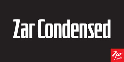
- CamingoDos Condensed by Jan Fromm,
$45.00 CamingoDos Condensed was designed to achieve a more powerful impact for the use in headlines. The compact appearance and the tight letter spacing makes it an ideal solution for display settings on a limited space. CamingoDos Condensed comes with a Pro version that offers a rich set of expert typographic features like small caps, ligatures, stylistic alternates, different figure sets, arrows, fractions and ordinals.
 - Isabel Condensed by Letritas,
$30.00 Isabel Condensed and Isabel were made out of necessity to create a new font for children and teenagers, that could be enough friendly and versatile for text in words or even easy-to-read long texts. The purpose of Isabel is to combine all the nice and friendly features of the simple letters that the teachers teach to the pupils at primary school, as they starting to learn to read, together with the normal editorial fonts we read every day. In this way it generates a very joyful serif font, or even friendly font, with some conservative aspects. In other words, Isabel is a font that, despite of being a “classic features” typography, is proud to show its innocent and ingenuous elements, this gives to the font a new point of view. The family is composed of 3 parts: the regular version, the italic version and the unicase version. Each one of them has 5 weights. The italic version has 825 characters; the regular and unicase have 739 and are composed for 220 latin languages, plus cyrilic.


Page 1 of 124Next page