10,000 search results
(0.101 seconds)
- Xavier by CastleType,
$29.00 The Xavier family of typefaces is based on the delightful deco typeface called Ashley Crawford, originally designed in 1930 by Ashley Havinden. After designing Xavier Black (Serif) and Xavier Sans Black, I added Bold Sans, Medium and Medium Sans and finally added lowercase to the medium weights. Although more manageable than Ashley Crawford, Xavier, due to its very playful nature (splayed A, M, etc.) needs to be used with care, especially in terms of spacing. Xavier is a playful typeface and I have been particularly pleased to see it used in children's books.
 - Sanitation JNL by Jeff Levine,
$29.00 Sanitation JNL is a bold Art Deco sans design inspired by some stylized hand lettering on a 1930s-era WPA (Works Progress Administration) poster and is available in both regular and oblique versions. The topic of the poster was "Your home is not complete without a sanitary unit" and that was recommended by the State Department of Public Health. A "sanitary unit" is the formal name for what rural folks called an "outhouse", and it's presumed the target group were homeowners not hooked up to major sewer lines such as in those rural areas.
 - Foundry Flek by The Foundry,
$99.00 Foundry Flek and Foundry Plek are created on the same dot matrix grid system. Each family includes: light, regular, medium and bold weights – with a selection of dot patterns that can extend the grid vertically and horizontally. The underlying matrix common to each weight allows experimentation with overlays, and mixing weights produces varying effects. Foundry Plek used conventionally works well for serious correspondence, with a 'typewriter font' effect. Foundry Flek has an integral dot matrix grid as a background. With these two fonts a whole new graphic language can be explored.
 - Postulat by ParaType,
$30.00 Postulat is a contemporary slab serif typeface. The family contains 16 fonts: 8 romans with matching italics, from Hairline to Bold. The character set include contains more than 600 glyphs which support most Latin and Cyrillic languages. The font uses a combination of smooth and extremely simple straight shapes. The author abandoned the use of teardrop-shaped classical elements, replacing them with straight ones, which makes Postulat more dynamic and modern. These unique features give the font a unique personality. Postulat is the perfect choice for headlines, logos, branding, packaging, publications and websites.
 - African Textile by Scholtz Fonts,
$19.00The African Textile font had two major influences. The pattern is derived from the bogolan cloths from Africa, originally made using a traditional dyeing technique from Mali that uses bogo or clay as prime dye material. The character shapes are largely based on the Tabwa font. The font is best used as a heading or poster font, although the boldness of the design allows it to be useful at medium sizes, as subheadings as well. It is professionally letter-spaced and kerned and contains a complete character set. - Whakatani by Jadugar Design Studio,
$20.00 Whakatani is a new font with only have Bold option at the moment, beautifully kerned letters and multi language supporting. About Whakatani---- Whakatane invites you to throw away your watch, relax in the sunshine, experience the special lure of the ocean and marvel at the relaxed friendliness of the people - as you discover all the little things that make Whakatane so exceptional. Renowned for great weather, beautiful beaches, culture and a relaxed lifestyle, the Whakatane region is one of New Zealands most attractive locations for visitors and relocators.
 - Gateway Heaven by Graphicxell,
$19.00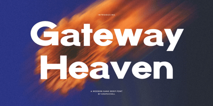 Gateway Heaven Modern Bold Sans serif Font inspired by the famous minimalist logo perfect for the purposes of designing templates, brochures, videos, advertising branding, logos, invitation, layout design, elegant crafting, beauty design and other What's Included : Standard glyphs International Accent Works on PC & Mac Simple installations Accessible in the Adobe Illustrator, Adobe Photoshop, Corel Draw. PUA Encoded Characters - Fully accessible without additional design software. Fonts include multilingual support Image used : All photographs/pictures/vector used in the preview are not included, they are intended for illustration purpose only. Thank You
 - Surfing by Graphicxell,
$19.00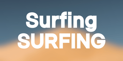 Skyline Bold Sans Font Typeface inspired by the famous minimalist logo perfect for the purposes of designing templates, brochures, videos, advertising branding, logos, invitation, layout design, elegant crafting, beauty design and other What's Included : + Standard glyphs + International Accent + Works on PC & Mac + Simple installations Accessible in the Adobe Illustrator, Adobe Photoshop, Corel Draw. PUA Encoded Characters - Fully accessible without additional design software. Fonts include multilingual support Image used : All photographs/pictures/vector used in the preview are not included, they are intended for illustration purpose only. Thank You
 - Foundry Plek by The Foundry,
$99.00 Foundry Plek and Foundry Flek are created on the same dot matrix grid system. Each family includes: light, regular, medium and bold weights – with a selection of dot patterns that can extend the grid vertically and horizontally. The underlying matrix common to each weight allows experimentation with overlays, and mixing weights produces varying effects. Foundry Plek used conventionally works well for serious correspondence, with a 'typewriter font' effect. Foundry Flek has an integral dot matrix grid as a background. With these two fonts a whole new graphic language can be explored.
 - Oxona - Personal use only

- Volta by Linotype,
$29.99Volta is a robust typeface from the 1950s. A revisit to styles that were en vogue at the turn of the century, Bauer type foundry designers Walter Baum and Konrad Bauer designed this type family in1955. The form of Volta's letters are similar to those in New Transitional Serif typefaces, like Cheltenham and Century. Developed after the Didone (i.e., Bodoni) style types, New Transitional Serifs speak more to the zeitgeist of the late 19th Cntury, and were typographic adaptations to it's newer technologies. Already in the period of mass production, typographers and printers at the dawn of the 20th Century had to cope with larger print runs on cheaper materials. The robust letterforms of New Transitional Serifs were designed to compensate for this, but they were also ingenious little inventions in their own right. Form the beginning, the new, peculiar forms of New Transitional Serif letters were adopted for use by advertisers. Their robustness also allowed them to be used in virtually all sizes. Volta was designed especially with advertising display usage in mind. The x-height of Volta's letters is higher than average for serif faces. It is recommended that Volta be used exclusively for shorter tracks of text, above 12 point. Headlines look dashing set in Volta. Four different font styles are available for the Volta typeface: Regular, Medium, Medium Italic, and Bold." - Sonrisa by CastleType,
$59.00 Sonrisa is a design that evolved from my sketches of the skeletal structure of Jakob Erbar’s Koloss, trying to discover its underlying essence without all the contrast and bulkiness of the original design. Sonrisa Thin was the resulting font, from which the other weights of the family were developed. Gentle curves, open counters, generous x-height, and sleekly tapered terminals give Sonrisa a very legible, modern, elegant appearance. When she saw the first draft of this typeface, the smile on my friend Jennifer’s face gave me the idea to call it “Sonrisa” (Spanish for “smile”). Jennifer, a clinical psychologist, described Sonrisa’s personality as: "happy, clean, clear, open, joyful, spacious, playful, calm. I can see it being used for body product lines such as oils and lotions. Can see it being used in home/travel magazines or even Architectural Digest. Yoga magazine, definitely." Sonrisa is what some foundries call a “Pro” typeface family with all the bells and whistles that provide typographic versatility: true small caps, oldstyle numerals, arbitrary fractions, discretionary ligatures, and other powerful OpenType features. All fonts in the family, except Sonrisa Titling, support most European languages, including modern Greek and languages that use the Cyrillic Alphabet. (Cyrillic glyphs designed in consultation with Ukrainian type designer, Sergiy S. Tkachenko.) Sonrisa is available in the original Thin, monoline version as well as six weights (Light, Regular, Medium, Bold, Extra Bold, Black), and a Titling font that is essentially a display font construction kit. If you enjoy using Sonrisa even half as much as I enjoyed creating it, then I know you will have a “sonrisa” (smile) on your face!
 - Stellar by Monotype,
$29.99Robert Hunter Middleton drew the original design of Stellar for the Ludlow Typograph Company in Chicago. Work began in the late 1920s, when Middleton was asked to create a sans serif type family to compete with European imports of Futura and Kabel. Stellar was Middleton's attempt to raise the ante. Where Futura and Kabel were geometric in design and monotone in weight, Stellar was based on roman character proportions and stroke weighs were stressed. In the late 1990s, Dave Farey took on the task of reviving the Stellar design. While Ludlow cut Stellar in a full range of point sizes, the family was limited to just a roman and bold design. Farey's revival is twice as large a family. It ranges from a very light called Stellar Nova to a very bold called Zeta In between are Lyra and Epsilon. - Corsham by Greater Albion Typefounders,
$14.00 Corsham was inspired by traditional stonemason's engraved lettering designs. Designed to be used alone, or in combination with our Corton family, it has wonderfully lively air, with distinctive lively serifs and beautifully swashed downstrokes. Four faces are offered-regular bold and black weights as well as a condensed form. All faces include a range of Opentype features, including ligatures and old-style numerals. The Corsham faces merge 'olde-worlde' charm with fun character, yet remaining clear and legible for text use.
 - TF Madloud by Teenage Foundry,
$19.00 TF Madcloud - This bold and playful graffiti font is perfect for any project that needs an eye-catching touch. Its thick, rounded letters will grab attention and communicate a fun, carefree vibe. The hand-drawn style of this font gives it a unique, personal touch that sets it apart from more standard typefaces. With both regular and outline versions, you can use this font in a variety of ways to suit your needs. Features: Uppercase, Lowercase, Numeral, Punctuation & Multilingual. For any questions please contact me 🙂 Thanks!
 - FS Benjamin by Fontsmith,
$80.00 Stone and steel FS Benjamin is a flared serif typeface designed by Stuart de Rozario. Consisting of 12 styles ranging from Light, Book, Regular, Medium, SemiBold and Bold with Italics it has clear, delicate letterforms, punctuated with brutal chiselled angles. With a pure and crafted feel to the forms the typeface has traditional roots but has been designed to work in a contemporary setting. Archetypal proportions in terms of x-height to cap height and ascender to descender ratio, allow the typeface to feel familiar and be legible in all platforms. Delicate brutalism Inspired by the contrasts of London and named after Big Ben, FS Benjamin was designed by Stuart de Rozario and founder, Jason Smith. Walking around London Jason was inspired by the juxtaposition of the old and the new. Glass and steel architecture can often be found amongst traditional signage and coats of arms seen around the City. These surroundings sparked an idea to create a modern design based on an alphabet that would traditionally be carved from stone. “Much of the typography we see today is so similar. I thought what if we created a typeface with traditional roots but modernised it to sit amongst the punk and noise of the streets of London? Old with new. Business with busyness. This is what London is all about.” Jason Smith
 - SF Comic Script - Unknown license

- SF Automaton - Unknown license

- SF Intermosaic B - Unknown license

- SF Wonder Comic - Unknown license

- SF Arch Rival - Unknown license

- Action Man Extended - Personal use only

- Qiduwy by Twinletter,
$15.00 Qiduwy is a futuristic and stylish font perfect for designing labels, retro, stamps, badges, Oktoberfest posters, packaging, titles, beer, logos, barbershops, whiskeys, tattoos, music, movies, or certificates. This font is perfect for a dark and mysterious look. Bold black lines make this font perfect for a classy and stylish look. The wide, bold typeface gives this font an upscale look. Sharp corners and edges add a touch of class. This is the perfect font for a dark and mysterious look.
 - PAG Sottoterra by Prop-a-ganda,
$19.99Prop-a-ganda offers retro-flavored fonts inspired by lettering on retro propaganda posters, retro advertising posters, retro packages all the world over. This is perfect font for your retrospective project. PAG Sottoterra is heavy and high-contrast font, and you can see triangles in some letters. This font reminds us of old posters of science fiction movie. It works best for for display or titling. - Farson Family by Garisman Studio,
$20.00 Proudly Present Farson - Vintage Typeface Farson born from an inspiring vintage display. This font gives a feel of a vintage, classic, old, and based on handmade. Already PUA Encoded and I think this font is perfect for people looking for vintage aesthetic or logo-type. Suitable for any graphic designs such as branding materials, t-shirt, print, business cards, logo, poster, t-shirt, photography, quotes .etc.
 - XXII Totenkult by Doubletwo Studios,
$21.99 The “XXII Totenkult” is inspired by the classical letterforms of old roman/renaissance typefaces and an ode to the decay. This is an allCapitals-font and the lowercase glyphs contain a variation of the uppercase. With activated “calt”-feature every second lowercase will be replaced by an alternate, this will give the font a more natural look. Detailed information here: XXII Totenkult on Behance.
 - Beret by Linotype,
$29.99Brazilian designer Eduardo Omine designed his Beret family of typefaces in an attempt to create a warm counterpart to the clean, minimalist sans serif of the 20th Century. The most individual characteristics of Beret are the terminals at the ends of its vertical strokes. They are slightly bent", simulating a subtle flare. Like many classic sans-serif typefaces (e.g., the original Syntax and Univers), this family does not include true (calligraphic) italics. Instead, a masterful set of obliques has been created. As Stanley Morison articulated in the early 1920s and 30s, these slanted versions of the regular "roman" faces may even work better when one wishes to emphasize certain words or passages within a text. The Beret family of typefaces is suitable for numerous applications, in both text and display sizes. The following nine fonts make up the family's design: Beret Light, Beret Light Italic, Beret Book, Beret Book Italic, Beret Regular, Beret Medium, Beret Medium Italic, Beret Bold, and Beret Bold Italic. Beret was awarded an Honorable Mention in the 2003 International Type Design Contest, sponsored by the Linotype GmbH." - Sinova by Linotype,
$29.99 The simplified letterforms of Sinova™ make it an ideal choice for those settings where you really don't want the type to shout too loudly or draw unnecessary attention to itself. Christian Mengelt has drawn five weights: Thin, Light, Regular, Medium, and Bold, all with complimentary obliques. Sinova is an OpenType family that is unfussy, functional, and legible, with extensive language support (some 48 languages). Thanks to its clear and straightforward design and dynamic rhythm, one of the main characteristics of Sinova is its excellent legibility, irrespective of whether it is used in longer passages as a stylish book script or for text in the digitalised office environment. But Sinova also happily adapts itself to being used as a titling font in combination with Renaissance Antique serif typefaces. For this reason, another potential application for the font family is as a graceful and elegant titling and text script for job printing and in publicity texts. The two complementary stroke widths, light and bold, are perfect for commercial applications.
 - Comic Mode by 38-lineart,
$24.00 Comic Mode is a warm, fun and comical sans serif family, "its an alternative for comic sans, with a more formal looks". Availavle of 9 weights from thin to black. with a curved character that is round on thin and increasingly elliptical on black. The unique look of comic Mode is the combination of a technical sans serif and casual handwriting . These 9 diffrent weights also come with oblique style, so there are 18 styles in this family and 1 variable font that are a relatively new font format that allow one font file to contain multiple stylistic variations. Fresh, unique and casual, make this font really worth having.
 - Kirsty - Unknown license

- Spectre by Letteralle,
$23.00 Spectre is an allcaps display font. With bold and sharp shapes, this font is able to bring a fierce and bold impression to your designs. Spectre is perfect for editorial projects, Logo design, Music Album, Clothing Branding, product packaging, magazine headers, or simply as a stylish text overlay to any background image.
 - Oxtail by MAC Rhino Fonts,
$36.00 This typeface has its roots in the Egyptienne-family which became popular in the beginning of the 19th Century. To make the family more unique and personal, ”twists” have been crafted throughout the design. All together a family of 6 weights, including: Medium, Medium Italic, Bold, Bold Italic, Black and Black Italic.
 - Eurotypo BKL by Eurotypo,
$28.00 Eurotypo BKL is a family of fonts inspired in on one of the most beautiful British Typography ever done. This version of Baskerville tries to reflect the taste of his fine style, compatible with the bluntness of the digital present. As many other designers and foundries, our intention has been to represent the atmosphere of Baskerville's style, than simply relive the shapes of its letters. Actually, capitals fits almost to a square proportions, lowercases are more open, ascenders and descenders are shorter, offering more space for enlarge the "x" high. The beauty of his letterforms can enrich headlines; this font can also be used as body text for its good legibility and accurate kerning. John Baskerville (1706-1775) was born 1706 in Wolverley, England. He was a great typographer and printer who published a remarkable edition of Virgil in 1757. His typefaces were greatly admired by Benjamin Franklin; He also has improved and developed many innovations in printing, paper and ink production. Baskerville’s typefaces are regarded as transitional types that represents the link between Old Roman Style and Modern Roman typography.
 - Rozza by Serebryakov,
$49.00 Rozza is a single weight stencil cursive fat face font for extremal display use. Looking at this font the story of beauty and the beast comes to mind. That is how I would describe it. On the one hand prickly and dangerous, and on the other - pulsating beauty and passion. Try to combine Rozza together with Displace — great pair!
 - Mercato VF by Borutta Group,
$79.00 MERCATO is a headline family of typefaces inspired by hand-painted price tags. The idea for this family was born a few years ago in South America. I wanted to create a typeface that is written, expressive and organic on the one hand, and thrown into a geometric frame on the other. Co-designers: Karol Mularczyk & Małgorzata Bartosik.
 - BD Gitalona Variable by Balibilly Design,
$139.00 We introduce our Variable Font from the high-complex BD Gitalona font family. Consisting of 3 axes; weight, optical size, and serif, that will give you a different experience extending the family of BD Gitalona. We don't want to mention how many families can be generated from this variable font. During the development process, we got up to more than 50 families and stopped to allow you to continue to play with the slide buttons. And again, BD Gitalona is filled with an explorative and experimental decorative version that we present separately. Figure out the decorative version BD Gitalona Moxa to make the aesthetic appeal of this whole typeface here! Inspiration The world of entertainment moves non-stop. One by one, figures appeared and left. We expect to create something to entertain previous trends with packaging more relevant to the present. More specifically, we admire and are inspired by some of the world's leading and top singers with a segmented nature. We imagine so many figures that can affect every viewer. However, each artist or singer has a segment because almost all of them have characteristics. The Design The basic design of this typeface begins with a transitional serif shape with sharp, shapeless corners. Then in the middle of the invention, there was an opportunity to explore it further from the readability side by adding an optical variable that can adjust the serif thickness when used together between large, medium to paragraph text sizes for editorials. The shift from serif to sans-serif with the contrast initiated by the shift of the serif family form as a different variable also makes this font richer in terms of the features it contains. Parts are expected to add to the user satisfaction with the complexity of this font. The Features BD Gitalona consists of one sub-family intended for body text with nine weights from Thin(100) to Black(900) and four other display sub-families such as Display serif, Flick, Harmony Sans and Contrast Sans. Each consists of four weights Thin(100), Regular Weight(400), Bold(700), and Black(900). And again, there are also retailed separately; the BD Gitalona Variable font, which is designed to accommodate all Subfamily in 1 font file, and BD Gitalona Moxa, an experimental typeface. A total of 700+ glyphs in each style. Advanced OpenType features functionally and aesthetically, such as Case-sensitive forms, small caps, standard and discretionary ligatures, stylistic alternates, ordinals, fractions, numerator, denominator, superscript, subscript, circled number, slashed zero, old-style figure, tabular and lining figure. Supports multi-languages including Western Europe, Central Europe, Southeast Europe, South America, and Oceania.
 - Goneon by Ditatype,
$29.00 Goneon is a vibrant and eye-catching display font designed to bring the electrifying energy of neon lights to your designs. With its big, bold uppercase letterforms and mesmerizing neon style, this typeface captures the essence of a lively and dynamic atmosphere.. Each letter is meticulously crafted to emanate a radiant and electrifying glow, just like the vibrant neon signs that illuminate city streets at night. This neon style adds a touch of excitement and energy, instantly drawing the viewer's attention. Inspired by the pulsating rhythm of city nightlife, Goneon exudes a sense of modernity and vibrancy. The font captures the essence of an urban atmosphere, casting a dazzling neon glow that creates a lively and captivating visual impact. Each letter radiates with an unmistakable charm, bringing your designs to life with its electrifying vibes. Features: Alternates Multilingual Supports PUA Encoded Numerals and Punctuations Goneon perfect for headlines, banners, posters, and any design that requires a bold statement. The neon style adds an extra layer of excitement, making your text shine with a dynamic and eye-catching appeal. Whether you're working on advertising campaigns, event promotions, digital artwork, or any creative project that calls for a lively aesthetic, this font will instantly infuse your designs with an electrifying energy. It particularly shines in applications related to nightlife, entertainment, music, and urban-themed designs. Find out more ways to use this font by taking a look at the font preview. Thanks for purchasing our fonts. Hopefully, you have a great time using our font. Feel free to contact us anytime for further information or when you have trouble with the font. Thanks a lot and happy designing.
 - PF Tempesta Five Compressed - Unknown license

- PF Tempesta Seven Condensed - Unknown license

- PF Tempesta Five Extended - Unknown license


