10,000 search results
(0.292 seconds)
- Straight Angles by Celebrity Fontz,
$24.99Straight Angles is a precisely designed three-dimensional font with a clean and futuristic look. The predominant angles are 90 degrees and 180 degrees with parallel and perpendicular lines. Each character is surrounded by a crisp black border of even thickness throughout the font. Upper- and lower-case letters are the same, providing a constant maximum top height while the stems extending below are allowed to show off their distinct personalities in order to spice things up. The 3D extrusion effect makes text appear to stand out from the page. - Belinsky Text by Tabular Type Foundry,
$32.99 Belinsky is a monospace sans serif typeface inspired by early 20th century geometric sans serifs, architectural letterings, and retro video games to some extent. Its exaggerated proportions and sharp details appear less harsh thanks to the corner rounding. It is comprised of a standard and text families, and the latter is especially suited for small text and programming, with wider spacing and more centralised gravity of certain letters like E. It still gives your codes a lot of personality. The typeface name is a reference to the designer�s favourite animated film, American Pop.
 - Beckford Script by Dear Alison,
$29.00 Brush lettered scripts have such a quick expressive quality to them and have amazed me since I was a little girl. The quick whip of the wrist can make or break a letterform so easily. They are filled with personality and visual flavor. Beckford Script taps into that association and brings a quick handed sassiness reminiscent of vintage travel brochures and old pulp and romance novels. But for whatever you might need this script for, you'll find it up for the task. Spice up your font collection and pick up Beckford Script today!
 - Bargain by Arkalandara,
$115.00 Handwriting is a unique and personal expression of language created by individuals using a pen, pencil, or other writing instrument. It encompasses various styles, characteristics, and nuances that make each person's writing distinctive. Pointed shapes and characters refer to the specific forms and angles of the letters and symbols in a written script. Pointed shapes in handwriting typically involve the presence of sharp angles or well-defined points in the formation of letters. This can contribute to a more angular and edgy appearance in the overall writing style.
 - Bocahe by IbraCreative,
$13.00 Bocahe, a delightful and whimsical doodle kids font, captures the essence of youthful imagination and playful charm. Each letter in Bocahe is carefully crafted with endearing doodles, resembling the spontaneous drawings of children at play. The font exudes a carefree spirit, making it perfect for projects geared toward a younger audience. Bocahe’s adorable characters bring a sense of innocence to any design, from playful invitations to colorful educational materials. The font’s hand-drawn aesthetic and vibrant personality make it an enchanting choice for conveying joy, creativity, and the boundless wonder of childhood in typographic form.
 - Belinsky by Tabular Type Foundry,
$32.99 Belinsky is a monospace sans serif typeface inspired by early 20th century geometric sans serifs, architectural letterings, and retro video games to some extent. Its exaggerated proportions and sharp details appear less harsh thanks to the corner rounding. It is comprised of a standard and text families, and the latter is especially suited for small text and programming, with wider spacing and more centralised gravity of certain letters like E. It still gives your codes a lot of personality. The typeface name is a reference to the designer�s favourite animated film, American Pop.
 - Gulyesa Script by Ahmet Altun,
$39.00 Gulyesa script font is a handwriting typeface. It offers stylish alternatives at the first and last letters of the words. In addition to that the font contains a great number of alternates as stylistic, titling, contextual alternates... Also it contains Swashes, Oldstyle Figures and Ornaments. Gulyesa script font is a stylish handwriting font that can be used in everywhere the designers choose and admire. The name of Gulyesa Script Font consists two words; gul means Rose and yesa means a praised person. The name comes from my dear daughter's name.
 - Lewis by Thierry Fétiveau,
$10.00 Lewis is a stencil typeface inspired by vintage sign painting. Lewis is designed for display use within printed publications as it has a high contrast of organic forms. Lewis consists of 3 styles; Classic, Display and Inline. Each style is based on the same skeleton but with a different personality. The Classic style is a simple and elegant stencil typeface which is also the original structure of Lewis. The Display style features intertwined flourish like parts and the last member of the family is the Inline style which features subtle internal details.
 - Hello Amsterdam by Ake,
$18.00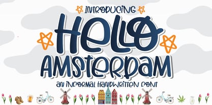 Hello Amsterdam Font is an informal, cute modern, fashionable, friendly, and trendy handwritten font. With its playful yet versatile style, Hello Amsterdam adds a delightful touch to any design project. Whether you're creating greeting cards, invitations, logos, social media posts, or anything in between, this font brings a casual and adept vibe to your work. Its handwritten charm and contemporary appeal make it a perfect choice for those seeking a touch of personality in their designs. Embrace the trendy vibes of Hello Amsterdam Font and let your creativity shine!
 - Kimberlie Display by Attract Studio,
$23.00 Kimberlie is a luxurious display serif font with unique character by combining geometric shapes with organic curvy details. It is a unique typeface for your individual personality. Inspired by old-style serif and contemporary serif fonts. The extreme contrast between thick and thin strokes gives a harmonic and stylish look. Elegant and sensuality didone serif enhanced by ligatures, alternates and swashes. Kimberlie features OpenType with 1025+ glyphs, 210 Stylistic Alternates, 486 Ligatures. Perfect for a wide range of uses. From greeting cards to magazines, wedding invitations, logos to website etc.
 - Jarvis by Alan Smithee Studio,
$9.00 Jarvis is a hybrid. Not a pure grotesque, not a humanist sans, but the best of both worlds. Its open counters and strong geometry, coupled with smooth curves and features give it a unique personality. Very legible even at small sizes, instantly recognisable at large sizes, it is an ideal candidate for corporate identity as well as print and digital communications of all kind. Its wide range of weights (from Thin to Black), extensive OpenType features, circled numbers, and extended character-set are the hallmark of the highest technical level.
 - F2F Al Retto by Linotype,
$29.99The Techno sound of the 1990s, a personal computer, a font creation software and some inspiration had been the sources to the F2F (Face2Face) font series. Alessio Leonardi and his friends had the demand to create new unusual faces that should be used in the leading german techno magazine "Frontpage". Even typeset in 6 point to nearly unreadability it was a pleasure for the kids to read and decrypt the messages. About Al Retto: "Al" means "Alessio Leonardi" and Retto "straight", but if you read it as an italian world means "in the a**". - Glagio by Ergibi Studio,
$19.00 Glagio is a Signature font for handwritten logotype with alternative characters. perfect font for creating photography studios or personal photography logos, best for initial logo or brand signatures. Glagio includes a full set of beautiful handwritten upper and lower case letters, numbers, assorted punctuation marks. All lowercase letters include end strokes, providing a cool handwriting style. What's Included : Standard glyphs Ligatures International Accent Works on PC & Mac Simple installations If there is a problem, question, or anything about my fonts, don't hesitate to ask! Big Thanks ~ Ergibi Studio
 - Mominacute by IbraCreative,
$23.00 Mominacute is an adorable handwritten font that radiates charm and sweetness. With its delicate letterforms and whimsical curves, Mominacute captures the essence of cuteness and playfulness. Each letter feels like a gentle brushstroke, exuding a sense of innocence and joy. The soft and friendly nature of this font makes it a perfect choice for designs aimed at capturing the hearts of young audiences, such as children's books, playful invitations, and cheerful branding. Mominacute adds a touch of endearing personality to any project, bringing smiles and warmth to those who encounter it.
 - Standard Shaded Slab by Yes Please,
$35.00 The Standard Shaded family is an homage to the grandiose Woodtypes of yesteryear. Standard blends a contemporary sense of craft and proportion with a dash of Woodtype-era personality to keep things interesting. The Standard Shaded family features OpenType conventional ligatures, discretionary ligatures and stylistic alternates as well as a standard set of accents and symbols to provide a versatile end-user experience. The Standard Shaded family has seen action in the print, web and motion arenas for clients such as IFC, Showtime, Nike Women's Training, Nike Sportswear, Target and Starbucks.
 - Apadana by Naghi Naghachian,
$100.00 Apadana is a new creation of Naghi Naghashian. Apadana design fulfills the following needs: A. Explicitly crafted for use in electronic media fulfills the demands of electronic communication. Apadana is not based on any pre-digital typefaces. It is not a revival. Rather, its forms were created with today's technology in mind. B. Suitability for multiple applications. Gives the widest potential acceptability. C. Extreme legibility not only in small sizes, but also when the type is filtered or skewed, e.g., in Photoshop or Illustrator. Apadana's simplified forms may be artificial obliqued in InDesign or Illustrator, without any loss in quality for the effected text. D. An attractive typographic image. Apadana was developed for multiple languages and writing conventions. Apadana supports Arabic, Persian, and Urdu. It also includes proportional and tabular numerals for the supported languages. E. The highest degree of geometric clarity and the necessary amount of calligraphic references. This typeface offers a fine balance between calligraphic tradition and the contemporary sans serif aesthetic now common in Latin typography.
 - Ekbatana by Naghi Naghachian,
$75.00 Ekbatana is a new creation of Naghi Naghashian. Ekbatan design fulfills the following needs: A. Explicitly crafted for use in electronic media fulfills the demands of electronic communication. Ekbatana is not based on any pre-digital typefaces. It is not a revival. Rather, its forms were created with today's technology in mind. B. Suitability for multiple applications. Gives the widest potential acceptability. C. Extreme legibility not only in small sizes, but also when the type is filtered or skewed, e.g., in Photoshop or Illustrator. Ekbatana's simplified forms may be artificial obliqued in InDesign or Illustrator, without any loss in quality for the effected text. D. An attractive typographic image. Ekbatana was developed for multiple languages and writing conventions. Ekbatana supports Arabic, Persian, and Urdu. It also includes proportional and tabular numerals for the supported languages. E. The highest degree of geometric clarity and the necessary amount of calligraphic references. This typeface offers a fine balance between calligraphic tradition and the contemporary sans serif aesthetic now common in Latin typography.
 - Agathe Ledden by Sabrcreative,
$25.00 Discover Agathe Ledden, a captivating brush script font that brings a dynamic and expressive touch to your designs. With its fluid brush strokes, Agathe Ledden exudes a sense of energy and authenticity, making it perfect for adding a personal and artistic flair to your projects. Whether you're designing logos, branding materials, posters, or social media graphics, this versatile script font is sure to leave a lasting impression. Agathe Ledden offers a harmonious blend of uppercase and lowercase letters, ensuring a seamless flow and balance in your typography. Its natural and organic appearance creates a handcrafted feel, evoking a sense of warmth and personality in your designs. With the inclusion of numbers and punctuations, Agathe Ledden ensures that your message is communicated effectively and professionally. This script font is not limited by language barriers, as it features multilingual support. It allows you to reach a global audience and incorporate different languages seamlessly into your designs. Whether you're targeting local or international markets, Agathe Ledden enables you to connect with diverse audiences and create a truly inclusive experience. Agathe Ledden also features PUA encoding, granting easy access to a variety of ligatures. These ligatures add stylistic variations and decorative elements, giving you the freedom to customize and enhance your text. The versatility of Agathe Ledden allows you to create unique and captivating designs that reflect your individual style and vision.
 - Tube Script by Ingo,
$42.00 A font from the tube: an individual handwriting with a slightly wet character. In this case, the “pen” was a tube of black paint. It’s easy to see that you can’t really write “beautifully” with it. Nevertheless, the “Tube Script” is a beautiful, personal handwriting whose clumsy origins are not at all obvious in small font sizes. But if it’s big enough, then all the peculiarities of the paint container misused as a writing implement become apparent. Sometimes the line is very thin and delicate, sometimes it’s just a thick blob meant to represent a letter, depending on how hard the tube was squeezed. A few spills are inevitable. These coincidences of painterly writing are what make this font so appealing. This creates organic forms, random effects, breaks, streaks, where the writer normally determines the form. As such, this font is a great match for anything organic, picturesque, handmade, personal, or even random, unpredictable, or just plain natural. Hundreds of ligatures make the letters appear in a different form each time depending on it’s combination. And more than a hundred alternate characters can be selected using the corresponding OpenType features, thus enabling even more variety in the typeface. This creates the typically restless, extremely varied impression of a really individual script – almost as if it were really handwritten.
 - Melango by IbraCreative,
$27.00 Melango is a captivating and artistic brush signature font that exudes a sense of flair and personality. With its handcrafted and expressive strokes, Melango captures the essence of a genuine signature, as if written with a brush. Each letter carries a unique and fluid charm, adding an element of authenticity to any design. The brush-like texture and varying thicknesses create a natural and dynamic appearance, making Melango an ideal choice for logos, branding, and creative projects seeking a touch of artistic elegance. Whether used for invitations, greeting cards, or social media graphics, Melango effortlessly infuses designs with a sense of warmth and creativity, making it a standout brush signature font.
 - Gather Serif by wearecolt,
$14.00 Gather Serif - The Modern Classic Let your creativity flow with Gather Serif. Beautifully crafted letterforms and ligatures to give your type a modern touch of elegance. Gather Serif is packed with extra ligatures and stylistic alternative glyphs. Ligatures: CH CO DO EH EA EO IJ KA KO LA LE LH OC OO QO QU RA RC RH RI RO RS RU TH TT Th ZO fl ffl fi ffi st Language Support for: Western European, Central European, South Eastern European, South American, Esperanto.
 - Bad Coma - Personal use only

- Militta Reguler by Four Lines Std,
$12.00 Personalize your designs and make them stand out from the crowd with our collection of handwritten fonts! From quirky to elegant, we’ve got something for everyone!
 - Greeting Monotone by Monotype,
$29.99Based on Art Nouveau models, Greeting Monotype was created by M.F. Benton in 1927. The Greeting Monotone font works well for titling, packaging and greeting cards. - Perpetua by Monotype,
$41.99 Eric Gill’s personal version of the Lapidary letterform. Perpetua® font field guide including best practices, font pairings and alternatives. Featured in: Best Fonts for Tattoos
 - Castelforte - Personal use only

- Prismatic Interlaces by MMC-TypEngine,
$93.00 PRISMATIC INTERLACES TYPEFACE! Prismatic Interlaces is a decorative system and ‘Assembling Game’, itself. Settled in squared pieces modules or tiles, embedded by unprecedented Intertwined Prismatic Structures Design, or intricate interlaced bars that may seem quite “impossible” to shape. Although it originated from the ‘Penrose Square’, it may not look totally as an Impossible Figures Type of Optical Illusions. More an “improbable” Effect in its intertwined Design, that even static can seem like a source of Kinetical Sculptures, or drive eyes into a kind of hypnosis. Prismatic Interlaces has two related families, both as a kind of lighter weight versions Prismatic Spirals Default & Pro. While Default is simpler or easier to use, same way as Prismatic Interlaces, Pro provides a more complex intricate Design that requires typing alternating caps. Instructions: Use the Map Font Reference PDF as a guide to learn the 'tiles' position on the keyboard, then easily type and compose puzzle designs with this font! All alphanumeric keys are intuitive or easy to induce, you may easily memorize it all! Plus, often also need to consult it! *Find the Prismatic Interlaces Font Map Reference Interactive PDF Here! (!) Is recommended to Print it to have the Reference in handy or just open the PDF while composing a design with this typeface to also copy and paste, when consulting is required or when it may be difficult to access, depending on the keyboard script or language. As a Tiles Type-System, the line gap space value is 0, this means that tiles line gaps are invisibly grouted, so the user can compose designs, row by row, descending to each following row by clicking Enter, same as line break, while advances on assembling characters. Background History: The first sketches of my Prismatic Knots or Spirals Designs dates back then from 2010, while started developing hand-drawn Celtic Knots and Geometric Drawings in grid paper, while engage to Typography, Sacred Geometry and the “Impossible Figures” genre… I started doing modulation tests from 2013, until around 2018, I got to unravel it in square modules or tiles from the grid, then idealized it as fonts, along with other Type projects. This took 13 years to come out since the first sketches and 6 months in edition. During the production process some additional tiles or missing pieces were thought of and added to the basic set, which firstly had only the borders, corners, crossings, nets, Trivets connectors or T parts and ends, then added with nets and borders integrations. Usage Suggestions: This type-system enables the user to ornate and generate endless decorative patterns, borders, labyrinthine designs, Mosaics, motifs, etc. It can seem just like a puzzle, but a much greater tool instead for higher purposes as to compose Enigmas and use seriously. As like also to write Real Text by assembling the key characters or pieces, this way you can literarily reproduce any Pixel Design or font to its Prismatic Spirals correspondent form, as Kufic Arabic script and further languages and compose messages easily… This Typeface was made to be contemplated, applied, and manufactured on Infinite Decorative Designs as Pavements, Tapestry, Frames, Prints, Fabrics, Bookplates, Coloring Books, Cards, covers or architectonic frontispieces, storefronts, and Jewelry, for example. Usage Tips: Notice that the line-height must be fixed to 100% or 1,0. In some cases, as on Microsoft Word for example, the line-height default is set to 1,15. So you’ll need to change to 1,0 plus remove space after paragraph, in the same dropdown menu on Paragraph section. Considering Word files too, since the text used for mapping the Designs, won't make any literal orthographical sense, the user must select to ignore the Spellcheck underlined in red, by clicking over each misspelled error or in revision, so it can be better appreciated. Also unfolding environments as Adobe Software’s, the Designer will use the character menu to set body size and line gap to same value, as a calculator to fit a layout for example of 1,000 pts high with 9 tiles high, both body size and line gap will be 111.1111 pts. Further Tips: Whenever an architect picks this decorative system to design pavements floor or walls, a printed instruction version of the layout using the ‘map’ font may be helpful and required to the masons that will lay the tiles, to place the pieces and its directions in the right way. Regarding to export PNGs images in Software’s for layered Typesetting as Adobe Illustrator a final procedure may be required, once the designs are done and can be backup it, expanding and applying merge filter, will remove a few possible line glitches and be perfected. Technical Specifications: With 8 styles and 4 subfamilies with 2 complementary weights each (Regular and Bold) therefore, Original Contour, Filled, Decor, with reticle’s decorations and 2 Map fonts with key captions. *All fonts match perfectly when central pasted for layered typesetting. All fonts have 106 glyphs, in which 49 are different keys repeated twice in both caps and shift, plus few more that were repeated for facilitating. It was settled this way in order for exchanging with Prismatic Spirals Pro font which has 96 different keys or 2 versions of each. Concerning tiles manufacturing and Printed Products as stickers or Stencils, any of its repeated pieces was measured and just rotated in different directions in each key, so when sided by other pieces in any direction will fit perfectly without mispatching errors. Copyright Disclaimer: The Font Software’s are protected by Copyright and its licenses grant the user the right to design, apply contours, plus print and manufacture in flat 2D planes only. In case of the advent of the same structures and set of pieces built in 3D Solid form, Font licenses will not be valid or authorized for casting it. © 2023 André T. A. Corrêa “Dr. Andréground” & MMC-TypEngine.
 - JAF Lapture by Just Another Foundry,
$59.00 Lapture is based on the Leipziger Antiqua by Albert Kapr, released in 1971 by the East German foundry Typoart. It has been extended and carefully redesigned by Tim Ahrens in 2002-05. The strong calligraphic characteristics are a result of the design process: "The size of the counters and the width of individual characters at small optical sizes were analysed with a steel pen while the letter shapes were designed in larger size with a specially trimmed reed pen. Sometimes the hand is more innovative than the head alone," says Kapr. A unique feature of this font is the introduction of gothic shapes into a latin typeface. "The basic concept is to string together narrow white hexagons as counters and inter-letter spaces, defined by vertical stems and triangular serifs. The interior spaces are at least as important as the strokes that make up the characters." Lapture is an ideal choice if a reference to gothic style is desired, as true black letter types are often too eye-catching and not as legible as latin fonts for unfamiliar readers. "The last few years have seen a number of very elegant typefaces based on the mellow and feminine renaissance model. However, sometimes we require a font that is strong and robust, harmonic yet rigid," says designer Tim Ahrens. JAF Lapture is provided in OpenType format. Each font contains more than 600 glyphs, including true small caps, nine sorts of figures, contextual and stylistic alternates and accented characters. This means that you only need to purchase one font whereas in other families you would have to buy two or three fonts in order to get the same. Technically, they follow the Adobe Pro fonts and provide the same glyph set and OpenType functionality. JAF Lapture Basic is provided in OpenType format. Each font contains the standard sets of both MacOS and Windows. In contrast to JAF Lapture they do not provide any advanced OpenType features and no extended glyph set.
 - Buckin by Ckhans Fonts,
$34.00 Buckin is a modern sans serif with a geometric touch that support for 87 languages. It comes in 10 weights, 20 uprights and its matching obliques, so you can use them to your heart’s content, in each of which there are more than 691+ glyphs. Buckin comprises 20 fonts, consisting of three distinct optical sizes: Display. Each one has been carefully tailored to the demands of its size. The larger Display versions are drawn to show off the subtlety of Geonik Pro and spaced with headlines in mind, while the Text sizes focus on legibility, using robust strokes and comfortably loose spaces. In the typeface, each weight includes extended language support, fractions, tabular figures, arrows, ligatures and more. Perfectly suited for graphic design and any display use. It could easily work for branding, web, signage, corporate as well as for editorial design. documents and folders, mobile interface. Support for 87 languages. Afrikaans Albanian Asu Basque Bemba Bena Breton Catalan Chiga Colognian Cornish Croatian Czech Danish Dutch English Estonian Faroese Filipino Finnish French Friulian Galician Ganda German Gusii Hungarian Inari Sami Indonesian Irish Italian Jola-Fonyi Kabuverdianu Kalenjin Kinyarwanda Latvian Lithuanian Lower Sorbian Luo Luxembourgish Luyia Machame Makhuwa-Meetto Makonde Malagasy Maltese Manx Morisyen Northern Sami North Ndebele Norwegian Bokmål Norwegian Nynorsk Nyankole Oromo Polish Portuguese Quechua Romanian Romansh Rombo Rundi Rwa Samburu Sango Sangu Scottish Gaelic Sena Serbian Shambala Shona Slovak Soga Somali Spanish Swahili Swedish Swiss German Taita Teso Turkish Upper Sorbian Uzbek (Latin) Volapük Vunjo Welsh Western Frisian Zulu
 - Kayto by Majestype,
$20.00 Kayto Script is the second collaboration of Erwin Indrawan as the calligrapher and Dexsar Harry Anugrah of Majestype as the typeface designer. Today the resurgence of calligraphy has reached the summit, with social media as the vehicle, we are now familiar with many styles of calligraphy. One of the popular styles is brush lettering, especially the pointed brush calligraphy. Kayto Script is an exploration in pointed brush calligraphy. It’s an interpretation of modern brush calligraphy that combines cursive writing with the East Asian calligraphy flair. Kayto is made with a real brush and held perpendicular to the paper so the brush can twist and turn freely to follow the movement of the hand. This technique gives a natural gesture and energetic look to the strokes. Kayto has a unique rhythm of brush pressure to generate the thick-and-thin strokes... the beating heart of brush calligraphy. Instead of the mechanical thick-and-thin strokes like the regular calligraphy, Kayto is written with a lot of variety of pressure that is somewhat melodic but still conform with the discipline. The result is a script that feels personal and characterized with lively energy. And just like handwriting, every letter in Kayto script is crafted with many varieties of glyphs and ligatures to make an unlimited combination of personalized lettering. Because of its natural letterforms, Kayto Script is best suited to complement anything that is earthy or has nature as the ground. Erwin, the calligrapher, has used Kayto in many of his watercolor illustrations. Another ideas are wedding names on invitations or place cards, logo for any natural products, inspirational quotes, business cards and the list goes on... but in the end, if you wish for something personal and truly one of a kind then Kayto script the one you want. Also, Kayto offer a free version called "Kayto Doodles" designed by Adiet Pramudya.
 - Artisinal by Stiggy & Sands,
$24.00 Artisinal, not to be confused with the term artisanal, is our revival of the Art Deco typeface known as Cubist Bold, by John W. Zimmerman for Barnhardt Bros. & Spindler in 1929, breathes new life into a classic. The original metal cast typeface was designed without a lowercase, as well as some wedge serif capitals made for not always perfect pairings. We've created a lowercase that blends well with the original design to give the typeface more usability. We've also created a fully sans version of the capitals as the default set, and moved the original wedge serif capital styles to a contextual alternates feature. And we created a few stylistic alternates for lowercase characters like the u and y and their accented styles. See the 5th graphic for a comprehensive character map preview. Opentype features include: - Full set of Inferiors and Superiors for limitless fractions. - A Standard lining figure set. - A collection of basic f Ligatures. - Stylistic Alternates for variations of several characters such as u and y. - Contextual Alternates for the original wedge variations of capitals that will mix in where appropriate. Approx. 450 Character Glyph Set: Artisinal comes with a glyph set that includes standard & punctuation, international language support, and additional features
 - FS Pimlico by Fontsmith,
$80.00 Born in the 70s Personal influences are unavoidable in type design and usually find their way through into finished fonts. At Fontsmith, one period in particular provides inspiration, according to FS Pimlico designer, Fernando Mello. “Jason and Phil have always known that I’m very into the visual language of the 70s. I know that Jason shares my love of the 70s and Phil will sometimes admit to being a fan, too. I think that’s the reason they were both so supportive in the development of this font. “And, of course, we all share an interest in good-humoured and intelligent design. We like to think it’s a Fontsmith characteristic.” Back from black FS Pimlico started in an unusual place: with a tubby, penguin-like lowercase “a” that Fernando Mello had been sketching. From “a” grew the rest of the alphabet – a bubbly, fat, friendly family with a brush-written quality that became FS Pimlico Black. The black weight certainly isn’t the normal starting point for creating a regular and bold weight, but Fernando pressed on, driven by a glut of influences: brush-writing; Letraset and early digital systems catalogues; the type of Herb Lubalin and Tony di Spigna; 70s clothes and vinyl; and 70s revival disco nights in London’s Pimlico and Vauxhall. Natural or flourished Not often do fonts come along that seem to span the ages. FS Pimlico is at home in an office environment providing a fresh clear identity in communications or providing text that’s clear and easy to read. But it likes to party, too, 70s style. With the OpenType features switched on, a designer can totally change the look of their work, and create point-of-sale, headlines and titles that stand out and get noticed.
 - FS Pimlico Variable by Fontsmith,
$249.99Born in the 70s Personal influences are unavoidable in type design and usually find their way through into finished fonts. At Fontsmith, one period in particular provides inspiration, according to FS Pimlico designer, Fernando Mello. “Jason and Phil have always known that I’m very into the visual language of the 70s. I know that Jason shares my love of the 70s and Phil will sometimes admit to being a fan, too. I think that’s the reason they were both so supportive in the development of this font. “And, of course, we all share an interest in good-humoured and intelligent design. We like to think it’s a Fontsmith characteristic.” Back from black FS Pimlico started in an unusual place: with a tubby, penguin-like lowercase “a” that Fernando Mello had been sketching. From “a” grew the rest of the alphabet – a bubbly, fat, friendly family with a brush-written quality that became FS Pimlico Black. The black weight certainly isn’t the normal starting point for creating a regular and bold weight, but Fernando pressed on, driven by a glut of influences: brush-writing; Letraset and early digital systems catalogues; the type of Herb Lubalin and Tony di Spigna; 70s clothes and vinyl; and 70s revival disco nights in London’s Pimlico and Vauxhall. Natural or flourished Not often do fonts come along that seem to span the ages. FS Pimlico is at home in an office environment providing a fresh clear identity in communications or providing text that’s clear and easy to read. But it likes to party, too, 70s style. With the OpenType features switched on, a designer can totally change the look of their work, and create point-of-sale, headlines and titles that stand out and get noticed. - Gaitera Ball - Personal use only

- News Gothic by ParaType,
$30.00A Bitstream version of News Gothic that was created by Morris Fuller Benton for American Typefounders and first appeared in 1908. There is the standard American sanserif of the first two thirds of the twentieth century with narrow proportions and a large x-height. Despite, or perhaps because of, the font’s unconventional relationships in proportion and form, News Gothic has long been a popular typeface for almost any use. Cyrillic version developed for ParaType in 2005 by Dmitry Kirsanov. Greek extension designed by Dmitry Kirsanov in 2009. - Scribbles AF by Andrew Foster,
$18.00 Updated October 2014. Scribbles AF is the perfect choice when you want to add a little personality to your design. The font comes in five weights and has been created using scans of real handwriting. The soft, rounded edges of each letter in Biro, Felt Tip, Marker and Chunky give it a very relaxed and friendly appearance, or for something a little more quirky why not try the Ink version? Ideal for notes, labels, packaging and child-friendly projects. What will you use it for?
 - Futura Classic by Wiescher Design,
$39.50 FuturaClassic is a recut of Paul Renners original Futura. This version was what Mr. Renner wanted the Futura to look like. He had to change his very stringent design because the market wanted a more pleasing typeface. I think the original design is worth saving because it is much more typical and has a personal and distinguished touch. I have also designed Geometra Rounded with rounded endings that looks more interesting than your usual DIN type Yours trying to save the typographical past Gert Wiescher
 - Alexandria Signature by Ergibi Studio,
$20.00 Alexandria Signature is a modern Signature font crafted in an elegant and professional style with alternative characters. perfect font for creating signature logos and watermarks for photography studios or personal photography logos, best for initial logo or brand signatures.Alexandria Signature includes a full set of beautiful handwritten upper and lower case letters, numbers, assorted punctuation marks. All lowercase letters include start and end strokes, providing a realistic handwriting style. If you have any questions about our fonts, please feel free to contact us Thank You Ergibi Studio
 - Nonlocal by DLetters Studio,
$30.00 NONLOCAL, has a firm personality and clearly produces a sturdy and consistent font, making it very easy to read that is suitable for everyday use. All caps fonts. USE NONLOCAL works great in branding, logos, Quotes, headlines, high fashion, Landing Page and Magazine. Have 2 Style give you full to explore for your project. FEATURES 2 Style / Numbers & Punctuation / Extensive Language Support Thanks for checking out NONLOCAL. I really hope you enjoy using it! please kindly send us a message for any question about our product. DLetters.Std
 - Collateral Damage by Chank,
$59.00Collateral Damage is a classic splatter font from the earlier days of the internet. A consistent fan favorite since its initial release in 1999, this ink-dripping font was inspired by the gonzo art of Ralph Steadman. It looks hand-painted, like graffiti. Or crazy scary, like splattered blood. It was made by designer Chris Hunt who lives in the Canadian North with the polar bears. After years as a Chank.com exclusive, it is now available at MyFonts for your personal or commercial use.


