9,937 search results (0.019 seconds)
  1. "Shelter_PersonalUseOnly," a unique font crafted by the skilled designers at DCOdesign, stands as a brilliant example of creativity and innovation in typeface design. This font, as its name suggests,...
  2. Imagine waking up on a beautiful, sunny morning, feeling refreshed and eager to conquer the world. That sensation, my friend, is what encountering the font "Greatday" by Letteratom is like. It's not ...
  3. The font named "Set Fire to the Rain" by Kimberly Geswein is an embodiment of expressive creativity and a palpable emotional resonance. Designed by Kimberly Geswein, a designer known for her diverse ...
  4. The "Blonde Personal Use" font by Billy Argel is a distinctive script typeface that exudes charm, elegance, and a personal touch, making it stand out in the realm of handwritten fonts. Crafted by the...
  5. Ah, KG Seven Sixteen, a font that confidently saunters into the world of typography, tipping its hat with a cheeky grin. Crafted by the whimsical wand of Kimberly Geswein, it's as if this font was sp...
  6. Imagine, if you will, a font that captures the whimsical essence of a sunny afternoon spent lying in the grass, musing about the mysteries of life with your best friend—a friend who just happens to b...
  7. The Uno Estado font by Iconian Fonts is a captivating choice for designers and typographers looking for a typeface that combines versatility with character. Crafted with attention to detail, Uno Esta...
  8. The We2000 font, conceived and crafted by Tom Tor, is a distinct typeface that captures the essence of both retro and futuristic design, effortlessly bridging the gap between the dawn of the millenni...
  9. The font Wonton emerges as a distinct and captivating typeface, infusing an eclectic mix of modernity and tradition into the world of typography. Its design is notably inspired by the hand-lettering ...
  10. Kalenderblatt Grotesk is a true gem in the world of typography, crafted by the talented Dieter Steffmann. This particular font marries the enduring appeal of grotesque design with Steffmann's unique ...
  11. The Edhiron Asdhúriel v. 1.2 font is a work of typographic art that transports the imagination to realms of ancient manuscripts and elvish lore. Its design intricately weaves together elegance and my...
  12. Imagine stepping into a bibliophile's dream, a realm where ancient manuscripts and regal scripts of yore come alive. This is the world of Basileus, a font that hails from the illustrious archives of ...
  13. Alison, if it were a person, would be the charming friend who can walk into any room and instantly make everyone feel more cheerful and at ease. Picture a font that balances the line between casual a...
  14. The "Mario and Luigi" font, crafted by the talented David Martin, encapsulates the playful spirit and nostalgic charm of the globally beloved video game characters from the Nintendo universe. This fo...
  15. "Tom-Bombadill" is a distinctive and eye-catching font created by the talented designer Tom Ledin. Its artistic roots are immediately apparent, weaving a tapestry of creativity and playfulness into e...
  16. As of my last update, the "British Outline Majuscules" isn't a universally recognized or widely used font name in the vast world of typography. However, given the descriptive nature of the name, we c...
  17. HIPTRONIC by Skydog is a fascinating font that embodies a blend of retro and futuristic aesthetics, presenting itself as a vibrant bridge between the past's nostalgia and the future's innovation. Des...
  18. Locked Window, a typeface that captures the imagination and intrigue of a suspense-filled narrative, is a typographic journey through mystery and discovery. At first glimpse, this font presents itsel...
  19. Imagine a font that decides to escape the mundane life of letters trapped on a dusty chalkboard, embarking on a dazzling journey into the neon-filled nights of a sci-fi metropolis. That font would be...
  20. Ah, Lelim 200, a typographic enigma birthed from the creative chambers of Stefan Motzigemba's mind! If fonts were people, Lelim 200 would be that effortlessly cool friend who knows all the best coffe...
  21. Ah, if fonts were people, Struck Base PERSONAL USE ONLY PERSONAL USE ONLY by Måns Grebäck would be that incredibly charismatic friend who insists on making a dramatic entrance at every party, yet onl...
  22. Bric-a-Braque, a font designed by the talented Nick Curtis, embodies the spirit of playful creativity and intricate artistry, standing out as an exemplar of how type can both communicate and captivat...
  23. Ah, the whimsical world of fonts, where the personality of a text comes to live, breathe, and sometimes do a little dance. Enter the scene: Digital Tech by Phuxer Designs. Imagine if the circuits of ...
  24. Ah, Fleurs de Liane by Chloe - if fonts were a garden, this one would be the enchantingly mysterious path that leads you through a whimsical wonderland of floral elegance and handwritten charm. Conce...
  25. Ah, the LED Counter 7 by Style-7, a font that hails from the digital age, winking at us from the not-so-distant past. Imagine, if you will, stepping into a time machine, only to find that instead of ...
  26. Oh, if fonts were animals in a grand zoo of alphabets, then PANDA, my dear friends, would be the adorable, munching, and utterly irresistible main attraction. Picture this: each letter of PANDA font ...
  27. Alright, picture this: Zekton Free, a font that looks like it moonlights as a futuristic secret agent. Designed by the font wizard Ray Larabie, this typeface isn't just another font in the crowd. Oh ...
  28. The "Grunt Reaper" is a distinctive font created by the renowned typeface designer known as PizzaDude. It stands out for its unique blend of playful irregularity and bold assertiveness, a hallmark of...
  29. Charon's Obol by David Kerkhoff is a distinctive typeface that embodies a blend of historical allure and modern versatility, making it a unique addition to any design project that seeks to evoke emot...
  30. Ah, the Abysmal Gaze font - a creation that seems to hail from the depths of an artist's most intriguing nightmares, or perhaps, their most whimsical dreams. Crafted by the hands and imaginative geni...
  31. Ah, SF Espresso Shack by ShyFoundry, the font that sounds like it was brewed in the cozy, eclectic coffee shop tucked away in the artsy part of town. Picture this: a font that packs all the warmth of...
  32. Ah, the GauFontExpositionW font! Picture this: if fonts were people, GauFontExpositionW would be that charismatic, globe-trotting adventurer you meet at a swanky, underground art exposition. It's the...
  33. Allow me to introduce you to the enchanting world of Dreamspeak, a font that could charm the socks off a centipede - not that they wear any, but let's not get bogged down by the details. Dreamspeak i...
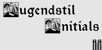
  34. Jugendstil Initials by HiH, $16.00
    Jugendstil Initials were designed by Heinrich Vogeler around 1905, based on the German blackletter tradition. A similar set of initials by Vogeler, but based on roman letters was released by Rudhardsche Geisserei of Offenbach at about this time. I believe the originals were woodcuts. The backgrounds to the letterforms may be seen as examples of Heimatkunst, an art movement within Germany that drew deliberate inspiration from the rural countryside. Like the Arts and Crafts Movement in England a little earlier, Heimatkunst may be seen, in part, as a romantic rejection of urban industrialization, while at the same time representing a back-to-roots nationalism. Like any river, it was fed by many streams. Jugendstil Initials is an experiment with which I am most pleased. It is far and away the most complex font HiH has produced and I was uncertain whether or not it could be done successfully. To oversimplify, a font is produced by creating outlines of each character, using points along the outline to define the contour. A simple sans-serif letter A with crossbar can be created using as few as 10 points. We decided to make a comparison of the number of points we used to define the uppercase A in various fonts. Cori, Gaiety Girl and Page No 508 all use 12 points. Patent Reclame uses 39 and Publicity Headline uses 43. All the rest of the A’s, except the decorative initials, fall somewhere in between. The initial letters run from 48 points for Schnorr Initials to 255 for Morris Initials Two, with 150 being about average. Then there is a jump to 418 points for Morris Initials One and, finally, to 1626 points for Jugendstil Initials. And this was only after we selectively simplified the designs so our font creation software (Fontographer) could render them. The average was 1678, not including X and Y. There was no X and Y in the original design and we have provided simple stand-ins to fill out the alphabet, without trying to imitate the style of the orginal design. We did a lot of looking to find a compatible lower case. We decided that Morris Gothic from the same period was the best match in color, design and historical context. We felt so strongly about the choice that we decided to produce our Morris Gothic font for the purpose of providing a lower case for Jugendstil Initials. The long s, as well as the ligatures ch and ck are provided. at 181, 123 (leftbrace) and 125 (rightbrace) respectively. This font was a lot of work, but I think it was worth it. I hope you agree.
  35. BD Gitalona Variable by Balibilly Design, $139.00
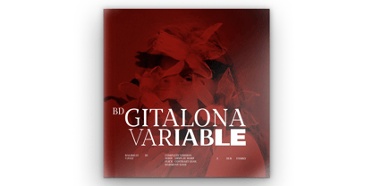
    We introduce our Variable Font from the high-complex BD Gitalona font family. Consisting of 3 axes; weight, optical size, and serif, that will give you a different experience extending the family of BD Gitalona. We don't want to mention how many families can be generated from this variable font. During the development process, we got up to more than 50 families and stopped to allow you to continue to play with the slide buttons. And again, BD Gitalona is filled with an explorative and experimental decorative version that we present separately. Figure out the decorative version BD Gitalona Moxa to make the aesthetic appeal of this whole typeface here! Inspiration The world of entertainment moves non-stop. One by one, figures appeared and left. We expect to create something to entertain previous trends with packaging more relevant to the present. More specifically, we admire and are inspired by some of the world's leading and top singers with a segmented nature. We imagine so many figures that can affect every viewer. However, each artist or singer has a segment because almost all of them have characteristics. The Design The basic design of this typeface begins with a transitional serif shape with sharp, shapeless corners. Then in the middle of the invention, there was an opportunity to explore it further from the readability side by adding an optical variable that can adjust the serif thickness when used together between large, medium to paragraph text sizes for editorials. The shift from serif to sans-serif with the contrast initiated by the shift of the serif family form as a different variable also makes this font richer in terms of the features it contains. Parts are expected to add to the user satisfaction with the complexity of this font. The Features BD Gitalona consists of one sub-family intended for body text with nine weights from Thin(100) to Black(900) and four other display sub-families such as Display serif, Flick, Harmony Sans and Contrast Sans. Each consists of four weights Thin(100), Regular Weight(400), Bold(700), and Black(900). And again, there are also retailed separately; the BD Gitalona Variable font, which is designed to accommodate all Subfamily in 1 font file, and BD Gitalona Moxa, an experimental typeface. A total of 700+ glyphs in each style. Advanced OpenType features functionally and aesthetically, such as Case-sensitive forms, small caps, standard and discretionary ligatures, stylistic alternates, ordinals, fractions, numerator, denominator, superscript, subscript, circled number, slashed zero, old-style figure, tabular and lining figure. Supports multi-languages ​​including Western Europe, Central Europe, Southeast Europe, South America, and Oceania.
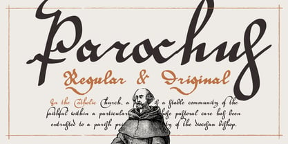
  36. Parochus by Kaer, $24.00
    Hello! Inspiration for this beautiful script font I found in “A Source of Solace in Illness” (Trost Bronn der Kranchhen) book, published in the middle of 17th century. There was an entire on the back of the top cover: Joannes Auanger Parochus Sinchingae 1808”. That's why I named my font family Parochus. In the Catholic Church, a parish is a community of the faithful within a particular church, whose pastoral care has been entrusted to a parish priest (Latin: parochus). There are original and regular style fonts. Also, I’ve added some modern symbols. With this set, you can precisely imitate medieval style text. I designed a full uppercase and lowercase set with Multilingual support and ligatures. You'll found ß, &, Š, ę and many other beautiful glyphs. Best, Roman.
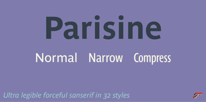
  37. Parisine Std by Typofonderie, $59.00
    Ultra legible forceful sanserif in 32 fonts Parisine was born as official parisian métro signage typeface. This family of typefaces has become over years one of the symbols of Paris the Johnston for the London Underground or the Helvetica for the New York Subway. The Parisine was created to accompany travelers in their daily use: ultra-readable, friendly, human while the context is a priori hostile. Meanwhile, Parisine is now a workhorse and economical sanserif font family, highly legible, who can be considered as a more human alternative to the industrial-mechanical Din typeface family. More human, but not fancy: No strange “swashy” f, or cursive v, w etc. on the italics, to keep certain expected regularity, important for information design, signages, and any subjects where legibility, sobriety came first. Born as signage typeface family, the various widths and weights permit a wider range of applications. In editorial projects, the Compress version will enhances your headlines, banners, allowing ultra large settings on pages. The Narrow version will be useful as direct compagnon mixed to standard width version when the space is limited. The various Parisine typeface subfamilies Parisine is organised in various widths and subsets, from the original family Parisine, Parisine Gris featuring lighter versions of the usual weights and italics, Parisine Clair featuring extra light styles, to Parisine Sombre with his darker and extremly black weights as we can seen in Frutiger Black or Antique Olive Nord. Many years of adjustments were necessary to refine this complex family. Initially, Parisine was designed by Jean François Porchez in 1996 for Ratp to solely fulfil the unique needs of signage legibility. Parisine remain the official corporate typeface of the public transport in Paris, the worldwide capital for tourism, and now integral part of the French touch. Directly related, Parisine Office was initially created for Ratp’s internal and external communication, Parisine Office is available at Typofonderie too. Not connected with Ratp and public transports, Parisine Plus was created as an informal version of Parisine. Parisine: Introducing narrow and compressed families About Parisine Parisine helps Parisians catch the right bus Observateur du design star of 2007
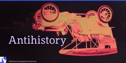
  38. Antihistory by Typodermic, $11.95
    Step back in time with Antihistory, the ultimate vintage typeface. Unlike other aged fonts that mimic designs from the early 1900s, Antihistory is inspired by typography from the late twentieth century and beyond. With its distressed look and feel, this typeface is perfect for adding an authentic, retro touch to your designs. Whether you’re working on a vintage-inspired logo, poster, or website, Antihistory will transport your audience to a future bygone era. Available in Regular and Italic styles, Antihistory is incredibly versatile. Use the Regular style for bold headlines and eye-catching titles, while the Italic style adds a touch of elegance and sophistication to your designs. Plus, with its unique look and feel, Antihistory is sure to make your work stand out from the crowd. So, why settle for boring, modern fonts when you can add a touch of alternate universe history to your designs with Antihistory? Get your hands on this one-of-a-kind typeface today and start creating stunning gonzo-vintage designs that will leave a lasting impression. Most Latin-based European, Greek, and some Cyrillic-based writing systems are supported, including the following languages. Afaan Oromo, Afar, Afrikaans, Albanian, Alsatian, Aromanian, Aymara, Bashkir (Latin), Basque, Belarusian (Latin), Bemba, Bikol, Bosnian, Breton, Bulgarian, Cape Verdean, Creole, Catalan, Cebuano, Chamorro, Chavacano, Chichewa, Crimean Tatar (Latin), Croatian, Czech, Danish, Dawan, Dholuo, Dutch, English, Estonian, Faroese, Fijian, Filipino, Finnish, French, Frisian, Friulian, Gagauz (Latin), Galician, Ganda, Genoese, German, Greek, Greenlandic, Guadeloupean Creole, Haitian Creole, Hawaiian, Hiligaynon, Hungarian, Icelandic, Ilocano, Indonesian, Irish, Italian, Jamaican, Kaqchikel, Karakalpak (Latin), Kashubian, Kikongo, Kinyarwanda, Kirundi, Komi-Permyak, Kurdish (Latin), Latvian, Lithuanian, Lombard, Low Saxon, Luxembourgish, Maasai, Macedonian, Makhuwa, Malay, Maltese, Māori, Moldovan, Montenegrin, Ndebele, Neapolitan, Norwegian, Novial, Occitan, Ossetian, Ossetian (Latin), Papiamento, Piedmontese, Polish, Portuguese, Quechua, Rarotongan, Romanian, Romansh, Russian, Sami, Sango, Saramaccan, Sardinian, Scottish Gaelic, Serbian, Serbian (Latin), Shona, Sicilian, Silesian, Slovak, Slovenian, Somali, Sorbian, Sotho, Spanish, Swahili, Swazi, Swedish, Tagalog, Tahitian, Tetum, Tongan, Tshiluba, Tsonga, Tswana, Tumbuka, Turkish, Turkmen (Latin), Tuvaluan, Uzbek (Latin), Ukrainian, Venetian, Vepsian, Võro, Walloon, Waray-Waray, Wayuu, Welsh, Wolof, Xhosa, Yapese, Zapotec Zulu and Zuni.
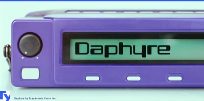
  39. Daphyre by Typodermic, $11.95
    Step into the future with Daphyre, the ultramodern headline typeface that’s out of this world. Its soft edges and techno strokes will transport you back to the magnetic ink (MICR) inspired display types of the 1960s, while its wide, stark letterforms and massive x-height will have you feeling the Y2K vibes. Daphyre’s design is sleek and refined, eschewing the zany take on the MICR style for a more austere approach. The stroke logic emphasizes verticals, making each letterform stand out in its own right. The result is a sumptuous typeface that oozes sophistication and luxury. With Daphyre, you can make a statement that is both bold and elegant. Use it to convey high-end electronics, opulent weapons, and luxury vehicles, or let your creativity run wild and experiment with its myriad of possibilities. So why wait? Grab Daphyre today and step into the future with confidence! Most Latin-based European, Vietnamese, Greek, and most Cyrillic-based writing systems are supported, including the following languages. Afaan Oromo, Afar, Afrikaans, Albanian, Alsatian, Aromanian, Aymara, Azerbaijani, Bashkir, Bashkir (Latin), Basque, Belarusian, Belarusian (Latin), Bemba, Bikol, Bosnian, Breton, Bulgarian, Buryat, Cape Verdean, Creole, Catalan, Cebuano, Chamorro, Chavacano, Chichewa, Crimean Tatar (Latin), Croatian, Czech, Danish, Dawan, Dholuo, Dungan, Dutch, English, Estonian, Faroese, Fijian, Filipino, Finnish, French, Frisian, Friulian, Gagauz (Latin), Galician, Ganda, Genoese, German, Gikuyu, Greenlandic, Guadeloupean Creole, Haitian Creole, Hawaiian, Hiligaynon, Hungarian, Icelandic, Igbo, Ilocano, Indonesian, Irish, Italian, Jamaican, Kaingang, Khalkha, Kalmyk, Kanuri, Kaqchikel, Karakalpak (Latin), Kashubian, Kazakh, Kikongo, Kinyarwanda, Kirundi, Komi-Permyak, Kurdish, Kurdish (Latin), Kyrgyz, Latvian, Lithuanian, Lombard, Low Saxon, Luxembourgish, Maasai, Macedonian, Makhuwa, Malay, Maltese, Māori, Moldovan, Montenegrin, Nahuatl, Ndebele, Neapolitan, Norwegian, Novial, Occitan, Ossetian, Ossetian (Latin), Papiamento, Piedmontese, Polish, Portuguese, Quechua, Rarotongan, Romanian, Romansh, Russian, Rusyn, Sami, Sango, Saramaccan, Sardinian, Scottish Gaelic, Serbian, Serbian (Latin), Shona, Sicilian, Silesian, Slovak, Slovenian, Somali, Sorbian, Sotho, Spanish, Swahili, Swazi, Swedish, Tagalog, Tahitian, Tajik, Tatar, Tetum, Tongan, Tshiluba, Tsonga, Tswana, Tumbuka, Turkish, Turkmen (Latin), Tuvaluan, Ukrainian, Uzbek, Uzbek (Latin), Venda, Venetian, Vepsian, Vietnamese, Võro, Walloon, Waray-Waray, Wayuu, Welsh, Wolof, Xavante, Xhosa, Yapese, Zapotec, Zarma, Zazaki, Zulu and Zuni.
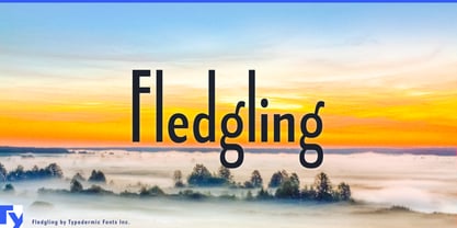
  40. Fledgling by Typodermic, $11.95
    Introducing Fledgling, the sans-serif typeface that exudes svelte elegance and refined sophistication. With a high waist and a low x-height, Fledgling boasts a unique silhouette that will set your message apart from the crowd. Its delicate curves and sophisticated contours were designed with a fashion-forward mindset, making it the perfect choice for any project that requires a touch of class. Whether you’re creating a logo, branding materials, or a fashion editorial, Fledgling will lend your message a one-of-a-kind voice that speaks volumes. And that’s not all. Fledgling is equipped with OpenType capabilities that include numeric ordinals, fractions, and old-style numerals, allowing you to effortlessly convey any numerical information with grace and style. Available in eight weights and obliques, Fledgling gives you the flexibility to experiment with different styles and weights to create a look that perfectly matches your vision. So why settle for ordinary when you can elevate your message with Fledgling? Most Latin-based European, Vietnamese, Greek, and most Cyrillic-based writing systems are supported, including the following languages. Afaan Oromo, Afar, Afrikaans, Albanian, Alsatian, Aromanian, Aymara, Azerbaijani, Bashkir, Bashkir (Latin), Basque, Belarusian, Belarusian (Latin), Bemba, Bikol, Bosnian, Breton, Bulgarian, Buryat, Cape Verdean, Creole, Catalan, Cebuano, Chamorro, Chavacano, Chichewa, Crimean Tatar (Latin), Croatian, Czech, Danish, Dawan, Dholuo, Dungan, Dutch, English, Estonian, Faroese, Fijian, Filipino, Finnish, French, Frisian, Friulian, Gagauz (Latin), Galician, Ganda, Genoese, German, Gikuyu, Greenlandic, Guadeloupean Creole, Haitian Creole, Hawaiian, Hiligaynon, Hungarian, Icelandic, Igbo, Ilocano, Indonesian, Irish, Italian, Jamaican, Kaingang, Khalkha, Kalmyk, Kanuri, Kaqchikel, Karakalpak (Latin), Kashubian, Kazakh, Kikongo, Kinyarwanda, Kirundi, Komi-Permyak, Kurdish, Kurdish (Latin), Kyrgyz, Latvian, Lithuanian, Lombard, Low Saxon, Luxembourgish, Maasai, Macedonian, Makhuwa, Malay, Maltese, Māori, Moldovan, Montenegrin, Nahuatl, Ndebele, Neapolitan, Norwegian, Novial, Occitan, Ossetian, Ossetian (Latin), Papiamento, Piedmontese, Polish, Portuguese, Quechua, Rarotongan, Romanian, Romansh, Russian, Rusyn, Sami, Sango, Saramaccan, Sardinian, Scottish Gaelic, Serbian, Serbian (Latin), Shona, Sicilian, Silesian, Slovak, Slovenian, Somali, Sorbian, Sotho, Spanish, Swahili, Swazi, Swedish, Tagalog, Tahitian, Tajik, Tatar, Tetum, Tongan, Tshiluba, Tsonga, Tswana, Tumbuka, Turkish, Turkmen (Latin), Tuvaluan, Ukrainian, Uzbek, Uzbek (Latin), Venda, Venetian, Vepsian, Vietnamese, Võro, Walloon, Waray-Waray, Wayuu, Welsh, Wolof, Xavante, Xhosa, Yapese, Zapotec, Zarma, Zazaki, Zulu and Zuni.
Looking for more fonts? Check out our New, Sans, Script, Handwriting fonts or Categories
abstract fontscontact usprivacy policyweb font generator
Processing