10,000 search results (0.027 seconds)
  1. As of my last update in 2023, "Deities" by Isis Type Foundry appears to be a fictional or nonexistent font, as it doesn't match any widely recognized typeface from known catalogues or collections wit...
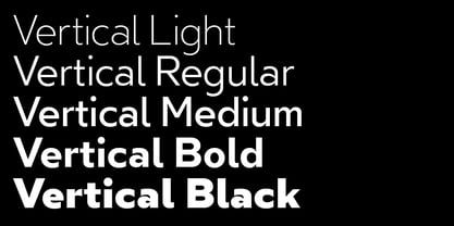
  2. Vertical by Alias, $60.00
    Alias Vertical is a sans serif typeface with a vertical cut-off point for letter endings. The vertical cut-offs bend round characters (b, c, o, etc) into a squarish, high-shouldered shape, suggesting Roger Excoffon’s Antique Olive. In mid-weights, the typeface mixes Antique Olive with typefaces such as Gill or Johnston, for example the shape of the t, the l borrowing Johnston’s flick. Vertical has the same minimal difference in weight between verticals and horizontals as Gill and Johnston, and the same sharp connection point where curves meet straight lines. Like Antique Olive, Vertical has a narrow connection point here, adding contrast and definition. The overall effect feels austere at lighter weights and strident and graphic at bolder weights, and sharp and incised throughout. In the Bold and Black weights, the squarish and top heavy shape of Antique Olive is most noticeable. For example the wide uppercase, with the B having almost-even width between top and bottom curves, and the almost-overhang of the top curve of the G. But Vertical does not have as extreme an aesthetic or square shape as Antique Olive. As well as its wide design, the upper case is given extra authority by being a slightly heavier weight than the lower case. This is a device borrowed from Gill, and other ‘old’ typefaces, where the upper case is presented as a titling design. Modern sensibilities are more focussed on an even colour between upper and lower case. Vertical was originally intended as a sister typeface to Ano, like AnoAngular or AnoStencil. Vertical developed into a similar but separate design. Ano was designed for use in Another Man — in its modular, circle-base design, and the way there aren’t the amendments usually made in bolder weights to ensure letter clarity. This is for layouts where different weights are used together in different sizes so that the overall letter weight is the same, a feature of the magazine. Where Ano is simple and graphic, Vertical has nuance and texture. It is a pragmatic, utility design. In the balance between graphic and typographic, its focus is the latter.
  3. Sony Sketch EF - Unknown license
  4. Quart - Unknown license
  5. minus - Unknown license
  6. Holitter Titan - 100% free
  7. Corleone - 100% free
  8. Guifx v2 Transports - Personal use only
  9. Holitter Tittanium - 100% free
  10. HardTalk - Unknown license
  11. KittKat - Unknown license
  12. Morgenstern - Unknown license
  13. In A Flash - Unknown license
  14. Alter-Ego - Unknown license
  15. DingMaps - Personal use only
  16. FiftyTwoLetters - 100% free
  17. Stellina - Unknown license
  18. lauralinda - Unknown license
  19. Idolwild - Unknown license
  20. COnsume - Unknown license
  21. Zebra Parade - Unknown license
  22. Nauert - Unknown license
  23. Snowflake Letters - 100% free
  24. id-isi-LightOT - Personal use only
  25. yorkville - Unknown license
  26. KiddoTR - Unknown license
  27. GINETTE - Personal use only
  28. Fingerpop - Unknown license
  29. 21 Heads - Unknown license
  30. Eyecicles - Unknown license
  31. Minotaur - Unknown license
  32. PopticsThreeExtras - Unknown license
  33. Phino Variation - Unknown license
  34. BN-Gillian - Unknown license
  35. Squitcher - Unknown license
  36. jarah! - Unknown license
  37. Y2K Analog Legacy - Unknown license
  38. Elektora - Unknown license
  39. Estrogen - Unknown license
  40. Wonderlism - Unknown license
Looking for more fonts? Check out our New, Sans, Script, Handwriting fonts or Categories
abstract fontscontact usprivacy policyweb font generator
Processing