10,000 search results
(0.774 seconds)
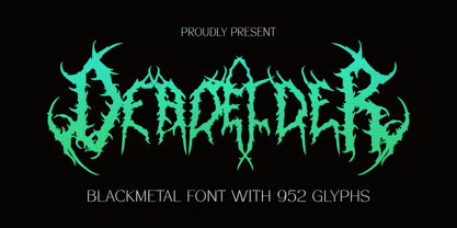
- Dead Elder Metal by Studio Hello Good,
$45.00Dead Elder is a font that embodies the raw, visceral essence of death metal in every stroke and curve. With an astonishing array of 952 meticulously crafted glyphs, this font unleashes a dark, otherworldly energy that is perfect for conveying the macabre and relentless intensity of the death metal genre. - ITC Werkstatt by ITC,
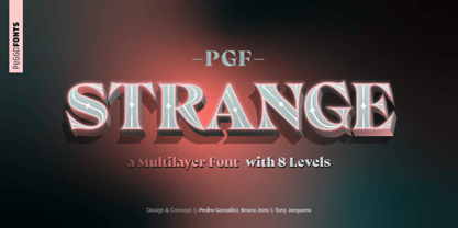
$29.99ITC Werkstatt is a result of the combined talents of Alphabet Soup's Paul Crome and Satwinder Sehmi, along with Ilene Strizver and Colin Brignall. It is inspired by the work of Rudolph Koch, the renowned German calligrapher, punchcutter, and type designer of the first third of this century, without being based directly on any of Koch's typefaces. Werkstatt has obvious affinities with the heavy, woodcut look of Koch's popular Neuland, but also with display faces like Wallau and even the light, delicate Koch Antiqua. Brignall began by drawing formal letters with a 55mm cap height, which Sehmi reinterpreted using a pen with a broad-edge nib. “Not an easy process,” says Brignall, “since one of the features of Koch's style is that while it was calligraphic in spirit, most of the time his counter shapes did not bear any resemblance to the external shapes, as they would in normal calligraphy. This meant that Sehmi could not complete a whole character in one go, but had to create the outside and inside shapes separately and then ink in the center of the letters.” The process was repeated, only without entirely filling in the outlines, for the Engraved version. Crome handled the scanning and digitization, maintaining the hand-made feel while creating usable digital outlines. “The collaboration of artisans with particular skills,” says Brignall, “in a modern-day, computer-aided studio environment, seems very much in step with the 'workshop' ethos that Rudolph Koch encouraged and promoted so much.” - PGF Strange by PeGGO Fonts,
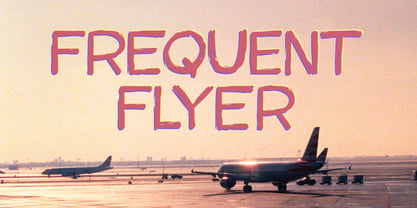
$36.00Multilayer Roman font with 8 levels, inspired on ’70-80s, it wears sharp edges and compact proportions, with a way fresh contemporary retro volumetric style, ideal for branding & packaging, logotype, headlines, covers, sign letters, label, ticket design, and even 3D lettering. It contains a variety of design resources like stylistic alternates, sensitive case adaptations, old-style numbers, fractions, ordinals, ligatures, localized forms, all of them are accessible via character set panel. Design period: 2019 & 2021. Release: 2021 Graphic interpretation: Pedro González Concept: Bruno Jara Development: Peggo Fonts Foundry. - Frequent Flyer by Hanoded,
$16.00I used to be a frequent flyer; as a tour guide I often had 6 to 10 international flights per year. At the time I didn’t even think about the consequences of flying, as I loved my job and the job was all about travel. Now, with the planet in deplorable state, I try to keep flying to an utter minimum. I guess you call it ’shame of flying’… Frequent Flyer font is a nice, eroded, all caps font. It comes with multilingual support, so you may come across it during your travels. - Base&Bloom by NaumType,
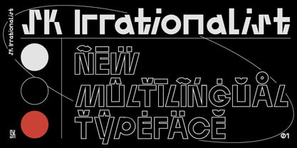
$35.00Base & Bloom is an experimental (but relatively organic) fusion of geometric monoline sans and high-contrast flourish didone. It was inspired by the lack of curious modern display sans as opposed to the uprise of contemporary serifs past couple of years. The idea was to incorporate flourishes not as unnecessary elements like swashes, but as a part of letter structure, which was an especially interesting task considering it was not a serif, which potentially could give more room for that. And after all, the idea pays off by generating many inventive letterform solutions. Base & Bloom has alternates for each letter (up to 11) so you can make endless combinations to find the perfect look. It is a bold choice for posters, album covers, identity and packaging, headlines, oversize typography, and editorial design. - SK Irrationalist by Shriftovik,
$16.00SK Irrationalist is a new experimental accidental font created by the SHRIFTOVIK font foundry and Tikhon Reztcov. This font is very unusual. It uses non-standard graphic techniques. Sloping non-parallel lines, sharp shapes and a combination of rectangles and circles all make the font special. The SK Irrationalist font was inspired by the works of constructivist artists of the early 20th century. The font contains both Latin, Latin Pro version for European countries and Cyrillic. This font delivered in 4 styles: Regular; Sharp; Outline; Rounded. - Carot Display by Storm Type Foundry,
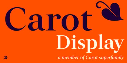
$45.00Carot Display is made for book covers and posters, but will also shine in advertising and visual identity. The whole Carot system is built up from what has long been around; in any case, it was the intention: to evoke the already experienced visual reminiscences of today's spectacled people. We all have a tendency toward sentiment, which, with each new diopter, deepens to melancholy. Only good font can calm us down. I believe in the raw effect of “Carot” typefaces. The superfamily of 64 members offers a modern alternative for all types of design work. - Mother Bones by IKIIKOWRK,
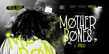
$19.00Proudly present Mother Bones - 90s Type Grunge Vibes, created by ikiiko. Mother Bones inspired by the handwriting style of the 90s, where the Seattle sound trended with a raw, wild and free style. With spontaneous strokes and unique lines, this font has strong vibes of 90s era. This type is very suitable for making a poster, magazine layout, brand logo, sleeve cover, party flyer, quotes, or simply as a stylish text overlay to any background image. What's Included? Uppercase & Lowercase Numbers & Punctuation Multilingual Support Works on PC & Mac - Nt1972 by Harvester Type,
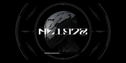
$20.00NT1972 is a display font from the future. Font in the era of cyborgs and cyberpunk. This is a sharp, brutal font with futuristic shapes. It combines style and functionality, so the font will look great in your futuristic design in any environment, be it a logo or a merchandize. The angle of inclination in each glyph is 50 degrees, all glyphs also have the same stem sizes to create a good font system. All this is done to get a good futuristic cyberpunk font that will give style to your design, be it a logo, poster, banner, merchandize, title, packaging or product design. In addition to all this, there is support for many languages and alternative characters. In case of any questions, problems or suggestions, please email: bunineugene@gmail.com - VLNL Neue Sardines by VetteLetters,
$35.00Sardines is a project by Jacques Le Bailly aka Baron von Fonthausen. It first saw the light as a student project for a monospaced font and eventually grew into Vette Letters’ largest font family. We saw its potential and expect it to be a million seller, just like our other typefaces. VLNL Sardines comes in 42 different variations, like rough and clean cuts, regular and condensed widths (condensed is the exactly half of the regular width). Sardines is an eclectic mash of classic curves and mathematical measurements, leaving a very distinct typographic flavor. While most of our type is market-fresh, this one comes out of the can, but it’s delicious nonetheless. And it’s great for adventurous BBQ-ing! - TessiePuzzlePieces by Ingrimayne Type,
$9.00After exploring tessellations for several years, I decided to see how many ways I could tessellate puzzle pieces. I began with a square template and used the same asymmetrical shape for all four edges. By flips or rotation each edge could be fitted in four ways. Eventually I discovered that, given this way of forming tiles, there were 15 distinct shapes that tessellate and these shapes can take a total of 96 orientations. (A note in the November 2016 issue of Mathematical Gazette has the proof for the 15 shapes.) This typeface contains those 15 shapes and 96 orientations. A pdf note here shows some of the tilings possible using only one shape in a pattern. An unlimited number of patterns are possible if shapes are mixed. There are two members of the family, a solid style that must have different colors when used and an outline style. They can be used separately or they can be used in layers with the outline style on top of the solid style. For rows to align properly, leading must be the same as point size. (Earlier tessellation fonts from IngrimayneType, the TessieDingies fonts, lack a black or filled version so cannot do colored patterns.) - Mosafin by Yukita Creative,
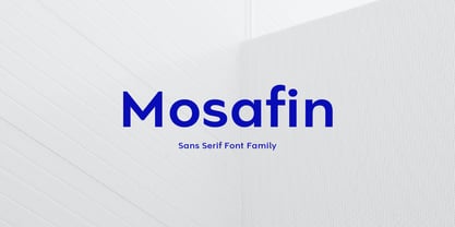
$12.00The Mosafin font is a sans-serif typeface that has a modern and elegant design. This font has a very consistent and proportional letterform, and has clean and firm lines, making it easy to read and very suitable for various graphic design purposes. Made with the latest technology and excellent design, the Mosafin font has distinctive characteristics, such as very geometric letter shapes, with sharp angles and clear, thin lines. This font can be used in various media, such as poster designs, logos, business cards, banners, and various other design purposes. This font also has a proportional font size ratio, so it's easy to read at any size - Wanker - Unknown license
- Monk SPF by S6 Foundry,
$19.00Monk is a multi-language geometric harmoniously balanced font in Arabic and Latin. The font family has its origins in Benedictine and Franciscan writing. Both Arabic and Latin work seamlessly together having shared counters, stem thickness, and curved forms. Monk is a type family that seeks a balance between the openness and legibility of humanist sans serifs. Letterforms have a distinct direction of the ductus, a wide overall stance, large open counters that help in its legibility. The typeface is versatile and can be successfully used in magazines, posters, branding, websites, headlines, large-format prints, brand identities, social media, advertising, editorial design, posters. The family contains over 40 alternative glyphs and over 50 ligatures in each style and comes in 10 styles with their corespondent italics. The family Latin supports Western, Central, South Eastern, South American, Oceanian, Pan African, Vietnamese, Sámi & Arabic - Akkordeon Slab by Emtype Foundry,
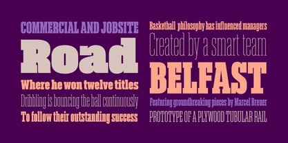
$69.00Akkordeon Slab is the next step in a series of ultra display typefaces. The new Slab version shares the same skeleton and spirit as the original Akkordeon, putting the same concepts into a different shape. Akkordeon Slab provides a stronger voice that enriches the whole family, becoming especially suitable for sports, business, fashion or any situation that requires impact headlines. Learn more about the Akkordeon design process at the Emtype's Blog. See also the Akkordeon Slab PDF. Check out Akkordeon which is a great pair for Akkordeon Slab. - Maus - Personal use only
- FS Lucas by Fontsmith,
$80.00Pure and not-so-simple Maybe it’s the air of purity, openness and transparency that they transmit, but geometric typefaces are more popular than ever among leading brands. Based on near-perfect circles, triangles and squares, geometric letterforms look uncomplicated, even though making them readable is anything but – something the designers of the first wave of geometric fonts discovered nearly a century ago. Many of the world’s most recognisable brands in technology, retail, travel, food, manufacturing and other industries continue to be drawn to the straightforward, honest character that geometric fonts convey. Fontsmith set out in 2015 to develop a typeface in the same tradition, but optimised for the demands of modern brands – online and offline usage, readability and accessibility. And, of course, with the all-important Fontsmith x-factor built in. FS Lucas is the bold and deceptively simple result. Handle with care The letterforms of FS Lucas are round and generous, along the lines of Trajan Column lettering stripped of its serifs. But beware their thorns. Their designer, Stuart de Rozario, who also crafted the award-winning FS Millbank, wanted a contrast between spiky and soft, giving sharp apexes to the more angular letterforms, such as A, M, N, v, w and z. Among his inspirations were the colourful, geometric compositions of Frank Stella, the 1920s art deco poster designs of AM Cassandre, and the triangular cosmic element symbol, which led him to tackle the capital A first, instead of the usual H. The proportions and angles of the triangular form would set the template for many of the other characters. It was this form, and the light-scattering effects of triangular prisms, that lit the path to a name for the typeface: Lucas is derived from lux, the Latin word for light. Recommended reading Early geometric typefaces were accused of putting mathematical integrity before readability. FS Lucas achieves the trick of appearing geometric, while taking the edge off elements that make reading difficult. Perfectly circlular shapes don’t read well. The way around that is to slightly thicken the vertical strokes, and pull out the curves at the corners to compensate; the O and o of FS Lucas are optical illusions. Pointed apexes aren’t as sharp as they look; the flattened tips are an essential design feature. And distinctive details such as the open terminals of the c, e, f, g, j, r and s, and the x-height bar on the i and j, aid legibility, especially on-screen. These and many other features, the product of sketching the letterforms in the first instance by hand rather than mapping them out mechanically by computer, give FS Lucas the built-in humanity and character that make it a better, easier read all-round. Marks of distinction Unlike some of its more buttoned-up geometric bedfellows, FS Lucas can’t contain its natural personality and quirks: the flick of the foot of the l, for example, and the flattish tail on the g and j. The unusual bar on the J improves character recognition, and the G is circular, without a straight stem. There’s a touch of Fontsmith about the t, too, with the curve across the left cross section in the lighter weights, and the ampersand is one of a kind. There’s a lot to like about Lucas. With its 9 weights, perfect proportions and soft but spiky take on the classic geometric font, it’s a typeface that could light up any brand. - FS Lucas Paneureopean by Fontsmith,
$90.00Pure and not-so-simple Maybe it’s the air of purity, openness and transparency that they transmit, but geometric typefaces are more popular than ever among leading brands. Based on near-perfect circles, triangles and squares, geometric letterforms look uncomplicated, even though making them readable is anything but – something the designers of the first wave of geometric fonts discovered nearly a century ago. Many of the world’s most recognisable brands in technology, retail, travel, food, manufacturing and other industries continue to be drawn to the straightforward, honest character that geometric fonts convey. Fontsmith set out in 2015 to develop a typeface in the same tradition, but optimised for the demands of modern brands – online and offline usage, readability and accessibility. And, of course, with the all-important Fontsmith x-factor built in. FS Lucas is the bold and deceptively simple result. Handle with care The letterforms of FS Lucas are round and generous, along the lines of Trajan Column lettering stripped of its serifs. But beware their thorns. Their designer, Stuart de Rozario, who also crafted the award-winning FS Millbank, wanted a contrast between spiky and soft, giving sharp apexes to the more angular letterforms, such as A, M, N, v, w and z. Among his inspirations were the colourful, geometric compositions of Frank Stella, the 1920s art deco poster designs of AM Cassandre, and the triangular cosmic element symbol, which led him to tackle the capital A first, instead of the usual H. The proportions and angles of the triangular form would set the template for many of the other characters. It was this form, and the light-scattering effects of triangular prisms, that lit the path to a name for the typeface: Lucas is derived from lux, the Latin word for light. Recommended reading Early geometric typefaces were accused of putting mathematical integrity before readability. FS Lucas achieves the trick of appearing geometric, while taking the edge off elements that make reading difficult. Perfectly circlular shapes don’t read well. The way around that is to slightly thicken the vertical strokes, and pull out the curves at the corners to compensate; the O and o of FS Lucas are optical illusions. Pointed apexes aren’t as sharp as they look; the flattened tips are an essential design feature. And distinctive details such as the open terminals of the c, e, f, g, j, r and s, and the x-height bar on the i and j, aid legibility, especially on-screen. These and many other features, the product of sketching the letterforms in the first instance by hand rather than mapping them out mechanically by computer, give FS Lucas the built-in humanity and character that make it a better, easier read all-round. Marks of distinction Unlike some of its more buttoned-up geometric bedfellows, FS Lucas can’t contain its natural personality and quirks: the flick of the foot of the l, for example, and the flattish tail on the g and j. The unusual bar on the J improves character recognition, and the G is circular, without a straight stem. There’s a touch of Fontsmith about the t, too, with the curve across the left cross section in the lighter weights, and the ampersand is one of a kind. There’s a lot to like about Lucas. With its 9 weights, perfect proportions and soft but spiky take on the classic geometric font, it’s a typeface that could light up any brand. - Nimali by Letrizmo,
$21.00Complement your collection of animal-shaped fonts with an illustration series that brings the different moods and moments of wildlife right to your desktop. Formed by shadows of animals in a variety of real life poses, it's perfect for design situations that require animals with a non whimsical look and a more correct morphology. 87 silhouettes and 9 pairs of tracks that range from the enigmatic energy of dodgy rats and rabbits, to the mysterious serenity of amphibians and much more. A simple and useful picture of nature. - delizioso - Personal use only
- DS Crystal - Unknown license
- MW TALON - Personal use only
- Pointened - 100% free
- UA Squared - Unknown license
- Konrad Kachelofen by Proportional Lime,
$9.99Konrad Kachelofen was a printer in the city of Leipzig beginning around 1483. He printed many works by contemporary authors and also many of the classics. He acquired an unusually large amount of typefaces for his shop, a place that included a wine bar and book store. This type face is based on Typ.11:340G GfT510 Gesamtkatalog der Wiegendrucke and is similar to Proportional Lime’s “Kachelofen'' font. The major differences are that the whole miniscule set is slimmer and the majuscule set has different style glyphs and this face was used solely for titles and section headings because of its sharper and clearer appearance at large point values. Konrad probably died in 1529 after passing his business on to his son-in-law Melchior Lotter, who also went on to fame as an industrious and illustrious printer. - Handel Gothic by URW Type Foundry,
$35.00The Handel Gothic? typeface has been a mainstay of graphic communication for over 40 years - all the while looking as current as tomorrow. Designed by Don Handel in the mid-1960s, and used in the 1973 United Airlines logo developed by Saul Bass, Handel Gothic was an instant success when released to the graphic design community. Its generous lowercase x-height, full-bodied counters and square proportions make the design highly readable at a wide range of sizes. Handel Gothic's slightly idiosyncratic character shapes gave the face a futuristic look 40 years ago that retains its power today. In addition, its Uncial-like lowercase is instantly identifiable - and unique among sans serif typestyles. - Handel Gothic by Linotype,
$40.99The Handel Gothic™ typeface has been a mainstay of graphic communication for over 40 years - all the while looking as current as tomorrow. Designed by Don Handel in the mid-1960s, and used in the 1973 United Airlines logo developed by Saul Bass, Handel Gothic was an instant success when released to the graphic design community. Its generous lowercase x-height, full-bodied counters and square proportions make the design highly readable at a wide range of sizes. Handel Gothic's slightly idiosyncratic character shapes gave the face a futuristic look 40 years ago that retains its power today. In addition, its Uncial-like lowercase is instantly identifiable - and unique among sans serif typestyles. - Brightfate by Zealab Fonts Division,
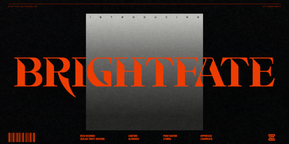
$10.00Brightfate is font designed by Reza Rasenda & Riska Candra Dewi, with design choices and a combination between the medieval times and urban street wear themes. Brightfate comes with stylistic, alternates, ligatures and supports multilingual languages. Create unique & beautiful logotype, use it as an elegant solution for your next magazine layout, or choose Brightfate for any graphics that require a sleek look with a elegant flair. - Airy Restoration by Wildan Type,
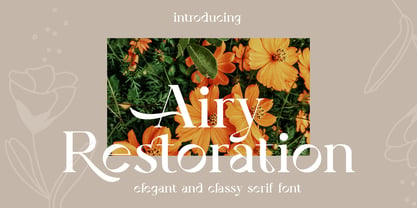
$15.00Airy Restoration, is a typeface designed by Wildan Suprian Syah. Born in the year 2022, With spirit in new era pasca pandemi of covid 19. This is stylish modern serif font. Contains uppercase & lowercase characters, all punctuation & numerals. Airy Restoration is absolutely perfect for editorial projects, Logo design, Wedding, Clothing Branding, product packaging, magazine headers, or simply as a stylish text overlay to any background image. - HollaBear by Designova,
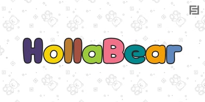
$9.00A cute and funny kid-friendly typeface inspired from bears and handmade with passion and joy. Will you believe if we say, HollaBear is made by bear cubs. The typeface is essentially simple but very uniquely expressive when it comes to the design of posters, flyers, cartoons graphics, logotype, web and display usage. Please see the examples shown above to get an idea about the capability of this typeface. HollaBear comes with Extended Latin character sets including Western European, Central European and South Eastern European character sets. The typeface comes in 6 variants (Regular, Italic, Outline, Outline Italic, 3D and 3D Italic). - People Are People - 100% free
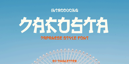
- Jakosta by Twinletter,
$15.00We introduce Jakosta, a one-of-a-kind Japanese-themed display font. This font was created by paying close attention to each letter shape to make it as natural as possible, similar to a Japanese font, while still prioritizing letterforms that are easy to read and understand by the audience so that all of your projects will become projects that are easy to remember and understand by anyone from anywhere in the world. anywhere Logotypes, food banners, branding, brochure, posters, movie titles, book titles, quotes, and more may all benefit from this font. Of course, using this font in your various design projects will make them excellent and outstanding; many viewers are drawn to the striking and unusual graphic display. Start utilizing this typeface in your projects to make them stand out. - taller evolution - Personal use only
- cibreo - Personal use only
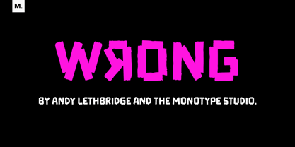
- Wrong by Monotype,
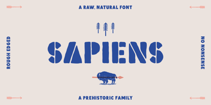
$15.99 - Sapiens by Hemphill Type,
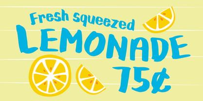
$25.99 - Oggie Marker by Dear Sue,
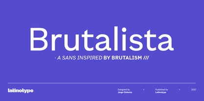
$15.00 - Brutalista by Latinotype,
$29.00Brutalista is a typeface inspired by the architectural brutalist style, which seeks to use the expression of raw or raw material. In graphic design it has been used to break rules and attract attention. His drawing has its roots in grotesque and neo-grotesque sources from the early twentieth century, but with a current style. It has a medium x height, clear counterforms, low contrast, which give it versatility and functionality. Peculiar cuts and drawings are also used in some characters, which give them personality It is an ideal font for headlines and brands, but also for when you need to present simple and clear information. - Janda Spring Doodles - Personal use only
- Tribal Dragon - Personal use only
