10,000 search results
(0.074 seconds)
- Neo Sans Paneuropean by Monotype,
$114.99The branding agency's client wanted an ultra modern"" typeface that was ""futuristic without being gimmicky or ephemeral,"" according to the design brief. Designer Sebastian Lester took on this intriguing custom font assignment, but soon, a bureaucratic decision cancelled the project. ""I was left with a sketchbook full of ideas and thought it would be a shame not to see what came of them,"" says Lester. He decided to finish the design on his own. Lester's research confirmed that the principal ingredient of an ""ultra modern"" typeface was simplicity of character structure: a carefully drawn, monoline form, open letter shapes and smooth, strong curves. To conceive a typeface that crossed the line from modern to futuristic, Lester decided to amplify these qualities. About a year after Lester's initial conceptual work, two highly functional and versatile typefaces emerged. These are Neo Sans and Neo Tech, designs Lester describes as ""legible without being neutral, nuanced without being fussy, and expressive without being distracting."" Both the Neo Sans and the more-minimalist Neo Tech families are available in six weights, ranging from Light to Ultra. Each has a companion italic, and Neo Tech offers a suite of alternate characters. While engineered to look modern as tomorrow, Neo Sans and Neo Tech display the functional and aesthetic excellence that earns them a place in the list of classic designs from the Monotype typeface library. - Poipoi by Dharma Type,
$14.99 Extraordinary impact and visual conspicuousness. Poipoi is a super 3D sans family for posters, logos and all display. The basic idea is not a brand new. The Stacking type system has been used since before wood type age. As you imagined, colored wood type(woodcut), many other engravings and contemporary printer machine print many colors separately with different printing plates for each color. Poipoi uses the same system for 3d effect. Please use Photoshop or Illustrator, or your favorite graphic design apps that can handle layers. Layers are the printing plates of wood type. You should be able to change text color for each layer. Poipoi "Standard" style is the base of this font family. You can add effects by stacking Highlight and shadow layers. Stacked layers in different color make the text in 3D. Instruction 1. Type your text as you like. 2. Set font-name "Poipoi" and font-style "Standard" 3. Set color of "Standard" layer. 4. Duplicate the "Standard" layer twice (One for Highlight, one for Shadow). 4'. The layer order should be Highlight, Standard, and Shadow from top to bottom. 5. Set font-style and color of "Highlight" and "Shadow" layers. 6. Adjust tracking if you need. (Please use same tracking value for all 3 layers.) For further detail, https://www.dropbox.com/s/xymis7dh5hwxn9q/Poipoi.pdf Poipoi Standard, Highlighted, and shadowed style can be used solely. Rounded terminals add soft, cute, and casual impressions to your design. Spec: Over 400 glyphs! Basic Latin ✓ Western Europe ✓ Central Europe ✓ South Eastern Europe ✓ Mac Roman ✓ Windows 1252 ✓ Adobe Latin 1 ✓ Adobe Latin 2 ✓ Adobe Latin 3 ✓ Almost all Latins are covered.
 - Big Bangs by 4RM Font,
$32.00 Big bangs font is made with letter anatomy that looks very unique with a characteristic bulging shape and very large weight size, inspired by explosions, this font looks big and dangerous as well as unique, suitable for use in graphic designs such as stickers, posters, covers, labels, and others.
 - Skywalking by The Bigmind Designs,
$4.99 The Skywalking font is inspired by sci-fi movies and video games. It purposely avoided the us of curves and preferred the sharp edges to get a more robot aesthetic into it. Designed by Mark Silva, the font is suited for logos, company branding, game titles and shirt designs.
 - Marigold by Monotype,
$29.99Originally designed by calligrapher Arthur Baker, Marigold font was released by Agfa Compugraphic in 1989. Marigold font is narrow in width like the chancery hand, and its shapes are true to the prescribed Renaissance proportions. The authentic handwritten look makes it versatile for a large variety of informal uses. - Black Bruno by Subectype,
$18.00 Black Bruno is a supercharged, street-wise brush font bursting with energy. It includes extra attention to quick strokes and sharp details. This font is perfect for challenging jobs, titles, t-shirts, websites, hoodies, clothing, headline, logotype, branding, advertising, event and various print and digital media with energy.
 - Firm by Larin Type Co,
$14.00 Firm is a black sans serif display font. Perfectly attracts attention due to its shapes. With it, you can highlight important information in your text, and it is also perfect for creating a logo.This font contains alternates lowercase, ampersand and ligatures, math symbols, arrows, fractions, and multilingual support.
 - Carrosserie by Letterwerk,
$27.00 Carrosserie is made for display use, inspired by the shapes of the ’30s. It is a capital letter font with alternate characters and special domain symbols (check the PDF in the gallery for details). The font is now available in thin, extra light, light, regular, medium, bold & fat. Enjoy!
 - Violenta Slab by Graviton,
$12.00 Violenta Slab font family has been designed for Graviton Font Foundry by Pablo Balcells in 2015. It is a display, geometric typeface, with a condensed design and sharp angles that provides an aggresive and strong appearence. Violenta Slab consists of 8 styles. Each containing glyph coverage for several languages.
 - Gafeniv by Rvandtype,
$10.00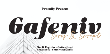 Gafeniv is Duo font Serif & Script. It has a elegant, and modern look which can be used for logos, establishing brand identities, crafting invitations, creating stunning stationery, shaping wedding designs, or producing eye-catching social media posts. Features: 5 Styles Font Numbers and punctuation Multilingual PUA encoded Thank You
 - Bolgate by Arsa Visual,
$9.00 Bolgate is a beautiful caligraphy font. This font works really well for Logos & Apparel Design. It's also great for creating Prints or Merchandise, as you can use the illustrative qualities of the shapes to create an art piece. Product includes: • Stylistic Alternates of Uppercase and Lowercase • Ligatures • Swash
 - View Roman Black - Personal use only

- mortis - Unknown license

- BrushType Longhand by Brush Art Design Office,
$52.00My name is Teruyoshi Matsui. I live in Japan. I am a Brush Artist. I artistically write the letters of the alphabet with a Japanese brush. I have created the font “ BrushType Longhand”. It was originally named "BrushType Alternative". But I changed my mind before it was completed. At first I aimed at an alternative font. But while I was trying to make it alternative, I realized that it was not. Of course there are many alternative letters that you have never seen before among them, so you have to be careful using the font. If you are a progressive and defiant designer trying to discriminate against others' designs, you should own my font "BrushType Longhand". Be ambitious! This is the word I will give you. I am ambitious ,too. No one in the world creates brush fonts like me. I am the only one as a Brush Artist though no one knows. I will be a world artist some day. So you should buy the font that is one of my favorite works. Thank you. - Monterey Popsicle NF Pro by CheapProFonts,
$10.00 A faux script font typical of classic american branding. I have totally reworked all the letterforms: they started with a “notch” and ended flat - I have removed the “notch” and rounded off the ending stroke, so now you can actually start words with the lowercase letters. I have also improved the spacing (especially after the capitals), and of course added all the “foreign” glyphs. A classic is reborn! Nick Curtis says: "Just another “somewhere from the thirties to the fifties” kinda script, named kinda after a sixties rock festival." ALL fonts from CheapProFonts have very extensive language support: They contain some unusual diacritic letters (some of which are contained in the Latin Extended-B Unicode block) supporting: Cornish, Filipino (Tagalog), Guarani, Luxembourgian, Malagasy, Romanian, Ulithian and Welsh. They also contain all glyphs in the Latin Extended-A Unicode block (which among others cover the Central European and Baltic areas) supporting: Afrikaans, Belarusian (Lacinka), Bosnian, Catalan, Chichewa, Croatian, Czech, Dutch, Esperanto, Greenlandic, Hungarian, Kashubian, Kurdish (Kurmanji), Latvian, Lithuanian, Maltese, Maori, Polish, Saami (Inari), Saami (North), Serbian (latin), Slovak(ian), Slovene, Sorbian (Lower), Sorbian (Upper), Turkish and Turkmen. And they of course contain all the usual “western” glyphs supporting: Albanian, Basque, Breton, Chamorro, Danish, Estonian, Faroese, Finnish, French, Frisian, Galican, German, Icelandic, Indonesian, Irish (Gaelic), Italian, Northern Sotho, Norwegian, Occitan, Portuguese, Rhaeto-Romance, Sami (Lule), Sami (South), Scots (Gaelic), Spanish, Swedish, Tswana, Walloon and Yapese.
 - Adelbrook by Vibrant Types,
$36.00 Adelbrook is a dynamic serif typeface that keeps calm. It enriches text with the archaic structure of humanist type, because its characters arrange in a harmonious rhythm with a dynamic stroke, asymmetric serifs and stems that lean in the direction of reading. These characters have gravity and are firmly on the baseline. The tapered stems define a heaviness that end in emphasized foot serifs. Actually all the details are heftier the lower they are. This is particularly evident in a subtle vertical hairline variation, light or unapplied head serifs, and clipped upper dots. The clearness of the semi-serif italics with a brushy nature integrates perfectly in a subtle way. All these details result in a sophisticated text typeface with a sharp contemporary design.
 - Marclane by Ironbird Creative,
$10.00 Marclane is a hand drawn slab serif typeface. This item consist of 4 fonts in various styles which you can play around with it and also come with MARCLANE DINGBAT to make better design. This typefaces is perfect for people looking for vintage aesthetic and organic feel or design needs with a touch of classic western. What Will You Get : Marclane Slab Serif Marclane Dingbat If you have any questions, please contact (ironbirdcreative@gmail.com)
 - La Paloma Script by Make Media Co,
$16.00 Add a touch of elegance to your work with La Paloma Script - A clean, modern, hand-written typeface with over 170 Ligatures and Decorative End Characters to add a dash of luxury to any project. And if you're looking for a lovely logo font, you just found it! La Paloma was designed with Branding in mind! But don't stop there, use this chic type in headlines & titles, signage, greeting cards, invitations & more!
 - Inglenook Corner NF by Nick's Fonts,
$10.00This whimsical wonder is based on the lettering of Laurence Schall, as presented in Lewis F. Day's 1910 classic, Alphabets Old and New. The typeface radiates a charm reminiscent of the works of many talented artists (including Howard Pyle and Arthur Rackham) who illustrated children's books around the turn of the twentieth century. The Opentype version of this font supports Unicode 1250 (Central European) languages, as well as Unicode 1252 (Latin) languages. - Woodgrit by Baseline Fonts,
$39.00The Woodgrit family could originally be found on broadsides (posters, playbills) throughout the midwest on any public announcements. All original letterforms available were incorporated into the set with little modification. Typographic convention was limited to creating three weight to serve the needs of the design community. Woodgrit Heavy is a perfect headline weight; Woodgrit Medium fits nicely in subheads, and Woodgrit Thin enables this chunky font to even work well as body copy. - McKellar Borussian NF by Nick's Fonts,
$10.00This unusual Gothic face was found in the 1882 McKellar, Smiths and Jordan specimen book under the name Borussian, a then-current variant of “Prussian”. This version is true to the original, so please note: a few of the uppercase characters—notably E and G—are rather unusual, so proceed with caution. All versions of this font include the Unicode 1250 Central European character set in addition to the standard Unicode 1252 Latin set. - Fabriga by LuxTypo,
$50.00 Fabriga speaks a familiar language in a distinctive voice. Ideas around clarity and tone informed all emblematic decisions. Fabriga’s structure and warmth are influenced by how its character set is approached as an ensemble while exploring individual ‘creative’ opportunities as they pose themselves throughout the process. Fabriga sets out to take a supportive role as a font family, understanding that one of its great strengths is its diversity in application and composition.
 - Antique Typewriter JNL by Jeff Levine,
$29.00 “Victoria Underwood” was found within the pages of the 1923 American Type Founders specimen book. It was one of many printing fonts faithfully replicating those used on various makes and models of actual typewriters. The purpose of such type was to allow mass production of letters or notices that could appear personalized rather than shop printed. Antique Typewriter JNL is the digital version of this design, and is available in both regular and oblique versions.
 - Coroner by Storm Type Foundry,
$39.00 I never needed to digitize this early design from 1988. I found it in a drawer underneath layers of dozens of other type designs. The drawings were made with ink on paper, about 15 cm high, meticulously executed and retouched separate glyphs for a primitive photo-lettering. I used a photographic magnifier to set words and lines in my darkroom. In 2018 I decided to make a font out of it just for fun...
 - Junior Clerk JNL by Jeff Levine,
$29.00 Junior Clerk JNL is the plain sans serif version of the lettering found on the cover of the sheet music for 1919's "The World is Waiting for the Sunrise". The song title was originally set in a decorative sans serif with an engraved line adorning each character. This version of the more fanciful design is available as the companion font Legal Eagle JNL. Junior Clerk JNL is available in both regular and oblique versions.
 - Poseidon by Club Type,
$36.99 Ancient Olympian god of the sea, brother of Zeus; Poseidon is the bearer of a trident, the three pronged spear of tunny fishers and is drawn along by monstrous sea creatures-half horse, half serpent. Around him travels an entire retinue of dolphines, nereids, seals and different spirits of the sea. Likewise, the Poseidon font family is accompanied by the waved serifs and flourishes that enable its character to retell these ancient Greek myths.
 - Lateral Incised NF by Nick's Fonts,
$10.00Gravure was designed by Morris F. Benton in 1927 for American Type Founders and was also released in 1929 by the London foundry of C. W. Shortt. This luminous face has a slightly naïve charm seldom found in incised typefaces. Ornamental and engaging, it’s a perfect choice for headlines with warmth and grace. Both versions of the font include 1252 Latin and 1250 CE (with localization for Romanian and Moldovan) character sets. - Azoft Sans - 100% free

- Ganz Grobe Gotisch by URW Type Foundry,
$39.99 It is not only coarse but extremly black, and it is quite right to name it Black Letter in English. Ernst Schneidler, the designer, created the smallest possible counters. Still, this very coarse black letter is sensitive in detail and drawn with a high level of aesthetics. By the way, it was said in Schneidler's design class in Stuttgart that his number one student Walter Brudi had cut some of the characters with �silhoutte scissors� from black paper. Sharing his ideas and work with his students does not at all decrease or lower his copyright.Ganz Grobe Gotisch is not only a distinguised but also a very catchy design.(Albert Kapr in Fraktur -- �Form und Geschichte der gebrochenen Schrift�.)
 - Furniture Type by Forme Type,
$19.99 Forme Furniture Type Em and Furniture Type En Designed by using the pieces of letterpress furniture usually hidden, to create letter shapes. The square nature of the type means it could be used as a low resolution type. Forme Furniture Type Em – Low resolution type. Designed using *Furniture and **Em quads from letterpress printing. *Furniture: Pieces of wood or metal placed around or between metal type to make blank spaces and fasten the printed matter in the chase. ** Quads: (originally quadrat) is a metal spacer used in letterpress typesetting. An em quad is a space that is one em wide and one em high. Also available as Em Shadow to be used as a headline or display font. Forme Furniture Type En – Low resolution type. Designed by using *Leads and ** En quads from letterpress printing. *Lead or Reglet is a piece of Lead or wooden spacing material used in letterpress typesetting, to provide spacing between paragraphs. **An En quad is a space that is one En wide half the width of an Em quad, and the same height as the typeface. Also available as En Shadow to be used as a headline or display font.
 - Calcis by Eurotypo,
$24.00 “Chalkís” or “Chalkida” was the capital of the Euboea island in old Greece. The name derived from the Greek and it means copper - bronze. Colonist from this area founded several important cities in the Magna Graecia, such as Cumae (coastal area of Southern Italy), where our alphabet come from. At the beginning, first scribes draw the signs in mono-line, but later on, the influence of materials, tools and the skill of calligraphers, developed the refinement of the lettering. “Calcis” is a family of sans serif fonts, characterized by its austere, functional and clear style, emerged from straight lines and primary shapes; but enriched by the contribution of countless anonymous calligraphers who have polished and embellished their forms over the years. “Calcis” is presented in five weights and italic style. It has good legibility in small sizes, elegance and strong visual impact in headlines as well. Each font of the family contain 377 glyphs with accurate kerning pairs careful controlled, and advanced typographical support with OpenType features such as: old style numerals, ligatures, discretional ligatures and case-sensitive forms. It also contain diacritics for Central European languages.
 - Kompakt by Linotype,
$29.99 Kompakt is one of the early typefaces of type designer Hermann Zapf, whose Palatino has long been a standard in almost every area of application. Kompakt consists of a single weight and was designed in 1952, two years after Palatino. It was produced by the foundry D. Stempel AG in Frankfurt am Main, Germany, where Zapf was at the time in the artistic department. The figures of this extremely strong and heavy typeface are decidedly those of a broad tipped pen. When enlarged, the sharp outlines of the characters can be clearly seen. The unique dynamic of the alphabet is a result of its strong serifs, which on the lower case letters almost connect the letters in a line. Together with the slight slant to the right, this gives Kompakt the character of handwriting, making it look like it is always striving to go forward. Kompakt is an excellent choice for advertisements, especially for posters which should display a hint of nostalgia, and should be used only in headlines.
 - Optic Art by Eurotypo,
$32.00 Opticart is a family of glyphs inspired by Op Art (Optical Art). They include 133 models -- each letter is a subfamily that can combine overlapping (A, a, a.salt and A.swsh) and thus generate more than 365 glyphs, or thousands if we combine different letters or symbols. Opticart is so easy to use, user does not need guidance, just repeat typing [aaaa, bbbb, etc.] or do overlap them and repeat [(a + A) (a + A) (a + A), etc.] You may overlay and combine shapes with colors as you please.
 - Runway by Canada Type,
$24.95 Runway is the font that will satisfy the need for speed in your design. Simple lines and curves, a commanding slant, and big sturdy shapes made to cruise at any speed or altitude, through summer breeze or horrible snowstorms. Runway was designed to be tight like an engine chain, powerful like the hum of the engine itself, and simply the best choice when it comes to strength and velocity in design. Initially Runway was meant to be a single font. But during the spacing and kerning stages, Patrick noticed that most of the letters, especially the vowels and the s, can clasp stylishly with the L or the T to make some really funky combinations. That's how the Alternates font was born. After building a few alternates and about 40 "clasped" combinations around the L and the T, the decision was made to take Runway to the next level: OpenType. The OpenType version of Runway is a single font that contains some serious font magic. Some of the many features the font includes: Over 430 characters for that great character map utility you have, automatic to-and-fro small-capping, discretionary ligatures that call up some pretty funky combinations automatically as you type, and a lot of stylistic and contextual alternates for many characters, ligatures and composites. If your design program of choice supports the features of OpenType fonts (Illustrator CS, Photoshop CS, InDesign CS), then you're in for a lot of enjoyment playing with Runway. For those who don't fancy OpenType or can't handle it, Runway is also available (in Regular, Caps and Alt styles) in the usual font formats for both Mac and PC.
 - Art Gothic HiH by HiH,
$10.00 Art Gothic was attributed to the Central Type Foundry of St. Louis, Missouri, USA by Henry Lewis Bullen, writing in INLAND PRINTER in 1907, with a reproduction shown in Kelly’s American Wood Type. The typeface appears on the cover of an issue of “The Superior Printer” pictured in Typology by Heller and Fili dated in the 1870s. Art Gothic was designed in 1884 by Gustav Schroeder and proved to be one of the more popular and enduring of the American-designed Victorian display faces of the period, appearing frequently in ads in various publications. The Hamilton Mfg. Co showed a very similar wood type, No. 232, with a modified and rather heavy-handed upper case in 1892. As late as 1897, it may be found in the advertising section of The Ivy of Trinity College of Hartford, Connecticut and was included in the Norwood Press 1902 Specimen Book. Our font includes a complement of five upper case and four lower case alternatives as follows: 123=C, 125=E, 135=H, 137=S, 172=c, 175=e, 215=m and 247=s. Great for period pieces. ART GOTHIC HIH is clean, readable, and surprisingly modern-looking; unlike so many overly complex Victorian display fonts, it can be used in text sizes.
 - Kingthings Petrock Pro by CheapProFonts,
$10.00 For these fonts I have reworked the spacing a bit, and completely redesigned the "N" as they were calligraphically very wrong. Kevin King says: "Petrock is based on letterforms found in a small city Church in Exeter - from a display case about bell ringing. A lovely simple labeling hand, I think I've done it justice... Petrock Light is a lighter form of Petrock - makes both of them more usable." ALL fonts from CheapProFonts have very extensive language support: They contain some unusual diacritic letters (some of which are contained in the Latin Extended-B Unicode block) supporting: Cornish, Filipino (Tagalog), Guarani, Luxembourgian, Malagasy, Romanian, Ulithian and Welsh. They also contain all glyphs in the Latin Extended-A Unicode block (which among others cover the Central European and Baltic areas) supporting: Afrikaans, Belarusian (Lacinka), Bosnian, Catalan, Chichewa, Croatian, Czech, Dutch, Esperanto, Greenlandic, Hungarian, Kashubian, Kurdish (Kurmanji), Latvian, Lithuanian, Maltese, Maori, Polish, Saami (Inari), Saami (North), Serbian (latin), Slovak(ian), Slovene, Sorbian (Lower), Sorbian (Upper), Turkish and Turkmen. And they of course contain all the usual "western" glyphs supporting: Albanian, Basque, Breton, Chamorro, Danish, Estonian, Faroese, Finnish, French, Frisian, Galican, German, Icelandic, Indonesian, Irish (Gaelic), Italian, Northern Sotho, Norwegian, Occitan, Portuguese, Rhaeto-Romance, Sami (Lule), Sami (South), Scots (Gaelic), Spanish, Swedish, Tswana, Walloon and Yapese.
 - Derania by limitype,
$15.00 Derania is a typeface that is inspired by the shape of the monstera leaf, Derania is made with fun and bold fonts. Derania is equipped with uppercase numbers, symbols, icon and some multilingual
 - Love Affair by Gleb Guralnyk,
$12.00 Love Affair is an art nouveau vintage style font. It's an old-school typeface, perfect for creating some classic lettering compositions. Love Affair includes lots of ligatures to create more organic text shape.
 - Trainbridge by Curvature Creations,
$10.00 My font Trainbridge is created by Power Point shapes, Block Arc and flowchart. It resembles a train and bridge, which gives it a unique look that will be eye catching and out standing.
 - Marmo by Stefano Giliberti,
$15.00 Marmo is a font family with sharp-edged and thick-bodied character. It supports 113 languages, features a total of 486 glyphs and includes an italicized version for each of the 5 weights.


