10,000 search results
(0.099 seconds)
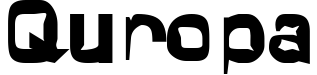
- Quropa - Unknown license
- Casper Comics - Personal use only

- Cry Uncial - Unknown license

- Parshanut MF by Masterfont,
$59.00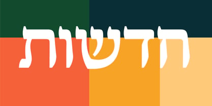 A modern touch to a Biblical oriented font. High legibility as text font.
 - Josephs Brush Pro by SoftMaker,
$9.99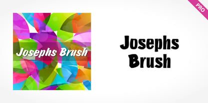 Josephs Brush Pro is one of the fonts of the SoftMaker font library.
 - Toxic Marker by Pedro Teixeira,
$14.00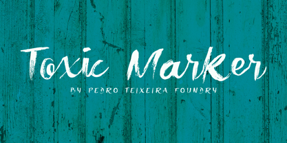 A font based on extreme texture marker. Dry brush script, modern calligraphy font.
 - Yakety Yak by BA Graphics,
$45.00A great fun font a happy-go-lucky font with a loose look. - Violin Script Pro by SoftMaker,
$9.99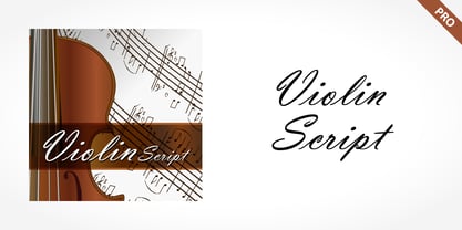 Violin Script Pro is one of the fonts of the SoftMaker font library.
 - Amsterdamer Garamont Pro by SoftMaker,
$14.99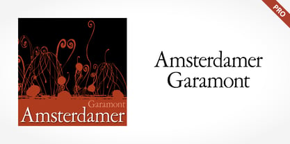 Amsterdamer Garamont Pro is one of the fonts of the SoftMaker font library.
 - Caslon Antique Pro by SoftMaker,
$9.99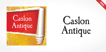 Caslon Antique Pro is one of the fonts of the SoftMaker font library.
 - Prismatic Spirals Pro by MMC-TypEngine,
$182.00 PRISMATIC SPIRALS PRO FONT! The Prismatic Spirals PRO is a Decorative Type-System and ‘Assembling Game’, itself. Settled in squared pieces modules or tiles, embedded by unprecedented Intertwined Prismatic Structures Design, or intricate interlaced bars that may seem quite “impossible” to shape. Although it originated from the ‘Penrose Square’, it may not look totally as an Impossible Figures Type of Optical Illusions. More an “improbable” Effect in its intertwined Design, that even static can seem like a source of Kinetical Sculptures, or drive eyes into a kind of hypnosis. Prismatic Spirals Pro has two related Typefaces both more basic or easier to use versions, the Default Family plus its “bold” braided version Prismatic Interlaces… PRO provides a more advanced, complex, and twisted Design, plus requires to be typed alternating caps. Instructions: Use the Map Font Reference PDF as a guide to learn the 'tiles' position on the keyboard, then easily type and compose puzzle designs with this font! All alphanumeric keys are intuitive or easy to induce, you may easily memorize it all! Plus, often also need to consult it! *Find the Prismatic Spirals Pro Font Map Reference PDF Here! (!) Is recommended Print it to have the Reference or open the PDF to also copy and paste, when consulting is required or when it may be difficult to access, depending on the keyboard script or language. The 2 glyphs sets are separated in colors for facilitating. Also use the Map Font with key captions or switch to it for ensure that the characters are alternating between both uppercase and lowercase letters as other Keys as numbers, marks, and punctuation along the strings, holding Shift one by one or actually two by two. As a Tiles Type-System, the line gap space value is 0, this means that tiles line gaps are invisibly grouted, so the user can compose designs, row by row, descending to each following row by clicking Enter, same as line break, while advances on assembling characters. Background History: The first sketches of my Prismatic Knots or Spirals Designs dates back then from 2010, while started developing hand-drawn Celtic Knots and Geometric Drawings in grid paper, while engage to Typography, Sacred Geometry and the “Impossible Figures” genre… I started doing modulation tests from 2013, until around 2018, I got to unravel it in square modules or tiles from the grid, then idealized it as fonts, along with other Type projects. This took 13 years to come out since the first sketches and 6 months in edition. During the production process some additional tiles or missing pieces were thought of and added to the basic set, which firstly had only the borders, corners, crossings, nets, Trivets connectors or T parts and ends, then added with nets and borders integrations. Usage Suggestions: This type-system enables the user to ornate and generate endless decorative patterns, borders, labyrinthine designs, Mosaics, motifs, etc. It can seem just like a puzzle, but a much greater tool instead for higher purposes as to compose Enigmas and use seriously. As like also to write Real Text by assembling the key characters or pieces, this way you can literarily reproduce any Pixel Design or font to its Prismatic Spirals correspondent form, as Kufic Arabic script and further languages and compose messages easily… This Typeface was made to be contemplated, applied, and manufactured on Infinite Decorative Designs as Pavements, Tapestry, Frames, Prints, Fabrics, Bookplates, Coloring Books, Cards, covers or architectonic frontispieces, storefronts, and Jewelry, for example. Usage Tips: Notice that the line-height must be fixed to 100% or 1,0. In some cases, as on Microsoft Word for example, the line-height default is set to 1,15. So you’ll need to change to 1,0 plus remove space after paragraph, in the same dropdown menu on Paragraph section. Considering Word files too, since the text used for mapping the Designs, won't make any literal orthographical sense, the user must select to ignore the Spellcheck underlined in red, by clicking over each misspelled error or in revision, so it can be better appreciated. Also unfolding environments as Adobe Software’s, the Designer will use the character menu to set body size and line gap to same value, as a calculator to fit a layout for example of 1,000 pts high with 9 tiles high, both body size and line gap will be 111.1111 pts. Further Tips: Whenever an architect picks this decorative system to design pavements floor or walls, a printed instruction version of the layout using the ‘map’ font may be helpful and required to the masons that will lay the tiles, to place the pieces and its directions in the right way. Regarding to export PNGs images in Software’s for layered Typesetting as Adobe Illustrator a final procedure may be required, once the designs are done and can be backup it, expanding and applying merge filter, will remove a few possible line glitches and be perfected. Technical Specifications: With 8 styles and 4 subfamilies with 2 complementary weights each (Regular and Bold) therefore, Original Contour, Filled, Decor, with reticle’s decorations and 2 Map fonts with key captions. *All fonts match perfectly when central pasted for layered typesetting. All fonts have 106 glyphs, in which 96 are different keys with 2 versions of each of both caps and shift keys, plus a few repeated for facilitating. It was settled this way in order for exchanging with its Prismatic relative fonts which has only 48 different keys repeated twice. Concerning tiles manufacturing and Printed Products as stickers or Stencils, any of its repeated pieces was measured and just rotated in different directions in each key, so when sided by other pieces in any direction will fit perfectly without mispatching errors. Copyright Disclaimer: The Font Software’s are protected by Copyright and its licenses grant the user the right to design, apply contours, plus print and manufacture in flat 2D planes only. In case of the advent of the same structures and set of pieces built in 3D Solid form, Font licenses will not be valid or authorized for casting it. © 2023 André T. A. Corrêa “Dr. Andréground” & MMC-TypEngine.
 - Certto Headline - Unknown license

- Flying Colours Don't Run - Unknown license

- Spin Cycle OT - 100% free

- Rickles - Personal use only

- Pyramidhead - Personal use only

- WC Wunderbach Wimpern - Unknown license

- KrazyKool - Unknown license

- Turnpike - Personal use only

- Roguedash by Stringlabs Creative Studio,
$25.00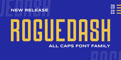 Roguedash is a stylish sans serif font family. This font is perfect for anyone who like strong style. Also, this font has Sporty, trendy, Futuristic, Modern, Elegant, Creative, and Unique Concept.
 - Rosemarine by ahweproject,
$9.00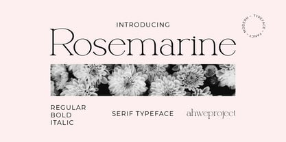 Rosemarine is an elegant and clean serif font. Whatever the topic, this font will be a wonderful asset to your font library, as it has the potential to enhance any creation.
 - PN Sharkypants by Illustration Ink,
$3.00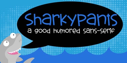 This whimsical font family is a hand-crafted, youthful sans-serif font with three weights and two cute sister fonts...a shadow version and a "showy" version with curls and flourishes.
 - Lost Land by Umbra95,
$20.00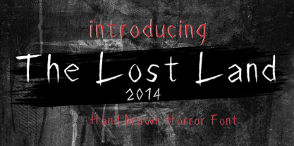 Lost Land is a horror hand drawn font. The font made for cover design, logos, headlines, apparel design, magazine titles etc. Font includes multi-lingual and currency support, numerals, and punctuations.
 - Dagota by ArimaType,
$18.00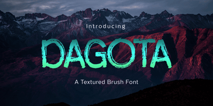 Dagota is a cool, brushed display font. No matter the topic, this font will be an incredible asset to your fonts’ library, as it has the potential to elevate any creation.
 - Thing by Umka Type,
$19.00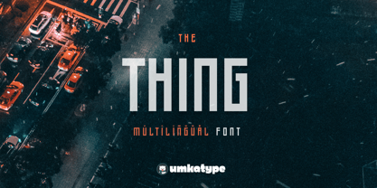 Thing - A Display Font : Thing is a carefully crafted display font. It has Extended Latin characters. It created for poster, web, brand and social media designs. This is all Caps Fonts.
 - Cordial by Elemeno,
$25.00Cordial is a solid, friendly font. Like other informal script fonts, Cordial works in nearly any context. This font was originally named Pulpatoon, but the designer's wife made him change it. - Ashley & Mellisa by GlyphStyle,
$16.00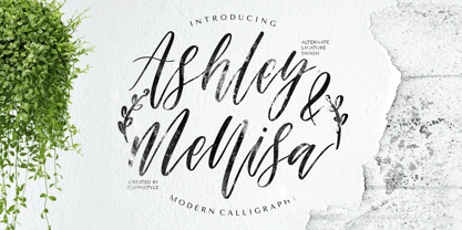 Ashley & Mellisa is a handwritten font with a modern calligraphy style, with up and down lettering. Sweet and lovely font - Font feature Uppercase, Lowercase, Numerals & Punctuations, Stylistic alternate Ligature, Swashes, Multilanguage
 - Rockwell WGL by Monotype,
$92.99Rockwell font appeared with Monotype Design Studio in 1934, a time which saw the return to popularity of slab serif fonts. Rockwell's strong and harmonious characters make this font particularly flexible. - Arsis by URW Type Foundry,
$35.99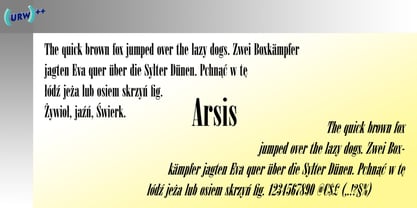 Arsis Regular Font was designed by Gerry Powell in 1937. It is a Serif (Antiqua) Modern Style font. Arsis Regular font attributes include roman serif, Didone, elegant, formal, modern style, feminine.
 - Ps Campen by Fontopia,
$25.00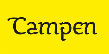 psCampen is a contemporary font with a medieval experience. The font can be used as a display variant in addition to the font psKampen. It is also useful for short texts.
 - Christy Marie by Elemeno,
$25.00Christy Marie likes fun fonts. This was the first font to meet with her approval. It's bouncy, teenage girl sort of font and would do well at parties or the mall. - Briskly Cabrales by Crumphand,
$19.00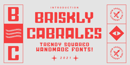 Hello, Introducing my new font "Briskly Cabrales" The Briskly Cabrales is block handmade font. Strong, elegant, modern, calm. What's Inside The Fonts ? Uppercase Lowercase Symbols Numerals European Multilungual Thank you, Regards!
 - Shining Night by Gleb Guralnyk,
$15.00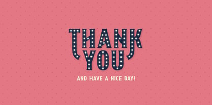 Hi! Introducing a vintage style font Shining Night. This font has additional font file with round dots over the base glyphs, that immitates a lamp lights of a real cabaret signboard.
 - Retrograph by GlyphStyle,
$15.00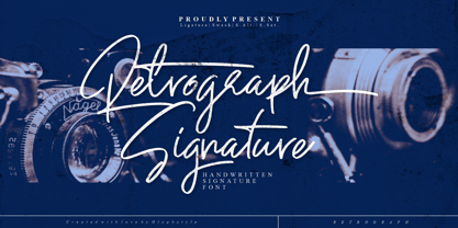 Retrograph is a handwritten font that looks neat and clear. Consistent lines make this font neat and beautiful. Font feature Uppercase, Lowercase, Numerals & Punctuations, Stylistic Alt, Stylistic Set, Swash Ligature, Multilanguage
 - Poliphili by Flanker,
$19.99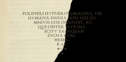 Hypnerotomachia Poliphili, which can be translated in English as “Dreaming Love Fighting of Poliphilus”, is a romance about a mysterious arcane allegory in which the main protagonist, Poliphilo, pursues his love, Polia, through a dreamlike landscape. In the end, he is reconciled with her by the “Fountain of Venus”. The author of the book is anonymous, however, an acrostic formed by the first, elaborately decorated letter in each chapter in the original Italian reads “POLIAM FRATER FRANCISCVS COLVMNA PERAMAVIT”, which means “Brother Francesco Colonna has dearly loved Polia”. Despite this clue, the book has also been attributed to many other authors. The identity of the illustrator is less certain than that of the author. It was first published in Venice, in December 1499, by Aldo Manutio. This first edition presents an elegant and unique page layout, with refined woodcut illustrations in an Early Renaissance style and a refined Roman font, cut by Francesco da Bologna, which is a revised version of the type used in 1496 for the De Aetna of Pietro Bembo. The print quality is very high for the time, but nevertheless it presents many inconsistencies and imperfections due to the non-ideal inking and adherence of the matrix to the paper. For that reason numerous samples of the original have been used to create every single glyph which will result in an appropriate reconstruction and not a mere and humble reproduction. Some letters like \J, \U and \W were extrapolated, because they are not part of the original alphabet of the period. Some letters like \Q, \X, \Y, \Z and \h have been updated to more modern variants, but the original shape is accessible by Stylistic Alternates Opentype Feature, which also changes the shape of the \V and the \v. The original numerals \zero, \one, \tree, \four and \six have been accompanied by reconstructions of the missing numbers and extended by modern figures. Finally, swashed lower cases and original scribal abbreviations were also included. The font has joined by a matching Italic variant, closely inspired from Aldo Manuzio's 1501 "Vergilius", the first book printed entirely in Italic type by Francesco da Bologna.
 - Oktah Neue by Groteskly Yours,
$25.00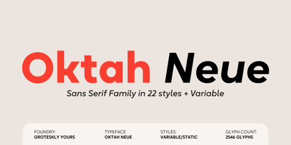 Oktah Neue is an extended version of a more limited Oktah family. Since its release in 2019, Oktah Neue received two major updates, the most recent in June 2022. The latest version of Oktah Neue is comes in 22 styles as well as one variable font. Oktah Neue inherits the best traits of Oktah—great legibility, simple geometric letters shapes, low contrast across all styles—but also introduces what Oktah fell short of: extensive language support and enhanced OpenType features. While working on Oktah Neue, we strove to create a neutral typeface that would be a workhorse for designers, typographers and other font users alike. Building onto the familiar shapes of Oktah, we tried to make them more neutral, at the same time preserving the unique character of the typeface. Certain characters remained the same, others have undergone a complete transformation, which left them better tailored for the wide implementation range of Oktah Neue. Over the past years the size of the character set in Oktah Neue was significantly expanded (currently standing at 2500+ characters). In addition to Extended Latin, new language systems (Extended Cyrillic, Greek — both Basic and Polytonic — and Hebrew) were introduced. The already vast Cyrillic set also includes localised forms for such languages as Bulgarian, Serbian and many others. Oktah Neue is OpenType friendly: it knows how to do alternatives, contextual alternatives, switch various between stylistic sets and adjust the height of punctuation and symbols as you type. Small Caps include all listed languages as well as numerals and symbols. Oktah Neue comes equipped with various styles of numerals — from standard Proportional Lining figures to Oldstyle, Tabular Oldstyle. Sub- and Superscript, Fractions and two sets of circled numbers. Oktah Neue is well-kerned with more than 3000 kerning pairs and automatically hinted. Oktah Neue comes in 22 styles (11 uprights and 11 italics), two of which — Ultra Light and Black Italic — can be downloaded free of charge to get a firsthand experience of what Oktah Neue is ready to offer. The latest update of Oktah Neue introduced a fully variable option: now, both axes (Slant and Weight) can be accessed in the same file for utmost convenience.
 - Whitenights by Linotype,
$29.99Whitenights is a contemporary text family, which was developed by the prolific Swedish typographer Lars Bergquist in 2002. Containing five weights (11 different fonts total), this family contains every tool you need to set splendid text. The base font of the family is Whitenights Regular, a reliable face designed in the old style manner. It ships in OpenType format, with old style figures. Whitenights Ligatures Regular is a supplementary font, which contains many extra ligatures (e.g., ffb, ffk, tt, and fj) whose use will improve the color" of a page of text set in Whitenights Regular. Whitenights Regular may be accented by combination with Whitenights Small Caps, Whitenights Italic, Whitenights Bold, and/or Whitenights Bold Italic. The Whitenights Italic, Bold and Bold Italic styles all have supplementary Ligature fonts available for purchase, similar to the Whitenights Ligatures Regular face described above. For larger, headline text, the specially designed Whitenights Titling is quite useful. This titling font has been optically redrawn and respaced for use in large sizes. Naturally, it has its own supplementary Ligature font as well. In books, magazines, and newsletters this font is a great display companion to the rest of the Whitenights family. Its use in conjunction with the text faces will make your typographical compositions more sophisticated. Last but not least in the Whitenights family is Whitenights Math, which contains many additional mathematical and logical glyphs not found in a standard font's character set. Used together, the above 12 styles can set almost any text or math-based document. The entire family is included in the Take Type 5 collection from Linotype GmbH." - Ethnocentric - Unknown license

- Good Times - Unknown license

- Street Cred - Unknown license


