10,000 search results
(0.096 seconds)
- Alterica Monchins by Maulana Creative,
$16.00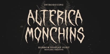 Alterica Monchins horror display font. Bold stroke, fun character with a bit of ligatures and alternates. To give you an extra creative work. Alterica Monchins horror display font support multilingual more than 100+ language. This font is good for logo design, Social media, Movie Titles, Books Titles, a short text even a long text letter and good for your secondary text font with script or serif. Make a stunning work with Alterica Monchins horror display font. Cheers, Maulana Creative
 - Macklin Variable by Monotype,
$156.99Designed by Malou Verlomme of the Monotype Studio, Macklin is a superfamily, which brings together several attention-grabbing styles. Macklin is an elegant, high contrast typeface that demands its own attention and has been designed purposely to enable brands to appeal more emotionally to modern consumers. Macklin comprises four sub-families —Sans, Slab, Text and Display— as well as a variable. The full superfamily includes 54 fonts with 9 weights ranging from hairline to black. The concept for Macklin began with research on historical material from Britain and Europe in the beginning of the 19th century, specifically the work of Vincent Figgins. This was a period of intense social change--the beginning of the industrial revolution. A time when manufacturers and advertisers were suddenly replacing traditional handwriting or calligraphy models and demanding bold, attention-grabbing typography. Typographers experimented with innovative new styles, like fat faces and Italians, and developed many styles that brands and designers continue to use today, such as slabs, serifs, and sans serifs. Verlomme pays respect to Figgins’s work with Macklin, but pushes the family to a more contemporary place. Each sub family has been designed from the same skeleton, giving designers a broad palette for visual representation and the ability to create with contrast without worrying about awkward pairings. With Macklin, Verlomme shows us it’s possible to create a superfamily that allows for complete visual expression without compromising fluidity. - Martin Gothic by URW Type Foundry,
$35.99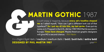
- Neue Aachen by ITC,
$40.99 Impressed by the quality of the Aachen typeface that was originally designed for Letraset in 1969 and extended to include Aachen Medium in 1977, Jim Wasco of Monotype Imaging has extended this robust display design to create an entire family. Derived from the serif-accented Egyptienne fonts dating to the early 20th century, Aachen has serifs that are very solid but considerably shorter than those of its precursor. The incorporated geometrical elements, such as right angles and straight lines, provide the slender letters of Aachen with a slightly technological, stencil-like quality. Despite this, the effect of Aachen is by no means static; its dynamism means that this typeface, originally designed for use in headlines, has come to be used with particular frequency in sport- and fitness-related contexts. Jim Wasco, for many years a type designer at Monotype Imaging, recognized the potential of Aachen and decided to extend the typeface to create an entire typeface family. He appropriated the existing Aachen Bold in unchanged form and first created the less heavy cuts, Thin and Regular. Wasco admits that he found designing the forms for Thin a particular challenge. It took him several attempts before he was able to achieve consistency within the glyphs for Thin and, at the same time, retain sufficient affinity with the original Aachen Bold. But he finally managed to adapt the short serifs and the condensed and slightly geometrical quality of the letters to the needs of Thin. The weights Light, Book, Medium and Semibold were generated by means of interpolation. Supplemented by Extralight and Extrabold, the new Neue Aachen can now boast a total of nine different weights. Wasco initially relied on his predilection for genuine cursives in his designs for the Italic cuts. But it became apparent with these first trial runs that the soft curves of cursives did not suit Aachen and led to the loss of too much of its original character. Wasco thus decided to compromise by using both inclined and cursive letters. Neue Aachen Italic is somewhat narrower than its upright counterparts; the lower case 'a' has a closed form while the 'f' has been given a descender, but the letters have otherwise not been given additional adornments. The range of glyphs available for Neue Aachen has been significantly extended, so that the typeface can now be used to set texts not only in Western but also Central European languages. Wasco has also added a double-counter lowercase 'g' while relying on the availability of alternative letters in the format sets for the enhancement of the legibility of Neue Aachen when used to set texts. The seven new weights and completely new Italic variants have enormously increased the potential applications of Aachen and the range of creative options for the designer. While the Bold weights have proved their worth as display fonts, the new Book and Regular cuts are ideal for setting text. And the subtlety of Ultra Light will provide your projects with a quite unique flair. The new possibilities and opportunities in terms of design and applications that Neue Aachen offers you are not restricted to print production; you can also create internet pages thanks to its availability as a web font.
 - Margin Notes by The Arborie,
$11.00 Margin Notes font offers a natural handwriting look. It had imperfect, organic curves and off set lines that imitate natural hand written writing. Give this handwriting font a try with note-taking, organization or even a back to school poster.
 - Vaccine Sans by ParaType,
$30.00 Vaccine Sans is a humanist sans-serif font family with soft terminals, but stem junctions on the contrary use hard constructions. Such combination of basic design features makes the font distinct and strong in setting and delicate and soft in appearance. This design peculiarity, together with very low contrast, produces a range of qualities needed for small sizes, low quality print and bad reading conditions. Vaccine Sans has a modern stylish design and takes its rightful place among popular faces. The family consists of 10 members — five weights with the corresponding italics. It can be used in a wide range of applications — magazines, advertising, corporate identity, urban navigation, packaging, children books, etc. Designed by Manvel Shmavonyan with the participation of Alexandra Korolkova and Gayaneh Bagdasaryan.
 - Aachen SH by Scangraphic Digital Type Collection,
$26.00Since the release of these fonts most typefaces in the Scangraphic Type Collection appear in two versions. One is designed specifically for headline typesetting (SH: Scangraphic Headline Types) and one specifically for text typesetting (SB Scangraphic Bodytypes). The most obvious differentiation can be found in the spacing. That of the Bodytypes is adjusted for readability. That of the Headline Types is decidedly more narrow in order to do justice to the requirements of headline typesetting. The kerning tables, as well, have been individualized for each of these type varieties. In addition to the adjustment of spacing, there are also adjustments in the design. For the Bodytypes, fine spaces were created which prevented the smear effect on acute angles in small typesizes. For a number of Bodytypes, hairlines and serifs were thickened or the whole typeface was adjusted to meet the optical requirements for setting type in small sizes. For the German lower-case diacritical marks, all Headline Types complements contain alternative integrated accents which allow the compact setting of lower-case headlines. - Gold by FontMesa,
$29.00 Gold is all new for 2021, the complete family has been rebuilt using the multiple masters technique. In this new version we've removed any alternatives that could not be shared across all weights in the family and we've trimmed a few others that just were not practical in keeping a consistent look to the whole font. All the alternates now have matching accented glyphs across all weights. Case sensitive forms have also been added to all weights. With 14 weights the difference between weights are closer together which may give you the effect of a variable font where variable fonts are not supported. For technical reasons the original Gold family has now been split into two families with Gold having ten weights and the four heavier weights under the Gold Magnum family. The Gold and Gold Magnum font families support accented characters for western, central and eastern European countries. Gold comes with OpenType features to access the alternate glyphs however you will need an application such as Adobe Creative Suite to take advantage of alternate glyphs.
 - Olis by Roman Polishchuk,
$34.00 Olis is a stylish, fresh new handwritten script. Olis comes with two weights, numerals, punctuations, and some variations on character including OpenType alternates, and common ligatures. It helps set your designs apart by adding a custom-lettered look. You will also find that its initial and terminal letters can enhance your designs in new and creative ways. Hand-drawn leaves, plants, flowers, as well as large and small snowflakes add original detail while complementing the font perfectly. If you like this font you might also like an aesthetic text generator by the same author.
 - Odds by DearType,
$30.00 Say hello to Odds - a versatile, chunky casual sans with lots of personality! It’s fresh, friendly and easy to read. It is also a great mix of boldness and cuteness, so it definitely captures attention. The Odds family comes in five distinct fonts styles : - Odds - an artistic handwritten-style sans - Odds Sans - a typical neat and clean sans (caps and small caps which you can mix & match) - Odds Narrow - a cute handwritten narrow sans (uppercase and lowercase), and two awesome sets of goodies: - Odds Extras - borders, arrows, speech bubbles, etc. - Odds Symbols - palm leaves, plants, fruits and other useful objects. Odds works great on a variety of mediums from web to print, but you can find it particularly useful if you're designing food packaging (actually any packaging) and clothes. Other awesome usages include posters, signage, ads, printed and personalized cards, t-shirts, sale banners, everything kids related - merchandise, toys, you name it. Its quirky character and fat letters make up for bold and friendly presentation while the slender letters of the Odds Sans and Odds Narrow are perfect for plain text. And yes, all fonts have Cyrillic! They also have some neat ligatures and alternates to spice up your designs and create more interest!
 - Bolded by We Make Font,
$16.00 Bolded is a new complete type family, designed and developed by creative professionals. Contains geometric and rounded features, optimized for both long texts and small screens and texts. The complete family offers seven weights divided between the basic, italic, condensed and condensed italic family. Created in 2022, Bolded has a modern and functional look, designed for the most diverse uses and projects. Bolded is a geometric rounded family that can meet the needs of the most varied professionals looking for a clean and elegant font family with a wide set of Latin characters.
 - Nolde by Brownfox,
$21.99 Nolde is a new titling typeface named after the German-Danish painter and printmaker Emil Nolde, one of the first artists to work in the Expressionist style. Not unlike the work of Nolde the artist, the seemingly rhythmical characters of Nolde the typeface conceal expressive tension of form and nervous line quality. While its letterforms hearken to the early-20th c. foundry types, this font makes a fresh and decidedly current impression, making it suitable for cutting-edge display use. Nolde capitals are available in two weights: regular and outline, and support over 60 languages that employ Latin and Cyrillic scripts.
 - Bolde by Figuree Studio,
$18.00 Bolde is a powerful sans serif font family with modern touches. A balance of hard lines and smooth curves makes them able to stand on their own dynamically Features: five all caps font, Numbers & Punctuation / Extensive Language Support Bolde works great in any branding, logos, magazines, film. The different styles give you the full range to explore a whole host of applications. Thanks for having a peek at Bolde. As always, if you have any questions just send me a message!
 - Molde by Letritas,
$25.00 Molde is a super sans serif font family, belonging to the neo-grotesque style. Formally, Molde was inspired by the extreme sobriety of famous post-Bauhaus Swiss Movement of the mid-twentieth Century. The masters of this style are famous for eliminating all the ornaments, as a brilliant mind said “Ornament und Verbrechen”(Ornament and Crime) as a creation law: ending up with only the essential. Thanks to the purity of its shapes, Molde spreads the message as clear as possible and this quality makes it much more versatile than any other typography. Molde can be therefore used in all types of designs, If we consider its personality and its amount of weights and widths. Molde is composed of 6 widths ranging from the tablet to the expanded and in the set of characters includes a Unicase version and a small caps version. The family is composed of 3 parts: the regular version, the italic version and the reverse version. Each one of them has 9 weights. Each weight has 649 characters and it has been thought for 219 latin languages.
 - Zold by EMME grafica,
$9.90 Zold is the first font designed by EMME Grafica. It's a simple, statuesque, architectural, eye-catcher, tough yet elegant font, particularly suitable for titling, subtitling, branding and typographic amusements. The solemnity of Zold does not affect the the elegance of the curves of the font, but gives it the right visibility and temper, like that of Zold, the surly character who will be the antagonist of a multimedia project currently under development at EMME Grafica.
 - BN Suck My Balls - Unknown license

- XXII DONT-MESS-WITH-VIKINGS - Unknown license

- 101! Your FontZ Are Served - Unknown license

- XXII DONT MESS WITH VIKINGS by Doubletwo Studios,
$-
- Cyrillic Old Face - Unknown license

- Old Standard TT - 100% free

- Old Rubber Stamp - 100% free

- SF Old Republic - Unknown license

- SF Old Republic - Unknown license

- Olde European ES - Unknown license

- old time radio - Unknown license

- OMEGA Old Face - Unknown license

- SF Old Republic - Unknown license

- SF Old Republic - Unknown license

- WL Rasteroids Old by Writ Large,
$5.00 Rasteroids Old is a typographic flashback to computing of the early 1980s, when 7-pin dot-matrix printers were the state of the art, and most home computer displays were TVs hooked up to RF modulators. Rasteroids Old not only captures the dot-matrix printer look, but recreates the rasterized appearance of text on those lower-resolution monitors. Rasteroids Old is a fixed width font lacking any descenders. Furthermore, the character set is limited to the subset of US-ASCII that would be available on a typical machine of 1980. As such, it is not intended for large areas of copy.
 - MPI Old Style by mpressInteractive,
$5.00 Old Style is an example of classic roman type design. It has little contrast in stroke weight, small rounded serifs, open characters, and is very easy to read. It is based on wood type of unknown origin.
 - Goudy Old Style by URW Type Foundry,
$35.99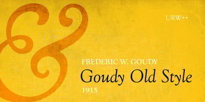
- Bookman Old Style by Monotype,
$40.99 The origins of Bookman Old Style lie in the typeface called Oldstyle Antique, designed by A C Phemister circa 1858 for the Miller and Richard foundry in Edinburgh, Scotland. Many American foundries made versions of this type which eventually became known as Bookman. Monotype Bookman Old Style roman is based on earlier Lanston Monotype and ATF models. The italic has been re drawn following the style of the Oldstyle Antique italics of Miller and Richard. Although called Old Style, the near vertical stress of the face puts it into the transitional category. The Bookman Old Style font family is a legible and robust text face.
 - Abbott Old Style by SoftMaker,
$7.99 SoftMaker’s Abbott Old Style is a revival of Joseph W. Phinney’s typeface of the same name, a modified serif typeface. It is charmingly antique and exotic.
 - Caslon Old Face by Bitstream,
$29.99William Caslon established the first major English typefoundry, re-creating earlier Dutch designs with excellent craftsmanship, color and rhythm. Caslon Old Face is one of many faithful revivals; the original matrices (from many hands; the lowercase of the 48 point is Moxon’s 1669 Great Canon) survive at Stephenson Blake. George Ostrochulski adapted this design for photocomposition at Mergenthaler with skill and understanding. - Old Paris Nouveau by Baseline Fonts,
$24.00Old Paris Nouveau is based on letterpress stylings of modern roman alphabets from the 1920s. Adapting the nouveau sensibility to the digital age required several conventions, including several alternate glyphs for specific individual letterforms as well as creating consistent stem weights and x-heights for more effective body copy. The inherent charm of Old Paris lies in its variation in form and style -- and yet the uniformity. Organic simplicity and elegance underscore the strength and utility inherent in the family of fonts. - Old Persian Cuneiform by Deniart Systems,
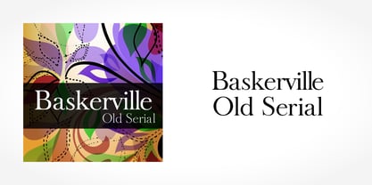
$10.00Based of the ancient Persian writing system. NOTE: this font comes with a comprehensive interpretation guide in pdf format. - Baskerville Old Serial by SoftMaker,
$-
- Century Old Style by URW Type Foundry,
$35.99 The Century Old Style font family was modeled on Century Expanded which had been cut in 1900. Similar weights and proportions were maintained but the letter shapes were made more elegant by the introduction of a number of old style characteristics. The Century Old Style font family is a useful text design that offers good legibility and economy.
 - Poynter Old Style by Font Bureau,
$40.00 In the 1670s, Christopher Plantin was the largest publisher of his day. Hendrik van den Keere cut for him an astounding series of romans. As Stanley Morison once observed, such types adopted features of Flemish blackletter to strengthen elegant French romans. Large on the body, strong in color, economical in fit, widely (if anonymously) distributed, they established effective standards for all that followed; FB 1997–2000


