10,000 search results (0.165 seconds)
  1. KG Primary Penmanship 2 - Personal use only
  2. Splats - Unknown license
  3. Vibertus by Cercurius, $19.95
    A revival of “Gras Vibert”, a French fat face originally cast by the Didot typefoundry in Paris. It was cut in 1840 by Vibert, an engraver employed by the foundry. The capitals are heavier than the lowercase letters, and the characters g, k, y and & are rather peculiarly shaped, exaggerating the vertical stress. The font is designed for large sizes.
  4. ITC Slimbach by ITC, $29.99
    ITC Slimbach font is the work of California calligrapher and type designer Robert Slimbach. Inspired in part by German fonts and the work of Hermann Zapf, Slimbach created a "contemporary text font with a progressive look", combining clean serif shapes with the warmth of calligraphic forms.
  5. P22 Schumann Pro by IHOF, $29.95
    Schumann Pro is the very first issue of a long lost early 1960s typeface project done by Heinz Schumann while he was at the University of Graphics and Book Design in Leipzig, where he studied under German type design giants Albert Kapr and Herbert Thannhaeuser. This alphabet was never published as a typeface, but Schumann went on to design Stentor for Typoart a couple of years after graduating. Albert Kapr’s influence is unmistakable in this playful upright script, especially in the wide and breezy capital forms. Unique exit strokes and serif placement work together to define the bouncy rhythm of this face. This is an expressive original alphabet that successfully bridges the gap between expert calligraphy and everyday sign lettering. P22 Schumann Pro comes with over 500 glyphs, which include plenty of alternates, quite a few ligatures, and extended Latin language support. It is a very effective font when used sparingly in packaging, signage, posters and things designed to catch the eye.
  6. Knives - Personal use only
  7. Sofachrome - Unknown license
  8. Scythe - Unknown license
  9. Bionic Type Cond Italic - Unknown license
  10. Alpha Sentry - Unknown license
  11. STAR+STAR (sRB) - Unknown license
  12. Docteur Atomic - Personal use only
  13. Sweet Treats by Jeff Levine, $29.00
    A piece of British sheet music for “You’re Sweeter than I Thought You Were” [from the 1935 film “Jack of All Trades” starring Jack Hulbert] provided inspiration for a digital typeface based on the credits for Hulbert and the film that rather than the song’s title. What’s interesting is the lettering style was influenced by Art Nouveau at a time when Art Deco was gaining in popularity. The result is Sweet Treats JNL, which is available in both regular and oblique versions. (According to Wikipedia, John Norman ‘Jack’ Hulbert (April 24, 1892 – March 25, 1978) was a British actor, director, screenwriter and singer, specializing primarily in comedy productions, and often working alongside his wife Cicely Courtneidge.)
  14. Karnac - 100% free
  15. LudwigHohlwein - 100% free
  16. Ademo by astype, $48.00
    Ademo is a classic, shaded and perspective looking display font. The design is based on two typefaces designed by Carl Albert Fahrenwaldt and published between 1931– 1932 by the German Schriftguss AG type foundry. pdf specimen Ademos special Fill fonts can be used for building multi colored text or for special finishing needs like blind imaging, embossing, stamping, partial UV coating and laser cutting.
  17. Honduras by Red Rooster Collection, $45.00
    Based on the typeface called either ‘Albert’ or ‘Select’ by Albert Augspurg, circa 1936, Amsterdam Foundry. Paul also designed the alternates not available on the original design.
  18. Phosphorus Selenide - Unknown license
  19. Buxom by ITC, $29.00
    Robert Trogman originally designed Buxom for Fotostar in 1975 with lettering from Herman Spinadel. Trogman’s design is an old-fashioned headline face, whose style feels at home in a number a different periods: the Wild West, the 1960s–70s, and once again today! Buxom is an all caps typeface with a three-dimensional effect: each character looks like it sits atop a trapezoidal shape, whose right side is always shaded. An inline around each letterform enhances this shadowy image. Buxom is best used in large display sizes as a single word, or single line of text.
  20. Parcival Antiqua by RMU, $35.00
    Schelter & Giesecke's highly esteemed font family, cut by Herbert Thannhaeuser, freshly redesigned for present-day use.
  21. Great Vibes - 100% free
  22. Niemi by Blank Is The New Black, $10.00
    Niemi is a continuation of the work started with Versteeg. Where Versteeg was separated into individual circles, Huet connects these circles and adds a sharp geometric style. This creates a nice juxtaposition between the rounded ends, and sharp corners.
  23. SpideRaY - Personal use only
  24. ITC Eras by ITC, $40.99
    ITC Eras font is the work of French designers Albert Boton and Albert Hollenstein. It is a typical sans serif typeface distinguished by its unusual slight forward slant and subtle variations in stroke weight. ITC Eras is an open and airy typeface inspired by both Greek stone-cut lapidary letters as well as Roman capitals.
  25. Willo the Wisp - Unknown license
  26. Eutheric by Typotheticals, $10.00
    This plain serif can be used for a variety of purposes. Good for headlines and larger text usages. Hulbert is a comical look at the Eutheric family. It is useful for those moments where no other font will fit. Eutheric is a serif style look at the Cooper type of fonts.
  27. towering - Unknown license
  28. Decomposing - Unknown license
  29. Neue Thannhaeuser by RMU, $40.00
    Neue Thannhaeuser - a tribute to Herbert Thannhaeuser .
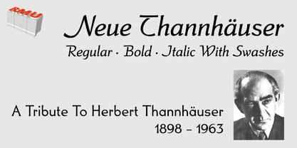
  30. Shred by Canada Type, $24.95
    Shred is the result of staring at so-called three-dimensional shapes for days on end, then capping the meditation by eating the white light at the end of the tunnel and sweating it out a blade a second. Bliss is overrated. Sharpness is where it's at. Get slicin'.
  31. Tube Station - Unknown license
  32. Sangkuriang - Unknown license
  33. Faust by Red Rooster Collection, $45.00
    Based on the Albert Kapr design, circa 1959.
  34. Steelplate Gothic Pro by Red Rooster Collection, $60.00
    Steelplate Gothic Pro is a sans serif font family with traditional and drop shadow weights. It shares letterform similarities to conventional Copperplate Gothic families, but has no spur serif endings. Most of the original designs came from the Western Type Foundry when BB&S acquired it in 1918; all were cut by Robert Wiebking. It was recast in 1954 by American Type Founders (ATF). Steve Jackaman (ITF) designed and produced a digital version of the original single weight in 1997. In 2017, Jackaman completely redrew and expanded the family, adding entirely new condensed variants and true small caps. Steelplate Gothic Pro has a masculine, industrial feel, and works effortlessly at display and subhead sizes. It shares letterforms with its sans serif sister family, Barnsley Gothic.
  35. Black Metal G - Unknown license
  36. Furia & Venganza - Personal use only
  37. StingRay - Unknown license
  38. Z_metalflame - Unknown license
  39. SF Piezolectric - Unknown license
  40. Spylord Bold - Unknown license
Looking for more fonts? Check out our New, Sans, Script, Handwriting fonts or Categories
abstract fontscontact usprivacy policyweb font generator
Processing