10,000 search results
(0.055 seconds)
- Shad by Ingo,
$27.00 The Shad is the almost illegible cousin of the >> Chiq. As the name suggests - it consists of the shadows of the letters. And the bolder the font style, the stronger it is. The “Light” only has a thin shadow, while the “Black” casts a very deep, broad shadow. Shad only consists of the letter shadows, the corresponding letter remains transparent, i.e. without filling. The “metrics”, i.e. the spacing and character widths, correspond to those of Chiq, so that both fonts can be placed congruently on top of each other. When you combine and play with the two fonts, very attractive effects quickly emerge. Shad brings a bit of 3D into typography.
 - Sinah by Linotype,
$29.99Linotype Sinah is part of the Take Type Library, selected from the contestants of Linotype’s International Type Design Contests of 1994 and 1997. Designed by the German artist Peter Huschka, Linotype Sinah is a rounded, ornamental font with many strokes ending in teardrop forms. The letters of this wide-running font do not share a common base line. The capital S and the lower case l both drop under it although neither have descenders. Overall, Linotype Sinah has an almost Asian or Indian feel. The font must be used with generous line spacing and is intended exclusively for headlines or shorter texts in point sizes of 12 or larger. - Dynamique by PizzaDude.dk,
$15.00 I wouldn't recommend that you use this font for massive text, or text written in CAPS ... but then again, go ahead and try - I even kerned all the capital letters ... just in case that you would do something so crazy! :) Dynamique is a kind of a "straight out of the highway" grid-font. But then again, not ... if you use the lowercase alone, you have this almost monospaced font - try starting every word with a capital letter, and let it end with the alternate ligature, your words suddenly got even more power! If you want to go lightspeed - then use the same technique, but only with the italic version!
 - Sinah Sans by Linotype,
$29.99Linotype Sinah is part of the Take Type Library, selected from the contestants of Linotype’s International Type Design Contests of 1994 and 1997. Designed by the German artist Peter Huschka, Linotype Sinah is a rounded, ornamental font with many strokes ending in teardrop forms. The letters of this wide-running font do not share a common base line. The capital S and the lower case l both drop under it although neither have descenders. Overall, Linotype Sinah has an almost Asian or Indian feel. The font must be used with generous line spacing and is intended exclusively for headlines or shorter texts in point sizes of 12 or larger. - Grand Prix ES - 100% free

- Fairy Strange - Personal use only

- Frail&Bedazzled - Personal use only

- Cage - Unknown license

- Ross by Elemeno,
$25.00Ross, named after Harold Ross, is also available as part of the Algonquin Collection at a special price. Six font families inspired by the great wits of the Algonquin Round Table. Buy all six and get two free! - HU Mois KR by Heummdesign,
$25.00 HU Mois KR is a calligraphy typeface with a sense of speed and a naturally slanted feel as if writing. It also gave a sense of free rhythm of handwriting. Includes Korean from the existing 'HU Mois' font.
 - PIXymbols Patchwork by Page Studio Graphics,
$25.00A collection of traditional American patchwork quilt motifs in a decorative font package. Over 80 designs, to be used as free-standing illustrations, in borders, or as an overall pattern. Several designs will work together into a pattern. - Parker by Elemeno,
$25.00Parker, named after Dorothy Parker, is also available as part of the Algonquin Collection at a special price. Six font families inspired by the great wits of the Algonquin Round Table. Buy all six and get two free! - Nanu by Gustav & Brun,
$20.00 Nanu is a hand drawn font where lower and upper cases have the same cap height. It is multilingual and contains a lot of open type features. When purchasing Nanu you get the Nanu Simple Ornaments for free.
 - PT Banana Split, though not a real font in widespread use as of my last update, conjures up whimsical and delightful imagery with its vivid name alone. Let's imagine it as a font that captures the es...
- Gladies by DYSA Studio,
$25.00 Gladies is a New Modern Serif Typeface. This another collection of Serif is perfect for your next branding project, excellent for your business. Gladies have a smooth edges, so this font gives an authentic handcrafted feel style. Gladies is perfect choice for people looking for clean, modern, minimalist, elegant, beauty design styles. Suitable for almost any graphic designs such as logo, branding materials, business cards, gift cards, t-shirt, cover, thumbnail, print, poster, photography, quotes .etc
 - Laceria by DYSA Studio,
$19.00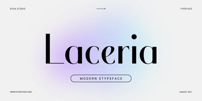 Laceria is a New Modern Serif Typeface. This another collection of Serif is perfect for your next branding project, excellent for your business. Laceria have a smooth edges, so this font gives an authentic handcrafted feel style. Laceria is perfect choice for people looking for clean, modern, minimalist, elegant, beauty design styles. Suitable for almost any graphic designs such as logo, branding materials, business cards, gift cards, t-shirt, cover, thumbnail, print, poster, photography, quotes .etc
 - Penta by Wiescher Design,
$29.00 »Penta« is a new Sans typeface, designed in the American tradition with contrast between the up- and downstrokes. The contrast is hardly visible on the »thin« cut, but the heavier the weights get, the more contrast becomes visible. That makes this font very useful, almost linear in the lighter weights and very distinct rhythm in the heavier ones. »Penta« is extremly versatile, it can be used for bodycopy in the lighter weights and for heavy headlines.
 - Belagoya by DYSA Studio,
$19.00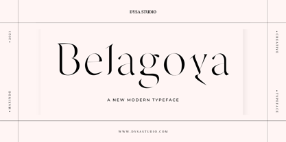 Belagoya is a New Modern Serif Typeface. This another collection of Display is perfect for your next branding project, excellent for your business. Belagoya have a smooth edges, so this font gives an authentic handcrafted feel style. Belagoya is perfect choice for people looking for clean, modern, minimalist, elegant, beauty design styles. Suitable for almost any graphic designs such as logo, branding materials, business cards, gift cards, t-shirt, cover, thumbnail, print, poster, photography, quotes .etc
 - Quilany by DYSA Studio,
$19.00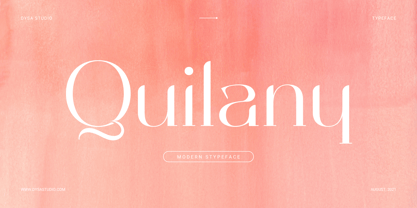 Quilany is a New Modern Serif Typeface. This another collection of Serif is perfect for your next branding project, excellent for your business. Quilany have a smooth edges, so this font gives an authentic handcrafted feel style. Quilany is perfect choice for people looking for clean, modern, minimalist, elegant, beauty design styles. Suitable for almost any graphic designs such as logo, branding materials, business cards, gift cards, t-shirt, cover, thumbnail, print, poster, photography, quotes .etc
 - Rawgly by DYSA Studio,
$19.00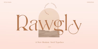 Rawgly is a New Modern Serif Typeface. This another collection of Serif is perfect for your next branding project, excellent for your business. Rawgly have a smooth edges, so this font gives an authentic handcrafted feel style. Rawgly is perfect choice for people looking for clean, modern, minimalist, elegant, beauty design styles. Suitable for almost any graphic designs such as logo, branding materials, business cards, gift cards, t-shirt, cover, thumbnail, print, poster, photography, quotes .etc
 - Summer Paradise by DYSA Studio,
$19.00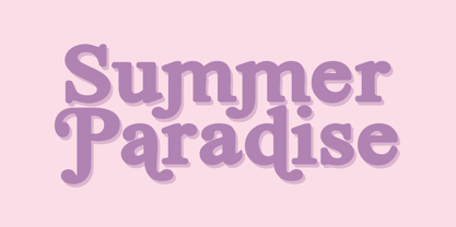 Summer Paradise a New Modern Serif Typeface. This another collection of Serif is perfect for your next branding project, excellent for your business. Summer Paradise have a smooth edges, so this font gives an authentic handcrafted feel style. Summer Paradise is perfect choice for people looking for clean, modern, minimalist, elegant, beauty design styles. Suitable for almost any graphic designs such as logo, branding materials, business cards, gift cards, t-shirt, cover, thumbnail, print, poster, photography, quotes .etc
 - Monka by DYSA Studio,
$19.00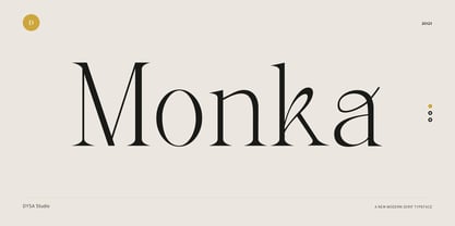 Monka is a New Modern Serif Typeface. This another collection of Serif is perfect for your next branding project, excellent for your business. Monka have a smooth edges, so this font gives an authentic handcrafted feel style. Monka is perfect choice for people looking for clean, modern, minimalist, elegant, beauty design styles. Suitable for almost any graphic designs such as logo, branding materials, business cards, gift cards, t-shirt, cover, thumbnail, print, poster, photography, quotes .etc
 - Rotally by DYSA Studio,
$19.00 Rotally is a New Modern Serif Typeface. This another collection of Serif is perfect for your next branding project, excellent for your business. Rotally have a smooth edges, so this font gives an authentic handcrafted feel style. Rotally is perfect choice for people looking for clean, modern, minimalist, elegant, beauty design styles. Suitable for almost any graphic designs such as logo, branding materials, business cards, gift cards, t-shirt, cover, thumbnail, print, poster, photography, quotes .etc
 - Deco Slice - Personal use only

- Shandy BF by Bomparte's Fonts,
$40.00 Shandy is a cheerful, free-spirited font that dances jauntily along an undulating baseline. Like Gene Kelly merrily cavorting through that rain-soaked street, in the famous dance scene from Singin’ in the Rain. Curiously, it’s got the liveliness of a bouncy brush script, with some elements of a robust Copperplate-style script, that appear to have been defined by a funhouse carnival mirror. In order to promote variety, no two letters are identical within most occurrences of typical lowercase double-letter pairings (bb, dd, ee, ll, nn, oo, tt, etc.) To enhance your typography, Shandy features many automatic OpenType ligatures, beginning and terminal lowercase forms and Stylistic Alternates for letters E, M and N which are accessible in OpenType-capable applications. Suitable for Branding, Logos, Product Packaging, T-shirts, Magazine headlines, Fashion Glossies, and Food Advertising to name a few arenas.
 - TT Bluescreens by TypeType,
$35.00 TT Bluescreens useful links: Specimen PDF | Customization options Please note! If you need OTF versions of the fonts, just email us at commercial@typetype.org Meet the upgraded TT Bluescreens! TT Bluescreens is a geometric sans serif with narrow proportions. The font has a memorable character, while remaining neutral, so it can be used in various design projects. The range of possibilities of the updated TT Bluescreens has become much wider! Condensed styles with narrowed proportions have been added. The classic styles of TT Bluescreens are universal and suitable for setting both in headings and in text arrays. Condensed styles are intended for non-standard design solutions. In small sizes, they are perceived as if having a texture, thanks to which they can become part of packaging or poster design. In large size they look extraordinary, but they are highly readable and convey information well. Variable font now changes along 3 axes: weight, width and slant. Even more options for those who love variety. The character set of TT Bluescreens was expanded, and additional extended Cyrillic and Latin characters were added. Expanded character set. Each style has 874 characters. This is 253 characters more than it there were in the previous version. New currency signs, arrows, punctuation and fractions were added. Number of OpenType features increased from 18 to 31! The font has become even more functional and convenient thanks to a large number of ligatures, stylistic alternatives and localizations. The quality of the contours has become even higher, diacritics were improved. The updated TT Bluescreens is suitable for the design of covers and posters, it will look aesthetically pleasing in packaging design. It can be used in the design of titles and disclaimers. Condensed styles are preferably used in large size. The TT Bluescreens font has 37 styles: 9 upright and 9 italics of standard width, 9 upright and 9 italics in Condensed, 1 variable style. Each style contains 874 characters. The font has 31 OpenType features, including ligatures, stylistic sets, and localizations.
 - Turlock JNL by Jeff Levine,
$29.00Turlock JNL is a more traditional-looking slab-serif Western Font along the line of Brogado JNL. With its hand-drawn, old-time look and feel, Turlock JNL is perfect for anything with a Western or cowboy motif. - Fan Script by Sudtipos,
$99.00 A friend of mine says that sports are the ultimate popular drug. One of his favorite things to say is, “The sun’s always shining on a game somewhere.” It’s hard to argue with that. But that perspective is now the privilege of a society where technology is so high and mighty that it all but shapes such perspectives. These days I can, if I so choose, subscribe to nothing but sports on over a hundred TV channels and a thousand browser bookmarks. But it wasn't always like that. When I was growing up, long before the super-commercialization of the sport, I and other kids spent more than every spare minute of our time memorizing the names and positions of players, collecting team shirts and paraphernalia, making up game scenarios, and just being our generation’s entirely devoted fans. Argentina is one of the nations most obsessed with sports, especially "fútbol" (or soccer to North Americans). The running American joke was that we're all born with a football. When the national team is playing a game, stores actually close their doors, and Buenos Aires looks like a ghost town. Even on the local level, River Plate, my favorite team where I grew up, didn't normally have to worry about empty seats in its home stadium, even though attendance is charged at a high premium. There are things our senses absorb when we are children, yet we don't notice them until much later on in life. A sport’s collage of aesthetics is one of those things. When I was a kid I loved the teams and players that I loved, but I never really stopped to think what solidified them in my memory and made them instantly recognizable to me. Now, thirty-some years later, and after having had the fortune to experience many cultures other than my own, I can safely deduce that a sport’s aesthetic depends on the local or national culture as much as it depends on the sport itself. And the way all that gets molded in a single team’s identity becomes so intricate it is difficult to see where each part comes from to shape the whole. Although “futbol” is still in my blood as an Argentinean, I'm old enough to afford a little cynicism about how extremely corporate most popular sports are. Of course, nothing can now take away the joy I got from football in my childhood and early teens. But over the past few years I've been trying to perceive the sport itself in a global context, even alongside other popular sports in different areas of the world. Being a type designer, I naturally focus in my comparisons on the alphabets used in designing different sports experiences. And from that I've come to a few conclusions about my own taste in sports aesthetic, some of which surprised me. I think I like the baseball and basketball aesthetic better than football, hockey, volleyball, tennis, golf, cricket, rugby, and other sports. This of course is a biased opinion. I'm a lettering guy, and hand lettering is seen much more in baseball and basketball. But there’s a bit more to it than that. Even though all sports can be reduced to a bare-bones series of purposes and goals to reach, the rules and arrangements of baseball and basketball, in spite of their obvious tempo differences, are more suited for overall artistic motion than other sports. So when an application of swashed handlettering is used as part of a team’s identity in baseball or basketball, it becomes a natural fit. The swashes can almost be visual representation of a basketball curving in the air on its way to the hoop, or a baseball on its way out of the park. This expression is invariably backed by and connected to bold, sleak lettering, representing the driving force and precision (arms, bat) behind the artistic motion. It’s a simple and natural connective analysis to a designer, but the normal naked eye still marvels inexplicably at the beauty of such logos and wordmarks. That analytical simplicity was the divining rod behind Fan Script. My own ambitious brief was to build a readable yet very artistic sports script that can be a perfect fit for baseball or basketball identities, but which can also be implemented for other sports. The result turned out to be quite beautiful to my eyes, and I hope you find it satisfactory in your own work. Sports scripts like this one are rooted in showcard lettering models from the late 19th and early 20th century, like Detroit’s lettering teacher C. Strong’s — the same models that continue to influence book designers and sign painters for more than a century now. So as you can see, American turn-of-the-century calligraphy and its long-term influences still remain a subject of fascination to me. This fascination has been the engine of most of my work, and it shows clearly in Fan Script. Fan Script is a lively heavy brush face suitable for sports identities. It includes a variety of swashes of different shapes, both connective and non-connective, and contains a whole range of letter alternates. Users of this font will find a lot of casual freedom in playing with different combinations - a freedom backed by a solid technological undercurrent, where OpenType features provide immediate and logical solutions to problems common to this kind of script. One final thing bears mentioning: After the font design and production were completed, it was surprisingly delightful for me to notice, in the testing stage, that my background as a packaging designer seems to have left a mark on the way the font works overall. The modern improvements I applied to the letter forms have managed to induce a somewhat retro packaging appearance to the totality of the typeface. So I expect Fan Script will be just as useful in packaging as it would be in sports identity, logotype and merchandizing. Ale Paul
 - Nixon Script by Barnbrook Fonts,
$30.00 NixonScript is a display typeface inspired by the typographic emancipation given voice by 1950s and '60s north American vernacular type. NixonScript's starting point was lettering found on a 1960s camera found in a Chicago junk shop, but its development saw it transformed from a punchy sans-serif to a more thoughtful serif, with a lowered x-height and a vibe of almost priestly piousness. Rather than a simple regular italic, a bold italic is offered. During its development, the regular version seemed almost placid but with the double emphasis of bold and italic, NixonScript gained an energetic, self-congratulatory form.
 - 99 Names of ALLAH Subhanahu by Islamic Calligraphy75,
$12.00 We have transformed the “99 names of ALLAH” into a font. That means each key on your keyboard represents 1 of the 99 names of ALLAH Aaza Wajal. The fonts work with both the English and Arabic Keyboards. We call this Calligraphy "Subhanahu Wa Ta'ala" because we have added "Subhanahu Wa Ta'ala" to each and every name. The first "Alef" has a "hamzit wasel", this indicates that the name can be pronounced both as "AR-RAHMAAN" or "R-RAHMAN" (in the zip file you will find a pdf file explaining the differences in the "harakat", pronunciation and spelling according to the Holy Quran). The calligraphy is rectangular shaped, and the "fatha" is big and covers almost the entire name, in most of the names. Decorative letters used in this calligraphy: "Mim, Aain, Sin, HHe, He, Ta, Kaf & Saad". Purpose & use: - Writers: Highlight the names in your texts in beautiful Islamic calligraphy. - Editors: Use with kinetic typography templates (AE) & editing software. - Designers: The very small details in the names does not affect the quality. Rest assured it is flawless. The MOST IMPORTANT THING about this list is that all the names are 100% ERROR FREE, and you can USE THEM WITH YOUR EYES CLOSED. All the “Tachkilat” are 100% ERROR FREE, all the "Spelling" is 100% ERROR FREE, and they all have been written in accordance with the Holy Quran. No names are missing and no names are duplicated. The list is complete "99 names +1". The +1 is the name “ALLAH” 'Aza wajal. Another important thing is how we use the decorative letters. In every font you will see small decorative letters, these letters are used only in accordance with their respective letters to indicate pronunciation & we don't include them randomly. That means "mim" on top or below the letter "mim", "sin" on top or below the letter "sin", and so on and so forth. Included: Pdf file telling you which key is associated with which name. In that same file we have included the transliteration and explication of all 99 names. Pdf file explaining the differences in the harakat and pronunciation according to the Holy Quran.
 - 1529 Champ Fleury Initials by GLC,
$42.00 In 1529, Geofroy Tory, French scholar, engraver, printer, publisher and poet, was publishing the well known so called Champ Fleury, printed by Gilles de Gourmond, in Paris. It is a fully illustrated handbook where the author explains how to draw Roman characters. The font used for the text - a Humane/Jenson type - was not a very beautiful one, but rough and ready, and the book is well known for its capital letters designs. We are offering here the two complete historical type sets and more -- we have entirely redrawn the lacked letters: J, U and W, Eth, Lslash, Thorn and Oslash in the two initial forms. The text font, 1529 Champ Fleury Regular is now containing all characters for West European (including Celtic), Baltic, East and Central European and Turkish language, and the Initial set 1529 Champ Fleury Init is containing two complete alphabets, with a very great effort to be as close as possible to the original pictures.
 - Domani CP by CounterPoint Type Studio,
$29.99 Domani from CounterPoint is a faithful digital revival of an old photo-typositing face called ITC Didi. Originally designed by Herb Lubalin and Tom Carnase, Domani brings to life a font that has been somewhat neglected by the digital era until now. Brought to the attention of Jason Walcott by graphic designer Rob King, this font immediately captured Jason with its 1970s high contrast Didone style, typical of that time period. It has some unique design details that set it apart from other didone style typefaces. “Domani” is the Italian word for “tomorrow”. The name was suggested by Rob King, and Jason felt it was perfect for this revitalized design. Walcott has created a professional quality digital version that is both faithful to the original design while expanding the character set to make use of OpenType features. A full set of swash capitals and several swash lowercase, designed by Walcott, has been added, as well as support for Latin-based and Eastern European languages.
 - Platinus Script Pro by Sudtipos,
$69.00 Platinus Script Pro is the latest example of what has now become a Sudtipos tradition: Adapting conventional calligraphic methods from the last two centuries to produce modern digital scripts for the current one. This time the resulting font explores the evolution of invitation scripts from the classic commercial lettering of the 1930s to the ideas clearly visible in the greeting cards of the 1980s and 1990s. Most base characters are made up of a single stroke, with some of the strokes driven from the top down, and some from the bottom up, putting the emphasis on the casual but precise fluidity of the hand, an emphasis magnified by the expert use of loops and swashes everywhere. The Platinus Script Pro family comes in two weights, each loaded with alternates and Latin-based langauge support, for more than 570 characters per font. Platinus Script Pro is great for product packaging, as well book covers, menus and greeting cards.
 - Geogrotesque Condensed Series by Emtype Foundry,
$69.00 The popular Geogrotesque family becomes an extended system with the inclusion of three new members to the family; Geogrotesque Condensed, Geogrotesque Compressed and Geogrotesque Extra Compressed. The condensed series keep the spirit of the original one, and give way to a superfamily up to 56 styles. This new system fluidly varies between widths, ranging from the original width to a 55% of it in the narrower one. As their original partner, the new fonts are great headline families for publications, but will also work in text of intermediate length and point size. The Geogrotesque superfamily offers now one font for each design need. It is available in Open Type format and includes Ligatures, Tabular Figures, Fractions, Numerators, Denominators, Superiors and Inferiors. All of them with support for Central and Eastern European languages. This type family consists of 42 styles, 7 weights plus italics in 3 widths. For more details see the PDF.
 - Ricksta by Twinletter,
$17.00 Ricksta is a charming gothic serif font, with a unique sharp touch. If you are looking for an eye-catching and truly powerful look in your various visual branding design projects, then Ricksta is the answer. This font has been created with detail and precision to meet the needs of your branding projects. With families that include regular, shadow, slant, and distort, you have a variety of options to create a look that matches your brand identity. Ricksta also features alternate ligatures and characters, giving you the ability to create truly unique and captivating letter designs. Ricksta also supports multiple languages. That way, you can reach a global audience without limitations. This is your chance to make your brand stand out with a strong character. So, prepare yourself to turn your branding projects into stunning works of typographic art. Get Ricksta now and see how this unique gothic serif look will add a special appeal to your brand and your projects.
 - Carrig Pro by Monotype,
$31.99 Carrig Pro is a refined and elegant serif. Classed as an Antiqua, Carrig Pro is born from [or borne by] a hybrid of influences that range from early Roman inscriptions to type of the Pre-Modern era, giving Carrig Pro a distinctive character all of its own. Carrig Pro will appear instantly familiar and friendly and could well be the perfect typeface for designers seeking to convey a message with a distinctive and prestigious air. Now a 12-font family, Carrig Pro (2017) is an extended version of Carrig (2015), it has been completely redrawn, revised and improved. Carrig Pro has many useful features for typographers to exploit, such as easily accessible small caps, discretionary ligatures, gadzooks and stylistic alternates, as well as a number of ornamental glyphs. See more here. Key features: 6 weights in roman and italic Small Caps, Ornaments, Alternates, Historic Characters, Ligatures and Gadzooks Full Latin character set 750 glyphs per font.
 - 57-nao by ILOTT-TYPE,
$49.00 Designed in 1950s Japan by Okanao & Kushiro, the perfect partnership until artistic temperaments drove them apart. The duo spent years crafting the font with the working title “Messenjā”, Okanao bringing technical expertise to craft letterforms, while Kushiro made it his life, obsessively working late into the night to check pages for errors. For him the project was never about making money, it was an artistic endeavor to reprint the great Western works of literature. When he found out Okanao had secretly sold the rights to the font for use as a logo for a major Japanese manufacturer, Kushiro burned all evidence of the designs in a fit of passionate fury. The two reportedly never spoke again. “Messenjā” was thought lost forever until a type specimen was discovered in a vintage typewriter box bought on eBay. Now redrawn and available as 57-nao, a faithful and beautifully crafted monospace characterized by what is considered Okanao’s defining moment, the angular loop on the lowercase ‘a’.
 - Hyperspace Race Capsule by Swell Type,
$25.00 Welcome aboard the Hyperspace Race Capsule! Let the weight of gravity slip away as our interplanetary transport system takes you around the solar system in unparallelled style and comfort. Our reclaimed UFO has been remodeled with soft, luxurious curves on the interior and the latest cutting edge flight technology under the hood, to meet all your typographic travel desires. Each weight and package includes these luxurious five-star amenities: Kick your Capsule into TURBO mode to access eleven sleek, fast-moving alternate letter shapes. Hit WARP SPEED to cross time and space with hundreds of auto-connecting letter pairs. Chat with passengers from all over Earth, as Hyperspace Race Capsule effortlessly presents speech in 224 languages. Use the versatile Variable font to access 20 preset weights plus over 100,000 options between. Hyperspace Race Capsule is a versatile, full-featured font that's perfect for galaxy-wide branding projects, now and into the future.
 - 161 Vergilius by GLC,
$38.00 This font was inspired by the rare manuscript Roman Quadrata used by an unknown scribe to inscribe a copy of the Roman poet Virgil’s GEORGICS, somehwere around 161 to 180 AD. Only a few sheets have survived, now preserved by different libraries around the world. In creating this font, we have adapted it for contemporary users, making differences between U and V; I and J (which made no difference at all to ancient Latin scribes) and naturally adding the glyphs for Thorn, Oslash, Lslash, W, Y, as well as the usual accented characters and punctuation, none of which existed at the time. Only capitals are present in the original; but we have provided alternates: so alternating each character A-Z/a-z will give a pleasant appearance of manual script. We have added the Roman numerals “I V X L C D M” in the OTF/TTF versions usable as “Old Style Numerals” alternates.
 - Algarabia by Macizo.com.mx,
$30.00 • Algarabía "Joy" is a provocative and multilingual text face designed by Leonardo Vázquez. • It was created for a mexican magazine with the same name that uses it as the body text font, and now it's released for the public. • In 1397, Frederic Goudy's was asked to draw a face for the exclusive use of the University of California Press at Berkeley. The font was called California. In 1983 a digital version of this typeface was created by Aaron Burns and it was called ITC Berkeley. • Algarabía is inspired by ITC Berkeley, it keeps the calligraphic touch and weight, but it presents certain features in its design that might result unexpected, yet at the same time they are invisible when used as body text and provides the typeface its unique own personality. • Small Caps and Small caps italic, Included in each version. • Ideal for magazines, Art books or any editorial purposes where legibility and originality are needed.


