10,000 search results (0.063 seconds)
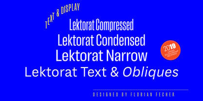
  1. Lektorat by TypeTogether, $35.00
    Florian Fecher’s Lektorat font family is one for the books, and for the screens, and for the magazines. While an editorial’s main goals are to entertain, inform, and persuade, more should be considered. For example, clear divisions are necessary, not just from one article to the next, but in how each is positioned as op-ed or fact-based, infographic or table, vilifying or uplifting. From masthead to colophon, Lektorat has six concise text styles and 21 display styles to captivate, educate, and motivate within any editorial purpose. Magazines and related publications are notoriously difficult to brand and then to format accordingly. The research behind Lektorat focused on expression versus communication and what it takes for a great typeface to accomplish both tasks. In the changeover from the 19th to 20th century, German type foundry Schelter & Giesecke published several grotesque families that would become Lektorat’s partial inspiration. Experimentation with concepts from different exemplars gave birth to Lektorat’s manifest character traits: raised shoulders, deep incisions within highly contrasted junctions, and asymmetrical counters in a sans family. After thoroughly analysing magazine publishing and editorial designs, Florian discovered that a concise setup is sufficient for general paragraph text. So Lektorat’s text offering is concentrated into six total styles: regular, semibold, and bold with their obliques. Stylistic sets are equally minimal; an alternate ‘k, K’ and tail-less ‘a’ appear in text only. No fluff, no wasted “good intentions”, just a laser-like suite to focus the reader on the words. The display styles were another matter. They aim to attract attention in banners, as oversized type filling small spaces, photo knockouts, and in subsidiary headings like decks, callouts, sections, and more. For these reasons, three dialed-in widths — Narrow, Condensed, and Compressed — complete the display offerings in seven upright weights each, flaunting 21 headlining fonts in total. If being on font technology’s cutting edge is more your goal, the Lektorat type family is optionally available in three small variable font files for ultimate control and data savings. The Lektorat typeface was forged with a steel spine for pixel and print publishing. It unwaveringly informs, convincingly persuades, and aesthetically entertains when the tone calls for it. Its sans serif forms expand in methodical ways until the heaviest two weights close in, highlighting its irrepressible usefulness to the very end. Lektorat is an example of how much we relish entering into an agreed battle of persuasion — one which both sides actually enjoy.
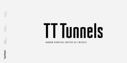
  2. TT Tunnels by TypeType, $29.00
    TT Tunnels useful links: Specimen | Graphic presentation | Customization options TT Tunnels is a modular font family with narrow proportions and a large number of pronounced visual compensators. In the basic version of the typeface, all glyphs have simple chopped shapes, created according to the usual geometric principles. In the alternative version of TT Tunnels, which becomes available when you turn on OpenType feature stylistic alternates or stylistic set 1, the typeface comes to life and turns into a stylized ductal gothic grotesque, in which the design of glyph forms is created based on the pen movements. Despite the fact that TT Tunnels was created as a display typeface for use in short inscriptions and titles, it works very interestingly in the body text, adding a small touch of archaics. This is especially evident in the Bold and Black faces, when the rhythm and thickness of the strokes create a dense set, covering the paper with a solid, dense pattern. The density and style of such a set conceptually refers us to the old Gothic texture and the Old Slavonic script. In addition to a larger number of alternates for lowercase letters, the typeface features an alternate for number 2, an alternate slashed zero, many ligatures, and other useful OpenType features (ordn, frac, sinf, sups, numr, dnom, case, tnum, onum, pnum, liga, salt, ss01, zero). The TT Tunnels includes five faces: Thin, Light, Regular, Bold, Black.
  3. Ethnocentric - Unknown license
  4. Good Times - Unknown license
  5. Street Cred - Unknown license
  6. Vademecum - Unknown license
  7. Baltar - Unknown license
  8. Astron Boy - Unknown license
  9. Mexcellent 3D - Unknown license
  10. Libel Suit - 100% free
  11. Zorque - Unknown license
  12. Wild Sewerage - Unknown license
  13. Walshes - Unknown license
  14. Metal Lord - Unknown license
  15. Graffiti Treat - Unknown license
  16. Misirlou Day - Unknown license
  17. Interplanetary Crap - Unknown license
  18. ParaAminobenzoic - Unknown license
  19. Let's Eat - Unknown license
  20. Motorcade - Unknown license
  21. Zeroes Three - Unknown license
  22. Saved By Zero - Unknown license
  23. Still Time - Unknown license
  24. Almonte - 100% free
  25. Highway to Heck - Unknown license
  26. Should've Known - Unknown license
  27. VDub - Unknown license
  28. Lewinsky - Unknown license
  29. Lady Starlight - Unknown license
  30. Spongy - Unknown license
  31. Green Fuz - Unknown license
  32. Operational Amplifier - Unknown license
  33. Orange Kid - Unknown license
  34. Sappy Mugs - Unknown license
  35. Lockergnome - Unknown license
  36. Univox - Unknown license
  37. Thiamine - Unknown license
  38. Husky Stash - Unknown license
  39. Kleptocracy - Unknown license
  40. Hello Larry - Unknown license
Looking for more fonts? Check out our New, Sans, Script, Handwriting fonts or Categories
abstract fontscontact usprivacy policyweb font generator
Processing