3,924 search results
(0.015 seconds)
- Safira March by Din Studio,
$25.00 Hoping to make bold and statement projects? Trying to impress your audiences or costumers? How about a mix of tropical, style, and elegance? Then check this one out. Introducing Safira March- A Serif Font Family This gorgeous font will engage your audience and make your promotions and projects stand out. It comes with 9 different weights fonts. Bring your branding to life and add a touch of modernity and style with Safira March. Use it for headings, logos, business cards, printed quotes, invitations of all sorts, cards, packaging, and your website or social media branding. Our font always includes Multilingual option to make your branding globally recognized. Features: Standard Ligatures Stylistic Sets Multilingual Support (91 languages) PUA Encoded Numerals and Punctuation Thank you for downloading premium fonts from Din Studio
 - Monogatari by Umka Type,
$19.00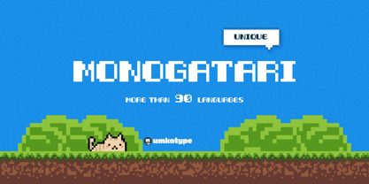 Monogatari - A Display Font : Monogatari is a carefully crafted display font. It has Extended Latin and Cyrillic characters. It created for poster, web, brand and social media designs. It supports 91 Languages: Belarusian, Russian, Afrikaans, Albanian, Asu, Basque, Bemba, Bena, Breton, Catalan, Chiga, Colognian, Cornish, Croatian, Czech, Danish, Dutch, Embu, English, Esperanto, Estonian, Faroese, Filipino, Finnish, French, Friulian, Galician, German, Gusii, Hungarian, Indonesian, Irish, Italian, Kabuverdianu, Kalenjin, Kamba, Kikuyu, Kinyarwanda, Latvian, Lithuanian, Lower Sorbian, Luo, Luxembourgish, Luyia, Machame, Makhuwa-Meetto, Makonde, Malagasy, Maltese, Manx, Meru, Morisyen, North Ndebele, Norwegian Bokmål, Norwegian Nynorsk, Nyankole, Oromo, Polish, Portuguese, Quechua, Romanian, Romansh, Rombo, Rundi, Rwa, Samburu, Sango, Sangu, Scottish Gaelic, Sena, Serbian, Shambala, Shona, Slovak, Soga, Somali, Spanish, Swahili, Swedish, Swiss German, Taita, Teso, Turkish, Upper Sorbian, Uzbek (Latin), Volapük, Vunjo, Walser, Welsh, Western Frisian, Zulu
 - Monstrous by Umka Type,
$19.00 Monstrous - A Display Font : Monstrous is a carefully crafted display font. It has Extended Latin and Cyrillic characters. It created for poster, web, brand and social media designs. It supports 91 Languages: Belarusian, Russian, Afrikaans, Albanian, Asu, Basque, Bemba, Bena, Breton, Catalan, Chiga, Colognian, Cornish, Croatian, Czech, Danish, Dutch, Embu, English, Esperanto, Estonian, Faroese, Filipino, Finnish, French, Friulian, Galician, German, Gusii, Hungarian, Indonesian, Irish, Italian, Kabuverdianu, Kalenjin, Kamba, Kikuyu, Kinyarwanda, Latvian, Lithuanian, Lower Sorbian, Luo, Luxembourgish, Luyia, Machame, Makhuwa-Meetto, Makonde, Malagasy, Maltese, Manx, Meru, Morisyen, North Ndebele, Norwegian Bokmål, Norwegian Nynorsk, Nyankole, Oromo, Polish, Portuguese, Quechua, Romanian, Romansh, Rombo, Rundi, Rwa, Samburu, Sango, Sangu, Scottish Gaelic, Sena, Serbian, Shambala, Shona, Slovak, Soga, Somali, Spanish, Swahili, Swedish, Swiss German, Taita, Teso, Turkish, Upper Sorbian, Uzbek (Latin), Volapük, Vunjo, Walser, Welsh, Western Frisian, Zulu
 - Transform by Umka Type,
$19.00 Transform - A Display Font : Transform is a carefully crafted display font. It has Extended Latin and Cyrillic characters. It created for poster, web, brand and social media designs. It supports 91 Languages: Belarusian, Russian, Afrikaans, Albanian, Asu, Basque, Bemba, Bena, Breton, Catalan, Chiga, Colognian, Cornish, Croatian, Czech, Danish, Dutch, Embu, English, Esperanto, Estonian, Faroese, Filipino, Finnish, French, Friulian, Galician, German, Gusii, Hungarian, Indonesian, Irish, Italian, Kabuverdianu, Kalenjin, Kamba, Kikuyu, Kinyarwanda, Latvian, Lithuanian, Lower Sorbian, Luo, Luxembourgish, Luyia, Machame, Makhuwa-Meetto, Makonde, Malagasy, Maltese, Manx, Meru, Morisyen, North Ndebele, Norwegian Bokmål, Norwegian Nynorsk, Nyankole, Oromo, Polish, Portuguese, Quechua, Romanian, Romansh, Rombo, Rundi, Rwa, Samburu, Sango, Sangu, Scottish Gaelic, Sena, Serbian, Shambala, Shona, Slovak, Soga, Somali, Spanish, Swahili, Swedish, Swiss German, Taita, Teso, Turkish, Upper Sorbian, Uzbek (Latin), Volapük, Vunjo, Walser, Welsh, Western Frisian, Zulu
 - Peckham by Los Andes,
$29.00 Peckham, designed by Daniel Hernández, is a contemporary and versatile slab serif of 8 weights (and matching italics)—ranging from an elegant Thin to a heavy Black—with strong serifs that give it a playful look while preserving the overall geometric structure of the font. Peckham comes with the standard Latinotype set of 395 glyphs resulting in a language support for 94% of the languages using the Latin alphabet. The font also includes stylistic alternates (A, R, Y, a) which provides extra versatility. The name of the font reminds us of the city that witnessed the birth of Vincent Figgins (1766). Figgins became known as the type designer who first included slab serif fonts in a commercial catalog. Peckham pays homage to classic typefaces yet looks very contemporary. Digital editing and corrections by Alfonso García.
 - Monore by Umka Type,
$19.00 Monore - A Display Font : Monore is a carefully crafted display font. It has Extended Latin and Cyrillic characters. It created for poster, web, brand and social media designs. It supports 91 Languages: Belarusian, Russian, Afrikaans, Albanian, Asu, Basque, Bemba, Bena, Breton, Catalan, Chiga, Colognian, Cornish, Croatian, Czech, Danish, Dutch, Embu, English, Esperanto, Estonian, Faroese, Filipino, Finnish, French, Friulian, Galician, German, Gusii, Hungarian, Indonesian, Irish, Italian, Kabuverdianu, Kalenjin, Kamba, Kikuyu, Kinyarwanda, Latvian, Lithuanian, Lower Sorbian, Luo, Luxembourgish, Luyia, Machame, Makhuwa-Meetto, Makonde, Malagasy, Maltese, Manx, Meru, Morisyen, North Ndebele, Norwegian Bokmål, Norwegian Nynorsk, Nyankole, Oromo, Polish, Portuguese, Quechua, Romanian, Romansh, Rombo, Rundi, Rwa, Samburu, Sango, Sangu, Scottish Gaelic, Sena, Serbian, Shambala, Shona, Slovak, Soga, Somali, Spanish, Swahili, Swedish, Swiss German, Taita, Teso, Turkish, Upper Sorbian, Uzbek (Latin), Volapük, Vunjo, Walser, Welsh, Western Frisian, Zulu
 - Cardio by Umka Type,
$19.00 Cardio - A Display Font : Cardio is a carefully crafted display font. It has Extended Latin and Cyrillic characters. It created for poster, web, brand and social media designs. It supports 91 Languages: Belarusian, Russian, Afrikaans, Albanian, Asu, Basque, Bemba, Bena, Breton, Catalan, Chiga, Colognian, Cornish, Croatian, Czech, Danish, Dutch, Embu, English, Esperanto, Estonian, Faroese, Filipino, Finnish, French, Friulian, Galician, German, Gusii, Hungarian, Indonesian, Irish, Italian, Kabuverdianu, Kalenjin, Kamba, Kikuyu, Kinyarwanda, Latvian, Lithuanian, Lower Sorbian, Luo, Luxembourgish, Luyia, Machame, Makhuwa-Meetto, Makonde, Malagasy, Maltese, Manx, Meru, Morisyen, North Ndebele, Norwegian Bokmål, Norwegian Nynorsk, Nyankole, Oromo, Polish, Portuguese, Quechua, Romanian, Romansh, Rombo, Rundi, Rwa, Samburu, Sango, Sangu, Scottish Gaelic, Sena, Serbian, Shambala, Shona, Slovak, Soga, Somali, Spanish, Swahili, Swedish, Swiss German, Taita, Teso, Turkish, Upper Sorbian, Uzbek (Latin), Volapük, Vunjo, Walser, Welsh, Western Frisian, Zulu
 - Spectron by Umka Type,
$19.00 Spectron - A Display Font : Spectron is a carefully crafted display font. It has Extended Latin and Cyrillic characters. It created for poster, web, brand and social media designs. It supports 91 Languages: Belarusian, Russian, Afrikaans, Albanian, Asu, Basque, Bemba, Bena, Breton, Catalan, Chiga, Colognian, Cornish, Croatian, Czech, Danish, Dutch, Embu, English, Esperanto, Estonian, Faroese, Filipino, Finnish, French, Friulian, Galician, German, Gusii, Hungarian, Indonesian, Irish, Italian, Kabuverdianu, Kalenjin, Kamba, Kikuyu, Kinyarwanda, Latvian, Lithuanian, Lower Sorbian, Luo, Luxembourgish, Luyia, Machame, Makhuwa-Meetto, Makonde, Malagasy, Maltese, Manx, Meru, Morisyen, North Ndebele, Norwegian Bokmål, Norwegian Nynorsk, Nyankole, Oromo, Polish, Portuguese, Quechua, Romanian, Romansh, Rombo, Rundi, Rwa, Samburu, Sango, Sangu, Scottish Gaelic, Sena, Serbian, Shambala, Shona, Slovak, Soga, Somali, Spanish, Swahili, Swedish, Swiss German, Taita, Teso, Turkish, Upper Sorbian, Uzbek (Latin), Volapük, Vunjo, Walser, Welsh, Western Frisian, Zulu
 - Hinauf by Umka Type,
$19.00 Hinauf - A Display Font : Hinauf is a carefully crafted display font. It has Extended Latin and Cyrillic characters. It created for poster, web, brand and social media designs. It supports 91 Languages: Belarusian, Russian, Afrikaans, Albanian, Asu, Basque, Bemba, Bena, Breton, Catalan, Chiga, Colognian, Cornish, Croatian, Czech, Danish, Dutch, Embu, English, Esperanto, Estonian, Faroese, Filipino, Finnish, French, Friulian, Galician, German, Gusii, Hungarian, Indonesian, Irish, Italian, Kabuverdianu, Kalenjin, Kamba, Kikuyu, Kinyarwanda, Latvian, Lithuanian, Lower Sorbian, Luo, Luxembourgish, Luyia, Machame, Makhuwa-Meetto, Makonde, Malagasy, Maltese, Manx, Meru, Morisyen, North Ndebele, Norwegian Bokmål, Norwegian Nynorsk, Nyankole, Oromo, Polish, Portuguese, Quechua, Romanian, Romansh, Rombo, Rundi, Rwa, Samburu, Sango, Sangu, Scottish Gaelic, Sena, Serbian, Shambala, Shona, Slovak, Soga, Somali, Spanish, Swahili, Swedish, Swiss German, Taita, Teso, Turkish, Upper Sorbian, Uzbek (Latin), Volapük, Vunjo, Walser, Welsh, Western Frisian, Zulu
 - Incidentia by Umka Type,
$15.00 Incidentia - A Display Font : Incidentia is a carefully crafted display font. It has Extended Latin and Cyrillic characters. It is created for poster, web, brand and social media designs. It supports 91 Languages: Belarusian, Russian, Afrikaans, Albanian, Asu, Basque, Bemba, Bena, Breton, Catalan, Chiga, Colognian, Cornish, Croatian, Czech, Danish, Dutch, Embu, English, Esperanto, Estonian, Faroese, Filipino, Finnish, French, Friulian, Galician, German, Gusii, Hungarian, Indonesian, Irish, Italian, Kabuverdianu, Kalenjin, Kamba, Kikuyu, Kinyarwanda, Latvian, Lithuanian, Lower Sorbian, Luo, Luxembourgish, Luyia, Machame, Makhuwa-Meetto, Makonde, Malagasy, Maltese, Manx, Meru, Morisyen, North Ndebele, Norwegian Bokmål, Norwegian Nynorsk, Nyankole, Oromo, Polish, Portuguese, Quechua, Romanian, Romansh, Rombo, Rundi, Rwa, Samburu, Sango, Sangu, Scottish Gaelic, Sena, Serbian, Shambala, Shona, Slovak, Soga, Somali, Spanish, Swahili, Swedish, Swiss German, Taita, Teso, Turkish, Upper Sorbian, Uzbek (Latin), Volapük, Vunjo, Walser, Welsh, Western Frisian, Zulu
 - Biotrip - Personal use only

- Biotrip Serif - Personal use only

- Resist Mono by Groteskly Yours,
$25.00 Resist Mono is a highly functional monospaced type family designed for optimal performance both in print and on the web. Inspired by the distinctive features of the original Resist Sans family, it showcases deep inktraps, angled terminals, and exceptional legibility. With its bold personality and style, Resist Mono remains highly readable even at small sizes. Suitable for coding, UX, web, and graphic design, Resist Mono offers versatility and visual impact for a wide range of applications. Resist Mono comes in 16 styles (14 static fonts) and two variable fonts. Each font contains over 1300 glyphs, including letters, small capitals, numbers, punctuation, symbols, etc. Resist Mono supports more than 200 Latin-based languages and has extensive Cyrillic support for languages like Russian, Bulgarian, Ukrainian, Serbian, and many more. In addition to this, Resist Mono also includes special Powerline symbols for coding. OpenType features in Resist Mono include Small Capitals, Case Sensitive Punctuation, Stylistic Alternates, Fractions, Subscript, Superscript, Ligatures and many more. Resist Mono Type Family Features: - 1300+ characters per font - 14 static fonts - 2 variable fonts - True Italics - Small Capitals - Extensive OpenType features - Supports 200+ Languages (Latin & Cyrillic) - Special Symbols and Features - Free Trial Fonts Available Resist Mono has been meticulously developed to prioritize functionality and legibility, making it an ideal choice for coding. It offers true italics with a calligraphic influence, adding a unique touch to the font. Additionally, users can access the regular slanted letterforms through OpenType by selecting the corresponding stylistic set. With its versatility, Resist Mono can be applied beyond coding, finding relevance in various contexts like product and graphic design, web design, publishing, and more, thanks to its visually appealing features and bold stylistic choices. Explore Resist Mono Dynamic Specimen for more features, type testers, etc.
 - Blok, a font designed by Tup Wanders, stands out in the typographic landscape with its distinctive and bold character. It belongs to a category of typefaces that draws inspiration from geometric form...
- Alright, so let's dive into the world of the font "Hard Block" designed by the incredibly talented Måns Grebäck. It's like this font has been pumped up with sheer boldness and is ready to take on the...
- Goulong Bold is a charismatic and visually captivating typeface that does more than merely fill space; it brings its unique energy and personality into any design project. As suggested by its name, G...
- The NFL Packers font captures the spirit and passion of the Green Bay Packers, one of the most storied franchises in the National Football League (NFL). This font is not merely a set of characters; i...
- Oomph, designed by David Kerkhoff, is a font that truly lives up to its name, delivering visual impact and dynamic energy to any piece it graces. One of the defining features of Oomph is its bold and...
- ATROX is a distinctive font that boasts a characterful design, making it stand out from the crowd. Its name, which invokes a sense of something formidable and bold, is a perfect representation of the...
- BPchubby, crafted by the imaginative hands at backpacker, is a display font that embodies a playful and friendly vibe, making it a delightful visual treat. Picture walking into a cozy, whimsical bake...
- The font Action Man Shaded by Iconian Fonts is a standout typeface that beckons the adventurous spirit within its viewers. Crafted by the imaginative minds at Iconian Fonts, this font exudes action-p...
- Bulka is a visually compelling font that exudes warmth and accessibility, striking a perfect balance between sophistication and playful charm. Its bold, rounded characters are designed to capture att...
- The Lane - Cane font, crafted by the talented Graham Meade under the GemFonts foundry, stands as a testament to the art of type design that balances between functionality and aesthetic charm. This fo...
- Maree by Ashton,
$5.00 If you want to write something sincere and genuine but not too formal then this is the font for you. It is based on real handwriting, not some artificial calligraphy made to be either too haphazard or spiky or have loads of elegant flourishes but an ordinary person's writing, and designed to look as natural and as close to the original lettering as possible. Like any person's writing it is individual and distinctive, but so easy going on the eye those differences sit comfortably with you. It is friendly and open with easy to read glyphs both as lowercase and uppercase. The letters are relatively wide with clearly shaped distinct outlines. This font may be ideal for projects where you expect a wide readership with different reading abilities from young to old. When you are using this font a slightly bigger point size usually gives a better result so for a standard letter or similar you should size up to 15 points or more. Maree has been individually crafted to the smallest detail. To create a realistic handwriting font that looks relatively simple but works in a wide variety of languages requires a complexity and attention to detail most fonts will never require. This font in any ordinary business environment would never have been made, the effort required to make it too great, the length of time too long. There have been no shortcuts in this font, no automatic scanning or tracing, no automatic generation, no class kerning. Not only is each glyph individual but the width of letters, the height, the accents and the positions of the accents are all different. Even the line weight of the letters is designed to have natural variation but yet similar enough that the font appears as though it were written effortlessly in the same pen. And in order to keep the spacing consistent even though the letters have different widths, heights, lengths of descenders and so on, there are a vast number of kerning pairs, letter to letter, number to number, letter to number... All kerning has been individually assessed with an eye to proportionality taking in character shape, size and weight. For instance if you write a telephone number the numbers all sit close together but if you write a number before a letter such as in a UK post code or before a unit of measurement an extra little bit of space has been added which makes the number more distinct and therefore readable. That space is so natural to the eye that you don’t even know it is there. However even in the spacing allowance has been made for the fact it can’t be too perfect because when you write by hand the spacing is inconsistent. There have to be some letters which are too close or far apart otherwise the font would look artificial. For similar reasons if you are going to print out this font for a letter, etc, check the print version before you make any letter spacing changes because with the zoom functions in modern applications that uneven spacing and lettering can seem more pronounced than it actually is. When this font is printed out you will find it is surprisingly neat. This font is what it is, simple clear handwriting. You will not go wow. But if you want something unique and different and looks good on the page you won’t be disappointed. This font is not a work of art but it is a work of love. This font has a soul. How many fonts can you say that about?
 - Le Monde Courrier Std by Typofonderie,
$59.00 A rounded slab in 4 styles In our age, since the arrival of microcomputing, the majority of professional letters have been composed in quality typefaces. Typewriters & the typestyles they used have become antiques. A letter set in Times or Helvetica & printed with a laser printer at 600 dpi or more are of such quality that one can no longer distinguish it with a document produced by offset printing. But letters composed in this way appear overly institutional when a bit of informality is needed. Le Monde Courrier, designed by Jean François Porchez, attempts to re-establish a style halfway between writing and printing. Informal neo-tech style This rounded slab serif returns the informal character of “typewritten” fonts to letters and suit well all bad conditions, from inkjet printed memos to webfonts use. With a unique typographic colour, it integrate itself with the rest of the Le Monde family with effective contrast. The verticals metrics and proportions of Le Monde Courrier are calibrated to match perfectly others Typofonderie families. Bukva:raz 2001 Type Directors Club .44 1998 European Design Awards 1998
 - Guinevere Pro by Canada Type,
$29.95 Guinevere Pro is a typeface designed by Icelandic art director Sigurdur Armannsson. It started in 2001 as simple hand-drawn sketches of a few letters built from modules, then became an experiment with four goals: - Construct an original alphabet from a specific set of predetermined modules. - See how certain letter forms built without said modules would behave within the totality of the module-constructed alphabet. - See if certain letters would actually enforce their own shapes to be drawn a certain way within the totality of the typeface. Likewise, see if the totality of the alphabet demands that individual letters be drawn in a specific way, and if so, how much room for variation would there be? - See how all of the above reacts/changes to implementing the alphabet across different weights. The experiment was finessed and re-worked over many years of technology changes, and Guinevere Pro is the final outcome, ten years later. The Guinevere Pro set is four cross-platform Open Type fonts, with built-in small caps, alternates, ligatures, and support for a wide range of Latin-based languages.
 - Wonder Garden by Calamar,
$15.00 A new modern calligraphy font with Latin & Cyrillic support is here: It's Wonder Garden Script. This beautiful font is for those who are needing of elegance and stylish for their designs and particularly well suited for wedding invitations, cards and feminine branding. Wonder Garden Script includes Uppercase and Lowercase Cyrillic and Latin Basic Characters, Numbers and Punctuation. Also the font contains ligatures and stylistic alternates (for initial and final letters) to perfectly re-create natural calligraphy. Wonder Garden Script supports Latin & Cyrillic alphabets giving a huge range of language support, including: - albanian, belarusian, bosnian, bulgarian, croatian, czech, danish, dutch, english, estonian, filipino, finnish, french, german, hungarian, icelandic, indonesian, irish, italian, latvian, lithuanian, luxembourgish, polish, portuguese, romanian, russian, slovak, slovenian, spanish, swedish, swiss german, turkish, turkmen, ukrainian, welsh and much more. You can check your language typing characters in text box above. The Sans Serif font is perfect pair to the Script. It's a classy, high-contrast font that contains only uppercase characters, numerals and punctuation. Now creating your own wedding invitation is super easy and quick.
 - Home Style by FontMesa,
$25.00 Home Style is a revival of a very old font previously thought to have been designed by Joseph Gillé in or around the year 1820, however recent evidence from France suggests that an artist by the name of Silvestre from the same time period may be the true designer of this font. You may have seen this font in the past under the names of Circus, Roma, Madame and Gillé Classic. Originally designed in France, this very decorative font was only available in uppercase including numbers. Today this font has been re-mastered and updated with the addition of a newly designed lowercase set of letters. Home Style with its diagonal or cast shadow lines breaks away from the original design which has squared off shadows. If you're looking for the original version of this font please refer to the FontMesa version named Maison Luxe. New in 2016 for Home Style is an uppercase German Double S (versal eszett), opentype features including case sensitive forms and old style numerals.
 - Sign Helpers JNL by Jeff Levine,
$29.00Sign Helpers JNL is a collection of silhouette images carefully redrawn from two distinct sources. Prior to their bankruptcy in 1984, the Holes-Webway Company of St. Cloud, MN produced thousands of their "Webway" sign kits that were utilized by merchants, libraries and schools throughout the country. At one point they included in their sales catalog a selection of die-cut images for embellishing sign work. In the late 50s and throughout the 60s, the Joseph Struhl Company (now known as Magic Master Industries) produced cling vinyl sign kits for business, and a home movie titling set for do-it-yourself film makers. This set also featured die-cut embellishments. A generous selection of designs from both kits have been faithfully re-drawn in digital form to pay tribute to two innovative companies. Other fonts based on products from these companies are Sign Kit JNL (Webway® Sign Kit), Cling Vinyl JNL, and Sign Maker JNL (Magic Master® Sign Kits). Trademarked names are used purely for reference purposes. - Leprechaun Vomit by Bellafonts,
$39.00 Leprechaun Vomit is just a pretty way of saying Lucky Charms, which I had to use something else besides the name of a cereal anyway. Leprechaun Vomit is a ding bat of luck including images of rainbows, horseshoes, clovers, diamonds, moons, the number 7, japanese "lucky" calligraphy, The Maneki Neko (the Beckoning Cat which is a lucky symbol), and some shooting stars (make a wish). You can use these images to create Irish themed designs like St. Patrick's Day art, or you can use them for lucky purposes. Bellafonts' user license allows for commercial use, so you can make products for re-sale, including services offering graphic design. You can choose from a variety of clovers for your own version of a "Kiss me I'm Irish" T-shirt, and you can add some shooting stars and rainbows to make any design for any occasion extra special. If you are a graphic designer with any clients like a ranch, horseback riding schools, and so forth, you may like these lucky horseshoes for your library.
 - VTC Bloke by Vintage Type Company,
$19.00 VTC Bloke is a revival of Miller & Richard’s classic metal typeface, ‘Egyptian Expanded’, including the three-dimensional, ‘Open’ style that was later introduced to the family. The roots of this typeface stem from the UK, where William Miller and his son-in-law Richard had their initial foundry in Edinburgh, Scotland. In addition to the beautiful and timeless type designs, the foundry gained a reputation for offering super small type sizes, designed for Bibles, dictionaries, documents, etc. Slab Serifs (or Egyptian Serifs) started to gain popularity in the early 19th century. It’s around this time, due to emerging industrial technologies, and an ever-expanding advertising industry, that type designers started to really experiment with letterforms that could help their clients distinguish themselves from the competitor, and catch people's eyes. The size of posters and advertising space was getting bigger, and bigger, and so was the type. All original letterforms have been re-drawn and cleaned up, with some more modern glyphs and characters added in. VTC Bloke supports Adobe Latin 1 Language Support.
 - Robur by Canada Type,
$24.95 It shouldn't be a surprise to anyone that these letter shapes are familiar. They have the unmistakable color and weight of Cooper Black, Oswald Cooper's most famous typeface from 1921. What should be a surprise is that these letters are actually from George Auriol's Robur Noir (or Robur Black), published in France circa 1909 by the Peignot foundry as a bolder, solid counterpart to its popular Auriol typeface (1901). This face precedes Cooper Black by a dozen of years and a whole Great War. Cooper Black has always been a bit of a strange typographical apparition to anyone who tried to explain its original purpose, instant popularity in the 1920s, and major revival in the late 1960s. BB&S and Oswald Cooper PR aside, it is quite evident that the majority of Cooper Black's forms did not evolve from Cooper Old Style, as its originators claimed. And the claim that it collected various Art Nouveau elements is of course too ambiguous to be questioned. But when compared with Robur Noir, the "elements" in question can hardly be debated. The chronology of this "machine age" ad face in metal is amusing and stands as somewhat of a general index of post-Great War global industrial competition: - 1901: Peignot releases Auriol, based on the handwriting of George Auriol (the "quintessential Art Nouveau designer," according to Steven Heller and Louise Fili), and it becomes very popular. - 1909-1912: Peignot releases the Robur family of faces. The eight styles released are Robur Noir and its italic, a condensed version called Robur Noir Allongée (Elongated) and its italic, an outline version called Clair De Lune and its condensed/elongated, a lined/striped version called Robur Tigre, and its condensed/elongated counterpart. - 1914 to 1918: World War One uses up economies on both sides of the Atlantic, claims Georges Peignot with a bullet to the forehead, and non-war industry stalls for 4 years. - 1921: BB&S releases Cooper Black with a lot of hype to hungry publishing, manufacturing and advertising industries. - 1924: Robert Middleton releases Ludlow Black. - 1924: The Stevens Shanks foundry, the British successor to the Figgins legacy, releases its own exact copies of Robur Noir and Robur Noir Allongée, alongside a lined version called Royal Lining. - 1925: Oswald Cooper releases his Cooper Black Condensed, with similar math to Robur Noir Allongée (20% reduction in width and vectical stroke). - 1925: Monotype releases Frederick Goudy's Goudy Heavy, an "answer to Cooper Black". Type historians gravely note it as the "teacher steals from his student" scandal. Goudy Heavy Condensed follows a few years later. - 1928: Linotype releases Chauncey Griffith's Pabst Extra Bold. The condensed counterpart is released in 1931. When type production technologies changed and it was time to retool the old faces for the Typositor age, Cooper Black was a frontrunning candidate, while Robur Noir was all but erased from history. This was mostly due to its commercial revival by flourishing and media-driven music and advertising industries. By the late 1960s variations and spinoffs of Cooper Black were in every typesetting catalog. In the early- to mid-1970s, VGC, wanting to capitalize on the Art Nouveau onslaught, published an uncredited exact copy of Robur Black under the name Skylark. But that also went with the dust of history and PR when digital tech came around, and Cooper Black was once again a prime retooling candidate. The "old fellows stole all of our best ideas" indeed. So almost a hundred years after its initial fizz, Robur is here in digital form, to reclaim its rightful position as the inspiration for, and the best alternative to, Cooper Black. Given that its forms date back to the turn of the century, a time when foundry output had a closer relationship to calligraphic and humanist craft, its shapes are truer to brush strokes and much more idiosyncratic than Cooper Black in their totality's construct. Robur and Robur Italic come in all popular font formats. Language support includes Western, Central and Eastern European character sets, as well as Baltic, Esperanto, Maltese, Turkish, and Celtic/Welsh languages. A range of complementary f-ligatures and a few alternates letters are included within the fonts.
 - Type Ultimate by VP Creative Shop,
$39.00 Type Ultimate is an exquisite serif font that combines elegance and sophistication. It comes in regular and italic versions, each containing a stunning collection of 383 ligature glyphs and alternate glyphs, as well as 26 swashes for both regular and italic versions. With its extensive character set, Type Ultimate supports a wide range of languages, making it a versatile choice for various projects. This font is perfect for creating a memorable logo, establishing a strong brand identity, and making headlines that stand out. Its timeless and refined design also makes it an excellent choice for elegant wedding invitations and other formal occasions. Overall, Type Ultimate is a font that exudes beauty and refinement, adding a touch of sophistication to any project it's used in. Language Support : Afrikaans, Albanian, Asu, Basque, Bemba, Bena, Breton, Chiga, Colognian, Cornish, Czech, Danish, Dutch, Embu, English, Estonian, Faroese, Filipino, Finnish, French, Friulian, Galician, Ganda, German, Gusi,i Hungarian, Indonesian, Irish, Italian, Jola-Fonyi, Kabuverdianu, Kalenjin, Kamba, Kikuyu, Kinyarwanda, Latvian, Lithuanian, Lower Sorbian, Luo, Luxembourgish, Luyia, Machame, Makhuwa-Meetto, Makonde, Malagasy, Maltese, Manx, Meru, Morisyen, North Ndebele, Norwegian, Bokmål, Norwegian, Nynorsk, Nyankole, Oromo, Polish, Portuguese, Quechua, Romanian, Romansh, Rombo, Rundi, Rwa, Samburu, Sango, Sangu, Scottish, Gaelic, Sena, Shambala, Shona, Slovak, Soga, Somali, Spanish, Swahili, Swedish, Swiss, German, Taita, Teso, Turkish, Upper, Sorbian, Uzbek (Latin), Volapük, Vunjo, Walser, Welsh, Western Frisian, Zulu Ligatures Uppercase - AB,AC,AD,AG,AK,AL,AM,AN,AP,AR,AS,AT,AV,AY,BE,BL,BO,BU,CE,CH,CK,CO,CT,DE,DI,DO,EA,ED, EE,EF,EI,EL,EM,EN,EP,ER,ES,ET,EV,EX,EY,FA,FE,FF,FI,FO,FR,FT,FU,GA,GE,GH,GO,GR,HA,HE,HI, HO,HT,KE,KI,KN,LA,LD,LE,LF,LI,LL,LO,MA,ME,MI,MM,MO,MP,MU,NA,NC,ND,NE,NG,NK,NO,NS,NT, NY,OA,OD,OK,OL,OM,ON,OO,OP,OR,OS,OT,OU,OW,PA,PE,PL,PO,PP,PR,RA,RD,RE,RI,RO,RR,RS,RT, RY,SA,SE,SH,SO,ST,SU,TA,TE,TH,TI,TL,TO,TR,TS,TT,TU,UG,UL,UN,UR,US,UT,VE,VI,WE,WH,WI,WO,YO, YS,MEN,WER,FRO,RON,ROM,THE,AND,ING,HER,HAT,HIS,THA,ERE,FOR,ENT,ION,TER,WAS,YOU,ITH, VER,ALL,THI,TIO,OUL,ULD,IGH,GHT,AVE,HAV,ICH,HIC,HIN,HEY,ATI,EVE,HING,WERE,FROM,THAT,THER, TION,OULD,IGHT,HAVE,THIS,THIN,THEY, ATIO,EVER,MENT Lowercase - ab,ad,ag,ai,ak,al,am,an,ap,as,at,av,ay,ba,be,bl,bo,bu,ca,ce,ch,ck,co,ct,de,di,do,ea,ec,ed,ee,ef,eg,ei,ej,el,en,ep,es,et,ev,ew,ey,fa,fe,fi,fo,fr,fu,ga,ge,gh,gi,gr,ha,he,hi,ho,ht,ic,id,ie,ik,il,im,in,io,ir,is,it,iv,ke,ki,kn,la,ld,le,lf,li,lo,ly,ma,me,mi,na,nc,nd,ne,ng,ni,nk,nl,no,nt,ny,oa,oc,od,of,oi,ok,ol,om,on,oo,op,ot,ou,ov, ow,pa,pe,pi,pl,po,pp,qu,ra,rd,re,ri,rm,rn,ro,rr,rs,rt,ru,ry,sa,se,sh,si,so,sp,ss,st,su,ta,te,th,ti,tl,to,ts,tt, tu,uc,ug,um,un,up,ur,us,ut,va,ve,wa,we,wo,xp,ye,yo,ys,men,wer,fro,rom,ron,the,and,ing,her,hat,tha, ere,for,ent,ion,ter,you,ver,thi,ght,ave,hey How to access alternate glyphs? To access alternate glyphs in Adobe InDesign or Illustrator, choose Window Type & Tables Glyphs In Photoshop, choose Window Glyphs. In the panel that opens, click the Show menu and choose Alternates for Selection. Double-click an alternate's thumbnail to swap them out. Mock ups and backgrounds used are not included. Thank you! Enjoy!
 - Roughhewn, as crafted by the talented GemFonts foundry under the creative direction of Graham Meade, is a distinctive and expressively rustic typeface that captures the essence of hand-carved letteri...
- The font "Birth of a Hero" created by Last Soundtrack is a distinctive typeface that sets itself apart with its rugged, grungy appearance. Perfectly capturing the essence of a bygone era of heroism a...
- The font "Basket of Hammers" created by !Exclamachine is a remarkable display of creative ingenuity that breaks away from traditional font designs. This typeface stands out with its unique name that ...
- MACIZA, designed by Pedro Pan, stands as a robust and striking display font that commands attention. Its design embodies a solid, heavy presence that suggests it's built for impact and emphasis, maki...
- The "Octin College Free" font, designed by the prolific type designer Ray Larabie, is part of the Octin series of fonts, which includes various styles catering to different themes and requirements. T...
- Tuffy, a font designed by Thatcher Ulrich, stands as an emblem of the versatile and adaptable nature that a well-crafted typeface can embody. At its core, Tuffy is a sans-serif font, characterized by...
- The font "Chopin-Bold" evokes a sense of elegance and grandeur that is truly reminiscent of its namesake, the famed composer Frédéric Chopin. Known for his romantic-era compositions that stir the sou...

