10,000 search results
(0.024 seconds)
- Gradl Highstep by HiH,
$8.00 Gradl Highstep is an archetypical Art Nouveau face by the prolific and mysterious Max Joseph Gradl. It epitomizes the visual language of elegance and sophistication. It seems strange that so little information is available today about Max Gradl: He seems to have been well known in his day. In addition to his jewelry design, he did advertising work for customers in Naples, London and New York in addition to customers in cities all over Germany. Gradl Highstep is an all-cap font with a wide range of ligatures: 094=SA, 123=CH, 125=CK, 126=TS, 167=FA, 172=PA, 177=TA, 188=WA and 190=YA. In addtion, 137=Gradl’s dated monogram “MJG 1903,” 175=LLC abbreviation, 181=alternate S. This is a subtle font with thin, variable strokes. It is best used at 28 points and larger to give it the presence it needs to be be appreciated. Gradl Highstep Initials is a companion font, incorporating a deft line drawing of a fashionable woman of the period who is every bit as elegant as the underlying font.
 - Foverdis by insigne,
$22.00 Foverdis is a versatile and powerful ornate script face. Foverdis features flowing hand lettering with tall and graceful ascenders. The face offers a wide array of weights, from the powerful Black weight to the graceful Thin to unique Hairline. Foverdis can get the job done for many unique design tasks. Its wide range of weights at a great price, and OpenType alternates make it a very valuable font for your design toolbox. Foverdis OpenType features include a set of non-connecting alternates, 20 ligatures, and two types of ending letterforms. OpenType features include ornaments, a full set of swashes, swash endings, ending contextual alternates, discretionary ligatures, ligatures and twelve different stylistic sets filled with alternates. In total, there are over 150 alternate letterforms and ornaments. Please see the sample .pdf to see these features in action. OpenType capable applications such as Quark or the Adobe suite can take full advantage of the automatically replacing ligatures and alternates. This family also includes the glyphs to support a wide range of languages. Foverdis is great for a professional designer that wants to maximize design capabilities.
 - Quarantinus by JOEBOB graphics,
$33.00 The Quarantinus font was created during the 2020 covid 19 lock-down. Tranquility being all around, the JOEBOB graphics studio almost felt like a monastery, and as a result my style of writing and my choice of pen had to fit. All this writing was turned into an authentic handwritten script font with over 150 ligatures, which make it look very credible and spontaneous. The font is especially suitable for personalized 'handwritten' notes, cards and messages. It can be used on T-shirts and on shop-windows. It has an 'instant logo' quality, it can be used for tattoo-designs and it screams home-made everything. And in case you are a writer you now have an option to print your work in a way that seems as if you wrote it yourself. Please note that even though the font comes with a complete set of Western characters, accents and special signs, the Cyrillic and Greek characters that are in the font do not make a complete set.
 - Stack by James Todd,
$40.00 Stack brings the spirit of industrial chimney lettering from the early twentieth century to the digital age. The typeface is designed to work both horizontally and vertically. Additionally, the fonts can work together in myriad chromatic expressions—providing limitless design possibilities. The family is true to the spirit of masonry lettering without being a direct lift of any specific lettering style from the industrial age. Like some of its masonry predecessors Stack is built as a typeface of 15 courses (horizontal rows) of ‘bricks.’ Based on several years of research a collection of 150+ photographs and roughly two dozen archival engineering drawings were amassed. The value of the historical references is a type family that is a legitimate reflection of masonry lettering styles of the period. In updating Stack for the digital age, the proportions of the base-unit ‘bricks’ and the thickness of ‘mortar’ joints have been optically adjusted to work in both screen-based and print media. Stack would not have been possible without the research and design input from Craig Welsh and Jenna Flickinger of GoWelsh.
 - Escalope by Antipixel,
$15.00 Escalope is a hand-drawn font with a quirky and unique personality: low midline, unicase, all-caps, matching icons, textures, and the playful Stylistic Sets. 'Escalope Soft' has smooth outlines and sharp terminals. 'Escalope Crust One' is relatively clean but rugged, with an ink stamp outcome. 'Escalope Crust Two' is harsh in texture, with large coarse grains in its jagged outlines. 'Escalope Crust Three' is rather heavy-built, stout, defined, and less grainy. This type family has three alternating alphabets that slightly differ from one another. Thanks to the Contextual Alternates, the alphabets are automatically replaced, in turn, repeatedly to avoid the same letterforms and textures appearing next to each other. Stylistic Sets are also available. SS01 has underlined characters, SS02 has double-underlined characters, and SS03 has a mixture of graphic ornaments. These Sets can be used separately or combined. If the Contextual Alternates are running, the Stylistic Sets will alternate automatically. Escalope includes a set of 150 icons consistent with the four styles of the typeface. They share weight, texture, and font characteristics for a perfect match.
 - Quarter Braille by Echopraxium,
$20.00 Presentation QuarterBraille (Abbreviated as "QB" thereafter) is a decorative, steganographic and lattice font. Its core design concept is that Braille dots are represented as "quarters of a square"[1]. This is illustrated by posters 1 and 2 (NB: these glyph parts will be called "QB dots" thereafter). The other glyph parts (see poster 3) are purely decorative and meaningless in terms of Braille dots encoding[2]. All glyph parts are meant to generate a wide variety of patterns from horizontal and vertical combinations of glyphs. There is also a graphic convention to differentiate uppercase from lowercase letters with the presence or absence of shape subparts (in the "endings", "quarter of a circle with a ring" and "quarter of a diamond with a small square in the middle") like shown by poster 4. This font is suitable for very short texts (e.g. logos, acronyms, quotes, ambigrams, pangrams, palindromes, etc...) but on the other hand it may be used for steganographic purpose like geocaching as well as fictive alphabets (e.g. Alien/SciFi/Fantasy/Antique civilizations). Posters 1. Font Logo: the displayed text is " Quarter " followed by " Braille". There's a rainbow layer above the text to highlight the "QB dots", this is achieved by A..Z glyphs with "only QB dots" (codes 230..255) 2. Anatomy of a Glyph (L) and "QB Dots" (quarters of a square) 3. Glyphs Parts: Square and Cross (Inverted square), Circle and Inverted Circle (with or without the small circle in the middle), Diamond (with or without the small square in the middle), Inverted Square and Circle, Shape combos, Ending 4. Uppercase vs Lowercase (tiny shape subparts are shown in red) 5. Sample 1: Bathroom sink with QB tiles on the credence 6. Sample 2: Hands knuckle tatoos: "LOVE/HATE"[4] 7. Sample 3: Poker Hand: pocket Aces. It's an Ace of Hearts (Ah) on the left and an Ace of Spades (As) on the right. Like in regular cards, the card value (e.g. Ah) is displayed twice: at the top and rotated by 180 degrees at the bottom. This poster also illustrates that QB could be used to print embossed playing cards with tactile and visual display of card values. 8. Sample 4: Pangram: "Adept quick jog over frozen blue whisky mix" 9. Sample 5: Latin Magic Square: "SATOR AREPO TENET OPERA ROTAS" (NB: for compensation of the 2/3 glyph ratio, letters on each line are separated by a space: "S A T O R", ...). 10. Sample 6: Quote of Mahatma Gandhi: "Learn as if you will live forever, live like you will die tomorrow.". This is also a demonstration of border glyphs combinations. 11. Sample 7: Steganography use case: the text is a sequence of 64 aminoacids (1 Letter notation), this protein was described in a research paper "The complete Aminoacid sequence of an amyloid fibril protein AA of unusual size (64 residues) 1975". 12. Sample 8: Border Glyphs with the provided styles and mixed styles. The words are the same than in poster 9 ("SATOR AREPO TENET OPERA ROTAS"). Despite the 2/3 glyph ratio, the "TENET cross" was achieved by both inserting spaces in horizontally ("T ENE T") and by using the "thin borders glyphs". Notes a. Border glyphs[3] are meant to enhance the esthetics of text samples displayed with QB b. Special characters (e.g. *$()[].,;:&@# ...) are provided and follow the NABCC (North American Braille Computer Code) convention. c. A..Z Glyphs with only the "QB dots" are provided as demonstrated by posters 1 and 2 (A/N: this was very useful to create them). d. Glyph Map: 32..64: Special characters - 161..187: "Thin variant" of Border glyphs, 192..229: Border glyphs, 230..255: A..Z with only the "QB dots" - Codes 176 an 181 are "regular SPACE" (empty glyph). Footnotes 1. There is indeed two shapes which represent the braille dot: the "quarter of a square" and the "quarter of a cross". It's because a cross may be considered as an "inverted square" because the square corners are merged in the center. 2. That's why the SPACE glyph is only made of decorative/meaningless glyph parts (i.e. no "QB dots"). 3. For other fonts with border glyphs, please take a look at my other "decorative Braille fonts" (GoBraille, HexBraille, KernigBraille, StackBraille, MaBraille, DiamondBraille, LorraineBraille). 4. LOVE/HATE knuckle tatoos are inspired by the anthology scene from "The Night of the Hunter" movie (Charles Laughton 1955), it also appearead in "Do The Right Thing" movie (Spike Lee 1989). Disclaimer This font is not appropriate and not meant to print text documents in Braille for the blind readers audience.
 - Unisketch by Letters&Numbers,
$22.00 Unisketch is an homage to my favorite font Univers when I was at design college. Univers is a neo grotesk font by famous Swiss typeface designer Adrian Frutiger. Unisketch, with its worn, misaligned and slightly tilted characters, still retains some of the qualities that workhorse body copy requires: It is legible at small sizes and produces a compact ‘Schriftbild’.
 - Mealky Winter by Allouse Studio,
$16.00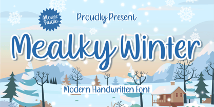 Proudly Presenting, Mealky Winter a Modern Handwritten Font Mealky Winter is perfect for any tittles, logo, product packaging, branding project, megazine, social media, wedding, or just used to express words above the background. Mealky Winter also come with Multi-Lingual Support. Enjoy the font, feel free to comment or feedback, send me PM or email. Thank You!
 - Roundlane by Zealab Fonts Division,
$10.00 Roundlane is a font inspired by retro badges antique labels, and includes all-caps, multilingual support, alternates signs, numbers & punctuation. It works well for album covers, video tittles, stickers, clothing brand names, t-shirt designs, badges designs, banner, flyer and more. I can’t wait to see what you guys will come up with with using this font!
 - Goldenlife by Putracetol,
$22.00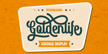 Goldenlife is a vintage display typeface. This font was inspired by classic vintage signs. It come with uppercase, lowercase, various alternates, numbers, punctuation and multi-lingual support. Goldenlife is great for any kind of display purpose from logos, t shirts, apparel, handwritten quotes, product packaging, tittle headers, posters, merchandise, social media, labels, branding and greeting cards.
 - Natube by Dhan Studio,
$14.99 Natube is a font that is scratched with a brush pen, to get a natural texture, so this font will display the characteristics of the hand. This font is very suitable for a variety of places such as clothing, poster, tittle books, stationery designs, quotes, branding, logos, invitations, greeting cards, t-shirts, packaging designs and more.
 - Fenggasta by Gatype,
$9.00 Fenggasta is a font that is scratched with a brush pen, to get a natural texture, so this font will display the characteristics of the hand. This font is very suitable for a variety of places such as clothing, poster, tittle books, stationery designs, quotes, branding, logos, invitations, greeting cards, t-shirts, packaging designs and more.
 - Burnfolk by Allouse Studio,
$14.00 Burnfolk a Brush Font that bring an a natural brush impression. Come with separate alternate and Multi-Lingual Support. Burnfolk is perfect for any tittles, logo, product packaging, branding project, megazine, social media, wedding, or just used to express words above the background. Enjoy the font, feel free to comment or feedback, send me PM or email. Thank You!
 - Flaminia by Andinistas,
$39.95 Flaminia is a typeface family of 4 members designed by Carlos Fabián Camargo G. The central idea started as Dingbats and titles labeled with fine-tipped brushes and flat tip for graphic design related restaurant menus, instructions, packaging, food containers and labels. Thus began the process of drawings and letters integrated by shapes and counterblocks that seem inaccurate yet but at the same time clean and attractive. For this reason each variable suggests fresh brushstrokes that combine ideas from Roman and italic calligraphy. Flaminia members work separately or together by solving needs in different scenarios. This will enhance its properties in order to control and diagram titles, subtitles and short paragraphs with an effusive and manuscript character. Flaminia is useful for generating a flavor of "hand lettered by skilled artists lettering." In conclusion, Flaminia Regular and Italic are used to write short paragraphs. His ascending and downs are lower that the X height. Its width is imperceptibly condensed to save horizontal space. Its smooth lines and finishes simulating a crescent moon have been made with fine-tipped brush. The contrast between thick and thin has medium intensity. Its complement is an ideal italic to emphasize words and phrases. Its conceptual characteristics are similar with foundation's handwriting, except for his companion who takes ideas from the ornamental italic calligraphy. Flaminia Black is compact and ideal for ranking information such as words and titles. Its personality is based on ornamental penmanship italics mixed with humanistic ideas outlined with contrast-type, flat-tipped brush thickness. Its overall width is slightly condensed, rising and falling are short compared to an exaggerated X height. Its smooth lines and terminations as in a crescent moon simulate the path of a broad brush. Its amount of contrast between strokes have average intensity. In brief, push to the limit parameters such as the type and amount of contrast, size, backward, forward, overall width, etc. And finally, Flaminia Dingbats offers three sets of different illustrations, a total of almost 90 drawings useful in communications related to: Food, Clothes and Sketchy. Each carefully wrought through research, testing, analytical design, visual strategy and high-definition of Bezier paths, optimizing time and work to their users. And in conclusion, I have plans to continue expanding the family with more complete versions in the future.
 - As of my last update, Futured doesn't appear to be a widely recognized or standardized font in the realms of typography or design that I can directly reference or describe. However, hypothesizing bas...
- "Wizards Magic" is a font that seems to encapsulate the enchanting essence of the mystical and magical world, inspired by the rich tapestry of fantasy literature, movies, and folklore that involve wi...
- The "Evil Dead" font is a visually striking typeface that seems to crawl out from the darkest corners of horror and fantasy themes, invoking the chilling atmosphere of its namesake - the iconic horro...
- The font "Face Your Fears" by David Kerkhoff is a compelling and evocative typeface that delves into the darker, edgier side of typography. Its design is characterized by an unsettling juxtaposition ...
- Alright, diving into the world of typography, Phosphorus Selenide is one cool font that captures attention almost immediately. Crafted by the creative minds at Apostrophic Labs, this font isn’t your ...
- Gunplay by Ray Larabie is a font that grabs your attention as soon as you lay eyes on it. Designed with a robust and unapologetic style, it embodies a gritty, almost rebellious attitude that seems to...
- The Wildcard font by Iconian Fonts, designed by Dan Zadorozny, is a remarkable addition to the dynamic world of typography, capturing the essence of versatility and creativity that seems to burst for...
- The Tork font exists as a compelling and dynamic creation by the renowned type designer Ray Larabie, who is revered for his ability to craft fonts that carry unique character and stylistic flair. Tor...
- TE Aldwawin by Tharwat Emara,
$50.00 Features of TE ALDWAWIN font with his high ability according to the letter's requirements. Diwani calligraphy is characterized by the convergence of letters, and their contiguity through one path, with the exception of some letters that must deviate from their path in order to move away from the monotony, leading to a horizon characterized by magnificence and beauty, flexibility and elegance in flow. Diwani calligraphy is characterized by being soft and malleable, and fits most writings. Suitable for most writings and is flexible in writing, The calligraphy was concerned with official books sent between kings and sultans, books of appointments to prominent positions, imitation of high positions, and special statements and orders issued by kings and princes. Write major names for books, and write ads.
 - Deportivo by 8AV,
$15.00 Welcome Deportivo - Spanish for sporty. Deportivo is a simple and powerful typeface based on the lettering on vintage sports equipment. I saw it as a brand on a pair of old skis and fell in love with it because it is so bold and it can be easily read while moving at high speed, making it perfect in a sports and dynamic environment. Due to its high legibility, it gets great results with sports teams, league names and t-shirt numbers and race indications. The high x-height gives the typeface a unique look and a strong tone of voice - that will echo in each arena and outside making it perfect also for headlines in newspapers and magazines and product names. Keep scoring!
 - Displace Serif by Serebryakov,
$35.00 Displace Serif is a continuation of my Displace fonts. Adding serifs allows you to see the font in a new way. There is a more pronounced charm of Italian monumental fonts, but in an expressive way. The appearance of the serifs allowed the font to move to the antiqua class, but this is purely a formal matter. The proportion of serifs changes markedly from weight to weight, allowing the font to retain its decorative character. In the Light drawing the serifs are barely visible and delicate, while in the Black they are in superposition. The font is catchy, noticeable, which makes it suitable for graphics requiring instantaneous spectator emotions. Displace Serif is suitable for editorial design, as despite the modern image it retains the classic concept.
 - Mira by HiH,
$10.00 Mira is a playful, decorative Art Nouveau font, released by Roos & Jung Foundry in Offenbach AM, Germany about 1902. The exaggerated serifs and the sharp contrast between the thick and thin strokes gives the page a whimsical “salt and pepper” look that is very distinctive. Mira uses our new encoding. The Euro symbol has been moved to position 128 and the Zcaron/zcaron have been added at positions 142/158 respectively. Otherwise, MIRA has our usual idiosyncratic glyph selection, with the German ch/ck instead of braces, Western European accented letters, lower case “o” and “u” with Hungarian umlaut and our usual Hand-in-Hand symbol. In addition, black-letter-style upper case “H” and “T” characters are included. Download the PDF Type Specimen for locations.
 - Zoxelyna by Meutuwah,
$20.00 Hello Font Lovers... Zoxelyna is another lovely modern signature font, which is combining the style of classic calligraphy with an modern style. combines from copperplate to contemporary typeface with a dancing baseline, modern and elegant touch. Including alternates, and ligatures. Can be used for various purposes such as headings, logos, wedding invitation, t-shirt, letterhead, labels, news, posters, badges etc. To enable the OpenType Stylistic alternates, you need a program that supports OpenType features such as Adobe Illustrator CS/CC, Adobe Indesign CS/CC, Adobe Photoshop CS/CC, CorelDraw X6-X7 & Microsoft Office. Mention, a font having characters move up and down like a dancer. This freestyle has a very unique style of signature and is very suitable for modern design. THANK YOU SO MUCH.
 - Shania Script by Seniors Studio,
$17.00 Shania Script is a modern calligraphy typeface with a free flowing and moving baseline. It has a casual, yet elegant touch. It can be used for various purposes such as logos, wedding invitations, headings, t-shirts, letterheads, signage, labels, news, posters, badges etc. Features 370+ glyphs and 136 alternate characters, including initial and terminal letters, alternates, ligatures and multiple language support. To enable the OpenType Stylistic alternates, you need a program that supports OpenType features such as Adobe Illustrator CS, Adobe Indesign & CorelDraw X6-X7, Microsoft Word 2010 or later versions. There are additional ways to access alternates/swashes, using Character Map (Windows), Nexus Font (Windows), Font Book (Mac) or a software program such as PopChar (for Windows and Mac).
 - Marita by profonts,
$51.99 Marita combines sternness with swing and, from this, develops its own, unique elegance. This makes Marita quite versatile, also and especially for headline settings. Apart from numerous ligatures, the font also includes old style figures. Marita is based on brush writing with drop-shaped serifs. The idea was to try to apply a given design criteria (also see Volker Schnebel's Manuel and Martin fonts) to every single character. In other words, start with a character and develop all of the others from it. This is quite easy for some characters but extremely difficult for others. This process generates creativity and the characters move away from the initial constructed sketch. Together in a typeface, the individual characters are now all of a piece and character.
 - Weiss by Linotype,
$29.99The German poet, painter, calligrapher and type designer Emil Rudolf Weiß originally created this eponymous typeface for the Bauer Foundry of Frankfurt. Long known and loved by metal type enthusiasts under the name "Weiss Antiqua," this design was inspired by typefaces from the Italian Renaissance while still distinctly reflecting the artistic and poetic personality of its twentieth-century designer. Weiss has tall ascenders, sharp apex points, and a low-slung midsection on the caps. The italic moves like a classical ballerina. Weiss is one of the earliest contemporary serif types to have italics based on the chancery style of writing. The Weiss family works well for warmly legible text typography; and it's also an original choice for refined headline and display graphics." - Lagom by Fenotype,
$20.00Do you find some of the contemporary fonts just a tad too cool, restrained – even arrogant in their appearance? Here’s something to charm your worried clients with – Lagom, a polite and diplomatic type family. Use Lagom and you’ll be able to reach just that fine line between sophistication and mundane. The font family works really well with FMCG (fast moving consumergoods) products, restaurant identities and menus or way finding systems – you could even try it on a mobile app for that more human, ease-of-approach feel. Perfectly adept for contemporary needs, Lagom fonts come with smart Open Type features and the family is kept just the right sized – not too vast, not too compact. Make your designer life easier with Lagom! - Geogrotesque Stencil by Emtype Foundry,
$69.00 Geogrotesque Stencil is a member of the popular Geogrotesque family, and despite being thought as a display typeface, it goes one step further and tries to solve some of the typical problems with stencils fonts. Geogrotesque Stencil comes with 3 widths of cut (A, B and C). These cuts not only allow a better performance when printing at different sizes, you can also move across versions A, B or C in accordance to the rigidity of the material used. The family consists of 42 styles, 7 weights with 3 versions each plus italics, all of them in Open Type format including ligatures, tabular figures, fractions, numerators, denominators, superiors and inferiors with support for Central and Eastern European languages. For more details see the PDF.
 - TT Geekette by TypeTrends,
$27.00 TT Geekette is an experimental variable* serif with friendly and flexible character of shapes. In this project, we wanted to get away from simplifications and dry geometry and to experiment with the smoothness, softness and plasticity of forms. And in order to make the project a little more stylish and serious, we decided to make the font monospaced. When creating TT Geekette, we did not rely on traditional writing techniques or on the influence of pen movement on the font pattern. Despite the fact that judging by certain characters TT Geekette is a serif, the font is specifically “built” and “drawn”. There are several systemic techniques in font design, such as “loops” which set the plastic rhythm for the entire typeface. Variability in TT Geekette is influenced by contrast buildup in the font—moving the slider to adjust the variability axis, you gradually move from a completely non-contrast monolinear serif font to a font with a pronounced reverse contrast. In addition, with the help of the variability slider, you can remove serifs from the monolinear essence of the font. The TT Geekette family consists of 3 styles: the TT Geekette Bones—monolinear font, the TT Geekette Muscles—reverse contrast serif, and the TT Geekette Variable font. Each style contains over 450 glyphs. And yes, technically the typeface can be used in programming, at least you are guaranteed to get your share of bright emotions. *An important clarification regarding variable fonts. At the moment, not all graphic editors, programs and browsers support variable fonts. You can check the status of support for the variability of your software here: v-fonts.com/support/
 - Candy Pop! - Personal use only

- Monod Brun by Resident,
$40.00 Created in 2009 by V.H. Fleisher, Monod Brun is a geometric sans-serif typeface. The font has OpenType features that can be accessed in programs like the Adobe Creative Suite. These features include tabular lining figures, titling caps which are heavier & more loosely spaced than the regular caps, alternative punctuation marks, and arbitrary nut fractions (for single digit numerators & denominators). By clicking on the “Gallery” tab above, you can see an illustration of the OpenType features. The “ff” tab on the “Sample Text” bar below allows you to test the OpenType features with your own text. Supported languages include: Albanian, Czech, Danish, Dutch, English, Faroese, Finnish, French, German, Icelandic, Italian, Norwegian, Portuguese, Spanish & Swedish.
 - Thrifty by Typogama,
$19.00 Thrifty is a clean, contemporary typeface family created for branding and communication design. With a narrow form and clear letter forms, this family is both suited for display and title settings while equally remaining legible in smaller point sizes. Through it’s nine weights and accompanying italics plus a large glyph set that covers the majority of Latin based languages, Thrifty aims to offer a versatile and functional design. Thanks to the implementation of OpenType features, this family includes different sets of numerals, from tabular, hanging or scientific, it equally includes ligatures and free form fractions. Each weight equally offers a complete set of arrows and 99 different pictograms focused on themes of mobility and transport.
 - Hardbop by W Type Foundry,
$29.00 Hardbop is a typographic system inspired by jazz, especially the style it's named after "Hardbop". It's also inspired by the prolific graphic work of Reid Miles for the covers of Blue Notes Records in the '50s, Japanese jazz album covers of the '70s and condensed and grotesque hand painted signs. Hardbop also references classic fonts such as Impact, Bebas, Din, Frontage and TT Trailers, the latter in the exaggeration of certain characteristics such as counterforms and endings. Hardbop design works for titles and wide spaces and was specially designed for covers and posters, where its intention is not to go unnoticed. Although it is a small family, it allows game possibilities with a wide set of characters. Enjoy!
 - Grace Tokyo by Kulokale,
$23.00 Grace Tokyo is a modern display sans font. Grace Tokyo is well-suited for advertising, branding, logotypes, packaging, titles, headlines and editorial design. This font comes in two styles, Regular and Oblique Version. This font is encoded with Unicode PUA, which allows full access to all additional characters without having special design software. Mac users can use Font Book, and Windows users can use Character Map to view and copy one of the extra characters to paste into your favorite text editor / application. We highly recommend using a program that supports OpenType features and Glyphs panels such as Adobe Illustrator, Adobe Photoshop CC, Adobe InDesign, or CorelDraw, so you can see and access all Glyph variations.
 - Librada Pro by Typehead Studio,
$12.00 Librada Pro is a Sans-serif style font.librada pro font has 9 variants of style weight, ranging from Thin, Regular, Bolt, Outline Style and Texture Style. Each variation has 2 types of styles Regular and italic. Librada Pro Font is suitable for any design needs, invitation design, branding, Cover Book design, advertising design, Art Quote, Home decor, Book Title, special events, birthday, custom mug, pillow, t-shirts, any handwriting signature style needs and more. Librada Pro Font supports the following languages : Albanian, Basque, Breton, Chamorro, Dutch, English, Finnish, Frisian, Galician, German, Italian, Malagasy, Portuguese, Spanish, Swedish. Thank you for your watching! Hope you Like it and you're having fun with Librada Pro ! Happy creating! Thanks. Typehead Studio
 - Thang by Fenotype,
$30.00 Aint’ nuthin but the Thang. Thang is a street cred script family with big initial caps and tight flow. Thang is great for flashy headlines or as a logotype. Thang family comes with three weights. Thang Extras is a pack of strokes and dots that can be used to decorate your texts typed with Thang. Thang Extras can also be combined with Thang letters for custom Swash. Thang is packed with several OpenType features: keep on Standard Ligatures and Contextual Alternates for smooth flow. Try Swash, Stylistic or Titling Alternates for alternate characters to create customised lettering works. Check out Glyph Palette for even more alternate characters and go wild the Thang.
