10,000 search results
(1.168 seconds)
- Curly Lava Bubble by TypoGraphicDesign,
$15.00 CONCEPT/ CHARACTERISTICS The lava/soap/pudding character of the font reminds us of a modern bitmap pixel font. »Curly lava bubble« goes even further. The rectangular hard edges expands to soft and almost organic forms. APPLICATION AREA The fancy, modern & decorative font »curly lava bubble« would look good at display size for party flyer & movie poster, music covers or headlines in magazines or websites… TECHNICAL SPECIFICATIONS Headline Font | Display Font | Decorative Font »curly lava bubble« with 3 stlyes (light, regular, bold) & 305 glyphs inkl. accents & € KONZEPT/BESONDERHEITEN Der Lava/Seifenblasen/Pudding Charakter der Schrift lässt an eine moderne Bitmap Pixel Schrift erinnern. Wobei »curly lava bubble« noch weiter geht und die harten rechteckigen Kanten zu weichen und fast schon organischen Formen ausbaut. EINSATZGEBIETE Der Font würde sich über folgende Gebiete sehr freuen und sich dort wohl fühlen: Logos/Wortmarken aller Art, Flyer für fast jede Party, PlattenCover, CD-Cover, PlakatDesign, Game- und Videospiel-Design aller Genres, als Headlineschrift für print und digitale Magazine, Bücher, Webseiten… TECHNISCHE INFORMATIONEN Headline Font | Display Font | Deko Font »curly lava bubble« OpenType Font mit 3 Schriftschnitten (light, regular, bold) & 305 Glyphen inkl. diakritisches Zeichen & €
 - Fontella by Canada Type,
$24.95 Italian type design master Aldo Novarese was not famous for making calligraphic designs, nor had he any interest in them. He is much better known for his text faces, and quite innovative sans serif and decorative designs which became the definition of what we now know as techno and modern. But in 1968, Novarese surprised everyone with a fantastic flowing deco script entitled Elite. Novarese's formula of simple soft curves and toned-down swashes makes for one of the most unique alphabets ever seen, not to mention one of the best flowing and most legible scripts. This is now its digital incarnation, named Fontella. Fontella's applications are virtually limitless. This is the sort of script that can feel at home pretty much anywhere; a sign, a fridge magnet, a bumper sticker, a greeting card, a movie poster, a book cover, music artwork, magazine ads, newsletter headlines, etc. Digitized from original specimen and expanded with a few built-in alternates and ligatures by Rebecca Alaccari, the font was named after the famed jazz singer Fontella Bass. These letters are just so sweet they had to be called Fontella.
 - Darkness Awakening by Ditatype,
$29.00 Darkness Awakening is a chilling display font designed to send shivers down your spine. This uppercase font features eerie details that give it an air of horror and mystery, making it the perfect choice for spine-tingling design projects. Each letter in Darkness Awakening is meticulously crafted with the appearance of brush strokes, evoking a sense of handcrafted artistry. The brush details add a touch of unpredictability and chaos, giving the font a haunted and unsettling vibe. While the font is uppercase, it is not bold, allowing the horror theme and brush details to take center stage. For the best legibility you can use this font in the bigger text sizes. Enjoy the available features here. Features: Multilingual Supports PUA Encoded Numerals and Punctuations Darkness Awakening fits in headlines, logos, movie posters, flyers, invitations, branding materials, print media, editorial layouts, headers, and any horror-themed projects. Find out more ways to use this font by taking a look at the font preview. Thanks for purchasing our fonts. Hopefully, you have a great time using our font. Feel free to contact us anytime for further information or when you have trouble with the font. Thanks a lot and happy designing.
 - Linotype Typo American by Linotype,
$29.99Mark Stanczyk designed Linotype Typo American in 1999. The font is an excellent revival of American style typewriter type. As most of us can remember from our childhood years, or through old stories and movies, everyone used to type with typewriters before the invention of computers. Unlike computers, most individual typewriters only had one typestyle, or font, to chose from. To make matters worse, the letters in a typewriter font would wear down with use. Over time, text typed out on a typewriter would look more and more corroded, old, and uneven. Stanczyk has captured exactly these features in this “revival” font! Also like most older typewriter styles, Linotype Typo American’s letters are all mono-spaced, i.e., the letter i is the same width as the letter w. Typewriter letters also all tended to be cast in the same size, around 12 points or so. When using typewriter-style fonts, it is best to keep setting your text in similar sizes. (Of course, you can set really large and fun headlines with Linotype Typo American, too; if anything the unevenness of the design will come even more across in these applications.) - Mistery Brush by Ditatype,
$29.00 Mistery Brush is a captivating script font that exudes an air of intrigue and enigma. Designed in large letters with a thick weight, this typeface commands attention and makes a powerful statement. Each letter is meticulously crafted with brush-like strokes, adding a touch of handcrafted artistry to the font. The brush details in Mystery Brush lend the font an organic and dynamic feel, as if the letters were painted with the strokes of an enigmatic artist. These artistic details add depth and character, making every word a work of art. For the best legibility you can use this font in the bigger text sizes. Enjoy the available features here. Features: Multilingual Supports PUA Encoded Numerals and Punctuations Mistery Brush fits in headlines, logos, movie posters, flyers, invitations, greeting cards, branding materials, print media, editorial layouts, headers, and many more. Find out more ways to use this font by taking a look at the font preview. Thanks for purchasing our fonts. Hopefully, you have a great time using our font. Feel free to contact us anytime for further information or when you have trouble with the font. Thanks a lot and happy designing.
 - Pattern by Mauve Type,
$29.00 The Pattern Project is an ornamental display type family. It is inspired by medieval initials and transforms their mesmerizing rhichness of detail into cool state-of-the-art typography. All letter shapes and patterns are exclusively geometric, providing a very distinct and contemporary feel. Pattern is the new sexy – perfect for vodka labels, record sleeves and posters. For editorial design and packaging. With a special typographic impact. Some practical details: - Family consists of 9 diverse patterns + a blank version. - 3 weights available. - As with patterns in general: It is quite essential how far you zoom in to change the graphic impression. 3 pattern resolutions (Coarse, Medium + Fine) allow varying the pattern size independently from the font size. - Each pattern comes with diverse weights and/or pattern resolutions. - Use in display sizes only. The bigger – the better! - Fine pattern resolutions require even larger font sizes than coarse resolutions. - Fonts gain kind of ʺtransparencyʺ through the patterns - handy for use on top of images. - Characterset is caps only and supports Central, Eastern and Western European languages. - Entertaining 2 min movie explaining the basic concept: youtube.com/watch?v=wbuUkRDApzs
 - Black Dread by Ferry Ardana Putra,
$39.00 Introducing our first death metal font! We called it Black Dread! This brutal death metal font is can be used for logos or branding and your metal band name without having to pay for expensive logo-making services. Just by buying this font, you can immediately make your own band or brand logo name. Combine it with the death metal ornaments and make your own death metal design with ease! This black metal typeface is perfect for logotypes, t-shirts, vintage badges, branding, packaging, posters, clothing brands, posters, horror movies, album covers, and many more! ——— Black Dread features: A full set of uppercase Numbers and punctuation Multilingual language support PUA Encoded Characters OpenType Features +313 Total Glyphs +Death Metal Ornaments included! ——— Black Dread includes: Black Dread Regular Black Dread Outline ——— ⚠️To enable the OpenType Stylistic alternates, you need a program that supports OpenType features such as Adobe Illustrator CS, Adobe InDesign & CorelDraw X6-X7, Microsoft Word 2010, or later versions. There are additional ways to access alternates/swashes, using Character Map (Windows), Nexus Font (Windows), Font Book (Mac), or a software program such as Pop Char (for Windows and Mac).
 - Bellerin by Mevstory Studio,
$15.00 Bellerin is one of my fonts based on a hand lettering project in 2020. I was very inspired by the famous retro typography designs form the late 60's till the 70's. So you won't need extra efforts for create an extrude effect for this font. This mean it will saves your time.
 - Henny by driemeyerdesign,
$19.95 Henny is a simple but elegant handwriting font which is legible even in very small sizes and longer texts. There is an extended character set with some extra ligatures for a natural look. Henny was used in “Coffeeshop” for titel and headlines: http://www.amazon.de/Aus-dem-Coffeeshop-Dr-Oetker/dp/376700688X Have fun using it!
 - Sunny Bunny by Allouse Studio,
$16.00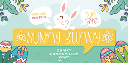 Sunny Bunny a Quirky Handwritten Font. Sunny Bunny is perfect for any tittles, logo, product packaging, branding project, megazine, social media, wedding, or just used to express words above the background. Sunny Bunny also come with Multi-Lingual Support. Enjoy the font, feel free to comment or feedback, send me PM or email. Thank You!
 - Gikit by bb-bureau,
$65.00 Gikit is a very raw and quirky typeface structured according to a strict grid. The design is massive, with very little curve (just the dots and a few punctuation marks). A really stand out characteristic is Gikit’s accents that crush the forms. The type is drawn with 2 styles, for 2 uses: Tittle or Text.
 - Wiramatra by Beewest Studio,
$25.00 Wiramatra is a modern Wire-Metric style font. This neat display font with unique wire cable on each character. Dainty and joyful, this font will be ideal for Sci fi Novel Tittle book, or writing techno modern wedding style invitations, cards or any other design that may need a techno futuristic romantic, personalized touch!
 - Alesantria Mane by Allouse Studio,
$16.00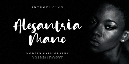 Alesantria Mane a Modern Calligraphy Font. Alesantria Mane is perfect for any tittles, logo, product packaging, branding project, megazine, social media, wedding, or just used to express words above the background. Alesantria Mane also come with Multi-Lingual Support. Enjoy the font, feel free to comment or feedback, send me PM or email. Thank You!
 - PB Carolingian Xc by Paweł Burgiel,
$32.00 PB Carolingian Xc is a font face designed for imitate Carolingian minuscule (from the region of the German southeastern scribal schools) found in 10th century manuscripts. All characters are handwritten by use ink and quill pen, scanned, digitized and optimized for best quality without lost its handwritten visual appearance. Character set support codepages: 1250 Central (Eastern) European, 1252 Western (ANSI), 1254 Turkish, 1257 Baltic. Include also additional characters for Cornish, Danish, Dutch and Welsh language, spaces (M/1, M/2, M/3, M/4, M/6, thin, hair, zero width space etc.), historical characters (overlined uppercase Roman numerals, many mediaeval abbreviations, d-rotunda, r-rotunda, I-longa, e-caudata, historical ligatures for “nomina sacra”) and wide range of ancient punctuation. OpenType TrueType TTF (.ttf) font file include installed OpenType features: Access All Alternates, Localized Forms, Fractions, Ordinals, Superscript, Tabular Figures, Proportional Figures, Case-Sensitive Forms, Stylistic Alternates, Contextual Alternates, Stylistic Set 1-11, Historical Forms, Historical Ligatures, Standard Ligatures. Include also kerning as single ‘kern’ table for maximum possible backwards compatibility with older software. Historical ligatures for additional glyphs are mapped to Private Use Area codepoints. OpenType features automatically exchange some default glyphs by stylistic alternates and create ligatures for better historical appearance.
 - Arta by Olivier Blanc,
$34.00 ARTA is an ArtDeco style font, inspired by classic font like Newport Classic with elongated typeface with high waisted uppercase letters which curve in an geometric and elegant way. It consisted of really condensed lettering which had little space available. It's a well complet font with 315 Glyphs for most latin languages as "English, French, Spanish, German, Icelandic, Afrikaans, Catalan, Czech, Esperanto, Hungarian, Latin, Latvian, Lithuanian, Maltese, Northern Sami, Polish, Serbo-Croatian, Slovak, Slovene, Sorbian, Turkish and Welsh". ARTA will give to your design an chic presentation, you will be able to generate beautiful writings,thanks to 3 differents type "Light, Regular & Bold". It can be used for Shop, Restaurant, Jewelry, Cosmetic, Press identity & more. I started to work on this typeface at the creation of a logo in 2017 for the butcher shop of my uncle in Luchon in France named "Le Louchébem". I always had in mind to complete & share it. So after some years, I decided that it was time to finish it. This was my first Typography creation and I wanted to make it as an Art Deco typeface. I really love this elegant, high & classy lettering style. I want to bring this 1910's vibes back to be more use in our days.
 - Retro Checkbook JNL by Jeff Levine,
$29.00 By the 1990s, the availability of font creation software opened the door to an explosion of creativity, experimentation and exploration into the world of digital typography by amateur and professional alike. The undisputed king of the freeware fonts was Ray Larabie through his Larabie Fonts website. It seemed at the time that Ray’s output was endless, and he amassed dozens upon dozens of fonts that ranged from the ridiculous to the sublime. In fact, Ray was the driving force of encouragement and a behind-the-scenes “mentor” who helped Jeff Levine Fonts get underway in January of 2006. As Larabie’s focus changed to higher-quality commercial type design with the launch of Typodermic, Inc., many of his “less than perfect” font experiments were withdrawn and shelved. Ray eventually turned those lost (and sometimes questionable) typefaces into a bundled zip archive released into the public domain through Creative Commons. One particular design “Boron” (circa 1996) featured computer-oriented lettering as if etched onto a circuit board. Running with this idea, and with Ray's approval, the electronic elements were stripped away, the characters cleaned up and modified, and the font reworked in Retro Checkbook JNL, which is available in both regular and oblique versions.
 - Isabelle Pro by Canada Type,
$39.95 Isabelle is the closest thing to a metal type revival Jim Rimmer ever did. The original metal face was designed and cut in late 1930s Germany, but its propspects were cut short by the arrival of the war. This was one of Jim's favourite faces, most likely because of the refined art deco elements that reminded him of his youthful enthusiasm about everything press-related, and the face's intricately thought balance between calligraphy and typography. Not to mention one of the most beautiful italics ever made. Jim's early 2000s digitization included mathematical corrections to the original metal cut, as well as some functional improvements for digital use. In 2013, during the remastering of the entire Rimmer collection, Isabelle underwent a considerable rethinking/expansion and was rechristened Isabelle Pro. The new revisions include small caps, ligatures, seven types of figures, automatic fractions, extended Latin language support, stylistic alternates that include lowercase serif angle options in the roman and looped ascenders/descenders in the italic, and plenty of extra OpenType features like caps-to-small-caps substitution, case-sensitive positioning, ordinals, and extended class-based kerning. Now each of the Isabelle Pro fonts includes over 680 glyphs. 20% of this font's revenues will be donated to the Canada Type Scholarship Fund, supporting higher typography education in Canada.
 - Mon Nicolette by Sudtipos,
$49.00 This is a digital revival by Cristóbal Henestrosa based on an experimental typeface named Charter, designed – yet never fully accomplished – by the prominent William Addison Dwiggins. It is an upright italic, unconnected script typeface, whose main features are a pronounced contrast, condensed forms and exaggerated ascenders. While Dwiggins worked on this project from 1937 to 1955, he only completed the lowercase and a few other characters. However, it was used to set a specimen in 1942 and a short novel in 1946. The sources that Cristóbal used for Mon Nicolette were the original sketches by WAD as well as printing trails kept at the Boston Public Library, and a copy of the 1946 edition of The Song-Story of Aucassin and Nicolette. This gorgeous typeface can be used successfully in headlines, subheads and short passages of text from 12 points onwards, in applications such as fashion magazines, soft news, advertising, poetry, albums, and book covers. This project started ten years ago, while Cristóbal was studying the Type@Cooper Extended Program at New York City. A previous version was selected to be part of the Biennial Tipos Latinos 2018, and now Mon Nicolette is finally ready for commercial distribution with Sudtipos… and we are very proud of it! Festina lente.
 - Century Gothic by Monotype,
$40.99 Century Gothic™ is based on Monotype 20th Century, which was drawn by Sol Hess between 1936 and 1947. Century Gothic maintains the basic design of 20th Century but has an enlarged x-height and has been modified to ensure satisfactory output from modern digital systems. The design is influenced by the geometric style sans serif faces which were popular during the 1920s and 30s. The Century Gothic font family is useful for headlines and general display work and for small quantities of text, particularly in advertising. The Century Gothic family has been extended to 14 weights in a Pan-European character set from Thin to Black and their Italics. The already existing 4 weights of Regular and Bold with their Italics are additionally still available in the STD character set. The W1G versions featuring a Pan-European character set for international communications supports almost all the popular languages/writing systems in western, eastern, and central Europe based on the Latin alphabet including several based on Cyrillic and Greek alphabets. Looking for the perfect way to complete your project? Check out Aptifer™ Slab, ITC Berkeley Old Style®, FF Franziska™, Frutiger®, ITC Legacy® Square Serif or Plantin®.
 - Freundschafts-Antiqua AR by ARTypes,
$35.00Freundschafts-Antiqua AR is based on a 20th-century German type design. Freundschafts-Antiqua (which was also called Chinesische Antiqua) was designed by the Chinese calligrapher Yü Bing-nan when he was a student at the Hochschule für Grafik und Buchkunst at Leipzig in 1960. It was cast in 1964 by VEB Typoart, Dresden, in 9-pt and 28-pt (Didot). The design combines the best German traditions with the Chinese bamboo pen. It is a unique, wholly modern, yet quiet and dignified typeface which is well suited for text-setting in many sizes. The original design was carefully crafted with all non-kerning letters (none of the letters overhangs its side-bearings); the lower-case f was designed so that no ligatures were needed. The AR fonts include the type's ch and ck logotypes, monetary signs and all the standard accents. The letterfit of the original design is retained and, as can be seen in the attached printable .pdf, text composed at normal sizes is very agreeable indeed. Freundschafts-Kursiv AR A features old-style (non-lining) figures and 'kerning' letters; Freundschafts-Kursiv AR B contains lining (cap-height) figures and all non-kerning letters following the original design of the face. - Syntax Next Paneuropean by Linotype,
$103.99Syntax was designed by Swiss typographer Hans Eduard Meier, and issued in 1968 by the D. Stempel AG type foundry as their last hot metal type family. Meier used an unusual rationale in the design of this sans serif typeface; it has the shapes of humanist letters or oldstyle types (such as Sabon), but with a modified monoline treatment. The original drawings were done in 1954; first by writing the letters with a brush, then redrawing their essential linear forms, and finally adding balanced amounts of weight to the skeletons to produce optically monoline letterforms. Meier wanted to subtly express the rhythmical dynamism of written letters and at the same time produce a legible sans serif typeface. This theme was supported by using a very slight slope in the roman, tall ascenders, terminals at right angles to stroke direction, caps with classical proportions, and the humanist style a and g. The original foundry metal type was digitized in 1989 to make this family of four romans and one italic. Meier completely reworked Syntax in 2000, completing an expanded and improved font family that is available exclusively from Linotype GmbH as Linotype Syntax. In 2009 the typeface family was renamed into a more logical naming of "Syntax Next" to fit better in the Platinum Collection naming." - FS Blake by Fontsmith,
$80.00 Art deco The inspiration for FS Blake’s elegant, lightly geometric forms can be traced back to design of the 1930s; designer Emanuela Conidi was influenced by the typography of cool, European, art deco posters. FS Blake bears traits of the art deco style, from its thin weights to its heavy weights, giving a set of faces each with their own distinct character, but still with a strong family resemblance. Mechanical type Mechanical and organic shapes combine in FS Blake to create a harmonious whole of generous curves and cursive spikes. A strong, punchy contender in display sizes, it’s also got a gentle touch with small text in lighter weights. Lively, versatile and with plenty of character contrast between weights, the FS Blake family offers impact in whatever task it’s given.faces each with their own distinct character, but still with a strong family resemblance. Sketch book Great fonts still emerge from a combination of hand, paper and pencil. After filling her sketch book with ideas, Emanuela and Jason extracted the elements that both felt could work in a font. The process yielded a whole crop of starting points for future designs as well as a focus for FS Blake as a striking, characterful, almost industrial font.
 - Nurnberg Schwabacher by Intellecta Design,
$29.95"I digitized and to revitalize NurnbergSchwabacher by the extinct Haas'sche Schriftgiesserei, a German/Swiss foundry established in 1790 and based in Basel/Münchenstein. Many of its shares were acquired by D. Stempel in 1927. On the Luc Devroye site this foundry is listed on the Extinct Foundries of the 18th century page. This design is very similar to another Intellecta best seller: Hostetler Fette Ultfraktur Ornamental, both drawn from the classical type specimen book from Hostetler. The ornamental frame that completes the font is a fantastic baroque ornament that I found in another old book, unfortunately lost now. Luc Devroye, whose book is the source for all of my fonts, writes this about Rudolf Hostettler: He was a Swiss type designer, author of “The Printer’s Terms” designed by Jan Tschichold, of "Technical Terms of the Printing Industry" (5th edition was printed in 1995), and of "Type: eine Auswahl guter Drucktypen; 80 Alphabete klassischer und moderner Schriften" (Teufen, Ausser-Rhoden: Niggli, 1958). He also wrote "Type: A Selection of Types" (1949, fgm books, R. Hostettler, E. Kopley, H. Strehler Publ., St. Gallen and London) in which he highlights type made by European houses such as Haas, Enschedé, Deberny and Nebiolo. Jost Hochuli wrote his biography. - FF Signa Slab by FontFont,
$72.99 FF Signa is a typically Danish typeface, rooted in architectural lettering rather than book typography. Originally designed for signage—hence the name—FF Signa is now a typographic family with three widths. All weights include italics, small caps, and several styles of figures. Because of the quality of this “vernacular-lettering-into-typeface” conversion, FF Signa received a Danish Design Prize in 2002. FF Signa is radically different from most sans serif text typefaces that were published during the 1990s. It neither belongs in the “humanist sans” category, nor is it on the list of typefaces based on 19th-century grotesques. Its concise letterforms and a minimum of detail produce clear and harmonious word images. Yet its proportions are classical, and the underlying geometry has been subtly adjusted in order to create letterforms which are at once interesting, harmonious, and contemporary. These features make FF Signa pleasant for reading, even at very small sizes. The typeface has developed into a versatile family, with Condensed, Extended, and Correspondence versions. Later on Signa Serif, Stencil variants and a Signa Slab family added even more versatility. The resulting FF Signa type system may be used for corporate identities, brochures, magazines, communication, books, and on-screen publications.
 - Philadelphian by FontMesa,
$29.00 Philadelphian is a revival of a MacKellar, Smiths & Jordan font from 1867 by the same name. The regular version with shadow outline was the only style that was offered in 1867. We've taken the original design further by creating two additional weights of medium and bold plus plain black versions. The medium and bold weights are unique because only the horizontal strokes increase in thickness while the vertical strokes remain the same in each weight. Philadelphian Nite is the plain black version of this font family, Nite is the casual spelling of the word Night meaning dark or black. In the late 1800's Philadelphian was a very popular typeface which can be seen on many billheads and letterheads through the early 1900's. If you're looking for a western style font that doesn't look like any other then Philadelphian is the right choice. While the name doesn't remind you of the cowboy genre we've kept the original name for historical reasons because this font was so popular in its day. We plan on going forward with a weathered version of Philadelphian which will be released under a southwestern style name. With Philadelphian we've decided to set the complete family price to an amount that may be considered on sale all of the time.
 - Times New Roman Windows compatible by Monotype,In 1931, The Times of London commissioned a new text type design from Stanley Morison and the Monotype Corporation, after Morison had written an article criticizing The Times for being badly printed and typographically behind the times. The new design was supervised by Stanley Morison and drawn by Victor Lardent, an artist from the advertising department of The Times. Morison used an older typeface, Plantin, as the basis for his design, but made revisions for legibility and economy of space (always important concerns for newspapers). As the old type used by the newspaper had been called Times Old Roman," Morison's revision became "Times New Roman." The Times of London debuted the new typeface in October 1932, and after one year the design was released for commercial sale. The Times New Roman World Version is an extension of the original Times New Roman with several other scripts like with the Helvetica World fonts. It is part of the Windows Vista system. The following code pages are supported:1250 Latin 2: Eastern European 1251 Cyrillic 1253 Greek 1254 Turkish 1255 Hebrew 1256 Arabic Note: The Roman and Bold versions include the arabic scripts but they are not part in the corresponding italic versions. 1257 Windows Baltic 1258 Windows Vietnamese
- Boogie Nights NF Pro by CheapProFonts,
$10.00 A typical Art Deco font. I have redesigned the uppercase “S” to mach the lowercase, tweaked a little here and there - and completely redesigned all the diacritics (which didn't really match the letter designs). Nick Curtis says: "The inspiration for this font came from a poster for an Austrian trade show from the 1920s, credited simply to Wasserman." ALL fonts from CheapProFonts have very extensive language support: They contain some unusual diacritic letters (some of which are contained in the Latin Extended-B Unicode block) supporting: Cornish, Filipino (Tagalog), Guarani, Luxembourgian, Malagasy, Romanian, Ulithian and Welsh. They also contain all glyphs in the Latin Extended-A Unicode block (which among others cover the Central European and Baltic areas) supporting: Afrikaans, Belarusian (Lacinka), Bosnian, Catalan, Chichewa, Croatian, Czech, Dutch, Esperanto, Greenlandic, Hungarian, Kashubian, Kurdish (Kurmanji), Latvian, Lithuanian, Maltese, Maori, Polish, Saami (Inari), Saami (North), Serbian (latin), Slovak(ian), Slovene, Sorbian (Lower), Sorbian (Upper), Turkish and Turkmen. And they of course contain all the usual “western” glyphs supporting: Albanian, Basque, Breton, Chamorro, Danish, Estonian, Faroese, Finnish, French, Frisian, Galican, German, Icelandic, Indonesian, Irish (Gaelic), Italian, Northern Sotho, Norwegian, Occitan, Portuguese, Rhaeto-Romance, Sami (Lule), Sami (South), Scots (Gaelic), Spanish, Swedish, Tswana, Walloon and Yapese.
 - Plate Gothic by Monotype,
$29.00Around the turn of the twentieth-century, Steel and copper plate engraving was the most sophisticated and expensive method for producing business cards, stationery, and formal announcements. In engraved printing, the image is incised, or engraved into a hard, flat plate. Ink is applied to the plate, and then wiped off; leaving only the ink that is trapped below the surface in the incised areas. When the paper is pressed against the flat plate, the ink is drawn out of these areas and transferred to the paper. The results are twofold: printing which sits above the surface of the paper, and the reproduction very delicate lines and shapes. For business and formal printing, engraved printing was, and is, considered the best. The problem is that not everybody can afford the best. Type foundries, in the early 1900s, figured that if they could produce a typeface for traditional printing, which had appearance of engraving, they would be able to satisfy the needs of those forced to live with modest printing budgets. Engravers faces were born. Fredric Goudy’s Copperplate Gothic was one of the most popular. Plate Gothic is a version of this style updated for digital technology. It has all the charm and charisma as the metal type and yet is perfect for today's needs. - Bodrum Stencil by Bülent Yüksel,
$19.00 Bodrum Collection: 1- Bodrum Sans 2- Bodrum Sweet 3- Bodrum Stencil 4- Bodrum Slab 5- Bodrum Styte 6- Bodrum Soft Bodrum Stencil is a stencil serif type family. Designed by Bülent Yüksel in 2018/19. The font, influenced by style serifs, popular in the 1920s and 30s, is based on optically corrected geometric forms for better readability. Bodrum Stencil is not purely geometric; it has vertical strokes that are thicker than the horizontals, an “o” that is not a perfect circle, and shortened ascenders. These nuances aid in legibility and give "Bodrum Stencil" a harmonious and sensible appearance for both texts and headlines. Bodrum Stencil provides advanced typographical support for Latin-based languages. An extended character set, supporting Central, Western and Eastern European languages, rounds up the family. The designation “Bodrum Stencil 14 Regular” forms the central point. "Bodrum Stencil" is available in 10 weights (Hair, Thin, Extra-Light, Light, Regular, Meduim, Bold, Extra-Bold, Heavy and Black) and 10 matching italics. The family contains a set of 650+ characters. Case-Sensitive Forms, Classes and Features, Small Caps from Letter Cases, Fractions, Superior, Inferior, Denominator, Numerator, Old Style Figures just one touch easy In all graphic programs. Bodrum Stencil is the perfect font for web use.
 - Business Penmanship by Sudtipos,
$79.00 Business Penmanship is an ode to the business handwriting from the era penmanship was a highly-valued part of business education and practice. In the early 1800s, Platt Rogers Spencer (1800-1864) created what would become the most widely accepted and prized cursive writing method used in business. Before the American Civil War, Spencer was the undisputed king of handwriting. He was also an outspoken supporter of American business education. By the late 1800s business education included some focus on penmanship, and there were many colleges that specialized in it. One of the most influential penmanship schools was founded by Charles Paxton Zaner and his partner E. W. Bloser. Later on, in the early 1900s Austin Palmer introduced the Palmer Method of business penmanship, and it soon became the most popular handwriting system in the United States. Business Penmanship is a single feature-rich font that includes over 1100 characters, covering ligatures, alternates, a large set of beginning and ending extensions, as well as a wide range of Latin-based languages, including Turkish and the languages of Central and Eastern Europe and the Baltic region. To take advantage of all the OpenType features included in the font, please use within programs that support such advanced typography.
 - Floras Display by Putracetol,
$22.00 Floras is a display typeface font inspired by vintage albums and posters from 1960s music bands. This unique font features a classic typeface with a fun and groovy impression, making it perfect for any display purpose, including album covers, posters, labels, t-shirts, apparel, signage, quotes, logos, greeting cards, and more. Floras also supports multiple languages, making it a versatile font for any project. In addition to its classic typeface, Floras also features several variations such as ligatures, adding to its uniqueness and versatility. The font comes with several Open Type features, including swashes, stylistic sets, stylistic alternates, contextual alternates, and ligatures, which can be accessed using Open Type savvy programs such as Adobe Illustrator, Adobe InDesign, Adobe Photoshop, Corel Draw X version, and Microsoft Word. The Floras font package includes three file formats - otf, ttf, and woff - providing compatibility across various platforms. It also comes with several features, including uppercase and lowercase letters, alternates, ligatures, and support for numbers, punctuation, and symbols. If you're looking for a font with a classic yet unique vibe, Floras is an excellent choice. This display typeface is perfect for any project that requires a touch of vintage charm and a groovy impression. With its multiple language support and versatile features, Floras is sure to impress.
 - Wedge Gothic by HiH,
$12.00 Bold, muscular, vaguely oriental, Wedge Gothic ML is the original name of this font released by Barnhart Bros. and Spindler of Chicago in 1893. The straight-forward, no-nonsense name tells us exactly what to expect: sans-serif letterforms based on wedge-shaped vertical strokes. The typeface was dropped for awhile -- it does not appear in the 1907 catalog for example -- but reappeared in 1925 as Japanette. What is the opposite of "straight-forward" anyway? According to McGrew, Wedge Gothic was originally created for the Chicago Herald newspaper. The designer is unknown. A distinctive display face, useful when a strong and unusual statement is desired. Wedge Gothic ML features: 1. Glyphs for the 1250 Central Europe, the 1252 Western Europe, the 1254 Turkish and the 1257 Baltic Code Pages. Total of 335 glyphs. 2. OpenType GSUB layout features: pnum, ornm, hist & salt. 3. 66 kerning pairs. 4. Both tabular & proportional numbers. 5. Alternate bullets. The zip package includes two versions of the font at no extra charge. There is an OTF version which is in Open PS (Post Script Type 1) format and a TTF version which is in Open TT (True Type)format. Use whichever works best for your applications.
 - 1812 by Apostrof,
$40.00 '1812' type family is a revival and further development of the typeface '1812' by Lehmann Type Foundry (St. Petersburg). It was created for the centenary of the French invasion of Russia, known in Russia as the Patriotic War of 1812 along the lines of decorative engraved inscriptions and ornamented typefaces of that time, presumably by the artist Alexandre Benois. It was used mainly for the decoration of luxurious elegant publications. Later, in 1917, this typeface was used on the Russian Provisional Government banknotes. In the Soviet period of time '1812' appeared to be one of the few typefaces included in the first Soviet type standard OST 1337. It was produced for manual typesetting until the early 1990s. This typeface could be seen on Soviet letterheads, forms, posters and even air tickets. The digital version development was launched in 2010. The original version was supplemented with lowercase letters and alternative symbols, the extended Latin and Cyrillic alphabets were fully supported. The font was evolved into a family of 14 decorative styles which can refine any design giving it a festive and elegant but at the same time strict and nostalgic look. Despite its decorative nature, '1812' is perfectly readable in small emphasized text blocks due to its classic shape and careful spacing.
 - Bodrum Soft by Bülent Yüksel,
$19.00 You can download Bodrum Soft PDF Type Specimen here . "Bodrum Soft" is a rounded sans serif type family, designed by Bülent Yüksel in 20018/19. The font, influenced by serif styles that were popular in the 1920s and 30s, is based on optically corrected geometric forms for a better readability. "Bodrum Soft" is not purely geometric; it has vertical strokes that are thicker than the horizontals, an “o” that is not a perfect circle, and shortened ascenders. These nuances helps the legibility and gives "Bodrum Soft" an harmonious and sensible appearance for both texts and headlines. Bodrum Soft provides advanced typographical support for Latin-based languages. An extended character set, supporting Central, Western and Eastern European languages, rounds up the family. “Bodrum Soft 14 Regular” forms the central point. "Bodrum Soft" is available in 10 weights (Hair, Thin, Extra-Light, Light, Regular, Medium, Bold, Extra-Bold, Heavy and Black) and 10 matching italics. The family contains a set of 650+ characters. Case-Sensitive Forms, Classes and Features, Small Caps from Letter Cases, Fractions, Superior, Inferior, Denominator, Numerator, Old Style Figures can be accessed with one simple touch in all graphic programs. Bodrum Soft is the perfect font for web use. I hope you enjoy using it!
 - Ongunkan Younger Futhark by Runic World Tamgacı,
$45.00 The Younger Futhark, also called Scandinavian runes, is a runic alphabet and a reduced form of the Elder Futhark, with only 16 characters, in use from about the 9th century, after a "transitional period" during the 7th and 8th centuries. The reduction, somewhat paradoxically, happened at the same time as phonetic changes that led to a greater number of different phonemes in the spoken language, when Proto-Norse evolved into Old Norse. Also, the writing custom avoided carving the same rune consecutively for the same sound, so the spoken distinction between long and short vowels was lost in writing. Thus, the language included distinct sounds and minimal pairs that were written the same. The Younger Futhark is divided into long-branch (Danish) and short-twig (Swedish and Norwegian) runes; in the 10th century, it was further expanded by the "Hälsinge Runes" or staveless runes. The lifetime of the Younger Futhark corresponds roughly to the Viking Age. Their use declined after the Christianization of Scandinavia; most writing in Scandinavia from the 12th century was in the Latin alphabet, but the runic scripts survived in marginal use in the form of the medieval runes (in use ca. 1100–1500) and the Latinised Dalecarlian runes (ca. 1500–1910)
 - Flanker Tanagra by Flanker,
$12.00 In order to give new imput to the art of typeface design in Italy, Nebiolo Company held, in March 1910, an artistic competition for a new alphabet conception, so the best-ranked design would be transformed into a real new typeface. 42 competitors participated and, although the first prize was not technically awarded, "Ancora" resulted as the best typeface, created by the designer-typographer Natale Varetti of Turin. Nonetheless, the new alphabet was transformed into a full-fledged metal typeface in 1924, renamed "Tanagra" in honor of the Greek city in the center of Boeotia. The new font, although not significantly detached from the classical Roman form, introduced decorative elements that allowed its use in both rational and artistic compositions. This font appears very clear and easy to read, with very high ascenders and some decorations that make it distinctly retrò. Finally, after almost 100 years, this peculiar character has been digitized taking it as a model the shapes of the 16 points size (other dimensions have significantly different contrasts and proportions). To adapt it to modern use, some glyphs have been modified, but all the originals are available as Stylistic Alternate OTF, as well as all the swashed variants while the missing ones were added.
 - Arlen by Groteskly Yours,
$45.00 Meet Arlen, a funky, variable type family in 36 styles. Inspired by 20th century hand-painted signs and the visual culture of the 1980's, Arlen adds a little extra to this already charismatic mix. Arlen is a display sans serif that can be freely used for larger bodies of text. Among its most prominent visual features are high contrast, flaring stems and dynamic letterforms. With 860 characters in each font, Arlen supports most Latin-based languages and offers a large number of extra characters, dingbats, alternate glyphs, ligatures, and punctuation marks. Some of the most useful OpenType features are included too, such as Case-Sensitive Punctuation, Stylistic Alternates, Tabular Figures, Fractions, Localization, and a lot more. Some letters and characters come in two versions: thin and bold, and you can easily alternate between the two using a corresponding stylistic set. Arlen is a cheerful typeface that conveys kindness, good cheer, and only good vibes. It would feel at home both in digital and print mediums; it can be used in advertising, editorial design, social media, web design, packaging, or personal design projects. With versatility at its heart, Arlen would be a perfect typeface for large design systems that require multiple styles for typesetting.
 - Mila Script Pro by FaceType,
$79.00 Proud to introduce: The all hand-drawn Mila Script Pro Family Mila Script is a handmade brush script with round and soft letterforms, a low x-height and jumping baseline. Smart OpenType features care about all letterforms and choose between connected and non-connected styles. AutomaticSwashControl adjusts the swashy letters to the available white space. It’s installed within Mila’s main features OpenType Contextual-Alternates, Swashes and Titling-Alternates. Switch one on and let Mila do the rest. · Please read over the manual. It describes the family in detail. · Of course there’s a little more know about Mila Script Pro: 2600+ characters offer four different initial styles, capital swash and titling alternates, connected words, 17 different initial and terminal swashes and much more. All of course with full ISO latin 1 & 2 language support. · Mila Script Basic (900+ characters) offers all single features contained in OpenType Contextual-Alternates: subtle contextual swash alternates, positional forms, ligatures, connecting and non-connecting characters … · Mila Script Sans: Mila Script Sans is a hand-drawn/handwritten “all caps” in three different weights. Mila Script and Mila Script Sans go well together: combine them and equal the line weights by choosing Light, Regular or Bold. Always keep it way smaller than Mila Script. Mila Script Sans also works well as a standalone. It offers negative typesetting, bicolor typesetting by layering two styles and even alternates without counters. Please see the manual for instructions. · Mila Script Ornaments: Change the size and keep the line weight: activate Contextual Alternates, type a letter and add + to enlarge all swashes according to your likings. Mila Script Ornaments contains 69 different swashes and symbols, all of them available in seven different sizes, which makes a total of 483 characters. All ornaments are within easy reach and there’s no need to access certain symbols manually via your glyph palette. · Have fun! · View other fonts from Georg Herold-Wildfellner: Sofa Serif | Sofa Sans | Mila Script Pro | Pinto | Supernett | Mr Moustache | Aeronaut | Ivory | Weingut · Language Report for Mila Script / 195 languages supported: Abenaki, Afaan Oromo, Afar, Afrikaans, Albanian, Alsatian, Amis, Anuta, Aragonese, Aranese, Aromanian, Arrernte, Arvanitic, Asturian, Aymara, Bashkir, Basque, Bikol, Bislama, Bosnian, Breton, Cape Verdean, Catalan, Cebuano, Chamorro, Chavacano, Chickasaw, Cimbrian, Cofan, Corsican, Creek, Crimean Tatar, Croatian, Czech, Danish, Dawan, Delaware, Dholuo, Drehu, Dutch, English, Estonian, Faroese, Fijian, Filipino, Finnish, Folkspraak, French, Frisian, Friulian, Gagauz, Galician, Genoese, German, Gooniyandi, Greenlandic, Guadeloupean, Gwichin, Haitian Creole, Han, Hawaiian, Hiligaynon, Hopi, Hotcak, Hungarian, Icelandic, Ido, Ilocano, Indonesian, Interglossa, Interlingua, Irish, Istroromanian, Italian, Jamaican, Javanese, Jerriais, Kala Lagaw Ya, Kapampangan, Kaqchikel, Karakalpak, Karelian, Kashubian, Kikongo, Kinyarwanda, Kiribati, Kirundi, Klingon, Ladin, Latin, Latino Sine, Latvian, Lithuanian, Lojban, Lombard, Low Saxon, Luxembourgish, Makhuwa, Malay, Maltese, Manx, Maori, Marquesan, Meglenoromanian, Meriam Mir, Mohawk, Moldovan, Montagnais, Montenegrin, Murrinhpatha, Nagamese Creole, Ndebele, Neapolitan, Ngiyambaa, Niuean, Noongar, Norwegian, Novial, Occidental, Occitan, Oshiwambo, Ossetian, Palauan, Papiamento, Piedmontese, Polish, Portuguese, Potawatomi, Qeqchi, Quechua, Rarotongan, Romanian, Romansh, Rotokas, Sami Lule, Sami Southern, Samoan, Sango, Saramaccan, Sardinian, Scottish Gaelic, Serbian, Seri, Seychellois, Shawnee, Shona, Sicilian, Silesian, Slovak, Slovenian, Slovio, Somali, Sorbian Lower, Sorbian Upper, Sotho Northern, Sotho Southern, Spanish, Sranan, Sundanese, Swahili, Swazi, Swedish, Tagalog, Tahitian, Tetum, Tok Pisin, Tokelauan, Tongan, Tshiluba, Tsonga, Tswana, Tumbuka, Turkish, Turkmen, Tuvaluan, Tzotzil, Uzbek, Venetian, Vepsian, Volapuk, Voro, Wallisian, Walloon, Waraywaray, Warlpiri, Wayuu, Welsh, Wikmungkan, Wiradjuri, Xhosa, Yapese, Yindjibarndi, Zapotec, Zulu, Zuni
 - Schnorr Gestreckt by HiH,
$12.00 Peter Schnorr was a German artist/illustrator of Art Nouveau period (called Jugendstil in Germany and Austria). He was quite adept at calligraphy and did a variety of commercial work, including business signs. He designed at least four different alphabets and collaborated with Bruce Rogers on advertising work and title page designs for books. One of their clients was the publishing house of Houghton Mifflin. I have not been able to discover anything else about him, but I suspect he might be the grandson of the Bavarian artist Jules Schnorr von Carolsfeld, who was once commissioned to do a mural by Ludwig II of Bavaria (whose famous castle was copied by Disneyland). Schnorr did not give individual names to his fonts. Where there is no historical name, we like to follow the tradition initiated by Bauer and name fonts after their designer, with a descriptive adjective in the designer’s native language. Gestreckt is German for stretched or elongated. An interesting deign detail of this typeface is the cross bar of the “T” --it is NOT symetrical. The right hand side extends only 88% as far as the left hand side (a ratio of 9:8). I presume this was done for a more pleasing letter fit. Today Schnorr’s design is frequently offered under the name “Ambrosia.” However. close inspection will usually reveal that the serifs have been treated differently. I believe our font has a greater fidelity to the original design. Please also compare the design of the various auxiliary characters to those in other fonts. Often they are either borrowed from an inappropriate font of a different period or are missing altogether. We make every effort to design characters that are in keeping with the overall design and spirit of the typeface. For example, see the superscript Registered Trademark symbol (0174) and the Double s (0223). I think both are quite successful. Schnorr Gestreckt ML represents a major extension of the original release. In addition to the standard 1252 Western Europe Code Page with character slots up to decimal position 255, there are glyphs for the 1250 Central Europe, the 1252 Turkish and the 1257 Baltic Code Pages. There are also two alternate letter forms, one ornament and seven ligatures with Unicode codepoints (Private Use Area) and OpenType aalt, ornm & liga GSUB layout features. There are a total of 318 glyphs and 351 kerning pairs. Please note that some older applications may only be able to access the Western Europe character set (approximately 221 glyphs). This release also incorporates a redesign of several glyphs: the comma, quotes, acute accent, and grave accent.
 - Genteta by Typephases,
$25.00 In the tradition of the stock cuts that printing type foundries offered as metal, these spot illustrations remind you —for their look and technique— of vintage publications like victorian age newspapers and magazines. Similar to their counterparts in the Whimsies, Absurdies, Ombres, Bizarries and Whimsies series, the Genteta is another collection of little people in funny and absurd situations, recreated in black ink, from imagination and with no reference or models, and then carefully digitized. The Genteta trio of dingbats includes more than 150 new images. Their vectorial file format means you can use them at any size with no loss of quality. Every Genteta dingbat offers ready-made images for a variety of creative projects. They can be used as they come or easily customized in any graphics program. At small sizes they are ideal spot illustrations with a whimsical touch; at large sizes they can bring a whole page, a spread or even a big poster to life. Use them in creative projects including, but not limited to, flyers, brochures, book jackets and editorial illustration.