10,000 search results
(0.027 seconds)
- RunyTunesRevisited - Unknown license

- Palmona Plus by Ingo,
$46.00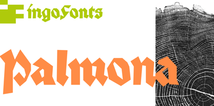 A rustic black letter from the 1930ies — with stylistic alternates. The high degree of abstraction of this typeface allows it to appear modern, even though its shapes clearly show an origin from Fraktur and Gothic. The letters present the effect of woodcarving or silhouette cuttings as they are defined exclusively with straight lines and sharp corners. By doing without any bowls, the typeface becomes a stylistic entity with a decorative effect. Palmona is especially appealing in combination with bold illustrations. Some of the characters of Palmona are available in one or more alternate forms which can be accessed manually or automatically. Use of these alternates is most easily operated with OpenType-Functions Standard-Ligatures and Discretional Ligatures in the user program. With Standard Ligatures activated, problematic letter compositions are substituted with appropriate ligatures. Likewise, in certain letter combinations the alternates are inserted. The Discretional Ligatures include additional alternatives. Configuration of the characters of the Palmona font is according to Unicode ISO 8859-1 (Latin1). Consequently all characters for all European languages with Latin type are covered — including Turkish, the Baltic languages, East European and Scandinavian languages. Congruent with the time of its origin and typical for black letter typefaces, Palmona also includes a long s as well as — uncommon but definitely reasonable — a capital ß. Both characters are automatically applied with the activation of Discretional Ligatures, and the associated ligatures appear automatically as well. When using ”long s,“ you must ensure the correct use of the rules for the Fraktur font: ”round s“ is always at the end of the word, also in compound words. For those of you who want to be even more correct, read the corresponding >> article in Wikipedia.
 - Initiate by Stiggy & Sands,
$24.00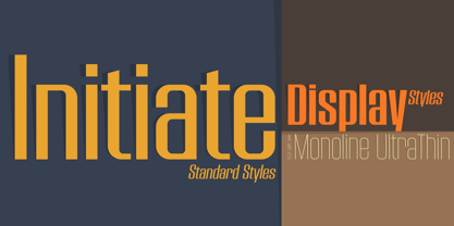 A Stylish Technology Sans Serif Initiate began as a digitization of a film typeface from LetterGraphics in the early 70's known as "Kent". The original specimen was only in a Black weight with a tall x-height and included standard Capitals, Lowercase, Numerals and minimal Punctuation. It was a techno style sans-serif, ripe with potential. As a single weight typeface, it yearned for so much more: from family weight development to stylistic variants. We also decided to create a more normalized x-height version as well, leaving the original design as the Display series. Extras we developed for this family are Unicase variants, High & Low hairline position glyphs, as well as other alternate styled characters. The Initiate standard family has 1154 characters per font, while the Display family and Monoline font has 685 characters per font. A comprehensive character map preview is at the end of the poster graphics collection. Opentype features for Initiate Family include: Ligatures Unicase Stylistic Alternate Set Stylistic Set 02 - Limited Alternate Characters (A,K,X,Y,k,u,x,y and variants) Stylistic Set 03 - Lower Hairline Characters (B,C,E,F,G,H,P,R,Æ,a,c,e,r,s and variants) Stylistic Set 04 - M & N alternates Stylistic Set 05 - I alternates Smallcaps Set Smallcaps Lower Hairline Set when Stylistic Set 03 is enabled Limitless Fractions Ordinals Superscript & Subscript Opentype features for Initiate Display Family & Monoline font include: Ligatures Unicase Stylistic Alternate Set Stylistic Set 02 - Limited Alternate Characters (A,K,X,Y,k,u,x,y and variants) Stylistic Set 03 - Lower Hairline Characters (B,C,E,F,G,H,P,R,Æ,a,c,e,r,s and variants) Stylistic Set 04 - M & N alternates Stylistic Set 05 - I alternates Limitless Fractions Ordinals Superscript & Subscript
 - beachsunshine - Personal use only

- Tondu by The Northern Block,
$37.95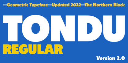 Tondu is a straightforward display typeface inspired by film posters of the early 1900s. Strong upright forms combined with smooth curved details create a clear and bold font ideal for apparel, billboards, books and posters. Tondu is now available as version 2.0 (2021); the remastered version meets higher technical standards that modern-day users demand. Included in the font are over 490 characters, in one heavyweight style. Opentype features consist of digital numerals, lining figures, fractions and language support covering Western, South and Central Europe.
 - Sincerely by Canada Type,
$24.95Whether with pen on paper, or in digital, realistically connecting vertical handwriting is never an easy task to accomplish. After working with many handwriting fonts, and after intently dissecting so many different handwritings, one tends to expect such things to be quirky, disconnected, and almost never upright. In fact, in spite of vertical handwriting’s academically-sung virtues of rationality, efficiency, clarity and logic, very few people manage to deviate from the natural slant when writing. Even fewer manage to make the vertical handwriting connect and keep its natural flow. Calligraphy and upright cursive aside, it is almost impossible to make a vertical letters connect and maintain a real handwriting appearance. This is where the genius of this design comes in to bridge the gap between upright handwriting and calligraphy. Sincerely is based on one of the most fascinating handwriting designs to ever come out of Germany: Karlgeorg Hoefer’s 1968 Elegance for the Ludwig & Mayer foundry. It is a handwriting with the full meaning of the word, yet it possesses the rare, very commanding and appealing trait of being both vertical and connected while managing to remain realistic. It is the ultimate branding iron of handwriting fonts. When set and printed, Sincerely simply cannot be ignored. Ideal for humanity-asserting poster designs, lettering of short wording with plenty of space, poetry, notes, greeting cards, craft literature, book covers, history-related designs, and a whole range of other applications. - Austin Pen by Three Islands Press,
$29.00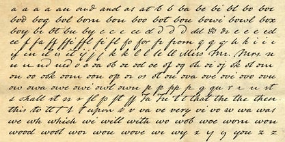 Empresario Stephen F. Austin (1793-1836) is considered by many the “Father of Texas” for leading the first Anglo-American colony into the then-Mexican territory back in the 1820s. A few years later, while on a diplomatic mission to Mexico City, Austin was arrested on suspicion of plotting Texas independence and imprisoned for virtually all of 1834. During this time he kept a secret diary of his thoughts and musings—much of it written in Spanish. Austin Pen is my interpretation of Austin’s scribblings in this miniature prison journal (now in the collection of the wonderful Dolph Briscoe Center for American History, in the Texas city that bears his name). The little leather-bound book is filled with notes in ink and pencil—some of the faded penciled pages traced in ink years later by Austin’s nephew Moses Bryan. A genuine replication of 19th century cursive, Austin Pen has two styles: a fine regular weight, along with a bold style that replicates passages written with an over-inked pen. Each is legible and evocative of commonplace American penmanship of two centuries ago.
 - Paris Metro by Studio K,
$45.00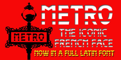 Nothing is more iconic of Paris than its antique Metro signs, which are the inspiration for this typeface. The signs vary from station to station, some featuring plain block capitals, others the most exquisite Art Nouveau. This example falls somewhere in between. and should inject a strong gallic flavour into any design or publishing project. To recreate the Metro effect in Photoshop, set your text white on red, then go to Layer Style> Inner Shadow. Or with Paris Metro Reverse set your text red on white, then go to Layer Style> Drop Shadow.
 - Checker by Shinntype,
$29.00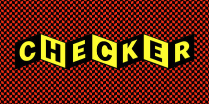 Checker is an all-cap ‘three-D’ font which automatically alternates white letters on black tiles with black letters on white tiles, by means of the Contextual Alternates feature. Checker is an attention grabber suitable for logos, titles and short headings. With its tiled construction, it's a natural for colorful interpretation. The letters are properly italicized and back-slanted, and adjusted for maximum readability within the constraints of the font’s concept. The letter style is bold grotesque, so Checker will mix smoothly with any other fonts in a layout.
 - TB StarsAndStripes by TrueBlue,
$18.00This font is dedicated to the glorious flag of the U.S.A., "Old Glory". The family consists of two versions: a base and one called "composable" composed from a set of glyph (characters) that they can be inserted to pairs. One of blue color and one red for to obtain one glyph to two colors. As an example inserting "Aa" with a red 'A' and the a blue 'a' will produce a single letter 'A' colored to white stars in a blue field and white stipes in a red field, thus producing the most impact. - Baker Half by Ingrimayne Type,
$9.00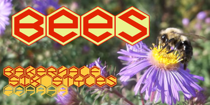 One of the odder things I remember from high school (50+ years ago) is the tile floor of hexagons in the bathroom. There is something fascinating with the way hexagons fill the plane. BakerHalfDozen is made of white letters that fit on black, hexagonal tiles. BakerHalfWhite switches the letters to black on white tiles, and BakerHalfBare eliminates the tiles. There are no true lower-case letters, but some letters have alternate shapes. To make the tiles line up right, alternate lines must be indented half a space. Use the {} characters (brackets) to do this.
 - Parking Lot Sale JNL by Jeff Levine,
$29.00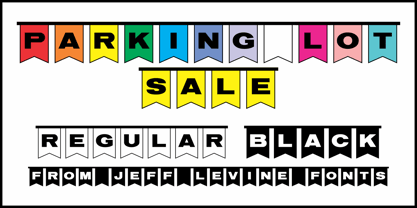 Here’s a novelty font emulating the plastic pennant streamers that were popular in the 1950s and 1960s used to decorate a store parking lot or used car lot for a sales event. The typeface inside the individual pennants is Manufacturer JNL, which can be used for body copy associated with titles made by this font. Parking Lot Sale JNL is available in regular (black letters on white pennants) and black (with white letters). A blank pennant for word spacing or end caps is available on the backslash key.
 - Ongunkan Norwegian Futhark by Runic World Tamgacı,
$40.00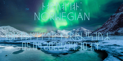 THE NORWEGIAN RUNES The oldest runes discovered in Norway date from 400 AD. They were based upon the 24 - rune Elder Futhark of Germanic origin. Two of the runes in the Elder Futhark, Pertra and Eoh, have never been found in any Norwegian rune text. From 550 AD to 700 AD there was a transition period between the older 24-rune Futhark and the newer 16-rune Futharks. By the end of this period, the 24-rune Futhark went completely out of use and the 16-rune Futharks had prevailed. Then, about 900 AD, the Shorttwiggs-runes were introduced from Sweden. Shortly thereafter, from 1000 AD, Futharks with more than 16 runes became more prevalent, as these were more consistent with the Latin alphabet. These types of runes were used in Norway up to 1800 AD.
 - Lyra by Canada Type,
$39.95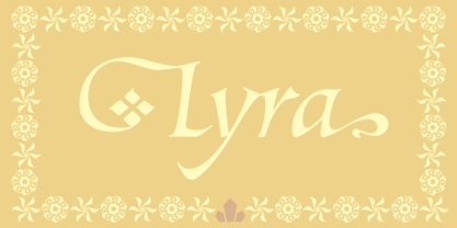 Lyra is an Italian Renaissance script that might have developed if metal type had not broken the evolution of broad pen calligraphy. It lies in the area between the humanist bookhand and the chancery cursive, combining the fullness and articulation of the Roman letters with a moderate italic slant and condensation. A steep pen-angle allows use of a broader pen relative to the x-height, giving the letters more contrast with light verticals and heavy curves. Lyra embodies the Renaissance spirit of refining technical advances of the late middle ages with reintroduction of ancient classical principles. Based on the moving penstroke with constantly changing pen-angle, it brings the vitality of handwriting to the ordered legibility of type. Lyra is a formal italic, too slow for copying books. By eliminating the element of speed, digital technology opens up a new level of calligraphy, bringing it into the sphere of typography as would naturally have happened if metalworkers had not controlled the process. If classical Western traditions are respected, digital calligraphy has the potential to recapture the work of the past and restart its stalled evolution. There is of course no substitute for the charm of actual writing, with each letter made for its space; but the tradeoff is for the formal harmony of classical calligraphy as every curve resonates in tune with every other. This three-weight font family marks Philip Bouwsma's much-requested return from a three year hiatus. It also reminds us of his solid vision in regards to how calligraphy, typography and technology can interact to produce digital beauty and vesatility. Each of the three Lyra fonts contains almost three character sets in a single file. Aside from the usual wealth of alternates normally built into Bouwsma's work, Lyra offers two unique features for the user who appreciates the availability of handy solutions to subtle design space issues: At least three (and as many as six) length variations on ascending and descending forms, and 65 snap-on swashes which can be attached to either end of the majuscules or minuscules. The series also offers 24 dividers and ornaments built into each weight, and a stand-alone font containing 90 stars/snowflakes/flowers, symmetric contstructs for building frames or separators, masking, watermarking, or just good old psychedelia.
 - Bad Coma - Personal use only

- Eutemia Ornaments - 100% free

- Hacjiuza Dirty - Personal use only

- Digs My Hart - Personal use only

- Old printing press_free-version - Personal use only

- Loyal Fame - Personal use only

- Selectric - Unknown license

- Metal Macabre - 100% free

- Spike - Unknown license

- Sfilth - Unknown license

- InfraRed - Personal use only

- FD Textured - Personal use only

- Hula Skirt Girl - Unknown license

- Funny Sports - Personal use only

- Black Damon by Zeptonn,
$5.00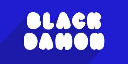 Looking for a big, bold and curvy font? Here’s Black Damon! She is a hand-drawn typeface with explicit curves and angles that still retains softness and has a handcrafted feel. All glyphs are handcrafted by illustrative designer Zeptonn. She might not be your best friend for body text, but still, she won't hesitate to perform well under pressure. She will make an interesting yet unusual partner for headlines. Awesome and distinctive in use for titles, displays and fresh illustrations. Prepare to make a statement!
 - ITC Zinzinnati by ITC,
$29.99ITC Zinzinnati is based on a font called Ohio, released in 1924 by Die Schriftguss A.G. Typical of the Plakatstil letterforms of the time, the original font had a rough outline, as if drawn with a brush. Nick Curtis has smoothed the rough edges, which enhances the design's playful curves and engaging charm. As for the name: it's the punchline to an old vaudeville routine that starts with the question, Name a city in Ohio that begins with a 'Z.'" Pie in the face, comin' atcha!" - Toshiko by Thinkdust,
$10.00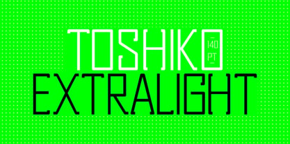 Toshiko is an experimental typeface which mixes techno and traditional designs, creating a straight edged but curly serif font. The characters themselves are very carefully crafted, with precise, accurate lines and predictable forms, but the serifs, as well as the indecision between curved and square corners, gives the font an impression of unpredictability that shows off its creative freedom. Whether you’re looking to brand something technological or express rebellion, Toshiko can create the mix of conformist and nonconformist that will draw readers into interest and attentiveness.
 - Chalk Hand Lettering by Fontscafe,
$39.00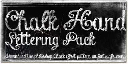 If you are into the vintage feel, you will love this one. This is as vintage as it probably gets. There are probably only a handful of places in the world where schools still use blackboards and chalk – they’ve given way to their white board and marker counterparts for decades now. White boards are definitely more practical and less messy when compared to chalk, but then if you are creatively inclined you will agree that a little bit of mess is worth it if you are going to get the effects that you desired! Well, we can give you the effects minus the mess with our chalk hand lettering fonts! As the name suggests, this font gives you that distinctly unique chalk on slate feel, and if you are wondering what’s distinct about it; writing on slate or blackboard was a slow process which required deliberated and concentrated efforts resulting in a handwriting which was usually quite different to a person’s handwriting on paper. Typography of chalk on slate was an everyday event in the classrooms of yesterday, and today we hardly ever get to see one of these if it all. Writing on a black board with chalk was quite an interesting achievement in its own right, if you ended up with anything legible and if your writing remained focused and ‘in-line’! But of course like everything else, his took time to master and when you did get it right, chalk hand lettering was quite an enjoyable experience! For semi-permanent designs, say for example an eventful day at school; students of the day would create beautiful typography on the boards, and add a solidarity to it sometimes by shading one side of the lettering – usual y the right side towards which the lettering leaned. This is the effect our chalk hands lettering shaded variation gives you. You could get this font individually, but we strongly advise you check out the “chalk hand lettering pack” font. It includes the simple “chalk hand lettering” (minus the shading effect) and also a “chalk hand elements” bag of tricks. The elements is a collection of graphic art which resemble shapes and designs that used to be added to chalk art, to beautify the typography. If you enjoyed seeing the effects of our Chalk Hands font, and the shaded variant – you are simply going to go gaga over Chalk Hand Elements! The chalk hand font of course enables you to make typographic art similar to the effect of chalks on slates and black boards. This was quite the art form in the days gone by! The shaded variation added a bit of solidarity and the technique was commonly used to make semi-permanent designs say for example a welcome note when somebody important was to visit. Classic chalk hand designs, especially the semi permanent ones often had little pieces of art to help beautify the creation as a whole. It could simply be symmetrical graphics appearing before and after the title and headings, maybe just an interesting shape to fill in an empty area on the board, and such…our Chalk Hand Elements offers you a ton of such graphics. The two chalk hand variations and the elements are all included in the Chalk Hand Family, and this is strongly recommended if you want to make designs that are truly reminiscent of the days of chalk on slate.
 - Ronet by yasireknc,
$10.00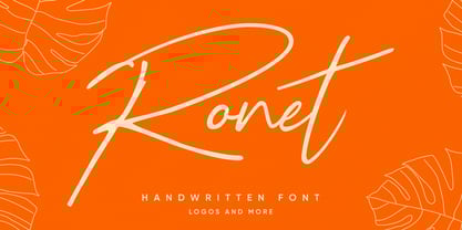 It can be tricky to find typefaces that can convey the feeling of personal warmth that comes from a handwritten note, custom brandings, special series of products, especially as we type more and more and write with a pen or pencil less and less. To add some more of that warmth to a font, I’ve made Ronet. A duo font based on the my handwriting. Double eponymous styles of the font —Ronet and Ronet Alternative— each have a unique flavor with its own rhythm and character. It can be used on branding designs, product labels, invitation cards, social purposes which is bloggers, influencers but they were capable of so much more, and I’m happy to share them for general use. Ronet has extraordinary alternative characters, that makes these fonts so impressive. These two styles have dynamic substitution, alternates, and beautiful kerning! Nevertheless, they each support an impressive range of languages using the Extended Latin alphabets and because they were designed to work well in a simple tool, a rare feature of these fonts is that they look just as good no matter where you use them. LOTS of writing, and then even more care once I developed and refined digital outlines from the samples. Ronet and Ronet Alternative each wrote pages and pages of letters to produce lots of examples for comparison and selection, in order to get the most authentic overall texture that captured the spirit of my left hand.. Ronet feels friendly and personal, like a neighbor or local shopkeeper who always seems happy to see you. This will perk up your social feeds in a snap. Start with Ronet and just add in your design to make it perfect. What started with a simple pen and paper has become a diverse and ever-expanding creative outlet that blends hand-drawn creativity with cutting-edge technology — and the end results are popping out everywhere, from advertising to design and decor to art and DIY.
 - Conversation Hearts by Harald Geisler,
$-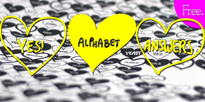 Conversation Hearts are inspired by the sweethearts and conversation hearts that can be found all over the US and Britain, but not in Germany. A source of endless fun and surprise. As a typographer to me they are also a surprising document of written communication. Most people complain that nowadays the inscriptions are not as sweet as they used to be. While they used to held romantic and promising inscriptions like “Be True” “Sweet Talk”, today they carry “Tweet me” “Ur Hot” and “Party Girl”. So i took this as a motivation to work with conversation sweetheart on a conceptial inspirational and typographical level. The obvious: every letter pressed on the keyboard brings out a conversation heart that starts with the letter - i.e. L = Loverboy, H = Heartless but what to write? Since i didn't want to reproduce the old “Fax me” and “Email me” I had to come up with something new. Something with a personal relation and of course something that I Love - what else could i write in the shape of the heart? So I tried to access my upper subconsciousness and looked for two words for every letter in the alphabet. One for the capital letter pressed and one word for the lowercase letter. Resulting in a Kurt Schwitters worthy assemblage of vocables "Post-office" “Internship” “Zebra” “Answers” etc. It is not easy to read a text set in Conversation Hearts but easier as a text set in Zapf-Dingbats. To sparkle the visual appearance uppercase letters are filled hearts with “carved” inscription, while lowercase letters are an outlined heart with written inscription. Conversations Hearts is a part of the Light Hearted Font Collection that is inspired by a recording of Jean Baudrillard with the title, "Die Macht der Verführung" (The Power of Seduction) from 2006. Further inspiration came from the article, "The shape of the heart: I'm all yours". The heart represents sacred and secular love: a bloodless sacrifice. by British writer Louisa Young printed in EYE magazine (#43) London, 2002.
 - Hazim by Arabetics,
$39.00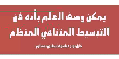 Hazim is a display font designed with isolated letters. It uses thin white slits positioned within extra bold black space glyphs emphasizing the main visual characteristics of the Arabetic letters in two positions: initial/medial and final/isolated. The spacing widths between glyphs match that of the slits to give a virtual cursive look and feel. The name Hazim was chosen to honor a friend of the designer, Hazim al-Khafaji. Hazim supports all Arabetic scripts covered by Unicode 6.1, and the latest Arabic Supplement and Extended-A Unicode blocks, including support for Quranic texts. It comes with one weight and a left-slanted “italic”. The script design of this font family follows the Arabetics Mutamathil Taqlidi style and utilizes varying x-heights. The Mutamathil Taqlidi type style uses one glyph per every basic Arabic Unicode character or letter, as defined by the Unicode Standards, and one additional final form glyph, for each freely-connecting letter in an Arabic text. Hazim includes the required Lam-Alif ligatures in addition to all vowel diacritic ligatures. Hazims’s soft-vowel diacritic marks (harakat) are only selectively positioned with most of them appearing on similar lower or upper positions to make sure they do not interfere with the letters. Kashida is enabled.
 - Bandbox by Sean Thorenson,
$22.00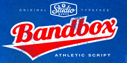 Inspired by classic sport logo lock-ups, Bandbox delivers with its heavy, streaming cursive letterforms. Bandbox's wide, gently-sloped script comes bundled with a collection of ligatures and 18 athletic swash banners, perfect for logotype, posters and t-shirt designs. Here's what's included in the single-weight typeface Bandbox: Upper (A-Z) and lower case (a-z) characters Numbers (0-9) Standard punctuation and glyphs Alternates, Ligatures and Swashes Multilingual support
 - ALS Bingley by Art. Lebedev Studio,
$63.00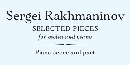 Bingley is a beautifully old-fashioned, proper, and full of class body typeface. The British feel of this face comes from its inspirational source—a tombstone script from Oxford. The characters are squat and nearly square in proportions, even cursive comes with a pronounced breadth. Generous counters and pleasant stroke weight contrast ensure high legibility of any text set in Bingley. Pronounced serifs and drop-shaped terminals further enrich the experience.
 - GFY Handwriting Fontpak #2 by Chank,
$99.00Explore a diverse range of 23 different handwriting styles with the new Go Font Yourself! Volume 2 Fontpak. This is a collection of 23 new, genuine handwriting fonts in OpenType format for Mac or PC. Fancy cursive or extrabold marker, stylish script or sassy scribbles; this fontpack is loaded a lot of personality. And if that's not enough handwriting styles for you, check out the original: GFY Handwriting Fontpak (Volume 1). - Counte by NamelaType,
$19.00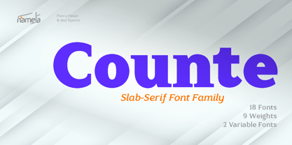 This is our first experience of creating serif fonts. It resulted in a modern slab serif family designed with symmetrical bracketed serifs for uprights and cursive serifs for Italics. Crafted with low contrast strokes, it makes this font versatile and can be used for text and printing. Counte contains many International diacritics and OpenType Features. It consists of 9 weight, going from Thin to Black with matching italics.
 - Flanker Ruano by Flanker,
$18.00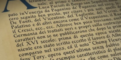 The typeface Ruano was inspired from “Lettera cancelleresca formata” by the Vatican calligrapher Ferdinando Ruano, carved and cast in 1926 by Nebiolo of Turin on the advice of Raffaello Bertieri who designed the capital letters and numbers, missing in the original. The difficulty of the design of this chancery font lies in its original vertical layout, bending the calligraphic harmonies to the Gothic style, thus distinguishing it from contemporary cursive alphabets.


