10,000 search results
(0.034 seconds)
- CarTown - Unknown license

- Valerie - Personal use only

- You are what you eat - Unknown license

- Krazy Nights - Unknown license

- Paddington - Unknown license

- Temphis Sampler - Unknown license

- Zoloft - Unknown license

- Digeria - Unknown license

- Erinal Wide - Unknown license

- Acorn Initials - Personal use only

- Plastic Tomato - Unknown license

- Viney Times - Unknown license

- Heil Vertica - Unknown license

- Gamma Scale - Unknown license

- Daville Condensed Rev Slanted - Unknown license

- Whackadoo Upper - Unknown license

- Philing - Personal use only

- Elbjorg - Unknown license

- Zoloft - Unknown license

- Marusya - Unknown license

- Raindrop Splash - Unknown license

- Roslyn Contour - Unknown license

- SexyMF - Unknown license

- I Am - Unknown license

- PixieFont - Unknown license

- Cayetano Round - Unknown license

- BR Nouveau Ramblings 2 - Personal use only

- Dekon - Unknown license

- Speedlearn - Unknown license

- Elric - Unknown license

- Storybook Initials NF by Nick's Fonts,
$10.00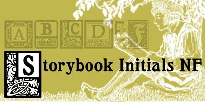
- ZT Voltra by Zeune Type Foundry,
$25.00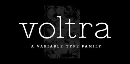
- Tsubu by Takehiko Ono,
$5.00
- Gagarin Star Mix Cyrillic - Unknown license

- Juvelo - 100% free

- XXII ARMY - Unknown license

- Zekton - Unknown license

- A Fire Inside The Walls - 100% free

- Citaro Voor (Dubbele hoogte, breed) - 100% free

- DS UstavHand - Unknown license


