10,000 search results
(0.187 seconds)
- Almondlatte by Essentials Studio,
$16.00 Almondlatte Is a Cute Display Font Almondlatte is perfect for product packaging, branding project, megazine, social media, wedding, or just used to express words above the background.
 - Sanelma by Melvastype,
$35.00 Sanelma is a brush script inspired by Hot Rod lettering and sign painting. Sanelma is a very versatile script: It includes two different styles of end swashes, swash caps, small caps, lots of alternate characters and underline option. All in all it has over 1,200 glyphs. Sanelma is bouncy and smooth and has a very organic feel. You have a lot of options to customize it and that makes it perfect for logos, packages and titles.
 - Swingly Lours by Jolicia Type,
$21.00 Meet Swingly Lours, the epitome of serif elegance enriched with magnificent ligatures and a plethora of alternates. This font transforms your typography into a visual symphony, striking the perfect balance between classic sophistication and contemporary creativity. Swingly Lours is not just a typeface, it's a versatile tool for crafting unique and captivating designs. Elevate your projects with the charm of this serif font, where every detail tells a story of timeless sophistication and customizable creativity.
 - Hakan by Typefactory,
$14.00 Hakan is an modern display font with an Arabian look. This font particularly for those not native to Arabic languages. Hakan try to bring back the Baghdad and Alladin memories to your design or typography. The font suits creative titling on both web and print, perfect for scroll text. Well balanced letters make for readable blocks of copy or headings.
 - Bistecca - Personal use only

- Duepuntozero - Personal use only

- Targa - Personal use only

- Byron - Personal use only

- Kamaboko by Fype Co,
$14.00 Hey guys! Today I want to present to you with Kamaboko decorative display font, this fun font is a perfect choice if you want to give your design a playful and childish look. This is a cute font that would be perfect for the cutest cards, posters, flyers, calendar, packaging, T-shirts, invitations and so much more!
 - Lemonado by Melvastype,
$29.00 Lemonado is a type family drawn with a dry brush pen. It includes upright and italic scripts and all caps fonts with brush texture or with smooth edges. Lemonado Script is playful and slightly bouncing connecting script. It includes two sets of lower cases to increase the hand writing effect. By enabling Contextual Alternates from OpenType panel you can cycle these two sets and achieve variation. Lemonado Script also includes set of lowercases without connecting stroke, you can use those in the middle of words or automatically add them at the end of words by enabling Stylistic Set 1 at the OpenType panel. There are also set of lower cases with end swashes, you can automatically add these swashes to end of words by enabling Stylistic Set 2 at the OpenType panel. Also other alternate characters and underlines are included to give you even more possibilities to play with. Lemonado Caps has two sets of upper case letters, high and low ones. You can achieve this fun looking bouncing effect by varying them. Just enable Contextual Alternates from OpenType panel and those two sets will cycle.
 - Getty Dubay by Handwriting Success,
$9.00 The Getty-Dubay® family of fonts has been 500 years in the making — so that you can make your handwriting worksheets in seconds. These fonts are modern descendants of the chancery handwriting style (now called “Italic”) from the Italian Renaissance, when master scribes designed a fluid and graceful hand, inspired by the proportions of the golden rectangle and Roman capitals. The Italic style has been in constant use since then. In modern times, it has been celebrated by Alfred Fairbank, Lloyd Reynolds and many others including authors Barbara Getty and Inga Dubay in their Getty-Dubay® Italic method. The Getty-Dubay® monoline handwriting fonts provide a replete resource to effectively model the highly-legible and beautiful Italic handwriting style. These are the official fonts of Getty-Dubay® Italic. Download the Getty-Dubay® Font Guide for everything you need to know about the Getty-Dubay® fonts. The Getty-Dubay® Joined fonts produce a clean cursive handwriting with join-as-you-type ease. Four join options are included: Standard, Pointed (altered joins into m, n and r), e k (utilizing the two-stroke e and one-stroke k), and Beginning (easiest joins only). The Getty-Dubay® Basic fonts provide sans-sarif clarity suitable for young writers. The Getty-Dubay® Precursive fonts add serifs to the lowercase letters, while retaining the pure Roman capitals of Basic Italic. The Getty-Dubay® Smallcaps fonts make mixed capitals easy to use. All Getty-Dubay® fonts come with scaffolds such as dashed contours, ruled lines, directional arrow and starting dots (for Basic and Smallcaps). They support multiple Latin-based languages from around the world. Getty-Dubay® is a registered trademark in the United States.
 - Mosketa by Typo5,
$16.95Grunge at its best, Mosketa looks real good typing any word, and adds a beautiful chaos without losing the balance. Try alternating uppercase with lowercase according the words to get the best of it. - Resplendent by Set Sail Studios,
$16.00 Resplendent is a beautiful and free-flowing hand-lettered modern brush script font. Along with a full set of alternate lowercase characters, Resplendent comes in 2 different styles; Brush and Solid - giving you a hugely versatile brush font which can be used in a range of different scenarios. Resplendent Brush maintains a rough hand-painted aesthetic, whereas Resplendent Solid has a totally clean & smooth finish to it's edges; ideal for vinyl cutters such as Cricut and Silhouette Cameo, or simply for any project which needs a silky smooth style. Both styles of the font include an 'Alt' version, this has replaced all of the lowercase characters with a completely new set. If you wanted to avoid letters looking the same each time to recreate custom lettering, or try a different word shape, simply switch to the 'Alt' fonts for an additional layout option. Language Support • All Resplendent fonts include language support for; English, French, Italian, Spanish, Portuguese, German, Swedish, Norwegian, Danish, Dutch, Finnish, Indonesian, Malay
 - Rethink by Viktor Nübel Type Design,
$35.00 The robust and contemporary sans-serif typeface Rethink, comes with strong characteristics. The typeface is made for work in text as well as in display. It features nine weights in two styles, including Small Caps, a set of contemporary OpenType functions, multiple figure sets and a rich language support. Rethinks main characteristics are the non-straight stroke endings and a slope that might come in an unexpected direction. It brings a bit of movement to the baseline and some attraction to the shapes in bigger sizes. These details are designed to ‘disappear’ in smaller sizes and to not disturb a reading process. Rethink was designed with the idea to help spreading bold ideas ond strong opinions, to support the work of activists in contemporary movements, to design statements with impact and meaningfulness.
 - Sweynheym Pannartz by Proportional Lime,
$19.99 The font SweynheymPannartz is strongly modeled after an example Conrad Sweynheym and Arnold Pannartz used in their early printing venture in Subiaco, Italy which began around 1465. Their efforts were supported by Pope Sixtus the IV after they enthusiastically printed more books than they could sell. They not only brought printing to Italy, but also developed the first Roman style type. This font has over 600 defined glyphs to cope with modern needs, and also the ability to use several abbreviations common to that period. It also has an alternate minuscule “k” more modern in appearance for those that find the original too unusual.
 - Bronwen by Hanoded,
$15.00 In Welsh mythology, Bronwen was the daughter of Llyr, the god of the sea. It is a popular girls name in Wales and it apparently means "white breast" or "pure heart". I really like this name and I think it fits the font. Bronwen is a fantasy font with a bit of roughness to it. It comes with some curly swashes and a handful of alternates. Use it for your books, cards and products!
 - Martie by Canada Type,
$25.00From the heart of the Blue Ridge Mountains, by way of Toronto, comes Martie's handwriting. Martie Byrd is a school teacher in Roanoke, Virginia, and a friend of Canada Type's Rebecca Alaccari. After years of admiring the cheer and clarity of Martie's handwriting, we asked her to write out full alphabets for some cool font treatment. The intent was to do three different versions of her writing in two different pens, then use the auto-magic of OpenType to determine letter sequences and rotate character sets on the fly when the fonts are in use. A successful endeavor it was. Take a look at the images in the MyFonts gallery to see the character rotation in action, along with a visual explanation of why Martie is not just another handwriting font. Unlike other available felt tip and ballpoint handwriting fonts, the regular and bold variations are style-based, not weight-based. They are the handwritten expressions of two different Sharpie pens: The fine point one (Martie Bold), and the ultrafine one (Martie Regular). The style-based variation considerably helps the realism needed in design pieces that take advantage of the contrast of two different handwriting fonts. Weight thickening in handwriting is an obvious mechanical effect that only happens with computers. Weight changing by replacing pens is what happens in the real world. Martie Pro and Martie Pro Bold each contain three different character sets in a single font. Language support includes Western, Central and Eastern European languages for all three sets. This translates into each Pro font containing over 750 characters. Add OpenType code and stir, and you have true handwriting fonts with versatility unavailable out there in anything else of the genre. A software program that supports OpenType features is needed to use the randomization coded in Martie Pro and Martie Pro Bold. Current versions of QuarkXpress and Adobe applications (Photoshop, Illlustrator, InDesign) do contain support for the randomization feature. But if you don't have one of these apps, you can still use the interchangeable Type 1 or True Type fonts and change the characters manually to achieve the appearance of true handwriting. The Martie fonts come in a variety of price packages, from the affordable single fonts to value-laden complete sets. All the proceeds from these fonts received by Canada Type will be donated 50/50 to two primary schools: One in Roanoke (where Martie teaches), and one in Toronto (where the 10-year old, real Canada Type boss goes). So next time a design project needs a handwriting font, do the write thing and use Martie to keep it real. - Al Salks Bold by Aluyeah Studio,
$149.00 Hello Aluyeaholics! Introducing Salks, the Typeface That Brings Joy to Your Designs! Salks is a playful and joyful display typeface that will add a touch of happiness to your creative projects. With Salks' 140+ playful ligatures, four weight options, quick access features, and careful attention to detail, you'll have the perfect tool to instantly uplift any project and unlock unlimited creative possibilities. Experience the happiness that Salks brings to your creative world with this delightful display typeface that guarantees smiles all around.
 - SK Irrationalist by Shriftovik,
$16.00 SK Irrationalist is a new experimental accidental font created by the SHRIFTOVIK font foundry and Tikhon Reztcov. This font is very unusual. It uses non-standard graphic techniques. Sloping non-parallel lines, sharp shapes and a combination of rectangles and circles all make the font special. The SK Irrationalist font was inspired by the works of constructivist artists of the early 20th century. The font contains both Latin, Latin Pro version for European countries and Cyrillic. This font delivered in 4 styles: Regular; Sharp; Outline; Rounded.
 - Baka Expert by Positype,
$25.00 Why Baka Expert? There’s actually a simple answer. The original Baka was done as an experiment of sorts. I wanted to quickly capture a rough, frenetic handwriting style that broke normal conventions. Commercially, it was successful, received some accolades ... but I wasn’t completely satisfied, so I went back to the master art and the lettering explorations and produced Baka Too. This addressed some of the line items I wanted to refine in Baka. I liked it. Each font has been out for a few years now, and I have seen them in use. I’m very critical of my work, and I could still see things—modulations of strokes, angle of the nib, ink swell, and so on—that I wanted to change, refine, and reorder. For me, it is typographic indulgence, but I wanted to take this handwriting ‘font’ and turn it into a robust ‘typeface.’ So I did just that and a bit more by adding back more of my initial flourish concepts; attaining tighter, consistent control of the modulation; optimizing points; adding titling options; and expanding the character language set. Baka and Baka Too had to exist to produce this entirely new re-envisioning of an old friend ... and they all play well together :)
 - Dom Loves Mary by Correspondence Ink,
$39.99 Dom Loves Mary has a baby brother! Check out Fratello Nick here: http://www.myfonts.com/fonts/correspondence-ink/fratello-nick/ The DomLovesMary font family has all you need to create unique, custom stationery products. THE INSPIRATION BEHIND THE DOMLOVESMARY FONT FAMILY: DomLovesMary is named in memory of Dominic and Mary Sementelli, Debi’s in-laws. Dom and Mary were opposites who were truly “made for each other”. A snazzy dresser, Mary was feisty, loved to dance, sing, and be the life of the party. Dom was cool, calm and collected and was happy to shine the spotlight on the love of his life. They balanced each other out in a really great way. Going through some of her in-laws old photos, Debi found their wedding album. She was struck by the beautiful look on their faces as they got ready to start their life together. She saw the excitement, joy and anticipation of them envisioning “Una Bella Vita!” (A beautiful life!) She decided to create a hand-lettered font with them in mind represented by two totally different lettering styles that were, like Dom and Mary, “made for each other”. It’s her way of honoring them and sharing their beautiful life with all of the couples just starting theirs together. They truly had “Una Bella Vita” and we hope you do too. WHAT'S UNIQUE ABOUT THE DOMLOVESMARY FONT FAMILY: The SCRIPT & TEXT FONTS are lettering styles that were made to compliment each other. With a vintage, classic feel, they will add elegance to your design, while the TEXT serves to offer support with easy to read simplicity. In addition to the standard character set, each of the uniquely styled script fonts includes a collection of flourished ornaments. Use them to create corners, headers or other embellishments to complete the look. And if you really want to fancy things up, we offer two sets of 72 additional flourishes that were specifically made to add to upper and lower case letters for easy customization. Dress them up with one, two or more. It’s like choosing simple pearls or piling on the glitz! Or combine several to create unique flourished ornaments of your own. To add even more panache, we're pleased to present our ready made set of most frequently used ADD-ON WORDS. Created with the wedding client in mind, this set of 66 includes envelope friendly titles: Mr and Mrs, Mr, Mrs, Miss, Ms, Doctor, the Doctors, as well as words to fill out your invitation suite: RSVP, Respond, Save the Date, Accommodations, Directions and more! Easily create Bride and Groom signs or Thank You cards or tags with the click of a key. Or use angled words like “and, at, to, on, for, from and of” to add a special touch to your large groups of copy. PACKAGES: We are pleased to have a variety of customers. From professional invitation designers to DIY brides, publishing companies and website / blog designers among others. So we've created packages to help fit their diverse needs. Purchase just one of our beautiful DomLovesMary SCRIPT fonts, each with its collection of included flourishes or the PRO VERSION complete with ALL THREE script fonts and a combined total of over 100 flourished ornaments. Add our TEXT font, a set of FLOURISHES or ADD-ON WORDS. Love the idea of customizing your letters with all the possible combinations? We offer a special price when you purchase both sets of flourishes. Or choose our Accoutrements Package containing both sets of FLOURISHES for letter customization as well as our ADD-ON WORDS. Want to have it all? The “DomLovesMary Total Design” package is for you. Each of these packages are offered at a 25% savings. WHAT PROGRAM WILL YOU USE?: All of the font options come in both Pro and Standard format fonts. For those with programs that can take advantage of OpenType features (click on the link to see if the program your using is one of them) the Pro fonts are for you. http://www.typotheque.com/fonts/opentype_feature_support/ For others without the ability to use Open Type features, we provide all of the script fonts that comprise the Pro Version as separate versions (Regular, Contextual and Stylistic). If you are using a program like Microsoft Word, and want all three script fonts, you can still purchase the Pro Version (a $50.00 savings), and install the individual fonts bundled in the Standard Fonts folder. We have set it up so they will appear separately as DomLovesMary, DomLovesMary Contextual and DomLovesMary Stylistic in your fonts list. Exciting news! In an effort to help our customers access all the goodies that are normally only available in Open Type Capable programs (like the flourished ornaments that come with our script fonts), we have found a simple application that allows you to do just that. For this reason, we've made sure to unicode all of our characters and glyphs so that they will work in this type of program. There may be others, but we checked this one out and found that it works. Check out PopChar
 - Bamew by Twinletter,
$14.00 BAMEW is a fun and slightly dirty graffiti font designed by us. We put a lot of thought into every detail so that you may use this font in a wide range of outdoor event projects for people of all genders and ages. If you utilize this typeface, the project you’re working on will be harmonious and harmonious, making it amazing for everyone who sees it. Use this font right now for that. This graffiti font is great for product logos, poster titles, headlines, packaging, film titles, logotypes, gorgeous writing, and trendy graffiti designs, among other things. Of course, if you utilize this font in your numerous creative projects, they will be perfect and outstanding. Use this typeface right away for your one-of-a-kind and remarkable projects.
 - Peanut Square Layer by PizzaDude.dk,
$19.00 This is a font that will fit in the "hard to read section" because it may not be super legible at first sight - that is because of the negative space. But when you combine the two layers (Layer and Box) the letter suddenly appears very legible! Play around with your favourite colour palette while adjusting the transparency in order for the colours to blend, giving a really nice handcrafted look! You have 4 different versions of each letter to play around with and of course there is multilingual support!
 - ITC Cherie by ITC,
$29.99Some words from the designer... Like long legs walking a runway in stiletto heels, ITC Cherie is both sophisticated and feminine. West coast designer Teri Kahan developed this art nouveau-style font into two distinct all capital alphabets – one with a “high waist”, placed in the capital position, and the other a “low-waist,” placed in the lower case position. They work separately or together, and this dual nature gives a designer the ability to make subtle changes in a logo or line of text. Additional flourished letters round out this versatile headline font. - Prillwitz Pro by preussTYPE,
$49.00 Johann Carl Ludwig Prillwitz, the German punch cutter and type founder, cut the first classic Didot letters even earlier than Walbaum. The earliest proof of so-called Prillwitz letters is dated 12 April 1790. Inspired by the big discoveries of archaeology and through the translations of classical authors, the bourgeoisie was enthused about the Greek and Roman ideal of aesthetics. The enthusiasm for the Greek and Roman experienced a revival and was also shared by Goethe and contemporaries. »Seeking the country of Greece with one’s soul«. All Literates who are considered nowadays as German Classics of that time kept coming back to the Greek topics, thinking of Schiller and Wieland. The works of Wieland were published in Leipzig by Göschen. Göschen used typefaces which had been produced by until then unknown punch cutter. This punch cutter from Jena created with these typefaces master works of classicist German typography. They can stand without any exaggeration on the same level as that of Didot and Bodoni. This unknown gentleman was known as Johann Carl Ludwig Prillwitz. Prillwitz published his typefaces on 12th April 1790 for the first time. This date is significant because this happened ten years before Walbaum. Prillwitz was an owner of a very successful foundry. When the last of his 7 children died shortly before reaching adulthood his hope of his works was destroyed, Prillwitz lost his will to live. He died six months later. His wife followed him shortly after. The typeface Prillwitz as a digital font was created in three optical styles (Normal, Book and Display). The typeface Prillwitz Press was created especially for a printing in small sizes for newspapers. »Prillwitz Press« combines aesthetic and functional attributes which make written text highly readable. It was originally designed for a newspaper with medium contrast to withstand harsh printing conditions. Its structure is quite narrow which makes this typeface ideal for body text and headlines where space is at premium. For the Normal – even more for the Book – a soft and reader-friendly outline was created through a so-called »Schmitz« and optimized in numerous test prints. The arris character and the common maximal stroke width contrast of the known classicist typefaces (Didot/Bodoni) were edited by the study of the original prints. This was also done in order to reach a very good readability in small type sizes. This typeface is perfectly suited to scientific and belletristic works. Accordingly it has three styles: Regular, Bold and Italic as Highlighting (1). The typeface Prillwitz is a complete new interpretation and continuing development of the conservated originals from 1790. They have been kept in the German Library in Leipzig. It was always given the priority to keep the strong roughness and at the same time optimizing the readability of this striking font. The type family has all important characters for an efficient and typographic high quality work. ----------- (1) Accentuation of particular words or word orders (e.g. proper names, terms etc.). Typographic means for Highlighting could be Italic, SmallCaps or semi-bold.
 - Museum Tertia Cursive by T4 Foundry,
$21.00Museum Tertia Cursive is inspired by a beautiful set of 126 matrices in the Swedish Norstedts type collection. These types were probably manufactured in Germany before 1750. The matrices are part of a set imported to Sweden by J.P. Lindh from Breitkopf & Härtel 1818. Now this exquisite design is available again, thanks to type designer Torbjörn Olsson. Please note modern additions like the ?-mark, @-sign and €-sign. Museum Tertia Cursive is an OpenType creation, for both PC and Mac. Swedish type foundry T4 premiere new fonts every month. Museum Tertia Cursive is our eighth introduction. Museum Tertia Cursive is part of the growing Museum type family. Museum also includes three different border fonts, an ornament font with some of Granjon's arabesques and a flowery Fournier font with Rococo capitals. - Querencia Army DEMO VERSION - Unknown license

- Relista by Jos Gandos,
$15.00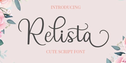 Relista is a beautiful handwritten font carefully created with a touch of elegance. This font is suitable for any projects such wedding cards, watermarks, quotes, social media, posters, invitations, and more. This font is PUA encoded so it will be accessible in the Adobe Illustrator, Adobe Photoshop, Adobe InDesign, even work on Microsoft Word.
 - Lightly Sailler by Zamjump,
$17.00 Lightly sailler is a beautiful new serif font that's created to complement a classic style for your project needs to be more perfect. Classic curves and sharp serifs make the Lightly sailler Serif feel elegant and nostalgic, at the same time, while still leaving enough simplicity to use for both headings and body types. It is also equipped with four special ligatures (ct, st, it, ck, sl, el, et, the, and end) as well as alternate features either capital or lowercase with a little tail that bumps the letters after which is a combination idea to give a more elegant impression. provides extra flair and body text legibility. Test the Lightly sailler in the box above to see how it works for your next project! Lightly sailler Includes: Uppercase & lowercase letters Numbers & Punctuation Ability Foreign language Ligature Alternate
 - Mail Route JNL by Jeff Levine,
$29.00 It’s not often a vintage cartoon can inspire a type design, but such is the case when the name “Daffy Duck” is hand lettered on a mailbox in the 1946 Warner Brothers cartoon “The Great Piggy Bank Robbery” (famously being a send-up of the popular Dick Tracy comic strip by Chester Gould). Mail Route JNL is available in both regular and oblique versions.
 - Statendam by Hanoded,
$15.00 Statendam is an all caps Art Deco font. It reminds me of the bold lettering used for cruise ship posters from the interbellum, especially those used for the Holland America Line (HAL) ads. It is not a recreation of a particular typeface; merely my salute to a bygone era. Statendam comes with all diacritics.
 - Btoxina by FSdesign-Salmina,
$39.00 Btoxina is a free interpretation of the theme pixel font. With its technological feeling, it reflects the spirit of our age. By designing the font Filippo Salmina, the author, has been inspired by the signage used in starships. Btoxina is grid-based but it differs from classical screen fonts by the use of diagonal lines. It is characterized by the renouncement of the use of capital letters in favor of using negative letters and by the automatic generation of ligatures. The typeface is available in two different styles: Atoxina (regular) and Btoxina (italic). Btoxina is especially suited for headlines in cool or experimental typography; be careful though, this font is toxic, we deny any responsibility for its use!
 - Superia Aurora by Putracetol,
$28.00 Introducing Superia Aurora - a unique and modern display font that brings a classic, fun, and trendy impression to your designs. This font features various styles, including ligatures, making it even more unique and distinct. Superia Aurora is inspired by elegant typefaces and posters with display themes, making it perfect for a wide range of display purposes, such as album covers, posters, labels, t-shirts, apparel, signage, quotes, logos, greeting cards, logotypes, and more. It also supports multi-language characters, making it accessible for designers around the world. Superia Aurora offers alternative characters that are divided into several Open Type features, including Swash, Stylistic Sets, Stylistic Alternates, Contextual Alternates, and Ligatures. These features can be easily accessed using Open Type savvy programs like Adobe Illustrator, Adobe InDesign, Adobe Photoshop, Corel Draw X version, and Microsoft Word. This allows you to customize and create unique lettering compositions that suit your design needs, giving you ample options for creative exploration. In your zip package, you'll find the Superia Aurora font files in otf, ttf, and woff formats, providing versatility for different design projects. The font includes uppercase and lowercase letters, numerals, punctuation, and symbols, ensuring that you have all the elements you need for your designs. Superia Aurora is also designed to support multi-language characters, making it suitable for designing in different languages. Whether you're creating designs in English, Spanish, French, or any other language, Superia Aurora has got you covered. In summary, Superia Aurora is a unique and modern display font that offers a variety of styles and Open Type features for customization. With its multi-language support and versatile design options, Superia Aurora is perfect for various display purposes. So, unleash your creativity with Superia Aurora and create eye-catching designs that stand out and make a statement! Thank you for choosing Superia Aurora from our collection. Happy designing!
 - Doyotama by Nirmalagraphics,
$18.00 Doyotama is my first font that I created in a graffiti style. the font that I made with a sketch with a ballpoint pen then I became the font as it is now. In this font, uppercase and lowercase letters are the same, the only difference is the size. You can use this font for all your needs, such as drawing posters, murals or logos Don't forget to give Feedback after buying my product, thank you very much, Nirmala
 - Shed Light by Olivetype,
$18.00 Shed Light is not your average brush font - it's a bold and dynamic typeface that could add a touch of coolness to any design. With its unique texture, every letter seems to come to life on the page, creating an eye-catching visual experience. Whether you're designing a poster, crafting headlines, or working on branding materials, this font is here to make your text stand out from the crowd. Thank You.
 - Mr Chalk by Thinkdust,
$10.00 Mr Chalk has a simple goal: being Mr Chalk. This font sets out to occupy a form indistinguishable from the real thing, and comes as close as ink will get. Looking at this font you can hear the scrabble of writing on a chalkboard, though the character is more of a mischievous child than a strict teacher. Round and free, Mr Chalk is a light and fluffy font ideal for an impersonal and friendly tone. If you're looking for another Chalk based font check out Lippy, a typeface for both lipstick and chalk based finishes!
 - Lingua by JOEBOB graphics,
$30.00 Lingua is the unlikely offspring of our CAPUT font. Wondering what the undercast characters of this font would look like, I started writing. I was pleased with the first results and this encouraged me to pursue the process. The final font still has some slight resemblance to its predecessor, but stands completely on its own. This bold, sturdy typeface is very suitable for headers, posters and other designs where large sizes are needed. It comes with both a western and a cyrillic character set.
 - Misheard Lyrics by Bogstav,
$18.00 Did you ever get lyrics from a song wrong? And maybe found out years and years later, that is was wrong...but the wrong lyrics get stuck, even though you know that they are wrong! :) Misheard Lyrics is a font that most likely gets stuck in your design, because it has that bouncy and random look that makes your text come alive - without overdoing it!
 - SCR-N by URW Type Foundry,
$39.99 SCR fonts are screen optimized (also called 'pixel fonts'). Unlike standard fonts (and like the few well-hinted fonts like Verdana or Arial), they give a crisp look on screen at very small sizes, thus increasing legibility. The perfect applications for those fonts are web pages and software user interfaces (computer, cellular phones, console games and any other system that uses a screen interface). Unlike most pixel fonts, SCR fonts contain kerning information. Kerning is the adjustment of space between certain pairs of characters (like 'AV') to make text look more fluid, thus increasing legibility and appeal. To benefit from this feature, auto-kerning must be activated in the application. In Photoshop, kerning must be set to 'Metrics'. Although SCR fonts are optimized for screen, they can be used for print (in Illustrator or Indesign for example) for a decorative 'computer text' effect. In this case, there is no constraint: they can be used as any other font. For screen use (in Photoshop, Fireworks, Flash... ), they have to keep aligned with the screen pixel grid not to look blurred or distorted. To achieve this, here are the guidelines to follow: RESOLUTION If the application permits it (Photoshop, Fireworks), document resolution must be set to 72 pixels per inch. SIZE The font size must be set to 10 (or multiples of 10) points. POSITIONING & ALIGNMENT The reference points of text fields and text blocks (upper left corner for left aligned text, upper right for right aligned text) must be positioned at integer values of pixels. In Photoshop, text can be precisely moved with [Edit Free Transform]. In Flash, movie clips containing text fields must also be positioned at integer values on the stage. Text must be aligned to the left or right only. Center alignment can be simulated with left alignment by adding spaces at the begin of each line. To dispense with the positioning and alignment constraints, text anti-aliasing can be turned off if the application permits it (Photoshop, Flash MX 2004). OTHER SETTINGS Leading (line spacing), tracking (letter spacing), manual kerning and baseline shift must be set either to integer values of points or to multiples of 100 units (depending on the application). Vertical and horizontal scaling must be set to 100%. Faux bold or Faux italic must not be used. The document must neither be resized on export, nor allow resizing (Flash Movies).
 - SCR-I by URW Type Foundry,
$39.99 SCR fonts are screen optimized (also called 'pixel fonts'). Unlike standard fonts (and like the few well-hinted fonts like Verdana or Arial), they give a crisp look on screen at very small sizes, thus increasing legibility. The perfect applications for those fonts are web pages and software user interfaces (computer, cellular phones, console games and any other system that uses a screen interface). Unlike most pixel fonts, SCR fonts contain kerning information. Kerning is the adjustment of space between certain pairs of characters (like 'AV') to make text look more fluid, thus increasing legibility and appeal. To benefit from this feature, auto-kerning must be activated in the application. In Photoshop, kerning must be set to 'Metrics'. Although SCR fonts are optimized for screen, they can be used for print (in Illustrator or Indesign for example) for a decorative 'computer text' effect. In this case, there is no constraint: they can be used as any other font. For screen use (in Photoshop, Fireworks, Flash... ), they have to keep aligned with the screen pixel grid not to look blurred or distorted. To achieve this, here are the guidelines to follow: RESOLUTION If the application permits it (Photoshop, Fireworks), document resolution must be set to 72 pixels per inch. SIZE The font size must be set to 10 (or multiples of 10) points. POSITIONING & ALIGNMENT The reference points of text fields and text blocks (upper left corner for left aligned text, upper right for right aligned text) must be positioned at integer values of pixels. In Photoshop, text can be precisely moved with [Edit Free Transform]. In Flash, movie clips containing text fields must also be positioned at integer values on the stage. Text must be aligned to the left or right only. Center alignment can be simulated with left alignment by adding spaces at the begin of each line. To dispense with the positioning and alignment constraints, text anti-aliasing can be turned off if the application permits it (Photoshop, Flash MX 2004). OTHER SETTINGS Leading (line spacing), tracking (letter spacing), manual kerning and baseline shift must be set either to integer values of points or to multiples of 100 units (depending on the application). Vertical and horizontal scaling must be set to 100%. Faux bold or Faux italic must not be used. The document must neither be resized on export, nor allow resizing (Flash Movies).


